Mastering Design Principles Repetition
Discover how the design principles repetition creates visual harmony and stronger UX. Learn to apply consistency for professional, intuitive results.
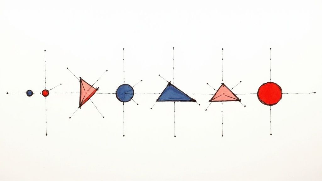
When we talk about repetition in design, we're talking about reusing the same or very similar elements throughout a layout to create a sense of harmony. Think of it like a recurring chorus in a song; it’s the part that ties everything together, making the whole piece feel connected and intentional. By simply repeating things like colors, fonts, or shapes, you’re using a powerful tool to build user trust and guide them through your design.
The Unseen Power of Repetition in Design
So, why does something as simple as repetition have such a big impact? It all comes down to human psychology. Our brains are pattern-seeking machines. When we see consistent visual cues, it cuts down on our cognitive load—that's the mental energy we have to spend to figure something out.
Less mental effort makes an interface feel natural and easy to use. The user doesn't have to second-guess what a button does or hunt for information, because the repeated elements have already taught them the "rules" of the design.
Fostering Unity and Professionalism
Repetition is what makes a design feel polished and complete. It creates order, connecting elements that might otherwise seem random. A website that uses the same button style, header font, and color scheme on every single page feels instantly more cohesive and professional than one that looks like a different experiment on each page.
This isn't just about looking good; it's a strategic move. Consistency reinforces your brand identity and builds a subtle sense of reliability. When users encounter familiar elements, they feel more comfortable and confident. That feeling of trust is essential, whether you're designing an e-commerce store, a mobile app, or a personal blog.
Repetition transforms a collection of separate parts into a cohesive whole. It creates a visual language that users can quickly learn and understand, making the design feel both familiar and professional.
Building a Foundation for Other Principles
Repetition isn't a standalone trick; it’s the foundation that holds up other key design principles. Without it, good luck trying to establish a clear visual hierarchy or a satisfying rhythm. You can see how these ideas connect in our other posts on design principles. Hierarchy and rhythm only work because you're applying styles consistently to show what's important and to guide the viewer's eye.
For example, if all your main headlines are the same size and color, you've established a clear hierarchy. This isn't just about making things match; it’s about creating a predictable structure people can rely on. And this stuff works. Research from Adobe shows that brands with a consistent visual identity are seen as more trustworthy by up to 90% of consumers.
At the end of the day, repetition is the backbone that supports a strong, intuitive, and memorable design.
Your Toolkit for Applying Repetition
Putting the theory of repetition into practice is all about knowing which elements to repeat and why. The real power of design principles repetition is its incredible versatility. We're not just talking about copying and pasting the same box over and over again.
Instead, think of it as building a consistent and intuitive visual language for your audience. Every element you consciously repeat helps guide the user's eye, establish a clear hierarchy, and ultimately, reinforce your brand's identity.
Color and Typography
Color is easily one of the most effective tools for creating unity. When you stick to a defined color palette, you instantly create a sense of cohesion. For example, using a specific primary color for all clickable buttons teaches users what they can interact with, while a consistent secondary color might be used to highlight key pieces of information. This isn't just about looking good; it's about function.
Typography works in much the same way, building a clear and predictable information hierarchy.
- H1 Headings: Use one specific font, size, and weight for all your main page titles.
- Body Text: Choose a readable font and stick to the same size and line height for all paragraphs.
- Link Styles: Make sure all your hyperlinks share the same color and styling, so users never have to second-guess what’s clickable.
This consistent use of type helps people scan your content almost effortlessly because they know exactly what to expect from each block of text.
A well-defined system of repetition acts as a silent guide for your users. It builds a subconscious understanding of how to navigate and interact with your design, reducing friction and increasing usability.
The infographic below shows just how much consistent design, driven by repetition, can impact real business metrics.
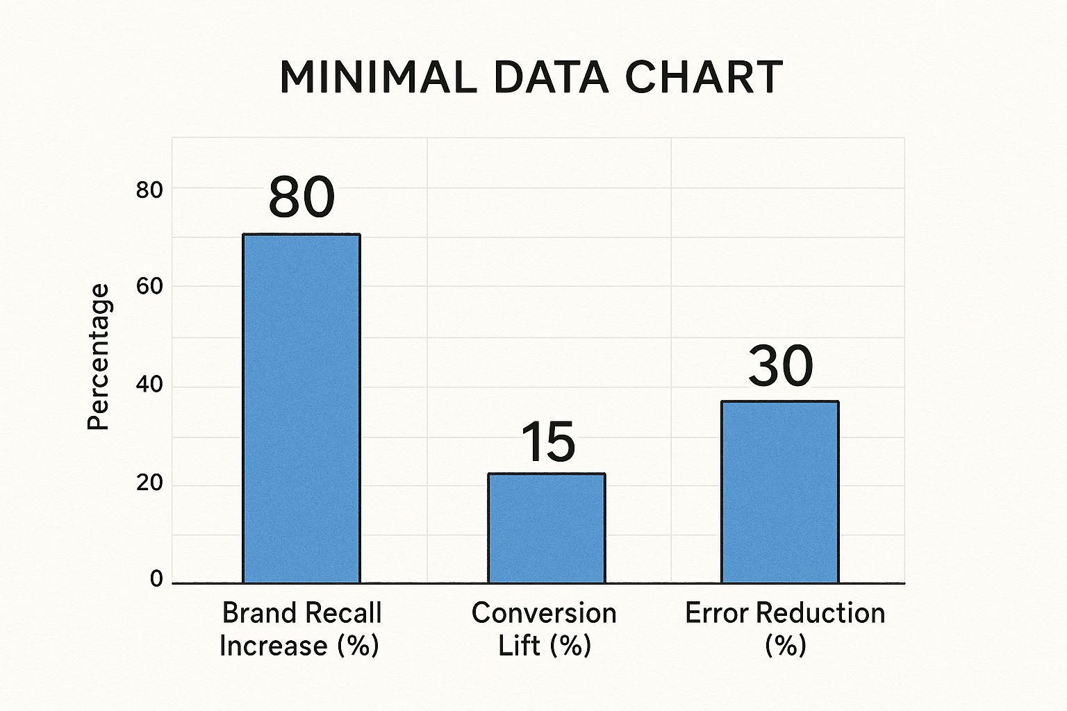
As you can see, a unified design experience achieved through repetition directly leads to stronger brand recognition and a much smoother user journey.
Shapes Spacing and Layout
Beyond just color and text, the shapes and spacing you repeat are what create a design's underlying visual rhythm. Think about using the same rounded corners on all your buttons, input fields, and content containers—it creates a soft, unified aesthetic. If one button has sharp corners and another has rounded ones, the whole design starts to feel disjointed and accidental.
Spacing is the invisible glue holding your entire design together. Consistent margins, padding, and the gaps between elements are what create an organized and professional-looking layout.
Key Spacing to Repeat:
- Grid System: Ground your layout in a consistent grid to keep elements aligned logically.
- Padding: Apply the same padding values inside similar components, like cards or buttons.
- Margins: Keep the spacing between sections and text blocks uniform to create a clean, uncluttered feel.
Here's a quick breakdown of how you can apply repetition to different design elements to achieve specific goals.
Applying Repetition Across Design Elements
| Design Element | Method of Repetition | Primary Goal Achieved |
|---|---|---|
| Color Palette | Use a primary color for all interactive elements (buttons, links). | Usability, Brand Recall |
| Typography | Maintain consistent font, size, and weight for H1, H2, and body text. | Visual Hierarchy, Readability |
| Iconography | Use a single icon style (e.g., line art, filled) from one library. | Visual Consistency, Brand Identity |
| Button Style | Apply the same shape, size, and padding to all primary buttons. | Usability, Predictability |
| Spacing | Use a consistent grid system and uniform margins between sections. | Visual Rhythm, Organization |
| Imagery | Apply the same filter, overlay, or composition style to all photos. | Brand Identity, Cohesion |
| Layout | Repeat a specific card layout or section structure across multiple pages. | Predictability, Ease of Navigation |
By intentionally repeating these fundamental building blocks, you elevate your work from a random collection of parts to a harmonious and professional-looking design. Every repeated element strengthens the overall structure, making the entire user experience feel deliberate, polished, and trustworthy.
Creating Unity and Rhythm in Your Work
When you use the principle of repetition, you’re doing more than just making things look the same—you're composing a visual melody. Think of repeated elements as the steady, predictable beat in a song. This consistency creates a rhythm that guides the user's eye smoothly across the page, making the whole experience feel natural.
This rhythmic flow is a huge part of good usability. It makes information much easier to process and dramatically lowers cognitive load, which is just a fancy way of saying it takes less brainpower to use your design. When a user instinctively knows what a button looks like or where to find important info, the interface just works.
Forging a Unified Experience
If rhythm is the path, then unity is the destination. A design has achieved unity when all its individual pieces look like they belong together, forming a complete and seamless whole. Repetition is your number one tool for building that connection.
Every time you repeat a specific button style, font, or color, you’re creating a visual language. Each repeated element reinforces the "rules" of this language, making sure every screen and component feels like it's part of the same family. It's this sense of belonging that makes a design look professional and polished, not chaotic or thrown together.
A unified design doesn't just look better—it feels more reliable. Consistency breeds familiarity, and familiarity builds trust with your audience. Every repeated element strengthens the user's confidence in your interface.
Take a news app, for example. Every article preview probably follows the same pattern: image on top, headline below, followed by a short text snippet. This repetition isn't boring; it's smart. It makes the content scannable and easy to navigate because the user's brain quickly learns the pattern, letting them focus on what they're reading, not on how to read it.
Practical Application of Rhythm
To really nail the rhythm in your work, pay close attention to the spacing and flow between your repeated elements.
- Consistent Spacing: Stick to a grid and use uniform margins between sections. This creates a steady, paced flow and keeps the layout from feeling random or cluttered.
- Logical Grouping: Repeat patterns for items that are related. For instance, all your testimonial blocks should share a similar structure, which visually tells the user, "these are all the same type of thing."
- Predictable Actions: Make sure your main call-to-action buttons all look and feel the same. This consistency trains users to instantly recognize what they can click on.
When you master this rhythm, you create an experience that feels both intuitive and intentional. This level of detail is a core part of effective visual communication and is what can turn a simple interface into a truly great product.
How Repetition Builds Stronger Brands
When we zoom out from a single design layout, we start to see where the principle of repetition really shines: building a brand. Think about the brands you instantly recognize—Apple, Coca-Cola, McDonald's. What makes them so powerful isn't just a clever logo. It’s the constant, almost relentless, repetition of their colors, fonts, logo, and even their tone of voice, everywhere you look.
This consistency is what fuels brand recognition. When someone sees your signature blue button on your website, then sees that same shade of blue on your Instagram posts and in your email campaigns, their brain quietly makes a connection. Little by little, these connections build a sense of familiarity, and familiarity is the bedrock of trust.
From Visuals to Value
A strong brand is really just a promise of a consistent experience. Repetition is how you visually keep that promise. Every time a customer sees one of your recurring design elements, you're reinforcing your identity and subtly telling them, "This is us. You know what to expect."
This isn't just about good vibes; it directly impacts the bottom line. Presenting a brand consistently has been shown to increase revenue by up to 20%. Why? Because it builds the kind of trust and loyalty that keeps customers coming back. Considering that 75% of people judge a company's credibility based on its website design, making things look cohesive isn't just a nice-to-have, it's a strategic necessity. A fascinating brand consistency study at Lucidpress digs deeper into these numbers.
Repetition in branding transforms abstract brand values into tangible, recognizable assets. It’s the visual thread that weaves together every user interaction into a single, cohesive brand story.
This unified approach helps your brand stand out in a ridiculously crowded market. When every piece of your brand speaks the same visual language, your message is clearer, stronger, and far more likely to stick.
The Mechanics of Brand Repetition
So, how do you actually do this? It all starts with creating a solid set of brand guidelines that spell out exactly which elements need to be repeated and how.
- Logo Usage: Have clear rules for your logo's size, placement, and acceptable color variations. No exceptions.
- Color Palette: Define your primary and secondary colors and use them faithfully across all your marketing materials, your website, and your product.
- Typography System: Choose one or two font families for everything—headings, body copy, CTAs—to create a consistent textual voice.
- Iconography Style: Make sure all your icons feel like they belong to the same family. Whether they’re line art, filled, or duo-tone, stick to one style for a polished look.
By systematically applying these elements, you’re not just designing pages; you're building a powerful, unified brand experience. Each repeated component works in harmony to create an identity that’s strong, memorable, and trustworthy—the very things that drive loyalty and growth. We explore this topic more in our other posts on brand consistency.
Avoiding Monotony with Smart Variation
While repetition is the glue that holds a design together, there's a fine line between cohesive and just plain boring. Lean too heavily on repeating elements, and your design can quickly become monotonous and predictable. The real artistry lies in knowing when to follow the rules you’ve set—and when to break them with strategic variation.
Think of it like a piece of music. Repetition creates the beat, a familiar rhythm that makes the song feel whole. But it's the unexpected change in tempo or a standout solo that grabs your attention and makes the track memorable. This is exactly what we're aiming for in design: creating predictable patterns and then intentionally breaking them to make a point.
The Power of a Single Break
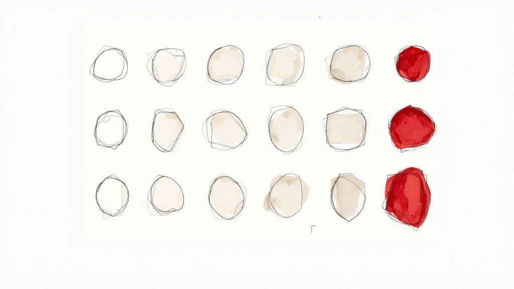
The most powerful variations are often the simplest. You don't need to throw your entire design system out the window. All it takes is a single, contrasting element that defies the established pattern. That one break acts like a spotlight, instantly pulling the user's focus exactly where you want it.
The classic example? A call-to-action (CTA) button. Imagine a page where every button is a standard, muted gray. By making the one "Buy Now" button a vibrant, high-contrast color, you've used repetition to establish normalcy and then variation to shout, "This one is different. Pay attention to this."
Smart variation isn't about creating chaos; it's about creating controlled emphasis. By breaking an established pattern, you assign immediate importance to the element that is different, guiding user action without disrupting the design's overall unity.
This is what separates the pros from the beginners. A good designer can build a consistent interface. A great designer knows how to use that consistency to build expectations, only to cleverly break them to create focus and guide behavior.
How to Introduce Effective Variation
Adding variation should never be a random act. It needs to have a purpose. Here are a few practical ways to break a pattern without destroying the harmony you've worked so hard to create:
- Color Contrast: Make one element a completely different color from your primary palette to make it pop.
- Size Difference: Dramatically increase the size of a key headline or a featured product card to give it more visual weight than the other elements.
- Shape Alteration: If all your containers are sharp-cornered rectangles, introduce rounded corners for one specific section to soften it and draw the eye.
- Typographic Emphasis: Change the font weight, style, or even the case of a crucial piece of text you need users to read.
By carefully choosing where to break your own rules, you're actually using the design principles of repetition and contrast together. This creates a design that is not just unified, but also dynamic, engaging, and ultimately, more effective.
Answering Common Questions About Repetition in Design
Even when you understand the theory behind repetition, putting it into practice can feel a bit like walking a tightrope. How do you stay consistent without being boring? Let's clear up some of the most common questions and concerns that pop up when working with this design principle.
One of the first things designers worry about is creativity. Will sticking to a strict set of rules just make my work feel dull and uninspired? Surprisingly, the opposite often happens. When you establish a solid framework of repeating elements—your grid, your type scale, your color palette—you're actually setting yourself free. You no longer have to sweat the small stuff, which frees up your brainpower to focus on the things that truly make an impact, like stunning photography or captivating copy.
How Much Is Too Much?
There's a fine line between a design that feels cohesive and one that’s just plain monotonous. You've crossed that line when a user looks at your page and has no idea where to look first because everything carries the same visual weight. If there's no hierarchy and no focal point, the design becomes a flat, uninteresting landscape.
The key to avoiding this is to introduce strategic variation.
- Create Emphasis: Make your main call-to-action button pop by giving it a unique color or making it slightly larger than the others.
- Guide the Eye: Intentionally break a repeating pattern to signal the start of a new section or highlight a limited-time offer.
Think of repetition as the underlying rhythm of your design. The goal isn't to make every beat the same, but to create a predictable pattern that you can then strategically disrupt to create emphasis and tell the user exactly where to look.
Does Repetition Still Work on Mobile?
Yes, absolutely. In fact, you could argue that repetition is even more important on mobile. With such limited screen real estate, clarity is everything. A consistent visual language is what helps users make sense of complex information on a tiny screen without getting frustrated.
When you repeat elements like button styles, list formatting, and icon designs throughout your mobile app or website, you're creating a predictable and intuitive experience. This consistency lowers the cognitive load on the user, making your interface feel easy and almost effortless to navigate, no matter the device.
Tired of endlessly searching for icons that actually fit your design system? With VibeIcons, you can generate custom, AI-powered icons that perfectly align with your brand's visual style. Get your first five icons for free and see how simple it is to maintain visual consistency.