How to Create Style Guide: Build a Strong Brand Identity
Learn how to create style guide for your brand. Our step-by-step guide covers visual language, voice, and consistency to make your brand memorable.
Think of a style guide as the blueprint for your brand. It’s the one document that lays out the ground rules for your company's identity, from the exact shade of blue in your logo to the tone of voice you use on social media. It’s how you guarantee a cohesive brand presentation everywhere your brand shows up.
Why a Style Guide Is Your Brand's North Star

Before you can build anything lasting, you need a solid foundation. For your brand, that foundation is a style guide. It’s your single source of truth, the one place everyone on your team—and every freelancer you hire—can turn to for answers. This isn't just a stuffy corporate document; it's the very thing that turns your abstract brand ideas into a real, recognizable identity.
Without one, things get messy, fast. Picture this: your sales team uses an old logo on a PowerPoint deck while the marketing team uses the new one on a brochure, and your social media manager is just picking colors that "feel right" for Instagram. This kind of inconsistency doesn't just look sloppy; it actively confuses your audience and weakens your brand's authority.
A style guide is an insurance policy against inconsistency. It empowers your team to make independent decisions that still feel unified, protecting your brand's integrity and value over time.
This document is what ensures every tweet, every email, and every billboard looks and sounds like it came from the same brain. And that consistency isn't just about looking pretty. It builds a sense of professionalism and reliability that customers absolutely notice.
The Foundation of Trust and Efficiency
The numbers don't lie. Research shows that about 55% of a brand's first impression is purely visual. That's a huge chunk of how people judge you right out of the gate. And it gets more serious: 81% of people say that trusting a brand is a major factor in their decision to buy. A consistent look and feel is a direct line to building that trust.
But a great style guide does more than just make your brand look good. It makes your whole operation run smoother. It cuts out the endless back-and-forth about which HEX code to use or how to format a blog post title. Your team can stop asking the same questions and start getting work done.
Core Benefits of a Comprehensive Style Guide
The impact of a well-crafted style guide goes far beyond just consistent visuals. Here's a quick look at the tangible benefits your business gains by putting one in place.
| Benefit | Impact on Your Business |
|---|---|
| Team Empowerment | Gives designers and writers the confidence to create on-brand materials without constant supervision, speeding up projects. |
| Improved Scalability | As your company grows, a style guide keeps your brand identity strong and unified across new products, teams, and markets. |
| Stronger Brand Recognition | Every consistent touchpoint reinforces your brand in the minds of your audience, making you more memorable. |
| Streamlined Onboarding | New hires and freelancers can get up to speed quickly, understanding your brand's rules from day one. |
Ultimately, having a clear set of guidelines gives you a scalable system for quality control and protects your most valuable asset: your brand.
Here are a few other key advantages:
- Empowers Your Team: It gives designers, writers, and marketers the confidence to create on-brand materials without constant oversight.
- Improves Scalability: As your company grows, a style guide ensures that your brand identity remains strong and unified across new products, regions, and teams.
- Strengthens Brand Recognition: Every consistent interaction reinforces your brand in the minds of your audience, making you more memorable in a crowded market.
Creating a style guide is a smart investment that pays for itself over and over again through stronger brand recognition and more efficient workflows. For more tips, check out our other posts on maintaining brand consistency.
Defining Your Brand's Core Identity

Before you even think about picking a font or a color palette, you have to get to the heart of your brand. What is its personality? This is the foundational work, the part where you define the soul of your business that will actually connect with people. If you skip this, you’ll end up with a style guide that looks pretty but feels completely empty.
This isn’t about spewing corporate jargon. It’s about digging deep and answering some tough questions that give your brand a real purpose. The most authentic brands out there are built on a crystal-clear understanding of why they exist, which makes every single design decision feel intentional and powerful.
Your brand identity is the strategic foundation for your entire style guide. It’s the 'why' behind every 'what'—from your logo’s shape to the copy on your website. Without a strong identity, your style is just decoration.
The best place to start is by getting your mission, vision, and core values down on paper. These three pillars form the bedrock of your brand's personality and dictate how it should act.
- Mission Statement: This is your purpose in a nutshell. What do you do, who do you do it for, and why does it matter?
- Vision Statement: This is the big, audacious goal. What's the future you're working to create? It's your north star.
- Core Values: Think of these as your non-negotiables. They’re the principles that guide every action and decision, shaping your culture and your reputation.
Once you’ve nailed these down, they become a filter for every single choice you make moving forward.
Understanding Your Target Audience
You can't connect with people if you don't know who you're talking to. That’s why creating a detailed audience persona is so critical. And I don’t just mean listing out basic demographics like age and location. It's about painting a picture of a real person—someone with their own goals, struggles, and motivations.
Give this person a name, a job, maybe even a backstory. What does their average day look like? What are the problems keeping them up at night that you can help solve? This level of detail is what helps you build a brand that truly resonates.
Applying Identity to Your Brand
Let's look at how this plays out in the real world. Imagine two very different companies.
First, a B2B cybersecurity firm. Their identity is built on pillars like security, reliability, and expertise. Their ideal customer might be an IT manager named Sarah who’s constantly worried about data breaches. This identity naturally leads to a style guide with a formal, authoritative tone, a stable color palette of deep blues and grays, and sharp, precise iconography.
Now, picture a direct-to-consumer wellness brand. They’re all about tranquility, nature, and self-care. Their target customer could be a young professional named Alex, feeling stressed and searching for balance. This identity calls for a completely different approach: a calming, conversational voice, an earthy color scheme, and soft, organic visuals.
Nailing down your core identity first is what ensures every piece of your style guide works together. From the tiniest icon to your homepage headline, everything becomes a genuine reflection of who you are. This turns your style guide from a simple rulebook into a powerful tool for creating a brand people remember.
Crafting Your Brand's Visual Language
Once you've defined your brand's soul, it's time to give it a face. This is where the magic happens—where you translate all those abstract ideas and values into a concrete visual system people can actually see and connect with. This isn't just about picking pretty colors; it's about building a functional, consistent language that speaks volumes about your brand's personality at a single glance.
A strong visual language ensures every single element, from your main logo right down to the tiniest icon, works together in harmony. Think of it as the visual handshake you give your audience every time they encounter you. In our increasingly visual world, this consistency is more critical than ever. In fact, around 22% of Gen Z and young millennials have used visual search to shop for fashion, which tells you everything you need to know about the shift toward visual-first brand interactions. You can dig deeper into how younger audiences engage with brands visually with these style documentation trend statistics.
Logo Usage and Application Rules
Your logo is the most concentrated version of your brand, so protecting its integrity is absolutely non-negotiable. Your style guide must lay out crystal-clear rules that leave no room for interpretation by designers, marketers, or partners. These are the "terms and conditions" for your most important visual asset.
Get started with these fundamentals:
- Clear Space: Always mandate a minimum "exclusion zone"—a pocket of empty space around the logo to make sure it breathes and never feels cluttered.
- Minimum Size: You need to define the absolute smallest your logo can appear while still being legible, both on-screen and in print.
- Incorrect Usage: This is huge. Show concrete examples of what not to do. Include common mistakes like stretching the logo, changing its colors, adding a drop shadow, or rotating it. Visual do's and don'ts are far more powerful than written rules alone.
This infographic lays out a clear process for establishing these core visual components.
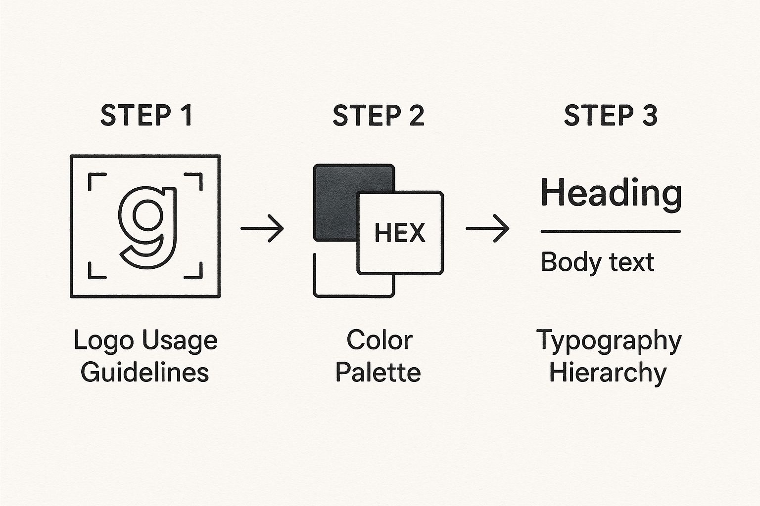
As you can see, defining these foundational rules for your logo, colors, and typography creates a solid structure for your entire brand identity.
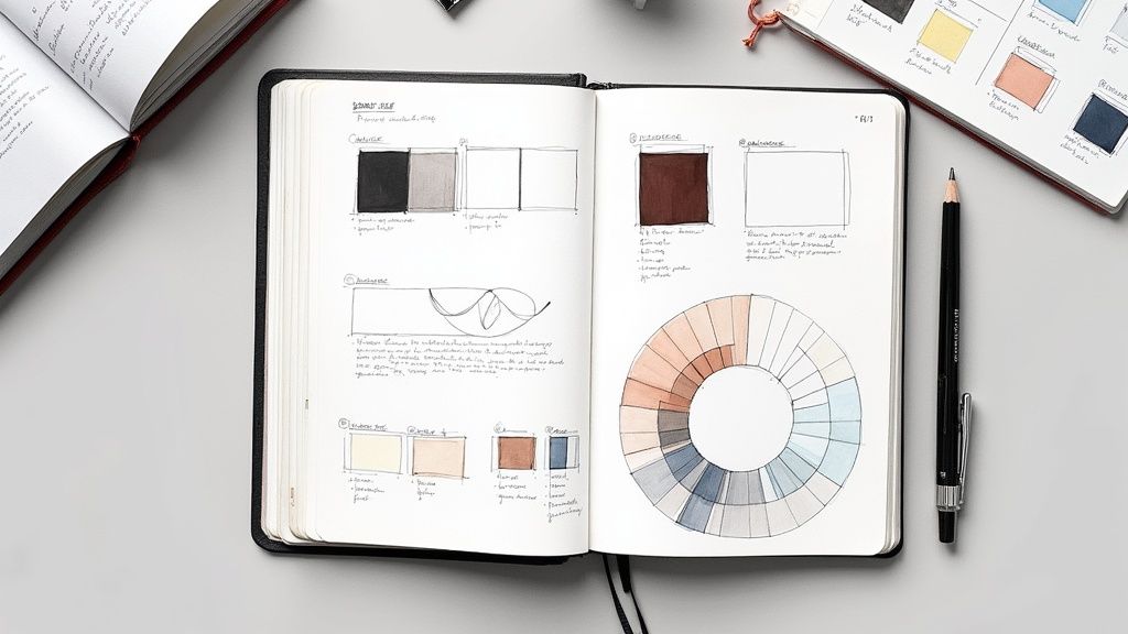
Building Your Color and Typography System
Color is about so much more than aesthetics; it’s about emotion. It sets the tone for every interaction. A well-defined color palette is what makes your brand instantly recognizable, whether it's on a billboard or a mobile app. Your guide must specify your primary, secondary, and accent colors.
Don't just show a swatch of the color. Provide the specific codes for every possible application. Including HEX for web, RGB for digital, and CMYK for print is the only way to guarantee true consistency wherever your brand shows up.
Typography, on the other hand, is the voice of your written content. The fonts you choose have a personality—are they modern and clean, classic and sophisticated, or friendly and approachable? The key is to establish a clear hierarchy that guides the reader's eye and makes your content easy to digest.
Make sure your guide defines:
- Primary Typeface: This is your workhorse, typically used for headlines and major callouts.
- Secondary Typeface: A complementary font, often used for body copy and longer text blocks for readability.
- Sizing and Weight Rules: Get specific. Define the exact font sizes and weights (e.g., bold, regular, light) for your headings (H1, H2, H3), body copy, and captions. This creates a predictable and professional visual order.
If you’re struggling with pairing fonts, our detailed typography guide has plenty of practical tips to get you started.
To help you keep track of all these visual decisions, I've put together a simple checklist. It's a great way to make sure you've covered all your bases as you build out your guide.
Visual Style Guide Checklist
| Visual Component | Key Decisions to Make | Example Application |
|---|---|---|
| Logo | Minimum size, clear space, approved variations (e.g., full color, monochrome), examples of incorrect usage. | "Use the full-color logo on light backgrounds; use the all-white version on dark backgrounds." |
| Color Palette | Primary, secondary, and accent colors. Provide HEX, RGB, and CMYK codes for each. | "Primary Blue: #0A74DA. Use for call-to-action buttons and primary headlines." |
| Typography | Primary and secondary typefaces, heading hierarchy (H1-H4 sizes/weights), body copy specifications. | "H1: Poppins Bold, 48px. Body: Lato Regular, 16px." |
| Iconography | Icon style (e.g., line, solid, duo-tone), size, color, stroke weight. Link to the icon library. | "All icons should be 24x24px with a 2px stroke weight. Use the VibeIcons 'Outline' set." |
| Imagery | Photography style (e.g., candid, posed), color treatment, composition rules, illustration style. | "Photos should feature natural light and avoid overly staged compositions. Apply the 'Warm' filter." |
| Layout & Grid | Grid systems, spacing principles (e.g., 8pt grid), margins, and padding rules for key components. | "Use a 12-column grid for web layouts with a 24px gutter." |
This checklist isn't exhaustive, but it's a fantastic starting point. Ticking off these items ensures your visual language is not only beautiful but also systematic and easy for your entire team to follow.
Finding Your Authentic Brand Voice and Tone
Let's be honest: how your brand sounds is just as critical as how it looks. Your visuals might catch someone's eye, but it's your voice that truly builds a connection. This is the part of the style guide where you bottle up your brand's personality, ensuring every email, social media post, and even microcopy feels like it comes from you.
It helps to think about the difference between voice and tone. Voice is your brand's personality—it’s fixed and consistent. Tone is the emotional inflection you apply in different contexts. For example, your voice might always be "helpful and expert." Your tone, however, would shift to be encouraging on a tutorial page but reassuring and direct on an error message. The core personality stays the same, but the delivery adapts.
A well-defined voice and tone guide gives your team the confidence to write without second-guessing themselves. It's the difference between a tweet and a formal proposal feeling like they came from two different companies versus one coherent brand.
Without this guidance, your brand's personality fractures. The marketing team might be all jokes and memes on social media, while your support team sounds like a corporate robot in their emails. This disjointed experience confuses customers, erodes trust, and just makes your brand feel less genuine.
From Adjectives to Actionable Rules
Simply listing a few adjectives like "friendly" or "professional" in your guide just doesn't cut it. You have to show, not just tell. The most effective voice guidelines bring the personality to life with concrete, side-by-side examples.
My favorite way to do this is with a "Use This, Not That" table. It makes an abstract concept like "voice" tangible for everyone, from a new hire to a seasoned executive.
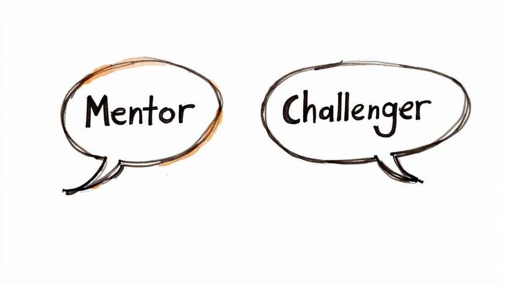
Let's imagine two different brand archetypes:
- The Mentor Brand: This persona is a knowledgeable guide. They're empowering and break down complex topics without ever sounding condescending.
- The Challenger Brand: This persona is bold, direct, and here to shake things up. They're not afraid to be a little edgy to disrupt the status quo.
Here’s how these two very different personalities might tackle the same message:
| Brand Persona | The Mentor | The Challenger |
|---|---|---|
| Headline | "A Step-by-Step Guide to Mastering Our New Feature" | "Stop Wasting Time. Our New Feature Changes Everything." |
| Explanation | "This tool helps you organize your projects more efficiently." | "This is the only tool that will actually fix your workflow." |
| Call to Action | "Ready to learn more? Start the tutorial." | "Tired of the old way? Upgrade now." |
Adapting Your Voice for a Global Audience
As your brand expands, your style guide has to evolve with it. You can't ignore cultural nuances. In fact, many global marketing experts predict that authentic, localized storytelling is only going to become more vital. This means your guide needs to provide a framework for adapting your message while protecting your core voice.
Think about how Coca-Cola adjusts its campaigns and even its packaging to resonate with local cultures. It's a masterclass in staying true to a global identity while speaking a local language. You can find more fascinating insights into these global marketing trends on welocalize.com.
Building this flexibility into your guide ensures your brand connects with diverse audiences, making it an indispensable tool for both consistency and relevance as you grow.
Bringing Your Style Guide to Life
You’ve done the hard work of building a style guide, but its real value comes from how people use it. A guide that’s buried in a shared drive or, worse, printed and collecting dust on a shelf, isn't helping anyone. The final, critical step is making sure your guide is a living, breathing part of your team's everyday workflow.
The first big decision is where this guide will live. A beautifully designed PDF is fine for a one-off presentation, but it’s a nightmare to keep updated. For most teams I've worked with, a digital-first approach is the only way to go.
- A Central Digital Hub: Think about creating a dedicated home for your brand using a tool like Notion or Frontify. Even a well-structured section on your company intranet works. This makes your guide searchable, easy to update on the fly, and accessible to everyone, from marketing to engineering.
- Direct Design Tool Integration: For product and design teams, this is huge. Embedding your style guide directly into a tool like Figma is the most effective way to ensure consistency. When your brand rules and components live right where the work is happening, you eliminate guesswork.
The whole point is to remove friction. It should be faster for a teammate to find the correct logo or HEX code in the guide than to ping someone on Slack.
Launching and Maintaining Your Guide
Okay, please don’t just send a company-wide email with a link and call it a day. That's a surefire way to get your guide ignored. A proper launch generates some buzz and shows people why this new resource is going to make their lives easier.
Host a short, engaging launch meeting. Walk everyone through the new guide, highlighting the most important sections. Show them how it helps them do their jobs better. A quick Q&A session can clear up confusion and build that all-important buy-in from the start.
But the launch is just the beginning. The best style guides are never truly "finished."
Your style guide should be a conversation, not a command. Create a clear channel for feedback, whether it's a dedicated Slack channel or a simple suggestion form. This empowers your team to help improve the guide over time.
You need a process for keeping it fresh. I recommend setting up quarterly or bi-annual reviews. This is your chance to add guidelines for that new social platform you just joined, tweak your messaging based on customer feedback, or swap out dated visual assets.
Keeping everything organized through these updates is critical. This is where having solid brand asset management solutions in place makes a world of difference.
By making your style guide easy to access, launching it with a bit of fanfare, and treating it like the living document it is, you'll turn it into an essential part of your company culture. It stops being a rulebook and starts being a tool that empowers everyone to be a true brand champion, protecting your identity as you grow.
A Few Common Questions We Get About Style Guides
Even with the best plan, you're bound to hit a few practical snags when you start building and implementing a style guide. Let's walk through some of the most common questions that pop up, so you can sidestep those challenges and make smarter decisions for your brand.
What's the Real Difference Between a Style Guide and a Brand Book?
This is a big one. People use these terms interchangeably all the time, but they really serve two different, though related, functions.
Think of your style guide as the practical, hands-on manual for your creative team. It's all about the "how"—the specific, day-to-day rules for using your logo, colors, fonts, and voice. It’s the nitty-gritty stuff that ensures consistency.
A brand book, on the other hand, digs into the "why." It's more of a high-level, philosophical document that tells the story of your brand. It covers your company's mission, vision, core values, and the big ideas that drive everything you do.
A brand book is the soul of your brand; it tells your story. A style guide is the instruction manual that shows your team how to bring that story to life, consistently. One inspires, the other directs.
Simply put, the brand book sets the stage, and the style guide gives your team the script and blocking for every single performance.
What Are the Best Tools for a Digital Style Guide?
Honestly, the "best" tool really depends on your team's workflow and size. A static PDF made in Canva or Adobe InDesign might cut it if you're a tiny team, but they become a nightmare to update and manage pretty quickly.
For a living document that can actually grow with your brand, you’ll want something more dynamic.
- Dedicated Platforms: Tools like Frontify and Zeroheight are built for this. They create interactive, web-based brand hubs that are easy for anyone to access and simple for you to update.
- Flexible Workspaces: Something like Notion can be a surprisingly powerful and budget-friendly option. You can build a completely custom, collaborative guide to house everything from your hex codes to your mission statement.
- Design-Integrated Systems: If your designers live and breathe Figma, building the style guide right inside the tool is a total game-changer. It connects your brand rules directly to your design components, which closes the gap between the guidelines and the actual work being done.
How Often Should We Update Our Style Guide?
A style guide should never be treated as a "one-and-done" project. It’s a living document that has to evolve as your brand does.
As a general rule, it's smart to schedule a formal, comprehensive review at least once a year. That’s your chance to make sure the guide still aligns with your current business goals and marketing strategies.
But don't wait for the annual review if something big changes. You’ll need to make updates on the fly when things like a brand refresh happen, a new product launches, or you decide to jump on a new social media channel. The most important thing is to have one person who "owns" the guide. Their job is to manage the changes and—just as crucial—let the entire team know what’s new.
Who Needs to Be in the Room When We Create the Guide?
Trying to create a style guide in isolation is the fastest way to make sure no one ever uses it. If you want people to actually adopt it, you have to build it collaboratively.
Your core team for this project should absolutely include:
- Marketing Leaders: They provide the strategic big picture and make sure everything aligns with what the business is trying to achieve.
- Designers: They’re the ones who will define and document the entire visual identity, from the logo to the smallest icon.
- Writers or Content Strategists: They’ll be responsible for nailing down the brand's voice, tone, and all the editorial rules.
But don't stop there. Once you have a draft, get feedback from other departments. Show it to developers, product managers, and even your sales reps. They're the ones using these assets in the real world, and they’ll be able to tell you if the guidelines are practical or just wishful thinking. This kind of collaboration builds a sense of shared ownership and makes the guide a tool people actually want to use.
Finding the perfect icons to bring your new style guide to life can feel like searching for a needle in a haystack. With VibeIcons, you can generate custom, AI-powered icons that perfectly match your brand's unique aesthetic, ensuring every last visual detail is on point. Create your first five icons for free at https://www.vibe-icons.com.