Your Guide to a Flawless Icon Clean Up
Transform your design system with our guide to icon clean up. Learn to audit, standardize, and optimize your icons for peak consistency and performance.

An icon cleanup is the process of untangling your entire icon library. It involves taking a hard look at every single icon, standardizing them, and optimizing them to ensure they’re all consistent and performant.
This isn’t just a cosmetic touch-up. It's a strategic overhaul to create a single, reliable source of truth for your brand's visual assets, which has a massive impact on brand integrity, developer workflow, and user experience.
Why a Strategic Icon Clean Up Matters
Let’s be honest, staring down a chaotic folder of icons is daunting. It's the kind of task that's easy to push off, but letting that clutter fester creates real problems down the line.
When designers and developers are forced to pull from different, unverified icon sets, your product’s visual language becomes a mess. A user might not consciously register that the "profile" icon in the settings menu is slightly different from the one in the main navigation, but these small inconsistencies create a subtle feeling of sloppiness that chips away at brand trust.
And it's not just about looks. A disorganized library is a huge time sink. Think about all the hours your team wastes hunting for the "right" version of a simple checkmark icon or—even worse—redrawing one that was already there, buried in some forgotten folder. This isn't a small inconvenience; it’s a direct drain on your team's productivity.
The Hidden Costs of Icon Chaos
The fallout from a neglected icon library even impacts your technical performance. A hodgepodge of unoptimized assets, particularly bloated SVG files, can seriously slow down your application. Slower load times lead to a clunky user experience, and those "tiny" files add up fast, especially for users on mobile devices or weaker connections.
A well-maintained icon library is more than a design resource; it’s a critical piece of infrastructure that supports brand consistency, accelerates development, and enhances the end-user's interaction with your product.
Ultimately, an icon cleanup is an investment in your team's sanity and your company's efficiency. By setting clear standards, you get rid of the guesswork and create a smooth, predictable workflow.
This is a fundamental part of smart brand asset management—making sure every visual element is purposeful and perfectly aligned with your brand. To dig deeper into building a solid system, check out our guide to brand asset management solutions. It’s all about turning that chaos into a powerful, efficient, and scalable asset.
Auditing Your Existing Icon Library
Before you can build a clean, consistent icon system, you have to get a handle on the chaos you're currently dealing with. A thorough audit is the first real step in any serious icon cleanup, and it's where you'll uncover every duplicate, one-off, and outdated asset hiding across your projects.
The main goal here is to create a complete inventory. Start by hunting down icons from every corner of your digital world. Comb through your product UIs, marketing websites, and dig into old design files in tools like Figma or Sketch. Don't be surprised if you find multiple versions of the same icon with tiny, maddening variations in style or stroke weight.
This initial gathering phase can feel like a huge task, but a simple system will bring order to the madness. Trust me, a basic spreadsheet is your best friend for this.
Creating Your Audit Spreadsheet
Set up a spreadsheet with columns to track the essential info for each icon you find. This doesn't need to be overly complex—just focus on what actually matters for making decisions later.
Here's what I'd recommend tracking:
- Icon Preview: Just a small screenshot of the icon itself.
- Location: Where did you find it? Be specific, like "iOS App Onboarding" or "Marketing Homepage CTA."
- Usage Frequency: Is this icon used everywhere, or is it buried in some legacy feature that sees one user a month?
- Action Needed: This is the most important part. Tag each one as Keep, Redesign, or Archive.
Going through this process helps you see the true scope of the problem. It replaces guesswork with data, giving you a solid foundation for your entire cleanup strategy. You're not just collecting icons; you're building a clear picture that will guide every decision you make from here on out.
An icon audit isn't about finding fault; it's about establishing a baseline. By seeing every asset in one place, you can finally identify patterns of inconsistency and build a clear path toward a unified visual language.
This simple workflow shows how you turn that audit into real action.
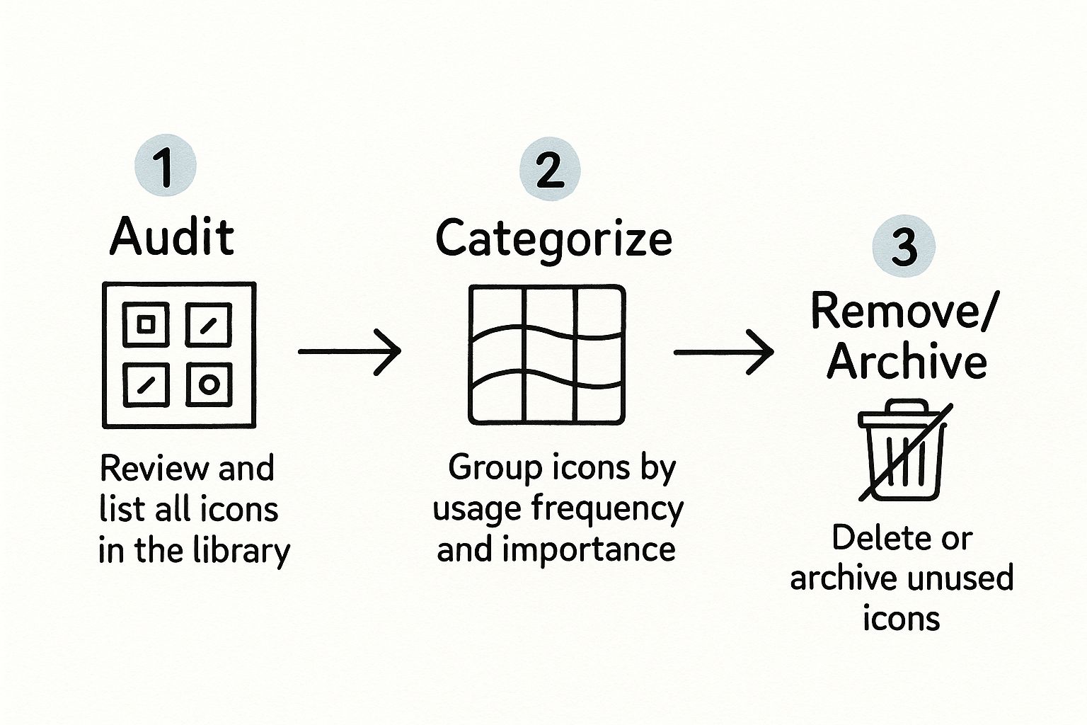
As you can see, after auditing and categorizing everything, the final step is to decisively remove or archive the icons that no longer serve a purpose. This clears the deck and makes room for a truly standardized set.
How to Standardize Your Icon Grid and Style
Alright, with your audit done, it's time to stop the chaos for good. The next step is creating a single source of truth for your entire icon library. This isn't just about making things look nice; it's about building a predictable, easy-to-use system that eliminates guesswork.
Start with the Foundation: The Grid
The very first decision you need to make is your bounding box. Think of this as the canvas for every single icon. A common and versatile size is 24x24 pixels, but choose whatever works for your system. The key is that every icon, from a simple checkmark to a complex illustration, lives inside this same container.
But you can't just let the icon fill the whole box. You need a safe zone, which is just a fancy term for internal padding. This is the breathing room that stops your icons from bumping into the edges of their frame. It's a small detail that makes a massive difference in visual balance, especially when icons are placed side-by-side in a UI.
Define Your Visual Language
Once the grid is set, the real fun begins: defining the style. This is where you bake your brand’s personality directly into the icons themselves.
Here are the non-negotiables to lock down:
- Stroke Weight: Pick one consistent line thickness and stick with it. A 1.5px stroke, for example, is a great starting point for a clean, modern feel. This one rule does more for consistency than anything else.
- Corner Radii: Decide how sharp or rounded your corners should be. Sharp, 90-degree angles can feel precise and technical, while rounded corners give off a friendlier, more organic vibe.
- End Caps and Joins: How do your lines end? Are they squared-off or rounded? These subtle details might seem minor, but they add up to create a distinct and polished look.
To keep everything straight, it helps to document these choices in a clear, accessible way. Here’s a simple checklist you can use to define your style.
Icon Style Standardization Checklist
| Property | Definition | Example Value |
|---|---|---|
| Bounding Box | The standard container size for all icons. | 24x24 px |
| Safe Zone | The internal padding to create visual spacing. | 2px on all sides |
| Stroke Weight | The default thickness for all icon lines. | 1.5px |
| Corner Radius | The roundness applied to corners. | 2px |
| End Caps | The style of the ends of open lines. | Round |
| Color | The primary color used for all icons. | #1F2937 (Neutral-800) |
Having a table like this makes it incredibly easy for anyone on the team to understand the rules at a glance.
An established icon style guide isn't restrictive; it’s liberating. It frees your team from making small, repetitive decisions and empowers them to build user interfaces with speed and confidence.
For example, a tech startup aiming for a clean, professional aesthetic might go with a 1.5px stroke and sharp corners. On the other hand, a wellness app might choose a softer 2px stroke and rounded corners to feel more approachable and gentle.
Your documentation—whether it’s a dedicated page in Figma or a shared library in Sketch—becomes the unbreakable standard. It's the go-to resource that ensures every icon, now and in the future, fits perfectly.
If you're interested in going even deeper, check out our full guide on how to make custom icons from the ground up.
Getting Your Vectors Production-Ready

Alright, with your icon styles locked in, it's time to roll up our sleeves and get into the technical weeds of vector optimization. This is the part of the process where we go beyond just how an icon looks and focus on how it performs. A clean vector isn't just a matter of professional pride; it directly affects file size and, ultimately, your product's loading speed.
Your first mission, should you choose to accept it, is hunting down redundant anchor points. It's incredibly easy to end up with stray points that don't actually change the shape, especially when you’re in the creative flow. Each one adds a tiny bit of data to the final SVG, and while it seems small, it adds up. Go through your paths and remove any point that isn't absolutely essential.
The Nitty-Gritty of Vector Cleanup
Another rookie mistake I see all the time is leaving strokes as live paths. This is a recipe for disaster when it comes to scaling. You’ve probably seen it before—an icon gets resized, and suddenly the line weights are all wrong. The fix is simple: once your design is final, convert strokes to outlines. This bakes the thickness into the shape itself, ensuring it scales perfectly every time.
In the same spirit, you'll want to combine shapes wherever you can. An icon built from five separate pieces is far more complex under the hood than one that's a single, unified form. Use your tool's pathfinder or boolean operations (like 'Unite' or 'Merge') to flatten everything into one clean object. This drastically simplifies the SVG code.
I always tell designers to think of vector cleanup like decluttering a room. You're getting rid of the unnecessary junk (extra points), and grouping similar items together (combining shapes). The result is a clean, efficient space that’s just easier to work with.
These technical tweaks really start to matter at scale. Shaving a few bytes off one icon is nice, but when you apply that discipline to a library of 200 icons, you're making a real dent in your asset load. It’s a foundational skill for anyone serious about icon design.
Your Go-To Optimization Checklist
To keep things consistent, I run through a quick mental checklist for every single icon before it gets exported. It’s a habit that guarantees quality.
- Simplify Paths: Get rid of any anchor point that doesn't define the shape's curve or corner. Most vector tools have a "Simplify" function that can give you a head start.
- Outline All Strokes: No exceptions here. Convert every stroke into a filled shape to lock in its appearance.
- Combine and Unite: Merge all the separate parts of your icon into a single vector shape whenever possible.
- Flatten Transformations: If you've rotated or scaled elements, make sure to apply those transformations directly to the vector path so the SVG code stays clean.
Of course, the tools you use can make a huge difference in how smoothly this all goes. If you're wondering which program is right for you, we put together a guide on the best vector design software that breaks down the pros and cons of the top contenders. Finding the right fit for your workflow is half the battle.
Getting Your Naming and Export Strategy Right
Even the most beautifully optimized icon is dead in the water if a developer can't find it. The last piece of the puzzle—and honestly, one of the most crucial—is locking in a solid naming and export strategy. This isn’t just about keeping things tidy; it’s about building a reliable bridge between your design files and the final product.
A logical naming convention is your first line of defense against chaos. It’s time to say goodbye to names like icon-arrow-2.svg forever. What you need is a predictable system that tells you exactly what an icon is without even needing to see it.
A great approach is to use a simple category/name/style pattern.
For instance, naming an icon nav/profile/filled.svg immediately tells a developer everything they need to know. It’s for navigation, it’s a profile icon, and it’s the filled version. This kind of clarity makes searching for assets a breeze and speeds up development work significantly.
Dialing in Your Export Settings
With a naming system in place, you’re ready to get your icons out of the design tool and into production. The main goal here is to get the smallest possible SVG file size without any drop in quality. Most modern design tools like Figma or Sketch give you a good amount of control over this, and a few minor adjustments can have a massive impact.
Here are the non-negotiables for your export settings:
- Minify the code: Always check the box to minify. This strips out all the junk that browsers don't need to render the icon, like comments, editor metadata, and other fluff.
- Inline styles: It's usually best to inline styles directly into the SVG. This keeps everything self-contained and avoids potential conflicts with external CSS classes.
- Vector precision: You rarely need a high number of decimal places for your vector coordinates. Dropping the precision down to 2 is usually perfect for web icons and can make a surprisingly big difference in file size.
Think of your export settings as the final quality check. A clean name gets the icon into the right hands, but a clean export ensures it performs beautifully for your users.
Putting in the effort to systematize your naming and exporting pays off big time. It turns a messy folder of graphics into a powerful, scalable system that your whole team can rely on. You eliminate guesswork, which means everyone can build faster and with more confidence.
Got Questions About Icon Cleanup? We've Got Answers
Even with a solid plan, a few questions always pop up when you're deep in an icon audit. Let's tackle some of the most common ones I hear from design teams.
Getting these details right can be the difference between a smooth project and one that gets bogged down in confusion.
How Often Should We Actually Do an Icon Audit?
Ideally, you'd do a big, comprehensive audit once a year or whenever you're going through a major brand refresh. But let’s be honest, the best strategy is to make it a continuous process.
Instead of letting the mess pile up, build a system where every new icon has to meet your established standards before it ever gets added to the library. This proactive habit turns a massive, painful annual task into a small, manageable part of your daily workflow.
The most effective icon cleanup is the one you barely have to do. By setting and enforcing clear standards from the start, you spend less time fixing old problems and more time designing.
What's the Best Format for Web Icons?
Hands down, it's SVG (Scalable Vector Graphics). I can't recommend it enough. Because SVGs are vector-based, they look crisp and perfect on any screen, from a tiny phone to a giant retina display. That’s a non-negotiable for responsive design.
They're also incredibly small in file size and can be manipulated directly with CSS. This gives developers the power to change colors, sizes, and even animate them with just a few lines of code—something you just can't do with a PNG.
Should We Use Filled or Line Icons in Our UI?
This one really comes down to your brand’s personality and the specific context of the interface. There's no single right answer, but there are some solid conventions.
Line icons tend to feel lighter and more modern, while filled icons have more visual weight and are often easier to recognize at a glance, especially when they’re small.
A pattern I see work really well is using both styles to communicate state:
- Line Icon: Use for the default or inactive state.
- Filled Icon: Use for the active, selected, or hover state.
This simple trick gives users immediate, clear feedback, which is a huge win for usability.
Struggling to create consistent icon variants that match your existing library? VibeIcons uses AI to generate pixel-perfect icons in styles like Heroicons and Lucide, so you can stop searching and start creating. Get your first five icons for free.