Top Quotes for Graphic Design to Spark Creativity
Discover inspiring quotes for graphic design that fuel your creativity and boost your projects. Click to explore the best quotes for graphic design!
In the world of visual communication, a well-placed line, a perfect color palette, or a seamless user experience can make all the difference. But what fuels the thinking behind these critical decisions? Often, it's the timeless wisdom of those who came before us, distilled into powerful, memorable phrases. This article moves beyond a simple list of motivational phrases, offering a deep dive into foundational quotes for graphic design that carry real-world weight.
We will dissect the practical wisdom of legends like Steve Jobs, Paul Rand, and Saul Bass. The goal is to translate their core philosophies into actionable strategies you can apply to your projects today. Each quote serves as a launchpad to explore a specific principle, from the function-first approach of user experience to the meticulous craft of visual details.
Whether you're battling creative block, refining a user interface, or seeking to add more depth and intention to your work, these insights will serve as your guide. Prepare to transform abstract inspiration into a concrete framework for creating more impactful and intelligent designs. This curated collection is designed to help you not just see design differently, but to think like a designer on a fundamentally deeper level.
1. Good design is obvious. Great design is transparent. - Joe Sparano
This powerful quote from graphic designer and educator Joe Sparano draws a critical distinction between competent design and masterful design. While a good design clearly communicates its function, a great design integrates so seamlessly into the user experience that it becomes virtually invisible. The user doesn't stop to admire the button design; they simply complete their task effortlessly, with the design serving as a silent, intuitive guide.
Transparency in design means removing cognitive load. Instead of making the user think about how to use the interface, great design allows them to focus solely on their goal, whether that’s finding information, making a purchase, or connecting with others.
Achieving Design Transparency
The path to transparent design is paved with user-centric decisions and relentless simplification. It’s about prioritizing the user's journey over flashy visuals or unnecessary features.
Examples of Transparent Design:
- Google's Search Page: The design is famously minimalist. It doesn't distract; it immediately serves its single, core purpose of helping you find information.
- Apple's iOS: Despite its complexity under the hood, the user interface relies on intuitive gestures and consistent patterns that quickly become second nature, making the technology feel like an extension of the user.
Actionable Tips for Implementation
Here are practical steps to apply Sparano's wisdom to your projects:
- Practice Subtractive Design: For every element you add, ask, "Does this directly help the user achieve their goal?" If the answer is no, or if it complicates the process, remove it. A clean interface is a transparent one.
- Prioritize User Journey Mapping: Before you even think about colors or fonts, map out the ideal path a user will take. Every design decision should support making that journey smoother and more intuitive.
- Conduct "No-Hint" User Testing: Test your prototypes with real users but give them minimal instruction. If they struggle to complete a core task, it's a clear sign that your design is not transparent enough. Observe where they get stuck to identify friction points.
2. Design is not just what it looks like and feels like. Design is how it works. - Steve Jobs
This iconic quote from Apple co-founder Steve Jobs fundamentally shifts the definition of design from pure aesthetics to holistic functionality. It argues that a beautiful object that fails to serve its purpose is not well-designed. True design excellence is achieved when form and function are so deeply intertwined that the product or experience is not only visually appealing but also intuitive, efficient, and effective at solving a user's problem.
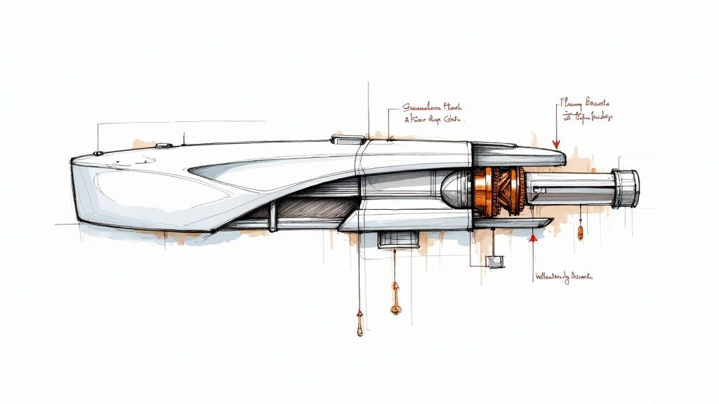
For graphic designers, this quote is a crucial reminder that our work is more than just making things pretty. It's about creating systems that guide users, communicate information clearly, and enable seamless interactions. The "how it works" principle demands that we think like engineers and strategists, not just artists. Understanding these core design principles on vibe-icons.com is essential for modern design.
Embodying Functional Design
The philosophy of "how it works" is centered on the user's ultimate success and satisfaction. It means prioritizing usability, accessibility, and performance as core components of the visual design process itself.
Examples of Functional Design:
- Dyson Vacuums: The transparent dustbin and exposed cyclone technology aren't just stylistic choices. They show the user exactly how the product works, building confidence and making it clear when the bin needs emptying.
- IKEA Furniture: The design is optimized for flat-pack shipping and simple self-assembly. The entire system, from manufacturing to user experience at home, is a masterclass in functional, cost-effective design.
Actionable Tips for Implementation
Here are practical ways to ensure your design truly "works":
- Start with a Problem, Not a Palette: Before opening Figma or Photoshop, clearly define the user problem you are trying to solve. Every design choice, from layout to typography, should be a direct answer to that problem.
- Prototype Functionality First: Create low-fidelity, interactive wireframes to test the core user flow and functionality. If the experience is confusing in its simplest form, no amount of visual polish will fix it.
- Collaborate with Developers Early: Treat developers as design partners. Understand the technical constraints and possibilities from the beginning to ensure your visual concepts are feasible and performant. This integration is key to making a design work flawlessly.
3. Simplicity is the ultimate sophistication. - Leonardo da Vinci
This timeless wisdom from Renaissance master Leonardo da Vinci is a foundational principle in graphic design. It suggests that true elegance and mastery are found not in complexity or ornamentation, but in the clarity and purity of a simple, well-executed idea. Achieving this level of simplicity is deceptive; it requires a deep understanding of the subject to distill its essence into a powerful, minimalist form.

In a world saturated with visual noise, a simple design cuts through the clutter, communicates instantly, and leaves a lasting impression. This approach isn't about being plain or empty; it's about being intentional, removing every non-essential element until only the core message remains, presented with grace and purpose.
Achieving Sophisticated Simplicity
The journey to a simple design often begins with complexity. It’s the process of refining, editing, and abstracting that ultimately leads to a sophisticated solution that appears effortless. This is one of the most vital quotes for graphic design because it emphasizes process over initial impulse.
Examples of Sophisticated Simplicity:
- Nike's Swoosh: This iconic logo is just a simple checkmark, yet it powerfully conveys movement, speed, and victory without a single word.
- The FedEx Logo: At first glance, it's a clean wordmark. A closer look reveals a perfectly formed arrow in the negative space between the "E" and "x," brilliantly representing direction and delivery.
- Apple's Product Packaging: The experience of unboxing an Apple product is a masterclass in simplicity. The clean white box, minimal text, and perfect fit of each component create a sense of premium quality and focus.
Actionable Tips for Implementation
Here are practical methods to apply da Vinci's philosophy to your work:
- Practice Reductive Design: Start with all your ideas on the canvas, then systematically remove elements one by one. Ask yourself, "Is the design weaker without this?" If not, it can go.
- Leverage Negative Space: Don't treat white space as an empty background. Use it strategically to guide the eye, create focus on key elements, and give your design room to breathe.
- Limit Your Toolkit: Challenge yourself to create a design using only one or two typefaces and a minimal color palette. These constraints force creativity and lead to more cohesive, simple solutions.
- Focus on a Single Message: Every design should have one primary goal. Ensure that every element, from imagery to typography, directly supports that single, clear message without distraction.
4. The details are not the details. They make the design. - Charles Eames
This profound statement from legendary designer Charles Eames challenges the notion that details are minor or secondary. Instead, it asserts that the smallest elements are the very essence of a design. While a big idea provides a framework, it is the meticulous execution of every line, space, color, and interaction that elevates a project from mediocre to magnificent and truly defines the user experience.
Attention to detail builds trust, communicates professionalism, and creates a sense of quality. When users encounter a polished, cohesive design where every element feels intentional, they perceive the product and the brand behind it as more reliable and valuable. This is a key principle in many famous quotes for graphic design.
Cultivating a Detail-Oriented Mindset
Embracing this philosophy means treating every design choice, no matter how small, with deliberate care. It's about seeing the entire composition as a sum of its carefully crafted parts, where a single misaligned pixel or inconsistent font weight can disrupt the harmony.
Examples of Detail-Driven Design:
- Apple's iOS: The precise spacing, crisp typography, and subtle animations in the interface create an experience that feels intuitive and premium. Every icon and transition is meticulously considered.
- Mailchimp's Branding: From its friendly illustration style to its consistent button microcopy, Mailchimp’s attention to detail creates a cohesive and approachable brand personality across all touchpoints.
- Swiss International Air Lines: The airline's branding is a masterclass in systematic design, where every detail, from typography to iconography, adheres to a strict grid, ensuring absolute consistency and clarity.
Actionable Tips for Implementation
Here are practical steps to apply Eames's wisdom to your design process:
- Create a Detailed Style Guide: Go beyond just logos and colors. Document rules for typography hierarchy, spacing, button states, icon styles, and even the tone of voice for microcopy. This ensures every detail is consistent.
- Use Grid Systems Religiously: A solid grid provides a structural foundation for your design, helping you maintain consistent alignment and spacing. This brings an intentional order to the layout.
- Perfect Your Typographic Hierarchy: Pay close attention to font sizes, weights, and line heights. A clear visual hierarchy guides the user's eye and makes content much easier to scan and understand.
- Review Designs at 400% Zoom: Zooming in forces you to inspect every pixel. This practice helps you catch subtle misalignments, inconsistent spacing, or rendering imperfections that you might otherwise miss.
5. Design is thinking made visual. - Saul Bass
This iconic quote from legendary designer Saul Bass frames design not merely as an aesthetic practice, but as an intellectual one. It asserts that design is the bridge between abstract strategy and tangible communication. A designer's true role is to take a complex idea, a feeling, or a business objective and translate it into a visual language that an audience can instantly understand and connect with. The final visual is the end product of a rigorous thought process.
This perspective elevates the craft beyond just making things look good. It positions the designer as a strategic partner who makes thinking visible, turning concepts into compelling visual narratives. The power of this approach lies in creating work that is not only beautiful but also deeply meaningful and effective, as it is rooted in clear, intentional thought.
Bringing Thinking to Life
The core of Bass's philosophy is that every visual choice must be justified by the underlying concept. This requires a deep understanding of the message before a single pixel is placed.
Examples of Visual Thinking:
- Saul Bass's Film Posters: Bass didn't just illustrate scenes; he distilled the entire film's mood and central theme into a single, potent graphic symbol (e.g., the fractured silhouette for Anatomy of a Murder).
- Nike’s "Just Do It" Campaign: The campaign visuals don't just show athletes; they embody the idea of determination and overcoming limits, turning a simple phrase into a powerful visual identity.
- The Obama "Hope" Poster: Shepard Fairey's design translated the abstract concept of hope and change into a stylized, iconic image that became a symbol for a whole movement.
Actionable Tips for Implementation
Here are practical steps to make your thinking visual in your design work:
- Start with a 'Why' Brief: Before any design work begins, write a simple brief that answers: "What is the single most important idea we are trying to communicate?" This becomes your North Star for every decision.
- Sketch Concepts First: Resist the urge to jump directly to digital tools. Use a pencil and paper to explore different visual metaphors and concepts quickly. This low-fidelity process prioritizes thinking over execution. Learn more about how to articulate your design concepts with powerful graphic design phrases on vibe-icons.com.
- Create Visual Mood Boards: When dealing with abstract concepts like "trust" or "innovation," build a mood board. This helps you and your stakeholders align on the visual tone before committing to a specific design direction.
6. Design can be art. Design can be aesthetics. Design is so simple, that's why it is so complicated. - Paul Rand
This famous paradox from Paul Rand, a titan of modern graphic design, gets to the heart of a designer's greatest challenge. Rand suggests that while design often serves artistic and aesthetic purposes, its ultimate goal is profound simplicity. Achieving that simplicity, however, is an incredibly complex process of distillation, problem-solving, and strategic thinking. It’s the journey of turning a messy, complicated problem into an elegant, intuitive solution that feels effortless to the end user.
The quote highlights that true simplicity isn't about being basic or plain; it's about achieving a state of clarity and purpose after wrestling with all the complexities. This idea is central to many of the best quotes for graphic design, as it speaks to the hidden intellectual labor behind visually simple outcomes. The complication lies in the thinking, not the final execution.
The Sophistication of Simplicity
The most effective designs often appear obvious in hindsight, yet reaching that point requires deep understanding, research, and countless revisions. It's about saying "no" to a thousand ideas to arrive at the one perfect solution that works seamlessly.
Examples of Complicated Simplicity:
- Paul Rand's Logos: His iconic work for IBM, UPS, and ABC are masterclasses in this philosophy. They are visually simple, memorable, and instantly recognizable, yet they emerged from a rigorous process of understanding the core essence of each brand.
- Muji's Brand Philosophy: The Japanese brand Muji builds its entire identity around "no-brand quality goods." Its minimalist product design and packaging feel simple, but this is achieved through a complex philosophy of material selection, functional efficiency, and waste reduction.
Actionable Tips for Implementation
Here are practical steps to apply Rand's wisdom to your design process:
- Embrace the Messy Middle: Don't be afraid of complexity during the initial thinking and discovery phases. Allow yourself to explore every intricate detail of the problem, gather extensive research, and generate a wide range of ideas before you even think about simplifying.
- Simplify Through Iteration: Simplicity is rarely achieved on the first try. Develop a process of gradual refinement. With each version of your design, ask, "What can I remove without losing the core message or function?"
- Study the Masters: Analyze the work of designers like Paul Rand or Dieter Rams. Deconstruct their simple outputs and try to understand the complex thinking and problem-solving that must have led to them. This helps train your mind to see the sophistication behind simplicity.
7. Content precedes design. Design in the absence of content is not design, it's decoration. - Jeffrey Zeldman
Web design pioneer Jeffrey Zeldman offers a foundational principle with this quote, arguing that true design serves a purpose dictated by its content. When aesthetics are developed in a vacuum without the actual text, images, and data they are meant to support, the result is an empty, decorative shell. Purposeful design, in contrast, is an intentional response to the substance it communicates.
This "content-first" approach ensures that the form of a design is directly shaped by its function. Rather than forcing real content into a pre-made template filled with "lorem ipsum," the designer builds the layout, typography, and visual hierarchy around the actual user needs and communication goals.
Achieving Content-First Design
Embracing this philosophy means shifting your process to prioritize substance over style from the very beginning. The layout should be built to enhance the message, not compete with it.
Examples of Content-First Design:
- Medium: The platform's interface is famously minimal, using typography and white space to put the writer's words and ideas at the absolute center of the experience. The design serves the content, not the other way around.
- The New York Times: Its digital presence is a masterclass in designing for content. The responsive layouts are meticulously crafted to ensure articles are legible and engaging, regardless of device, prioritizing the reading experience above all else.
- Gov.uk: This government website was built from the ground up based on user needs and content. The design is simple and functional, focusing entirely on helping citizens find critical information quickly and efficiently.
Actionable Tips for Implementation
Here are practical steps to apply Zeldman’s wisdom to your graphic design projects:
- Gather Real Content Early: Before you open your design software, work with clients and content strategists to obtain the actual text, headlines, images, and data that will populate the design. Avoid "lorem ipsum" whenever possible.
- Design for Content Variation: Build flexible design systems that can handle both short and long headlines, different image aspect ratios, and varying amounts of body text. Test your layouts against these "stress cases."
- Collaborate with Writers: Treat content creators as essential partners. A close working relationship ensures that both the visual design and the written word are working together to achieve the same communication goal.
8. You can't use up creativity. The more you use, the more you have. - Maya Angelou
This profound insight from the celebrated poet and activist Maya Angelou offers a liberating perspective on the creative process. While not explicitly about design, this quote serves as a powerful antidote to the fear of creative burnout, reframing creativity as a muscle that grows stronger with use rather than a well that can run dry. It encourages designers to engage in their craft consistently and fearlessly.
Many designers worry about depleting their best ideas on a single project. Angelou's wisdom suggests the opposite is true: the very act of generating ideas, experimenting, and producing work stimulates even more creative thought. It transforms creativity from a scarce commodity to an abundant, self-renewing resource, making it one of the most vital quotes for graphic design professionals to embrace.
Cultivating Creative Abundance
Treating creativity as a practice rather than a finite resource changes a designer's entire approach. It prioritizes consistent effort and exploration over waiting for a singular moment of inspiration, leading to more innovative and prolific output.
Examples of Creative Abundance:
- Paula Scher: Her prolific career is a testament to continuous typographic exploration. By constantly working and experimenting, she has built a vast and influential body of work that continues to evolve.
- Aaron Draplin: Known for his extensive logo portfolio and "get to work" attitude, Draplin embodies the idea that consistent practice and a high volume of work lead to a deeper well of creative solutions.
Actionable Tips for Implementation
Here are practical ways to apply Angelou's philosophy to your design work:
- Establish a Creative Habit: Dedicate time each day or week to a creative practice, even if it's just a 15-minute sketch or a quick design exercise. Consistency builds creative momentum.
- Start Personal Projects: Work on projects just for you, free from client constraints. This is a low-pressure environment to explore new styles, tools, and ideas, effectively refilling your creative reservoir.
- Document and Share Everything: Keep a journal or a digital folder of your experiments, even the "failures." Sharing your process can spark new ideas and collaborations, reinforcing the cycle of creative growth.
- Embrace Creative Play: Set aside time for unstructured creative activity without a specific goal. This playful approach can unlock unexpected connections and improve the overall user experience in your professional work by fostering a more intuitive and innovative mindset.
8 Key Graphic Design Quotes Comparison
| Quote Title | Implementation Complexity 🔄 | Resource Requirements ⚡ | Expected Outcomes 📊 | Ideal Use Cases 💡 | Key Advantages ⭐ |
|---|---|---|---|---|---|
| Good design is obvious. Great design is transparent. - Joe Sparano | Moderate: Focus on simplifying design | Moderate: User testing recommended | Seamless, intuitive user experience | UI design, Web design, Product design, Info architecture | Prioritizes user needs and clarity |
| Design is not just what it looks like and feels like. Design is how it works. - Steve Jobs | High: Integrates function with form | High: Cross-disciplinary collaboration | Balanced, functional, and aesthetic products | Product design, UX design, Industrial design, Software interface | Promotes holistic, user-centered design |
| Simplicity is the ultimate sophistication. - Leonardo da Vinci | High: Mastery needed to simplify well | Moderate: Skill-intensive process | Clear, elegant, timeless designs | Logo, Web, Print, Branding | Enhances memorability and reduces cognitive load |
| The details are not the details. They make the design. - Charles Eames | High: Requires meticulous attention | High: Detailed style guides and QA | Polished, professional, credible designs | Branding systems, UI, Print, Environmental graphics | Builds brand credibility through craftsmanship |
| Design is thinking made visual. - Saul Bass | Moderate: Conceptual-to-visual focus | Moderate: Research and ideation needed | Meaningful, strategic communication designs | Corporate identity, Advertising, Publishing, Motion graphics | Bridges strategy and visual communication |
| Design can be art. Design can be aesthetics. Design is so simple, that's why it is so complicated. - Paul Rand | High: Balances complexity and clarity | Moderate to high: Iterative process | Sophisticated, thoughtful, artistically rich | Corporate identity, Logo, Branding, Publication | Validates artistic expression with strategic clarity |
| Content precedes design. Design in the absence of content is not design, it's decoration. - Jeffrey Zeldman | Moderate: Content-driven approach | Moderate: Requires content collaboration | Purposeful, content-focused design | Web design, Publishing, Info architecture, UX | Ensures communication effectiveness through content |
| You can't use up creativity. The more you use, the more you have. - Maya Angelou | Low: Encourages ongoing creative practice | Low to moderate: Time and effort on creativity | Continuous creative growth and experimentation | Creative process, Professional development, Artistic exploration | Reduces creative anxiety, fosters experimental mindset |
Turn Inspiration Into Action
The journey through these foundational quotes for graphic design reveals a powerful truth: great design is a discipline of thought before it is an act of creation. From the wisdom of Joe Sparano urging for 'transparent' design to Steve Jobs’s focus on function, each insight acts as a compass, guiding us beyond mere aesthetics to the core of effective visual communication.
These are not just passive words for a mood board; they are active principles for your workflow. Paul Rand’s reflection on design’s deceptive simplicity and Charles Eames’s reverence for details remind us that mastery lies in conscious, deliberate choices. Every pixel, every typographic decision, and every bit of negative space contributes to the whole. The ultimate goal, as echoed by Saul Bass, is to make our thinking visible, clear, and impactful.
From Philosophy to Practice
The most significant takeaway is that inspiration is inert until it is applied. The next time you open Figma or Illustrator, challenge yourself to embody these philosophies. Let these quotes for graphic design become your internal checklist for excellence.
- Embrace Transparency: Ask yourself, does this design feel effortless for the user? Is its purpose immediately clear, as Joe Sparano suggests? Eliminate anything that creates friction between the user and their goal.
- Prioritize Function: Before refining colors or perfecting gradients, critically assess if the design works. Steve Jobs’s mantra is a reminder that a beautiful interface that fails its functional purpose is ultimately a failed design.
- Champion Simplicity: Channel Leonardo da Vinci by questioning every element. Is it essential? Does it serve a purpose? True sophistication is often achieved by removing, not by adding.
- Elevate the Details: As Charles Eames taught, the small things are the big things. Scrutinize your alignment, consistency in spacing, and icon-set cohesion. These details are what separate professional work from the amateur.
The Modern Designer's Toolkit
Applying these principles, especially the Eamesian focus on detail, requires both creative energy and meticulous execution. In today's fast-paced environment, efficiency is paramount. You must be able to obsess over the right details without getting bogged down by repetitive, time-consuming tasks. This is where strategic tools become an extension of your design philosophy.
When you're focused on the larger strategic vision informed by Maya Angelou's limitless creativity and Jeffrey Zeldman's content-first approach, you can’t afford to spend hours on manual production. For instance, creating a perfectly consistent set of icons for a new feature can be a major time sink, yet it's a detail that can make or break a user interface. This is where you can leverage technology to uphold your design standards without sacrificing momentum. Let automation handle the precision of execution, freeing your mind to focus on the strategic, creative problems that truly define great design.
Ready to elevate your details without sacrificing your creative flow? VibeIcons helps you generate entire, cohesive icon sets from a single prompt, perfectly matching your existing design system. Stop wasting hours on manual icon creation and start turning your visual thinking into stunning reality. Explore the future of icon design at VibeIcons.