A Guide to Strategic Use of Icons in UI Design
Master the strategic use of icons in modern UI. This guide explains key principles, psychology, and AI creation to improve user experience and engagement.
When you think about icons in a user interface, it's easy to dismiss them as just little pictures. But their real job is far more strategic: they're all about communicating actions and ideas in the quickest, most universal way possible.
These small visual elements act as digital signposts, guiding users through an app or website with as little thinking as possible. They’re a cornerstone of truly intuitive design.
Why Icons Are More Than Just Decoration
Icons are the silent language of the digital world. They aren't just there to look pretty; they're functional, hard-working elements that bridge the communication gap between a person and a piece of software. A well-designed icon gets its message across almost instantly, doing a job that words alone often struggle with.
This immediate recognition is their superpower.
Think about it: a magnifying glass icon means "search" everywhere you go. A simple house shape means "home." You don't need to read a label to know what to do; the symbol itself gives you all the clues you need. This kind of efficiency is what makes for a smooth and satisfying user experience.
The Foundation of Intuitive Design
Icons lay the groundwork for a user-friendly interface by doing a few critical jobs:
- They lighten the mental load. By replacing text, icons let users process information and make decisions much faster. This visual shorthand keeps interfaces feeling clean and uncluttered.
- They cross language barriers. A cogwheel for "settings" or a trash can for "delete" is understood pretty much anywhere in the world. This instantly makes your product more accessible to a global audience.
- They build brand identity. A unique set of custom icons can inject personality into your design and reinforce your brand's visual style, making the entire experience feel more cohesive and memorable.
A thoughtful icon set is like a standardized system of road signs for your interface. It helps people navigate with confidence because they don't have to learn new symbols at every turn. That builds trust and makes the learning curve feel a lot less steep.
The way icon design has evolved shows just how important they've become. We've gone from simple, functional symbols to a key part of digital communication. Today, the focus is on minimalism and hyper-personalization, with over 80% of top global businesses now creating custom icons to reflect their unique brand messages. It’s clear they've become powerful tools for telling a story and setting a brand apart. You can explore more icon design trends for 2025 to see how things like accessibility and AI are shaping what's next.
Generating a Universal 'Search' Icon
So, how do you create an icon that everyone gets? For a core function like "search," clarity is everything. You can get a solid starting point by using an AI icon generator with a really specific prompt that leans on familiar symbols.
AI Prompt Example:flat design, search icon, simple magnifying glass silhouette, solid fill, single color on a transparent background, vector art, rounded corners
This kind of prompt tells the AI exactly what you need: a clean, modern "search" icon that's instantly identifiable. It strips away any confusing details that might make someone pause and think, which is exactly what you want to avoid.
Applying Core Principles for Effective Icon Design
Great icon design is less about artistic talent and more about a deep understanding of human psychology. It’s about communication. The best icons guide users through an interface so smoothly that they don't even notice them. They just work.
Think of it this way: if a user has to pause and wonder, "What does this little picture mean?" the icon has already failed. The goal is instant recognition. This is where the first, and most crucial, principle comes in: clarity.
Right alongside clarity is consistency. Imagine driving down a highway where every road sign used a different shape, color, and font. It would be pure chaos. A well-designed icon set acts like a unified system of road signs for your app or website, creating a predictable visual language that users learn once and can apply everywhere.
Making Icons Instantly Recognizable
How do you achieve that instant recognition? It comes down to two things: simplicity and familiarity. Icons that are too complex or abstract are a recipe for confusion, especially when they’re shrunk down to a tiny size on a mobile screen.
Always lean towards clean lines, basic shapes, and a focused color palette. You want to strip the concept down to its most essential visual form.
This is where the three pillars of effective icon design come together to guide the user, ensure they understand, and create a visually pleasing experience.
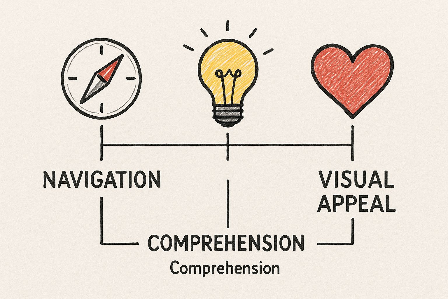
As the image shows, these goals aren't independent; they support each other. A clear icon is often an appealing one, and a recognizable icon is one that best guides the user.
Recognizability isn't just about using a magnifying glass for "search." It’s about crafting a symbol that clearly communicates its purpose without any room for doubt, even if the user is seeing it for the first time.
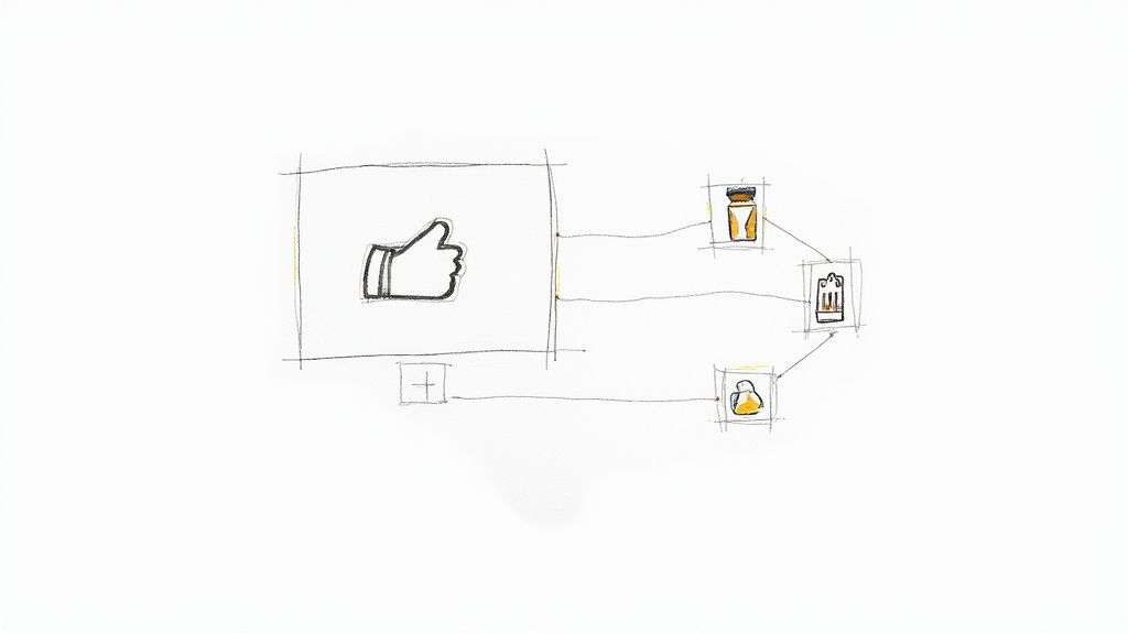
Context is everything here. A heart icon means "like" on a social media feed, but it almost always means "add to wishlist" on an e-commerce site. The surrounding text, buttons, and overall page layout provide the critical clues users need to interpret the icon's function correctly. This is why following established user experience design best practices is non-negotiable.
Generating a Context-Specific 'Like' Icon
Let's say you need a 'like' icon for a social media app. The context demands something warm and engaging. An AI prompt can help capture that specific feeling.
AI Prompt Example:flat design, like icon, classic heart shape, friendly and simple, solid red fill, rounded corners, vector art, high contrast for mobile UI
This prompt ensures you get a symbol that’s not just a generic heart, but one tailored to the positive, quick-tap environment of a social feed.
Icon Clarity Checklist Do's and Don'ts
| Principle | Do (Best Practice) | Don't (Common Mistake) |
|---|---|---|
| Simplicity | Use clean lines and basic geometric shapes. | Adding excessive detail, textures, or shadows. |
| Familiarity | Rely on established conventions (e.g., gear for settings). | Inventing new, abstract symbols for common actions. |
| Context | Ensure the icon's meaning is clear on that specific screen. | Using the same icon for different actions in your app. |
| Scalability | Test the icon at its smallest intended size to ensure it's still legible. | Designing an icon that only looks good when it's large. |
| Consistency | Maintain a uniform style (stroke weight, color, etc.) across all icons. | Mixing and matching different icon styles and families. |
This table serves as a great sanity check during the design process to make sure your icons are truly user-friendly.
How We See and Understand Icons
Our brains are hardwired for efficiency. It’s why we can process an image in a fraction of the time it takes to read a sentence. This simple fact is the secret behind why icons work so well in design. When you see an icon, you don't read it; you recognize it. This is a powerful cognitive shortcut that makes navigating a digital space feel effortless.
This instant recognition relies on mental models we’ve built up over years. We’ve learned that a magnifying glass means "search" and an envelope means "mail." A great icon taps directly into this shared visual language, letting users move through an interface almost on instinct, without needing to stop and think.
Color and Cues That Guide the User
Beyond just the shape, color is a massive part of an icon's story. It’s not just for decoration; it’s a tool for guiding users. Think about it: a confirmation button is almost always green. Why? Because we associate green with "go" and success. Red, on the other hand, is universally used for errors and deletions, signaling "stop" and "be careful."
This is where the concept of affordance comes into play. Affordance is a fancy word for a simple idea: an object's appearance should hint at how it’s used. A trash can icon looks like something you can put things in, which perfectly communicates the "delete" action without a single word of text.
The goal is for your icons to visually whisper their purpose. When an icon clearly affords its function, the interface feels less like a set of instructions and more like a natural conversation. Using the best vector design software is key to creating these kinds of crisp, communicative symbols.
Icons as Brand Signatures
The psychological power of icons goes way beyond just helping users get around. They are fundamental building blocks of a brand’s identity. The most obvious example is a logo—at its core, a logo is just a unique icon for a company.
And the data backs this up. A staggering 75% of consumers can recognize a brand by its logo alone. This is a direct line from a simple visual to a company's entire reputation. What’s more, consistent branding that features a strong logo can lead to a 23% increase in revenue.
Color plays a huge part here, too. It’s no accident that blue is a top choice for major companies; it’s associated with trust and stability. This shows how every detail, from shape to color, builds a powerful mental connection with users.
An icon doesn't just represent an action; it represents an experience. Every time a user interacts with a well-designed icon, it subtly reinforces their trust in the brand and the product.
Generating a Brand-Aligned 'Profile' Icon
To create an icon that reinforces brand identity, your AI prompt needs to include brand-specific style cues. A generic user icon won't cut it.
AI Prompt Example:line art, user profile icon for a corporate brand, minimalist and professional, uses brand color #005A9C, consistent 2px stroke weight, clean and modern, vector art, isolated on white
This prompt ensures the icon not only communicates 'profile' but also fits seamlessly into a specific brand's visual system, building trust through consistency.
Adapting Icon Design for Different Use Cases

A great icon is never designed in a vacuum. It’s built for a specific job in a specific place. The most effective use of icons means tailoring your design to fit the context. You wouldn't use a massive billboard font for the text in a book, and you can't expect one icon style to work everywhere.
Just think about the difference between a mobile app icon on your home screen and the tiny "send" icon inside your email app. The app icon has to be a bold, memorable brand statement, something you can spot instantly in a sea of others. Its job is to be seen and tapped.
But that "send" icon? It’s a quiet worker. It needs to be clear and functional, guiding you to an action without stealing the spotlight.
Platform and Purpose Dictate Design
Where an icon lives is probably its biggest design constraint. A detailed, multi-colored icon that looks amazing on a desktop toolbar can easily turn into an unrecognizable smudge when shrunk down for a mobile navigation bar.
This is where platform-specific guidelines are a lifesaver. As a designer, you have to be mindful of the rules of the road:
- Apple's Human Interface Guidelines generally push for a clean, uniform aesthetic. They have strict size requirements and discourage things like transparency for app icons, all to make sure everything fits neatly into the iOS world.
- Google's Material Design offers a bit more flexibility with its "adaptive icons." These clever icons can change shape—from a circle to a square—to match the look and feel of different Android devices, all while keeping their core visual identity intact.
The best icon design strategy is a flexible one. It starts by recognizing that an icon’s purpose—whether it’s for navigation, information, or action—should always be the primary driver of its style and appearance.
This kind of adaptability has become more critical than ever. Mobile app icons, for example, have evolved into powerful marketing tools. A well-designed app icon can actually boost install rates because it’s often the very first impression a user gets.
This is exactly why a simple, clear symbol that’s instantly recognizable at tiny sizes (like 60×60 pixels) is so crucial for standing out in a crowded app store. You can dive deeper into the data and see how thoughtful mobile app icon design impacts user engagement and download numbers.
Generating Context-Aware Icons
When it's time to create your icons, the instructions you use—your prompts—need to reflect their final destination.
Let’s compare two prompts for a "share" icon. One is for a big, bold action button in an app, and the other is for a subtle link in a website footer.
For a mobile action button:flat design, share icon, bold and high-contrast, rounded corners, solid fill, single color, vector art, optimized for a small tap target on a mobile screen
For a subtle website footer link:minimalist line art, share icon, thin 1.5px stroke weight, muted color, delicate and clean, vector, transparent background for web use
The difference is night and day. These two prompts will give you completely different results, each one perfectly suited for its role. That's the essence of designing with context in mind.
Creating Custom Icons With AI Prompts
Moving past the world of generic icon libraries is a huge leap toward building a memorable visual identity. Thanks to AI, you no longer need to be a master illustrator to generate completely unique icons that feel right at home with your brand. The real magic is all in how you write the prompt.
Think of an AI prompt as a creative brief you'd hand to a designer. The more thought you put into the instructions, the closer you'll get to what you're picturing in your head. A lazy prompt like "make a settings icon" will spit back something equally generic. To get great results, you have to guide the AI with specific details about style, color, and even the technical format.
Building Your Prompts From Scratch
The first step is to lock down the core visual rules you want every single icon to follow. This is what creates that consistent, professional look across your entire app or website.
Try to define these key attributes for every prompt you write:
- Style: Get specific about the aesthetic. Are you after minimalist line art, a flat design look, something playful like 3D claymation style, or maybe a soft neumorphic vibe?
- Line Weight: For any icon built from lines, this is crucial. Tell the AI you want a consistent 2px stroke weight or thin, delicate lines to control the final feel.
- Color Palette: Don't leave color to chance. You can request monochrome, a single-color on a white background, or even plug in specific hex codes to match your brand's palette perfectly.
- Format: This is a big one. Always, always ask for vector art or SVG format. This ensures your icons are infinitely scalable and stay razor-sharp on any screen, from a watch to a 4K monitor.
When you start combining these elements, you can build incredibly powerful prompts that deliver consistent, high-quality icons every time. If you want to dive even deeper, our guide on how to make custom icons has a ton of extra tips and tricks.
From a Single Icon to a Full Set
Once you've nailed down the perfect style for one icon, you can apply that same recipe to create a whole family. The trick is to keep all the stylistic instructions exactly the same, only swapping out the subject of the icon itself.
Let's say you're building a sleek finance app. A great prompt for an entire set might look something like this:
minimalist line art icon set for a finance app, including symbols for dashboard, transactions, and profile, vector art, single-color on a white background, professional and clean style
With one detailed command, you're telling the AI to generate a whole batch of icons that share the same visual DNA. It’s a remarkably efficient way to make sure every icon in your interface feels like it belongs, building a user experience that feels seamless and trustworthy.
Common Icon Design Mistakes to Avoid
Even the most seasoned designers can stumble into a few common traps when working with icons. It’s one thing to create a beautiful symbol, but it's another thing entirely for it to work effectively in a real-world interface. A stunning icon that leaves users scratching their heads isn't just a missed opportunity; it’s a roadblock in their experience.
The single biggest mistake? Creating ambiguous symbols. The moment a user has to pause and wonder, "What does this little picture do?" you've introduced friction. An icon isn't a puzzle to be solved; it should be an instant, intuitive signpost.
Overlooking Consistency and Context
Another classic misstep is a lack of consistency. When your icons look like they were pulled from five different icon packs—some filled, some outlined, some thick, some thin—the entire interface starts to feel disjointed and unprofessional. This kind of visual chaos quietly erodes user trust and makes the whole product feel less polished.
The solution is to define a clear visual language for your icons and stick to it religiously.
- Inconsistent Styling: Are your icons filled or outlined? Is the stroke weight a consistent 2px across the board? Mixing these styles makes the design feel accidental, not intentional.
- Ignoring Platform Conventions: Users get used to certain visual cues. An icon that feels right at home on iOS might stick out like a sore thumb on an Android device. Respecting platform conventions makes your app feel native and familiar.
- Forgetting to Test: This is the big one. You are not your user. An icon that seems perfectly obvious to you might be completely baffling to someone else.
Forgetting to test is like writing a joke and never telling it to anyone to see if it’s funny. You’re just assuming your icons land perfectly, and that's a huge gamble in UI design.
Then there's the temptation to over-design. It's easy to get carried away with intricate details, gradients, or shadows, but this complexity often backfires. A great icon is stripped down to its essential visual essence, making it instantly recognizable even at tiny sizes. When in doubt, simplify.
Generating Unambiguous Icons
If you're using an AI tool to generate icons, you have to be incredibly deliberate with your prompts to get clear, simple results. Vague requests lead to ambiguous icons.
Think about a "delete" icon. We all know what that is: a trash can. It’s a universally understood metaphor that needs no explanation.
Here's how you’d prompt an AI to get exactly that, leaving no room for weird interpretations:
AI Prompt Example:flat design, delete icon, simple trash can symbol with a closed lid, monochrome, 2px stroke weight, clean lines, vector art, easily recognizable at a small scale
This prompt doesn't just ask for a "delete icon." It specifies the style, the exact symbol, the visual treatment, and the most important functional requirement—that it must be clear even when it's small. This is how you guide the tool toward an icon that actually helps users, instead of confusing them.
Clearing Up Common Questions About Icons
Even when you've got the basics down, you'll still run into tricky situations where the "right" answer isn't so obvious. Let's tackle some of the questions that pop up most often when designers are in the thick of a project.
Do I Really Need a Text Label for Every Single Icon?
It's tempting to go for a super clean, icon-only look, right? And for universally understood symbols like a house for 'home' or a magnifying glass for 'search,' you can often get away with it.
But for just about everything else, a visible text label is non-negotiable. Relying on an icon alone is a gamble that forces users to guess, and that guesswork leads to frustration. If there's any doubt in your mind, add the label. It’s always the safer, more user-friendly bet.
Generating a Universal 'Home' Icon
To create a universally understood icon like 'home', lean on established symbols. Your prompt should focus on clarity and instant recognition.
AI Prompt Example:minimalist line art, home icon, simple house silhouette with a door, single color on a transparent background, 2px stroke weight, vector art
This prompt guides the AI to produce a clean, universally understood symbol that requires no text label to be effective.
What’s the Best File Format to Use for Icons on the Web?
This one's easy: SVG (Scalable Vector Graphics) is the hands-down winner and the industry standard. Think of SVGs as infinitely scalable. They look perfectly crisp on a tiny phone screen, a massive 4K monitor, and everything in between—no pixelation, ever.
On top of that, they're tiny in file size, you can easily change their color and style with a little bit of CSS, and they’re built to be accessible. Steer clear of old-school formats like PNG or JPG for your interface icons; they just can't compete.
How Do I Make Sure My Icons Are Accessible to Everyone?
Accessibility isn't an afterthought; it's a core part of good design. Here's a quick checklist to keep in mind:
- Go for high contrast. Make sure your icon’s color stands out clearly against its background.
- Keep it simple. Complex shapes can be hard to decipher, especially for users with cognitive disabilities.
- Provide a text alternative. This is the big one. An icon must have a text equivalent. This could be the visible label we just talked about, or it could be screen-reader-only text (like an
aria-label) that describes what the icon does for visually impaired users.
Can I Generate Accessible Icons with AI?
Absolutely. The trick is to build accessibility right into your prompt. Instead of just asking for an "edit icon," get specific about the accessibility requirements you need.
Here’s an example of how you could phrase it:
AI Prompt Example:flat design, edit icon, a simple pencil symbol, high contrast #FFFFFF on a #0000FF blue circular background, vector art, clean lines, no shadows, meets WCAG AA contrast standards
Stop hunting for the perfect icon and start creating it. VibeIcons lets you generate unique, AI-powered icons that match your exact style, ensuring your projects always feel cohesive and professional. Generate your first five icons for free at https://www.vibe-icons.com.
Article created using Outrank