Master the User Interface Design Process Step-by-Step
Learn the user interface design process from start to finish with our expert guide. Discover tips on research, wireframes, prototyping, and testing.
The user interface design process is where a product's strategic goals get translated into something you can actually see, touch, and interact with. If building an app is like building a house, UI design is the interior design—it’s all about the look, the feel, and how everything works together, from the color on the walls to the shape of the doorknobs.
Demystifying the User Interface Design Process
At its heart, the UI design process is about building a beautiful and intuitive bridge between a person and a piece of technology. It’s the craft that makes software not just work, but feel good to use. And while it’s definitely a creative field, it’s not just about making things pretty; it’s a structured journey that ensures the final product is consistent, usable, and truly polished.
This way of thinking didn't just appear out of thin air. A huge leap forward was the invention of the graphical user interface (GUI). The groundbreaking work done at Xerox PARC gave us the Alto computer way back in 1973, which was the first to use the now-familiar desktop metaphor. This was a massive shift away from clunky command-line interfaces and made computers approachable for everyone. You can discover more insights about this pivotal moment in interaction design to see how far we've come.
The Core Stages of UI Design
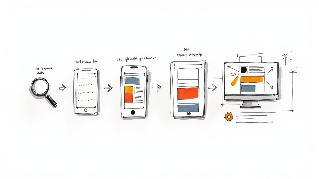
The entire journey from a vague idea to a finished interface can be broken down into a few key stages. Each one has its own specific goals and produces different results, giving designers a clear roadmap to follow.
Research and Discovery: This is the foundation. It’s all about getting to know the user, the brand's personality, and what competitors are doing. Designers dig into user personas, conduct competitive analysis, and pull together mood boards to set the visual tone.
Design and Structure: Here's where ideas start taking shape. It often begins with rough, low-fidelity wireframes to figure out the basic layout and where everything goes. From there, designers move on to high-fidelity mockups, which bring the vision to life with color, real typography, and branding elements.
Testing and Iteration: A design isn't finished until it's been tested. Static mockups are turned into interactive prototypes that feel like the real thing. These are put in front of actual users to get feedback on everything from visual clarity to how easy it is to use, allowing for smart, data-driven improvements.
Developer Handoff: In the final stage, it’s time to pass the baton. Designers prepare and deliver all the necessary assets, detailed specifications, and style guides so the engineering team can build the interface exactly as it was intended.
To help you get a clearer picture, I've put together a quick summary of these phases.
The Core Stages of the UI Design Process
This table breaks down each phase, its main objective, and what you can expect to see produced at each step.
| Phase | Primary Goal | Key Deliverables |
|---|---|---|
| Research & Discovery | To understand the user, brand, and market landscape. | User Personas, Mood Boards, Competitor Analysis |
| Design & Structure | To create the visual framework and aesthetic of the interface. | Wireframes, High-Fidelity Mockups, Style Guides |
| Testing & Iteration | To validate the design with real users and make refinements. | Interactive Prototypes, Usability Test Reports |
| Developer Handoff | To provide engineers with everything they need for implementation. | Design Specs, Asset Libraries, Final Style Guide |
Think of this table as your cheat sheet—a quick reference for navigating the entire UI design journey from start to finish.
A great UI is not just about looking good; it's about creating a seamless and predictable experience. Consistency in design—from button styles to spacing—builds user trust and reduces cognitive load, allowing them to navigate the interface effortlessly.
The diagram below provides a great visual summary of how these core pillars of the UI design process work together.
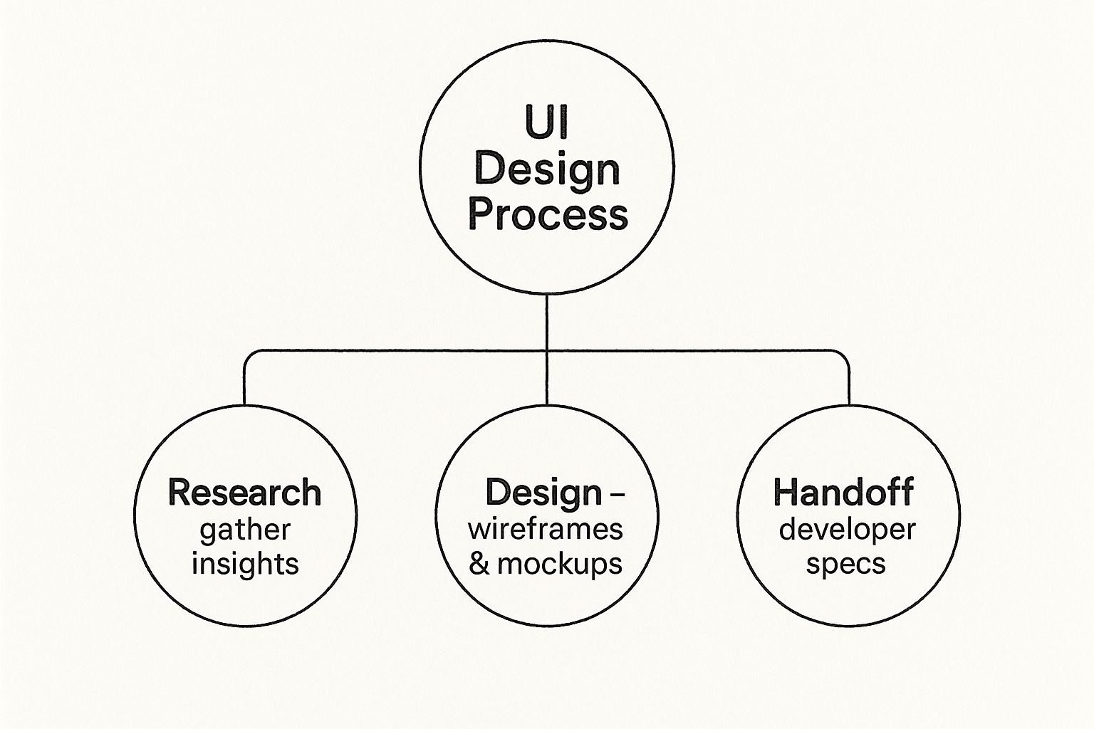
As you can see, each phase flows logically into the next, building upon the work of the previous one. It’s a progression that takes you from abstract ideas all the way to a concrete, developer-ready design.
1. Building the Visual Foundation with Research
Before a single pixel ever hits the screen, the best user interfaces are born from a deep-seated understanding of people. This initial research phase isn't about jumping on the latest design trends; it's a careful investigation into the users, the market, and the brand itself.
Think of yourself as an architect. You wouldn't design a house without knowing who will live there, what the local climate is like, or the lay of the land. It’s the same with UI design. This groundwork informs every single visual decision, ensuring the final product doesn't just look pretty but actually connects with its audience and feels intuitive to use.
Translating User Needs into Visuals
The first stop is often the goldmine of existing UX research. We're talking about user personas and journey maps. A designer's job is to look past the functional requirements and hunt for the aesthetic clues hidden within.
A persona for a busy surgeon, for instance, screams for an interface that’s clean, efficient, and dead simple. In contrast, a persona for a young gamer might point toward something more dynamic and visually expressive. Journey maps are just as crucial, as they show us where a user might feel frustrated or delighted. A UI designer can use these emotional cues to make smart visual choices, like using calming colors during a complex checkout process. For a closer look at this empathetic approach, check out these user experience design best practices.
Analyzing the Competitive Landscape
Let's be real: no product is an island. A solid analysis of your competitors is non-negotiable. By seeing what others in your space are doing, you start to understand the visual language your potential users are already familiar with.
But this isn't about imitation. It's about education. This analysis is where you find your opening to do something different—and better.
- Spot Visual Trends: Are all your competitors using blue and white? Is sans-serif typography the norm? Knowing the trends is the first step to either aligning with them or consciously breaking them.
- Find the Gaps: Is everyone’s design sterile and corporate? That might be your chance to introduce a more human, approachable visual style.
- Learn from Their Mistakes: Pay close attention to competitor apps that feel cluttered, confusing, or just plain ugly. Those are free lessons in what not to do.
This process helps you strike that perfect balance: creating an interface that feels familiar enough for users to pick up quickly, yet distinct enough to be memorable.
"Prefer global UI consistency over local optimizations. A consistent user interface is predictable and learnable. When elements look and behave the same way across the application, users can apply their previous knowledge, which reduces cognitive load and makes the experience feel seamless."
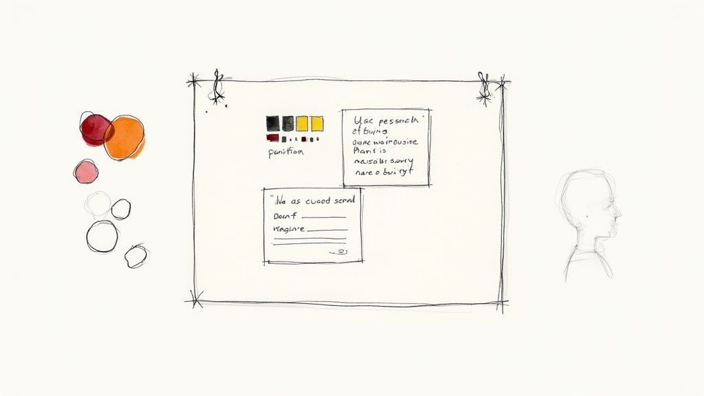
Defining the Visual Direction with Mood Boards
Okay, so you've gathered all this great research. Now what? It's time to translate all those abstract ideas into something tangible, and that’s where mood boards shine.
A mood board is simply a curated collage of images, colors, type, and interface examples that together capture the "vibe" you're aiming for. It’s a fantastic tool for getting everyone—from developers to the CEO—on the same page about the aesthetic vision before you pour hours into detailed designs. It's all about collecting inspiration that reflects key brand attributes like "trustworthy," "playful," or "premium."
This visual exploration naturally leads to a preliminary style guide. This isn't the final, exhaustive document, but it sets the core rules of the road that will keep the entire design consistent.
- Color Palette: Establish the primary, secondary, and accent colors that will set the right emotional tone.
- Typography: Choose fonts that are not only readable but also reflect the brand's personality.
- Imagery & Iconography: Define the style for all visual assets, from photographs to the tiniest icon.
Laying this foundation first makes the rest of the design process smoother, faster, and far more intentional. Every element you create from here on out will have a clear purpose.
Creating a Blueprint with Wireframes
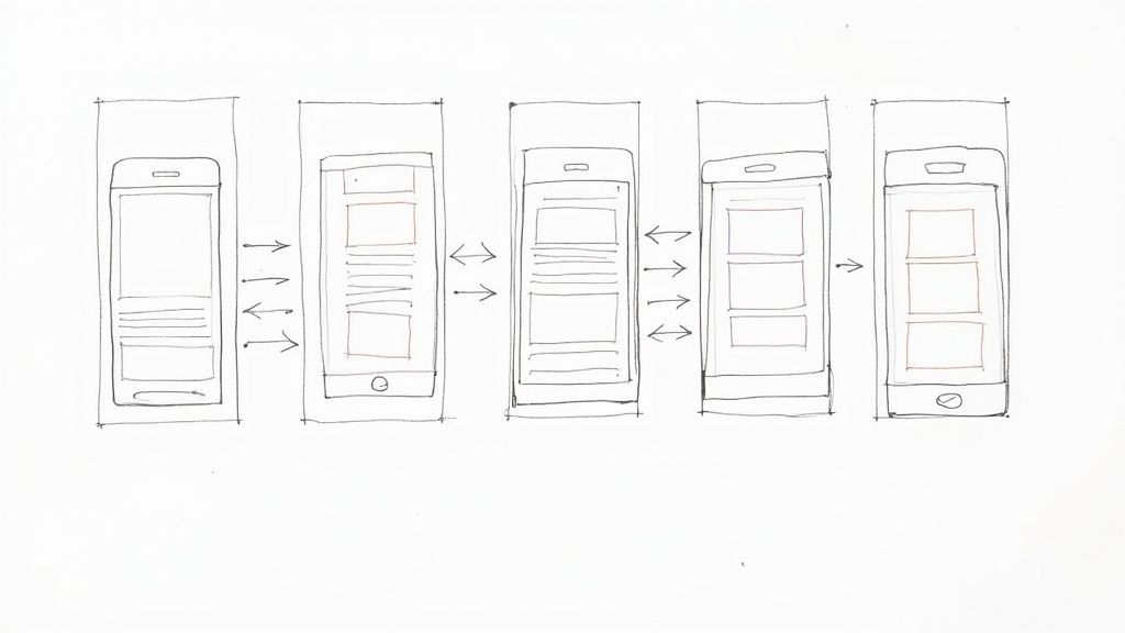
Once you've got a feel for the visual direction, the user interface design process pivots from big ideas to a concrete structure. This is where wireframing comes into play, serving as the architectural blueprint for your digital product before you lay a single "pixel brick."
Think about it like this: you'd never build a house without a floor plan. You need to know where the walls, doors, and windows go long before you start picking out paint colors. Wireframes do the exact same thing for a user interface, giving you a simple, low-fidelity skeleton of every screen.
By intentionally stripping away all the flashy stuff—colors, fonts, images—wireframing forces the team to focus purely on function and flow. It’s all about mapping out the user’s journey in the most logical way possible, not getting sidetracked by aesthetics.
The Power of Low-Fidelity Design
The main goal here is to nail down the layout and decide what’s most important on each screen. This practice isn’t new; it has deep roots in design history. Early systems like the Xerox Star workstation in 1981 introduced foundational concepts like windows and icons, proving just how critical a structured layout is. You can explore more about the history of graphical user interfaces to see how these core principles have evolved over time.
At this stage, simplicity is your greatest strength. It allows you to experiment and make changes on the fly without the headache of redesigning polished visuals. There are a couple of ways to approach this:
Paper Sketches: This is the quickest way to get ideas out of your head. A pen and paper are perfect for brainstorming sessions where you want to explore a bunch of different layouts without getting too attached to any one idea.
Digital Wireframes: Using tools like Figma or Balsamiq, you can create cleaner, more formal wireframes. These are great for easily duplicating screens and creating basic user flows, making them ideal for sharing with stakeholders to get more structured feedback.
No matter which method you choose, the mantra is the same: structure over style. It's about figuring out where the navigation lives, what the most important button is, and how to organize information so people can actually find what they're looking for.
From Static Screens to Basic User Flows
A stack of individual wireframes is a good start, but the real magic happens when you connect them. By linking these simple screens together, you create a low-fidelity prototype—a bare-bones, clickable version of your product.
This lets you test the core navigation and user journey at a ridiculously early stage. Can a user figure out how to get from the homepage to their account settings? Is the checkout process confusing? Finding the answers to these questions now, with nothing more than gray boxes, will save you countless hours down the road.
A wireframe’s job is to provoke conversation about functionality, behavior, and hierarchy. If the feedback you're getting is about the color of a button, your wireframe is too detailed.
This early testing is a gut check for your product's logic. It confirms that the blueprint is sound before you even think about painting the walls or picking out furniture.
What to Include for Meaningful Feedback
To get good feedback, your wireframes need to be clear without being cluttered. It's a balancing act. You need to provide just enough detail for people to understand the layout, but not so much that they get distracted.
Your wireframes should clearly communicate:
- Content Hierarchy: Show what’s most important. Use different text sizes or simple bolding to distinguish headlines from body text.
- Key UI Elements: Make it obvious where buttons, forms, and navigation menus are supposed to go.
- Basic Functionality: A few simple notes or arrows can explain what happens when a user clicks a button or interacts with an element.
By focusing on these fundamental building blocks, you keep the conversation centered on usability and flow. This step ensures that the foundation of your interface is strong, logical, and built around the user from the very beginning.
5. Designing Polished High-Fidelity Mockups
Alright, your wireframes have given the design a skeleton. Now it's time to put some meat on those bones. This is the stage where the interface's personality really comes to life, moving from a functional blueprint to something that looks and feels like a real, finished product.
We're talking about high-fidelity mockups—static but pixel-perfect images of what your users will actually see. This is where you’ll weave in all the visual decisions from your earlier research, combining your color palette, typography, and branding with the structure you've already built. It's all about sweating the details to create an experience that not only works well but also feels right.
Mastering the Core Visual Elements
Great UI isn't just about splashing color onto a wireframe; it’s a deliberate, almost surgical process. Every single visual element has a job to do. Get it wrong, and the interface can feel disjointed or unprofessional. Get it right, and you create a seamless experience that guides the user effortlessly.
Color Theory: Color does more than just make things look pretty—it communicates. It can set a mood, highlight critical actions, and anchor your brand's identity. A solid color palette with clearly defined primary, secondary, and accent colors is your best friend for creating harmony. For instance, that bright, attention-grabbing color? Save it for your main call-to-action button so it’s impossible to miss.
Typography: The fonts you pick say a lot about your product's tone, and more importantly, they determine how readable everything is. A strong typographic hierarchy—using different sizes and weights for headings and body text—is non-negotiable. It creates a clear path for the user's eye to follow. A simple rule of thumb? Stick to just two font weights to keep things clean and consistent.
Spacing and Layout: All that empty space on the screen? It's not empty at all. It’s what we call negative space or whitespace, and it’s one of the most powerful tools in your arsenal. Good spacing prevents a design from feeling cramped, improves readability, and gives the whole layout a sense of calm and order. Using a grid system is the secret to making sure every element is perfectly aligned, which is the foundation of a professional-looking design.
Each of these elements must work in concert. The goal is to develop a consistent visual language that’s both beautiful and incredibly intuitive.
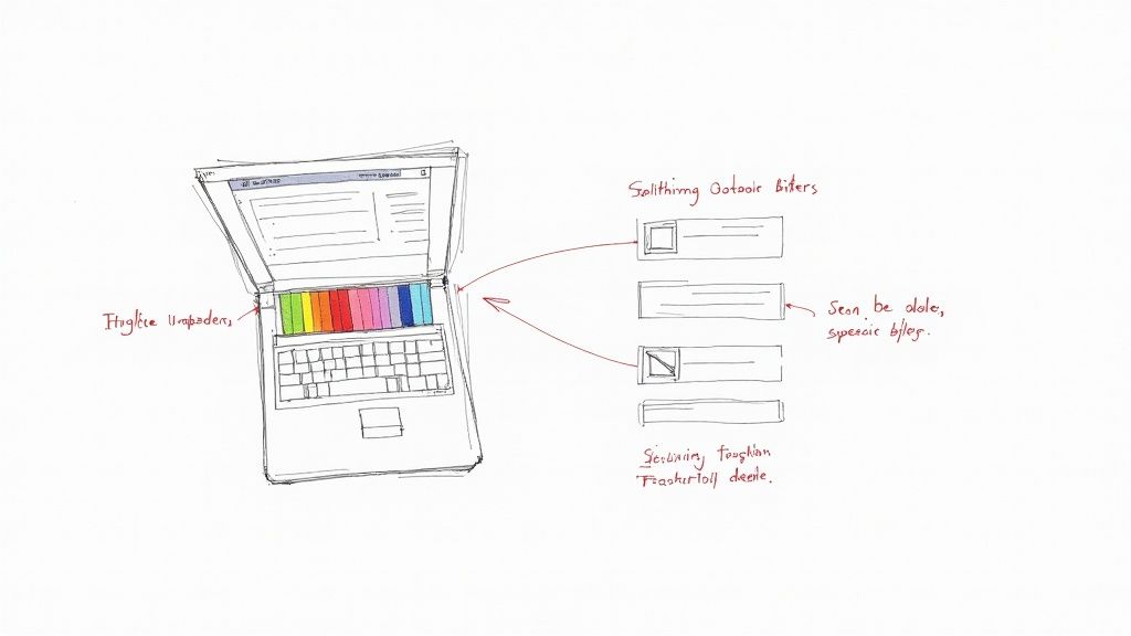
Building a Scalable Design System
Designing one perfect screen is an accomplishment. But ensuring 100 screens feel like they belong to the same product? That's a whole different ballgame, and it's where a design system becomes an absolute necessity.
Think of a design system as a master library of pre-built, reusable components and clear guidelines. It's like having a set of high-quality LEGO bricks that you can assemble to build anything you need, knowing each piece will fit perfectly with the others.
By using a component library, a lot of the small-scale design is already done for you. Prefer global UI consistency over local optimizations. A consistent user interface is predictable and learnable.
This approach guarantees that a button, a dropdown menu, or a search bar looks and functions identically everywhere. That consistency is gold because it lowers the user's cognitive load—they don't have to constantly relearn how things work as they navigate your product. A robust design system usually contains:
- UI Components: Buttons, form fields, cards, modals, and other interactive elements.
- Style Guides: The single source of truth for your color palette, typography rules, spacing units, and icon sets.
- Usage Guidelines: Simple rules that explain how and when to use each component correctly.
When designing the core building blocks of an interface, it's crucial to understand what each element does and how to make it effective. Here’s a quick breakdown of some essential components and the best practices to follow.
Key UI Elements and Their Best Practices
| UI Element | Primary Function | Design Best Practice |
|---|---|---|
| Buttons | Trigger an action (e.g., submit, save, delete). | Use a high-contrast color for primary actions. Text should be a clear, verb-based command. |
| Input Fields | Allow users to enter text or data. | Include clear labels, placeholder text as a hint, and visible field boundaries. |
| Dropdown Menus | Offer a list of options in a compact space. | Use when there are more than 5 options. Pre-select a default value when possible. |
| Checkboxes & Toggles | Select one or more options, or switch a setting on/off. | Use checkboxes for multi-select lists and toggles for instant on/off states. |
| Cards | Group related information into a digestible block. | Maintain consistent spacing and visual hierarchy within each card. Don't overload with info. |
| Modals | Display critical information or require user input. | Use sparingly. Ensure the background is dimmed and provide a clear exit path (e.g., 'X' icon). |
Following these guidelines helps ensure your components aren't just visually appealing but are also intuitive and easy for people to use from the get-go.
Designing for Everyone with Accessibility
Let's be clear: a beautiful interface that only some people can use is a failed interface. Accessibility isn't a feature you tack on at the end—it's a fundamental part of professional UI design. We have a responsibility to create products that people with a wide range of abilities can use, including those with visual, motor, auditory, or cognitive impairments.
Thinking about accessibility from the very beginning is far more effective than trying to patch it in later. Here are a few key things to focus on:
- Color Contrast: Make sure your text and interactive elements have enough contrast against the background. This is a lifeline for users with low vision. Tools like the WebAIM Contrast Checker are great for this.
- Legible Text: Use font sizes that are easy to read. Even better, allow users to increase the text size without completely shattering your layout.
- Clear Focus States: For anyone who navigates with a keyboard instead of a mouse, seeing which element is currently selected is essential. Make your focus states (the outline that appears when you tab through elements) obvious and distinct.
Ultimately, designing for accessibility makes the experience better for everyone. A clear, high-contrast interface is easier for all of us to use, whether we're in a brightly lit room or quickly checking something on our phone. This final layer of polish ensures your design is more than just good-looking—it's inclusive and truly user-centric.
Testing the Experience with Interactive Prototypes
Static mockups are great for getting the look right, but they're completely silent. They can't tell you if a button is satisfying to press or if a transition feels jarring. To truly understand how an interface will feel in someone's hands, you have to bring it to life with an interactive prototype. This is a non-negotiable step in the user interface design process.
It's like the difference between a picture of a car and a test drive. The photo shows you the color and shape, sure, but only getting behind the wheel tells you how it actually handles. Prototypes add that layer of real-world interaction, turning flat designs into clickable, tappable experiences that feel just like the final product.
This move toward dynamic testing became essential after the iPhone was introduced in 2007. Its success was built on an intuitive, touch-based UI that felt natural. That shift forever changed how we approach design, making ease of use the absolute top priority. You can actually explore the history of touch interfaces on Toptal.com to see just how big of an impact it had.
From Static to Dynamic Prototypes
Creating a prototype is all about connecting your polished mockups with interactive hotspots. A tap on the "Login" button on one screen takes the user to the dashboard screen on another. This simple linking creates a complete, navigable path through the app, letting you test the entire user flow from start to finish.
Thankfully, modern design tools have made this part of the job incredibly simple. What used to require complex coding can now be done with a few clicks. For designers looking to speed things up, there are tons of great resources available for Figma that make building prototypes a breeze.
But a good prototype goes way beyond just linking screens together. This is where you get to bake in the subtle details that create a truly delightful experience:
- Animations and Transitions: How does a new screen appear? Does it slide in from the side, or gently fade into view? These small decisions guide the user's eye and help them understand their place within the app.
- Micro-interactions: These are the tiny, gratifying moments of feedback. Think of the subtle bounce when you pull-to-refresh a social media feed or a button that changes color when you hover over it. These details make an interface feel responsive and alive.
A prototype isn’t a fully coded product. Its job is to be just real enough to get meaningful feedback. Think high-fidelity visuals but low-fidelity code—or, even better, no code at all.
Conducting UI-Focused Usability Tests
Once your interactive prototype is ready, it's time for the moment of truth: putting it in front of real people. While broader UX testing focuses on whether users can complete a task, UI-centric usability testing hones in on the visual and interactive experience. You’re not just asking, "Can they do it?" but also, "How did it feel to do it?"
The whole point is to get specific, actionable feedback on the interface itself. This helps you move beyond your own biases and make design decisions based on how real users react.
During these test sessions, you’re trying to answer questions like:
- Clarity and Recognition: Are the icons universally understood, or do people hesitate before clicking?
- Visual Hierarchy: Do users immediately notice the most important thing on the screen, like the main call-to-action button?
- Interaction Feedback: Do the animations and micro-interactions actually help, or are they just distracting? Is the feedback clear and immediate?
- Overall Aesthetic Appeal: What's the user's gut reaction to the design? Do the colors and fonts create the right mood (e.g., trustworthy, exciting, calm)?
Gathering this feedback is the final, crucial loop in the design phase. It lets you spot weaknesses, validate your choices, and make precise improvements before a single line of code gets written. This cycle of prototyping, testing, and refining is what separates good design from truly great, user-centric design.
Ensuring a Smooth Developer Handoff
So, you've got a polished, user-tested design. What now? The final—and arguably most critical—step in the UI design process is handing it over to the developers. A beautiful mockup is just a picture; it's useless if it can't be built to spec.
The developer handoff is all about translating your visual language into a technical blueprint that engineers can follow without any guesswork. Think of yourself as creating a super-detailed instruction manual for your interface. You need to clearly spell out every color hex code, font size, spacing value, and interaction behavior.
Creating a Single Source of Truth
Thankfully, the days of manually redlining every single element are mostly behind us. Modern tools like Figma and Zeplin are a designer's best friend here. They automatically generate a lot of the technical specs, creating a "single source of truth" for the entire team. This drastically cuts down on miscommunication and ensures developers are always looking at the latest version.
Prefer global UI consistency over local optimizations. A consistent user interface is predictable and learnable. When elements look and behave the same way, users can apply their previous knowledge.
This single source of truth is often rooted in a well-maintained design system. If you're looking to build one from the ground up, it's worth exploring different takes on creating a design system to establish a library of reusable and consistent components.
Your handoff documentation should always include:
- Exported Assets: Provide every icon, illustration, and image in the right formats and resolutions (like SVG for icons and PNG or WebP for images).
- Style Guides: The nitty-gritty details on your typography, color palettes, and grid systems. No ambiguity allowed.
- Component States: Show exactly how elements like buttons or input fields should look when they are active, hovered, disabled, or in an error state.
The Designer’s Role During Implementation
The handoff isn't a "drop-and-run" situation. A designer's job isn't over just because the files have been delivered. You need to stay involved and act as a partner throughout the development cycle. That means being ready to answer questions, clear up any confusion, and provide feedback along the way.
A huge part of this is doing visual quality assurance (QA). This is where you get your hands on the built product—on a real device—and compare it against your original designs. You're looking for any and all visual bugs.
Catching those tiny inconsistencies, like a font weight that’s slightly off or spacing that’s a few pixels short, is what separates a good product from a great one. This final collaborative check ensures your vision comes to life exactly as you intended.
A Few Common Questions About UI Design
Even with a solid plan in place, it's natural for questions to come up as you get into the thick of UI design. Let's tackle a few of the most common ones to help clear things up.
What's the Real Difference Between UI and UX Design?
This is probably the most-asked question in the design world. The best way to think about it is to imagine you're building a car.
UX (User Experience) design is the engineering. It’s about making sure the car is safe, efficient, and easy to drive. Does the steering wheel turn smoothly? Are the pedals in a logical spot? Can you see out the back window? It’s all about the fundamental usability and the feeling of the drive itself.
UI (User Interface) design, on the other hand, is the dashboard, the seat upholstery, and the color of the paint. It’s the look and feel of the radio controls, the shape of the gear stick, and the font on the speedometer. UI is what makes the car's controls visually appealing and intuitive to interact with.
Simply put, UX is the underlying structure and feeling of the journey, while UI is the set of controls and visuals you use to navigate it. You absolutely need both to create a product people love.
What Are the Go-To Tools for a UI Designer?
A UI designer's toolbox is pretty specialized, centering on a few powerhouse applications. While there are many options out there, the industry has really rallied around three main players.
- Figma: This one has taken the industry by storm, mostly because its real-time collaboration is second to none. It’s become the standard for teams that need to work together seamlessly.
- Sketch: For a long time, Sketch was the undisputed king, especially for designers on Macs. It’s known for its clean, straightforward interface and has a massive library of plugins.
- Adobe XD: Adobe's answer to Figma and Sketch is a serious competitor, especially if you're already living in the Adobe Creative Cloud ecosystem.
Of course, the toolkit doesn't stop there. For more advanced, interactive prototypes with slick animations, designers often turn to tools like ProtoPie. And for making sure developers get exactly what they need, a tool like Zeplin is fantastic for bridging the gap between design and code.
So, How Long Does This Whole UI Design Thing Take?
Ah, the classic "how long is a piece of string?" question. There's no single answer, because the timeline for the user interface design process depends entirely on the project.
A few key things will influence the schedule: the project's complexity, the size of your team, and how you approach the work.
For instance, designing a simple mobile app with just a handful of screens could be wrapped up in a couple of weeks. But if you're building a massive enterprise software platform with hundreds of unique views and intricate user flows, you could easily be looking at a timeline of several months, or even longer. It’s also important to remember that design doesn't just stop once development starts; it’s a continuous loop of feedback, testing, and refinement.
Stop wasting time searching for the perfect icon. With VibeIcons, you can generate custom, AI-powered icons that perfectly match your project's style in seconds. Generate your first five icons for free at VibeIcons.