The Awesome Font Cheat Sheet for Modern Design
Download the awesome font cheat sheet. Get expert font pairings, CSS snippets, and typography tips to elevate your web and graphic design projects.
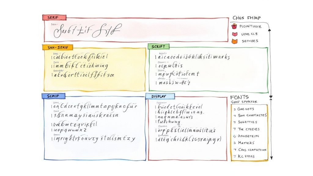
Think of this as your awesome font cheat sheet. It's the fastest way I know to make confident font choices, helping you instantly match a font's personality to your project's goal. Need a trustworthy serif for body text or a bold display font for branding? This is the place to start.
Your Instant Guide to Choosing the Right Font
Picking the right font is about so much more than just what looks good—it's about clear communication. The typeface you land on sets the entire emotional tone for your project before anyone even reads a word. Think of this section as the core of the cheat sheet, designed to give you quick answers on which font category will work best for what you're trying to achieve.
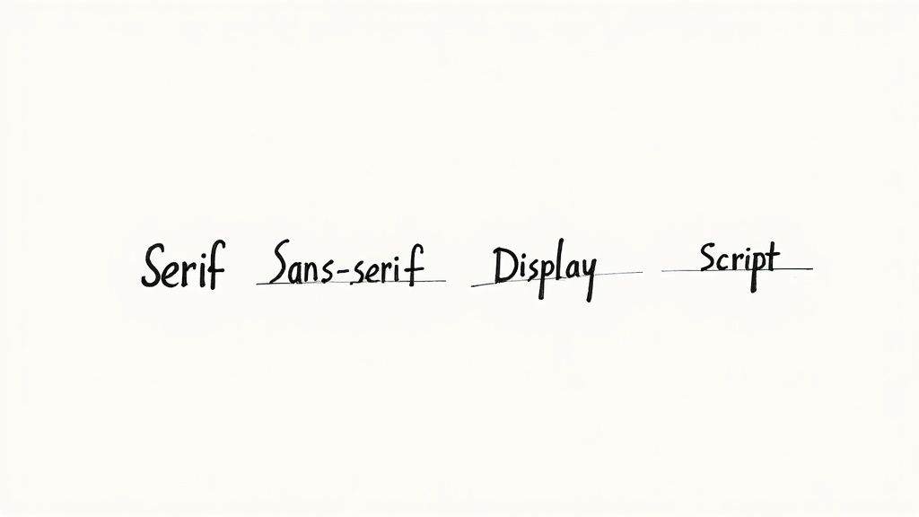
We're going to zero in on the four essential types you'll encounter most: Serif, Sans-Serif, Script, and Display. Each one carries its own distinct psychological weight and really shines in different applications.
- Serif Fonts: These are the classics, recognizable by the small decorative strokes (serifs) at the ends of the letters. They feel traditional and reliable, and their high readability in long-form text makes them a go-to for books, reports, and body copy.
- Sans-Serif Fonts: By stripping away those decorative strokes, sans-serifs offer a clean, modern, and straightforward appearance. Their fantastic legibility on digital screens makes them a top choice for websites, apps, and user interfaces.
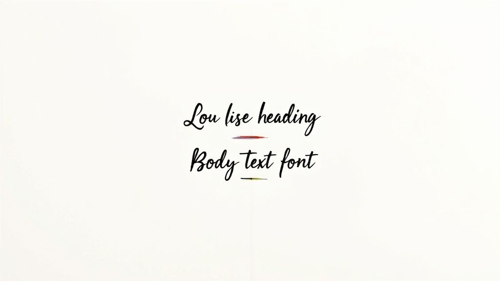
- Script & Display Fonts: Now for the attention-grabbers. Script fonts mimic handwriting for a personal, elegant touch, while Display fonts are crafted to be bold and unique. They're perfect for logos, headlines, and creative campaigns where making a statement is the whole point.
To make this even easier, here’s a quick reference table that breaks down where each font category really excels.
Font Category Quick Lookup
| Font Category | Best Used For | Common Feeling |
|---|---|---|
| Serif | Body text, print, academic papers, formal documents | Traditional, trustworthy, elegant, respectable |
| Sans-Serif | Web content, UI/UX, headlines, corporate branding | Modern, clean, approachable, minimalist |
| Script | Invitations, branding, logos, decorative headlines | Personal, elegant, artistic, friendly |
| Display | Logos, posters, headlines, short, impactful text | Bold, unique, expressive, attention-grabbing |
This table should help you quickly narrow down your options based on the vibe you're after.
The decision tree below maps out a simple path for selecting the right font based on your main goal.
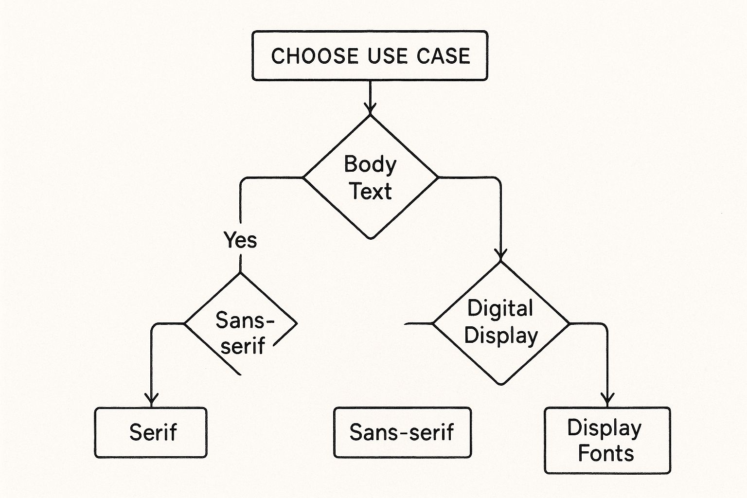
As the graphic shows, your font choice should always start with its function. This is one of the most important user experience design best practices you can follow, ensuring that your design not only looks great but works flawlessly for the end user.
Essential Sans-Serif Fonts for Clean Design
When it comes to modern digital design, sans-serif fonts are the undisputed workhorses. They're defined by their clean lines and the absence of the small decorative strokes (the "serifs") you see on more traditional typefaces. This clean, minimalist style is exactly why they excel on screens, making them a must-have for websites, apps, and just about any user interface.
Their popularity is backed by some serious numbers. A staggering 85% of websites use sans-serifs for their main text, a testament to their readability and modern feel. It’s no surprise that professionals often lean on fonts like Open Sans to project a sense of trustworthiness and clarity. You can dig into more font usage statistics to see just how dominant they really are.
Our Top Sans-Serif Picks
If you're building a go-to font list, these are the ones you absolutely need to know. I've even included a quick CSS snippet for each one so you can get started right away.
Roboto: This is Google's own creation, a geometric but friendly sans-serif designed specifically for high legibility on mobile screens. It’s incredibly versatile, working just as well for big, bold headlines as it does for body copy.
body { font-family: 'Roboto', sans-serif; }
Open Sans: You can't go wrong with Open Sans. It’s known for being neutral yet approachable, making it a safe and professional bet for nearly any project. It shines in longer paragraphs where readability is key.
body { font-family: 'Open Sans', sans-serif; }
Modern Classics for Every Project
Moving beyond the usual suspects, these fonts bring a bit more personality to the table without sacrificing readability.
Montserrat draws its inspiration from old posters and signs in Buenos Aires, giving it a stylish, urban feel. It’s a fantastic choice for impactful headlines and short bursts of text that need to grab attention.
h1 { font-family: 'Montserrat', sans-serif; }
Pro Tip: A great trick for pairing sans-serif fonts is to play with different weights. For instance, try a bold Montserrat headline with a regular-weight Roboto for the body. This contrast creates a natural visual hierarchy and makes the content much easier to scan.
Lato is another one of my favorites because it manages to feel both warm and serious at the same time. Its semi-rounded details give it a feeling of stability, which is why it works for everything from corporate sites to creative portfolios. It’s a real workhorse that looks great at any size.
Classic Serif Fonts for Authority and Elegance
Even though sans-serifs seem to be everywhere online, you can't beat a classic serif for conveying a sense of tradition, authority, and trust. What makes a serif a serif? It's the small strokes, or "serifs," at the end of each letter. They aren't just decorative; they're fantastic for readability in long-form content, which is why they've been the go-to for books, magazines, and important documents for centuries.
That long history in print is what gives them an almost built-in feeling of credibility and sophistication. When a brand wants to look established and respectable, a good serif is often the perfect choice. They have a way of guiding the eye smoothly across the page, making for a comfortable reading experience.
Timeless Serif Selections
Here are a few serif fonts that have proven their worth time and time again, bringing a touch of class to any project. I've included a quick CSS snippet for each one to get you started.
Garamond: This is a true old-style serif, known for its graceful and fluid look. Garamond is a workhorse for body text, making it a favorite for books, résumés, and academic papers where readability and a sophisticated feel are key.
p { font-family: 'Garamond', serif; }
Playfair Display: This one is a more modern take on the serif. With its high-contrast strokes and delicate hairlines, Playfair Display was practically made for big, elegant headlines. It’s a fantastic choice for fashion brands, editorials, or any design that needs a dramatic, stylish flair.
h1 { font-family: 'Playfair Display', serif; }
Versatile and Web-Friendly Choices
Not all serifs were born in the print world. These have been specifically designed to look great on digital screens without losing their classic charm.
Merriweather is a perfect example—it was built from the ground up for on-screen reading. It’s slightly condensed with sturdy serifs that don't fall apart at smaller sizes. This makes it an incredibly legible and reliable choice for website body copy.
body { font-family: 'Merriweather', serif; }
Design Insight: One of the best ways to use a serif is to pair it with a clean sans-serif. For instance, try using an elegant serif like Playfair Display for your main headings and a neutral sans-serif like Lato for your paragraph text. This contrast creates a strong visual hierarchy and a really balanced, professional look.
And then there's Lora, a well-balanced contemporary serif with roots in calligraphy. Its moderate contrast makes it comfortable for body text, but those brushed curves give it a unique personality. It’s a beautiful font for storytelling or when you want a tone that’s friendly yet artistic.
Creating Impact with Script and Display Fonts
When you need to move beyond purely functional typography to make a real statement, script and display fonts are what you reach for. These typefaces are bursting with personality, designed specifically to grab attention and inject a particular mood into your work. They're anything but neutral; their whole purpose is to be expressive and memorable.
Unlike their workhorse cousins, serifs and sans-serifs, you'd never use a script or display font for long paragraphs of text. Their strength is in their visual punch, making them perfect for logos, headlines, and social media graphics—anywhere a few words need to carry a lot of weight. Think of them as the bold accessories of your design; they complete the look but can easily overpower it if you're not careful.
Standout Fonts for Special Uses
This part of our awesome font cheat sheet is all about those high-impact choices and how to deploy them effectively. The key, as you'll see, is moderation. These fonts shine brightest when they have room to breathe.
Lobster: This is a bold, retro-inspired script that just feels friendly and energetic. It’s a fantastic choice for branding, posters, and social media quotes where you want a playful, eye-catching vibe. Just be warned, its connected letters make it a poor choice for anything longer than a short headline.
h1 { font-family: 'Lobster', cursive; }Oswald: A modern take on the classic "Alternate Gothic" sans-serif, Oswald is a condensed display font built for the screen. Its tall, narrow letterforms allow it to command attention in headlines without hogging horizontal space, making it perfect for web banners and news headings.
h2 { font-family: 'Oswald', sans-serif; }
The Golden Rule of Display Fonts: Less is always more. Use a powerful display font for your main heading, then pair it with a simple, neutral font like Roboto or Lato for your body text. This creates a clear visual hierarchy and ensures your message remains readable.
Mastering the Art of Perfect Font Pairing
Pairing fonts is one of those skills that can truly take a design from just okay to something special. It's less about strict rules and more about a feeling, but there are definitely some solid principles that can guide you. The whole point is to create a visual hierarchy that makes sense, guiding the reader's eye through the content without them even realizing it.
One of the most classic, can't-go-wrong strategies is to pair a serif font with a sans-serif. Think of it like a visual yin and yang. The clean, modern lines of a sans-serif (like Lato) create a beautiful contrast with the more traditional, decorative strokes of a serif (like Playfair Display). This contrast naturally separates things like headlines from body copy, making everything instantly more organized and readable.
Proven Font Combinations
To get you started, here are a few tried-and-true pairings that just work. Consider this a core part of any good font cheat sheet—these combinations are popular for a reason.
- Playfair Display & Lato: This is a go-to for a reason. You get the elegance and high-contrast of Playfair Display for your headlines, balanced perfectly by the friendly, clean readability of Lato for body text. It’s a great fit for designs that need a touch of sophistication.
- Montserrat & Merriweather: The bold, geometric letterforms of Montserrat make for powerful headlines. When you pair that with Merriweather, a serif specifically designed for on-screen reading, you get a combination that’s both stylish and incredibly legible for longer articles.
- Oswald & Roboto: Oswald is a condensed, impactful font that grabs attention, making it perfect for headlines. Combine it with the neutral, jack-of-all-trades vibe of Roboto, and you’ve got a strong, contemporary pairing that's fantastic for web content.
Typography is the cornerstone of effective visual communication. A thoughtful font pairing not only improves readability but also reinforces the brand's personality and message, ensuring every word contributes to the overall design harmony.
Think of these combinations as reliable starting points for your next project. As you get more comfortable, you can start experimenting and creating your own unique pairs, perhaps using some of the best vector design software to craft custom graphics that complement your typography.
Navigating Font Licensing and Implementation
Choosing the right font is about so much more than just looks. You also have to get into the nitty-gritty of licensing and the technical side of actually getting it to show up on a screen. This part of our guide will walk you through what you need to know to do it right.
First things first: licensing. Getting this wrong can lead to serious legal headaches down the road. Licenses can be as straightforward as the open-source agreements for Google Fonts (which are free for commercial use) or incredibly complex for premium typefaces. The bottom line? Always, always read the fine print before you commit to a font.
It's a booming industry, too. The font market is projected to hit USD 1.563 billion by 2033, a huge jump driven by a constant demand for fresh designs and the rise of subscription services. You can dig deeper into these trends in this global font and typeface market report.
Putting Fonts into Practice
Once you've sorted out the license, it's time to get the font working on your website. There are a few standard ways to do this.
- @font-face: This is a classic CSS rule that gives you maximum control. You host the font files yourself and load them directly into your site's stylesheet.
- Google Fonts API: This is easily the most popular and simplest method. Just add a single line of code to your HTML
<head>, and Google's servers take care of delivering the font efficiently. - Adobe Fonts: If you're in the Adobe ecosystem, this is a great option. It’s a subscription service that seamlessly syncs fonts across your projects, so you don't have to juggle font files.
Each approach gets the job done, ensuring your typography is not only well-designed but also professional and legally compliant. Of course, things can get a bit more specific depending on the tools you use. For instance, developers working with modern frameworks should check out our guide on implementing Font Awesome in React for a more targeted walkthrough.
Where Typography is Headed
If you want your design work to feel current, you have to keep an eye on what's next in typography. Like any other part of design, fonts are always evolving, pushed forward by new tech and shifting cultural tastes. Knowing which way the wind is blowing is essential for keeping your skills sharp.
One of the biggest changes we're seeing is the widespread adoption of variable fonts. Think of these as all-in-one font files. Instead of needing separate files for light, regular, bold, and italic, you get a single file that lets you smoothly adjust weight, width, and other properties. This isn't just a cool trick; it gives you incredible design flexibility and seriously boosts website performance.
The Trends Defining Tomorrow's Type
What else is popular? We're seeing a huge comeback of retro and nostalgic styles, right alongside a growing demand for more accessible and inclusive typography. It’s a fascinating mix of old and new.
Looking at what people are searching for tells a similar story. While "handwritten fonts" are always a favorite, there's been a massive spike in searches for "digital fonts," which points to a growing interest in tech-forward, almost futuristic looks. You can dive deeper into this with some detailed font trend analysis that shows just how much vintage revivals are shaping modern design.
Looking Ahead: The future of type is all about being more functional, expressive, and inclusive. I'd bet on seeing more fonts built for a global audience, with massive language support, and styles that manage to feel both human and digitally precise at the same time.
Common Typography Questions, Answered
Even with the best guides, typography always throws a few curveballs in real-world projects. Let's tackle some of the questions that pop up most often for designers and developers. Think of this as the last piece of the puzzle for your awesome font cheat sheet.
These quick answers should help you sidestep common issues and apply typography principles with more confidence.
What's the Real Difference Between a Typeface and a Font?
This is a classic. A typeface is the design family—the overall look of the letters, like Helvetica. A font, on the other hand, is a specific instance within that family, like Helvetica Bold at 12pt.
That said, in the digital world, people use these terms interchangeably all the time. Don't sweat it too much; everyone will know what you mean.
How Many Fonts Are Too Many for a Website?
Stick to two or three fonts, max. Any more than that and things start to look messy and unprofessional, which can seriously hurt readability.
A solid, time-tested strategy is to pick one font for your headings and a second, complementary one for your body text. This simple pairing keeps your site looking clean and focused, preventing the visual chaos that can send visitors clicking away.
Simplicity in font selection is key to good user experience. Too many competing styles can make a site feel chaotic and unprofessional, harming readability and brand perception.
When your design needs a unique icon to match your carefully chosen fonts, VibeIcons can help. Instantly generate high-quality, AI-powered icons that perfectly match your project's aesthetic. You can start creating for free over at Vibe-Icons.com.