A Guide to React Font Awesome Integration
A complete guide to using React Font Awesome. Learn how to install, customize, and optimize icons to elevate your user interface with practical examples.

When you need icons in your React project, reaching for React Font Awesome is almost a reflex for many developers, and for good reason. It brings a massive, professionally designed collection of icons right into your components, with 1,264 free icons and a whopping 2,316 Pro icons available.
It's the go-to solution for creating scalable, consistent UI elements without the headache.
Why Use Font Awesome in Your React App?
Let's be honest, manually importing and styling individual SVG files is a tedious process that can quickly lead to an inconsistent mess. This is where the official React Font Awesome library truly shines. It’s built with deep React integration in mind, making both the free and Pro icon packs feel like a natural part of your development workflow.
The library's popularity isn't just anecdotal; it's a cornerstone of the modern design ecosystem. Its widespread adoption means you’re using a tool that's been battle-tested by millions of developers.
Here’s what makes it a standout choice:
- A Huge Icon Library: With thousands of icons, you can maintain a consistent visual language across your entire application.
- Accessibility First: Icons come with built-in accessibility attributes out of the box, which makes supporting screen readers much simpler.
- Performance-Minded: The library is tree-shaking friendly, so you only import the icons you actually use. This keeps your final bundle size lean and mean.
- Multiple Styles: Whether you need solid, regular, or brand icons, Font Awesome has you covered.
Font Awesome vs Other Icon Libraries
Choosing an icon library is a key decision that impacts everything from development speed to your app's performance. While there are several great options out there, they each come with different trade-offs.
Here’s a quick look at how React Font Awesome stacks up against other popular choices like Material-UI Icons and React-Icons.
| Feature | React Font Awesome | Material-UI Icons | React-Icons |
|---|---|---|---|
| Icon Count | 3,332+ | 1,500+ | 20k+ |
| Accessibility Support | ARIA-ready defaults | Manual ARIA setup | Varies by pack |
| Bundle Optimization | Tree-shaking enabled | Partial tree-shake | Full tree-shake |
| Styling Options | Props & CSS classes | CSS-in-JS | Inline & props |
When you look at the whole picture, Font Awesome in React hits a sweet spot, offering a perfect balance of icon variety, built-in accessibility, and performance that’s hard to beat.
Ultimately, this powerful combination makes it an indispensable tool for building modern, polished user interfaces.
A Focus on Accessibility and Performance
Right out of the box, Font Awesome icons include ARIA labels, a small detail that makes a huge difference for screen reader compatibility. Performance is also a top priority. The library is designed for lazy loading and efficient tree-shaking, which can shave precious seconds off your application's load time by optimizing how icons are imported.
One of the less-obvious benefits of upgrading to Pro is the uniform weight across all icons. This might sound minor, but it means you'll spend far less time tweaking CSS to get perfect alignment. It's that professional consistency, delivered without the extra overhead, that makes your UI feel truly polished.
Getting Started with Installation and Setup
Getting Font Awesome up and running in a React project is pretty painless, but a little prep work goes a long way. The key is to grab the right packages and set up your icons in a way that keeps your app fast and light.
First things first, you'll need to pull the necessary packages into your project. I usually use npm, but yarn works just as well. You're not just installing one thing; you're grabbing a few related packages that work together.
Installing the Core Packages
You’ll always need the main library, which gives you the <FontAwesomeIcon> component you'll be using everywhere. Then, you'll install the specific icon packs you want. Font Awesome splits its icons into different styles, like solid (fas), regular (far), and brands (fab).
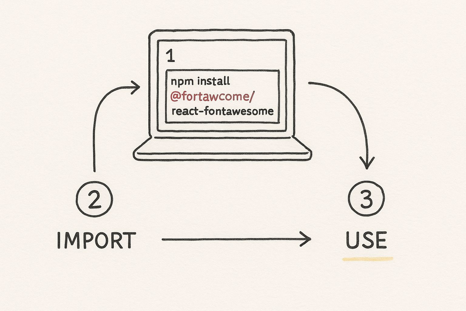
To get the essentials, open your terminal and run this command. It installs the core SVG library, the main React component, and the entire set of free solid icons.
npm install @fortawesome/fontawesome-svg-core @fortawesome/free-solid-svg-icons @fortawesome/react-fontawesome
If you need to display logos for social media or other companies, you’ll want the brand icons, too. Just run this command separately:
npm install @fortawesome/free-brands-svg-icons
This is the command that gets the ball rolling.
With that one line, you've opened the door to using thousands of crisp, scalable vector icons right inside your React components.
Building Your Icon Library
Here’s a pro tip that I can't recommend enough: create a central "library" for your icons. Instead of sprinkling individual icon imports across dozens of different components, you define every icon your app needs in one place. This isn't just for organization; it's a huge performance win.
This explicit import strategy is what enables "tree-shaking." Modern bundlers like Webpack or Vite can see exactly which icons you're using and will only include those in the final production build. Your app stays lean because you're not shipping the entire Font Awesome icon set.
A common pattern is to set up a dedicated file, maybe something like src/fontawesome.js. In that file, you import the library object from the core package and then add the specific icons you need. This has become a standard practice in the community, and you can find great discussions about this approach on platforms like dev.to.
By centralizing your icon imports, you create a single source of truth for your project's entire icon set. This makes future maintenance a breeze because you have a clear, at-a-glance view of every icon in use.
How to Display Your First Icon
Alright, with the setup out of the way, it's time for the fun part: actually getting an icon to show up in your app. It’s surprisingly simple. The library gives you a <FontAwesomeIcon> component that you can drop right into your JSX, and it takes care of rendering the SVG for you.
A classic "hello world" for icons is adding a user symbol to a profile button. It's a small touch that instantly makes the UI more intuitive.
Example 1: The Profile Button Icon
Let's say you have a ProfileButton component. First, you'll need to pull in the FontAwesomeIcon component itself, along with the specific icon you want to use—in this case, faUser from the solid icon pack.
import { FontAwesomeIcon } from '@fortawesome/react-fontawesome';
import { faUser } from '@fortawesome/free-solid-svg-icons';
Now, you can use it directly in your component's JSX. Just pass the imported icon to the icon prop.
function ProfileButton() {
return (
);
}
Just like that, you have a clean, universally understood symbol right next to your text. It’s a simple change that adds a lot of polish.
A well-placed icon can communicate meaning faster than text alone, guiding users without cluttering the interface.
Example 2: Adding a Shopping Cart to the Navbar
Another common use case is a shopping cart icon in an e-commerce header. It acts as a constant, clear signpost for users.
The process is the same. Start by importing the faShoppingCart icon.
import { faShoppingCart } from '@fortawesome/free-solid-svg-icons';
Then, place the <FontAwesomeIcon> component inside your navigation bar. Here, I'm also using the size prop to make it a bit larger and more prominent.
A few pro tips I've picked up along the way:
- Be specific with imports. Always import only the icons you need. This allows your bundler (like Webpack) to perform tree-shaking, which keeps your final JavaScript bundle lean.
- Use props for styling. Take advantage of built-in props like
size,color,spin, andfixedWidthbefore reaching for CSS. It’s often faster and easier. - Think about semantics. Wrap your icons in meaningful elements like
<button>or<a>to ensure they're accessible and interactive.
For more hands-on examples, you might find our guide on React Icons in Practice helpful.
Example 3: Social Media Links in the Footer
Footers are the perfect spot for social media links, and brand icons are essential here. The free-brands-svg-icons package has you covered.
You can import multiple icons from the same package in a single line.
import { faFacebook, faTwitter } from '@fortawesome/free-brands-svg-icons';
Next, embed them within anchor tags to make them functional links.
This is where accessibility becomes critical. Since these icons have no visible text, you absolutely need to include an aria-label. This tells screen readers what the link is for, ensuring your site is usable for everyone. Also, don't forget to add custom CSS to handle hover and focus states to provide clear visual feedback.
One pattern I often use in larger projects is to centralize all my icon imports into a single icons.js or icon-library.js file. This makes it much easier to manage which icons are being used across the application and helps prevent duplicate imports.
And remember, if an icon is purely for decoration and adds no functional meaning, you can add aria-hidden="true" to it. This tells screen readers to ignore the element, reducing unnecessary "noise" for users.
Customizing Icons with Props and CSS
Getting an icon to show up is one thing, but making it truly fit your design is where the magic happens. The react-fontawesome library makes this incredibly simple by giving you a powerful set of props to use directly on the <FontAwesomeIcon> component. This means you can change how an icon looks on the fly, often without touching a single line of CSS.
Think about resizing an icon—a super common task. Instead of messing with font-size in a separate stylesheet, you can just use the size prop. Pop in a value like lg, 2x, or 3x, and the icon scales perfectly. The same goes for color. The color prop takes any CSS color value you can throw at it, making it easy to match your brand's exact hex codes. For a deeper look into this, our guide on how to change an icon's color is a great resource.
Advanced Transformations and Animations
Beyond the basics of size and color, the library gives you tools for more dynamic effects. The spin prop is a personal favorite for loading indicators; it adds a smooth, continuous rotation that instantly tells the user something is happening. If you just need to tweak an icon's orientation, the rotation and flip props offer precise control.
Here are a few of the props I find myself using all the time:
size: Sets the scale. Thinkxs,sm,lg, or multipliers like2x.color: Applies a specific color using names, hex codes, or RGB.spin: Animates the icon to rotate continuously.rotation: Rotates the icon by a set degree (90,180,270).flip: Mirrors the icon horizontally, vertically, or both.
These props are a huge part of what makes the library so developer-friendly. It’s worth noting that react-fontawesome has evolved quite a bit, even undergoing a full rewrite from JavaScript to TypeScript in version 3.0.0. This move really modernized the library, adding better type safety and performance. You can dig into its history over at the official repository.
From my experience, you can handle over 80% of your styling needs just by using these built-in props. It keeps your styling logic right there with your component, which makes your code much cleaner and easier to manage down the road.
Applying Custom CSS for Finer Control
Props are great for quick adjustments, but sometimes you need more fine-grained control. This is especially true for interactive states, like hover or focus.
For those situations, you can simply pass a standard className prop to the <FontAwesomeIcon> component. This gives you a hook to target the icon with your own CSS. For instance, you could write a class that changes an icon's color when a user hovers over its parent element, making your UI feel more responsive. This blend of easy-to-use props and the power of custom CSS gives you the flexibility to make Font Awesome icons look at home in any design system.
Keeping Your App Fast with Explicit Imports
Performance is a feature, not an afterthought. When working with an icon library as extensive as Font Awesome, it's easy to make a common mistake that can seriously slow down your app: importing the entire icon library at once.
Doing this can add a surprising amount of weight to your application's final bundle, which means longer load times and a clunkier experience for your users. Nobody wants that.
Thankfully, the React Font Awesome library is built to play nicely with modern tools like Webpack and Vite. It takes advantage of a clever process called tree-shaking, which automatically scans your code and strips out any icons you haven’t actually used. This ensures your final build is as lean as possible.
The Explicit Import Strategy
To help the tree-shaking process work its magic, you need to be specific. Instead of pulling in an entire icon style set, you should only import the individual icons you need for a particular component. It's a small change in your code that makes a huge difference in performance.
Let's look at the two approaches:
- The Wrong Way: Importing the whole
@fortawesome/free-solid-svg-iconspackage can dump hundreds of kilobytes of unused data into your app. - The Right Way: Importing just
{ faUser, faCog }pulls in only the data for those two specific icons. We're talking a few bytes versus a massive file.
Adopting this explicit import strategy is a non-negotiable for building professional, production-ready applications. You're essentially telling your bundler exactly what to keep, allowing it to create the smallest, fastest version of your app possible.
This mindful approach is key to keeping your application feeling lightweight and responsive. While we're focused on React here, the core idea of efficient icon management applies everywhere. If you're curious, you can see similar techniques applied for Next.js icons in our related guide.
Common Questions About React Font Awesome
Even when things go smoothly, you're bound to run into a few head-scratchers. I've seen these questions pop up time and again, so let's walk through the most common ones you'll likely face when using React Font Awesome.
Why Are My Icons Showing Up Huge?
Ah, the classic "giant icon" problem. If you've just added your first icon and it's taking up half the screen, don't worry—you're not alone. This is almost always a symptom of missing CSS.
The react-fontawesome library needs a tiny bit of its own CSS to work correctly. Without it, the browser has no idea how to size the SVG, so it just displays it at its full, massive native resolution.
The fix is incredibly simple. Just add this one line to the top of your main entry file (usually App.js or index.js):
import '@fortawesome/fontawesome-svg-core/styles.css';
As soon as you add that, your icons should snap back down to a reasonable size.
How Can I Start Using My Pro Icons?
Putting your Font Awesome Pro license to work is pretty straightforward. It just requires a quick one-time configuration to give your project access to the private Pro icon packages.
First, you'll need to tell your package manager (like npm or Yarn) how to authenticate. You do this by creating a file named .npmrc in the root of your project and adding a special line to it that contains your auth token.
Once that's set up, you can install the Pro icon sets just like you did the free ones:
@fortawesome/pro-solid-svg-icons@fortawesome/pro-regular-svg-icons@fortawesome/pro-light-svg-icons@fortawesome/pro-thin-svg-icons@fortawesome/pro-duotone-svg-icons
After that, using them in your components is exactly the same as using the free icons. You just have a much bigger library of professional, high-quality icons to work with.
The official
react-fontawesomepackage is hands-down the best way to go for deep integration, especially if you're a Pro user. However, if your project pulls from many different icon families (not just Font Awesome), a library likereact-iconsmight simplify your workflow, though you'll miss out on some of the advanced Font Awesome-specific features.
Tired of the same old icon sets? VibeIcons lets you generate completely custom, AI-powered icons that actually fit your brand's unique style. You can create your first five icons for free.