A Designer's Guide to Backgrounds for Icons
Create stunning backgrounds for icons that enhance usability. This guide covers color, shape, trends, tools, and best practices for modern UI design.
The best backgrounds for icons do more than just sit there—they boost visibility, strengthen your brand, and subtly guide users without creating a cluttered mess. A thoughtfully designed background can turn a simple graphic into a powerful communication tool that feels perfectly at home in your interface.
Why Icon Backgrounds Are a Design Superpower
It’s easy to overlook an icon's background as just a decorative touch, but it’s a massive part of the user experience. Think about the apps on your phone. The circular background on a notification or the soft, rounded square behind a settings icon? That’s no accident. These are deliberate choices made to build a clear visual hierarchy and make the app easier to get around.
A good background gives an icon a solid footprint, so it doesn’t get lost against busy photos or shifting screen colors. This is absolutely critical in complex interfaces where every pixel fights for attention. For example, putting a dark icon inside a light-colored circle ensures it’s always easy to see and tap, no matter what’s happening behind it.
Boosting Brand and Usability
Beyond just making things visible, icon backgrounds are a fantastic branding opportunity. They let you weave your brand's color palette and signature shapes throughout the entire user interface. This kind of repetition creates a sense of familiarity and reinforces your brand identity every time someone interacts with your product.
On a deeper level, effective icon backgrounds improve usability by tapping into how our brains work. They can:
- Group Related Actions: Using the same background shape or color for similar functions—like putting all "edit" icons in a blue circle—helps people learn your app’s logic much faster.
- Signal Interactive States: Ever hovered over an icon and seen its background change color or gain a subtle shadow? That’s instant, clear feedback telling you it’s clickable.
- Reduce Cognitive Load: When icons are consistent and instantly recognizable, users don't have to waste brainpower trying to figure them out. They can just navigate on instinct.
By giving an icon a consistent shape and color, you're creating a visual cue that users learn to associate with a specific action or piece of information, making your entire system more intuitive.
The real goal here is to build a visual language that feels intentional but completely effortless for the user. Every decision, from a simple circular background to a completely custom shape, adds up to a more polished and user-friendly experience. We explore this further in our guide on the functional use of icons, which shows just how much impact these small elements can have.
Ultimately, a well-executed background elevates an icon from a simple picture to a core piece of effective design communication.
Mastering the Core Principles of Background Design
When you move from thinking about icon design to actually doing it, everything boils down to three key elements: color, shape, and contrast. These are the pillars that make an icon background work. They team up to give your icons clarity and personality. Getting them right isn't about following a strict formula; it’s about making deliberate choices that help the user and align with your brand.
Color is your best friend for setting a mood and creating instant associations. While your brand's palette is the obvious starting point, don't feel boxed in by it. A great trick is to assign certain colors to specific types of actions. For instance, you could use a warm, energetic color for all "creation" icons (like "Add" or "Compose") and a cooler, calmer tone for informational icons.
The real magic here is consistency. Once users learn that a particular color signals a certain type of interaction, they'll know what to expect without even thinking. It’s like creating a secret visual language that makes your entire interface feel more intuitive.
Defining Personality with Shape
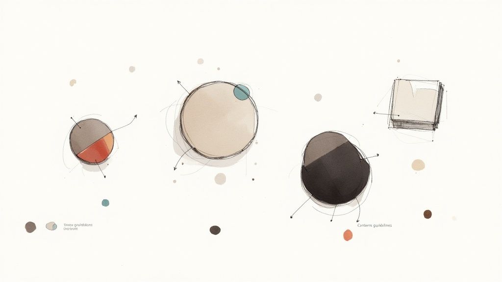
The shape of an icon's background does more than just hold it in place—it injects a ton of personality. Clean geometric forms have been a mainstay for a reason: they just work. The simplicity of circles, squares, and hexagons cuts down on mental friction, making icons instantly scannable. You can see how this minimalist approach is influencing modern design over at Big Red Illustration.
But you're not limited to the basics. Each shape sends a different message:
- Circles feel friendly, complete, and approachable. They're a solid, safe choice for almost anything, from profile pictures to primary action buttons.
- Squares and Rectangles project a sense of stability, balance, and trust. Those sharp corners can feel a bit more formal and structured.
- Rounded Squares (Squircles) are the perfect compromise, giving you the sturdiness of a square with the softness of a circle. It's a very modern, friendly look.
- Organic or Custom Shapes can be a fantastic way to stand out, but use them wisely. Too much complexity can quickly turn into visual noise.
Your choice of shape is a quiet, constant signal about your brand’s personality. A fun, creative startup might lean into organic blobs, while a bank will almost certainly stick with grounded, reliable squares.
I've put together a quick reference table to help you think about what each shape communicates.
Icon Background Shape Psychology
| Shape | Psychological Association | Best Used For |
|---|---|---|
| Circle | Unity, harmony, community, friendliness | Social media avatars, notification badges, toggles |
| Square | Stability, reliability, order, professionalism | Financial apps, enterprise software, structural icons |
| Rounded Square | Modernity, approachability, innovation, safety | Tech startups, consumer apps, user interface controls |
| Hexagon | Technology, intelligence, connection, complexity | Science-focused brands, data visualization, gaming |
| Triangle | Direction, movement, power, purpose | Navigation buttons, alerts, high-energy brands |
| Organic/Blob | Creativity, nature, uniqueness, playfulness | Artistic platforms, lifestyle brands, children's apps |
Choosing a shape is a strategic decision that subtly reinforces your brand's identity every time a user interacts with your product.
This infographic gives a great snapshot of what designers are actually doing right now.
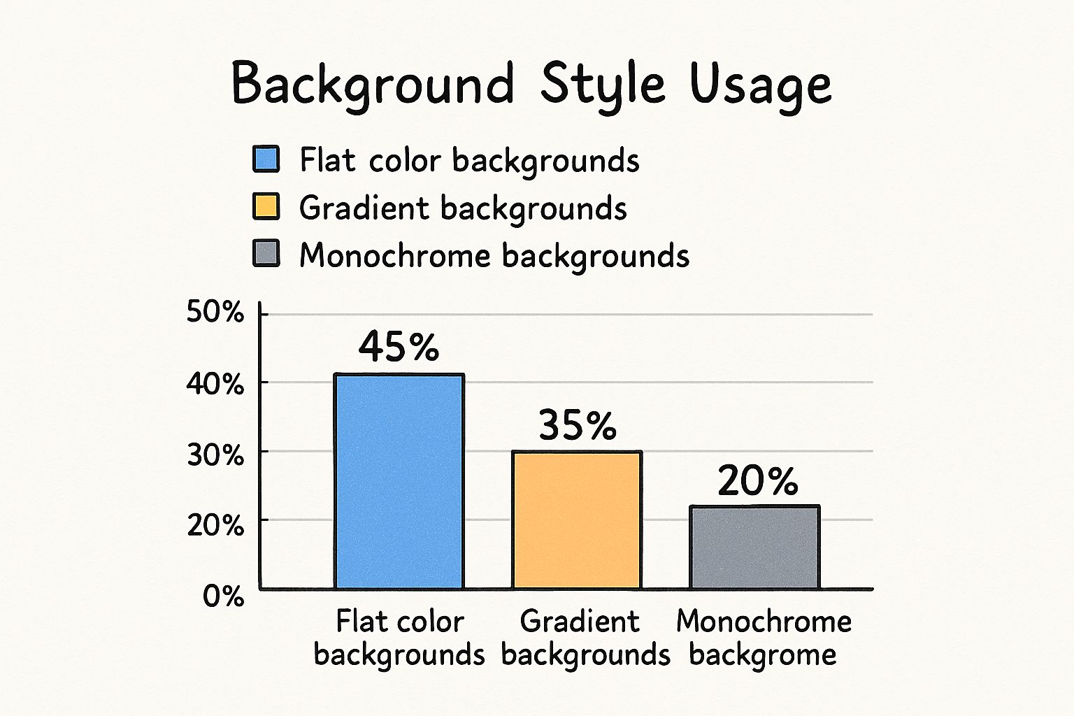
As you can see, flat color is still king at 45% because it's so clean and straightforward. But gradients are not far behind at 35%, proving that a little bit of depth and visual flair goes a long way.
Nailing Contrast for Accessibility
Let's be clear: contrast isn't just a stylistic choice. It's a fundamental part of accessibility.
Your icon and its background must have enough contrast to be readable for everyone, including those with visual impairments. The official guideline to follow is from the Web Content Accessibility Guidelines (WCAG), which recommends a contrast ratio of at least 3:1 for graphical elements like icons.
This is a hard and fast rule. An icon that a user can't properly see is an icon that might as well not be there at all.
Thankfully, you don't have to guess. There are fantastic tools like Adobe's Color Contrast Analyzer or countless Figma plugins that can check your ratios in seconds. This ensures your designs are not only beautiful but usable for every single person. To see how all these pieces fit together in a broader context, feel free to explore our other articles on fundamental design principles.
Exploring Modern Styles and Trends
Icon design is always evolving. The real trick is to create something that feels current without looking dated in a year or two. Right now, the best backgrounds for icons are all about adding depth, texture, and a bit of personality in smart, subtle ways. We're moving past the era of perfectly flat, single-color squares into something more dynamic.
Gradients, for example, have made a huge comeback. But forget the harsh, Web 2.0-style gradients you might be picturing. Today’s gradients are smooth, sophisticated, and serve a purpose. They can be anything from a soft two-tone fade that makes a button look more tangible to a complex mesh gradient that gives the background an almost liquid feel. It’s a simple way to add visual interest and make an entire interface feel more alive.
Adding Depth with Texture and Shadow
Color is only half the story; texture is playing a massive role in making icons feel less sterile and more grounded. A faint grain effect, for instance, can give a background a slightly retro, printed quality. Likewise, a soft, diffused drop shadow can gently lift an icon off the screen, creating a much clearer sense of layering and hierarchy.
These elements are effective because they mimic things we see in the real world, like unique materials and natural lighting. The key to getting it right is subtlety. You want to suggest a texture, not scream it.
- Noise and Grain: A fine layer of noise can break up an otherwise flat color, adding a sophisticated, almost photographic quality.
- Inner Shadows: A faint inner shadow creates a subtle "pressed-in" look, which is perfect for showing when a button is in an active or selected state.
- Metallic Sheens: A simple radial gradient can mimic a metallic finish, a great touch for premium or tech-focused branding.
These visual details aren't just for show—they get results. Icons with more engaging backgrounds, like those using gentle gradients or unique textures, can genuinely improve user interaction. In fact, some studies have shown that visually appealing backgrounds for icons can boost click-through rates by up to 20% compared to plain, flat designs. You can find more on how these choices impact users with these valuable icon design insights.
Minimalism and Negative Space
Even with gradients and textures trending, minimalism hasn’t gone anywhere. It’s just evolved. Modern minimalism isn't about stark emptiness; it’s about a masterful use of negative space. This is where the background stops being a container and starts being an active part of the design itself.
An icon's background isn't just a container; it's a framing device. The empty space around the symbol is just as important as the symbol itself, directing the user's eye and creating visual breathing room.
This approach often means placing a simple, clean icon inside a generously sized background shape. The high contrast between the minimal foreground element and the spacious background creates a clean, focused look that’s both elegant and incredibly easy to understand. It’s a timeless style that puts clarity first, ensuring your icons do their job effectively. The sweet spot is always finding that balance between what’s trendy and what’s timeless.
Your Toolkit for Creating Icon Backgrounds
Once you've nailed down the theory, it's time to get your hands dirty with the right software. The go-to tools for pros—like Figma, Adobe Illustrator, and Sketch—are purpose-built for creating the kind of dynamic, scalable backgrounds for icons we're talking about. Their real magic is in their non-destructive workflows, which let you build flexible design systems that are a breeze to update.
The whole point is to avoid creating a unique background for every single icon. That's a recipe for inconsistency and a massive waste of time. Instead, you want to build a reusable library of styles. Create one master background component, apply it to hundreds of icons, and when you need to tweak the color or corner radius, you just edit it in one place.
Building Reusable Background Styles
A non-destructive workflow is the secret sauce here. It means you’re not permanently baking changes into your original icon or shape. You're simply layering on effects, masks, and styles that you can toggle on, off, or adjust whenever you need to.
Here’s how this plays out in practice:
- Start with a Base Shape: Lay down a simple vector square or circle. This is your canvas.
- Use Styles for Fills & Strokes: Don't just slap a color on it. Save that color as a style (e.g., "Primary-Action-Fill"). Why? Because when your brand color gets a refresh, you change it once in your library, and every single icon background updates instantly.
- Add Depth with Effects: Drop shadows, inner glows, or subtle blurs should always be applied as layer effects. This keeps them separate from the base shape, so you can dial their intensity up or down without having to start over.
- Mask for Ultimate Flexibility: Place your icon over the background shape and use it as a mask. This is so much smarter than permanently punching the icon shape out of the background. It keeps everything editable.
This component-based method is the industry standard for a reason. It’s efficient, scalable, and will save you from an ocean of tedious manual edits down the road. To get a better sense of which tool might be right for you, check out our guide on the best vector design software.
The Role of AI in Modern Workflows
The tools themselves are also getting a lot smarter. AI is quickly becoming a valuable partner in design, especially for generating unique and complex background effects for icons. It’s an amazing way to blend classic design principles with a bit of modern tech to get something totally new.
Imagine needing a unique, subtle gradient for a new set of premium feature icons. Instead of spending 20 minutes manually tweaking color stops, you could use an AI tool to generate ten different options in seconds from a simple text prompt.
These tools are fantastic for brainstorming and rapid prototyping. They can spin up intricate patterns, organic textures, or vibrant mesh gradients that would take forever to create by hand. They won't replace a designer's eye, but they are becoming an indispensable part of the toolkit for finding inspiration and creating truly standout backgrounds for icons.
Exporting and Implementing Your Icons Flawlessly
Designing a great-looking icon is really just the first part of the job. The real test comes when you export it. If your export settings are off, that beautiful design can become a blurry, pixelated mess or, just as bad, a file so large it slows down the entire user experience.
This is where your design actually meets the real world. Getting this final step right isn't just a suggestion; it's a must. The format you choose to export in will directly affect both the visual quality and the performance of your site or app. You'll primarily be dealing with two formats: SVG and PNG. Each has its own job to do, and a big part of being a pro is knowing which one to use and when.
Choosing the Right File Format
For most icons, SVG (Scalable Vector Graphics) should be your go-to. I can't stress this enough. Because SVGs are essentially code, they can be scaled up or down to any size without losing a drop of quality. They’ll look perfectly crisp on a tiny smartwatch or a massive 4K monitor, and the file sizes are incredibly small. This makes them perfect for simple icons, logos, and any graphics that don't need photorealistic details.
On the other hand, you have PNG (Portable Network Graphics), which is a raster format—meaning it's built from a grid of pixels. While PNGs are fantastic for images with complex color palettes and transparency, they have a major weakness: they pixelate if you try to scale them up. I typically only reach for a PNG when I’m working with an icon that has intricate textures, very detailed gradients, or actual photographic elements that just can't be created with simple vector shapes.
Here’s a quick mental checklist I run through when deciding on a format:
- Is it just simple shapes and solid colors? Go with SVG. Every single time. It's smaller, faster, and perfectly scalable.
- Does it have complex gradients or textures? This is where you might consider a PNG. While SVGs can handle gradients, really complex ones can make the file size balloon, and a well-optimized PNG might actually look better and load faster.
- Are there any photographic elements? PNG is your only real choice here.
- Will it be animated? SVG is a powerhouse for animations driven by CSS or JavaScript, opening up a world of interactive possibilities.
Your goal is always the same: deliver the highest visual quality at the lowest possible file size. For over 90% of the UI icons I design, SVG is the undisputed champion. Only step away from it when a specific visual effect, like a grainy texture, demands a raster format.
Optimizing for Performance
Once you've picked your format, the next step is optimization. Don't skip this. Even SVGs can be bloated with unnecessary code that makes them heavier than they need to be. I always run my SVGs through a tool like SVGOMG. It's brilliant for stripping out junk metadata, comments, and redundant points from the code without changing how the icon looks at all.
For PNGs, it's all about compression. Tools like TinyPNG are lifesavers. They work by intelligently reducing the number of colors in the image, which can slash the file size dramatically, often with no visible loss in quality. Taking a few seconds to run your assets through an optimizer can shave precious milliseconds off your page load time, and trust me, that adds up to a much better experience for the user.
Finally, think about the handoff to your developers. Clear, consistent naming is your best friend. A file named icon-add-circle-active.svg is infinitely more helpful than Untitled-1.svg. This small habit makes the codebase cleaner and prevents a lot of headaches down the road. Make sure you also provide clear specs for sizes and state changes so the backgrounds for icons you so carefully designed look exactly as you envisioned in the final product.
Frequently Asked Questions About Icon Backgrounds
Even with a great plan, a few tricky questions always seem to surface when you're deep in the design process. Let's tackle some of the most common hurdles I've seen designers face with icon backgrounds, so you can make decisions with confidence.
One question I hear all the time is, "Does every single icon need a background?" The short answer is almost always no.
Think of backgrounds as a tool for emphasis. They're perfect for highlighting a primary call-to-action, visually grouping related functions (like in a toolbar), or making sure an icon is legible on top of a busy photograph. For less critical icons, a simple glyph keeps the interface feeling clean and uncluttered. It all comes down to visual hierarchy.
How Should I Design for Hover and Active States?
Handling interactive states is where the rubber meets the road for user experience. The icon's background is your best friend here, giving you a canvas to provide instant, clear feedback.
Here’s how I usually break it down:
- Hover State: A subtle change is all you need. Think about slightly lightening or darkening the background color, or maybe adding a soft outer glow. The goal is to signal, "Hey, you can click this."
- Active/Pressed State: This needs a bit more punch. A common go-to is an inner shadow that gives a "pressed in" feel. Making the background noticeably darker also works really well.
- Selected State: When an icon is part of a navigation bar or acts as a toggle, its selected state has to be persistent and obvious. This often means a complete color fill change or adding a bold stroke around the background.
The real secret is consistency. Define these state changes in your design system from the start and stick to them. Users learn these patterns quickly, which makes your entire interface feel more predictable and intuitive.
Do My Backgrounds Need to Match Our Brand Colors Exactly?
While your brand palette is the natural starting point, don't feel locked in. It’s often a smart move to create a secondary, UI-specific color palette that’s derived from your primary brand colors.
This gives you the flexibility to create tints and shades that are perfectly tuned for accessibility and various interaction states.
For instance, your main brand blue might be way too vibrant for a default icon background, but it could be perfect for the active state. A much lighter tint of that same blue could serve as the default, keeping things on-brand without visually shouting at the user. This approach to creating backgrounds for icons ensures your interface feels like an extension of your brand while still putting usability first.
Tired of searching for the perfect icon or struggling to create consistent variants? VibeIcons lets you generate AI-powered, style-matched icons in seconds. Get started for free and create the missing icons you need.