A Guide to Buttons for Websites That Convert
Discover how to design buttons for websites that boost engagement and conversions. Learn key principles for color, accessibility, and CSS to improve your UI.
Website buttons are the clickable elements that let users do things—submit a form, buy a product, or jump to a new page. Think of them as the digital doorknobs and signposts of your site; they’re essential for guiding visitors and letting them interact with your content.
The Hidden Power of a Single Click
Buttons are really the engines that drive the internet. They're what turn passive browsing into active participation, transforming a simple visit into a real interaction. They aren't just clickable boxes; they're the critical touchpoints that move a user from one step to the next.
Imagine them as bright, clear signs on a digital highway, directing traffic exactly where it needs to go, whether that's a checkout page, a contact form, or a newsletter signup.
A well-placed "Buy Now" or "Learn More" button does more than just sit there. It actively shapes decisions and helps people get what they came for, quickly and easily. This makes button design far more than a simple aesthetic choice—it's a core part of your business strategy that directly impacts user satisfaction and, ultimately, your bottom line.
From Engagement to Revenue
That tiny click has a surprisingly direct and powerful connection to business growth. Every time a user interacts with a button, it kicks off a chain of events that can lead to deeper engagement, better conversion rates, and more revenue. A lot of businesses overlook this, and it’s a costly mistake.
It's pretty shocking, but research shows that over 70% of small business websites don't have a clear call-to-action (CTA) button. That's like having a store with no cashier. This oversight leaves potential customers confused and directionless.
On the flip side, a thoughtfully designed interface with strategic button placement can boost conversion rates by up to 200%. And considering that a staggering 88% of users will abandon a website after a bad experience, getting your buttons right is non-negotiable for keeping people around. You can discover more key website statistics to see just how much these small details matter.
This infographic breaks down how a single, effective click directly influences user engagement, conversion rates, and revenue growth.
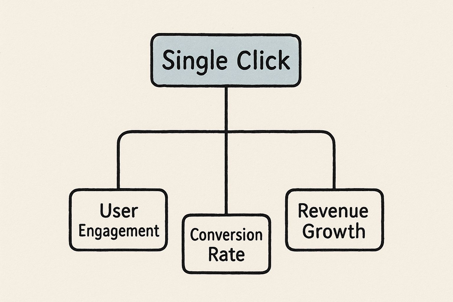
As you can see, a button isn't just an isolated element. It's the trigger for a value chain that turns a flicker of user interest into measurable business success.
Why Every Button Matters
Every single button on your site has a job to do. Each one is an opportunity to guide, inform, and persuade your visitors, and their combined effect is what makes your website feel either intuitive or frustrating.
Here are the core jobs that make website buttons so indispensable:
- Guiding User Flow: They carve out a clear path for people to follow, cutting down on confusion and helping them navigate your site with confidence.
- Encouraging Interaction: Buttons are an open invitation to take action, making the whole experience feel more dynamic and engaging.
- Providing Feedback: Visual cues like a button changing color on hover or looking "pressed" down confirm that the user's click was registered, giving them a sense of control.
A great button is an intuitive signpost that answers the user’s unspoken question: "What should I do next?" It removes friction and makes the desired action feel like the most natural next step.
Understanding Different Types of Website Buttons
Think of your website's navigation like a city's road system. You have major highways, local streets, and small alleyways, all designed to get people where they need to go. Website buttons work the same way. Not every action is a superhighway, so not every button should look like one.
Using the right button for the right job is the secret to an interface that just feels right. It’s all about creating a clear visual hierarchy. The most important action on a page—your "Buy Now" or "Sign Up"—needs to be the most obvious thing a user sees. When everything is screaming for attention, people get overwhelmed and just tune it all out.
That's why getting a handle on the different types of buttons for websites is one of the first and most important steps in great design.
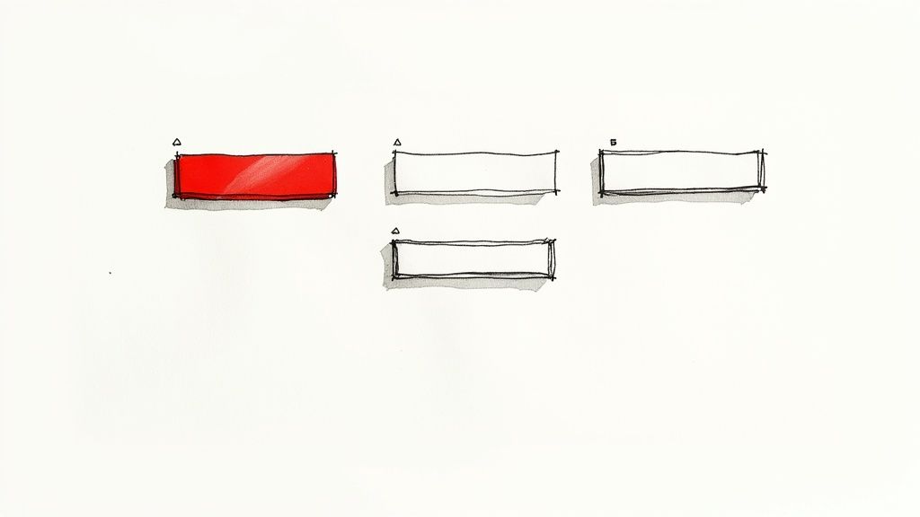
The Core Trio: Primary, Secondary, and Tertiary Buttons
Most well-designed sites use a simple three-tier system to organize their buttons. This framework helps users quickly figure out what's important and what's optional, often without even reading the text.
Primary Buttons are your headliners. They represent the single, most-desired action on a page, like "Add to Cart" or "Get Started Today." These buttons need to be bold and pop off the page, usually with a high-contrast color that immediately draws the eye.
Secondary Buttons are for the "what's next?" options that aren't the main goal. Think "View Wishlist" or "Continue Shopping." They need to be visible, of course, but should play a supporting role. Often, they’re styled with a simple outline or a less saturated color to keep them from stealing the spotlight.
Tertiary Buttons handle the least critical actions. These are your "Cancel" links or "Learn More" options. They’re typically designed as plain text links to minimize their visual footprint and avoid cluttering the interface.
The whole point of this hierarchy is to make the right choice the easy choice. You’re essentially clearing a path for the user so they don't have to stop and think. The design should guide them, making the primary action feel like the most natural next step.
This simple structure helps prevent "decision fatigue" and makes the user journey feel smooth and logical.
To help you decide which button to use and when, here’s a quick reference table. It breaks down the most common types you'll encounter.
Common Website Button Types and Their Functions
| Button Type | Visual Style | Primary Use Case |
|---|---|---|
| Primary Button | Solid, high-contrast color | The most important action on a page (e.g., "Sign Up," "Buy Now") |
| Secondary Button | Outlined or low-contrast color | An alternative, less critical action (e.g., "Save for Later") |
| Tertiary Button | Plain text, often looks like a link | The least important action, like canceling a process (e.g., "Cancel") |
| Ghost Button | Transparent with a thin border | A subtle, secondary call-to-action that doesn't distract |
| Toggle Button | A switch-like control | Turning a setting on or off (e.g., enabling notifications) |
| Floating Action Button (FAB) | A circular icon that "floats" | The primary action on a screen in mobile UI (e.g., compose email) |
| Text Button | A hyperlink-styled button | Low-priority actions, often in forms or dialogs (e.g., "Forgot Password?") |
This table is a great starting point, but remember that context is everything. The key is to match the button's appearance to the importance of its action.
Exploring Other Common Button Styles
Beyond that main trio, designers have a whole bag of tricks filled with specialized buttons for different situations. Knowing when to pull out the right one can make a huge difference in your site's usability.
Here are a few other styles you'll see all the time:
Ghost Buttons: These are the minimalists of the button world—transparent with just a simple outline and text. They’re fantastic for secondary actions on visually clean pages where a solid button would feel too heavy.
Floating Action Buttons (FABs): If you've used a modern mobile app, you've seen a FAB. It's that circular icon button, usually in the corner, that stays put as you scroll. It’s reserved for the single most common action on a screen, like adding a new contact or composing a tweet.
Toggle Buttons: These are perfect for on/off states. Think of a switch for dark mode or email notifications. Toggles give instant feedback, clearly showing the user which state is currently active without a page refresh.
Text Buttons: Sometimes, you just need something simple. Text buttons look like regular links but act like buttons. They're ideal for low-priority actions inside forms or pop-ups, like the classic "Cancel" option sitting next to a big, bold "Submit" button.
Ultimately, choosing the right button is less about what looks cool and more about what feels intuitive. It’s a strategic decision that aligns the visual design with the user's goals, creating an interface that's not just beautiful, but truly effortless to use.
Designing Buttons That Beg to Be Clicked
Knowing the different types of buttons is one thing; designing one that users genuinely want to click is a whole other ballgame. This is where art and science really come together, blending visual appeal with proven psychological principles to create buttons that do more than just sit there—they actively help you reach your goals. The best buttons for websites are designed with intention, where every detail, from size to feedback, is carefully considered.
A great button doesn't feel like a command. It feels like a helpful suggestion. It guides the user's eye, instantly communicates what it does, and makes the next step feel both easy and obvious. This all boils down to understanding a few key ideas about how people interact with digital interfaces, starting with the physical aspects of the button itself.
Size and Placement: The Science of Reachability
Have you ever tried to tap a tiny link on your phone, only to hit the wrong one by mistake? It’s frustrating, and it’s a classic example of a design that ignores a core principle known as Fitts's Law. At its heart, the law says that the time it takes to move to a target (like a button) depends on how far away it is and how big it is.
Put simply: bigger buttons that are closer to the user's cursor or thumb are easier and faster to click.
This is exactly why you see those big, prominent "Add to Cart" buttons on e-commerce sites. On mobile, they're often stuck to the bottom of the screen, right where your thumb naturally rests. Getting this wrong adds friction to the user's experience and can tank your engagement and conversion rates.
Here’s how to put Fitts's Law into practice:
- Make Buttons Large Enough: Give your buttons a generous tap area, especially for mobile users. A minimum of 44x44 pixels is a solid rule of thumb.
- Provide Ample Spacing: Don’t cram your buttons and links together. A little white space makes each one a clearer target and cuts down on frustrating mis-clicks.
- Position Buttons Logically: Place your most important buttons where people naturally look—think the top-right of a header or the center of a content block.
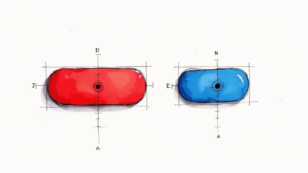
Color Psychology: What Your Button's Hue Says
Color is so much more than decoration; it’s a powerful communication tool that triggers emotions and signals meaning before a user ever reads the text. The color of your button can dramatically influence whether it gets noticed and, more importantly, clicked. Red, for example, often signals urgency or excitement, making it a go-to choice for "Buy Now" buttons during a sale.
On the other hand, blue tends to inspire trust and calm, which is why banks and tech companies love it for "Login" or "Sign Up" buttons. And green? It’s the universal color for "Go," making it perfect for confirming an action or submitting a form.
But the most important factor isn't the specific color itself—it's contrast. A button that blends into the background might as well be invisible. It needs to pop. There's real data to back this up, too; one study found that a red link blew a blue link and a banner out of the water, resulting in a 53.13% increase in clicks. It’s a powerful reminder to test what works for your audience. You can read more about these web design findings to see just how much color influences what users do.
Button States: Providing Clear Visual Feedback
A button's job isn't done after you've picked its color and shape. A truly effective button communicates with the user throughout their entire interaction by changing its appearance. We call these changes button states, and they provide critical visual feedback that makes an interface feel intuitive.
Think of button states as a micro-conversation. The button says, "You can click me," then, "You're about to click me," followed by, "Okay, I got your click," and finally, "You can't click me right now." This feedback makes an interface feel responsive and alive.
Every button should have these four primary states designed:
- Default: This is the button’s normal, resting appearance. It should clearly look clickable from the get-go.
- Hover: When a user moves their cursor over the button, it should react. A slight color change, a shadow, or a subtle animation all work to signal interactivity.
- Active/Pressed: This is the state at the exact moment of the click. The button might look like it's being pushed in, which confirms to the user that their action was registered.
- Disabled: When a button can't be clicked yet (like a "Submit" button before a form is complete), it should be disabled. Graying it out is the standard way to visually communicate that it's unavailable.
By putting real thought into a button's size, color, and states, you turn a simple rectangle into a powerful tool that guides users, builds their confidence, and drives them to take action.
Making Your Buttons Accessible to Everyone
A truly great button is one that everyone can use, no matter their abilities. Thinking about accessibility for buttons on websites isn't some niche, add-on feature—it's the very foundation of inclusive design that makes the experience better for your entire audience. It’s about making sure someone using a screen reader or navigating with just a keyboard can use your site as effortlessly as anyone else.
This isn't about ticking boxes on a compliance checklist. It's about building a better, more thoughtful web. An accessible button is predictable, clear, and easy to use, and those are qualities that help every single visitor.
Start with the Right HTML Foundation
The single most important thing you can do for an accessible button is to use the right tool for the job. You can make a <div> look like a button with some CSS magic, but it’s a poor imitation of the real thing. For accessibility, the native HTML <button> element is your best friend.
Why? Because the <button> tag comes pre-loaded with accessibility features right out of the box.
- Keyboard Focus: Users can navigate to it with the Tab key—no extra code needed.
- Actionable by Default: It works when someone hits either the Enter or Space key.
- Screen Reader Friendly: Assistive tech instantly knows it's a "button," telling the user its role and purpose without you having to do anything special.
If you try to use a <div> or a <span>, you're forced to Frankenstein all this functionality back together with complex JavaScript and ARIA attributes. It's easy to get wrong. Just stick with <button>. It’s simpler, cleaner, and far more reliable.
Ensure Sufficient Color Contrast
For a button to be useful, people have to be able to see it. This sounds obvious, but it’s especially vital for users with low vision or color blindness. The Web Content Accessibility Guidelines (WCAG) give us clear standards for this.
A button's text label needs a contrast ratio of at least 4.5:1 against its background to meet the common AA standard. If you’re using larger text (think 18pt or 14pt bold), that requirement eases up a bit to 3:1.
Good contrast isn’t just for accessibility. It's a massive usability win for everyone. A button that’s easy to read in bright sunlight or on a dim screen is simply a better button.
Luckily, you don't have to guess. There are tons of free online contrast checkers that will tell you in an instant whether your colors make the grade.
Write Clear and Descriptive Labels
Try this thought experiment: navigate a website with your eyes closed, relying on a screen reader to describe everything. If a button just says "Click Here," you have zero idea what happens next. Context is king.
Every button needs a label that clearly describes what it does.
Instead of: "Read More"
Try: "Read More About Our Services"
Instead of: "Submit"
Try: "Submit Your Contact Form"
This small change makes a world of difference for screen reader users, who can now understand the button's purpose without having to hunt for clues in the surrounding text. If you want to go deeper on creating interfaces that work for everyone, you can find some great advice by exploring more topics on web design accessibility. By making your labels specific and action-oriented, you create a more predictable and less frustrating experience for all your users.
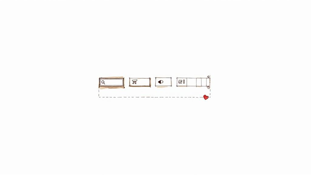
Using Icons to Enhance Button Clarity
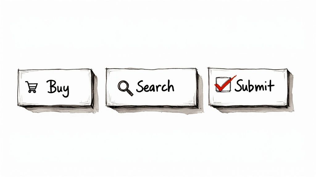
While a clear text label is the backbone of any good button, the right icon can take it from functional to fantastic. Think of icons as a universal language. A magnifying glass for "search" or a shopping cart for, well, "cart," is understood almost anywhere in the world. This simple addition can break down language barriers and make your site easier for everyone to use.
This kind of visual shortcut is incredibly effective. The human brain processes images an astonishing 60,000 times faster than text. That means a user can understand what a button does from its icon before they even finish reading the words. It makes the whole experience feel snappier and more intuitive.
When you pair a short, punchy label with a familiar symbol, you're giving the user two distinct clues that reinforce each other. This one-two punch is one of the smartest ways to design clear, user-friendly buttons for websites.
Choosing the Right Icon for the Job
Here's the key: icons are for clarity, not decoration. A weird, abstract icon can cause more confusion than it solves. The goal is always to pick a symbol that’s immediately recognizable and directly tied to the button's action.
For instance, a gear icon is the go-to for "Settings," and an envelope works perfectly for "Contact." These symbols don't require any real thought from the user. They see it, they get it, they click it.
The best icon is one a user doesn't even notice. If they have to stop and think, "What does that symbol mean?", the icon has already failed. It should be an invisible guide, not a puzzle.
When you're picking icons, keep these three principles in mind:
- Universality: Stick to symbols with widely accepted meanings. Don't try to reinvent the wheel.
- Simplicity: Complex, detailed icons are hard to see, especially on small screens. Keep it simple and clean.
- Relevance: The icon must be an obvious visual match for what the button actually does.
Best Practices for Icon Placement and Sizing
Once you've found the perfect icon, where you put it and how big it is matter just as much. Sloppy placement or inconsistent sizing can make an otherwise clean design look messy and unprofessional. Luckily, a few simple rules can keep everything looking sharp.
For most buttons, the icon should sit to the left of the text label. This follows the natural left-to-right reading flow in Western languages. The user sees the visual cue first, then gets confirmation from the text. Putting it on the right can also work, especially for forward actions, like an arrow icon on a "Next" button.
Here’s a quick checklist to follow:
- Consistent Placement: Decide if icons go on the left or the right, and then stick with that choice everywhere on your site.
- Appropriate Sizing: The icon should be proportional to the text. It needs to be big enough to be clear, but not so big that it overwhelms the words.
- Adequate Spacing: Always add a bit of breathing room (padding) between the icon and the text so they don't look squished together.
Maintaining a Consistent Visual Style
Your icons are a huge part of your site's visual identity. If you start mixing and matching different styles—like a sharp, outlined icon next to a soft, filled one—your design will feel chaotic and thrown together. To avoid this, you need to use an icon set that shares a consistent visual language.
This means all your icons should have common traits, like:
- Stroke Weight: The thickness of the lines should be the same across all icons.
- Corner Style: Are your corners sharp or rounded? Pick one and stick to it.
- Fill Style: Choose between solid (filled) icons or outline (stroke) icons and use that style throughout.
Keeping this consistency can be tough, especially when you need a specific icon that isn't in your main library. Thankfully, modern tools are making this much easier. For designers and developers who want a cohesive look, platforms like VibeIcons allow you to generate new icons that perfectly match popular sets. You can explore a huge library of professionally designed icons for buttons to help you maintain a polished and consistent interface.