Mastering Animated Arrow CSS for Modern Web Design
Create stunning, high-performance animated arrow CSS. Our guide covers pure CSS, keyframes, and SVG techniques for better UI and user engagement.
An animated arrow css is a clever bit of visual flair built entirely with code. By using CSS transitions, transforms, or keyframes, we can create motion that guides a user's eye without ever touching JavaScript or loading a single image file. This approach gives us lightweight, scalable, and high-performance arrows perfect for buttons, sliders, and those handy "scroll down" indicators.
Why Pure CSS Animated Arrows Are a Game Changer
In modern web design, every little detail adds up to the total user experience, and performance is king. It might seem small, but how you create a simple arrow can actually make a difference. Ditching clunky GIFs or static image files for pure CSS animated arrows isn't just a neat trick; it's a smart move that pays off in speed, flexibility, and a more engaged audience.
These subtle animations aren't just for show—they're powerful visual cues. A bouncing arrow can intuitively signal a user to scroll down, a sliding arrow can draw attention to a "next" button on a carousel, and a rotating chevron can indicate an accordion menu is expandable. It’s a gentle nudge that makes navigating your site feel more natural and responsive.
The Performance Advantage
The biggest win here is the tiny footprint. CSS arrows are just a handful of code, while even well-optimized image files add to your page's overall weight. This might not sound like much, but it really matters on mobile devices or slower connections where every kilobyte counts.
- Faster Load Times: The browser renders code almost instantly. Images, on the other hand, require separate HTTP requests, which can bog down the initial page load.
- Smoother Animations: When you animate CSS properties like
transformandopacity, the browser can offload the work to the GPU. The result is buttery-smooth, 60fps motion that GIFs or even JavaScript often struggle to replicate. - Infinite Scalability: Because they're built from code, CSS arrows are essentially vectors. They look perfectly crisp at any size, from a tiny inline icon to a full-screen prompt, with zero pixelation or quality loss.
Before we dive into building our own, let’s quickly break down why this method is so effective compared to the old way of doing things.
CSS Arrows vs Image-Based Arrows
| Attribute | Pure CSS Arrows | Image-Based Arrows (GIF/PNG) |
|---|---|---|
| Performance | Extremely lightweight, no extra HTTP requests. | Adds to page weight, requires an HTTP request. |
| Scalability | Vector-based; scales perfectly to any size. | Pixelates when scaled up; requires multiple sizes. |
| Customization | Colors, size, and speed are easily changed with CSS. | Requires editing the source image file. |
| Animation | Smooth, hardware-accelerated animations. | Can be choppy (GIFs) or complex to manage. |
| Maintenance | Easy to update styles site-wide from one stylesheet. | Requires re-uploading files for any visual changes. |
Ultimately, choosing CSS is about gaining more control while reducing overhead. It's a modern, efficient approach that aligns perfectly with today's performance-focused web standards.
Key Takeaway: By skipping image files, you’re not just saving a few kilobytes; you're building a faster, more responsive experience. CSS arrows, often crafted from simple borders and pseudo-elements, are a surprisingly powerful tool for any developer's kit. You can find more great examples of their efficiency over at Slider Revolution.
Designing Your Own Icons
Want to keep your design totally consistent and lightweight? You can even generate your own unique arrow icons to use alongside your CSS animations. An AI icon generator can be a great starting point for creating custom assets that perfectly match your site's vibe.
AI Icon Prompt Idea:Clean, minimalist vector arrow pointing down, enclosed in a soft-edged circle, indicating a 'scroll down' action. Use a single, muted color on a transparent background, flat design style.
Building a Foundational Animated Arrow
Alright, let's get our hands dirty and build your first animated arrow using nothing but CSS. The real magic here is a clever little trick using element borders. By carefully manipulating the size and color of an element's borders, you can create a perfect triangle—no image files needed.
We'll begin by just getting the static arrow shape on the page. The HTML for this is laughably simple; a single <div> or <span> is all we need to get started. The heavy lifting happens in the CSS, where a pseudo-element like ::before or ::after will construct the arrowhead. This keeps your HTML clean and focused on content, which is always a good thing.
Crafting the Static Shape
The core of this technique is to create an element with zero width and zero height, but with thick borders. By making three of the borders transparent and giving one a solid color, you can form a triangle. It works because of how browsers render borders—they meet at diagonal angles, naturally creating the triangular shape we're after.
This visual shows exactly how a single colored border combines with transparent ones to create the arrow shape.
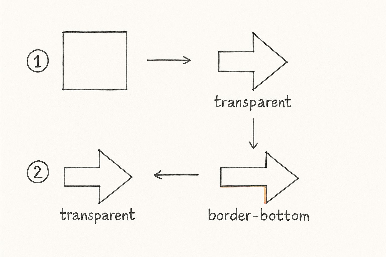
Think of the transparent borders as "carving out" the triangular arrowhead from what would otherwise be a solid block of color.
Here’s the basic HTML and CSS to get you started:
.arrow-container {
width: 50px; /* This is the arrow's shaft /
height: 4px; / Thickness of the shaft /
background-color: #333;
position: relative; / Absolutely essential for positioning the pseudo-element */
}
.arrow-container::after {
content: '';
position: absolute;
top: -6px; /* Position the arrowhead at the end of the line /
right: -16px;
width: 0;
height: 0;
border-top: 8px solid transparent; / Creates the top slope /
border-bottom: 8px solid transparent; / Creates the bottom slope /
border-left: 8px solid #333; / This is the visible arrowhead! */
}
This snippet gives you a simple, right-pointing arrow. The ::after pseudo-element has no dimensions itself, but its borders do all the work to form the triangular head.
Adding Simple Animation on Hover
Now that we have the static structure, adding a basic animation is surprisingly easy thanks to the CSS transition property. A transition lets you define how an element changes from one state to another, giving you a smooth animation instead of a jarring, instant jump.
Let's make our arrow subtly shift to the right and change color when someone hovers over it. This is a classic pattern you’ll see on "Next" buttons or carousel controls.
/* Add to your existing .arrow-container CSS /
.arrow-container {
/ ... existing styles ... /
transition: transform 0.3s ease-in-out; / Smooth transition for movement */
}
/* Add to your existing .arrow-container::after CSS /
.arrow-container::after {
/ ... existing styles ... /
transition: border-left-color 0.3s ease-in-out; / Smooth transition for color */
}
/* Define the hover state /
.arrow-container:hover {
transform: translateX(10px); / Move the arrow right by 10px on hover */
}
.arrow-container:hover::after {
border-left-color: #007bff; /* Change the arrowhead color on hover */
}
Just by transitioning the
transformandborder-left-colorproperties, we've created a functional and engaging animated arrow CSS effect. This foundational technique is not only lightweight and performant but also incredibly versatile for all sorts of UI elements.
Creating Dynamic Motion with Keyframes
While CSS transitions handle simple hover states beautifully, @keyframes are where you truly unlock the power of your animated arrow CSS. This at-rule gives you fine-grained control over every step of an animation, letting you build sequences that loop, pulse, and bounce all on their own—no user interaction needed. It's how you create arrows that really grab a user's attention.
Think of keyframes as a set of instructions for a journey. You define specific "stops"—from the start (0% or from) to the end (100% or to) and any point in between—to orchestrate complex movements. This is perfect for building persistent animations, like a "scroll down" arrow that gently bobs to guide the user.
This screenshot from the MDN Web Docs lays out the basic structure.
As you can see, you’re just defining styles at different percentage points. The browser then does the heavy lifting, smoothly transitioning between them over the animation's duration.
The Bouncing Scroll-Down Arrow
A classic example you've probably seen a thousand times is the bouncing arrow that coaxes users to scroll below the fold. It's a subtle but highly effective visual cue that there's more to see. We can pull this off with a simple translateY transform wrapped in a keyframe definition.
Here’s the code to make it happen:
/* First, we define the animation's steps */
@keyframes bounce {
0%, 20%, 50%, 80%, 100% {
transform: translateY(0);
}
40% {
transform: translateY(-20px);
}
60% {
transform: translateY(-10px);
}
}
/* Then, we apply it to our arrow */
.bouncing-arrow {
animation: bounce 2s infinite;
}
Notice how we set multiple stops? This creates a much more natural "bounce" instead of a robotic up-and-down movement. The infinite keyword is the magic that keeps it looping.
The Pulsing Call-to-Action Arrow
For something like a "Buy Now" or "Sign Up" button, you might want an arrow that pulses to draw the eye. This is a great way to add a sense of urgency without being obnoxious. We can create this effect by animating the transform: scale() property, making the arrow gently grow and shrink.
Pro Tip: I always tell developers to stick to animating
transformandopacitywhenever possible. These properties are hardware-accelerated, meaning the browser's GPU handles them. The result is silky-smooth animations that don't cause lag or jank, which is a common problem when you try to animate properties likemarginorwidth.
Take a look at this code for a pulsing effect:
@keyframes pulse {
0% {
transform: scale(1);
opacity: 1;
}
50% {
transform: scale(1.1);
opacity: 0.7;
}
100% {
transform: scale(1);
opacity: 1;
}
}
.pulsing-arrow {
animation: pulse 1.5s ease-in-out infinite;
}
Pairing the scale change with a subtle shift in opacity really sells the pulsing feel and makes the animation feel less mechanical.
Designing Animated Icons
To really make your animated arrows stand out, try animating a custom icon you've created. With an AI icon generator, you can get a perfectly styled asset in just a few seconds, ready for you to bring to life.
AI Icon Prompt Idea:A sleek, modern arrow icon with a glowing neon outline, designed for a dark mode UI. The arrow should point right, with a pulsating energy effect implied in its design. Flat 2D vector style.
Integrating custom icons can level up your design, especially when you're working within a framework. If you're using a modern JavaScript framework, our guide on implementing Next.js icons offers some practical steps for a smoother workflow.
Don't underestimate the impact of these small touches. An online retailer I followed saw a 25% increase in user engagement simply by adding animated transitional arrows to their product carousels. In another case, a food delivery app cut down on customer support tickets by 40% by using animated icons to clarify order progress. You can dive deeper into these findings on CSS animations to see just how much they can move the needle.
Animating SVG Arrows with CSS
Sometimes, the simple, clean lines of pure CSS arrows just don't cut it. When a design calls for more intricate shapes, custom curves, or unique details, I always turn to SVGs. Combining the design freedom of Scalable Vector Graphics (SVGs) with the raw power of CSS animations gives you the best of both worlds: beautifully crisp graphics and silky-smooth, hardware-accelerated motion.
The secret is to put your SVG code directly into your HTML instead of just linking to it with an <img> tag. This is often called "inline SVG," and doing it this way makes all the inner parts of the graphic—the <path>, <circle>, and <line> elements—visible to your stylesheet. Suddenly, you can target them with CSS just like you would a <div> or a <p>.
Targeting SVG Paths for Animation
Once your SVG is inline, the real fun begins. You can assign classes or IDs directly to the internal paths of the graphic. This lets you isolate and animate specific parts of the arrow, unlocking some seriously creative possibilities. For instance, you could make the arrowhead fade in while the shaft slides into place.
A classic effect, and one of my personal favorites, is the "drawing" animation. It makes the arrow look like it's being drawn right onto the screen. You can pull this off with two clever CSS properties: stroke-dasharray and stroke-dashoffset.
Here’s the breakdown:
stroke-dasharray: This property turns a solid line into a dashed one. The trick is to set the dash length to the total length of your SVG path, creating a single, long dash that covers the entire shape.stroke-dashoffset: This property controls where the dashes start. By setting the offset to be the same as the path length, you effectively push the dash completely out of view, making the line invisible.
To create the animation, all you have to do is transition the stroke-dashoffset back to 0 on hover. The browser smoothly animates the dash back into place, creating that beautiful drawing effect. It's an incredibly powerful technique for building an engaging animated arrow CSS that works with any complex shape you can imagine.
One of my favorite micro-interactions for icons involves this exact method. By applying different transition delays to the shaft and the arrowhead paths, you can create a beautifully staggered animation that feels incredibly polished and responsive. It’s a subtle detail that makes the UI feel alive.
Generating Custom Animated Icons
Want to take this a step further? You can create your own unique SVG arrows perfectly tailored to your brand's style. An AI icon generator can be a fantastic starting point, giving you clean SVG code that’s ready to be broken apart and animated.
AI Icon Prompt Idea:A modern, geometric SVG-style arrow icon breaking apart into three distinct animated segments, showing a sense of dynamic motion and transformation. Use a two-tone color palette, style of a technical diagram.
A prompt like this gives you a graphic that’s already visually segmented, making it much easier to plan out how you’ll animate each individual piece. This approach is the perfect blend of bespoke design and high-performance CSS animation, resulting in a lightweight UI element that looks completely custom.
Optimizing Animations for Peak Performance
A flashy animated arrow css is a great touch, but a slow, jerky one can completely ruin the user experience and even hurt your site's SEO. When you're building animations for a real, production-level website, performance has to be your top priority.
The gold standard we're all chasing is a silky-smooth 60 frames per second (fps). That might sound fast, but it means each frame of your animation has just over 16 milliseconds to render. Blink, and you'll miss it.
The secret to hitting this target is knowing which CSS properties are "cheap" for a browser to animate. You should always, always prioritize animating transform (for moving, scaling, and rotating) and opacity (for fading). Why? Because these properties are hardware-accelerated. The browser can pass the heavy lifting off to the Graphics Processing Unit (GPU), which results in that buttery-smooth motion we're after, free from frustrating lag.
Proactive Performance With will-change
For animations that are a bit more complex or are a critical part of the user experience, you can give the browser a helpful heads-up with the will-change property. Think of it as a friendly tip.
When you apply will-change: transform, opacity; to an element, you're essentially telling the browser, "Hey, I plan on animating these properties soon, so you might want to get ready." This simple line prompts the browser to run optimizations ahead of time, like moving the element to its own compositor layer.
A word of caution: while
will-changeis a powerful tool, don't sprinkle it everywhere. Overusing it can actually consume more system resources and backfire, hurting performance. My advice? Only apply it right before an animation kicks off and, if you can, remove it once the animation is complete.
Ensuring Accessibility for All Users
Great design is inclusive design. Not everyone wants or can tolerate motion on a screen. For some people with vestibular disorders, for instance, excessive animation can be disorienting or even trigger nausea. This is exactly why the prefers-reduced-motion media query is so important.
It's easy to implement. You just wrap your more intense animations in this query to respect a user's system-level preferences:
@media (prefers-reduced-motion: no-preference) {
.bouncing-arrow {
animation: bounce 2s infinite;
}
}
This snippet ensures the bouncing animation only runs for users who haven't specifically requested reduced motion. It's a small change that makes a big difference.
By 2025, the trend towards pure CSS animations will only continue to grow. A big reason for this is their tiny payload size, which is a huge win for mobile users on limited data plans. You can read up on the growth of CSS animations in email and web design to see where things are headed.
Finally, remember that optimization isn't just about speed. It's also about visual clarity. Make sure your arrow has strong color contrast against its background. If you need some pointers, our guide on choosing the right icon colors is a great place to start for ensuring maximum impact and accessibility.
Common Questions About Animated Arrows
As you start weaving animated arrows into your projects, you'll inevitably run into a few common questions and roadblocks. I've seen these pop up time and time again. Getting these details right is what really separates a good implementation from a great one.
Let's walk through some of the most frequent hurdles developers face with animated arrow css and how to clear them. This will make sure your animations are not just slick, but also performant, responsive, and accessible for everyone.
How Do I Make My CSS Arrow Animation Responsive?
This one's a biggie. To make sure your arrow looks sharp on any device, you need to ditch fixed pixel values. Instead, lean on relative units like em, rem, or percentages for all your sizing and positioning.
This simple change allows the arrow to scale naturally with its parent container or the root font size. For example, if you set the arrow's width and height in em, it will resize based on the font-size of its container—it's that easy. For more granular control, you can always use media queries to tweak animation properties on smaller screens. Sometimes, you might even find that disabling a complex animation on mobile is the best call for performance.
Why Is My CSS Arrow Animation Jerky or Lagging?
Ah, the classic janky animation problem. This is almost always caused by animating properties that force the browser to do heavy lifting, like repainting the layout. The usual suspects are properties like margin, padding, top, or width. The solution? Stick to properties that can be hardware-accelerated.
Your go-to properties should be
transform(for moving, scaling, and rotating) andopacity(for fading). The browser's GPU handles these, which leads to buttery-smooth performance. You can also give the browser a heads-up by addingwill-change: transform, opacity;to the element, which lets it optimize things ahead of time.
Can I Use Animated CSS Arrows in Email Clients?
The short answer is yes, but it comes with a lot of caveats. Support for CSS animations in email clients is all over the map. Modern clients like Apple Mail and Outlook for Mac handle @keyframes and transitions pretty well, but others, like Gmail and older Windows versions of Outlook, offer spotty support at best.
The safest approach is to design your arrow so it looks and functions perfectly as a static element first. This guarantees a solid experience for every user, regardless of their email client. Think of the animation as a progressive enhancement. And always, always test your final design across as many clients as you can.
Thinking through how these small technical choices impact the person on the other end of the screen is a cornerstone of great design. If you want to go deeper, exploring user experience design best practices offers some fantastic insights that apply far beyond just animations.
Ready to create stunning, custom icons that perfectly match your animated arrows? With VibeIcons, you can generate unique, high-quality icons in seconds. Generate your first five icons for free and see the difference. https://www.vibe-icons.com