The Ultimate Guide to File Type Icons in UI Design
Explore our complete guide to file type icons. Learn UI/UX best practices, design principles, and step-by-step creation for a seamless user experience.
File type icons are those little graphics you see everywhere on your computer.They're the visual shortcuts that tell you a file is a document, an image, an application, or something else entirely. Think of them as the digital equivalent of a book cover—you know what's inside without having to read the title. This simple concept is a huge part of what makes modern computers easy to use.
The Foundations of Digital Navigation
Imagine trying to find a specific presentation on a cluttered desktop. What do you look for first? Probably not the filename. Your eyes are actually scanning for a familiar shape and color—that distinctive icon you associate with your presentation software. That's the real power of file type icons in action.
They're the unsung heroes of how we get around our digital lives. They act as silent, universal guides, instantly telling us what a file is for and which app will open it. Without them, every file would be just a name in a list, forcing us to read every single one. That would make finding anything a serious chore and massively slow us down.
From Commands to Clicks
The reason these icons are so important today goes back to a major turning point in computing history. Back in the early days, you had to type commands to do anything. But in 1984, the Apple Macintosh changed everything by popularizing the graphical user interface (GUI). Suddenly, you could point and click instead of just typing.
This shift made visual cues essential for helping people navigate their files. It turned out that this visual-first approach could cut down the mental effort—or cognitive load—of finding files by 30-40%. If you're curious, you can discover more about the history of icons on Iconscout. This simple change made computers approachable for everyone, not just tech experts.
More Than Just Decoration
It’s easy to look at icons and think of them as just a bit of visual flair, but they're incredibly functional. Their main job is to give you context in an instant, making everything you do more efficient. A well-designed icon set makes for a smooth experience by quickly answering a few key questions:
- What is this file? The icon immediately flags the format (e.g., DOCX, JPG, MP3).
- What can I do with it? It hints at the file's purpose—a document is for reading, a song is for listening.
- What happens if I click it? It sets your expectations by linking the file to a specific program.
By acting as a consistent visual language, file type icons help build a user's confidence and make a system feel predictable. They turn a confusing list of data into an organized, scannable, and intuitive space.
In this guide, we'll dive deeper into their role in the user experience. We’ll cover the nitty-gritty design principles that make an icon truly effective and walk you through how to create a set that genuinely makes your digital products easier to use.
Why Effective Icons Are Crucial for User Experience
Think about driving down a busy highway. What do you rely on? The road signs. They give you instant, universally understood information to guide your journey, all without forcing you to pull over and read a manual. In the digital world, effective file type icons do the exact same thing. They’re the silent signposts that help us navigate a sea of files with confidence and speed.
These little graphics are so much more than just digital decoration; they're a core part of an intuitive user experience (UX). By providing immediate, language-free clues about what a file is and what it does, they let us make split-second decisions. It's an incredibly efficient way to communicate visually.
The Power of Recognition Over Recall
One of the golden rules in UX design is to favor recognition over recall. The idea is simple: it’s way easier for us to recognize something we’ve seen before than to pull that same information out of our memory from scratch. File type icons are this principle in its purest form.
When you see that familiar red PDF icon or the blue DOCX symbol, you don't have to stop and think about what it means. Your brain just knows. It instantly connects the pattern to a specific file type and the app that opens it. This process is almost automatic, which dramatically cuts down on the mental effort—or cognitive load—needed to manage your files.
This immediate recognition lets users operate on instinct. Instead of having to read every single filename in a folder, your eyes can just scan for the visual target you need. This makes workflows feel fluid and effortless, not like a chore. For a deeper dive, check out our guide on other crucial user experience design best practices.
Improving Scannability and Building Trust
A well-designed set of file type icons makes any list of files instantly scannable. It allows users to tell the difference between documents, images, spreadsheets, and audio files with just a quick glance.
Take a platform like Dropbox, for example. Look at how it uses distinct icons to keep a mix of file types perfectly organized in a user's cloud storage.
The clear visual cues for folders, PDFs, and other documents make finding the right file a breeze, without having to meticulously read every single filename.
But this visual consistency does more than just save a few seconds—it builds trust. When users see a predictable and coherent icon system, they feel more in control of their digital space. This reliability gives them confidence that clicking on a file will lead to the expected result, which reduces uncertainty and makes the entire interface feel dependable.
The impact of this visual efficiency is massive, especially when you consider the scale of today's biggest platforms.
Usability studies have shown that users can find and open files up to 25% faster when clear file type icons are present. With Windows holding about 75% of the global OS market share, its standard icons for formats like PDF and DOCX shape billions of daily file interactions. Additionally, web platforms like Google Drive and Dropbox expose another two billion active users to their customized file icons every month.
At the end of the day, effective file type icons are a cornerstone of user-centric design. They turn abstract data into something tangible and easy to navigate, empowering people to work faster and with more confidence. By reducing friction and boosting clarity, they help create an experience that just feels right.
Core Principles for Designing Effective File Type Icons
Alright, let's move from theory to what actually works in practice. Designing a great file type icon isn't just about making something pretty; it's about creating a visual shortcut that the user's brain understands instantly. The best icons communicate their purpose so quickly that people don't even have to think about it.
Think of these principles as the unspoken rules of visual communication. When you follow them, you create a set of icons that work together, making your app or website feel intuitive and effortless to navigate.

Embrace Clarity and Simplicity
Above all else, an icon has to be clear. It needs to be recognizable in a split second, even when it's tiny and sitting in a long list of other files. The only way to achieve that is through simplicity. Overly detailed designs just turn into muddy, indecipherable blobs when you shrink them down.
A minimalist approach is your best friend here. It forces you to boil down the file type to its most essential visual cue. What’s the simplest symbol that screams "document" or "image"? Stripping away all the unnecessary fluff ensures the icon’s message lands immediately.
An icon isn't a miniature illustration. It’s a symbol designed for instant recognition. Simplicity isn't just a style choice—it's a fundamental requirement for clear communication.
Create Strong Visual Differentiation
While keeping things simple, your icons also need to be distinct from one another. Users have to be able to tell a DOCX file from an XLSX file without squinting. If they look too similar, you’re just creating frustration and forcing people to read the filenames—which completely defeats the purpose of having icons.
You can achieve this by using unique shapes, distinct inner symbols, and a smart color palette. For instance, a document icon might have lines representing text, while a spreadsheet icon could use a simple grid. These small, clear identifiers are what prevent user confusion.
Use Color Strategically
Color is an incredibly powerful tool for creating associations and categorizing files, but you have to use it with intent. A classic, effective approach is to assign a specific color to a software suite or file category. Just think about the iconic blue for Word, green for Excel, and red for PDFs.
This color-coding system builds strong mental shortcuts, helping people find what they need even faster. But don't forget about accessibility.
- Go for High Contrast: Make sure your icon’s main elements stand out clearly against the background. This is crucial for users with vision impairments.
- Don't Lean on Color Alone: Color should always be a secondary identifier. The primary cues should come from the icon's shape and symbols, since not everyone perceives color the same way.
Getting this right ensures your file type icons work well for every user. If you want to dive deeper into how these visual elements play together, you can learn more about the strategic use of icons in UI design.
Ensure Scalability and Legibility
File type icons have to live in a lot of different places, from a large preview thumbnail down to a tiny 16x16 pixel icon in a browser tab. It absolutely must stay sharp and legible at every single size. This is where vector formats like SVG (Scalable Vector Graphics) become non-negotiable.
Unlike pixel-based formats like PNG, vectors are built on math, so they can be scaled up or down infinitely without losing a drop of quality. Designing in a vector-based program is standard practice for modern icon design. Make sure you test your icons at their smallest sizes throughout your design process. An icon that looks fantastic at 256 pixels is completely useless if it’s an unreadable smudge at 32 pixels.
To bring these ideas together, here's a quick reference table covering the essential design principles.
Key Design Principles for File Type Icons
This table summarizes the most important considerations for creating clear, scalable, and user-friendly file type icons.
| Design Principle | Best Practice | Common Pitfall to Avoid |
|---|---|---|
| Clarity & Simplicity | Focus on the most essential visual cue; remove all non-essential details. | Over-designing with complex illustrations that become blurry when small. |
| Visual Differentiation | Use unique shapes and symbols to make each icon distinct. | Creating icons that are too similar, forcing users to read filenames. |
| Strategic Color Use | Assign colors to file categories for quick identification; ensure high contrast. | Relying solely on color, which excludes color-blind users and lacks clarity. |
| Scalability & Legibility | Design in a vector format (SVG) and test at all required sizes. | Designing only at a large size and failing to check legibility at small scales. |
Sticking to these principles will help you create a set of file type icons that not only look professional but also genuinely improve the user experience.
How to Create Custom File Type Icons Step by Step
Alright, let's move from theory to practice—this is where the fun really begins. I'm going to walk you through the actual process of building a custom set of file type icons from the ground up. To keep things practical, we'll imagine we're designing icons for a new project management app, turning abstract ideas into real, usable assets.
This isn't just about jumping into a design tool and hoping for the best. It's a structured workflow that starts with a solid plan and ends with pixel-perfect icons ready to be handed off to developers. We'll cover everything from the initial strategy to the final export, making sure your icons are both beautiful and functional.
Defining Your Icon System
Before you draw a single pixel, you need a plan. This foundational step is what separates a cohesive, scalable icon set from a jumbled mess. Think of it as creating the blueprint for your visual language.
First, make a list of every single file type your application needs to handle. For our fictional project management tool, that list might look something like this:
- Documents: DOCX, PDF, TXT
- Spreadsheets: XLSX, CSV
- Presentations: PPTX
- Images: JPG, PNG, SVG
- Design Files: FIG, PSD, AI
- Generic: A fallback icon for anything you don't recognize.
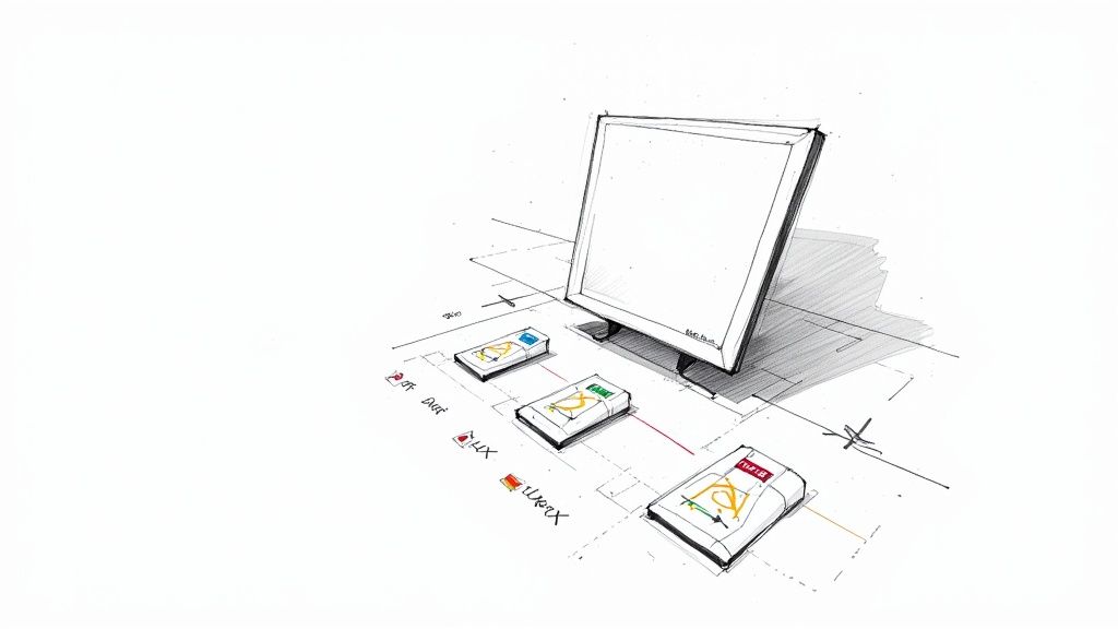
Next, nail down a consistent visual style. Are you going for minimalist line art, colorful flat designs, or something more illustrative? This choice has to align with your brand's personality and the overall look of your interface. For our app, we’ll aim for a clean, line-art style to give it a modern, professional vibe.
This image shows a simple, three-step way to think about applying color consistently across different file types.
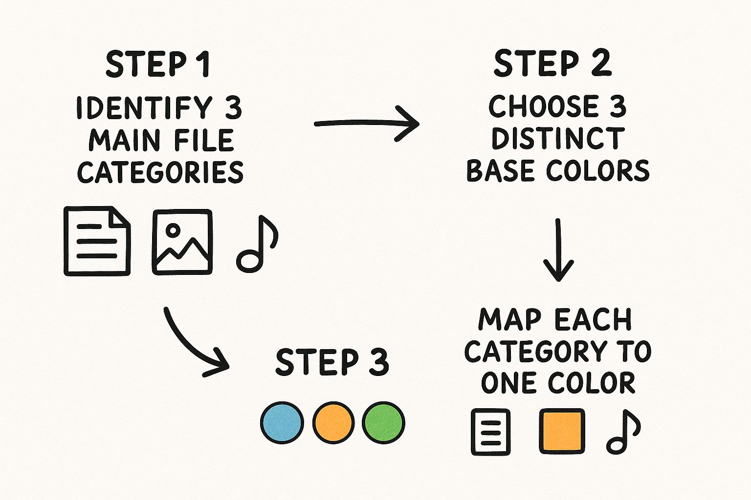
As you can see, assigning a specific color to a category—like blue for documents or purple for images—creates a super intuitive visual shortcut for your users.
Sketching and Ideation
With a plan in hand, fight the urge to go straight to your design software. The best ideas almost always start on paper. Sketching is a low-stakes, high-reward part of the creative process that lets you explore concepts fast without getting bogged down by digital tools.
Grab a pen and paper and just start brainstorming visual metaphors for each file type. How can you represent a spreadsheet in a fresh way? What small detail could differentiate a JPG from a PNG?
This early brainstorming is where you refine your concepts. It’s a whole lot easier to scribble out a bad idea on paper than it is to delete a vector asset you just spent an hour perfecting.
For our project, let's say the base icon for all files is a simple document shape with a folded corner. From there, we can sketch unique identifiers inside that shape—a few lines for a DOCX, a mountain silhouette for an image, or simple geometric shapes for a presentation. This approach gives you a consistent "family look" while keeping each icon distinct. If you want a deeper dive, our article on how to make custom icons has more tips on the creative process.
Vector Design Workflow in Figma
Once you're happy with your sketches, it's time to bring them to life as vectors. Using a tool like Figma, Adobe Illustrator, or Sketch is non-negotiable here. Vector graphics (SVGs) can be scaled to any size without losing quality, which is essential for responsive design.
Let's walk through the process in Figma using our project management app icons:
- Create a Base Component: Start by designing the universal document shape with the folded corner. Immediately turn this into a main component. This is a huge time-saver, as any change to this one shape will update across all your icons.
- Build Out Variants: Create instances of your base component for each file type. Now, add the unique identifiers you sketched out. For the DOCX icon, drop in a few horizontal lines. For the XLSX icon, a simple 3x3 grid will do the trick.
- Establish a Grid: Design everything on a strict pixel grid (a 24x24 pixel artboard is a common standard) to keep your icons sharp and aligned. Use consistent stroke weights and corner radii across the entire set for that polished, harmonious look.
- Apply Color Systematically: Pull from the color palette you decided on earlier. Maybe all document-related icons get a blue accent, while all image files get a purple one. This reinforces the visual categories you planned from the start.
This component-based method is incredibly efficient and ensures every icon shares the same DNA, creating a professional and unified look across your entire app.
Exporting for Implementation
The final step is getting your icons out of the design tool and into the hands of developers. A sloppy export can ruin all your hard work, leading to blurry or incorrectly sized icons in the final product.
Here are the best practices for exporting your new file type icons:
- For Web (SVG): The gold standard here is SVG (Scalable Vector Graphics). It’s a tiny file size, it's infinitely scalable, and you can even style it with CSS. When exporting from Figma, always check the "Outline Stroke" option to convert lines into filled shapes. This prevents any weird rendering issues in the browser.
- For Native Apps (PNG): Mobile apps often need PNGs at multiple resolutions to look sharp on different screen densities (you'll see folders for 1x, 2x, 3x). Export your icons at these various sizes to ensure they look crisp on everything from older phones to high-resolution tablets.
By following this structured path—from planning your system to exporting with care— you'll create a custom set of file type icons that is professional, cohesive, and genuinely improves the user experience.
Getting Icons into Your UI for the Biggest Impact
So you’ve designed a beautiful set of file type icons. That's a huge win, but the job's not done yet. The real magic happens when you implement them thoughtfully. A great icon in the wrong place can be just as confusing as a bad one, so integrating these little visual cues seamlessly is what turns them from just graphics into powerful tools for your users.
Think of it like organizing a workshop. It’s not enough to have the best tools; you have to put them where you can find them, make them easy to grab, and keep the space from getting cluttered. The same ideas apply when placing icons in your UI.

Nail Down Your Sizing and Spacing
Visual consistency is everything. If your icons are all different sizes with random spacing, the whole interface starts to feel chaotic and a bit sloppy. This visual mess actually makes users work harder to figure out what they’re looking at, which completely defeats the purpose of using icons in the first place.
The best way to keep things tidy is to set some ground rules in your design system. This becomes the single source of truth for both designers and developers, making sure everyone is on the same page.
Here’s what your guidelines should cover:
- Standard Dimensions: Pick a few fixed sizes for your icons (like 16px, 24px, and 32px) and stick to them. This stops icons from looking awkwardly huge or tiny in different parts of your app.
- Clear Padding Rules: Every icon needs a little "breathing room" around it. This negative space is crucial for making things easy to read and keeps the UI from feeling claustrophobic.
- Consistent Alignment: Make sure every icon lines up perfectly with its text label. This creates a clean, straight line for the eye to follow, which is especially important in lists.
Have a Plan for Unknown File Types
No matter how many icons you create, someone will eventually upload a file format you've never heard of. If you haven't planned for that, your UI can look broken, showing a blank space or a generic "missing image" symbol. This immediately makes your app feel less polished and trustworthy.
The solution is simple: always design a generic or "unknown" file type icon. This acts as a graceful fallback. It keeps your layout intact and tells the user, "We see your file, we just don't have a special icon for it." A good generic icon is usually simple and neutral—think of a blank page—so it fits in without causing a fuss.
A well-designed generic icon is your UI’s safety net. It keeps the user experience professional and consistent even when the unexpected happens, preventing those visual glitches that can really hurt user confidence.
Always Pair Icons with Text for Accessibility
Icons are fantastic visual shortcuts, but they should never be the only way to convey important information. If you rely only on a symbol, you're leaving out users who don't recognize it or people who use screen readers.
That’s why file type icons must always be accompanied by a clear text label, which is almost always the filename itself. This duo is a powerhouse for a few reasons:
- It Includes Everyone: It ensures that all users, including those with visual impairments, know exactly what the file is.
- It Removes Guesswork: A filename gives you specific details that even the cleverest icon can't communicate.
- It Boosts Scannability: The eye catches the icon first as a visual cue, and the text provides the quick confirmation.
This pairing creates a system that's robust, accessible, and understandable for absolutely everyone.
Keep an Eye on Web Performance
On the web, every kilobyte matters. If your interface has to load dozens of individual icon files, it can create a traffic jam of server requests, slowing down your page and frustrating users. Thankfully, we have some great techniques to avoid this performance hit.
The most popular approach is using SVG sprites. A sprite is basically one big SVG file that contains all of your smaller icons. The browser downloads that single file just once, then plucks out the specific icon it needs by referencing its ID. This trick reduces all those separate HTTP requests down to just one. Icon fonts work in a similar way, bundling icons into a font file. Both methods help ensure your interface stays snappy and responsive, no matter how many icons you're using.
Common Mistakes to Avoid in Icon Design
When you're designing file type icons, knowing what not to do is just as important as knowing what you should do. Even the best intentions can lead to a design that just plain frustrates people. Let's walk through some of the most common traps designers fall into.
The biggest mistake? Overly complex designs. It's tempting to create a mini-masterpiece, but an icon's job is to be a quick, recognizable symbol, not a detailed illustration. Piling on gradients, shadows, and tiny details might look great when it's blown up, but at the small sizes where icons actually live, it just turns into a confusing mess. Simplicity is what makes an icon instantly readable.
Another classic error is an inconsistent visual style. Imagine a user interface where some icons are simple line drawings, others are colorful and flat, and a few are fully illustrated. It feels disjointed and unprofessional, kind of like using five different fonts on one page. This visual chaos breaks the user's flow and makes your entire system feel less trustworthy.
Maintaining Clarity and Convention
You can't talk about icon mistakes without mentioning color. The cardinal sin here is low color contrast. A light gray icon on a white background, for example, might as well be invisible to users with vision impairments. Legibility has to come first, and that means choosing colors that stand out clearly against their background.
A successful file type icon should feel instantly familiar. When a design ignores established conventions, it forces users to stop and learn a new visual language, adding unnecessary friction to their workflow.
Finally, a surprisingly common blunder is simply ignoring platform conventions. People are creatures of habit. They know what to expect from their operating system, whether it’s Windows or macOS. Think about the little icon overlay on a thumbnail in Windows—that's a familiar cue.
When you create icons that completely break from these established norms, you're not being innovative; you're just causing confusion. The best designs work with the visual language users already understand, making your icons feel like a natural part of the experience, not some clunky add-on.
A Few Common Questions About File Type Icons
As you start working with file type icons, a few practical questions always seem to pop up. Let's tackle some of the most common ones that designers and developers run into.
What’s the Best Format for Web Icons?
Hands down, SVG (Scalable Vector Graphics) is the way to go for the web. Because they’re vector-based, SVGs can be stretched or shrunk to any size without losing a drop of quality. They’ll look sharp and clean on a tiny phone screen and a giant retina display.
On top of that, SVGs usually have tiny file sizes. You can even style them with CSS, which makes them incredibly flexible and efficient for any modern website.
Should I Put Text Inside an Icon?
It's tempting, but it's almost always a bad idea to bake text like "PDF" or "DOC" directly into the icon graphic. This can make the icon really hard to read, especially when it’s scaled down to a small size.
A strong, easily recognizable visual metaphor is much more effective. The filename and extension should always be displayed as actual text next to the icon. This keeps things clear and accessible for everyone.
This also makes your life way easier if you’re building an app for a global audience. You won't have to create a new set of icons for every language.
How Do I Make Icons Work for Light and Dark Modes?
The secret here is to keep it simple. Design your icons using a single, neutral color—think a mid-tone gray that shows up well against both light and dark backgrounds. This gives you a great starting point.
When you're using SVGs, you can use a little CSS magic to change the icon’s color depending on the user's theme. For instance, you could set the icon to a dark gray for light mode, and then have it automatically switch to a light gray or white for dark mode. This approach is much more reliable than using complex colors or shadows that might look weird in one theme.
Ready to stop hunting for the perfect icon and just create it? With VibeIcons, you can generate custom, AI-powered icons that slot right into your design system. Give it a try and get your first five icons for free.