How to Conduct Usability Testing That Gets Results
Learn how to conduct usability testing from planning to analysis. This guide offers actionable advice for uncovering insights that improve your product.
So, you want to run a usability test. The basic flow is pretty straightforward: you plan the study, recruit the right people, run the test sessions, and then analyze what you've found. It's a simple cycle that takes you from guesswork to solid evidence, making sure the product you’re building is one people can actually, and hopefully, enjoy using.
Why Usability Testing Is a Non-Negotiable
In a market this crowded, launching something based on a gut feeling is like burning money. Usability testing is what separates the products that stick from the ones that get forgotten. It's more than just a box-ticking exercise in QA; it's a strategic move that validates your ideas and makes sure you’re actually solving a real problem for real people.
Skipping it means you're flying blind. You're just hoping your design choices land, which is a massive gamble. The real goal here is to stop thinking of testing as an extra cost and start seeing it for what it is: your best tool for reducing risk. It helps you catch those glaring, expensive flaws before a single line of code is shipped, saving your team from headaches and rework down the road.
Let's quickly map out the journey ahead. This table breaks down the core stages we'll be covering, giving you a high-level look at the process from start to finish.
Quick Guide to the Usability Testing Process
| Stage | What You'll Accomplish |
|---|---|
| Planning | Define clear goals, identify target users, and write your test script. |
| Recruiting | Find and screen participants who match your ideal user profile. |
| Execution | Conduct the test sessions, observing users and gathering qualitative data. |
| Analysis | Synthesize your findings, identify key pain points, and create actionable recommendations. |
This roadmap provides the structure, but the real magic happens when you move from internal debate to external observation.
Moving Beyond Assumptions
Every product team I've ever worked with thinks they know what their users want. It's natural. But the "false consensus effect"—where we project our own behaviors and beliefs onto others—is a classic trap that leads to features nobody asked for. Usability testing is the antidote to this bias.
- You get objective evidence. Watching someone use your product gives you concrete data, replacing "I think..." with "I saw..."
- You find the real friction points. You can see exactly where people get stuck, frustrated, or confused, which lets you prioritize the most critical fixes.
- You build user confidence. When a product is intuitive and easy to use, it builds trust. That trust is what turns a one-time visitor into a loyal customer.
This is the whole point of the Plan, Test, and Analyze workflow.
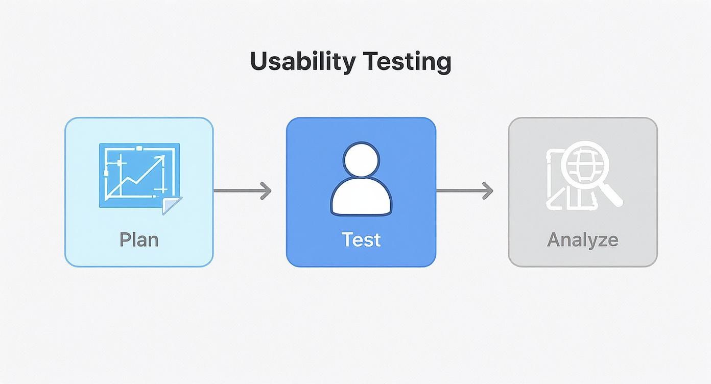
This structured approach is how you turn a bunch of observations into real product improvements. And it's not just a niche practice anymore. The global market for usability testing tools was valued at USD 1.28 billion in 2024 and is expected to soar to USD 6.55 billion by 2033. That's not just growth; it's a massive industry-wide shift toward putting users first.
The biggest lesson you'll learn from usability testing is that what you expect users to do and what they actually do are often two very different things. The only way to know for sure is to watch them.
Ultimately, putting money and time into testing is an investment in your bottom line. It has a direct line to customer satisfaction, retention, and conversions. These foundational principles are key to building products that don't just work, but feel effortless. If you're looking to go a bit deeper, you can also check out our guide on user experience design best practices.
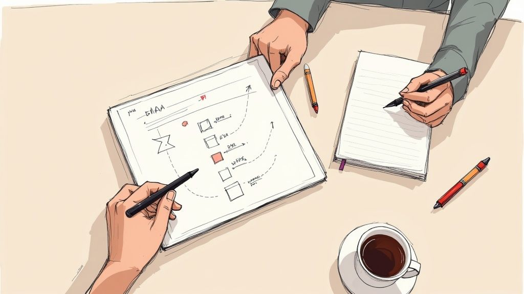
Building a Rock-Solid Test Plan
Great insights don't just happen. They're dug up through a deliberate, well-structured plan. Without one, you’re just collecting random opinions that won't lead anywhere meaningful. Your test plan is the blueprint for the entire study, making sure every minute you spend is focused, efficient, and aimed squarely at your most burning questions.
Jumping into sessions without this roadmap is a classic mistake. You’ll end up with murky results and a lot of wasted time. A solid plan gets your team on the same page, defines what a "win" looks like, and turns a vague goal like "test the website" into a sharp, strategic investigation.
Start with Sharp Research Questions
Before you even think about writing tasks, you have to know what you’re trying to learn. Fuzzy objectives like "see what users think" are a dead end. You need to frame your goals as specific, answerable questions that get right to the heart of a business or user problem.
These research questions are the bedrock of your plan. Everything else—from the tasks you design to the metrics you track—is built on top of them.
- Weak Question: "Do users like the new dashboard?" (This is just a yes/no question; it doesn’t tell you why or how.)
- Strong Question: "What's the first piece of information users look for when they land on the new dashboard?"
- Strong Question: "Where do users stumble when they try to create a custom report?"
The stronger questions demand that you observe behavior, not just collect opinions. They force you to hunt for friction points and moments of confusion, which is exactly why you're doing this in the first place.
Your goal isn't to ask users for solutions. It’s to find the problems they're facing so your team can design brilliant solutions.
Honing in on just a few key questions will keep your study tight and focused. It's always better to answer two important questions thoroughly than to get shallow answers for ten.
Crafting Scenarios and Tasks That Feel Real
Once your research questions are locked in, it's time to translate them into realistic scenarios and tasks for your participants. This is where so many test plans miss the mark. Generic instructions lead to artificial, unhelpful behavior.
A scenario gives the user context and a reason to care. Think of it as a short, relatable story that puts them into a real-life situation.
A task is the specific action you want them to take within that scenario. It needs to be crystal clear, but you have to be careful not to give away the answer by using your internal product jargon.
Here’s a simple example for an e-commerce site:
| Element | Weak Example | Strong Example |
|---|---|---|
| Scenario | You are on our website. | You’ve just finished a workout and realize you’re out of protein powder. You need to order more for delivery this week. |
| Task | Add a product to your cart. | Find a vanilla-flavored whey protein and add it to your cart. |
The strong example gives the user a genuine purpose. It mimics how someone would actually think and behave, which is how you get authentic insights. Designing these believable scenarios is a core part of the product validation process, and you can learn more by exploring some rapid prototyping techniques.
Define What Success Looks Like
How will you know if someone actually completed a task? You have to decide on your success metrics before you start testing. This crucial step prevents you from letting your own biases color your interpretation of the results later on.
A good mix of quantitative and qualitative metrics works best:
- Task Completion Rate: This one’s the most straightforward. Did they do it or not? A simple yes/no.
- Error Rate: How many wrong turns did they take? This could be anything from clicking the wrong button to going down a completely incorrect path.
- Time on Task: How long did it take? A task that takes 5 minutes when you expected 30 seconds is a huge red flag for friction.
- Subjective Feedback: After each task, ask a simple follow-up question, like, "On a scale of 1 to 5, how easy or difficult did that feel?"
Laying out these metrics provides a consistent framework for analyzing every single session. When everyone on your team is looking for the same things, your final analysis becomes much more reliable. This is what separates professional user research from just casually asking for feedback.
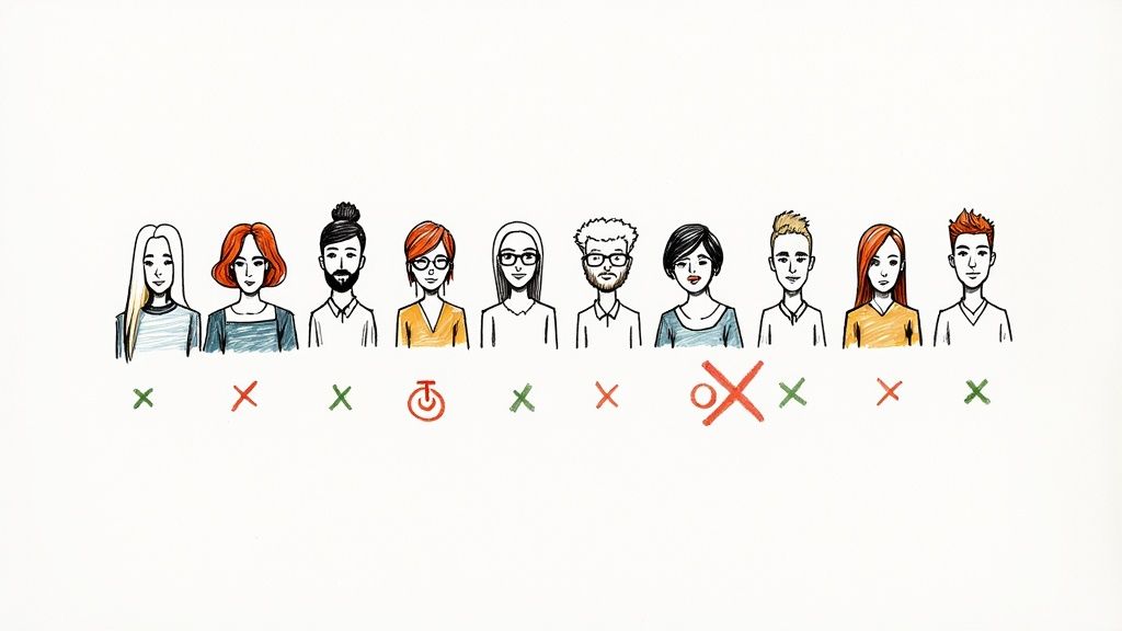
Finding People Who Mirror Your Real Users

The insights you get from a usability test are only as valuable as the people you test with. It’s a simple truth, but one that gets overlooked all the time. If you recruit participants who don't reflect your actual user base, you're just asking for misleading feedback and will end up solving problems that don't even exist.
Your goal is to find individuals whose behaviors, motivations, and tech-savviness genuinely line up with your real-world customers. Nailing this step prevents you from accidentally optimizing your product for the wrong crowd. Imagine testing a complex developer tool with folks who only casually use computers—their feedback, while honest, would be totally irrelevant to your actual audience. This is exactly why recruitment is such a critical make-or-break moment.
Where to Find Your Testers
So, where do you actually find these people? It can feel like searching for a needle in a haystack, but you have a few go-to channels. I've found that using a mix of these works best, depending on your timeline and budget.
- Your Existing User Base: This is your goldmine. These people already use your product and can offer incredibly relevant, contextual feedback. A quick email to your newsletter subscribers or an in-app message usually does the trick. Offering a small incentive like a gift card or some account credit goes a long way.
- Professional Recruiting Services: When you're short on time or need to find a very specific profile, services like UserTesting or Respondent are fantastic. They have huge pools of pre-screened people ready to go. It's the faster, more expensive route, but sometimes it's exactly what you need.
- Social Media and Online Communities: Don't underestimate "guerrilla" recruiting. Tapping into your network on LinkedIn or finding niche communities on Reddit can be a surprisingly effective and budget-friendly way to find participants, especially for B2C products or tools aimed at hobbyists.
I've seen teams make the same mistake over and over: they focus too much on demographics. A "30-year-old project manager from New York" sounds specific, but it's their behavior—how they actually manage tasks, which tools they prefer, and their comfort level with technology—that tells you if they're the right fit.
No matter where you find them, always make sure the people you select match the user personas you’ve already developed. This strategy is a core part of the overall product development process steps, as it ties real user feedback directly into your next build cycle.
Writing Screener Questions That Filter for Behavior
Once you have a list of potential candidates, you need to filter them with a screener survey. Think of this short questionnaire as your bouncer—it’s there to politely turn away anyone who isn’t a good match. The secret is to write questions that qualify people based on what they do, not just who they are.
Stay away from simple yes/no questions; they're too easy to guess. Instead, frame your questions to reveal past actions and habits.
| Weak Screener Question | Strong Screener Question |
|---|---|
| Do you use project management software? (Too vague, invites a simple "yes" from anyone.) | Which of the following project management tools have you used in the last month? (Forces a specific, verifiable answer.) |
| Are you a designer? (Easy for someone to fib if they want the incentive.) | How do you typically create and share design mockups with your team? (Reveals their actual workflow and expertise.) |
A well-crafted screener ensures the feedback you collect comes from people whose opinions will genuinely improve your product. It’s all about quality over quantity.
And on that note, you might be shocked by how few people you actually need. Classic research has shown time and again that testing with just five users can uncover roughly 85% of the usability problems in an interface. This makes usability testing one of the most efficient ways to gather powerful feedback. This principle allows even teams with tight budgets to get the insights they need without breaking the bank.
How to Moderate a Usability Session and Get Truly Honest Feedback
Running a great usability session is an art form. You have to wear a lot of hats at once: you’re a host, a detective, and maybe even a part-time psychologist. The ultimate goal is to make your participant so comfortable that they forget they’re in a test and start narrating their thoughts with complete, unfiltered honesty.
That’s where you find the gold. Those raw, off-the-cuff comments are worth a hundred polite suggestions. Getting there means mastering the art of moderation—steering the conversation without leading the user, building rapport in minutes, and knowing exactly when to speak up and when to just be quiet.
Setting the Stage for Candor
I can't stress this enough: the first five minutes of a session will make or break it. This is your window to completely disarm any nervousness. Most people walk in worried they’re the ones being tested, afraid they’ll "fail" or break something. Your first job is to blow that idea out of the water.
Start by just being a normal human. Introduce yourself, thank them for being there, and explain what’s about to happen in simple, jargon-free terms. The key is to frame the session correctly by emphasizing that you’re testing the product, not them. This one little shift changes everything.
Here’s a quick script I often use to put people at ease:
- Tell them there are no wrong answers. I usually say something like, "There's nothing you can do wrong here. In fact, the more we see you stumble, the more we learn. Your honest feedback is the most helpful thing you can give us."
- Encourage them to think out loud. You can frame it as a running commentary. "As you go through this, could you try to speak your thoughts out loud? Just tell me what you're looking at, what you’re trying to do, and what you expect to happen."
- Give them permission to be brutally honest. I’ve found that directly saying, "Please don't worry about hurting my feelings—or the designer's feelings," gives them the freedom to share tough criticism they might otherwise hold back.
This isn't just about being nice; it's a strategic move to unlock real, genuine behavior.
Guiding Without Leading the Witness
Once the test is underway, your biggest challenge is to observe without influencing. The second you drop a hint or use your company’s internal jargon, you’ve tainted the data. Your role is to ask probing, open-ended questions that get to the "why" behind what someone is doing.
This means you have to kill the "yes" or "no" questions. Instead, use prompts that force them to explain their thinking.
| Instead of This (Leading Question) | Try This (Open-Ended Question) |
|---|---|
| "Was that button easy to find?" | "Tell me what you were looking for on this page." |
| "So you'd click 'Settings' next, right?" | "Where would you go from here?" |
| "Did you like that feature?" | "Walk me through your experience with that feature." |
This approach keeps the focus squarely on their mental model, not yours. When a user gets stuck, your gut will scream at you to help them. Don't do it. Let them sit in that struggle for a moment. That friction is a critical data point.
Embrace the awkward silence. When a user goes quiet, resist the urge to fill the void. Give them a few seconds of space to process. More often than not, the most profound insights come tumbling out right after a moment of quiet thought.
Letting them sit with their confusion often prompts them to perfectly articulate the problem you're trying to find. If they’re truly stuck, a gentle nudge like, "What's on your mind right now?" is all you need.
The Power of a Good Observation Team
Not all feedback is spoken. A user’s body language—a sigh, a furrowed brow, a hesitant mouse movement—tells a story all its own. This is exactly why it’s so valuable to have a dedicated note-taker.
As the moderator, your job is to stay 100% engaged with the participant, maintaining rapport and keeping the conversation moving. The note-taker, on the other hand, is the silent scribe, capturing every little detail.
Here's how we typically structure our observation team for success:
- The Moderator (or Facilitator): This is the only person who interacts with the participant. They run the show, ask the questions, and keep things on track.
- The Primary Note-Taker: This person is laser-focused on documenting key observations, direct quotes, and user actions. They capture raw data, timestamping critical events and noting where users struggle or succeed.
- Observers (Optional but recommended): Get your designers, developers, and PMs to watch silently. It’s crucial they keep their cameras and mics off so they don't intimidate the participant. They can feed questions or observations to the moderator through a private chat.
This structure allows you to collect incredibly rich data without derailing the session. The moderator handles the human connection, while the team gathers the evidence you need to build a better product.
From Raw Notes to Actionable Insights

You’ve finished the last usability session. Great. Now comes the hard part. You're probably staring at a pile of scribbled notes, chat logs, and hours of video. This raw data is brimming with potential, but right now, it’s just noise. The real magic happens when you turn this chaos into a clear, compelling story that forces your team to take action.
This is the synthesis phase. It’s where you stop looking at individual comments and start seeing the bigger picture. You're connecting the dots to find the why behind what people did. Just listing out everything that went wrong isn't helpful. Your job is to build a narrative that helps everyone understand the core problems and actually feel motivated to fix them.
Finding the Patterns in the Noise
First things first: get all your observations into one place. I don’t care if you use a spreadsheet, a digital whiteboard like Miro, or a wall full of sticky notes. The goal is to get a bird's-eye view of everything you saw and heard. Go through your recordings for each participant and jot down every significant observation, quote, or pain point on its own "card" or note.
Once it's all laid out, it's time for some affinity mapping. It sounds fancy, but it's a dead-simple technique for grouping related things together.
- Did three different users completely miss the "Export" button? Boom, that's a cluster.
- Maybe four people mentioned that your onboarding tutorial was more confusing than helpful. That’s another one.
- Don't forget the good stuff! If two people lit up over a specific animation, group that too—it’s a positive theme worth protecting.
As you start dragging these notes together, you'll see high-level patterns jump out at you. These clusters are the beginning of your insights. You can finally stop saying "one user said this" and start saying, "60% of participants struggled with the primary navigation," which is a statement no one can ignore.
Prioritizing What to Fix First
Okay, you've identified the big issues. The problem is, you probably have a laundry list of them—far more than your team can tackle in the next sprint. This is where you have to get ruthless with prioritization. Not all usability problems are created equal. A typo on the "About Us" page is an annoyance; a broken checkout flow is a five-alarm fire.
You need a simple way to rank these issues. A common-sense approach is to categorize each finding based on how badly it torpedoes a user's attempt to get something done. This helps the team focus their limited time and energy where it truly matters.
A Simple Issue Severity Scale
Use this framework to categorize findings and help your team decide what to fix first.
| Severity | Meaning | Example |
|---|---|---|
| Critical | Stops users from completing a core task. There is no way around it. | The "Add to Cart" button is completely broken and doesn't respond. |
| High | Causes serious frustration and makes a core task a real slog to finish. | The search bar is hidden, forcing users to manually browse hundreds of products. |
| Medium | A minor issue that causes some friction but doesn't stop the user cold. | A form field rejects a common email format, forcing the user to try another. |
| Low | A cosmetic problem or small inconvenience with almost no impact on the user's goal. | There's a spelling mistake on a non-critical marketing page. |
A simple table like this transforms a messy list of complaints into a clear-cut action plan. It allows you to make objective decisions, ensuring you put out the biggest fires first instead of getting bogged down by trivial stuff.
Crafting a Compelling Report
Your last job is to share what you've learned in a way that people will actually listen to. A 50-page document is a great way to ensure your findings are ignored. Your goal should be a concise, visual, and persuasive summary that makes your team want to jump in and start fixing things.
Think like a storyteller. Don't just present problems; frame them as opportunities.
Instead of a dry observation like "User couldn't find the contact form," reframe it as a powerful, evidence-backed insight: "Our confusing navigation is hiding the contact form, creating a dead end for users needing support and likely costing us valuable leads."
A report that actually gets read usually includes:
- An Executive Summary: Put the most important takeaways right at the top. Don't bury the lede.
- Key Findings: Break down the top 3-5 usability issues, clearly prioritized by severity.
- Hard Evidence: For every finding, show, don't just tell. Use direct quotes and, most importantly, short video clips. Watching a real person struggle for 15 seconds is more powerful than any paragraph you can write.
- Actionable Recommendations: Don't just dump problems on the team. For each issue, offer a clear, specific suggestion for how to fix it.
This process is what turns a simple testing exercise into a genuine strategic advantage. It's an investment that pays for itself over and over. Research has shown every dollar invested in user experience can return up to $100—that's a staggering 9,900% ROI. Yet, surprisingly, only 55% of companies are currently doing any kind of online usability testing. As you can see from this research on usability testing ROI on userlytics.com, this leaves a massive opportunity on the table for those who take it seriously.
Common Usability Testing Questions Answered
https://www.youtube.com/embed/WG6uKQjOhaU
Even the best-laid plans come with questions, especially if your team is just getting into the swing of usability testing. Let's walk through some of the most common hurdles I see teams face. Getting these details right is a huge part of learning how to run tests that actually deliver results.
One of the biggest myths is that usability testing has to be expensive. I’ve seen teams get paralyzed thinking they need a huge budget, but that’s just not true. You can absolutely get powerful insights without breaking the bank.
Simple methods like guerrilla testing—literally just asking people at a coffee shop for five minutes of their time—or recruiting from your own email list with a small gift card can be incredibly effective. The most important thing is to just start. Don't let a small budget stop you from learning.
How Many Users Do I Really Need to Test?
This is the million-dollar question, and the answer almost always surprises people. You don't need a massive sample size to find the biggest problems. In fact, foundational research has shown that testing with just five users is enough to uncover about 85% of the major usability issues.
You hit a point of diminishing returns way faster than you’d think. Your first few users will trip over all the most significant hurdles. After five, you're mostly just going to see the same problems pop up again and again, which is good confirmation but not new information.
This "rule of five" is what makes testing so accessible. It means you can get solid, actionable data in a day or two instead of spending weeks recruiting and testing. The only major exception is if you have very distinct user groups—say, buyers and sellers on an ecommerce site. In that case, you’ll want to test five users from each group to cover your bases.
What Is the Difference Between Moderated and Unmoderated Testing?
Choosing between these two really comes down to what you're trying to learn. They're both incredibly useful tools, but they solve different problems.
Moderated Testing: Think of this as a conversation. A facilitator is right there with the participant, either in person or on a call, guiding them through tasks. This lets you ask clarifying questions and really dig into why they’re doing what they’re doing. It’s my go-to for exploring complex tasks or early-stage concepts.
Unmoderated Testing: Here, users are on their own. They complete a set of tasks whenever they have time, and software typically records their screen and voice. This approach is much faster and more affordable, making it perfect for getting quick feedback on a specific design or collecting data from a larger group.
If you need to understand the nuances of a user's journey, go with a moderated session. If you just need to know whether people can successfully complete a checkout flow, an unmoderated test will give you that answer quickly and at scale. Honestly, the most effective teams I've worked with use a mix of both throughout their design process.
Finding the right icons for your prototypes and final designs shouldn't slow you down. With VibeIcons, you can generate high-quality, AI-powered icons in seconds that perfectly match your existing libraries. Stop searching and start creating. Generate your first icons for free at https://www.vibe-icons.com.