How to Make a Vector From Scratch
Learn how to make a vector graphic from start to finish. Our guide covers Illustrator and Figma for creating professional, scalable icons and designs.

If you're looking to create your own vector graphics, the first thing to grasp is what makes them so different from regular images. Vectors aren't built from pixels; they're constructed from mathematical paths. This fundamental distinction is why they can be scaled to any size without losing an ounce of quality, making them the go-to for logos, icons, and any design that needs to be versatile.
What Are Vector Graphics and Why Should You Use Them?

Before we fire up any design software, it's crucial to understand what separates a vector from the everyday images you see online, like JPEGs or PNGs. Those are called raster images, and they’re made from a fixed grid of tiny squares, or pixels. When you try to make a raster image bigger, the software has to guess how to fill in the new space, which is why you end up with a blurry, "pixelated" mess.
Vectors are a completely different beast. They're defined by mathematical equations that create points, lines, and curves on a coordinate grid. That's the secret sauce behind their incredible flexibility.
Think of a vector graphic as a set of instructions. The file tells the computer, "Draw a line from this coordinate to that one, make it 2px thick, and then fill the shape you just made with blue." Since it's all based on math, you can scale it from a tiny app icon to a massive billboard, and it will redraw itself perfectly every single time.
This infinite scalability is precisely why professionals lean on vectors for any design element that needs to work in multiple places and at various sizes.
The Core Components of a Vector
Every vector image, no matter how intricate it looks, is pieced together from a few fundamental building blocks. Getting comfortable with these is your first real step toward mastering vector creation.
- Paths: These are the outlines that make up every shape in your artwork. A path can be open, like a simple wavy line, or closed, like a circle or a star.
- Nodes (or Anchor Points): These are the individual points along a path that you can grab and manipulate. By moving a node or its handles, you control the shape's curves, corners, and length.
- Fills and Strokes: A fill is the color, pattern, or gradient inside a closed path. A stroke, on the other hand, is the visible outline of a path. You can control its color, thickness (weight), and even its style (like a dashed line).
It’s a bit like a high-tech connect-the-dots game. By adding, removing, and adjusting nodes and paths, you can craft virtually any shape you can imagine.
Common Vector File Formats
When you’re ready to save your creation, you'll see a few different file types. Each one is designed for a specific job, so it pays to know which one to use.
- SVG (Scalable Vector Graphics): This is the undisputed king for web graphics. SVG files are incredibly lightweight, they can be styled with code like CSS and JavaScript, and every modern web browser supports them.
- AI (Adobe Illustrator): The native format for Adobe Illustrator. Saving your work as an AI file keeps all your layers, paths, and effects fully editable, making it perfect for your master working files.
- EPS (Encapsulated PostScript): An older but still very relevant format, especially in the world of professional printing. EPS files are great for ensuring your logo or design looks the same across different design programs and on a commercial press.
Choosing Your Go-To Vector Design Software
Picking the right software is the first real decision you'll make on your vector design journey. This choice will absolutely shape your workflow and what you can create. It's less about finding the one "best" tool and more about understanding the real-world scenarios where each one shines.
Let's break down the big three—Adobe Illustrator, Figma, and Inkscape—not by a boring feature list, but by what they're actually good for. Think of it as choosing the right tool for the job at hand.
The Industry Standard: Adobe Illustrator
For decades, Adobe Illustrator has been the undisputed king of vector graphics, especially when your final product is something you can touch. Think intricate logos, detailed character art, or anything headed for a printer—from t-shirts to massive billboards. Illustrator is simply the gold standard here.
Its power comes from its incredible depth. The Pen tool offers a level of precision that's hard to beat, and its advanced color management (hello, CMYK) and print-ready features are essential for professional graphic designers. If your work demands absolute, pixel-perfect control for physical media, Illustrator is your workhorse.
The Collaborative Powerhouse: Figma
Figma completely changed the game, especially for anyone working on screens. Its main advantage is its browser-based, collaborative core. Your whole team can jump into the same file and work together in real-time, which is a massive win for designing websites, mobile apps, and interactive prototypes.
But don't mistake it for just a UI tool. Figma's vector capabilities are surprisingly strong. When it comes to creating icon sets, web illustrations, and other digital assets, its intuitive tools and Boolean operations are quick, clean, and efficient.
If your vector work is mostly for screens and you're working with developers or other designers, Figma is almost always the smarter, faster choice. Its component system is a lifesaver for managing large design systems.
The Capable Open-Source Alternative: Inkscape
Just getting started or working on a budget? Inkscape is a fantastic, 100% free alternative. Don't let the price (or lack thereof) fool you—this open-source software packs a serious punch and has a passionate community behind it.
Inkscape is an amazing way to learn the fundamentals of vector creation without a monthly subscription. It handles all the essentials, from complex path operations to text manipulation and clean SVG exports. While the interface might not feel as polished as its paid competitors, it’s more than capable of producing professional-grade vectors.
For an even deeper look at these tools and a few others, check out our complete guide to the best vector design software. It's a great resource if you're ready to really dig in.
To help you see how these tools stack up at a glance, I've put together a quick comparison table.
Vector Tool Comparison: Illustrator vs Figma vs Inkscape
This table gives a side-by-side look at the key features, pricing, and ideal use cases for the top three vector design tools. It's a cheat sheet to help you decide which one aligns best with your projects and budget.
| Feature | Adobe Illustrator | Figma | Inkscape |
|---|---|---|---|
| Primary Use Case | Professional illustration, print design, complex logos | UI/UX design, web graphics, collaborative projects | General vector graphics, hobbyist projects, free alternative |
| Platform | Desktop (macOS, Windows) | Web browser, Desktop app | Desktop (macOS, Windows, Linux) |
| Collaboration | Limited real-time (improving) | Excellent, real-time | None (local files only) |
| Pricing | Subscription-based (Creative Cloud) | Freemium model (free tier + paid plans) | 100% Free and Open-Source |
| Best For | Illustrators, print designers, branding experts | UI/UX designers, product teams, web developers | Beginners, students, anyone on a budget |
| Key Strength | Unmatched tool depth and precision | Real-time collaboration and prototyping | Powerful features at zero cost |
Ultimately, the best way to choose is to try them out. Figma and Inkscape have free options, and Adobe offers a free trial. Spend a little time with each to see which workflow feels most natural to you.
Your First Vector Icon in Adobe Illustrator
Alright, enough with the theory—let's get our hands dirty. Creating your first vector is a huge step, and Adobe Illustrator is the perfect place to start. We’re going to build a simple, clean icon from the ground up, focusing on the core tools you'll come back to again and again.
First thing’s first: setting up the workspace. Fire up Illustrator and create a new document. I find a 512x512 pixel artboard is a great starting point for a single icon. It’s big enough to let you zoom in on the details without feeling cramped, and it's a pretty standard dimension. Just make sure your color mode is set to RGB, since that's what you'll need for anything displayed on a screen.
Mastering Basic Shapes and the Shape Builder Tool
The quickest way to get comfortable with vector creation is by starting with simple geometric shapes. Seriously, almost every complex illustration you see can be broken down into basic circles, squares, and triangles. Don’t even think about freehand drawing yet; let the tools do the work for you.
This workflow is the foundation for building almost any icon. It really is that simple.
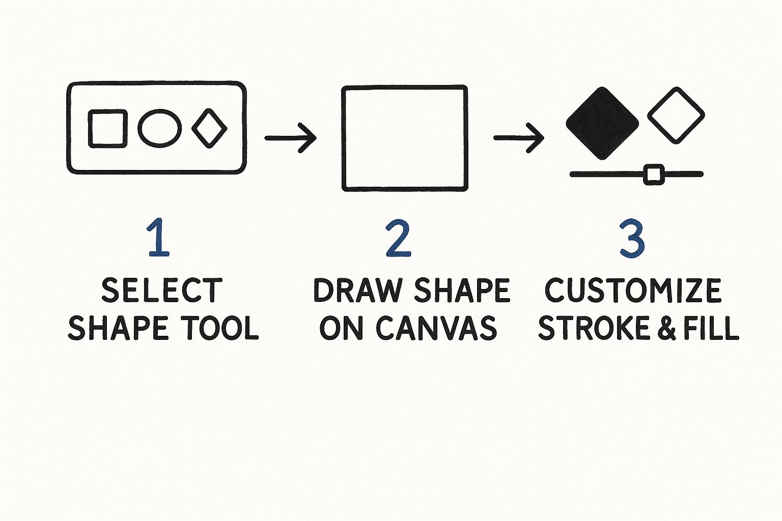
You start with a basic shape, draw it out, and then tweak its appearance with colors and strokes.
Let’s try it. Grab the Ellipse Tool (shortcut L). Hold down the Shift key while you click and drag on the artboard—this constrains the proportions and gives you a perfect circle. Now, make a second, smaller circle that overlaps the first one a bit. This is where the real fun begins.
With both circles selected (use the Selection Tool, shortcut V), it's time to find your new best friend: the Shape Builder Tool (Shift + M). When you hover over the different sections of your overlapping circles, you'll see them highlight with a mesh pattern. To merge parts together, just click and drag across them. To subtract a piece, hold Alt (or Option on a Mac) and click the part you want to zap. Go ahead and try removing the smaller circle's area from the bigger one. Just like that, you've got a perfect crescent moon.
The Shape Builder Tool is, without a doubt, one of the most powerful features in Illustrator for anyone starting out. It turns what could be a complex drawing task into a simple process of adding and subtracting, which will speed up your workflow immensely.
Drawing Precise Lines with the Pen Tool
While basic shapes are your building blocks, the Pen Tool (P) gives you total control to create custom paths and smooth, elegant curves. It works by letting you place anchor points and then adjust the Bezier curves that connect them. I'll be honest, it has a bit of a learning curve, but mastering it is essential if you want to do professional-level vector work.
To get started, select the Pen Tool. Click once on your artboard to place your first anchor point. Click somewhere else, and you've got a straight line. Want a curve? On your second click, don't let go—click and drag instead. You'll see handles pop out from the anchor point, and these are what control the arc of your curve. Spend some time just practicing simple waves and S-curves to get a feel for how it behaves.
- Clean Geometry is Key: Always try to use the fewest anchor points possible to create a shape. This isn't just for looks; it makes your final vector files smaller, cleaner, and much easier to edit down the road.
- Layer Organization: Make it a habit to name your layers from the very beginning. For a simple icon, you might just have an "Outline" layer and a "Fill" layer. Trust me, this small step becomes a lifesaver when your designs get more complex.
For a deeper look into the principles behind great icon design, check out our guide on how to create custom icon images. It’s packed with useful tips on style and consistency.
Finally, let’s give your icon some personality with color. Select your shape and head over to the Swatches panel to apply a fill and a stroke. You can easily adjust the thickness of your outline in the Stroke panel. Play around with different color combinations and line weights until it looks just right.
Crafting Vectors in Figma for Web and UI

While Adobe Illustrator has long dominated the print world, Figma has emerged as the clear favorite for vectors meant for screens. Its whole setup—browser-based, built for collaboration—makes it the go-to for UI design. But don't sleep on its vector tools; they're surprisingly powerful and intuitive for everything from icons to full-blown illustrations.
What I love most is how quickly you can get started. There's no complex file setup. You just hit F to create a Frame and you’re off to the races. That immediate workflow is a huge part of its appeal.
Building Complex Shapes with Boolean Operations
The quickest way to get the hang of vector creation in Figma is by starting with simple shapes and combining them. Think of it like Illustrator's Shape Builder, but Figma’s Boolean operations feel more direct and, crucially, non-destructive.
Let's say you're trying to create a simple cloud icon.
- First, grab the shape tools (O for Oval, R for Rectangle) and draw several overlapping circles and rectangles.
- Move them around until you get a rough cloud-like formation.
- Select all of them, head to the Boolean groups icon in the top toolbar, and click Union Selection.
Just like that, Figma merges everything into one clean, unified vector path. It's an incredibly efficient way to build out complex shapes from basic building blocks. You can also play around with Subtract, Intersect, and Exclude to carve out pieces, like cutting the hole in a donut.
Mastering Figma's Pen Tool
When you need something truly custom, Figma’s Pen Tool (just press P) is where the magic happens. Honestly, it's one of the most intuitive Pen tools I've ever used, which makes it far less intimidating if you're new to vector work. A simple click creates a straight line; a click-and-drag creates a beautiful, smooth curve with Bézier handles.
After you've laid down your basic path, just hit Enter to jump into Edit mode and tweak every single anchor point to perfection. One of the standout features here is the Vector Network, which lets you branch multiple paths from a single point—a level of freedom you don't get in more traditional vector editors.
Here's a pro tip I live by: always use the fewest anchor points possible to define your shape. It’s not just about making it easier to edit later; it results in a much cleaner and more optimized SVG file for the web.
Creating Reusable Icons with Components
This is where Figma really pulls ahead, especially if you're building out an icon set or a full design system. Once you’ve designed a vector you’re happy with, you can turn it into a Component with a quick shortcut: Ctrl+Alt+K on Windows or Cmd+Option+K on a Mac.
Your original design is now the "main component." From there, you can create instances of it all over your project. The real power becomes obvious when you need to make a change.
If you edit the main component—say, rounding a sharp corner or tweaking a color—every single instance of that icon across all your designs updates instantly. This is a massive time-saver and the key to maintaining consistency without the mind-numbing task of updating each icon by hand.
When you're ready to hand things off, exporting is a breeze. Just select your vector, find the Export panel in the right-hand sidebar, and choose SVG. Figma is known for its incredibly clean SVG exports, giving developers lightweight, optimized code that's ready to go straight into a project.
Taking Your Vectors to the Next Level
Once you've got the basics down, it's time to dig into the techniques that really separate a hobbyist from a professional. This is where you move beyond simple shapes and start creating vector work that's not just good-looking, but also clean, efficient, and ready for anything.
The secret to a truly great vector lies in its geometry. I see this all the time with designers who are just starting out: they'll use the Pen Tool and add way too many anchor points. It feels like you’re getting more control, but in reality, you're just creating lumpy, difficult paths and bloating the file size for no good reason.
The hallmark of a professional vector is using the absolute minimum number of anchor points required to achieve the desired shape. This isn't just about being tidy; it's a core principle that makes your work easier to edit, smoother to animate, and faster to load.
Clean Up Your Paths, Clean Up Your Life
Always, and I mean always, take a few minutes to refine your paths after you've drawn them. In a tool like Adobe Illustrator, the "Simplify" command (found under Object > Path > Simplify) is your best friend. It’s smart enough to strip out extra anchor points without wrecking your curves. Think of it as a starting point for a quick manual cleanup.
Getting in there and manually tweaking your paths is a skill you have to develop. Zoom in close and look for those awkward bumps or redundant points. You’ll often find you can delete two or three clunky points and replace them with a single, perfectly placed one with well-adjusted Bézier handles. It’s a small step that pays huge dividends in quality.
For a much deeper look into slimming down your files, you can learn more about vector optimization techniques in our detailed guide.
Creating Depth with Gradients and Masks
Flat colors have their place, but sometimes you need to give your work some dimension. This is where gradients and masks come into play, letting you create subtle shading, highlights, and more complex visual textures.
- Gradients: Instead of a single flat color, a gradient blends smoothly between multiple colors. I use linear gradients for straightforward directional light sources and radial gradients when I need a soft, circular glow.
- Clipping Masks: The easiest way to think of a clipping mask is like a cookie-cutter. You can place any shape or group of objects "inside" another shape, and only the parts within the cookie-cutter’s boundary will show. It’s fantastic for applying patterns or textures to a specific area.
- Blending Modes: Tucked away in the Transparency panel, blending modes like Multiply, Screen, and Overlay are incredibly powerful. They control how colors of overlapping objects interact, which is perfect for creating believable shadows or luminous highlights without having to manually pick every single shade.
Finally, don't forget about organization. A well-structured file is just as critical as a well-drawn vector. Name your layers logically—think "Outlines," "Fills," and "Shadows." This isn't just for you; when you export an SVG for a developer, clean layer names and simple paths translate directly into cleaner code. A little foresight here makes everyone’s job easier.
Got Questions About Making Vector Graphics?
When you're first getting your hands dirty with vectors, it's completely normal to hit a few roadblocks. We've all been there. Let's tackle some of the most common questions that pop up so you can get past the confusion and back to creating.
Can I Just Turn a Regular Picture into a Vector?
Absolutely. The process is called image tracing, and most pro-level vector software has a tool for it. In Adobe Illustrator, for instance, the "Image Trace" feature can analyze a raster image (like a JPG or PNG) and do its best to convert it into editable vector paths.
But here’s the reality check: the results can be a mixed bag. The quality hinges entirely on your source image.
- It works great for: Simple graphics, high-contrast logos, and straightforward black-and-white illustrations.
- You'll struggle with: Detailed photos, images with subtle color gradients, or anything that's low-resolution to begin with.
For anything more complex than a basic shape, you should expect to spend a good amount of time manually cleaning up the paths and fixing the tool's mistakes. It’s a fantastic starting point, but rarely a one-click magic wand.
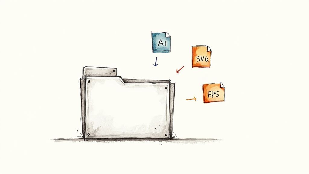
What's the Best File Format for My Vector?
The "best" format really comes down to where your vector is going to live. There isn't a single right answer, but there are definitely right choices for different situations. Always think about the end use before you hit export.
| File Format | Best For... | Why You'd Use It |
|---|---|---|
| SVG | Web design, UI/UX, and anything digital | It's lightweight, scales perfectly in browsers, and can even be styled with code. |
| AI | Your master files, sharing with other designers | It keeps all your layers, effects, and edits intact within Adobe Illustrator. |
| EPS | Professional printing and older workflows | This is a universal standard that most design software supports, making it great for compatibility. |
As a general rule, SVG is your go-to for anything that will be seen on a screen. If you're designing for print or handing off a file for someone else to edit, AI or EPS are much safer bets.
Why Does My Vector Look Blurry When I Upload It?
This is a classic—and frustrating—problem. If your vector looks blurry, it almost always means it was accidentally converted to a raster image (like a PNG or JPG) at some point. True vector files are built on math, so they should never pixelate, no matter how much you zoom in.
There are usually two culprits. First, double-check your export settings to make sure you're actually saving the file with an SVG, AI, or EPS extension. Second, investigate the platform you're uploading to. Many content management systems or social media sites automatically convert all images to raster formats for optimization. If the platform doesn't support vectors, it will force a conversion, and that's where the blurriness comes from. Always check the site's image guidelines first.
Ready to stop searching for the perfect icon and start creating it? VibeIcons uses AI to generate high-quality, style-matched vector icons in seconds. Get your first five icons for free and see just how easy it is to build out your design system.