How to Create Icon Images That Get Noticed
Learn how to create icon images that elevate your brand. This guide covers AI generation, practical design tips, and export settings for perfect icons.
Icons are so much more than just little pictures on a screen. Before we jump into the nuts and bolts of creating them, it's worth taking a moment to appreciate why they're such a massive part of modern design. A great icon does heavy lifting: it guides users, cleans up messy interfaces, and helps define your brand's personality, all without a single word.
They're basically universal symbols, which is what makes them so powerful for creating intuitive and accessible digital experiences for everyone.
Why Great Icons Are Non-Negotiable
So, why all the fuss? Think of icons as the silent workhorses of the user experience. They cut through language barriers, get complex ideas across in a flash, and create a visual shorthand that makes finding your way around an app or website feel second nature. You see a little gear icon, you know it means 'settings'. A house icon? That's 'home'. No translation needed.
This kind of instant recognition is exactly what makes the difference between an interface that feels like a chore and one that’s a joy to use. When people can navigate without thinking, they feel smarter and more in control, which is a huge win for engagement.
Driving Brand Recognition and Trust
Beyond just being useful, icons are a massive piece of your brand's visual puzzle. A custom, cohesive set of icons is like a visual signature—it makes your brand instantly recognizable. Just think about the unique icons you see from major tech companies; you know whose app you're in just by looking at them. This kind of consistency screams professionalism and builds a sense of trust.
When you invest in a thoughtful set of icons, it shows you care about the small stuff. For users, that attention to detail translates into trust, which is absolutely critical if you're a startup or a tech company trying to make a name for yourself.
Keeping Your Design Modern and Relevant
The style you choose for your icons also sends a strong message. Keeping up with design trends can make your product feel current and sharp. For instance, by 2025, the trend is leaning hard into minimalism and bold geometric shapes. This isn't just about looking cool; these clean, simple styles are proven to make interfaces less cluttered and more engaging.
This approach gives your digital product a sophisticated and trustworthy vibe. If you're curious, you can learn more about the latest icon design trends and see how to put them to work.
A thoughtfully designed icon does more than just fill space; it's a silent communicator for your brand and a crucial part of your user experience. It's the small detail that makes a big difference.
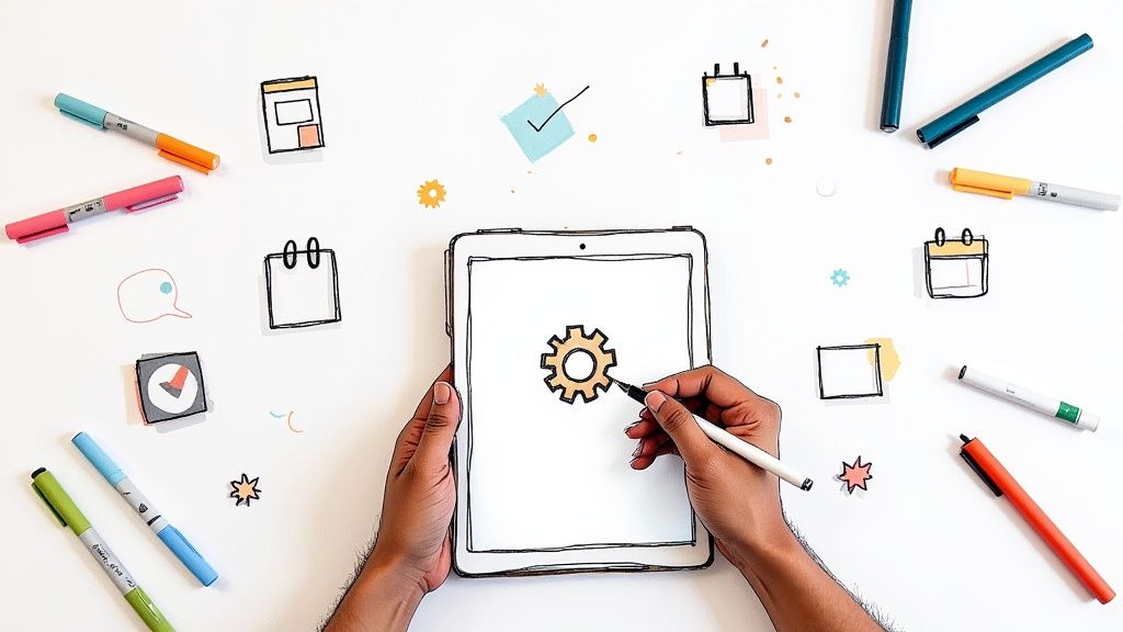
Bringing Your First Icons to Life with AI
The real power of AI icon generation kicks in when you learn how to talk to it. It’s not about code; it’s about being a good creative director. You need to take the idea in your head and describe it in a way the AI can visualize.
Let’s say you’re building a new productivity app called “Zenith.” It's all about managing tasks, tracking time, and hitting goals, so the icons need to feel clean, modern, and motivating. Just typing "a task icon" into the generator is a recipe for a generic, forgettable result. We can do much better.
Crafting the Perfect Prompt
The secret to a great result is layering your instructions. Start with your main subject, then pile on the details: style, complexity, color, perspective—anything you can think of. You're essentially giving the AI the same kind of brief you'd give a human designer.
So, instead of "a task icon," a prompt for our Zenith app might look something like this: "A minimalist checklist icon, single thin line style, with a subtle checkmark, flat design, using a calming teal and white color palette." See the difference? We’ve given the AI specific directions for every important visual element.
This kind of detail is non-negotiable. Vague prompts give you vague icons. Specific prompts are the foundation for a unique icon set that actually feels like it belongs to your brand.
A Real-World Prompting Example
Let's try this again with another icon for the Zenith app—this time, for time tracking.
- Vague Prompt: "A clock icon"
- Better Prompt: "A simple, modern clock icon, outline style"
- Excellent Prompt: "A minimalist clock icon, outline style with no numbers, thin strokes, flat 2D perspective, navy blue on a white background"
The final prompt nails it down. It defines the subject (clock), the style (minimalist, outline), specific features (no numbers, thin strokes), the perspective (flat 2D), and the exact color scheme. Getting good at AI generation is really about getting good at this process of adding more and more useful detail. If you want to dive deeper, our post on using an icon image creator has even more tips.
The quality of your AI-generated icon is a direct reflection of the quality of your prompt. Specificity isn't just a suggestion; it's the most critical ingredient for success.
Think of the process like a sketch evolving into a final design. You start with a rough idea and refine it with more detail, which is exactly what a good prompt does.
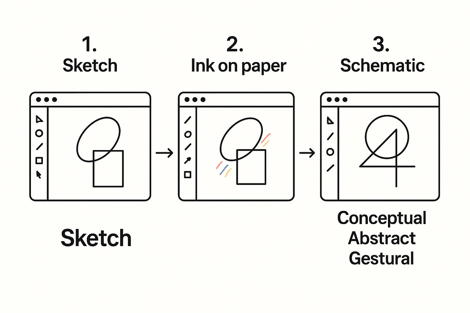
This journey from a basic shape to a polished icon is what you're guiding the AI through every time you add another keyword or stylistic instruction to your prompt.
Generating Your First Batch
Once you have a few solid prompts written down, it's time for the fun part. But don't just generate one icon and call it a day. I always recommend generating several variations for each concept.
The AI will interpret your words slightly differently each time, and creating a handful of options gives you a much better pool of creative assets to choose from.
Treat this first step like a visual brainstorming session. You’re just exploring what’s possible. Some results will be exactly what you imagined, while others might spark a new idea you hadn't even considered. The goal here isn't to get the perfect final icon on the first try, but to create a solid set of candidates that you can refine into a cohesive collection later.
Refining Your Icons with Precision Editing
Getting a great icon from an AI prompt is a solid first step, but the real artistry comes from the editing. This is where you take a promising concept and mold it into a polished asset that truly represents your brand. Think of the initial AI output as a lump of high-quality clay—now it’s time to get your hands dirty and shape it into something special.
It’s the small, intentional changes that make all the difference. Tweaking stroke weights, smoothing out a curve, or dialing in the perfect brand color—these are the details that separate a generic icon from a professional one. This level of precision is what builds a cohesive and trustworthy visual identity.
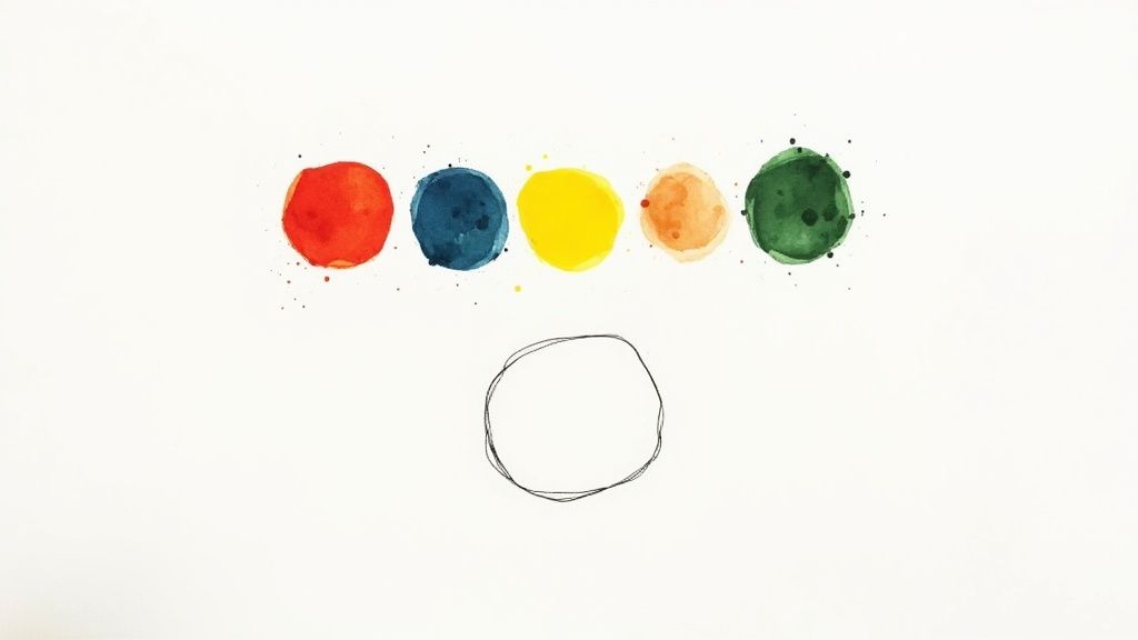
Mastering Color and Brand Consistency
Color is probably the most powerful tool you have for connecting an icon to your brand. While a good prompt can get the AI in the right ballpark, locking in your exact brand palette requires a more direct approach. VibeIcons makes this easy by letting you input specific HEX codes, guaranteeing every icon you create is a perfect match for your style guide.
This isn't just about looking good; it's about being instantly recognizable. The impact is real, too. Optimizing something as simple as an app icon can boost user acquisition by up to 25%. In crowded markets like finance apps, research has shown that vibrant, brand-aligned visuals can increase conversions by an average of 12%. It’s a clear line from precise color choices to better engagement.
If you want to get really granular with this, check out our guide on how to https://www.vibe-icons.com/blog/change-color-of-icons. It’s packed with more advanced techniques.
Adjusting Strokes and Shapes for Clarity
An icon's stroke weight—the thickness of its lines—has a massive impact on its overall feel and readability. A thick, beefy stroke can feel bold and friendly, while a thin, delicate one might communicate elegance and precision. The most important thing is to be consistent across your entire icon set.
Here’s a quick breakdown of how I think about it:
- Thicker Strokes: These are my go-to for icons that need to be crystal clear at tiny sizes, like in a mobile app’s navigation bar.
- Thinner Strokes: I save these for larger, more detailed icons where I'm aiming for a more sophisticated, refined look.
- Shape Modification: Sometimes, all an icon needs is a subtle tweak. Rounding off sharp corners can make an icon feel more approachable, while sharpening them can give it a crisp, modern edge.
The goal is to build a consistent visual language. When someone sees your icons, they should subconsciously feel like they all belong to the same family. That familiarity builds trust and makes your entire interface feel more intuitive.
Key VibeIcons Customization Features
To help you get this hands-on refinement just right, VibeIcons gives you a focused set of powerful tools. Here’s a quick look at the core features and how I use them to create truly unique icon images.
This table breaks down the most impactful tools available for your workflow.
| Feature | What It Does | Best Used For |
|---|---|---|
| Color Picker | Lets you apply colors using HEX, RGB, or HSL codes. | Matching an icon perfectly to your brand’s official palette. |
| Stroke Weight | Increases or decreases the thickness of all lines. | Ensuring legibility at different sizes and maintaining style. |
| Shape Editor | Modifies the vector points and curves of the design. | Refining small details and the overall form of the icon. |
| Background | Adds or removes a background shape and color. | Creating app icons or buttons with a consistent container. |
By really digging into these tools, you move beyond just generating icons and step into the role of a true designer. This hands-on customization is what will ultimately produce an effective icon library that stands out.
Getting Your Icons Ready for the Real World
You’ve tweaked the colors, perfected the lines, and your icon is looking fantastic. Now comes the final, crucial step: exporting it. This isn't just about saving the file; it's about making sure your hard work translates perfectly to every screen, from a tiny smartwatch to a massive 4K display.
Get this part wrong, and your sharp, beautiful icon can end up a blurry, pixelated mess. It’s the last mile of the design process, but it makes all the difference.
Choosing the right export settings directly impacts how your icons look and perform. Each file format has its own job to do, and knowing which one to pick is key to creating icons that feel truly professional.
Picking the Right File Format
When you hit "export," you'll usually be faced with three main choices: SVG, PNG, and JPG. They might seem similar, but they're built for very different things.
Here’s a quick breakdown of when to use each:
SVG (Scalable Vector Graphic): This is the undisputed champion for web and UI icons. Because SVGs are based on mathematical vectors, not pixels, you can scale them to any size without them ever getting blurry. They're also incredibly lightweight, which is a huge win for website performance.
PNG (Portable Network Graphics): The killer feature for PNG is its support for transparency. This makes it perfect for icons that need to sit on a colored background or a complex photograph without that ugly white box around them. If you need a pixel-based image with a transparent background, PNG is your go-to.
JPG (Joint Photographic Experts Group): Frankly, you should almost never use JPG for icons. It’s designed for complex, colorful images like photos. The compression it uses to keep file sizes small will create fuzzy artifacts around the simple shapes and solid colors of an icon. Just avoid it for this kind of work.
For any modern web or app project, SVG should be your default choice. Its scalability and tiny file size are non-negotiable for creating a fast, responsive experience that looks crisp on every single device.
Why SVG is More Than Just a Pretty Face
The power of SVG goes way beyond just looking sharp. Lately, designers have been tapping into its ability to handle animations and interactive effects right inside the file itself. This is a game-changer.
You get crystal-clear quality at any size, super-fast load times, and the ability to add slick animations without bogging down your site. This is a major trend, and you can dive deeper into these high-converting website icon design trends to see what's possible.
Nailing the Resolution and Sizing
Even with a scalable format like SVG, it’s smart to think about the initial size you export. Starting with common display sizes helps avoid any weird rendering glitches and ensures your icons look perfect right out of the gate.
Here are a few common scenarios and the sizes you'll need:
- Favicons: These tiny browser icons are typically 16x16 or 32x32 pixels. Simplicity is key here—intricate details will just get lost.
- App Icons: Mobile platforms like iOS and Android demand a whole set of sizes. You'll need everything from 180x180 pixels for an iPhone home screen and 192x192 for Android, all the way up to a massive 1024x1024 icon for App Store listings.
- Web UI Icons: For things like toolbars and navigation menus, 24x24 or 32x32 pixels is a great starting point. It’s big enough to be clear without taking up too much space.
By thinking through the format and the final context, you make sure all the effort you put into designing the icon actually pays off. The result? Icons that are sharp, load instantly, and create a great experience for everyone.
Building a Consistent and Mememorable Icon Set
A single great icon is good. But a whole set of icons that look like they belong together? That's where the real power lies. When your icons share a consistent visual style, they do more than just look professional—they create a predictable, intuitive experience for your users.
This turns a random collection of graphics into a true visual language for your brand.
The whole process starts by setting some ground rules that every icon will follow. Think of it as creating a mini style guide just for your icons. This way, whether you're designing a "settings" cog or a "user profile" avatar, they'll both feel like part of the same family. It’s this kind of consistency that makes a digital product feel polished and intentional.
Establishing Your Visual Language
The secret to a cohesive set is nailing the fundamentals. You’re not trying to make every icon look the same, but you want them to share a common visual DNA. It’s this underlying harmony that makes an interface feel expertly crafted and easy to get around.
Start by locking in these core principles:
- Stroke Weight: Pick a primary line thickness and commit to it. This is probably the single most effective way to tie your icons together visually.
- Geometric Foundation: Build your icons from a shared library of shapes. For example, you might decide that all rounded corners will have the exact same radius, or that all arrowheads will use a consistent angle.
- Color Palette: Don't go wild. Stick to your established brand colors to ensure every icon instantly feels connected to your brand identity.
Setting these rules upfront gives you a solid framework. It takes the guesswork out of creating new icons later on, ensuring every addition fits in perfectly with the rest of the family.
A well-designed icon set isn't just about aesthetics; it boosts usability. When users can subconsciously predict what an icon will look like, they find what they need faster. That leads to a much smoother, more enjoyable experience.
Managing and Expanding Your Icon Library
As your project gets bigger, your icon needs will too. Without a system, your library can quickly become a mess of duplicates, slight style variations, and general chaos.
First things first, get your naming convention sorted out. A filename like icon-action-save-24px.svg is infinitely more helpful than final-icon-v2.svg. It makes searching and identifying the right asset a simple task for anyone on your team. For a deeper dive, check out our guide on a proper icon clean-up for more practical tips on organizing your assets.
Also, make a habit of using your existing icons as a starting point. When a new icon is needed, don't start from a blank canvas. Grab a similar one from your library to make sure you're matching the stroke weight, corner radiuses, and overall feel. This simple discipline will help you maintain that visual harmony as your library grows from a dozen icons to hundreds.
Got Questions About Making Icons? We’ve Got Answers.
When you first dive into making icons with AI, a few questions always seem to surface. It's totally normal. Getting the hang of the little details—like what to write in your prompt or which file type to download—is what separates a decent icon from a great one.
Let's tackle some of the most common hurdles people run into when using a tool like VibeIcons. Nailing these concepts will help you create icons that look professional and perfectly match your project's vibe.
How Detailed Should My Prompt Be?
Think of your prompt as a creative brief for the AI. The more detail you give it, the closer you'll get to what's in your head. Vague prompts lead to vague, generic icons. It's that simple.
Instead of just typing "a gear icon," try getting really specific. Something like, "a minimalist, single-line gear icon with 8 teeth, flat design style, navy blue color" gives the AI much clearer instructions. You're defining the style, complexity, and color palette right from the start.
My advice? Start with a simple idea, see what you get, and then add more descriptive words to steer the next generation in the right direction.
Can I Use My Brand's Exact Colors?
Of course. This is one of the most important steps to make sure your icons don't look out of place. Color matching isn't just possible; it's a must-do for brand consistency.
Once VibeIcons generates your initial design, you jump into the customization tools. This is where you can plug in the exact HEX codes from your brand’s style guide. This little step ensures every single icon feels like a natural part of your visual identity, creating a polished and cohesive look across your website or app.
The goal is to make every icon feel like an intentional part of your brand's story. Hitting your exact brand colors is the key to making that happen.
What’s the Best File Format for Web Icons?
For almost any use on the web, SVG (Scalable Vector Graphic) is the hands-down winner. Unlike formats like PNG or JPG which are made of pixels, SVGs are built from code. This means you can stretch or shrink them to any size—from a tiny button to a huge banner—and they’ll always stay perfectly sharp.
This is a huge deal for responsive design, where your site needs to look great on a small phone screen and a giant 4K monitor. Plus, SVGs usually have tiny file sizes, which helps your website load faster for everyone. It's a win-win.
Ready to create some stunning, on-brand icons in just a few minutes? With VibeIcons, you can generate and fine-tune professional icons that fit your style perfectly. Give it a try for free and see just how easy building your ideal icon library can be. Start creating at VibeIcons.