How to Make a Vector Image in Illustrator
Learn how to make a vector image in Illustrator with our beginner-friendly guide. Master core tools, tracing, and exporting for professional results.

Vector graphics are the backbone of professional design for a reason. In Adobe Illustrator, you can create them from scratch using tools like the Pen Tool to draw precise paths, or you can convert a standard pixel-based image using the Image Trace feature.
The key difference is that vectors are built on mathematical formulas, not pixels. This means they can be scaled up or down infinitely without ever losing quality.
Why Vector Graphics Are a Designer's Secret Weapon
Before we jump into the "how," it's worth taking a moment to appreciate why vectors are so indispensable for designers. Unlike a photograph (a raster image made of pixels), a vector graphic is built from a collection of points, lines, and curves.
This might sound like a technical detail, but it’s a total game-changer in practice.
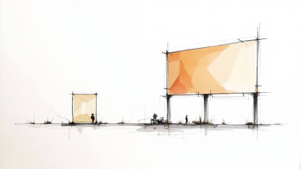
Think about designing a company logo. That single design needs to look perfect everywhere—from a tiny business card and a website header to a massive billboard. If you used a standard JPEG or PNG, blowing it up for the billboard would turn it into a blurry, pixelated disaster. A vector, on the other hand, can be resized to any dimension imaginable and will stay perfectly crisp every single time.
To make this distinction crystal clear, here’s a quick side-by-side comparison.
Raster vs Vector At a Glance
| Attribute | Raster Images (e.g., JPEG, PNG) | Vector Images (e.g., AI, SVG, EPS) |
|---|---|---|
| Composition | Made of a fixed grid of pixels | Made of mathematical paths and points |
| Scalability | Loses quality when enlarged (pixelates) | Infinitely scalable with no quality loss |
| File Size | Larger files, especially at high resolution | Generally smaller and more efficient |
| Best For | Detailed photographs, complex digital paintings | Logos, icons, typography, illustrations |
| Editability | Editing is pixel-based and can be destructive | Objects are fully editable and independent |
This table really highlights why choosing the right format from the start is so important for any design project.
The Power of AI in Vector Creation
The way we create vectors is also changing fast. While drawing by hand is still a fundamental skill, AI-powered features in Illustrator are now a huge part of the workflow. This is part of a much bigger shift in the creative world. In 2023 alone, more than 15 billion images were created using AI, a number that eclipses the entire 197-year history of photography.
This infinite scalability and editability are why vectors are the industry standard for logos, icons, and illustrations. You create it once and can adapt it for any purpose imaginable without starting over.
Once you truly grasp this core concept, you're ready to start building your own vector graphics in Illustrator.
Setting Up Your Illustrator Workspace for a Flawless Workflow
A messy workspace is a creativity killer. Before you even think about drawing your first line in Adobe Illustrator, taking a moment to organize your digital environment is probably the best thing you can do for a smooth workflow. I like to think of it like a chef prepping their station before service begins—everything you need should be right where you expect it.
First things first, create a new document by going to File > New. Right away, you have a critical choice to make: the color mode. If your design is for anything that will live on a screen (websites, social media graphics, app icons), stick with RGB. If it's destined for print, like a business card or a poster, you need to select CMYK. Getting this right from the start saves you a world of headache from color-shifting problems down the road.
Arranging Your Essential Panels
Once your artboard is ready, it's time to arrange your toolset. A well-organized workspace puts your most-used panels front and center, so you’re not constantly digging through menus. Considering that over 75% of professional designers rely on Illustrator for vector work, it pays to adopt a setup that the pros use. You can dive deeper into its industry dominance with these recent design statistics on everypixel.com.
For creating vector art, I've found a few panels to be absolutely non-negotiable. I always keep these docked and ready to go:
- Properties: This panel is a chameleon. It changes to show you the most relevant options for whatever tool or object you've selected. It's a massive time-saver.
- Layers: If you're working on anything more complex than a simple shape, the Layers panel is your best friend for keeping elements separate and organized.
- Pathfinder: This is your command center for creating complex forms by combining, subtracting, and manipulating basic shapes.
- Align: Essential for getting pixel-perfect positioning of objects, either relative to each other or to the artboard itself.
Here's a look at a clean, efficient setup with the panels docked neatly on the right.
This kind of arrangement keeps your main artboard uncluttered while giving you one-click access to the tools you'll be reaching for constantly.
Getting to Grips with Illustrator’s Core Vector Tools
Alright, your artboard is set up and you’re ready to go. Now for the fun part: actually making something. The best way to learn how to create a vector image is to just dive in and get your hands dirty with the tools. Adobe Illustrator has a ton of them, but honestly, you only need to really know a handful to build just about anything.
The Pen Tool (P) is probably the most iconic—and maybe the most intimidating—tool in vector illustration. It's the key to drawing custom shapes from scratch. You click to place an anchor point, then click and drag to create another, which pulls out handles that let you bend and shape the path between them. It takes a little practice, but once it clicks, you'll have absolute control over every curve and line.
Building with Blocks and Combining Shapes
While the Pen Tool is fantastic for freeform work, sometimes you just need a perfect circle or square. That's where the Shape Tools come in. They let you instantly create clean rectangles, ellipses, and polygons.
Think of these shapes as your raw materials. A really common and efficient workflow is to start by overlapping a few basic shapes and then merge them into a more complex design.
And for that, the Shape Builder Tool (Shift + M) is a game-changer. Once you have your shapes overlapped, just select them all, grab this tool, and drag your cursor across the pieces you want to combine. It's that simple. Want to remove a section instead? Just hold the Alt (or Option on Mac) key and click on the piece you want to delete.
This process lets you turn simple, primitive shapes into something unique and professional in just a few seconds.
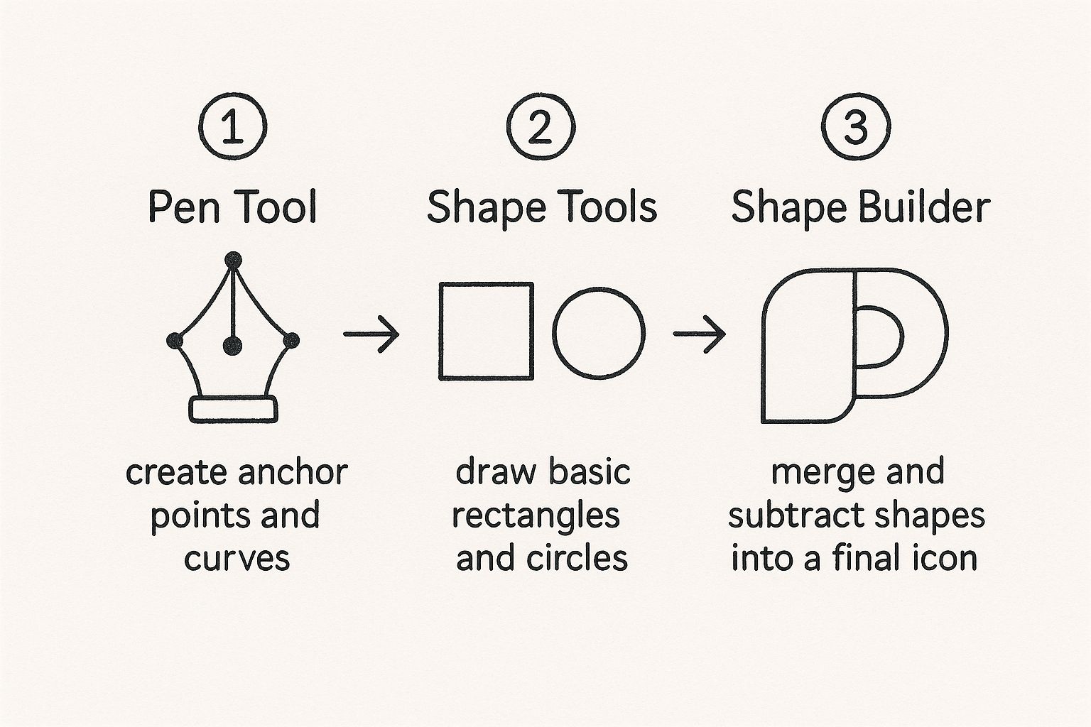
To help you keep track of these essential tools, here's a quick reference table.
Core Illustrator Vector Tools and Their Functions
| Tool Name | Primary Function | Best Used For |
|---|---|---|
| Pen Tool (P) | Draws precise paths with anchor points and curves. | Creating custom, freeform shapes and complex illustrations. |
| Shape Tools (M, L, etc.) | Creates perfect geometric primitives like rectangles and circles. | Building the foundational blocks of a logo or icon. |
| Shape Builder (Shift+M) | Intuitively merges or subtracts overlapping shapes. | Combining simple shapes into a complex, final form. |
Having a solid grasp of these three tools will form the foundation of your entire vector design workflow.
Let's Make a Quick Cloud Icon
Want to see it in action? Let's make a simple cloud icon right now.
- First, grab the Ellipse Tool (L) and draw three or four circles, overlapping them in a way that looks like the top of a cloud. Don't worry about perfection, just vary the sizes.
- Now, switch to the Rectangle Tool (M) and draw a rectangle across the bottom half of your circles to create a flat base.
- Select everything—all the circles and the rectangle.
- With everything selected, hit Shift + M to activate the Shape Builder Tool. Now, just click and drag a line through all the top parts of the circles and the rectangle to merge them into one cohesive cloud shape.
- Finally, hold down Alt/Option and click on all the leftover bits at the bottom to get rid of them.
And there you have it—a clean, simple vector cloud.
This method of combining and subtracting basic shapes is the secret to a fast and efficient workflow. It’s often quicker and yields more symmetrical results than trying to draw everything by hand with the Pen Tool.
These foundational skills aren't just for Illustrator, either. They're transferable to nearly any vector program you might encounter. If you're curious about what else is out there, our breakdown of the best vector design software can give you a great overview of the current options.
Turning an Existing Image Into a Vector with Image Trace
Sometimes, the quickest path to a vector graphic doesn't involve drawing a single line. If you've got a raster image—a JPG, PNG, or even a scanned sketch—you can use Adobe Illustrator's built-in Image Trace tool to convert it into a fully editable vector. It’s an incredibly powerful feature for digitizing hand-drawn logos or artwork without starting from scratch.
First things first, get your image onto the artboard by going to File > Place. Once it's selected, you'll see the Image Trace button pop up in your Properties panel. Clicking this is your gateway to a whole suite of presets and sliders that tell Illustrator how to turn those pixels into paths.
Getting to Grips with the Image Trace Panel
The Image Trace panel is where all the real work happens. Illustrator offers a bunch of handy presets like "Black and White Logo" or "Sketched Art," which are fantastic starting points for high-contrast, simple graphics. Often, one of these presets will get you 90% of the way there in a single click.
If you need more fine-tuned control, you can open up the advanced settings. For instance, the Threshold slider is key for black-and-white images; it dictates what becomes black and what becomes white. A lower threshold means fewer dark areas, while a higher one captures more.
Here's a look at the panel itself. You can see the various sliders for Threshold, Paths, and more that let you dial in the perfect result.
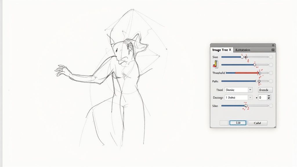
The best part is that you get a live preview, so you can tweak the settings and see the changes in real-time before committing.
Don't forget this crucial step: Once you’re satisfied with the preview, you absolutely must click the Expand button. This is what finalizes the process, converting the temporary trace into real, editable vector paths and shapes you can actually work with.
This automated approach has been a game-changer. Designers report spending roughly 30% less time on tedious manual tracing, with some even doubling their productivity on icon and logo projects. You can dive deeper into how AI is changing design on journal.everypixel.com.
After you've expanded the image, you can grab the Direct Selection Tool (A) to go in and clean things up. This lets you delete stray anchor points or smooth out any curves that didn't come out quite right. It's a fantastic way to create icons from existing images, giving you a solid base to refine and perfect.
Getting Your Vector Ready for the Real World
https://www.youtube.com/embed/Mmfu3IO3onw
Finishing the creative part of your vector is a great feeling, but the work isn't quite done. Before you can call it a day, you need to prep the file so it performs beautifully, whether it’s a logo on a website or a design on a t-shirt. This is where a good design becomes a professional one.
Polish and Tidy Up Your Artwork
Before you even think about exporting, it’s smart to clean up your file. I always start by simplifying complex paths. Head over to Object > Path > Simplify in Adobe Illustrator. This little trick reduces the number of anchor points, which shrinks your file size and makes the vector cleaner without messing up the visual design. It’s a game-changer for web graphics.
Another pro habit is organizing your work. Get comfortable with the Layers panel and group related elements together. Trust me, if you or someone else has to open that file six months from now, you’ll be grateful for the clear structure.
Choosing the Right Export Format
The final step is exporting, and picking the right file format is absolutely critical. Where your graphic is going to live determines the format you should choose. Don't just save it as the first thing you see.
- SVG (Scalable Vector Graphics): For anything on the web, SVG is the gold standard. They are incredibly lightweight, stay perfectly sharp on any screen, and can even be manipulated with CSS. This is what you want for icons and logos online.
- AI (Adobe Illustrator): This is your master file. Always, always save a native .ai version of your work. It keeps everything—layers, effects, paths—fully editable so you can easily make changes later.
- PDF (Portable Document Format): When you need to send a design to a client for review or prep a file for a printer, PDF is your best bet. It locks everything in place and preserves the look and feel perfectly.
- EPS (Encapsulated PostScript): It’s an older format, but many professional printers still prefer or even require EPS files. It's a reliable choice for high-end print jobs because of its wide compatibility.
Think of your export settings as the final quality check. A brilliantly designed vector can be ruined by the wrong format, like sending a blurry PNG to a print shop instead of a crisp PDF or EPS.
Taking the time to get these final details right ensures all your hard work pays off and your design looks flawless everywhere it’s used. If you want to dive deeper into making your files as efficient as possible, check out our other posts on vector optimization.
Answering Your Top Vector Questions
Once you start working in Adobe Illustrator, a few common questions almost always surface. Let's walk through some of the most frequent sticking points I see, so you can spend less time troubleshooting and more time creating.
Why Is My Illustrator File So Slow?
If you're noticing lag, especially with intricate designs, the culprit is often an overabundance of anchor points. Think of it this way: a clean, efficient vector uses the absolute minimum number of points to create a shape. Too many points bog things down.
Luckily, there's a quick fix. Head up to Object > Path > Simplify. This handy command will intelligently remove unnecessary anchor points without drastically changing your artwork's shape. It’s a lifesaver for complex illustrations.
My Exported Colors Look Wrong. What Happened?
This is a classic one, and it almost always comes down to the color mode. You have two main choices: RGB (Red, Green, Blue) for anything that will live on a screen, and CMYK (Cyan, Magenta, Yellow, Black) for anything destined for print.
If your web graphic looks dull or your printed flyer looks unexpectedly vibrant, you probably used the wrong mode. The best habit to get into is setting the correct color mode right when you create a new document (File > New). It saves a lot of headaches later.
Can I Edit Text in a Vectorized Image?
Technically, yes, but it's probably not what you're thinking. When you use the Image Trace feature on something containing text, Illustrator doesn't see letters—it sees shapes. The text gets converted into a collection of vector paths, meaning you can't just grab the Type Tool and fix a typo.
Your only options would be to delete the vectorized text entirely and re-type it, or painstakingly edit the anchor points of each letter. Trust me, you don't want to do that.
My rule of thumb is to always keep text as a live, editable layer in your main .ai file. Only convert it to outlines (shapes) right at the very end, and only if a printer or specific platform requires it. This preserves your ability to make easy edits.
Will Image Trace Work on a Detailed Photograph?
While Image Trace is a powerful tool, it has its limits. It truly shines with graphics that have distinct lines and a limited color palette—think logos, icons, and sketches.
It will struggle, however, to capture the thousands of subtle gradients and fine details in a high-resolution photograph. The result often looks more like a stylized illustration than a true vector copy. For photos, you're usually better off leaving them in a raster format like JPEG or PNG.
Ready to create icons that perfectly match your projects without the endless searching? With VibeIcons, you can generate high-quality, AI-powered icons that seamlessly integrate with popular libraries like Heroicons and Lucide. Get your first five icons for free and download them as SVGs or copy clean React code instantly. Start creating at https://www.vibe-icons.com.