Create Icons From Images A Practical Guide
Learn how to create icons from images with this practical guide. Turn any photo into a scalable SVG icon or React component for your next project.
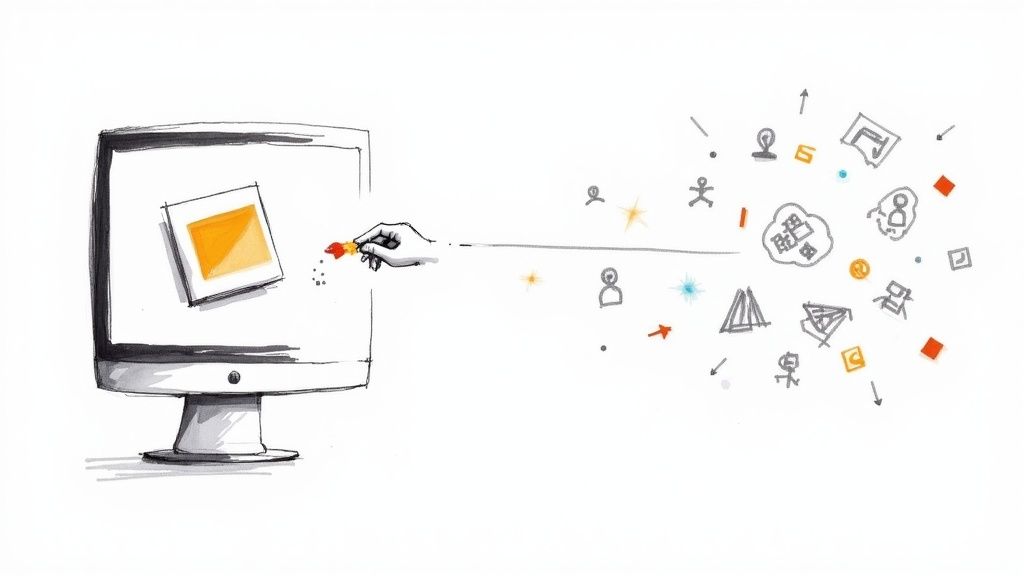
Turning a regular photo into a sharp, scalable icon used to be something you'd hire a designer for. Not anymore. With the right tools, you can create icons from images in just a few minutes—from prepping the image to exporting a finished SVG or React component.
Why Turn Photos Into Icons
At first glance, simplifying a detailed photo into a basic icon seems like a step backward. But it's actually a brilliant way to build a consistent and truly personal visual identity for your brand.
Generic icon libraries are fine, but they rarely have the exact visual you're looking for. What if you need an icon of a specific team member for an "About Us" page? Or a unique product for a features list? This is where creating icons from your own images is a game-changer. It fills the gap between generic stock icons and costly custom design work, giving your brand a personality that off-the-shelf assets just can't deliver.
The Growing Demand For Custom Visuals
The need for unique digital assets is definitely on the rise. The global market for image converters, which includes tools that create icons from images, was valued at US$127.3 million and is projected to hit US$198.4 million by 2032. This trend shows just how much people want tools that let them make custom visuals without a huge headache. You can read more about the image converters market to see the full picture.
Key Takeaway: The real advantage here is getting a unique, on-brand visual style without the high cost and long waits of traditional graphic design. It puts creative control back in your hands.
A Simple Workflow For Great Results
The whole process is much more straightforward than you might imagine. It really boils down to just a few key stages. This visual gives a great overview of the flow, from uploading your image to getting a ready-to-use icon.
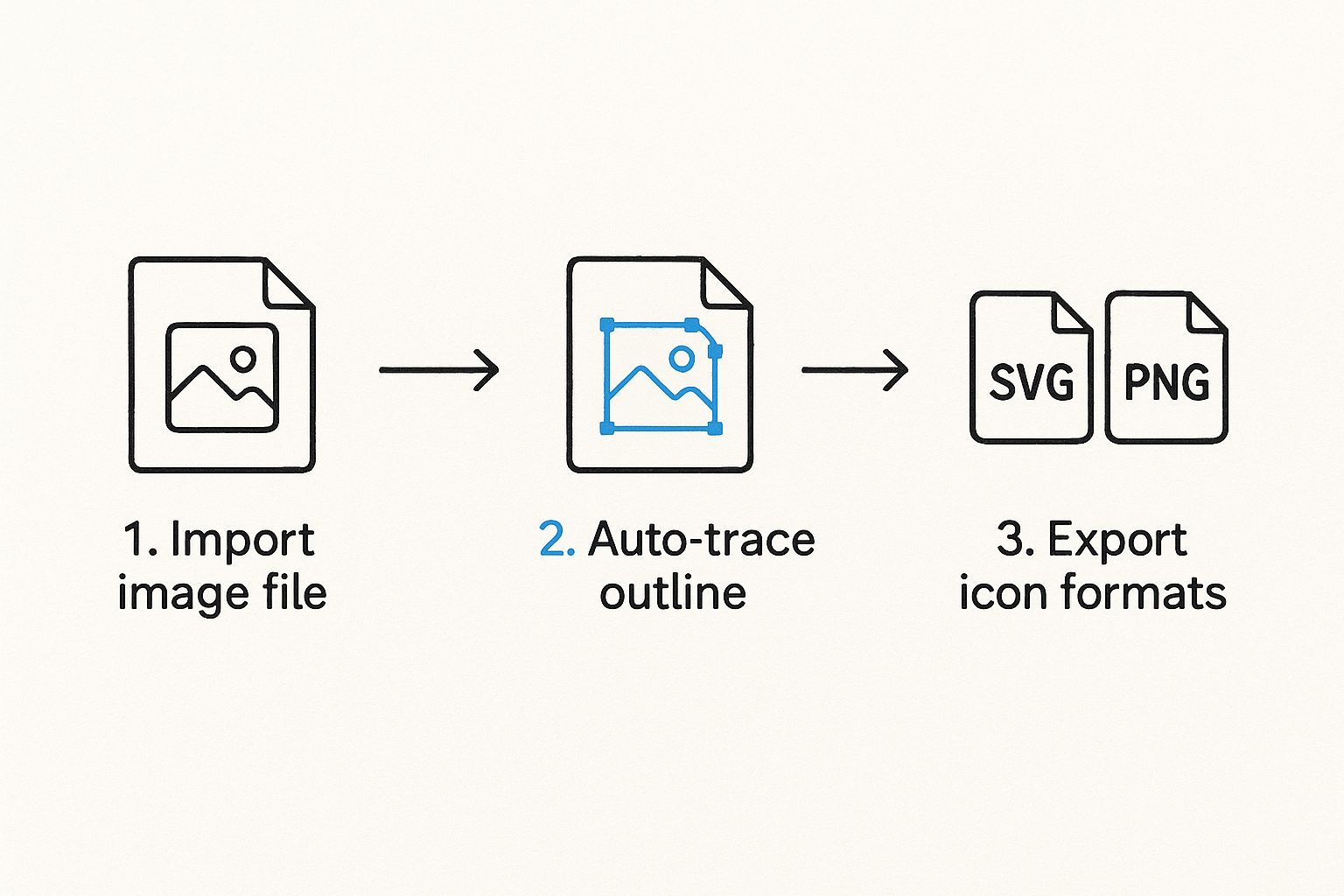
As you can see, modern tools like VibeIcons handle the heavy lifting—the tracing and vectorization—so you can focus on the creative side of things. This guide will walk you through each part of the workflow, and we'll start with the most important step of all: getting your source image ready for a clean, professional conversion. A well-prepared image is the foundation of an excellent icon.
To give you a clear roadmap of what's involved, here’s a quick breakdown of the journey from a simple image to a polished icon.
Key Stages of Icon Creation
| Stage | Objective | Key Action |
|---|---|---|
| Image Preparation | Ensure a clean, high-contrast source file. | Isolate the subject and remove the background. |
| Upload & Analysis | Get the image into the conversion tool. | Upload the prepared PNG to an AI icon generator. |
| Style & Customization | Define the icon's visual appearance. | Choose from available styles, variants, and colors. |
| Refinement | Fine-tune the AI-generated output. | Use prompts or settings to adjust details. |
| Export | Get the final icon in a usable format. | Download the icon as an SVG or copy the React code. |
Each stage is crucial for getting a high-quality result, but it all starts with that first step of preparing your image correctly.
Getting Your Image Ready for a Flawless Conversion
The secret to a great icon? It's not just about the tool you use; it’s about the quality of the image you start with. An automated converter is only as good as the raw material it's fed, so spending a few minutes on prep work can make a world of difference in your final result. Think of it like cooking—the best ingredients yield the best dish.
When you create icons from images, the software needs to clearly understand what the main subject is. From my experience, the best source images always share two key traits: a single, well-defined subject and a ton of contrast between that subject and whatever is behind it. A picture of a dog in an open field? Perfect. That same dog on a cluttered, multi-colored rug? That’s going to be a messy conversion.
A Few Quick Edits Make All the Difference
You don't need to be a Photoshop wizard to get your image in shape. In fact, you can do everything you need with free, browser-based tools like Canva or Photopea.
First thing's first: crop in tight on your subject. This immediately gets rid of any distracting junk on the edges and helps the AI know exactly what to focus on. If you're turning a portrait into an icon, crop it so the head and shoulders dominate the frame.
Next, you'll want to crank up the clarity. Bumping up the brightness and contrast a bit makes the subject's edges much sharper. This is a game-changer for photos taken in less-than-ideal lighting, as it stops the final icon from looking like a muddy blob. You're essentially drawing a clear line in the sand for the conversion tool to follow.
Why You Should Always Remove the Background
If you only do one thing, make it this: get rid of the background. A transparent background puts 100% of the focus squarely on your subject, which is the key to getting a super clean icon. Thankfully, most modern editing tools have a one-click background removal feature that does a surprisingly good job.
Here’s a simple checklist I run through before every conversion:
- Isolate the Subject: Crop out the noise and put the main element front and center.
- Boost the Contrast: Tweak the brightness and contrast until the subject really pops.
- Nuke the Background: For the absolute best results, save the image as a PNG with a transparent background.
Honestly, these prep steps are good practice for any kind of design work, not just icons. Starting with a clean, isolated asset is just a solid habit that makes your visuals look professional and easy to work with down the line.
Following these simple steps practically guarantees you won't end up with a weird, distorted icon. When the AI gets a clean, high-contrast image to analyze, it can trace the outlines perfectly and give you a sharp, scalable vector. If you're curious about what's happening under the hood, our guide on how to make a vector from an image breaks down the technical details. A little prep goes a long way.
Time to Create Your First Icon Set
You’ve done the prep work, and now for the fun part: turning that carefully prepared photo into a whole set of versatile icons. I've found the VibeIcons interface to be incredibly intuitive, taking what could be a really complex task and breaking it down into just a few clicks. This is where all that effort in getting the image right really pays off.
First things first, you'll need to upload your image. The platform takes standard formats like JPG and PNG, but I always stick with the transparent PNG we just made. It gives the AI the cleanest possible starting point, which means you'll get sharper, more accurate outlines right from the get-go.
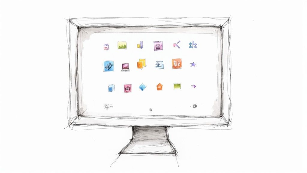
When you're ready, you'll land on a dashboard that looks like this.
This is your canvas. Once the image is uploaded, the real creative work begins.
Diving Into Different Styles and Variants
This is where the magic really kicks in. VibeIcons doesn't just give you one icon back; it generates a whole collection based on your photo, each with a different stylistic twist. Think of it less as a simple conversion and more as an exploration of what's visually possible.
You’ll see a range of options, from clean, minimal line art to bold, solid designs. Let’s say you uploaded a headshot of a team member. You could instantly generate:
- Outline Style: A sharp, modern icon that’s perfect for a minimalist UI.
- Filled Style: A more solid, impactful version that stands out on larger displays.
- Duo-Tone Style: A stylized icon that can be easily matched to your brand's color scheme.
- Memoji Style: A fun, illustrative option that gives off a friendly, more approachable vibe.
Being able to preview these styles in real-time is a massive advantage. You can see right away which look fits your brand’s voice, whether you're going for a polished corporate feel or something more creative and casual. It lets you experiment without pressure. To get a better sense of the possibilities, check out our guide on using an icon image creator.
Why Automated Icon Generation Is a Game-Changer
The need for tools that create icons from images has exploded recently. It points to a bigger trend: people are tired of generic stock icons and want visuals that are truly their own.
Consider this: the free online tool ConvertICO has processed over 61 million icons from JPG images alone. That number is staggering, and it shows just how often designers and developers need custom icons for everything from tiny 16x16 pixel favicons to full-blown app icons. You can dig into these image conversion trends and see the stats for yourself.
This is the exact pain point that VibeIcons addresses. By generating multiple stylistic variants from a single photo, you’re not just getting one icon. You're getting a complete foundational set that can be used across your entire design system, which ensures consistency and saves an unbelievable amount of time.
Customizing and Refining Your New Icons
The first set of icons you get from the generator is a fantastic starting point, but this is where the real fun begins. Now you get to take that AI-generated asset and polish it into something that feels uniquely yours and perfectly fits your brand. Think of the initial output as a great first draft—it's time to add your expert touch.
While many tools that create icons from images just give you a one-and-done conversion, VibeIcons puts the control back in your hands. You can tweak line weights, smooth out complex shapes, and—most importantly—swap in your exact brand colors. This is the step that takes an icon from "good enough" to a seamless part of your design system.
Aligning Icons with Your Brand Identity
Let's talk about color. One of the most critical parts of branding is a consistent color palette, and VibeIcons makes this incredibly simple. Instead of being stuck with generic black or grey, you can apply your official hex codes in seconds.
Say you just generated a new icon from a team member's headshot for your company's "About Us" page. Here’s how you’d make it match your brand:
- First, pick the generated icon variant you like best.
- Find the color editing tools—usually a color picker or a field for a hex code.
- Just type in your primary brand color, maybe something like
#4A90E2. You'll see the icon update instantly. - If you're using a duo-tone style, you can add your secondary brand colors to create more depth.
This small step is a game-changer. It ensures every single icon, no matter the source, looks like it was custom-made for your brand, which builds a ton of trust and recognition with your audience.
Fine-Tuning Details for Maximum Clarity
Beyond just color, you have the power to adjust the icon's actual structure. AI can sometimes pick up tiny, distracting details from a source photo that make the final icon look a bit too busy. The refinement tools are perfect for cleaning that up.
You can easily adjust the stroke width, for instance, to make sure it matches the other icons in your library. A thicker stroke often feels more solid and bold, while a thinner one can give off a more modern, minimalist vibe. You can also smooth out any jagged lines or simplify cluttered areas to make sure the icon is perfectly clear, even when it's shrunk down to a tiny size.
Pro Tip: When you create icons from images of people, the hair and clothing are often the first places to check. These areas can get a little messy and almost always benefit from some simplification. A few quick adjustments here can make a world of difference in the icon’s professional polish.
The goal isn't to redraw the icon from scratch. It's about making small, strategic edits that boost its impact. The real power of using custom icons from your own photos is that they feel more authentic and personal. In fact, one landmark study on website conversions showed that replacing stock illustrations with photos of real people boosted conversions by over 95%. That just goes to show how much authenticity matters. You can dig into the data yourself and learn more about how human photos impact conversion rates.
Taking a few extra minutes to refine your icons ensures they're not just functional but also a true reflection of your brand's aesthetic. It’s that final polish that separates a decent icon from a truly great one.
Bringing Your Icons to Life: Exporting for Design and Development
An icon isn't finished until it's in the hands of the people who will actually use it. Once you’ve dialed in the perfect look, the final step is exporting it in a format that works seamlessly for both your design and development teams. This handoff is where your creative vision starts to become a real, functional product.
When you create icons from images, the format you choose to export is a big deal. For virtually all modern design work in tools like Figma, Sketch, or Adobe Illustrator, the gold standard is SVG (Scalable Vector Graphics). Think of an SVG not as a picture, but as a set of instructions. Because it's code, you can scale it to any size imaginable—from a tiny favicon to a giant billboard—and it will always stay perfectly sharp.
A Direct Handoff for Developers
For the development side of the house, VibeIcons makes things even simpler. Instead of just handing over a static file, you can export your icon as a fully functional React component. This is a massive shortcut. Developers can skip the asset management hassle and just copy the JSX code straight into the application.
What’s really powerful here is that these aren't just static code snippets. They’re built to be interactive from the get-go, with built-in props that let you control the icon's appearance directly from your code.
- Effortless Color Changes: Pass a
colorprop to instantly match your brand's theme or reflect a specific UI state, like an error or success message. - On-the-Fly Sizing: Tweak the
widthandheightprops to make your icons fully responsive within your layouts.
Having this level of control is a game-changer. For a deeper dive into why this matters, check out our guide on how to change icon color effectively in your projects.
My Take: When you export as a React component, you're not just passing off an image. You're providing a living, breathing piece of the UI that eliminates the typical friction between designers and developers.
Export Format Comparison
So, which format should you choose? It really comes down to who is using the icon and where. Both SVG and React components are essential, but they serve very different roles in the journey from concept to launch.
| Format | Best For | Key Advantage | Consideration |
|---|---|---|---|
| SVG File | Designers using tools like Figma or Sketch. | Infinite scalability and universal compatibility. | Needs to be imported and managed as a separate asset. |
| React Component | Developers building web applications. | Direct integration with dynamic props for size and color. | Specific to the React framework; not as portable for other uses. |
Ultimately, having both options means your new icon is not just well-designed, but also incredibly easy to implement, no matter the context.
Got Questions About Making Icons? We've Got Answers
Jumping into a new tool always comes with a few questions, even one as simple as an icon generator. Let's walk through some of the common things people wonder about when they first start to create icons from images, from picking the right photo to getting the most out of the final product.
What Makes a Good Source Image?
This is, without a doubt, the number one question. While the tool is flexible, your results are only as good as what you put in. For the cleanest conversion, you'll want an image with a single, clearly defined subject against a simple background.
Think of it this way: the AI is trying to trace the most important outlines. A cluttered background just creates noise and confusion. High-resolution photos are also a huge help, as they give the AI more data to work with, resulting in smoother, more accurate lines. Stay away from blurry or pixelated images if you can.
PNG, SVG, React... What's the Difference?
File formats can be a little confusing, but here’s the simple breakdown for this process. When you upload your image, a PNG with a transparent background is the absolute best choice. It removes any ambiguity about what the subject is, which is exactly what you want.
When you're done and ready to export, SVG is your go-to for any design work. Because it's a vector format, you can scale it to any size without losing quality—perfect for websites, logos, or print. If you're handing off assets to a developer, the React component option is a lifesaver, giving them clean, ready-to-use code.
Troubleshooting Not-So-Perfect Icons
So, what happens if your icon comes out looking a little... weird? Don't worry, this is almost always fixable and usually traces back to the original image. If you're seeing strange lines or jagged edges, revisit your source file.
- Is the background really gone? Sometimes tiny, faint bits of the background can be left behind, and the AI will try to include them. A quick cleanup can work wonders.
- Is the subject clear enough? Low-contrast images, where the subject and background blend together, can produce muddy, undefined icons. Bumping up the contrast a bit beforehand helps a lot.
- Is it just too complicated? An image with a ton of tiny, intricate details—like a close-up of lace or flyaway hair—might need a little simplification before you get a clean outline.
Honestly, a little bit of prep work on your source image makes all the difference. Spending an extra two minutes cleaning up your photo will save you ten minutes of frustration trying to fix a messy icon later. It's the single most effective thing you can do.
Putting Your New Icons to Work
Once you've got a set of beautiful, custom icons, the fun part begins. Where do they go? Everywhere! They're fantastic for adding a personal, branded touch to your website's "About Us" page or for illustrating the unique features of a product.
I've seen people get really creative with them, like using them for custom bullet points in a presentation or on their website. It’s a small detail that makes a big impact. For instance, you can easily learn how to implement custom icon bullets on a platform like Squarespace to make a simple list look polished and professional.
At the end of the day, turning your own photos into icons is about building a visual language that feels authentic to your brand. By starting with a good image and knowing your export options, you'll have a library of unique assets that are truly yours.
Ready to stop searching for the perfect icon and start creating it? With VibeIcons, you can generate your first five icons for free and see how easy it is to build a custom icon library that perfectly matches your brand. Create your free icons now