Mastering Icon Color Change in Web Development
A practical guide to mastering icon color change. Learn modern CSS, inline SVG, and React techniques to create dynamic, interactive icons for your projects.
Changing an icon's color isn't just a minor style adjustment; it's a core skill for building user interfaces that feel alive and responsive. When you can control icon colors on the fly, you can signal state changes, match your brand's aesthetic, and give users immediate visual feedback. It's a small detail that makes a huge difference.
Why Dynamic Icon Colors Are a Game Changer
In modern web and app development, a static, one-color icon just doesn't cut it anymore. Users have come to expect interfaces that react to their every click and tap, and color is one of the most powerful ways to show that reaction. Being able to change icon colors dynamically is pretty much essential for creating a polished, professional user experience.
This one capability touches on several critical parts of UI design:
- Signaling State Changes: Think about an icon shifting from a subtle gray to a vibrant blue to show it's active. This gives the user instant confirmation that their action was registered.
- Boosting Accessibility: For features like a high-contrast mode, you absolutely need to adjust icon colors to make sure users with visual impairments can see and use your application.
- Powering Theming: If your app offers light and dark modes, you have to change icon colors to keep everything readable and visually consistent as the user switches themes.
The Power of Color in Branding
Beyond just interaction, color is a massive part of your brand. In fact, consistent use of a signature color can improve brand recognition by up to 80%. When your icons can adapt to your brand's color palette, they become powerful tools that reinforce your visual identity at every step of the user's journey.
Ultimately, using color effectively turns simple icons into a crucial part of the user feedback system. This dynamic approach is a cornerstone of modern interface design, directly influencing both usability and how people perceive your brand. You can dive deeper into this topic in our guide on the https://www.vibe-icons.com/blog/use-of-icons.
To follow the hands-on examples coming up, you’ll need a basic icon to work with. You can grab a simple and versatile one by generating an SVG with a prompt like this:
Generate a minimalist, line-art style gear icon with clean, bold lines and no internal fill, suitable for demonstrating color changes. The icon should be a simple SVG format, with a single path element.
When it comes to changing icon colors, modern CSS gives you a few different tools for the job. The best approach really boils down to how the icon is implemented—is it a font, an inline SVG, or an image file? Each method has its own quirks and advantages.
Let's walk through some of the most practical ways I've handled this over the years.
The Classic Approach: The 'color' Property for Font Icons
If you’re working with an icon font library like Font Awesome, you're in luck. The process is dead simple because the icon is treated just like text. You can change its color using the standard color property, making it incredibly easy to create effects like a simple hover state.
For instance, if you wanted a social media icon to pop with brand color on hover, your CSS is straightforward:
.social-icon {
color: #888888; /* Start with a neutral gray */
transition: color 0.3s ease;
}
.social-icon:hover {
color: #0077b5; /* Switch to LinkedIn blue on hover */
}
This is my go-to for quick, reliable color changes on font-based icons. Just remember, this won't have any effect on an SVG you’ve dropped in with an <img> tag.
Getting Creative: Manipulating SVG Colors with CSS Filters
What happens when your SVG icon is an <img> or a background-image? You can’t directly target its fill or stroke with CSS anymore. This is where CSS filters come into play. They're a clever way to alter the appearance of an image without ever touching the source file.
You have a few handy filter functions at your disposal:
invert(): Perfect for a quick dark mode switch.invert(1)turns black icons white.sepia(): Gives your icon a warm, brownish tint.brightness(): Makes the icon lighter or darker.hue-rotate(): Shifts all the colors around the color wheel, which can lead to some interesting results.
You can even chain multiple filters together. A common use case is simply inverting a black icon to make it white for a dark theme—it's a one-line fix.
The biggest gotcha with filters is the lack of precision. You're manipulating existing colors, not setting a new one. Trying to hit a specific brand color like
#FF5733is often a frustrating exercise in trial and error, and sometimes it's just not possible.
The Power Move: Using CSS Masks for Pinpoint Color Control
For total control over the color of an SVG used as a background image, my absolute favorite technique is using the mask-image property. Think of it this way: the icon's shape becomes a "stencil," and you can then spray any background-color you want through it.
Here’s a practical example of how you’d set that up:
.custom-color-icon {
width: 24px;
height: 24px;
background-color: #ff5733; /* The exact color you want */
/* Use the SVG as a mask */
-webkit-mask-image: url('path/to/your-icon.svg');
mask-image: url('path/to/your-icon.svg');
/* Ensure the mask fits and doesn't repeat */
-webkit-mask-size: contain;
mask-size: contain;
-webkit-mask-repeat: no-repeat;
mask-repeat: no-repeat;
}
This method is fantastic for theming. You can easily swap out the background-color using CSS variables to dynamically change icon colors across your entire site.
If you want to play around with this, you'll need a simple, single-color SVG. You could generate one with a prompt like:
Create a simple, solid-filled shopping cart icon in SVG format. The design should be a single, continuous shape to work well with CSS mask-image and filter properties.
Taking Full Control with Inline SVGs
When CSS filters feel a bit like a blunt instrument, embedding SVG code directly into your HTML is the way to go for precise color changes. This approach, often called inline SVGs, gives you direct access to every single part of the icon. We're talking about individual <path> and <circle> elements, even complex groups.
By dropping the SVG markup right into your document, each piece of the icon becomes a standard DOM element. This is a game-changer. It means you can give specific shapes their own classes or IDs and then style them with the CSS properties you already know and love, like fill and stroke.
Ever wanted to create a multi-colored icon where the outline is one color and the inside is another? With inline SVGs, it’s as simple as writing a couple of lines of CSS.
Targeting Specific Parts of an Icon
Let's say you have a settings icon with a few distinct parts. You could target these pieces individually.
If you had classes assigned to the different elements, like .gear-teeth for the outer part and .gear-center for the inner circle, your CSS would look something like this:
/* Make the outer part of the gear blue with a dark outline */
.gear-teeth {
fill: #3498db;
stroke: #2c3e50;
stroke-width: 2px;
}
/* Make the inner circle a contrasting red */
.gear-center {
fill: #e74c3c;
}
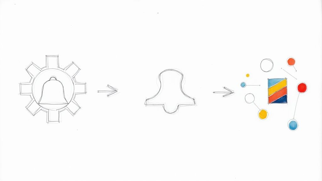
This level of control is perfect for creating complex visual states, like showing progress in a download icon or highlighting a specific feature. If you're putting together a custom design system, knowing how to do this is a must. We dive deeper into this in our guide on how to make custom icons.
As this visual shows, a single icon's structure can be separated from its color palette, opening the door for dynamic theming and branding.
A Quick Word on Choosing Colors
The colors you pick are more than just decoration. They send a message. Research into global branding shows that major companies are very intentional with their palettes.
- Blue is the most popular brand color, used in 30.8% of major logos, mostly because it's associated with trust and stability.
- Simplicity wins: 81.6% of top companies stick to just one or two colors for a strong, memorable identity.
These stats prove that a thoughtful, limited color palette often has the biggest impact.
The Bottom Line: Using inline SVGs moves you from just tinting an icon to truly art-directing it. You gain total control to change any color on any part, which is essential for detailed branding, complex animations, and interactive UI feedback. This method unlocks the most creative potential for styling icons on the web.
Dynamic Icon Styling in a React App
When you're deep into a big React project, you learn pretty quickly that handling styles on the fly can turn into a real headache. The last thing you want is a messy, unmanageable codebase. That's where a component-based approach for your icons becomes a lifesaver.
The trick is to build one, super-flexible <Icon> component that handles all the styling logic for you. Think of it as your single source of truth for every icon in the app.
Creating a Reusable Icon Component
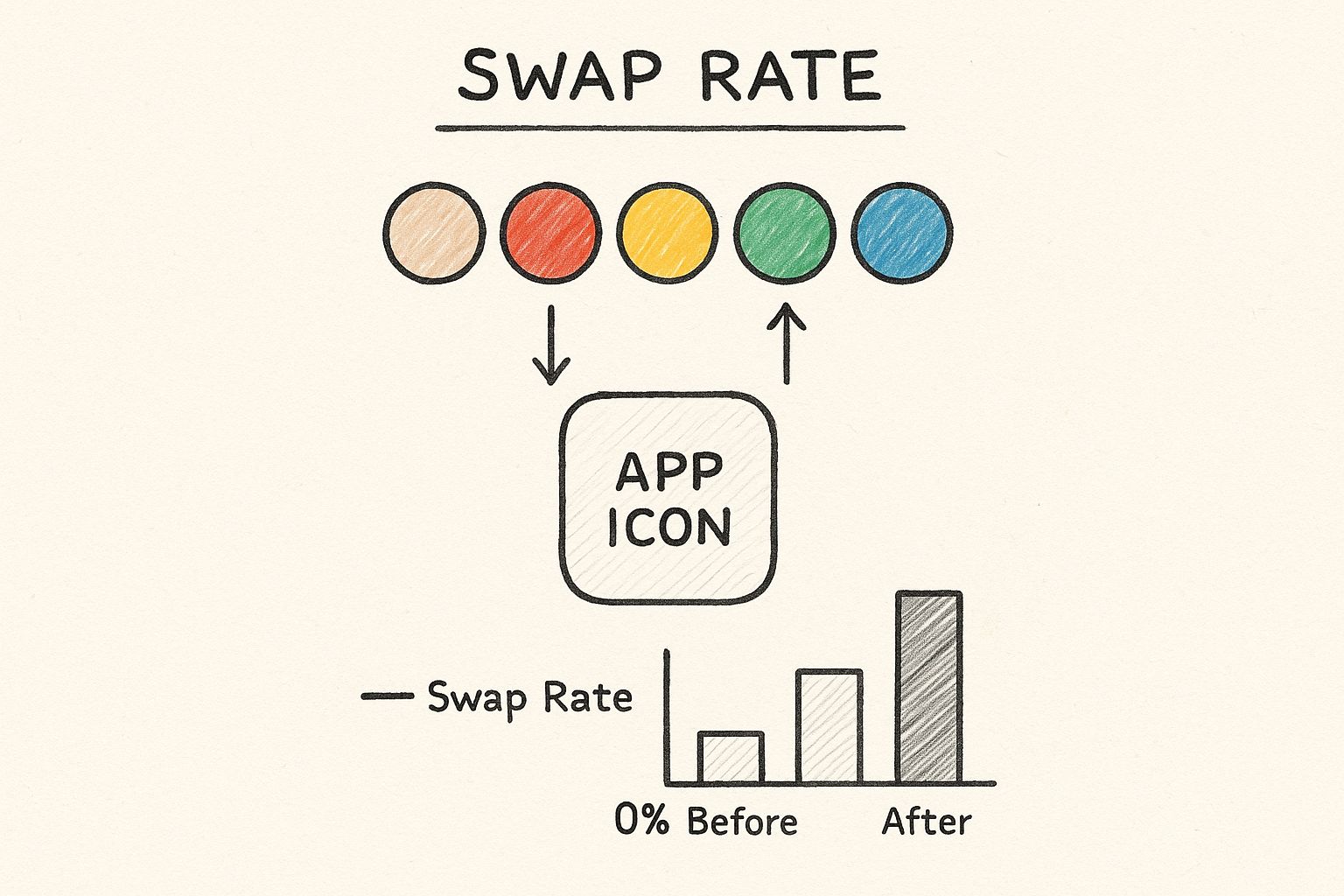
Let's say you're building a navigation menu. The icon for the currently active link needs to stand out with a different color. Instead of writing one-off CSS for every single icon, you can just pass a color prop to your reusable component based on the app's state.
Here’s how you could set up a simple but powerful <Icon> component, maybe using a library like VibeIcons.
// Icon.js
import { VibeIcon } from '@vibe-icons/react';
const Icon = ({ name, color = 'currentColor', size = 24 }) => {
return (
<VibeIcon
name={name}
style={{ color: color, width: size, height: size }}
/>
);
};
export default Icon;
This little component is incredibly useful. It takes the icon's name, a color, and a size and applies them directly as inline styles. I've set the default color to 'currentColor', which is a fantastic trick. It means the icon will automatically inherit the text color of whatever container it's in, unless you specifically tell it to be a different color.
Coloring Icons Based on Application State
Once that component is built, making icons change color based on user actions is a breeze. Back to our navigation menu example, we can just keep track of the active tab in our state and use a simple conditional to pass the right color to the right icon.
This keeps all your styling logic clean, predictable, and tied directly to what's happening in your app.
// Navigation.js
import React, { useState } from 'react';
import Icon from './Icon';
const Navigation = () => {
const [activeTab, setActiveTab] = useState('home');
return (
);
};
A quick tip from experience: This component-based pattern is the absolute key to building a scalable icon system in React. It wraps up all the styling logic, cuts down on repetitive code, and makes your UI much easier to debug when things go wrong.
Interestingly, the colors we choose are becoming more intentional than ever. The year 2025 is shaping up to be a big one for branding, especially as AI starts influencing color palettes. A recent survey found that 36% of consumers believe branding will split between two camps: earthy, organic tones and futuristic, AI-inspired shades like metallics and iridescents. You can dive deeper into these color psychology trends in Adobe’s research.
To create icons that work perfectly with this component-based method, you'll need SVGs designed for it. If you're using an AI image generator, try a prompt like this:
Create a set of three modern UI icons—a user profile, a settings gear, and a notification bell—in a consistent, minimalist line-art style. All icons should be designed as SVGs with a single color path to be easily manipulated by a React component's color prop.
Common Pitfalls and Pro Tips for Styling Icons
Once you get the hang of changing icon colors, you'll start running into some of the same little traps that trip up everyone at first. One of the most common is the dreaded CSS specificity battle. You'll set a color on your icon class, but nothing happens. After a frustrating bout of debugging, you'll find a more specific selector—maybe an ID somewhere—is overriding your styles.
Performance is another area to watch. Inline SVGs are fantastic for styling, but embedding hundreds of them directly into your HTML, especially if they aren't optimized, will absolutely bloat the file size and drag down your page load times. Always run them through an SVG optimizer before you go live.
Pro Tips for Cleaner Code
I've learned a few things over the years that help keep icon code clean, maintainable, and professional.
- Lean on CSS Custom Properties: Seriously, use variables like
--icon-primaryfor your colors. It makes theming for things like light and dark mode a breeze. Instead of hunting down every instance of a color, you just update one variable. - Don't Forget Accessibility: Always, always check your color contrast. An icon that your users can't see is worse than no icon at all. This is a fundamental part of good user experience design best practices.
- Smooth Out Your Hover Effects: When you're adding hover states, use the CSS
transitionproperty onfillorstroke. It creates a subtle, smooth fade that looks polished and professional, avoiding that jarring, instant color switch.
Want to play around with animations? You'll need an icon with distinct parts. Try a prompt like this:
Generate a line-art style mail icon with a separate path for the envelope and another for the seal, SVG format.
A Few Common Questions About Icon Colors
We’ve walked through the main techniques, but a few questions always pop up when developers start wrangling icon colors. Let’s clear up some of the most common sticking points.
So, Can I Change the Color of a PNG or JPG Icon?
Not really, at least not with any precision using just CSS. While you can technically use the filter property, it's a blunt instrument. Think of it more like shifting the overall hue rather than setting a specific color like #5A67D8. It just doesn't work well.
If you need full, reliable control over an icon’s color, SVGs are always the right tool for the job. Their vector nature means you can directly target their fill and stroke properties with pinpoint accuracy.
Is Inline SVG Really Better Than an <img> Tag?
When it comes to changing colors on the fly, absolutely. Placing an SVG inside an <img> tag effectively locks it down. The browser treats it just like a PNG, meaning your CSS can't reach inside to style the individual paths.
Pasting the SVG code directly into your HTML (inlining it) is what unlocks its full potential. This gives you complete access to every part of the icon, so you can style it with CSS or even animate it with JavaScript. It's the only way to go for dynamic icons.
For an AI-generated icon you can easily style, try a prompt like:
Generate a vector SVG of a document icon with separate, named paths for the page and the folded corner, allowing for multi-color styling.
Tired of searching for the perfect icon? VibeIcons helps you generate custom, AI-powered icons that match the style of popular libraries like Heroicons and Lucide. You can create your first five icons for free and see how well they fit your project.