Icon for Mobile App: Tips to Design a Standout Icon
Learn how to create an eye-catching icon for mobile apps. This guide covers design tips, app store rules, and testing strategies to boost downloads.

Your app's icon is your single most powerful first impression. In a sea of competitors, it’s a tiny digital billboard fighting for attention. It's the visual handshake that has to communicate your app's purpose, quality, and personality in a fraction of a second. More often than not, it's the one thing that gets a user to tap 'Install'.
Your App Icon Is Your First Handshake With Users
Think of your app icon as a book cover in a massive, sprawling digital library. Before anyone reads the description, scans the ratings, or even glances at the screenshots, they see your icon. This little square of pixels has a huge job: it needs to stand out, signal value, and build trust—all in the split-second a person’s thumb is hovering over the screen.
This isn't just decoration; it's a critical business asset. A well-crafted icon for a mobile app can directly boost download rates, shape how users perceive your brand, and build long-term recognition. It becomes the face of your app, the familiar symbol users will look for on their home screens day after day.
The Deciding Factor in a Crowded Store
That first impression is everything, especially when you consider how people find new apps. The app stores are still the main discovery channels, with around 70% of app downloads starting with a simple search on the Apple App Store or Google Play Store. With millions of apps vying for attention—roughly 3.7 million on Google Play and 1.7 million on Apple's App Store—your icon is your front-line soldier. You can learn more about user discovery habits from industry experts who have studied this for years.
Your app icon isn’t just part of the user interface; it's the beginning of the user experience. It sets expectations for the quality, functionality, and personality of your entire application before it’s even opened.
This all happens in a flash. Users make a quick, subconscious judgment based on what they see. Does the icon look polished and professional, or does it feel generic and rushed? A sharp, thoughtful icon implies a high-quality experience inside, while a sloppy one can make users think the app itself is buggy or untrustworthy.
Building an Instant Connection
The goal is to create a symbol that's not just pretty but also smart. It has to check a few key boxes:
- Instantly Recognizable: It must be distinct enough to be spotted immediately in search results and on a cluttered home screen.
- Conceptually Clear: The design should give a clue about the app's main purpose without being too literal or confusing.
- Aesthetically Pleasing: It needs to look good, feel modern, and fit perfectly with your brand's overall look and feel.
Once you grasp the strategic weight of your icon, you can start creating something that doesn’t just get your app noticed—it gets it downloaded and remembered. It’s how you turn a simple graphic into your most valuable marketing tool.
Core Principles of Unforgettable App Icon Design
Ever wondered what separates a truly great app icon from the millions that just blend into the background? It’s not luck, and it's not just about being a good artist. The most powerful and memorable icons are built on a solid foundation of proven design principles.
Think of these principles as the pillars holding up your icon's ability to grab attention, communicate its purpose, and stick in a user's mind.

When you master these concepts, designing an icon stops being guesswork and becomes a strategic process. Each pillar works with the others to forge a symbol that isn't just nice to look at, but is a hardworking asset for your brand. Let's break down these five essential pillars.
Make It Scalable
Your icon is going to show up everywhere. It needs to look just as crisp on a tiny smartwatch notification as it does blown up on a tablet screen or featured in the app store. This is the essence of scalability.
An icon bogged down with tiny details or fine text will just become a muddy, indecipherable blur when it's shrunk down. Your best bet is to use bold, simple shapes that hold their form at any size. Here’s a great little test: squint at your design from a few feet away. If you can still make out the basic idea, you're on the right track.
Design for Instant Recognition
On a crowded home screen, people scan; they don't sit and study. Your icon has to be instantly recognizable. We're talking about creating a unique visual that someone can spot in a fraction of a second.
Stay away from generic symbols that could represent a dozen different apps. Instead, zero in on a unique metaphor or a stylized graphic that speaks to your brand. Think about the unmistakable silhouettes of the Instagram camera or the Snapchat ghost—they’ve carved out their own unique visual territory in our minds.
A great icon creates an immediate mental shortcut to your app. It should be so distinct that users don't have to read the app's name below it to know what they're tapping.
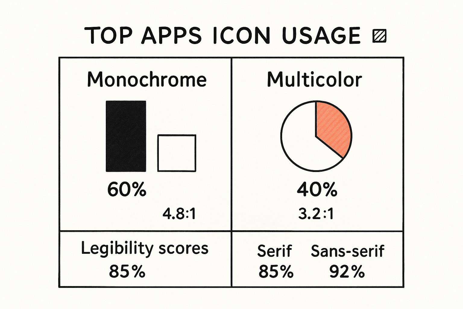
This isn't just about looks; a compelling design directly impacts performance. Research shows that something as simple as color can influence conversion rates by as much as 32%. Furthermore, modern trends like Dynamic Minimalism have been shown to boost recall rates by 31%, proving that a memorable design drives real engagement. You can dive deeper into the data and see the full research on app icon effectiveness.
Embrace Simplicity
One of the biggest traps in icon design is trying to cram too much in. An icon isn't an illustration; it's a symbol. The principle of simplicity is all about focusing on a single, powerful idea.
A simple design is easier to remember and faster for the brain to process. It cuts through all the visual noise and communicates with absolute clarity. To get there, you have to be ruthless. Strip away every non-essential element. For every line, shape, or gradient, ask yourself: is this absolutely critical? If the answer is no, it’s probably just clutter.
For instance, a weather app icon doesn’t need a detailed landscape with clouds, sun, rain, and wind all at once. A simple, stylized sun or a single cloud is far more effective and memorable.
Ensure Brand Cohesion
Your app icon isn't an island. It's the face of your app and the most visible ambassador for your brand. That means it absolutely must maintain cohesion with your app's overall user interface (UI), color palette, and brand identity.
This visual harmony creates a polished, professional experience. When someone taps your icon, the app that opens should feel like a natural next step. By using the same color families, typographic feel, and general aesthetic, you build a consistent world for your user. This consistency builds trust and reinforces what your brand is all about every time they use your app. You can also explore our guide on the strategic use of icons to better align your entire visual language.
Strive for Timelessness
Design trends come and go. It’s always tempting to jump on the latest visual craze—skeuomorphism, flat design, neumorphism—but a truly great icon has a timeless quality. Chasing trends can make your icon look dated in just a year or two, forcing you into redesigns that can confuse your users.
Instead, aim for a classic design that feels modern but isn't shackled to a specific moment in time. Focus on the fundamentals: a balanced composition, a thoughtful color palette, and a clear, universal symbol. This approach ensures your icon stays relevant and effective for years, building the kind of lasting brand equity that you can’t get any other way.
Navigating App Store Rules for iOS and Android
Designing a beautiful app icon is one thing; getting it approved by the app stores is another beast entirely. If your icon doesn't hit the strict technical marks set by Apple’s App Store and the Google Play Store, it’s going to get rejected, and your launch will grind to a halt.
Think of these guidelines less as creative roadblocks and more as an essential blueprint. Following them ensures your icon looks crisp and professional on every single device, saving you the headache of a failed submission.
Apple’s Blueprint for iOS Icons
Apple is famously particular about design, and its app icon rules are no different. The single most important rule is this: you must submit a perfect square. Don't round the corners yourself. Apple’s system automatically applies a specific corner mask to create that iconic "squircle" shape you see on every iPhone home screen.
This image from Apple’s own guidelines shows exactly how their system masks your square icon.
As you can see, your job is to focus on what’s inside the square canvas. If you try to pre-round the corners, it will clash with the system's mask and look completely wrong.
Beyond the shape, you’ll need to nail a few technical details for a smooth App Store submission:
- Resolution: You’ll need one large, high-resolution master file at 1024x1024 pixels. Apple uses this single asset to generate all the different sizes needed throughout iOS.
- No Transparency: Your icon must be fully opaque. Forget about alpha channels or any transparent elements—that’s an instant rejection.
- File Format: Stick to the PNG format for your final file.
Google’s Adaptive Icon System for Android
Over in the Android world, Google has a more flexible system called adaptive icons. The whole point is to bring a bit of visual harmony to the vast ecosystem of Android devices, where every manufacturer might have its own UI theme. Instead of a single, fixed shape, your icon has to be able to "adapt" to various masks—circles, squares, squircles, you name it.
To make this work, you actually design your icon in two separate layers:
- Background Layer: This is usually a simple, solid color or a basic pattern that fills the entire space.
- Foreground Layer: This is where your actual logo or key symbol lives. You have to keep it within a central "safe zone" to make sure no important bits get chopped off when different device masks are applied.
This two-layer setup also enables some neat visual effects, like subtle parallax animations when a user swipes through their home screen. For a closer look at getting this right, you can find more strategies in our articles on icon optimization.
iOS vs Android App Icon Requirements at a Glance
Navigating the different requirements can feel a bit overwhelming, so here’s a quick side-by-side comparison to help you keep the key details straight for both platforms.
| Requirement | Apple iOS (App Store) | Google Android (Play Store) |
|---|---|---|
| Final Shape | A "squircle" shape, automatically applied by iOS. | Adaptive—can be a circle, square, squircle, or teardrop. |
| Submitted Shape | A perfect square. Do not round the corners. | Two layers (foreground and background) within a square canvas. |
| Master Resolution | 1024x1024 pixels. | 1024x1024 pixels for the main store listing. |
| Transparency | Not allowed. The icon must be fully opaque. | Foreground layer can have transparency; background must be opaque. |
| File Format | PNG. | PNG. |
| Design Philosophy | A single, static asset that is perfectly rendered by the OS. | A flexible, two-part system that adapts to device UI themes. |
Ultimately, both Apple and Google are pushing for the same thing: a clean, consistent user experience. Understanding their different approaches is the first step to getting your app icon approved without a hitch.
A Step-by-Step Process for Designing Your Icon
Turning a great idea into a polished app icon can feel like a daunting task. Where do you even start? But if you break it down into a deliberate workflow, the whole thing becomes much more manageable. This isn't about waiting for a lightning bolt of inspiration; it's about following a methodical path from a blank page to a finished design.

By tackling the design in clear stages—thinking, sketching, building, and refining—you make sure every choice is intentional. Let's walk through each phase to build an icon that’s not just nice to look at, but actually works.
Stage 1: Conceptualization and Brainstorming
Before you draw a single line, you have to figure out what your icon is trying to say. This first stage is pure ideas and strategy. Start by asking a few core questions to give yourself a clear direction.
- What's the one thing my app does? Try to boil its purpose down to a single concept. For a task manager, maybe it’s "completion" or "organization." For a music app, it could be "sound" or "rhythm."
- Who am I talking to? Is your audience busy professionals, creative teenagers, or tech-savvy seniors? The visual language you use has to connect with them.
- How should this icon make people feel? Productive? Relaxed? Excited? Secure? Every design choice you make will nudge them toward a certain feeling.
Once you have those answers, start brainstorming visual metaphors and symbols. Think of it like a word association game. If your app is about security, your list might include a shield, a lock, a key, or a vault. This is all about quantity over quality—just get as many ideas down as you can without judging them.
Stage 2: Sketching and Exploration
With a solid list of concepts, it’s time to see what they look like. Grab a pen and paper (or a digital stylus) and just start sketching. The goal here isn't to create a masterpiece; it's to rapidly explore different compositions and ideas.
Don't get bogged down in the details. Focus on simple shapes and silhouettes. You should be creating dozens of tiny thumbnail sketches for your strongest concepts. This low-tech approach lets you experiment freely without getting too invested in any one idea. As you sketch, you'll start to see which symbols are instantly recognizable and which ones hold up when they're small.
Sketching is the fastest way to fail. By quickly getting all the bad ideas out on paper, you clear the path for the good ones to emerge before you ever open your design software.
Pick your top three to five strongest sketches. These are the ones you’ll carry forward into the digital world.
Stage 3: Digital Rendering and Color Selection
Now it's time to bring your best sketches to life in a vector program like Adobe Illustrator, Figma, or Sketch. Using vectors is non-negotiable. It’s the only way to ensure your icon can be scaled to any size without losing a single pixel of quality. Recreate your chosen sketches as clean, precise digital graphics.
This is also where you introduce color—a powerful tool for setting a mood and reinforcing your brand. Stick to a limited color palette that lines up with your app's branding. And remember, the colors need enough contrast to be perfectly clear, especially for users with visual impairments.
Test your digital drafts against different backgrounds. How does the icon look on a light wallpaper versus a dark one? A truly strong design works anywhere. For a deeper dive into this part of the process, our guide on how to make custom icons has some great tips for perfecting your digital work.
Stage 4: Refinement and Feedback
Your icon is almost there, but the final polish is what separates a good icon from a great one. This stage is all about tightening up the details and, crucially, getting outside opinions.
Look at your icon with a critical eye. Are the lines clean? Is the lighting consistent? Does every single element serve a purpose?
Most importantly, get fresh eyes on your design. Show your top contenders to people who match your target audience. But don’t just ask, "Do you like it?" That's a useless question. Instead, ask things that reveal what they see:
- "What do you think this app does?"
- "What words come to mind when you look at this?"
This kind of feedback is gold. It tells you whether your message is actually getting across. Use these insights to make your final tweaks, ensuring your icon isn't just a pretty picture but a powerful tool for communication.
How to A/B Test Your App Icon to Maximize Installs
https://www.youtube.com/embed/ZF_25i-be8k
Designing a great-looking app icon is a fantastic start, but it's only half the story. The real test of an icon isn't whether your team loves it, but whether it actually convinces people to tap that "Install" button.
Relying on gut feelings or internal debates in a packed app store is a huge gamble. What looks brilliant in a design meeting might fall completely flat with your target audience. This is exactly where A/B testing comes in, turning guesswork into a data-driven science.
By methodically testing different versions of your icon for a mobile app, you can uncover precisely which design choices trigger more downloads. It’s all about making confident decisions backed by real user behavior, so you're not leaving potential installs on the table.
Setting Up Your Icon A/B Test
The core idea behind A/B testing is refreshingly simple. You show your current icon (Version A, the "control") to one group of users, and a new design (Version B, the "challenger") to another. Then, you sit back and measure which one performs better.
On Android, Google Play makes this incredibly easy with its built-in Store Listing Experiments feature. This powerful tool lets you run tests right on your app's store page, giving you a direct line to real-world user data. For iOS, things are a bit different. Since the App Store doesn't have a native icon testing tool, you'll need to use third-party platforms or test icon variations in your ad campaigns to see what resonates.
Here’s a quick look at how you’d set one up:
- Form a Hypothesis: Start with an educated guess. For example: "A brighter, more vibrant background will make our icon pop in search results, leading to more taps."
- Create Your Variations: Based on that hypothesis, design your challenger icon (Version B). The key is to change only one significant thing at a time—the background color, the central glyph, the border—so you know exactly what caused any shift in performance.
- Run the Test: Launch your experiment and let the platform split the traffic. Now, you just need to wait for the data to roll in.
Defining Your Key Metrics
To figure out if your test worked, you need to track the right numbers. While you could get lost in a sea of data, a few key metrics are crucial for measuring how an icon for a mobile app is really performing.
The goal of A/B testing isn't just to find the "prettiest" icon. It's to find the one that does the best job of turning a casual browser into an active user.
When you're testing, it's essential to measure the right things. This table breaks down the most important metrics you should be tracking to understand how your icon truly performs.
Key Metrics for App Icon A/B Testing
This table highlights the primary metrics to track when testing different versions of an icon for a mobile app, helping you measure success accurately.
| Metric | What It Measures | Why It's Important |
|---|---|---|
| Tap-Through Rate (TTR) | The percentage of users who see your icon in search results or lists and tap on it. | This shows your icon's ability to grab initial attention and generate interest. |
| Conversion Rate (CVR) | The percentage of users who install your app after landing on your store page. | This is the ultimate measure of success, indicating how well the icon drives downloads. |
| Retention Rate | The percentage of users who continue to use the app after a certain period (e.g., 7 days). | While indirect, this can signal if an icon sets accurate expectations for the app experience. |
By focusing on these metrics, you get a clear, data-backed picture of which icon is working hardest for your app.
Analyzing Results and Avoiding Common Pitfalls
Once your test has run long enough to gather solid data, it’s time to see what happened. If Version B delivered a clear win—say, a 5% increase in your conversion rate—congratulations! You can confidently roll out the new icon to everyone.
But it’s also easy to trip up and get misleading results. Watch out for these common mistakes:
- Testing Too Many Things at Once: If you change the color, shape, and symbol all in one go, you’ll have no idea which change actually made the difference. Isolate your variables.
- Not Running the Test Long Enough: Pulling the plug too early can lead you astray. You need enough time to smooth out random daily spikes and dips—running a test for at least a full week is a good rule of thumb.
- Ignoring Statistical Significance: Don’t call a winner based on a tiny difference. Wait for your testing tool to tell you the results are statistically significant, which means the outcome is real and not just a fluke.
By making A/B testing a regular part of your process, you can systematically boost your app's performance, one data-backed decision at a time.
Common Questions About App Icon Design
As you get closer to finalizing your app icon, you're bound to run into some specific questions. Designing an effective icon is a balancing act between creative vision and hard technical rules. I've pulled together some of the most common questions I hear from designers and developers to help you sidestep common mistakes and make decisions with confidence.
Think of this as your go-to guide for those moments when you just need a straight answer to a tricky design problem.
What Are the Best Tools for Designing an App Icon?
Picking the right software is a huge first step, and honestly, the best tool often comes down to your own workflow and skill level. For professional results, you absolutely want to work with vector-based software. This is the industry standard for a reason—vector graphics are built on mathematical equations, not pixels, which means they stay perfectly crisp and sharp no matter how big or small they get.
For years, the heavyweights in this space have been Adobe Illustrator and Sketch, both offering incredibly powerful toolsets for creating polished, precise icons. More recently, Figma has taken the design world by storm. It's web-based, making it amazing for real-time collaboration.
But what if you're just starting out or need something fast? A tool like Canva can be a great starting point with its user-friendly templates. And if you want to kickstart the creative process, an AI-powered platform like VibeIcons can generate a whole slew of unique concepts from a simple prompt. You can then take your favorite idea and polish it up in a dedicated vector editor.
No matter which tool you settle on, the most important thing is that it lets you work with vectors and export a high-resolution PNG file that meets all the app store requirements.
This single step ensures your icon for a mobile app looks great everywhere, from a tiny notification dot to a featured banner in the app store.
Should My App Icon Include Text or My Brand Name?
Let's make this simple: almost always, the answer is no. As a general rule, avoid putting any text on your app icon. The biggest reason is legibility—or the complete lack of it. Your app's name is already displayed right below the icon on every home screen and in every app store.
Trying to squeeze text into that tiny square just creates a blurry, unreadable mess, especially on smaller phone screens. It adds visual clutter and seriously weakens the icon's punch. The goal is to create a powerful, simple symbol that people recognize in a split second. Think of the Instagram camera or the Spotify soundwave. They communicate everything without a single word.
Of course, there are a couple of rare exceptions. A single, heavily stylized letter that is your logo can work beautifully. The bold 'N' for Netflix or the iconic 'F' for Facebook are so baked into their brand identity that they function as symbols on their own. If you're going to go this route, you have to be absolutely sure that the letter is crystal clear and identifiable, even at the smallest sizes.
How Often Should I Consider Redesigning My App Icon?
There's no magic formula for this, but there are definitely clear signs that it might be time for a change. A major app overhaul or a complete rebranding is a perfect time to redesign your icon. You need your icon to stay visually in sync with your app's new look and feel to create a cohesive experience for your users.
Another big trigger is performance. If your icon is starting to look dated next to your competitors, it's time for a refresh. More importantly, if A/B testing shows a new design could seriously improve your download conversion rate, it's a smart business move. Even a modest 5% boost in conversions from a better icon can translate to thousands of new users over time.
But be careful. Don't change your icon just for the sake of it. For your loyal users, that icon is a familiar beacon on their crowded home screen. Changing it too often can be confusing and frustrating. When you do decide it's time for an update, it's usually best to evolve your existing design rather than starting from scratch. This helps you modernize your look while holding onto the core visual elements your users already know and trust.
Ready to create the perfect icon for a mobile app without the headache? VibeIcons uses AI to generate stunning, high-quality icons that match your brand's style in seconds. Generate your first five icons for free and see just how easy it is to get the perfect look for your project.