A Guide to User Experience Icon Design
Discover how to design a user experience icon that improves navigation and engages users. Learn key principles, best practices, and real-world strategies.
Let's be honest, a great user experience icon isn't just a pretty picture. It’s a silent guide, a universal signpost in your digital world that tells users exactly what to do without a single word. Think of it like the symbols on your car's dashboard—they give you instant clarity and direction at a glance.
A well-designed icon makes navigating an app or website feel second nature. It smooths out the rough edges of the user journey, lightens the mental load, and makes the whole interaction feel seamless.
The Unspoken Language of a Great UX Icon
So, what’s the secret sauce that turns a simple graphic into a powerful UX icon? It’s all about translation—taking a complex idea or action and boiling it down to a simple, instantly recognizable symbol. These little graphics are the unspoken language of your interface. They're critical communication tools that clarify what a button does, give immediate feedback, and make your platform feel effortless.
When you get the icons right, users can navigate almost on autopilot. Instead of pausing to read text, they rely on familiar visual cues to figure out their next move. This isn't just about making things look good; it's a strategic move to boost usability.
More Than Just Eye Candy
Don't mistake effective icons for mere decoration. They are hard-working assets that directly improve the user experience and strengthen your brand.
Here’s how they pull their weight:
- Lighter Mental Load: Our brains process images way faster than text. Icons let users make split-second decisions without getting bogged down.
- Better Usability: Clear, unambiguous symbols for actions like "save," "delete," or "share" leave no room for confusion and help prevent mistakes.
- Stronger Brand Identity: A unique and consistent icon set becomes a core part of your brand's visual signature, making it more memorable.
Never underestimate the impact of good visuals. Research shows that 38% of people will leave a website if they find the layout or content unattractive. That’s a huge chunk of your audience walking away simply because of design. If you want to dig deeper, it's worth exploring how visuals influence user behavior to see just how powerful they are.
An icon has truly succeeded when it becomes invisible. The user just acts, clicking the symbol without consciously thinking about it. Its job is to make the experience feel completely natural, not to shout for attention.
Ultimately, a great UX icon isn't just seen; it's understood. It’s the bridge between your user and your interface, building a sense of confidence and control that keeps them coming back for more.
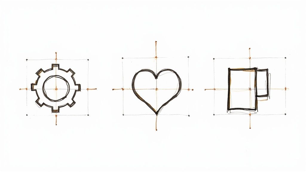
Mastering the Core Principles of Icon Design
Designing a great user experience icon isn't just about making pretty pictures. It's a craft built on a handful of solid, time-tested principles. Think of them as the fundamental rules of visual language—get them right, and your icons become silent guides for your users. Get them wrong, and even a beautifully drawn icon can cause confusion and frustration.
The first rule, and the one you can never break, is clarity. An icon must be instantly understood. Your user should never have to stop and wonder, "What does that little picture mean?" A magnifying glass for "search" is a perfect example; it's a universal symbol that requires zero thought. The goal is to wipe out any and all ambiguity.
Right behind clarity comes consistency. Your icons need to look like they belong to the same family. By using a consistent visual style—the same line thickness, corner style, and color scheme—you create a predictable and trustworthy interface. This shared visual language makes the entire user experience feel more professional and seamless.
Ensuring Your Icons Are Scalable
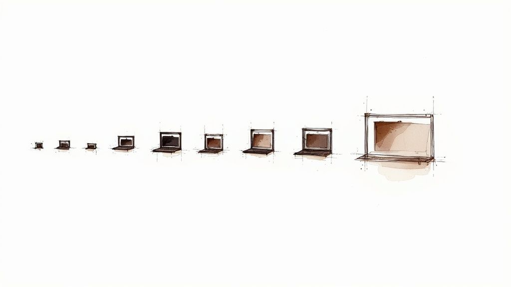
Another absolutely crucial principle is scalability. Your icon has to look just as sharp on a tiny smartwatch screen as it does on a massive desktop monitor. This is precisely why vector formats like SVG are the gold standard for icon design. They can be scaled up or down to any size without ever losing a pixel of quality.
It's a common pitfall: an icon looks perfect at its original size but turns into an unrecognizable smudge when shrunk. Always, always test your icons at multiple sizes to make sure they hold up and remain perfectly clear.
The Impact of Familiarity
Finally, always lean into familiarity over being overly clever. While there's a place for creativity, tapping into established visual conventions is a shortcut to better usability. The floppy disk icon for "save" is a classic case. The technology is ancient, but the symbol's meaning is so deeply embedded in our collective memory that it still works without a hitch.
When you use familiar symbols, you reduce the mental effort required from your users. They don't have to learn a new visual language from scratch. For a more detailed look at putting this into practice, you can explore our guide on the effective use of icons.
To tie this all together, here’s a quick breakdown of how these principles directly shape the user’s journey.
Key Principles for High-Impact UX Icons
| Principle | What It Means | Impact on User Experience |
|---|---|---|
| Clarity | The icon's meaning is obvious at a glance. | Reduces hesitation and lets users complete tasks faster and with more confidence. |
| Consistency | All icons share a unified visual style (e.g., weight, color). | Builds trust and makes the interface feel predictable, professional, and intuitive. |
| Scalability | The icon looks crisp and legible at any size, on any screen. | Ensures a high-quality, professional appearance across all devices, from watches to desktops. |
| Familiarity | The icon uses established, widely-recognized symbols. | Lowers the cognitive load, allowing users to navigate based on instinct rather than learning. |
By building your icon design process on this solid foundation, you ensure that every symbol you create is not just a piece of art, but a powerful tool that makes your product better. These aren't just suggestions; they are the bedrock of effective interface design.
How Icons Drive Business and User Success
Smart icon design isn't just about making things look pretty; it's a strategic move that delivers real, measurable business results. When a user experience icon is clear, intuitive, and well-placed, it becomes a powerful tool that guides users, simplifies complex actions, and boosts critical metrics like conversion rates and customer loyalty.
Think about the last time you booked a stay on Airbnb. The platform uses simple, universally understood icons for filtering—things like "Wi-Fi," "Pool," and "Free parking." This isn't just a design choice for a cleaner look. It’s a strategic decision that transforms a potentially overwhelming task into an effortless one. By swapping text for scannable symbols, they smooth out the user's journey, remove friction, and get people to a successful booking that much faster.
From Clicks to Conversions
At its core, a good icon's job is to eliminate hesitation and encourage action. A clear, inviting icon on a call-to-action (CTA) button can make a surprising difference in click-through rates. For instance, a simple shopping cart icon next to an "Add to Cart" button instantly reassures users about what's going to happen next, giving them the confidence to click.
This clarity has a ripple effect that can even reduce operational costs. A well-thought-out icon system helps people navigate without confusion, which means fewer user errors and, in turn, fewer calls to customer support. When users can easily find what they need, they're far less likely to get frustrated, abandon their cart, or send in a support ticket. That saves a business both time and money.
Investing in a great user experience isn't an expense—it's a direct path to boosting revenue and efficiency. And a strong visual system, built on the back of effective icons, is what makes every single interaction smoother and more profitable.
The financial impact here is genuinely staggering. Research consistently shows that for every $1 invested in UX, a business can expect an average return of $100. That’s an incredible 9,900% ROI, driven by higher conversions, better customer retention, and lower support costs. You can discover more about the financial impact of UX design to get a sense of just how powerful this is.
Building a Cohesive Brand Experience
Beyond just function, a consistent set of icons is fundamental to reinforcing your brand identity. It establishes a unified visual language that makes your app or website feel instantly recognizable and trustworthy. When users encounter the same polished and professional icons across your entire digital presence, it builds a powerful sense of coherence and reliability.
This is where a dedicated tool can make all the difference. The screenshot below from VibeIcons shows just a glimpse of the variety of icon styles available to designers and developers.
As you can see, the right icon set—whether it's sleek and minimal or more playful and illustrative—can be perfectly matched to a brand's unique personality. This ensures every visual element works together to create a consistent and memorable user experience.
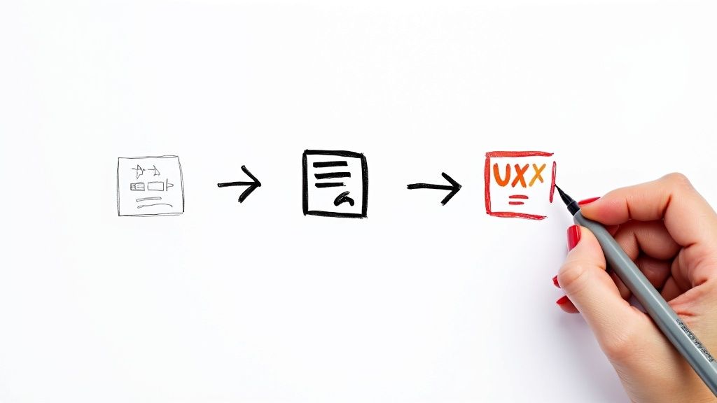
Creating Custom Icons with VibeIcons
Knowing the principles of good icon design is one thing, but actually creating a full set of icons is another challenge entirely. This is where you move from theory to practice, and having the right tool can make all the difference. That's exactly where VibeIcons comes in. It provides a surprisingly simple way to build a custom, professional user experience icon set, even if you’re not a seasoned illustrator.
The whole platform is built to be intuitive, letting you get right to the creative part. It’s the perfect bridge when you need a specific icon but don't want to spend hours designing it from scratch or digging through mismatched icon packs. You just generate what you need, right when you need it, and every single icon will match your project's look and feel.
Kickstarting Your Custom Icon Set
Getting started is refreshingly straightforward. The first thing you'll do is define the core DNA of your icon family. Take a moment to think about the personality of your brand. Are you going for a modern, minimalist vibe? Or something more approachable and friendly with rounded corners?
These first few decisions set the stage for your entire library. The key parameters you'll want to lock in are:
- Stroke Weight: This is simply the thickness of the lines. A thinner stroke can feel elegant and light, while a thicker one comes across as bold and confident.
- Style: Pick a base style that feels right for your brand. VibeIcons gives you great starting points like Heroicons or Phosphor, which serve as a solid, consistent foundation.
- Color Palette: Even if your icons will be monochrome, defining your brand's primary and secondary colors at this stage helps ensure everything looks consistent when you’re ready to add a splash of color.
Think of this initial setup as creating a blueprint. It ensures every icon you make from here on out shares the same visual language.
From Generation to Refinement
With your foundation in place, the real fun begins. You can start generating icons for whatever you need, whether it's for a common action or a unique concept. For instance, if you need an icon for "data analytics," you can just describe it, and the AI will create options that perfectly match the style you already defined. This is a massive time-saver, especially when you need to create a large set of icons.
The goal is not just to create icons, but to build a consistent visual system. A tool like VibeIcons acts as a creative partner, handling the heavy lifting of design consistency so you can focus on the user experience.
After an icon is generated, you’re not locked in. You can still tweak the details. Maybe you want to adjust the corner radius to be a little sharper or softer, or perhaps a specific element needs a slight modification for a particular use case. It's this blend of AI generation and manual control that gives you both speed and precision. For a more detailed walkthrough, our guide on how to make custom icons covers the entire process from start to finish.
Exporting for a Flawless User Experience
The last step is getting your icons out of the tool and into your project in a format that’s both high-quality and performant. For any modern website or app, SVG (Scalable Vector Graphics) is the absolute best choice, no question. SVGs are tiny in file size and look perfectly crisp on any screen, from a tiny smartwatch to a massive 4K monitor.
VibeIcons makes this part easy. You can download clean, optimized SVG files or even just copy the React code directly into your project. This smooth handoff from design to development means your beautiful icons get implemented without any frustrating hiccups or loss of quality. Following this workflow, you can build a polished and effective user experience icon library that truly elevates your brand and makes your product easier to use.
What Does the Future Hold for Icons in an AI-Driven World?
The days of static, one-size-fits-all user experience icons are numbered. As artificial intelligence weaves itself into the fabric of our digital tools, icons are shifting from simple visual markers into something much more dynamic—intelligent elements that can adapt to our needs in real time. This isn't just a cosmetic upgrade; it's about building interfaces that are genuinely smarter and more personal.
Think about it: an icon that subtly changes based on the time of day, where you are, or what you usually do in an app. A standard "map" icon, for instance, might morph into a "navigate home" shortcut right as you’re leaving the office. That's the power of context-aware design. It anticipates what you need and smooths out the experience, cutting down the clicks and taps to get things done.
This entire evolution is being pushed forward by new design tools that give human creativity a serious boost with AI.
The Rise of Generative and Adaptive Icons
AI is changing not only how we use icons but how we create them in the first place. Generative tools can spit out hundreds of icon variations in seconds, giving designers a massive playground to explore different styles and concepts. This frees us up to think about the bigger picture—the strategic role of each user experience icon—instead of getting bogged down in repetitive production work. You can dive deeper into this topic with our resources on the AI icon generator.
The next frontier for icon design is personalization at scale. AI allows us to move beyond a single, static visual language and create adaptive interfaces that feel uniquely tailored to each user's journey and intent.
We're seeing this trend pick up speed fast. By 2025, a lot of design control is expected to shift from human hands to automated tools inside platforms like Figma, Canva, and Vercel. These systems chew through massive datasets to generate design elements, including icons, which completely changes how we approach our workflows. You can discover more insights about these UX design trends and how they’re reshaping the industry.
Human Creativity, Amplified by Technology
So, is AI coming for our jobs? Not exactly. It's becoming more of a powerful creative partner.
This collaboration is what will allow us to build truly dynamic visual systems. In these systems, icons aren't just seen; they're understood on a personal level. They become predictive, helpful guides that are essential to the next wave of intuitive digital products. The future isn’t about replacing human creativity—it’s about amplifying it with incredibly smart tools.
Common Questions About User Experience Icons
Once you start using icons more strategically, you’ll inevitably run into some practical questions. Getting the details right can be the difference between a smooth user journey and a frustrating one. This section tackles some of the most common questions that come up when designing and implementing a high-quality user experience icon.
Think of this as a quick reference guide to help you make those decisions with confidence.
What Is the Difference Between a UI Icon and a UX Icon?
You'll hear people use these terms interchangeably, but there's a subtle yet important difference. A UI (User Interface) icon is just the graphic itself—the pixels, lines, and shapes that make up the image. But a UX (User Experience) icon is all about that graphic's function and how clearly it communicates its purpose to the person using it.
Here’s a simple way to think about it: a beautifully designed UI icon that nobody understands is a failed UX icon. The term "user experience icon" rightly puts the focus on what truly matters—clarity, usability, and making the user’s journey better, not just on making things look pretty.
Should Icons Always Have Text Labels?
This is a classic debate in the design world, and the right answer really boils down to context. For universally understood symbols—like a house for "home," a printer, or a magnifying glass for "search"—you can often get away with no label. In tight spaces, users know what these mean at a glance.
However, if an icon is abstract, unique to your product, or could be interpreted in more than one way, you absolutely need a text label. This icon-plus-label approach is a safety net that offers huge benefits:
- It Kills Guesswork: There’s zero ambiguity about what happens when you click.
- It Boosts Accessibility: Screen readers can announce the function to users with visual impairments.
- It Flattens the Learning Curve: New users can figure out your interface in record time.
When in doubt, add the label. Clarity should always trump a minimalist aesthetic. A confused user is a user who is one click away from leaving.
What Is the Best Format to Use for Web Icons?
For modern web design, this is an easy one: SVG (Scalable Vector Graphics) is the undisputed champion. Unlike raster formats like PNG or JPG, which are made of pixels, SVGs are built from mathematical equations.
This means you can scale them to any size—from a tiny button to a huge banner—and they will never lose quality or look blurry. This is non-negotiable for ensuring your site looks crisp on every screen, from a smartwatch to a 4K monitor. On top of that, SVGs have tiny file sizes and can be manipulated with CSS, which makes them incredibly flexible and great for site performance.
How Can I Test If My Icons Are Effective?
You can't just assume your icons make sense. You have to test them with real people.
One of my favorite quick-and-dirty methods is the 5-second test. Show a user an icon for just five seconds, then hide it and ask them what they think it does. If they nail it right away, you've got a winner.
For a deeper dive, run proper usability tests. Watch people as they navigate your interface and pay close attention to any hesitation or wrong clicks—those are red flags that an icon isn't doing its job. You can even A/B test different icon designs on your live site to get hard data on which one performs better.
Ready to create a custom icon library that perfectly matches your brand and elevates your user experience? With VibeIcons, you can generate beautiful, consistent, and professional icons in seconds. Stop searching for the right icon and start creating it. Try VibeIcons for free and design your first icons today!