A Guide to Using Next JS Icons
Discover how to use Next JS icons with our expert guide. Learn to integrate, customize, and optimize SVG icons for better performance and developer experience.
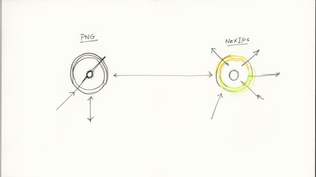
Picking the right way to handle Next JS icons isn't just a minor detail—it's a critical performance decision. We've moved way beyond the old methods. Modern libraries that use SVG components are a perfect match for Next.js, tapping into features like tree-shaking and server components to keep your app fast and lightweight.
Why Your Approach to Icons in Next JS Matters
Not too long ago, developers were stuck with clunky solutions like image sprites or heavy icon fonts. They worked, but they're completely out of place in a sophisticated framework like Next.js. These old-school techniques often make the browser download one huge file with every single icon, even if your page only uses two or three.
That’s why SVG component libraries, like VibeIcons, are such a breath of fresh air. They treat each icon as its own distinct React component, giving you an incredible amount of flexibility and efficiency.
The Synergy with Modern Next JS Features
The real magic happens when you see how these libraries interact with the core architecture of Next.js. A couple of key features really make them shine:
- Tree-Shaking: This is your bundler’s secret weapon for keeping your app lean. When you import an icon as a component, tools like Webpack or Turbopack can see exactly which icons you’re using. Everything else gets automatically stripped out of the final production build. Your users only download what they need.
- Server Components: Since the introduction of the Next.js App Router, you can now render icons directly on the server. The browser receives pre-built HTML, which cuts down on the client-side JavaScript needed for the initial render and makes your page feel faster instantly.
This isn’t just a small tweak; it's a completely different way of thinking about assets. Your icon system becomes a key part of building a high-performance web application. You can dive deeper into the strategic use of icons in our detailed guide.
When you import icons as individual components, you’re guaranteeing that only the SVG code you actually use makes it into your final bundle. This directly translates to a smaller footprint and faster load times, which has a real impact on your Core Web Vitals.
Generating Your First Icon Idea
Let's say you need a unique icon for a user settings page. Instead of searching for something generic, you could generate a perfect fit by giving an AI a specific prompt about its style and purpose.
AI Icon Prompt Example:Minimalist line art icon of a gear combined with a user profile silhouette, for a 'user settings' button, single color, SVG vector style, clean and modern aesthetic.
Icons are the unsung heroes of user interfaces. They guide users, add visual flair, and communicate complex ideas in a tiny space. When you're working with Next.js, you want an icon system that's just as fast and scalable as the framework itself. That's where a modern SVG component library like VibeIcons comes in.
Getting that first icon to show up should be a quick, satisfying win. With VibeIcons, you can get a comprehensive set of Next.js icons up and running in your app with a single installation command, setting a strong foundation for a clean and maintainable icon system right from the start.
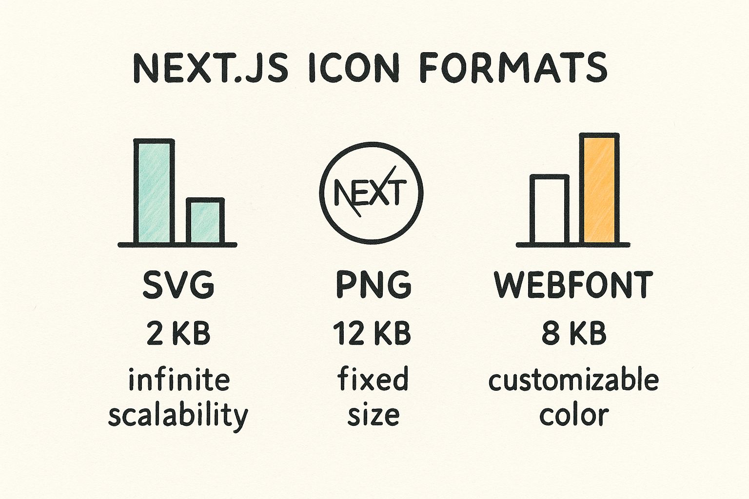
As you can see, SVGs hit the sweet spot. They offer the best of both worlds: tiny file sizes that keep your app nimble and full scalability for crisp visuals on any screen.
Icon Implementation Methods Comparison
When building with Next.js, you have a few ways to handle icons. Older methods like icon fonts or static images (PNGs, JPEGs) have largely been replaced by SVG component libraries, and for good reason. Here’s a quick breakdown of why modern developers overwhelmingly prefer SVG components.
| Method | Performance Impact | Customization | Accessibility |
|---|---|---|---|
| SVG Component Library | Low. SVGs are tiny, and tree-shaking removes unused icons from the final bundle. | High. Easily control size, color, and stroke-width via props or CSS. | Excellent. Natively supports ARIA attributes and title tags for screen readers. |
| Icon Fonts | Medium. Loads an entire font file, even if you only use a few icons. Can cause a flash of unstyled text (FOUT). | Limited. Restricted to single-color and basic CSS transformations. | Poor. Often requires complex workarounds with pseudo-elements to be accessible. |
| Static Image Files (PNG, JPG) | High. Raster images don't scale well, requiring multiple sizes and increasing page weight. | None. Customization requires editing the source file in an image editor. | Good. Relies on standard <img> alt attributes for accessibility. |
The choice is pretty clear. SVG component libraries give you the performance, flexibility, and accessibility needed to build a top-tier Next.js application without the baggage of older, less efficient methods.
Your First Icon and the Power of a Wrapper
Once the library is installed, you could technically start dropping icons directly into your pages. But hold on—there’s a much better way. To keep your code DRY (Don't Repeat Yourself) and your project maintainable, the best practice is to create a reusable wrapper component.
Think of it as your central hub for all things icons. This simple Icon component will handle default properties like size, color, and className for every icon in your app. Need to change the default icon size later? You'll only have to edit one file, not hundreds.
The real magic of a wrapper component is abstraction. You're creating a clean API for using icons in your app. If you ever decide to switch to a different icon library down the road, you only have to update the logic inside this one component.
A 2023 web performance analysis really drives this point home, finding that optimized SVG icons can slash mobile page weight by up to 30% compared to icon fonts. This translates directly to faster load times and a much sharper look on high-resolution screens. These performance benefits are a key reason why modern front-end development has moved so decisively toward SVGs.
Building the Icon Wrapper Component
So, what does this wrapper look like in practice? It's surprisingly simple. Here’s a lean and powerful example you can drop right into your Next.js project. It takes a name prop to dynamically render the right icon from VibeIcons and passes any other props down for easy styling.
Create a new file, components/Icon.jsx:
// components/Icon.jsx
import * as VibeIcons from '@vibe/icons-react';
const Icon = ({ name, className, size = 24, ...props }) => {
const IconComponent = VibeIcons[name];
if (!IconComponent) {
// A good practice is to return a default icon or null
// to prevent errors if an invalid name is passed.
return null;
}
return <IconComponent className={className} width={size} height={size} {...props} />;
};
export default Icon;
With this little component in place, adding an icon anywhere in your app is as clean and simple as <Icon name="Rocket" />. This approach doesn't just tidy up your code; it makes your entire icon system incredibly flexible and a breeze to manage as your project scales.
When You Need a Custom Icon
Sometimes, the perfect icon just isn't in a pre-built library. In those cases, you can turn to an AI image generator to create exactly what you need. The key is to be specific with your prompt.
Here are a few examples you can use as a starting point for common UI elements:
- For a 'Dashboard' Icon:
Clean line art icon for a business dashboard, showing a simple bar chart and a rising arrow, single color, SVG format, rounded corners. - For a 'Logout' Icon:
Minimalist icon representing 'logout,' an arrow pointing out of an open door frame, vector style, uniform stroke width.
Bringing Your Icons to Life with Advanced Styling
Static icons get the job done, but interactive icons? They make your user experience feel polished and responsive. When you pair VibeIcons with a utility-first framework like Tailwind CSS, you can create some seriously dynamic Next JS icons without a ton of extra work. Think icons that change color on hover or animate when you click a button—small details that make a huge difference.
This kind of interactivity is becoming the standard. If you look at the most popular icon libraries today—like Lucide Icons, Heroicons, or Phosphor Icons—they are all built with customization and modern features like dark mode in mind. That's because today's apps have to adapt to what users want. You can actually see a great rundown of the top 10 icon libraries on embarkingonvoyage.com to get a sense of the landscape.
Dynamic Styling with Tailwind CSS
One of the best things about Tailwind is how easily it handles states. You can use its utility classes to change an icon's style when a user hovers over it, clicks it, or even when its parent element is disabled. The group utility is a game-changer for this.
Let's walk through building a reusable button component that shows this in action. We'll integrate a VibeIcon that reacts to different button states—hover, active, and disabled. This is a pattern I use all the time to keep my UI consistent.
// components/StyledButton.jsx
import Icon from './Icon'; // Assuming you have the Icon wrapper from the previous section
const StyledButton = ({ iconName, children, disabled = false }) => {
return (
);
};
export default StyledButton;
See what's happening here? By adding the group class to the main button, we can then target the icon inside it with classes like group-hover:scale-110. Now, whenever a user hovers over the button, the icon inside it will subtly scale up, giving them some nice visual feedback. It's clean and efficient.
Handling Color and Dark Mode
Managing colors across different states, especially with dark mode in the mix, can get tricky. But Tailwind’s dark: variant makes it almost trivial. Whether you define colors directly in your classes or use CSS variables for a more robust theming system, the approach is the same. The real goal is to think about how an icon color change can communicate status to the user.
A well-styled icon isn't just decoration; it's a piece of communication. Its color, size, and animation should all serve a purpose, guiding the user and reinforcing the application's brand identity.
For instance, you might want the icon on a disabled button to look different in light mode versus dark mode to maintain good contrast.
- Default State:
text-white - Disabled State (Light Mode):
group-disabled:text-gray-200 - Disabled State (Dark Mode):
dark:group-disabled:text-gray-500
By adding these kinds of state-aware classes to your Icon component, you're building a truly adaptive UI that looks polished no matter the context.
Generating Ideas for Interactive Icons
Feeling stuck for ideas? AI tools can be surprisingly helpful for brainstorming both the icon design and its interactive behavior.
Try a prompt that's specific about what you need.
AI Icon Prompt Example:Minimalist SVG icon of a shopping cart for an e-commerce 'Add to Cart' button. Generate a second state for 'on-click' where a plus sign appears next to the cart, animated, single color, vector style.
This kind of prompt pushes you to think beyond just a static image. It helps you turn your Next JS icons into a genuinely interactive and engaging part of your application.
Making Your Icons Fly in Production
Once you’re ready to deploy, performance is everything. Every single kilobyte you can shave off your production build counts towards a better, faster user experience. The good news is that modern icon libraries like VibeIcons are built from the ground up to play nicely with Next.js's built-in performance features, particularly tree-shaking.
Think of tree-shaking as an intelligent decluttering tool for your code. When you build your app, it scans every file and figures out exactly what you're using. If you import an icon like <Icon name="Rocket" />, the bundler sees that specific import and makes sure only the "Rocket" icon's code makes it into the final bundle. The rest of the icon library? It gets left behind.
This process happens automatically and is a lifesaver for keeping your app lean. Users only download the code for the icons they actually see, which can dramatically shrink your JavaScript bundle and speed up those crucial initial page loads.
Taking it a Step Further with Lazy-Loading
Even with tree-shaking doing its job, we can get even smarter about performance. Not every icon needs to be there when the page first loads. Icons tucked away in modals, dropdowns, or complex settings panels are prime candidates for lazy-loading. This is where Next.js dynamic imports become your best friend.
Using next/dynamic, you can tell Next.js to hold off on loading a specific icon component until it’s actually about to be rendered. This means its code isn't part of the initial JavaScript sent to the browser, which can have a real impact on your Core Web Vitals, especially on pages with lots of content.
The whole idea here is to get the most important content in front of the user as quickly as possible. By delaying anything that isn't immediately visible, you free up the browser to render the main content first, making your app feel snappy and responsive from the get-go.
For app-level icons like favicons, Next.js has another powerful trick up its sleeve. It uses a metadata file convention that works with the ImageResponse API to optimize and cache these assets at build time. It’s worth diving into the official docs on Next.js's metadata file conventions to see how deep these framework-level optimizations go.
Lazy-Loading in Action: A Real-World Example
Let's make this practical. Imagine a user settings menu. It’s hidden by default and only appears when someone clicks their profile button. That menu is full of icons that don't need to be loaded upfront.
Here’s how you’d use next/dynamic to load a "Settings" icon only when that menu is opened:
import { useState } from 'react';
import dynamic from 'next/dynamic';
// This tells Next.js to create a separate chunk for our Icon component
const DynamicIcon = dynamic(() => import('../components/Icon'));
const UserMenu = () => {
const [isOpen, setIsOpen] = useState(false);
return (
<button onClick={() => setIsOpen(!isOpen)}>
{/* You could even have a lightweight, default icon here */}
Menu
  {/* This part only renders when the menu is open */}
  {isOpen && (
    <div className="menu-dropdown">
      {/* The Settings icon is only fetched and rendered at this moment */}
      <DynamicIcon name="Settings" />
      <span>Account Settings</span>
    </div>
  )}
</div>
);
};
export default UserMenu;
It’s a deceptively simple change, but the impact is significant. The code for the Settings icon is only requested from the server when the isOpen state flips to true. This directly shrinks your initial JavaScript payload, making your application faster one icon at a time.
Making Your Own Icons: Custom & AI-Generated
While huge libraries like VibeIcons are fantastic, there are moments when a project's brand just screams for something unique. Let's be honest, off-the-shelf icons can only get you so far. When you need your app to have a truly distinct visual signature, creating your own is the way to go. This doesn't always mean spending hours in a design tool—it can also mean using AI to dream up and produce entire icon sets in minutes.
The great thing is, integrating your own creations is surprisingly simple. It all starts with a clean, optimized SVG file. Tools like Figma or Adobe Illustrator are your best friends here. Once you've got your SVG, the next step is to transform it into a React component that plugs right into the icon system we've already set up.
From SVG Code to React Component
Turning raw SVG markup into a reusable React component is less intimidating than it sounds. The objective is to build a component that can accept props like className and size, just like the icons we’re importing from a library. This consistency is what makes your custom icon feel like a first-class citizen in your project.
Let's say you've designed a slick custom "dashboard" icon. The raw SVG code you export might look like this:
<svg
width="24"
height="24"
viewBox="0 0 24 24"
fill="none"
xmlns="http://www.w3.org/2000/svg"
To bring this to life in React, just create a new component file, maybe CustomDashboardIcon.jsx. Then, you'll adapt the SVG syntax to work with JSX. The main things to watch for are converting attributes like stroke-width to camelCase (strokeWidth) and spreading ...props to make it flexible.
// components/icons/CustomDashboardIcon.jsx
const CustomDashboardIcon = (props) => (
<svg
width="24"
height="24"
viewBox="0 0 24 24"
fill="none"
xmlns="http://www.w3.org/2000/svg"
{...props}
<path d="M10 3H3V10H10V3Z" stroke="currentColor" strokeWidth="2"/>
<path d="M21 3H14V10H21V3Z" stroke="currentColor" strokeWidth="2"/>
<path d="M21 14H14V21H21V14Z" stroke="currentColor" strokeWidth="2"/>
<path d="M10 14H3V21H10V14Z" stroke="currentColor" strokeWidth="2"/>
export default CustomDashboardIcon;
And just like that, this component is ready to be imported and used anywhere. You can style it with Tailwind and manage it exactly like any other icon. If you want to go deeper into the design side of things, check out our guide on https://www.vibe-icons.com/blog/how-to-make-custom-icons which walks through the whole optimization process.
Using AI for Quick Icon Creation
Sometimes the biggest hurdle isn't the code, it's coming up with the concepts. This is where AI image generators really shine. They're brilliant for brainstorming and creating entire icon sets with a unified style. From my experience, the quality of the output is almost 100% dependent on the quality of your prompt.
My Pro Tip: Be ridiculously specific with your AI prompts. Don't just ask for a "settings icon." Specify the style (line art, duotone, 3D), the subject, the format (SVG, vector), and where it will be used. Vague requests give you generic junk; detailed requests give you assets you can actually use.
Here are a few prompts I've used that you can adapt for your own Next.js icons:
For a SaaS Application:
Minimalist line art icon set for a fintech dashboard, including icons for revenue, users, settings, and reports. Use a single color on a transparent background, clean vector SVG style.For an E-commerce Site:
Friendly, rounded duotone icon set for an e-commerce platform. Icons needed: shopping cart, user profile, wishlist, and customer support. Use a soft blue and gray palette, SVG format.For a Creative Portfolio:
Hand-drawn sketch style icon set for a creative agency website. Include icons for 'Our Work,' 'Services,' and 'Contact Us.' Monochrome, on a transparent background, vector SVG output.
This approach is a game-changer for quickly generating a cohesive set of visuals that perfectly match your app's vibe without spending days in a design tool.
A Few Common Questions About Next.js Icons
Even with the best tools, you're bound to run into some head-scratchers when you're deep in the code. When it comes to using icons in Next.js, I've seen a few questions pop up time and time again. Let's tackle them head-on so you can keep building without getting stuck.
First up, let's talk about accessibility. This isn't just a box to check; it’s a fundamental part of building professional, inclusive websites.
An icon without a proper text alternative is just a meaningless shape to screen readers. For users who rely on this technology, it creates a frustrating and confusing experience. Making your icons accessible is simply non-negotiable.
The best practice is pretty straightforward. If an icon is purely decorative and adds no real meaning, you should hide it from assistive tech with aria-hidden="true". But if it conveys information or is part of an interactive element like a button, you absolutely must provide a text alternative using aria-label or some visually hidden text.
How Do I Handle Icons in Server vs. Client Components?
The Next.js App Router introduces a big question: where should your icons live? On the server or on the client? The answer really boils down to what the icon is doing.
- Server Components: For any static icon that doesn't change based on user interaction—think logos, informational icons in a footer, or bullet points—always stick them in a Server Component. This is a huge performance win because the icon's HTML is pre-rendered and shipped to the browser, cutting down on the amount of JavaScript the user has to download and run.
- Client Components: If an icon needs to be interactive in any way—maybe it changes color on hover, animates when you click it, or toggles based on some state—it has to be in a Client Component.
My rule of thumb? Default to Server Components for everything you can. Only pull an icon into a Client Component when you explicitly need that interactivity.
What if My Icons Cause a Layout Shift?
Ah, the dreaded Cumulative Layout Shift (CLS). This is a Core Web Vital that Google uses to measure visual stability, and yeah, icons can definitely be a culprit. You’ve probably seen it before: the text loads, and then an icon pops in a second later, causing everything on the page to jump.
Luckily, the fix is simple. You just need to reserve space for the icon before it renders.
By setting explicit width and height attributes on your SVG or <img> tag (or using CSS utility classes like w-6 h-6 in Tailwind CSS), you're telling the browser exactly how much room to save. No more annoying content jumps.
How Can I Generate a Custom Icon for Something Like an FAQ Section?
Sometimes, you need an icon that’s a perfect fit for a specific part of your UI, and a generic library just won't cut it. This is where AI-powered tools can be a fantastic starting point.
Let’s say you wanted a unique icon for this very FAQ section. You could use a prompt like this:
AI Icon Prompt Example:Minimalist line art icon of a question mark inside a speech bubble, for an FAQ section header. Single color, clean vector SVG style, with uniform stroke width.
A detailed prompt like that gives the AI clear instructions, ensuring you get a relevant, well-designed asset that fits right into your design system. Getting your icon strategy right in Next.js is all about balancing performance, developer experience, and aesthetics.
Ready to stop endlessly searching for the perfect icon and just create it instead? VibeIcons gives you high-quality, AI-powered icons that match your project's unique style in seconds. Try it for free and see how easy it is to build a beautiful visual identity for your Next.js application.