The Ultimate Guide to the App Drawer Icon
Explore the complete guide to the app drawer icon. Learn about its design principles, history, and UX best practices to create intuitive mobile interfaces.
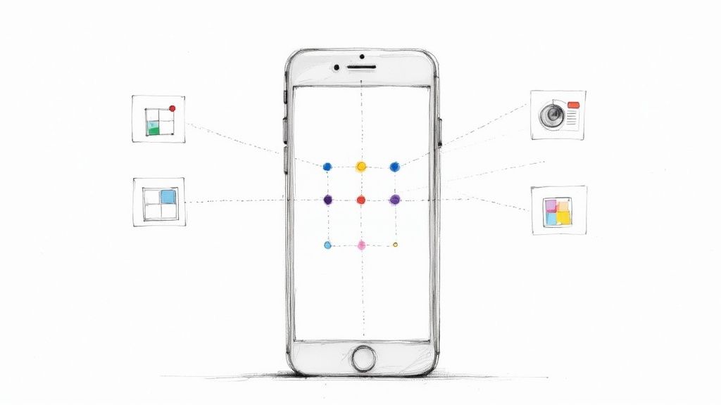
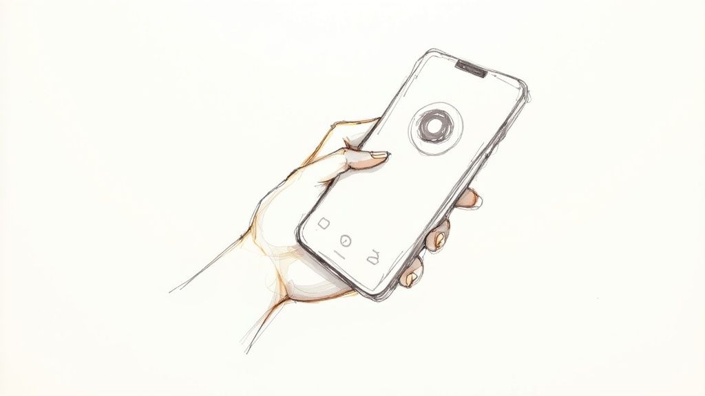
The app drawer icon is the little button that opens up the full list of every app on your phone. Think of it like the "Start Menu" on a computer, but for your mobile device. It's the gateway to all the apps you've installed, especially the ones you don't keep on your main home screen.
Unlocking Your Digital World
At its heart, the app drawer icon is all about organization. Imagine if every single app you downloaded was permanently stuck on your home screen—it would be an absolute mess. This simple icon lets you keep your home screen clean and tidy, showing only your favorite or most-used apps. Everything else is neatly tucked away in an alphabetical list, just a tap away.
This whole idea is a cornerstone of the user experience on Android, balancing a personalized interface with easy access to everything. When you tap that icon, you're instantly switching from your curated home screen to a complete library of all your tools, games, and services.
The Role of Visual Cues
The icon's design is a perfect example of saying a lot with very little. It has to scream "all your apps are in here" without using a single word. That's why a few common visual metaphors have caught on and are now instantly recognizable to most people.
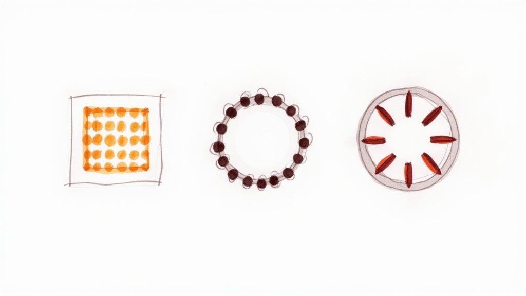
You'll usually see one of these designs:
- A grid of dots or squares: This is the classic look. A 3x3 or 4x4 pattern visually represents a grid of apps, making the connection immediate.
- A circle with smaller circles inside: This is a more modern take on the grid, giving the impression of a container holding all your other apps.
- An upward-facing arrow (or chevron): As gesture navigation became popular, this icon emerged. It visually prompts you to swipe up from the bottom of the screen to reveal the app drawer.
By acting as a consistent, recognizable gateway, the app drawer icon reduces cognitive load for the user. They don't have to hunt for their apps; they instinctively know where the main directory is located.
In the end, the icon's design has a direct impact on how efficiently you can use your phone. A clear, intuitive symbol makes navigation feel effortless and the device more responsive. It’s a tiny detail that makes a huge difference in daily usability, bridging the gap between a clean home screen and the full power of your device.
The Evolution of the App Drawer Icon
To really get why today’s app drawer icons look so clean and simple, it helps to take a quick trip back in time. The icon’s journey is a fantastic reflection of how digital design itself has grown up, moving from busy, literal graphics to the sleek, abstract symbols we see everywhere now. This tiny icon didn't just get a facelift; it had to change to keep up with better screens, new user habits, and a complete shift in design thinking.
This story really kicks off with the birth of Android. The app drawer icon was a core part of the user interface right from Android's first public release back in 2008. Early on, it was a pretty straightforward grid of squares—a literal picture of the grid of apps you’d find inside. It did the job. You can actually see a great breakdown of the design choices behind Android's evolution on YouTube.
From Skeuomorphism to Simplicity
In the early smartphone era, designers were all about skeuomorphism. The goal was to make digital things look like their real-world twins. Think digital notebook pages with binder rings or a calendar app with faux leather stitching. This style used textures, shadows, and glossy effects to make strange new touchscreens feel familiar and less intimidating.
The app drawer icon got the same treatment. The first versions often had a 3D look, like a physical button you could almost feel yourself push. It was a smart way to help people connect what they knew about the physical world with this new digital one.
But as we all got more comfortable swiping and tapping, that heavy-handed approach started to feel clunky and unnecessary. Plus, it created a real technical headache. Those detailed, textured icons looked fuzzy and dated on the new, high-resolution screens that were becoming common. Something had to give.
The Rise of Flat Design and Material You
The big change came around 2014 when Google unveiled its new design language, Material Design. This was the moment that skeuomorphism officially fell out of favor in the Android ecosystem. Material Design championed a "flat" look, getting rid of all the fake textures and shadows for clean lines, bold colors, and smooth, meaningful animations.
The goal was no longer to mimic reality but to create a rational, organized digital space that felt intuitive on its own terms. This philosophy completely reshaped the visual identity of Android.
With these new rules, the app drawer icon changed completely. It lost its 3D effects and became a simple, flat symbol.
- Grid of Dots: The classic grid was boiled down to its essence—a clean circle with nine small dots. This became the go-to look for years.
- Swipe-Up Arrow: As phones moved toward gesture-based controls, the icon often morphed into a subtle upward-pointing arrow, hinting that you should swipe up to see your apps.
- Search Bar Integration: Today, many phone launchers have done away with a dedicated icon altogether, merging it with the search bar at the bottom of the screen.
This whole journey follows a key rule of modern design: clarity over clutter. The app drawer icon we see today is efficient, looks sharp on any screen, and is instantly understood. It’s the perfect example of how, sometimes, the simplest design is the smartest one.
Core Principles of Effective Icon Design
Great icon design doesn't just happen by accident. It's a thoughtful process grounded in principles that put the user first. A truly effective app drawer icon is one you understand instantly, without even having to think about it. The goal is a perfect marriage of aesthetics and utility, creating an icon that works for everyone, on any device.
To get there, designers lean on a few core pillars. Think of these as a practical checklist to ensure an icon isn't just a pretty picture, but an intuitive, accessible, and technically solid part of the user experience.
The Pillar of Clarity
Above all else, an icon has to be understood. Clarity is king. It means the icon’s purpose is so obvious that it eliminates any guesswork. For the app drawer icon, this usually means sticking to simple, universally recognized symbols—like a grid of dots—that immediately say "here are all your apps."
Trying to get too artistic or cramming in too much detail is a recipe for confusion. That just slows people down. The real aim is to reduce the user's cognitive load, so they can see the icon, know what it does, and tap it without a second thought.
This chart really drives home how much clarity matters compared to other design goals.
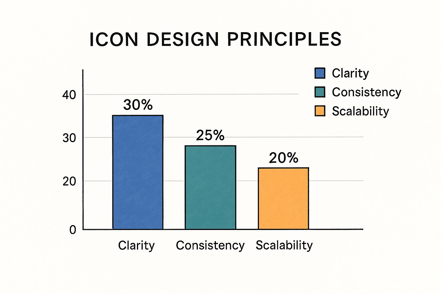
As you can see, while several factors are in the mix, making sure the icon is instantly understandable is the top priority for a successful design.
Harmony Through Consistency and Scalability
After clarity, the next step is making sure the icon looks like it belongs. Consistency is the principle that ensures your app drawer icon fits in with the other icons and UI elements on the screen. It needs to speak the same visual language, whether that's Google’s Material You or a unique skin from a manufacturer.
This harmony makes the whole interface feel more cohesive and less jarring. At the same time, scalability is a non-negotiable technical requirement. Your icon has to look crisp and clear on a huge variety of screens, from a small, low-resolution phone to a massive, high-density tablet.
Designers pull this off by:
- Working with vector graphics: SVGs are the industry standard for a reason. They can be scaled up or down infinitely without losing an ounce of quality.
- Sticking to simple shapes: Bold, clean, geometric forms hold up much better at small sizes than thin, intricate lines.
- Testing, testing, and more testing: You have to check how the icon looks on different devices and at various scales to make sure it’s always legible.
A scalable and consistent icon maintains its integrity and purpose, creating a seamless experience that feels native to the device. This builds user trust and makes the interface feel more polished and professional.
Designing for Everyone
At the end of the day, great design is inclusive design. Accessibility means making sure the icon is usable by people with visual impairments. A big part of this is paying close attention to color contrast so the icon stands out clearly against whatever background it's on.
Branding is the final layer. This is where custom launchers might add a subtle twist to the icon to create a unique identity, all while respecting the core rules of usability. If you want to go deeper on this, take a look at this fantastic guide to user experience icon design.
A Visual Journey From Skeuomorphism to Flat Design
To really get why the modern app drawer icon is so clean and simple, we need to take a quick trip back in time. This isn’t just about aesthetics changing; it’s a story about how our relationship with technology itself has evolved.
Our journey starts with skeuomorphism, the design philosophy that was absolutely everywhere in the early days of smartphones. The core idea was simple: make the new, unfamiliar world of touchscreens feel comfortable by making everything look like a real, physical object.
Think back to those early icons. They had heavy shadows, glossy finishes, and realistic textures designed to make you want to reach out and touch them. A notes app looked like a yellow legal pad, and your contacts were stored in what looked like a leather-bound address book. The app drawer icon itself often had a 3D, button-like quality, practically begging to be tapped.
The Great Design Divide
But as we all got more comfortable swiping and tapping, those hyper-realistic designs started to feel less helpful and more… well, cluttered. On the new, crisp, high-resolution screens, all that gloss and texture just looked dated. This opened the door for a radical change in thinking, led by the rise of flat design.
Flat design threw all that ornamentation out the window. It embraced a clean, two-dimensional aesthetic built on simple lines, bold colors, and basic geometric shapes. The goal was no longer to imitate the real world, but to create a digital space that was clear, functional, and fast.
You can see this shift clearly in early iOS and Android icons, which started out with that heavy, textured skeuomorphic look. By the mid-2010s, flat design had taken over, simplifying icons into the minimalist forms we know today. Of course, this completely changed the app drawer icon, which went from a detailed illustration to a simple grid of dots or squares. If you're curious about the nitty-gritty of this change, there's a great short history of iOS app icons that dives even deeper.
Skeuomorphism vs Flat Design in Iconography
To really see the difference, it helps to put these two philosophies head-to-head. Each had its moment, and each brought its own strengths and weaknesses to the table, shaping the user interfaces we interact with every day.
| Attribute | Skeuomorphism | Flat Design |
|---|---|---|
| Visual Style | Mimics real-world objects with textures, shadows, and gloss. | Uses minimalist, two-dimensional elements with clean lines and solid colors. |
| User Goal | To make new interfaces feel familiar and less intimidating for first-time users. | To prioritize clarity, efficiency, and speed in navigation for experienced users. |
| Pros | Highly intuitive for beginners; provides clear visual affordances (e.g., a button that looks pressable). | Scalable, looks sharp on all screen resolutions, and has a clean, modern aesthetic. |
| Cons | Can look dated and cluttered; complex designs don't scale well to different screen sizes. | Can sometimes lack clear signifiers for interactive elements, potentially confusing new users. |
In the end, moving toward flat design wasn't just a trend; it was a necessary evolution. It allowed interfaces to become cleaner, more consistent, and adaptable enough to look great on any device, from a watch to a massive monitor. For a closer look at how these principles are put into practice now, check out our guide on creating great app icons for iPhone.
Getting Icon Placement and Interaction Just Right
You can design the most beautiful, instantly recognizable icon in the world, but if you stick it in the wrong place or make it clunky to use, it's a failure. A great app drawer icon isn't just a pretty picture; its real success comes down to where it lives on the screen and how it feels to use. This is where user experience (UX) becomes crucial, transforming a simple symbol into a seamless gateway.
Think about it—we've all been conditioned by years of using smartphones to find certain things in certain places. It's why the app drawer icon almost universally sits in the dock, that persistent row of apps at the very bottom of the home screen. This isn't just a happy accident. That space is prime real estate, perfectly situated for an easy thumb tap without having to awkwardly shift your grip.
How Does the User Get In?
The where is important, but the how is just as critical. The way a user actually opens the app drawer sets their physical expectation of how the interface works. Thankfully, modern launchers have nailed down a few really effective ways to do this.
- The Classic Tap: It doesn't get more straightforward than this. One tap on the icon, and the full app list appears. It's predictable, intuitive, and has zero learning curve.
- The Swipe-Up Gesture: This has become a huge fan favorite. Instead of tapping an icon, you just swipe up from the bottom of the screen. It feels incredibly fluid and has the added bonus of freeing up a spot in your dock, since a visible icon often isn't even necessary.
- Long Press for Power Users: Some of the more advanced launchers, like the ever-popular Nova Launcher, add another layer. A long press on the icon can bring up a menu of shortcuts or custom actions, which is a neat trick for efficiency.
The best interaction models feel instantly responsive. When someone taps or swipes, a subtle animation—the drawer sliding up, icons bouncing gently into view—provides immediate confirmation that the action worked. These tiny details, or micro-interactions, are what make a device feel polished and alive.
Taking Cues from the Best in the Business
If you look at how popular launchers handle this, you can see different design philosophies at play. Google’s Pixel Launcher, for instance, has gone all-in on the swipe-up gesture, merging app drawer access directly into its search bar. It’s a clean, minimalist approach that keeps the home screen uncluttered.
On the other end of the spectrum, you have highly customizable launchers like Lawnchair that put the user in the driver's seat, letting them choose between a dedicated icon, a gesture, or both. Understanding why these choices matter is key, and getting a good grasp on the fundamental use of icons in UI design can provide some fantastic context. By mastering these placement and interaction principles, you can make sure your app drawer isn't just a feature, but a genuinely effortless experience.
Got Questions About the App Drawer Icon? We've Got Answers.
The app drawer icon has been around for ages, but it still seems to stir up plenty of questions. Whether you're a designer trying to build a clean interface or just someone trying to personalize their phone, a few common queries always seem to surface. Let's tackle some of the most frequent ones.
Think of this as your quick-reference guide. We'll cover everything from the basic "why is this even a thing?" to trickier questions about customization and where it's headed in a world of swipe gestures.
So, Why Don't Some Phones Have an App Drawer Icon?
If you've ever switched between an iPhone and an Android device, you've definitely noticed this. Apple's iOS, for instance, has never had an app drawer icon. This isn't a mistake; it's a fundamental difference in design philosophy. While Android has long championed a two-layer system—a clean home screen for your favorites and a separate drawer for everything else—iOS puts every single app you install right on the home screen.
Neither approach is inherently better, it just comes down to what you prefer:
- The Android Way: This prioritizes a tidy, minimalist home screen. You get to hide away the apps you don't use often without having to delete them.
- The iOS Way: This offers a simpler, more direct system where every app is immediately visible. No need to dig into a separate menu.
It's worth noting that some Android phone makers and custom launchers now give you the option to ditch the app drawer entirely, letting you get that iOS-style experience if that's your thing.
Can I Actually Change or Customize My App Drawer Icon?
You absolutely can! This is one of the best parts about being on Android. While the icon that comes with your phone's default software is usually locked in place, you can easily swap it out by installing a third-party launcher.
A "launcher" is just an app that takes over your home screen and app drawer, giving you a massive amount of control over how your phone looks and works. Think of it as a powerful theme engine for your entire phone.
Powerhouse launchers like Nova Launcher or the community-favorite Lawnchair give you total control. You can replace that standard grid of dots with a custom icon from an icon pack you downloaded, or even a picture from your photo gallery. It’s the perfect way to make your home screen truly your own.
Is the App Drawer Icon Going Extinct?
That's the million-dollar question in UI design circles right now. As our phones have embraced gesture-based navigation, we're seeing a clear shift away from a visible, tappable button. Instead of poking at an icon, we now just swipe up from the bottom of the screen to pull up our app list.
This evolution has led many modern launchers, including Google's own on its Pixel phones, to remove the dedicated icon completely. Often, the swipe-up gesture is integrated into the persistent search bar docked at the bottom. So, while the physical icon might be fading from view on some devices, the function of the app drawer is as important as ever. It's just moving from a button you tap to an action you perform.
Tired of hunting for the perfect icon? Why not create it instead? VibeIcons uses AI to generate beautiful, custom icons that perfectly match your style—whether you need a fresh app drawer icon or a complete set for your next project. Design your first five icons for free and see what you can create.