Create Stunning App Icons for iPhone | Design Tips & AI Tools
Learn how to design eye-catching app icons for iPhone with our expert guide on rules, concepts, and AI tools to make your app stand out.
Your app icon is arguably the most critical piece of marketing you'll ever create for your app. It's the first thing anyone sees. Before they read a single word of your description or see a screenshot, they're already forming an opinion based on that tiny square on their screen. It's a silent promise of the quality and experience waiting inside.
Why Your App Icon Is Your Most Important Handshake

Just glance at your own iPhone's Home Screen. Every icon is a portal—not just to an app, but to a feeling or a function. The bright, energetic icon for a game sets a totally different expectation than the sleek, minimalist symbol for a productivity tool. In the incredibly crowded App Store, your icon is your first, and sometimes only, chance to stand out.
This visual first impression has to communicate your app's core purpose in a fraction of a second. A great icon does this by expertly blending a few key elements:
- Color Psychology: Colors trigger immediate emotional responses. A finance app might lean on a trustworthy blue or a prosperous green, while a food delivery service could use an appetizing red or orange to get mouths watering.
- Clear Symbolism: A simple, recognizable symbol is always more effective than a busy illustration. Think of the iconic camera lens for Instagram or the simple musical note for Apple Music—you know what they do without thinking.
- Brand Identity: The icon has to fit seamlessly with your entire brand. It needs to look like it belongs with your website, your marketing, and the app's UI itself.
Before you jump into designing, it's worth having these core principles front and center. I've seen too many great apps held back by a mediocre icon.
Core Principles for Effective iPhone App Icons
This table sums up the foundational ideas you need to master. Keep these in mind as you start brainstorming.
| Principle | Why It Matters | Quick Tip |
|---|---|---|
| Scalability | Your icon must look sharp everywhere, from a tiny notification to the large App Store banner. | Test your design at multiple sizes. If details get lost when it's small, simplify it. |
| Recognizability | It needs to be instantly identifiable in a sea of other icons on a user's home screen. | Avoid generic shapes or symbols. Aim for a unique silhouette that stands on its own. |
| Simplicity | Overly complex icons become a visual mess at small sizes. Clarity is king. | Focus on a single, strong concept. Don't try to tell the whole story in one small square. |
| Consistency | The icon's style and color palette should align with your app's user interface and brand. | Ensure the icon feels like a natural entry point to the experience you've built inside the app. |
Getting these basics right is non-negotiable. It's the difference between an icon that gets tapped and one that gets ignored.
The Shift from Texture to Simplicity
The design philosophy for app icons for iPhone has come a long way. If you were around in the early days of iOS, you'll remember skeuomorphism—a style that used realistic textures, shadows, and gloss to make digital buttons and icons look like their real-world counterparts. It was a clever way to help people understand new digital interfaces by connecting them to familiar, physical objects.
The move away from skeuomorphism was a huge moment in UI design history. Before 2013, Apple’s icons looked tangible, like the glossy phone receiver icon from iOS 1. When Apple dropped iOS 7, that all changed. The new style was flat, clean, and minimalist, stripping away the extra fluff to focus on pure clarity and function. You can actually find a great breakdown of this mobile application design evolution on VentionTeams.com.
Today, the best app icons strike a balance. They’re clean and modern, but they have just enough depth and personality to pop. The goal isn’t to mimic reality anymore, but to create a distinct, memorable symbol that captures your app’s soul.
Treating your icon as a strategic asset from day one is crucial. Before you even think about opening a design tool, understanding its role as a powerful communication device will set you on the right path to creating something that truly works. It’s not just a decoration; it’s your app’s front door.
Getting to Grips with Apple’s Human Interface Guidelines for Icons

Before your app makes its grand debut on the App Store, it has to get past Apple's review team. A huge part of that approval process hangs on following their Human Interface Guidelines (HIG), and when it comes to app icons for iPhone, the rules are ironclad. It's best to think of the HIG less as a set of rigid constraints and more as a playbook for creating an icon that looks and feels like it belongs on iOS.
Trying to sidestep these guidelines is one of the quickest ways to get your app rejected. Apple is famously protective of its ecosystem's polished aesthetic, and an icon that breaks the mold will stick out for all the wrong reasons.
The Squircle and Other Ground Rules
The most recognizable feature of any iPhone icon is its shape: the "squircle." This specific rounded rectangle is a signature of iOS, and the system applies it automatically. Whatever you do, don't try to create this shape yourself or add your own drop shadow to the design.
Just deliver a full-bleed, perfectly square image. Apple's magic takes care of the rest, applying the mask that gives every icon that consistent, familiar look. It’s a basic step, but one that trips up a surprising number of newcomers.
Here are a few other non-negotiables to burn into your memory:
- No Transparency Allowed: Your icon image must be completely opaque. If your PNG has any transparent areas, they'll just show up as solid black, which looks sloppy and is a surefire way to get flagged.
- Simplicity is Key: Remember, your icon needs to be identifiable in a split second, whether it's featured prominently on the App Store or shrunk down to a tiny notification badge. Avoid cluttering it with text or intricate details that will turn into an unreadable smudge at smaller sizes.
- Pick a Single, Strong Focus: The best icons communicate one core idea. Think about what your app does and build around that. The Mail app is an envelope, the Camera app is a lens—they're simple, direct, and universally understood.
Apple’s guidelines are all about creating a seamless and high-quality user experience. An icon that plays by the rules doesn’t just look better; it feels more native and trustworthy to the person downloading it.
Why All the Different Icon Sizes?
One of the most common headaches for developers is the long list of icon sizes you need to submit. This isn't Apple trying to make your life difficult; it's about ensuring your icon looks incredibly sharp and crisp in every single place it appears. For a more detailed look at the technical side of things, our guide on creating a standout icon for your mobile app breaks it down even further.
You’re required to provide a whole set of sizes for different devices and contexts. The App Store, for example, needs a massive 1024x1024 pixel version for its listings. The icon on a modern iPhone's Home Screen is 180x180 pixels (@3x), and then there are even smaller versions for Spotlight search, the Settings menu, and notifications.
It might seem easier to just create one huge icon and let the system scale it down, but that's a recipe for blurry, pixelated results. By providing each specific size yourself, you get total control over the final look, guaranteeing a professional and polished appearance everywhere your icon shows up. My advice? Always start with a single, scalable vector graphic—it makes exporting all these different PNGs a breeze later on.
Developing an Icon Concept That Tells a Story

Alright, you've got Apple's rulebook down. Now the real fun begins. A great app icon is so much more than a splash of color on a user's home screen; it's a tiny, powerful story that needs to instantly telegraph your app's purpose and value. This is where you boil down your app's entire function into one compelling symbol.
Think about it. A fitness app icon should scream energy and motivation. A meditation app's icon? It better be simple and serene. That little square is your first handshake with a potential user, and it has to tell the right story from the jump.
Brainstorming and Sketching Initial Ideas
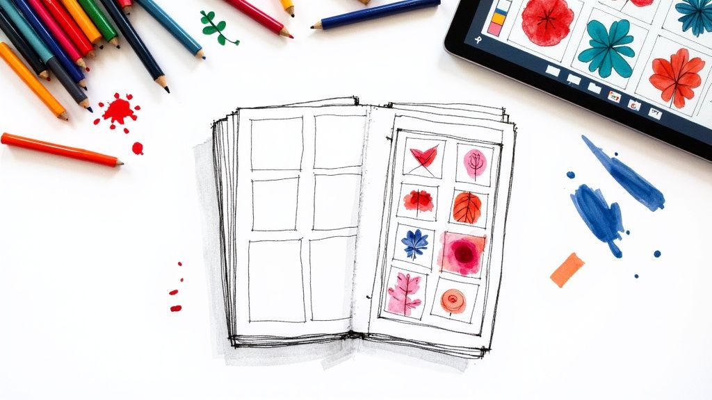
Before you even think about opening a design tool, step away from the screen. Seriously. Grab a notebook and a pen, and just let the ideas flow without judgment. The goal here isn't to create a masterpiece but to get as many raw concepts out as you can.
To get the creative gears turning, try these prompts:
- Go with a Metaphor: What object in the real world does what your app does? A magnifying glass for a document scanner, a filing cabinet for an organization app—you get the idea.
- Play with the First Letter: Can the initial of your app's name be worked into a unique shape? It's a classic for a reason. Just look at the "W" for WordPress or the "F" for Facebook.
- Try an Abstract Concept: Instead of a literal object, think about the feeling or the result. A simple checkmark can perfectly capture the essence of a productivity app.
This is all about quantity over quality in the beginning. Try to knock out at least 20-30 quick sketches. It's often in these messy, unfiltered doodles that you'll find the spark for your final design.
An app icon is your brand's most concentrated visual asset. It must communicate who you are and what you do in less than a second. This isn’t just design; it's high-speed communication.
Analyzing the Competition
Don't get too attached to a concept just yet. First, you have to do some recon. Open the App Store and search for apps in your category. What do you see? Are they all using the same shade of blue? Do they lean toward abstract symbols or literal illustrations?
You're doing two things here: first, learning the established visual language of your niche, and second, finding an opportunity to break the mold. If every single finance app uses a piggy bank, maybe your icon can stand out with a stylized growth chart or a unique symbol for wealth. This simple analysis is what keeps you from accidentally creating an icon that just blends into the background.
This is critical, especially when you consider there are nearly 2 million apps on the App Store. Your icon is a massive factor in your mobile app marketing, directly influencing whether someone stops scrolling and taps "download." A deep dive into top-performing app icons for iPhone shows clear patterns that successful developers follow. For a fantastic breakdown, you can check out this analysis of mobile app icon trends on Apptweak.com.
When you pair creative brainstorming with a smart, strategic look at the competition, you end up with a concept that's not just beautiful, but also clever. This groundwork is what ensures your final icon tells a clear story and earns its place on a user's home screen.
Using AI to Generate App Icons with VibeIcons
Once your concept is locked in, it's time to bring it to life. In the past, this meant diving into vector software and spending hours pushing pixels and tweaking Bézier curves. But now, AI can be an incredible creative partner, letting you churn through ideas at a speed we could only dream of a few years ago.
This is where a tool like VibeIcons completely changes the game. Instead of facing a blank canvas, you start with a simple text prompt. This closes the gap between an idea and a visual, letting you explore dozens of different looks in the time it used to take to draw a single shape.
The secret to getting great results is learning how to "speak" the AI's language. A vague prompt like "make a logo for a mail app" is a recipe for generic, forgettable icons. To get something truly special, you need to feed the AI specific, descriptive details that guide it toward your vision.
Crafting Prompts That Deliver Results
Think of your prompt as a creative brief you'd give a tireless designer who can work at lightning speed. The more detail you pack in, the better the output will be. A really solid prompt for app icons for iPhone usually has a few key ingredients.
I always try to combine these elements for the best results:
- Subject: What’s the core symbol? Think "a vibrant orange fox," "a stylized letter 'P'," or "a minimalist cloud."
- App Category: What is the app's purpose? This adds context, like "for a productivity app" or "for a weather forecast app."
- Art Style: What's the aesthetic? Be specific with terms like "flat design," "3D rendering," "cartoon style," or "minimalist lines."
- Mood/Color: What feeling are you after? Try "energetic and bold," "calm and professional," or specify "using a blue and white color palette."
Putting it all together, a really effective prompt might be: "a vibrant orange fox logo for a productivity app, minimalist, flat design." This gives the AI clear direction on the subject, style, and purpose. Don't be shy about mixing and matching different combinations to see what clicks.
This process chart shows the classic design workflow, from initial idea to the final exported files.

AI tools like VibeIcons basically supercharge the "Sketch concepts" and "Refine as vector" stages, letting you iterate rapidly before you settle on a final design direction.
Refining and Iterating with AI
Your first try probably won't be perfect—and that’s completely fine. The real magic of using an AI icon image creator is its ability to spin up endless variations. Think of the first batch of results as your raw material.
Here’s a practical workflow I use to dial in the design:
- Generate a batch: Start with your best prompt and create a set of 5-10 icons.
- Find the winners: Scan the results and pick one or two that feel the closest to your goal. Ask yourself what you like—is it the color? The shape? The overall composition?
- Tweak your prompt: Use what you've learned to refine your prompt. If the fox was too complex, add "simple silhouette." If the orange felt a bit muted, try swapping in "bright, fiery orange."
- Go again: Keep generating, analyzing, and refining your prompt until you land on a design that just feels right.
This iterative loop is where AI truly excels. It takes all the friction out of manual design work, so you can stay focused on the creative direction without getting bogged down in the technical side of things.
Once you have a design you absolutely love, VibeIcons lets you export it as a clean SVG file. This is crucial. A vector format is infinitely scalable, which guarantees your final app icons for iPhone will look perfectly crisp at every single size Apple requires, from the huge App Store banner all the way down to that tiny icon in the notification shade.
Preparing and Exporting Your Icons for Xcode
You’ve nailed the design, and now it’s time for the final, critical step: getting it ready for the real world. A brilliant icon is just a pretty picture until it’s properly exported, and this is where many developers, new and seasoned, can stumble. Prepping your app icons for iPhone for Xcode isn't rocket science, but it absolutely demands precision.
The whole game boils down to creating a complete set of perfectly sized PNG files. Why so many? Because your icon doesn't just live on the App Store page. It shows up everywhere—on the Home Screen, in Spotlight search, tucked away in the Settings menu, and popping up in notifications. Each of those placements requires a specific size to look crisp and clean.
The Right Format and Sizes
First things first: forget about JPGs or any other format. Apple is strict about this. Your icon assets must be non-interlaced PNG files. They also need to be completely opaque, which means no alpha channels or transparency. Don't worry about rounding the corners yourself; the system automatically applies its signature "squircle" mask, so your job is to export a perfect square.
Everything starts with a high-resolution master file. Make sure you have a 1024x1024 pixel version ready to go. This is the largest size you’ll need for the App Store, and it’s the source from which all the smaller versions will be scaled down.
Think of the Xcode Asset Catalog as a puzzle. Your job is to provide every single piece, perfectly cut to size. Skipping even one can lead to submission errors or, worse, a sloppy-looking app that damages user trust.
From that master file, you'll need to generate a whole family of smaller icons. For example, a modern iPhone with a @3x display requires a 180x180 pixel icon for its Home Screen. Tinier versions, like 87x87 pixels or 60x60 pixels, get pulled in for things like search results and notifications. If you want a full breakdown of the process and tools to help, you can learn more about how to create icon images that meet every requirement.
Working with the Xcode Asset Catalog
The journey of the iPhone app icon reflects Apple's own design evolution. We started with intricate, skeuomorphic designs before iOS 7 flipped the script to flat design in 2013. Then came the Retina Display, which doubled the required icon resolution from 512 to 1024 pixels. As icons started appearing in more places like Spotlight, the list of required sizes just kept growing. For a great recap, check out this brief history of iOS app icons on Jim Nielsen's blog.
Thankfully, Xcode gives us the AppIcon set inside the Asset Catalog, which makes this management process much less painful. It’s essentially a visual grid with clearly marked slots for every single icon size you need.
All you have to do is drag and drop each PNG into its matching box. Xcode even helps you out by flagging any empty slots with a yellow warning, so you know exactly what’s missing. A little bit of prep work—like naming your files logically (e.g., icon-180.png)—will make this final drag-and-drop step a breeze and get you that much closer to hitting "submit."
Common Questions About iPhone App Icons
Diving into icon design often brings up more questions than answers, especially when you're trying to meet Apple's strict rules. I've seen everyone from veteran developers to first-time designers get stuck on the same few hurdles.
Getting these things right from the start can save you a world of hurt—and a few frustrating App Store rejections. Let's walk through some of the most common questions I hear.
What are the biggest design mistakes to avoid?
I see the same few slip-ups time and again. The first is trying to cram text into the icon. Words like "free" or the app's name are totally unreadable at small sizes and just look messy. Your icon needs to be a strong, silent symbol that speaks for itself.
Another classic mistake is using a photograph. A detailed photo might look great on your desktop, but on a Home Screen, it just turns into an unidentifiable smudge. Always go for a clean, bold graphic. It'll be far more memorable.
Finally, people often forget about safe zones.
Don't let your main graphic touch the edges of the icon canvas. Always leave a bit of breathing room around the central element. This ensures the system's rounded corner mask doesn't awkwardly slice off a piece of your design.
Do I really need to export all those different sizes?
In a word: yes. It’s not just busywork; it's non-negotiable. Every single size Apple asks for is used in a specific spot across the OS, and each one needs to look pixel-perfect.
Think about it this way: the App Store icon is a massive 1024x1024 pixels, while the icon in Spotlight search is tiny. If you just handed iOS one big image and let it shrink it down, you'd get blurry, jagged-edged results. Your app would instantly look unprofessional.
By providing each size yourself, you maintain complete control over how your icon is rendered. It's a small detail that shows you care about the user experience.
Can I change my app icon after I launch?
You sure can. You're free to update your app icon with any new version you submit to the App Store. It's a great way to signal a rebrand, celebrate a holiday, or highlight a major new feature. The popular to-do app Things is a great example—they recently updated their well-known icon to better fit the modern OS aesthetic.
But a word of friendly advice: don't change it too often or too drastically without a solid reason. Your users get used to seeing your icon and tap it out of habit. A sudden, random change can leave them confused and scrolling right past your app on their Home Screen.
Ready to create an icon that stands out? VibeIcons uses AI to generate beautiful, professional app icons in seconds. Skip the tedious parts and get straight to a design you love. Generate your first icons for free at https://www.vibe-icons.com.