A Developer's Guide to Change Color Icon with CSS & SVG
Learn how to change color icon using CSS filters, masks, and inline SVG properties. A step-by-step guide with practical examples for developers.
When you need to change an icon's color, you have a few solid techniques at your disposal, depending on the icon's format. You can get pretty creative with CSS filters on standard image files, directly manipulate fill and stroke attributes for inline SVGs, or even build flexible components in frameworks like React that take a simple color prop.
Why Mastering Icon Color Is a Game Changer
Being able to dynamically change icon colors isn't just a minor design trick—it's a core skill for building modern, responsive user interfaces. The ability to shift icon colors on the fly is what separates a static design from a truly interactive and seamless user experience.
This one capability has a surprisingly big impact on a few critical areas of web design:
- Thematic Consistency: This is the most obvious one. It lets your icons flip effortlessly between light and dark modes, making sure they always look right and stay legible.
- Clear User Feedback: Changing an icon's color on hover or click gives users that instant "aha" moment, confirming the element is interactive. Think about a disabled button—a grayed-out icon instantly tells the user it's not clickable.
- Strong Brand Alignment: Keeping your icons locked into your brand's color palette is non-negotiable for a professional, cohesive look across your entire application.
A Small Detail with a Big Impact on Usability
Good color choices go way beyond just looking pretty; they have a real, measurable effect on how easily people can use your interface. In a study with 200 users, researchers at Microsoft found that colorful icons were a significant usability win over grayscale ones. People could find and distinguish between different color-coded icons much faster, which meant they got things done quicker.
The human brain is wired for pattern recognition, and distinct colors act as powerful shortcuts, making it easier to spot and differentiate icons at a glance. It's a subtle detail that can dramatically improve user satisfaction and accessibility.
Ultimately, getting a handle on icon color control gives you the power to build interfaces that aren't just more attractive, but are fundamentally more functional and intuitive for your users.
The Easiest Method: Using CSS Filters
Let's say you're stuck with a set of PNG icons and have no access to the original SVG files. You need to change their color for a hover state or to match a new brand theme. What do you do? This is where CSS filter becomes your secret weapon. It's a surprisingly powerful and versatile method that works on almost any visual element, not just icons.
The filter property is a CSS feature that lets you apply graphical effects directly in the browser. Think of it like a set of Instagram filters for your web elements. Instead of juggling multiple image files for different states, you can dynamically change an icon’s appearance on the fly.
Applying Basic Color Filters
Getting started with CSS filters is pretty straightforward. You’ll be using a handful of filter functions to manipulate the icon's color. It's often more of a creative process than an exact science, but you can get fantastic results with a little experimentation.
Here are the key functions you'll want to play with:
invert(1): This flips every color to its opposite on the color wheel. Black becomes white, green becomes magenta, and so on.sepia(1): Adds a warm, brownish tone, giving your icon an old-timey, vintage feel.hue-rotate(90deg): Rotates all the colors around the color wheel by a specified degree. A 90-degree rotation, for instance, turns red into a cool green.saturate(2): Bumps up the color intensity. Setting it to 0 will strip all color, leaving you with a grayscale icon.
Let's imagine you have a standard black PNG icon that needs to turn into your brand’s signature blue on hover. Trying to hit a specific hex code like #4A90E2 with filters can be a real headache and often requires an online filter generator. But for general theming and interactive states, it works beautifully.
For a deeper dive into controlling how your icons look with style sheets, our collection of articles on CSS icon color techniques is a great resource.
The image below compares a couple of popular design tools, Figma and Sketch, which are often central to the icon design workflow where these color decisions are first made.
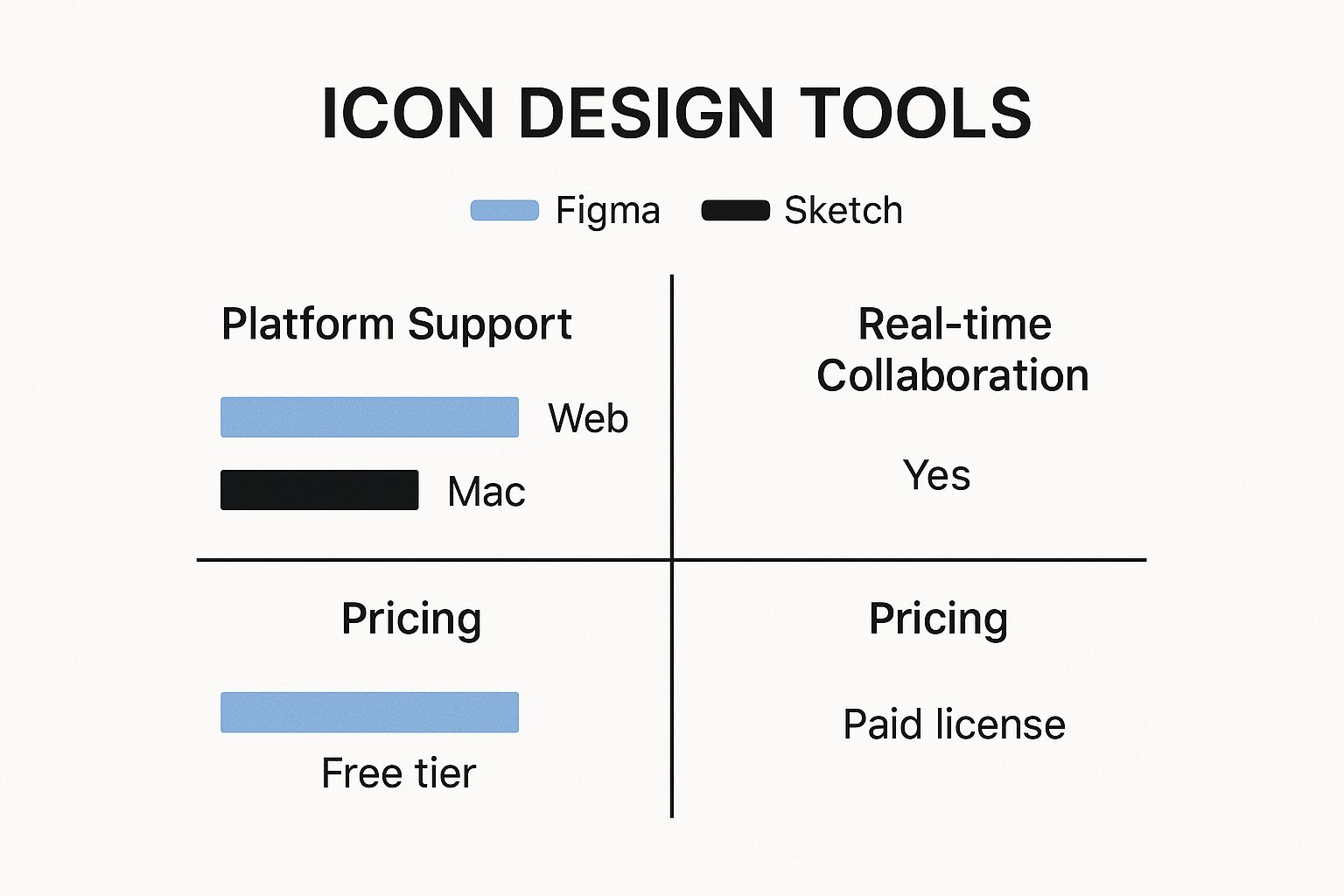
As the comparison suggests, the tool you use can really shape your team's workflow. Figma's cloud-based nature, for example, often provides an edge in real-time collaboration.
Pro Tip: The real magic happens when you chain multiple
filterfunctions together. You can layersaturate(),hue-rotate(), andbrightness()to dial in the exact look you're after. Just remember that the order in which you apply the filters can dramatically change the final result
Gaining Full Control with Inline SVGs
When you need surgical precision over your icon’s appearance, CSS filters just won’t cut it. For those moments, nothing beats placing the SVG code directly into your HTML. This technique, known as "inlining," unlocks the full power of CSS and gives you total control over every part of the icon.
By embedding an SVG, you're not just dropping in an image. You’re adding individual DOM elements that your stylesheets can see and target directly. This means you can finally get your hands on core SVG properties like fill for the icon’s main body and stroke for its outline, treating them just like any other element on your page.
This is a game-changer for multi-part icons. Think about a user profile icon that has a little notification dot. With an inline SVG, you can style the person's silhouette one color and the dot a completely different one. You can even add unique hover effects to each part independently.
Styling SVGs with CSS
The real beauty of inline SVGs is how straightforward they are to style. Once the SVG code is sitting in your HTML, you can target its internal <path>, <circle>, or <rect> elements using the same CSS selectors you already know and love.
For example, let's say you've wrapped your SVG in a div with an .svg-icon class. You could write CSS like this:
.svg-icon path { fill: #333; /* Default dark color */ transition: fill 0.3s ease; }
.svg-icon:hover path { fill: #007bff; /* Bright blue on hover */ }
This approach makes it incredibly easy to tie your icons into your site’s overall theme, especially if you’re using CSS variables for your color palette. To see these principles in action, check out our guide on creating a standout SVG email icon.
The key takeaway here is that an inline SVG stops being a static, black-box image. It becomes a living part of your document, fully responsive to the styling rules that govern the rest of your page. That integration is what allows you to build truly cohesive and interactive designs.
Handling SVGs in Modern Workflows
Icon-based GUIs have been around since Xerox first introduced them way back in 1981, and they’ve only become more important. Today, with about two-thirds of the world's population on mobile phones, icons are the universal language of navigation. Being able to change them on the fly is essential.
In modern frameworks like React or Vue, inline SVGs fit perfectly into a component-based workflow. You can build a reusable <Icon> component that accepts a color prop, which then dynamically sets the fill or stroke property.
This strategy keeps your codebase clean and makes your icon system incredibly scalable and a breeze to maintain down the line.
Sometimes you can't—or just don't want to—mess around with embedding SVG code directly into your HTML. This is where CSS mask-image comes in, offering a seriously powerful way to handle icon coloring for pretty much any format, even a standard PNG.
Think of it like using a stencil. The icon's shape acts as the cutout, and whatever you put behind it—like a solid background-color—shines through. It's a clever technique that keeps your HTML super clean; all you need is a basic <img> or <div>.
So, How Does CSS Masking Work Its Magic?
The secret sauce is the alpha channel, which is just the transparency information built into your icon file. The browser takes that transparency data and creates a mask, hiding parts of the element it's applied to. Once the mask is in place, you can get creative and color the visible area with any CSS background property you can think of.
This opens the door to some cool effects that are a real pain to achieve with other methods. Want to apply a gradient to your icons? No problem.
.icon-gradient { width: 48px; height: 48px; background-image: linear-gradient(45deg, #ff8a00, #e52e71); -webkit-mask-image: url('icon.svg'); /* For Safari/WebKit */ mask-image: url('icon.svg'); mask-size: cover; }
With just a few lines of CSS, you can slap a slick orange-to-pink gradient onto an icon. It’s an incredibly elegant way to build out themeable icon components for a design system.
Keeping a tight color palette is a cornerstone of strong branding. In fact, among the world's 250 largest companies, 43% stick to just two colors for their logos, and another 38% use only a single color. This minimalist strategy hammers home brand identity, and CSS masking is a perfect fit, letting you apply brand colors on the fly. You can dive deeper into logo color trends and branding impact if you're curious.
The real beauty of
mask-imageis that it completely separates an icon's shape from its color. You can maintain one set of simple black or white icon assets and then color them dynamically for any situation—hover states, different themes, or status notifications—all with pure CSS. This is a huge win for keeping your icon system clean and easy to manage.
Implementing Dynamic Icons in React
When you're working in React, building a flexible <Icon> component is a game-changer. It unlocks so many powerful UI patterns and makes your life easier down the road. The basic idea is to create a single component that can accept a color prop, allowing you to change its appearance on the fly.
If you're managing something like theme switching (light mode to dark mode, for example), using React's Context is the way to go. It lets you pass color values down through your entire app without having to prop-drill every single component. For larger projects with dozens of icons, this approach is a must—centralize your color logic in a provider and you're golden.
Creating a Flexible Icon Component
So, how do you get your SVGs into React in the first place? My go-to tools are SVGR or just using inline JSX. SVGR is fantastic because it automatically transforms your SVG files into React components that you can style directly with props.
For example, instead of a static image, you get a component you can use like this:
This approach gives you total control over the icon's styling.
- You can manage both the fill and stroke attributes through props.
- It's easy to connect them to your theme variables for automatic color switching.
- Most importantly, you avoid the bad practice of hardcoding hex codes directly inside your SVG assets.
If you prefer to keep the SVG markup directly in your component file (inline JSX), you can simply wrap the <svg> tag and spread any incoming props onto it. This keeps your markup just as flexible and fully responsive to CSS variables.
Managing Icon State
This is where the magic happens. You can use React’s useState hook to update an icon's color based on user actions or application state. A classic example is a notification bell icon that switches from gray to red when a new message arrives.
It's as simple as this: setColor(hasNewNotification ? '#e63946' : '#888');
This technique is perfect for reflecting live data. Think about changing a Wi-Fi icon based on network status or a checkmark icon during form validation.
Here are a few other common scenarios:
- Swap colors on hover, focus, and active states for better interactivity.
- Tie icon colors directly to form validation feedback (e.g., red for an error, green for success).
- Sync icon appearance with a global dark or light theme.
Integrating with Font Awesome
If you're using a library like Font Awesome, things are even simpler. Because these icons behave just like text, you can change their color with standard CSS color property. If you want to dive deeper, we have a whole guide on making color changes with React Font Awesome.
My personal take? Using inline SVG or a tool like SVGR gives you 100% control over icon styling and performance, which is invaluable for custom design systems.
By combining color props with state hooks, you can create icons that truly reflect your application's status. Imagine toggling an "active" state on a button click to switch between a primary and secondary color—it’s all easily achievable.
Here’s a quick breakdown of the methods:
| Method | Best For | Trade-off |
|---|---|---|
| SVGR import | Reusable, system-wide components | Adds a step to your build process |
| Inline JSX | Dynamic fills and strokes on unique icons | Can increase component bundle size |
| Font Awesome | Quick theming and broad icon sets | Limited control over individual SVG paths |
No matter which path you choose, remember to keep your components small and focused on a single purpose. And a final pro-tip: always wrap your icons in React.memo to prevent unnecessary re-renders, especially if they’re used in lists or frequently updated parts of your UI.
Got Questions? We've Got Answers
Which Method Is Best for Performance?
When you’re worried about page speed, my go-to is almost always an inline SVG styled with CSS variables. It's incredibly efficient. Since the SVG is right there in the DOM, tweaking its color with a CSS variable is a trivial task for the browser.
CSS masks are also a fantastic, high-performance option. The one I'm a bit more cautious with is the CSS filter property. It's powerful, but it can be a little more demanding on the browser, especially if you're applying complex filters to a ton of icons at once. It forces the browser to do some post-processing, which can add up.
Can I Apply a Gradient to an Icon?
You absolutely can, and there are a couple of great ways to do it.
For maximum control, I usually stick with inline SVGs. You can define a <linearGradient> right inside the SVG’s <defs> tag and then just reference that gradient's ID in your icon's fill attribute. It's a really solid, self-contained method.
If you prefer a pure CSS approach, mask-image is your best friend. This technique lets you apply a slick background-image: linear-gradient(...) to the element, effectively filling your icon's shape with the gradient.
How Do I Change Colors for Icon Fonts?
Ah, icon fonts like Font Awesome! This is where things get really simple. Since these icons are treated just like text characters, you can change their color using the basic CSS color property.
For example, a simple rule like .fa-icon { color: #ff0000; } is all you need to make the icon red. That ease of use is one of the main reasons people still love working with font-based icon systems.