How to Create a Perfect SVG Email Icon
A complete guide to designing and embedding a crisp SVG email icon. Learn the best practices for customization, optimization, and email client support.
An SVG email icon is a vector graphic that stays perfectly sharp and clear no matter where you use it in an email. Think of it—from a tiny icon in your footer to a big, bold call-to-action button, it will always look crisp. Unlike pixel-based images like PNGs or JPGs, an SVG (Scalable Vector Graphic) is built with code (specifically, XML) to draw its shapes. This makes it infinitely scalable, incredibly lightweight, and a dream to customize.
Why SVG Is a Superior Choice for Email Icons
When you're putting together an email, every little detail adds up to create the final experience for your reader. It might seem like a minor choice, but picking an SVG over a traditional PNG for your email icon can have a surprisingly big impact on performance, how your brand is perceived, and even accessibility.
Let's dig into why SVG has really become the go-to for visual elements in modern email design.
An SVG file isn't really an "image" in the traditional sense; it's more like a set of instructions for a drawing. This core difference is precisely why it shines where raster formats stumble, especially when you consider the huge variety of devices your audience is using to read your emails.
Unmatched Visual Fidelity
The biggest win for an SVG email icon is its flawless scalability. You’ve probably seen it before: a PNG icon that looks fine on a small screen, but when you open it on a high-resolution display like a 4K monitor or an Apple Retina screen, it suddenly looks blurry and pixelated. That kind of visual hiccup can make your brand feel unprofessional and cheapens the whole design.
An SVG, on the other hand, renders perfectly every single time. Since it’s drawn from mathematical coordinates instead of a fixed grid of pixels, it keeps its sharp lines and crisp details regardless of screen size or how much a user zooms in. This guarantees your brand’s visual identity stays strong and professional, no matter what.
Performance and Speed
In the world of email marketing, every millisecond counts. Heavy images can bog down an email's rendering time, which is a recipe for frustrated subscribers and lower engagement—especially for anyone on a spotty mobile network. An svg email icon is almost always significantly smaller in file size than a high-resolution PNG of the same design.
By opting for SVGs, you reduce the overall weight of your email, which translates to faster load times and a smoother experience for every recipient. This performance boost is a subtle but powerful way to keep your audience engaged.
This isn't just a theoretical advantage; the industry has already voted with its code. SVG technology is everywhere now. As of 2025, data shows that over 63% of all websites are using SVG for their graphics. The adoption among leading frameworks is even more telling—Next.js sits at an impressive 96% adoption. It's a clear signal of the industry-wide shift toward this more efficient format. You can dive deeper into these trends in the 2025 SVG industry report.
To really see the difference, it helps to put the two formats side-by-side.
SVG vs PNG for Email Icons
| Feature | SVG | PNG |
|---|---|---|
| Scalability | Infinitely scalable; always crisp and clear. | Pixelates when resized, looking blurry on high-res screens. |
| File Size | Typically smaller, leading to faster email loads. | Larger file size, especially for high-resolution images. |
| Customization | Easily editable with CSS and JavaScript for interactivity. | Static; changes require a new image file. |
| Accessibility | Supports text elements and ARIA attributes for screen readers. | Relies solely on alt text for accessibility. |
| Performance | Lighter on bandwidth, improving the user experience. | Can slow down email rendering, especially on mobile. |
Looking at this comparison, it's easy to see why SVG has become the standard for high-quality, performant email design. It simply outclasses PNG in nearly every category that matters for a professional, modern email experience.
Getting Started: Crafting Your Icon with VibeIcons
Alright, let's get our hands dirty and actually create this icon. Theory is great, but the real fun begins when you start building. I’ll walk you through how to use VibeIcons to find and generate a great-looking base icon that we can then tweak to match your brand perfectly.
First things first, pop over to the VibeIcons homepage. You'll notice it’s clean and gets straight to the point—no fluff, just a big search bar and some popular icons to get you started. It’s designed to help you find what you need without a ton of clicking around.
The search bar is front and center, which is exactly where we'll begin.
Finding the Perfect Icon
The search bar is your best friend here. Start by typing in some simple keywords. Think like your users: "email," "mail," or "envelope" are all solid choices that will pull up a bunch of relevant options.
Don't just grab the first icon that pops up. Scroll through the results for a minute. You'll see everything from classic envelope designs to more modern, abstract takes on "mail." Consider your brand's personality—is it more corporate and serious, or friendly and a bit quirky? Your icon should feel like it belongs.
Picking an Icon Style
Once you have a page of results, you'll see that the icons aren't one-size-fits-all. They come in a few different styles, and this choice is pretty important for making sure it gels with your existing branding.
VibeIcons gives you a few distinct options to choose from:
- Line Style: These are minimalist, outlined icons. They have a modern, clean feel that’s perfect for sophisticated or understated brands.
- Solid Style: A solid, filled-in icon has more visual weight. It's bolder, grabs your attention, and works incredibly well for calls-to-action.
- Duo-tone Style: This style uses two different colors to add a bit of depth and character. If your brand is vibrant and wants to stand out, this is an excellent choice.
Think about where this svg email icon is going to live. Is it sitting in a crowded email footer? A solid icon might stand out better. Is it placed subtly next to a contact form? A line icon might be a more elegant fit. If you're a developer looking for more technical pointers on implementation, our guide on using https://www.vibe-icons.com/blog/next-js-icons has some useful tips that can help inform your decision.
Pro Tip: Look at the other icons you use on your website or in your app. Try to match the style. A consistent icon set across all your platforms, including email, goes a long way in creating a polished and professional brand experience.
Once you’ve settled on a design and style you love, just click on it. This will take you into the editor, where we'll start customizing colors, sizes, and more. You've now got a professionally designed base icon ready to be tailored to your brand.
Making the Icon Your Own: A Guide to Brand-Specific Customization
Alright, you've picked out a solid base icon. Now for the fun part: turning that generic graphic into a sharp, recognizable piece of your brand. A great svg email icon isn't just a functional button; it’s a subtle nod to your brand identity in every single email. VibeIcons gives you a surprisingly powerful, yet straightforward, set of tools to get this done right.

This isn't just about throwing some color on and calling it a day. It's about being deliberate with each choice so the icon feels like it truly belongs in your emails. Let's dive in, starting with the most powerful change you can make: color.
Dialing in Your Brand Colors
When it comes to branding, consistency is everything, and color is your most powerful weapon. Don't just eyeball it or pick a color that looks "close enough." To get that professional, seamless look, you need to use your brand's specific color codes.
The VibeIcons editor makes this dead simple. Just find the color input field and paste your brand’s exact HEX code (like #1A2B3C) right in. In one move, you've ensured the icon perfectly matches your website, logo, and marketing collateral. It's this kind of detail that creates a cohesive experience for your audience. If you want to go deeper on this topic, our guide on how to approach an icon color change has some great tips.
This tiny step has a massive impact, instantly elevating your icon from a random graphic to a polished part of your brand identity.
Adjusting Stroke and Visual Weight
Color is just one piece of the puzzle. The thickness of the icon's lines, known as stroke width, has a huge effect on its overall feel. A thin, delicate stroke can communicate a modern, elegant vibe. On the other hand, a thicker, bolder stroke feels more solid and grabs more attention.
In the VibeIcons editor, you'll usually find a slider or a box to enter a number for the stroke width. Play around with it.
- Going for a clean, minimalist look? A lower stroke width is your friend. This works beautifully for icons that need to be subtle, like in an email footer.
- Need a call-to-action to stand out? Pump up the stroke width. This gives the icon more visual heft and makes it pop.
The real goal here is to match the icon's "weight" to its job and the design around it. An icon that feels too heavy or too light can throw off the whole balance of your email. Tweak it until it just feels right.
Adding a Background for Extra Pop
Sometimes an icon gets lost, especially if it's sitting on a busy or similarly-colored background in your email. This is where adding a background shape—like a circle or a square—can be a lifesaver. It carves out a dedicated space for your icon and makes it impossible to miss.
Look for the background options in the editor. You can typically control the shape, the color, and even how big it is in relation to the icon itself.
Think about it: you have a dark blue icon that needs to go in your dark gray email footer. It would just disappear. But by adding a simple white circular background, you create instant contrast. The icon is now perfectly framed and easy to see. It’s a simple trick, but it’s incredibly effective for making sure your icon does its job, no matter where it ends up.
Getting Your SVG Icon into Your Email HTML
You've got your custom svg email icon ready to go, and it looks fantastic. Now for the final piece of the puzzle: actually getting it to show up in your email. This part can feel a bit technical, but it really just comes down to picking the right tool for the job.
You have two main paths you can take. One gives you incredible control over styling and animation, while the other prioritizes making sure everyone sees your icon, no matter what email program they're using. We'll walk through both so you can make the best call for your subscribers.
Inline SVG: The Power User's Choice
If you want maximum creative freedom, embedding the SVG code directly into your email's HTML—a technique called inlining—is the way to go. Think of it as making the icon a living part of the email itself.
Because it's actual code, you can target it with CSS to do some really cool things. Want the icon to change color when someone hovers over it? No problem. Need to add a subtle animation to catch the reader's eye? You can do that, too. This is how you create those slick, polished emails that feel truly interactive.
But here's the catch: not all email clients play nicely with this method. While modern platforms like Apple Mail and Gmail handle inline SVGs beautifully, you'll run into trouble with older versions of Outlook (specifically Outlook 2007-2016 on Windows), which often won't display the icon at all.
Base64 Image: The "It Just Works" Method
For a safer, more reliable approach, you can use a standard <img> tag. But instead of linking to an image file on a server, you'll encode the entire SVG into a long text string called a Base64 string and pop that right into the image source.
This method is the go-to for a couple of big reasons:
- Rock-Solid Compatibility: Just about every email client out there, including those finicky old Outlook versions, knows exactly what to do with an
<img>tag. It's the most dependable way to ensure your icon shows up for your entire audience. - Completely Self-Contained: The image data is baked right into the HTML. This means no external files to get blocked by security settings or fail to load on a shaky connection.
The trade-off? You lose all that cool styling control. Once it's encoded, your SVG is essentially a static image, like a PNG. You can't dynamically change its colors or animate it with CSS. What you see is what you get.
As the data below shows, adding even simple visual flair like color changes or animations can have a real impact on how users engage with your emails.
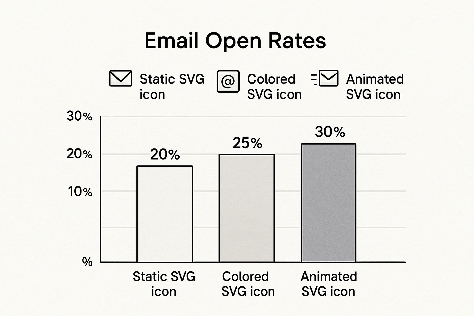
This boost in open rates is a powerful argument for using the inline method, but only if you're confident your audience uses modern email clients that can support it.
As you can see, the choice isn't always straightforward. Email client support is a notoriously tricky landscape to navigate. Here's a quick breakdown of how these methods generally fare across popular platforms.
SVG Embedding Method Compatibility
| Email Client | Inline SVG Support | Base64 |
|---|---|---|
| Gmail | Excellent | Excellent |
| Apple Mail | Excellent | Excellent |
| Outlook.com | Good | Excellent |
| Yahoo! Mail | Good | Excellent |
| Outlook 2007-2016 (Windows) | None | Excellent |
| AOL Mail | Good | Excellent |
This table makes the dilemma clear: while inline SVGs offer exciting possibilities, their complete lack of support in older (but still widely used) versions of Outlook for Windows is a major risk.
My Two Cents: I almost always start with the Base64
<img>method. It guarantees the best deliverability and ensures no one gets a broken-looking email. However, if I'm working with a client whose analytics show an audience overwhelmingly on Gmail and Apple Mail, that's when I'll start experimenting with inline SVGs to add that extra layer of polish.
Ultimately, this decision is a classic balancing act between creative ambition and the practical reality of email marketing. An amazing animated svg email icon does you no good if half your list can't even see it. Always put your subscribers' experience first.
Optimizing and Securing Your SVG Icon
You’ve got your new SVG email icon looking sharp and perfectly on-brand. The next logical step seems to be plugging it straight into your email template, right? Not so fast.
Taking just a few extra minutes to optimize and secure your icon is a small step that makes a huge difference. It’s what separates the pros from the amateurs. This final check ensures your icon is not only beautiful but also lightweight and safe for everyone who opens your email.
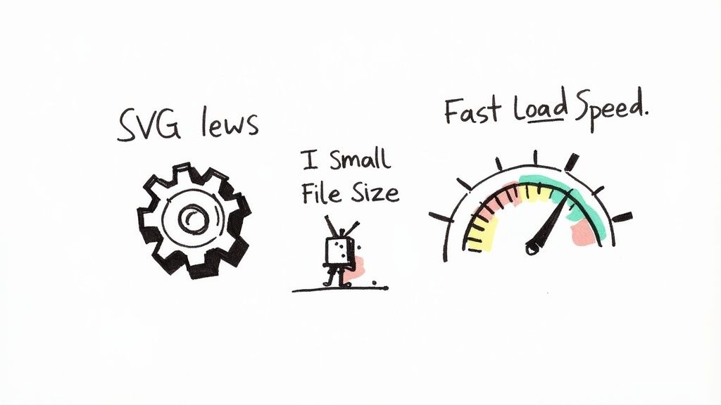
Cleaning Up for Peak Performance
Let’s talk performance first. When you export an SVG from a design tool, it often comes with a bit of extra baggage—think editor metadata, comments, and other bits of code that aren't needed to actually display the icon. This digital clutter can bloat the file size, which can ever-so-slightly slow down how quickly your email loads.
While one tiny icon won't bring your email to a screeching halt, keeping your assets lean is always a good habit.
This is where a tool like SVGOMG comes in handy. It’s a lifesaver. You just upload your SVG, and it automatically strips out all the junk without changing the icon's appearance one bit. You’re left with a much smaller, cleaner file that’s ready for the big time. If you want to really get into the nitty-gritty of this, we have a complete guide on strategic icon optimization.
A Quick Security Check to Avoid Trouble
Now for something many people don’t even think about: security. SVGs are built on XML, which means they can contain more than just image data. They can actually hold executable code, like JavaScript. This is part of what makes them so powerful, but it also creates a potential security hole if you’re not careful.
This dual nature of SVGs is what makes the svg email icon both a fantastic design element and a potential risk. Because they can contain scripts, they’ve unfortunately been used by phishers to hide malicious links inside what looks like a harmless image attachment.
The rule of thumb is simple: never, ever use an SVG from a source you don't trust without checking it first. You need to be sure it only contains the code needed to draw the image and nothing else.
So, before you embed your icon, do this one quick thing: open the SVG file in a basic text editor (like Notepad or TextEdit). You don't need to be a coder. Just scan the text for any <script> tags or attributes like onclick.
If you spot anything that looks fishy or isn’t clearly defining a shape, path, or color, get rid of it. You can also run the file through an SVG sanitizer tool to do the cleanup for you. This simple check takes seconds and guarantees your icon is 100% safe.
Common Questions About SVG Email Icons
https://www.youtube.com/embed/IM8eTD01UE8
Even with all their advantages, jumping into using an svg email icon can bring up a few practical questions. It’s always a good idea to think through these potential hurdles before you go all-in. Let's tackle some of the most frequent concerns to clear the air so you can use this format with confidence.
Getting ahead of these common issues just makes the whole email design process smoother and far more predictable.
Will My SVG Work in All Email Clients?
This is the big one, and the honest answer is: it depends. Support for SVGs in email has gotten much better over the years, but it isn't universal just yet. Modern email clients like Apple Mail, Gmail, and the web versions of Outlook handle them beautifully, showing your icons exactly as you intended.
The main holdouts, however, are the older desktop versions of Outlook on Windows—specifically, Outlook 2007-2016. These versions simply don't support inline SVGs, which means your sharp new icon might not show up at all for that slice of your audience.
This is precisely why using an
<img>tag with a Base64-encoded SVG is often the safest bet. It gives you the best shot at maximum compatibility. My advice? Always test your campaigns with a service like Litmus to see exactly how your icons look across the board.
Can I Animate an SVG Email Icon?
From a technical standpoint, yes. You can absolutely animate SVGs with CSS or a language called SMIL (Synchronized Multimedia Integration Language). This can open up some really cool creative doors for adding a little motion to grab a reader's attention.
The reality of the email world, though, is that support for these animations is incredibly spotty. Most email clients will just ignore the animation script and render the first frame as a static image. You just can't count on the animation to get an important message across.
My take is to treat animation as a progressive enhancement. Design your svg email icon to be perfectly clear and effective as a static image first. If the animation works for some people, that's just a nice bonus.
How Do I Make My SVG Icon Clickable?
This part is just good old-fashioned HTML. Turning your icon into a link is simple, and it doesn't matter if you've used an inline SVG or an <img> tag. You just wrap the entire element in a standard anchor (<a>) tag.
That one line of code turns a visual element into something people can actually interact with.
- For an email link: Just wrap your icon code like this:
<a href="mailto:your.email@example.com">...</a> - For a website link: Use a standard URL:
<a href="https://yourwebsite.com">...</a>
This technique makes the entire icon clickable, giving your users a nice, big target to tap or click. It's a fundamental step for making your icons do their job in an email signature or a call-to-action block.
Ready to create icons that are always on-brand and perfectly sharp? Stop searching and start creating with VibeIcons. Generate your first five icons for free and see how easy it is to build a consistent, professional icon set for your projects. Start creating with VibeIcons.