How to Change Color of Icons A Developer Guide
Learn how to change color of icons using SVG, CSS, React, and Tailwind. This practical guide provides code examples and tips for mastering icon styling.
Knowing how to change the color of icons isn't just a minor design tweak. It's a core skill for any UI designer or developer that directly impacts how users interact with your product. A simple color shift can be the difference between a confusing interface and an intuitive one, guiding user attention and signaling important actions.
Why Mastering Icon Color Is a Game-Changer for UI Design
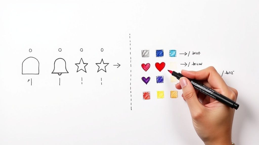
Changing an icon’s color might seem like a small detail, but it’s an incredibly powerful way to communicate with your users. Think about the apps you use every day. When a notification bell turns red, you immediately know there’s something new. When a "Save" button’s icon is grayed out, you understand it’s disabled. These aren’t just pretty visuals; they’re functional cues that make an interface feel responsive and alive.
With a strategic approach to color, you can turn a static design into a dynamic, interactive experience. This helps you:
- Signal Different States: Clearly show if a button is active, hovered, disabled, or even in a loading state.
- Guide User Attention: A pop of color can draw the user’s eye right where you want it, like on a bright "Add to Cart" icon.
- Reinforce Brand Identity: Keeping your icons consistent with your brand’s color palette creates a cohesive and professional look.
Just look at the VibeIcons homepage. The consistent and vibrant icon set is a perfect example of how color defines a brand’s visual language.
This screenshot shows how well-chosen icon colors lead to a clean, modern interface that’s both beautiful and easy to navigate. To dig deeper into this, check out our guide on the proper use of icons.
How Color Directly Affects Usability
The debate between monochrome and colorful icons comes down to more than just aesthetics—it’s about usability. Minimalist, single-color icons definitely have their place in clean designs, but research often shows that color is a key factor in helping users get things done more efficiently.
A fascinating piece of research from Microsoft found that users consistently completed tasks faster with color icons. Participants described them as more modern and easier to spot, while they saw grayscale icons as "dull and boring."
This really drives home the point that the ability to change the color of icons is a direct line to improving how people feel about and use your product. Throughout this guide, we'll be using VibeIcons to show you practical, real-world techniques for applying these principles. You'll see just how easy it is to implement dynamic color changes when you have a well-structured icon library to work with.
Changing SVG Icon Colors at the Source
Before we dive into the clever CSS tricks and component props, let's start at the very beginning: changing an icon's color by editing the SVG code itself. Honestly, this is the most direct method and the foundation for everything else we'll do. When you pop open an SVG file in a code editor, you're not looking at a static image; you're seeing XML markup that describes every line, curve, and, most importantly, color.
This markup is the blueprint the browser uses to draw your icon. A few small tweaks to this code can give you total control over how it looks.
For color, two attributes are king: fill and stroke. It’s pretty simple: think of fill as the color inside the lines and stroke as the color of the outline itself.
Finding and Editing Fill and Stroke Attributes
When you crack open the code for a VibeIcon, you'll find one or more <path> elements. These paths are what actually form the shape of the icon, and their color is usually set right there with a fill attribute.
Let’s take a look at a basic user icon as an example.
Want to change the color? Just swap out the hex code. Replacing #000000 with fill="#3B82F6" will immediately turn the icon blue. It’s that straightforward. This direct approach is incredibly powerful because it’s so explicit, often overriding other styling attempts down the line.
Understanding how
fillandstrokework at the source level is your secret weapon for debugging. If a CSS style isn't applying, it's almost always because an inlinefillattribute in the SVG markup is taking precedence.
Navigating More Complex Icons
Of course, not all SVGs are so simple. More detailed icons might have multiple <path> elements or even <g> (group) tags, and each one could have its own fill or stroke color. This is especially common in multi-colored icons where you need different shades for different parts.
Here are a few things I've learned to watch out for:
- Grouped Elements: Sometimes, a
fillattribute is applied to a parent<g>tag. Any paths inside that group will inherit that color unless they have their own specific fill set. - Inline Styles: You might also find colors defined inside a
<style>tag within the SVG, or as an inline attribute likestyle="fill:#RRGGBB;". These can be edited directly, too. - Stripping Out Colors: Here’s a pro-tip for when you want maximum flexibility with CSS: just remove the
fillandstrokeattributes from the SVG markup entirely. When you do this, the icon becomes "colorless" and will inherit its color from whatever parent element it's placed in. We'll get more into that in the next section.
Getting comfortable with editing the source code gives you the confidence to tackle any icon styling challenge. You’ll never be stuck wondering why a color won’t change, no matter which framework or styling method you're using.
Dynamic Icon Styling with CSS
Once you’ve got the basics of static SVG edits down, the real fun begins. Using CSS to change the color of icons is what brings your user interface to life, letting you create responsive buttons, intuitive state changes, and scalable design systems. Instead of being stuck with hard-coded colors, your stylesheet can do all the heavy lifting.
A super handy tool for this is the CSS currentColor keyword. When you set an SVG's fill or stroke attribute to currentColor, the icon inherits the color property from its parent element. It's a game-changer for keeping your icons perfectly in sync with the text they sit next to.
Mastering Icon States with Hover and Focus
One of the most common things you’ll do is change an icon's color on user interaction. Picture a button with a VibeIcon inside—you want it to change color when someone hovers over it, right? This kind of visual feedback is crucial, and thankfully, it's a breeze to set up with CSS pseudo-classes.
By targeting the SVG within a parent element like a button or a link, you can define styles for different states:
:hover: Triggers when the user's cursor moves over the element.:active: Applies a style for the split-second the element is being clicked.:focus: Styles the element when it's selected with keyboard navigation, which is great for accessibility.
This simple touch makes a world of difference in usability. The feedback tells the user, "Hey, this is clickable!" and makes the whole experience feel more polished and responsive. If you want to dive deeper, we have more guides covering CSS icon color techniques.
Building Themeable Systems with CSS Variables
On bigger projects, keeping colors consistent can be a real headache. That’s where CSS Custom Properties (you'll usually hear them called variables) come in. By defining your color palette as variables in your :root stylesheet, you create a single, reliable source for your entire design system.
This makes things like adding a dark mode surprisingly simple. Instead of hunting down every icon style, you can change the color of every icon across your entire site by just tweaking a few lines of code.
It's a shift in mindset. When you use CSS variables, you stop styling individual icons and start building a maintainable, scalable system. This is how you ensure brand consistency and make future updates—whether it's a small tweak or a complete theme overhaul—so much easier.
This diagram breaks down the basic flow of applying a CSS color change to an icon.
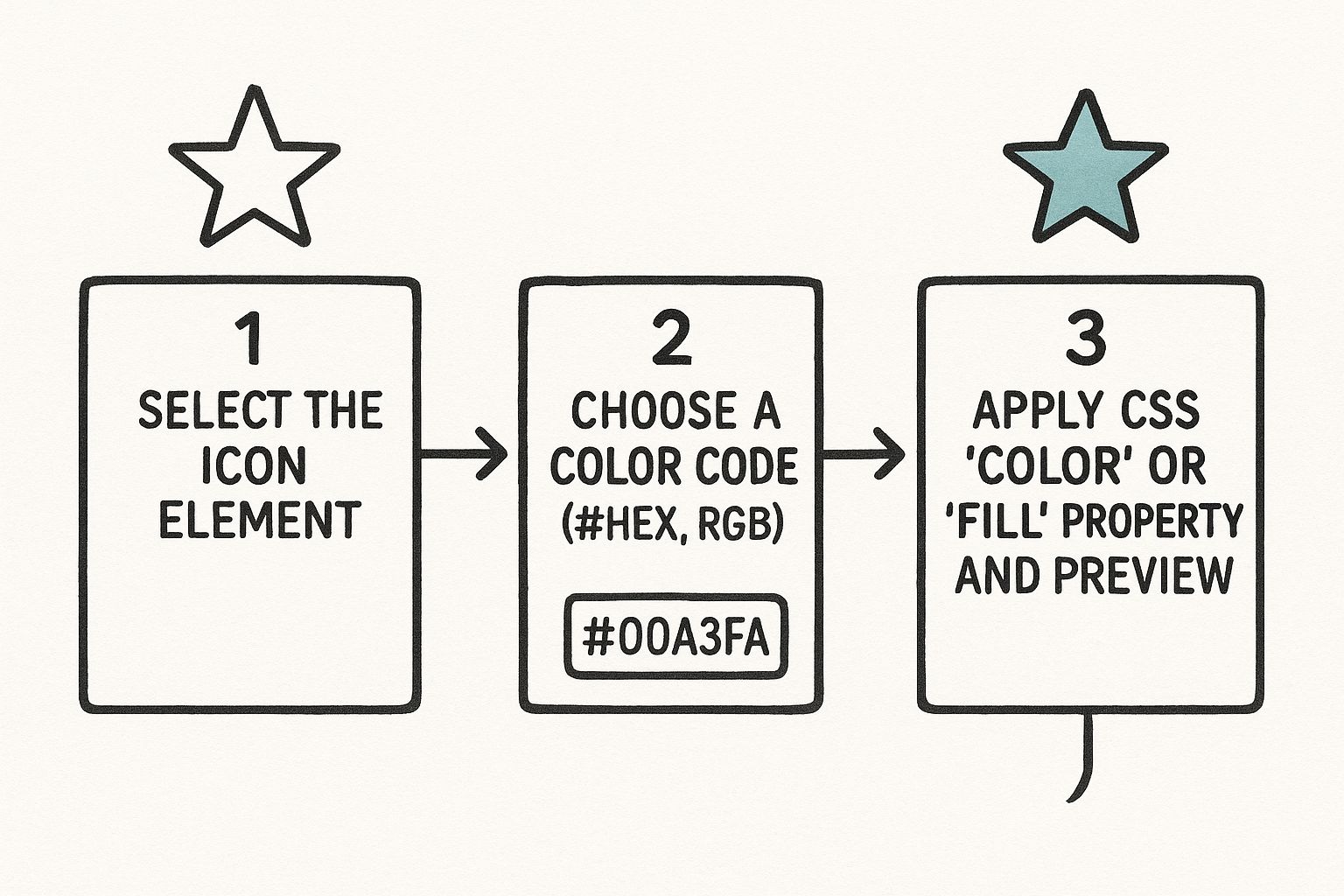
As the visual shows, just a few CSS properties give you full command over how your icons look. These color choices are more than just decoration; they guide the user. In fact, research shows that well-structured color coding in interfaces can lead to higher user accuracy in visual searches, with some layouts hitting over 85.71% accuracy. You can read more about it in this detailed study on UI color coding.
Comparison of Icon Coloring Methods
To help you decide which approach is best for your situation, here's a quick rundown of the different methods we've touched on. Each has its place, and knowing the pros and cons will help you make the right call.
| Method | Best For | Pros | Cons |
|---|---|---|---|
Direct SVG fill |
Simple, static icons or quick one-off changes. | Very straightforward; no extra CSS needed. | Not dynamic; requires editing the SVG code directly. |
| CSS Classes | Most common use cases; reusable styles and states. | Easy to manage and reuse; supports hover/focus states. | Adds a bit more CSS to your stylesheet. |
currentColor Keyword |
Icons that need to match surrounding text color. | Ensures perfect color consistency; great for buttons/links. | Limited to inheriting the parent's text color. |
| CSS Variables | Large-scale projects, theming, and design systems. | Centralized color management; makes updates simple. | Requires a more structured CSS setup. |
Choosing the right method really depends on the complexity of your project. For a simple site, CSS classes are often enough, but for a full-blown application, embracing CSS variables will save you tons of time in the long run.
Component-Based Icon Coloring in React
In the React world, we think in components. It’s all about building reusable, self-contained pieces of UI, and our icons should be no exception. When you stop treating icons as static images and start thinking of them as dynamic components, you gain an incredible amount of control over their appearance—especially when it comes to color.

The secret is passing the color down as a prop. This simple technique makes your icon components remarkably flexible. You can render the exact same icon in a dozen different places, each with a unique color, all without writing a single new line of CSS. It's a clean, declarative approach that feels right at home in a React codebase.
Setting Up a Reusable Icon Component
Let's get practical and build a simple <UserIcon> with a VibeIcon. Instead of hardcoding the color inside the SVG, we’ll design the component to accept a color prop and apply it directly to the fill attribute.
// UserIcon.jsx
const UserIcon = ({ color = 'black', size = 24 }) => (
<svg
xmlns="http://www.w3.org/2000/svg"
width={size}
height={size}
viewBox="0 0 24 24"
fill={color} // The color is passed in as a prop
<path d="M12 12c2.21 0 4-1.79 4-4s-1.79-4-4-4-4 1.79-4 4 1.79 4 4 4zm0 2c-2.67 0-8 1.34-8 4v2h16v-2c0-2.66-5.33-4-8-4z" />
export default UserIcon;
Now, actually using the icon is a breeze. You just tell it what color to be when you drop it into another component.
// App.jsx
import UserIcon from './UserIcon';
function App() {
return (
);
}
This component-based method is so much easier to maintain than juggling CSS classes. If you've ever dealt with other libraries, you'll appreciate how clean this feels. For anyone moving away from older icon fonts, our guide on a React Font Awesome alternative digs deeper into similar component-first strategies.
Dynamic Colors with Component State
Here's where things get really interesting. When you hook that color prop up to React state, you can make your icons respond to user interactions, API data, or anything else that changes in your app.
A classic example is the "like" button. You want a heart icon that’s gray by default but turns red the moment a user clicks it.
Here’s how you could build a <LikeButton> component that does just that:
- First, you’d use the
useStatehook to keep track of whether the item is "liked." - Next, you'd use a simple ternary operator to pass either a red or gray hex code to your icon component based on that state.
- Finally, an
onClickhandler would toggle the state fromtruetofalseand back again.
This approach keeps all the logic perfectly encapsulated. Your <LikeButton> becomes a plug-and-play component you can drop anywhere.
By treating icons as props-driven components, you're not just styling—you're building a more interactive and responsive UI. Your icon's color becomes a direct reflection of your application's state, providing clear and immediate visual feedback to the user.
This pattern is a workhorse. You can use it to change a notification bell's color when new messages arrive, update a status icon from a "pending" yellow to a "success" green based on API data, or even switch every icon in your app to match a user-selected theme. It’s a scalable, component-first way to handle icon styling in any modern React project.
Utility First Styling with Tailwind CSS
If you're a developer who thrives in a utility-first workflow, Tailwind CSS is your best friend for coloring icons. It lets you style VibeIcons directly in your markup, which means no more jumping back and forth between files to write custom CSS.
The beauty of this approach is its immediacy. You can add a class like text-blue-500 or fill-green-600 right onto your icon component and see the change instantly. It keeps you in the zone, building and styling without ever leaving your HTML or JSX.
Rapid Prototyping with Utility Classes
Let's say you're mocking up a dashboard and need some status indicators. With VibeIcons and Tailwind, you can quickly color-code icons for success, warning, and error states without writing a single line of CSS. It’s as straightforward as it gets.
Here’s what that looks like in practice:
- Success Icon:
<CheckCircleIcon className="text-emerald-500" /> - Warning Icon:
<ExclamationTriangleIcon className="text-amber-500" /> - Error Icon:
<XCircleIcon className="text-red-600" />
This method is incredibly intuitive because the class names tell you exactly what they do. You’re essentially writing visual instructions right into your code, making your markup clean and easy to understand at a glance.
When you pair VibeIcons with Tailwind, you're not just styling—you're building a more readable and maintainable component library. The icon's color becomes a self-documenting part of its implementation, which is a massive win for team collaboration.
Integrating with Your Design System
The real magic happens when you bring your tailwind.config.js file into the mix. This is where you define your project's color palette, ensuring every icon perfectly matches your brand guidelines.
You can easily extend Tailwind’s default theme with your brand colors.
// tailwind.config.js
module.exports = {
theme: {
extend: {
colors: {
'brand-primary': '#4F46E5',
'brand-secondary': '#10B981',
},
},
},
plugins: [],
}
Once that's set up, you can use classes like text-brand-primary on your VibeIcons. This creates a single source of truth for your entire design system, making site-wide color updates a breeze. Need to handle dark mode or responsive color changes? Just add a modifier like dark:text-gray-200 or md:text-blue-500.
This level of control isn't just about aesthetics; it has a real impact on user engagement. Research has shown that apps with well-designed icons can attract up to 25% more users, partly due to better visual appeal driving higher tap-through rates. You can read more about how icon optimization boosts user numbers. It’s a great reminder that a utility-first approach helps you quickly implement designs that actually perform.
Common Questions About Changing Icon Colors
https://www.youtube.com/embed/9PFmxvj3cf8
Even when you know the different ways to style icons, you’ll inevitably run into a few tricky situations on a real project. Let's walk through some of the most common hurdles I've seen designers and developers face when trying to change the color of icons.
My SVG Icon Won't Change Color!
This is probably the most common frustration out there. You’ve applied your CSS, but the SVG icon stubbornly stays its original color. 99% of the time, this is because the SVG file has hard-coded fill or stroke attributes baked directly into its code. These inline styles will always override your external CSS.
Luckily, the fix is straightforward. You have a couple of options:
- Edit the SVG by Hand: Just open the
.svgfile in a code editor. Look for<path>or other shape tags and delete anyfill="..."orstroke="..."attributes you find. - Use an Optimization Tool: If you’re dealing with a lot of icons, a tool like SVGO is a lifesaver. You can set it up as part of your build process to automatically strip out those hard-coded colors for you.
Once you do this, your icons become "color-agnostic," ready to inherit any color you define in your CSS.
Which Coloring Method Is the Best?
The short answer? It depends entirely on your project and tech stack. There's no single "best" way.
The most effective approach is the one that best fits your existing workflow. For a simple static site, basic CSS classes are perfect. For a complex React application with theming, passing colors as props is the most scalable and maintainable solution.
Think about the architecture of what you're building. If you're all-in on a design system with Tailwind, stick with utility classes. If you're deep in a component-based framework like React or Vue, props give you the dynamic control you need.
Don't overcomplicate it. Choose the path of least resistance that feels natural within your current tools. Knowing how to change icon colors is really about knowing which tool to grab for the job at hand.
Ready to stop searching for the perfect icon and start creating it? With VibeIcons, you can generate high-quality, AI-powered icons that perfectly match your project's style. Get your first five icons for free and see the difference. Start creating with VibeIcons today!