Create an Icon a Designer Would Envy
Learn how to create an icon from scratch. This practical guide covers design fundamentals, AI-powered tools, and pro tips for standout results.
You can create an icon by firing up a dedicated design tool like VibeIcons, nailing down its purpose, tweaking the visuals to fit your brand, and then exporting it in the right format. It’s a straightforward process that turns your icons from simple placeholders into powerful visual assets.
Why a Great Icon Is More Than Just a Pretty Picture
Before you dive into the design tool, let’s talk about what actually separates a good icon from a great one. Icons aren't just for navigation; they're tiny, hard-working brand ambassadors that communicate meaning in a split second.
Just think about the apps on your phone. That simple gear for "settings" or the bell for "notifications" is instantly understandable without a single word of text. That’s the kind of immediate recognition that builds a frictionless user experience.
Communicating Your Brand Personality
A well-crafted icon set does more than just show people where to click—it helps define your visual identity. For instance, a fintech app might use icons with sharp, clean lines to feel secure and professional. A sustainability brand, on the other hand, could go for soft, organic shapes and earthy colors to better reflect its eco-conscious mission.
These subtle design choices are what build your brand's personality, making your website or app feel cohesive and memorable. This is where custom icons really shine, letting you express your brand’s unique voice in a way that generic, off-the-shelf icon packs never could.
An icon's real power lies in its ability to tell a story. It's a compact piece of visual communication that reinforces your brand’s promise at every user touchpoint, from a website button to a mobile app menu.
The Growing Importance of Custom Icons
The push for unique visual branding isn't slowing down. In fact, over 90% of businesses see custom branding as essential for cutting through the noise. As we look toward 2025, custom icons have shifted from a "nice-to-have" to a must-have for companies of all sizes trying to build a strong identity. You can find more insights on this in these 2025 design trends on jukeboxprint.com.
Ultimately, putting in the effort to create an icon that truly aligns with your core message pays off in big ways. You'll end up:
- Improving usability with clear, intuitive symbols.
- Building brand recognition through a consistent visual language.
- Creating an emotional connection with your audience.
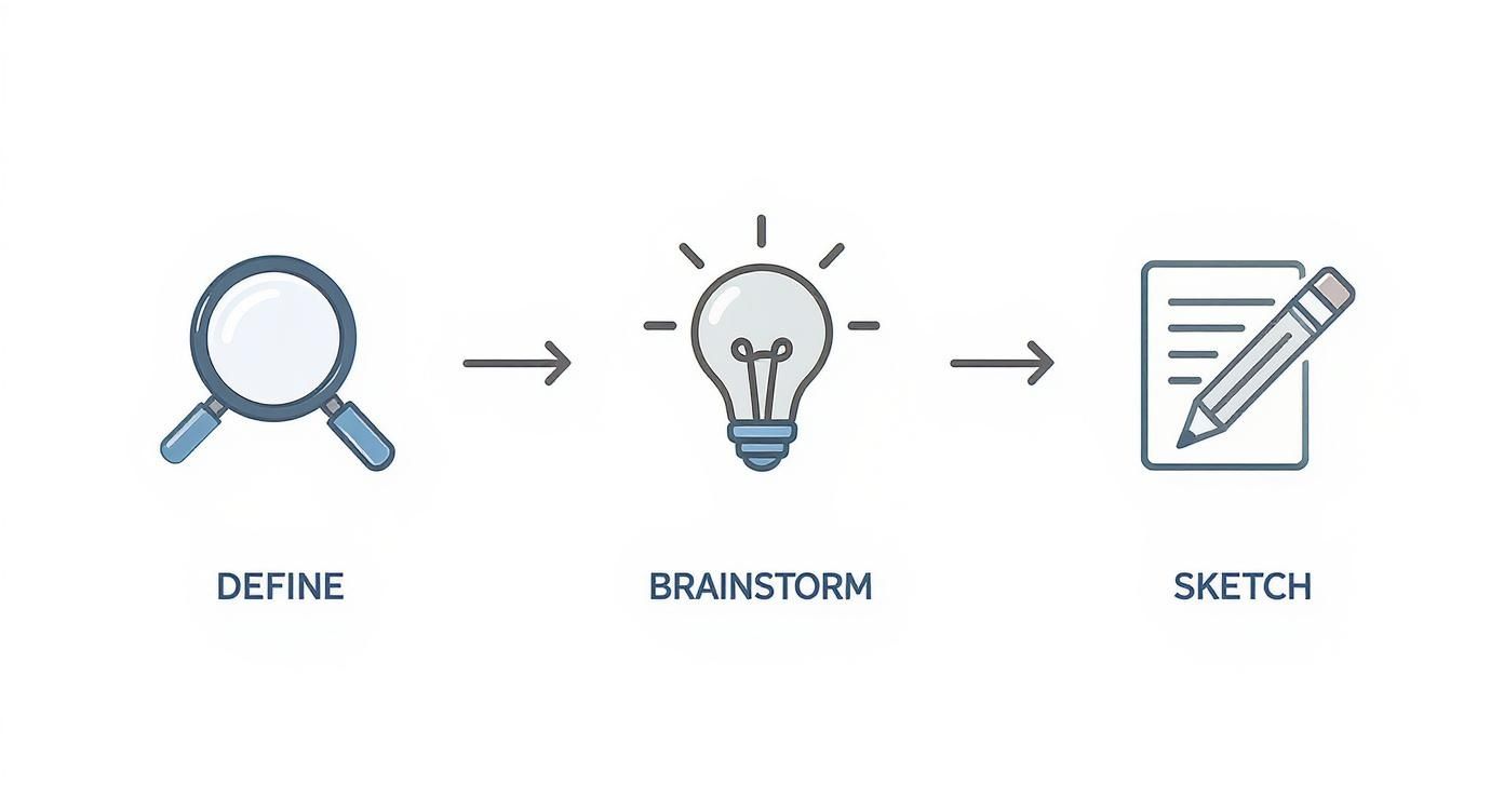
Laying the Groundwork for a Great Icon
Before you even think about opening a design tool, the best icons start with a solid plan. A great icon isn't just a pretty picture; it’s a piece of communication. So, the first step is always to ask the right questions. What's this icon supposed to communicate? Where will it live? And who are you trying to reach with it?
Thinking about placement is a huge deal. An icon designed for a massive web banner needs a different level of detail than one that has to work in a tiny mobile app menu. Your design has to be scalable—it needs to look just as sharp and clear on a giant screen as it does as a 16x116 pixel favicon. That's a tall order if you don't plan for it from the start.
Nailing Down Your Core Concept
Once you know the why, it's time for the what. Start by brainstorming words and themes that connect to the icon’s job. For example, if you're designing a "save" icon, you might jot down ideas like security, storage, or permanence. This little exercise can help you break free from the same old floppy disk cliché and find a visual metaphor that feels fresh and fits your brand.
Speaking of brand, consistency is everything. You want all your icons to look like they belong to the same family. The best way to do that is by setting up some ground rules. We’ve put together a comprehensive resource on exactly how to create a style guide that you can use to keep all your visuals in sync.
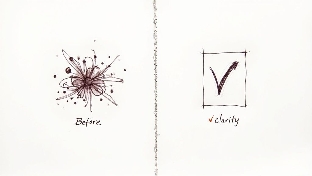
The most successful icons are born from restraint. Simplicity isn't just a style; it's a functional requirement that ensures your message is understood instantly, without ambiguity or clutter.
We're also seeing how technology shapes these design choices. The massive shift to mobile—where over 70% of web traffic now comes from—has pushed designers toward minimalism. On a small screen, icons have to be recognizable in a split second. This is why clean, simple designs with bold geometric shapes are more than just a trend; they’re a necessity for a good user experience. You can see more about where things are headed by checking out these upcoming icon design trends on bigredillustration.com.
To help you get your concept right before you start designing, run through this quick checklist.
Icon Design Principles Checklist
Use this checklist to ensure your icon concept is solid before you start designing.
| Principle | Why It's Important | Quick Tip |
|---|---|---|
| Clarity | The icon's meaning must be instantly understood without explanation. | Show your concept to someone unfamiliar with the project and ask what they think it means. |
| Simplicity | Fewer details make an icon more recognizable, especially at small sizes. | Remove elements one by one until the icon breaks. Then add the last one back. |
| Scalability | It must look good at 16px and 512px and every size in between. | Design in a vector format and test your icon at various common sizes early on. |
| Consistency | Your icon should feel like it belongs with the rest of your brand's visuals. | Stick to your brand’s color palette, line weight, and overall style. |
| Uniqueness | It should stand out and be memorable, not a copy of a competitor's icon. | Avoid the first idea that comes to mind—it's often the most generic. |
Ultimately, this planning phase is all about building a strong foundation. When you take the time to define your icon's purpose, audience, and core principles upfront, you're not just designing something beautiful—you're creating a tool that works.
Bringing Your Icon to Life with VibeIcons
With a solid plan in place, it’s time for the fun part: creating the actual icon. Even if you're not a seasoned designer, an AI-powered tool like VibeIcons lets you jump right in and get professional results. The entire process starts with a simple text prompt—think of it as giving the AI your creative brief.
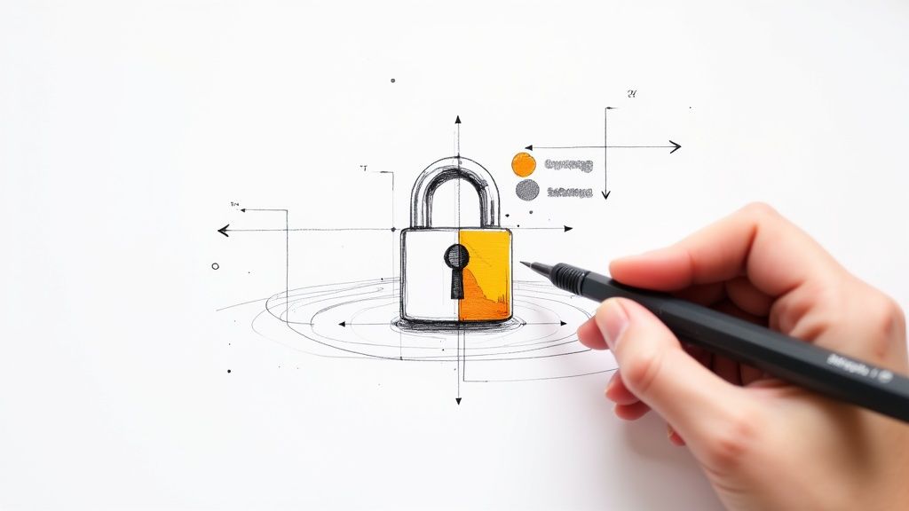
Let's walk through a practical example. Say we need a 'secure payment' icon for a new fintech app. The vibe we're going for is trustworthy, modern, and clean. In VibeIcons, I might start with a prompt like: "minimalist icon of a shield with a checkmark inside, clean lines, professional."
The AI takes that instruction and almost instantly generates a handful of different concepts. This is where the real time-saving kicks in. Instead of spending hours sketching, you get a range of visual ideas to build from in mere seconds.
Customizing the AI-Generated Design
The initial output is just your starting point. Now, you get to play art director and refine the design to perfectly fit your brand's unique style. This is how you take a great concept and make it a truly on-brand asset.
For our 'secure payment' icon, a few tweaks could make all the difference in matching our app's existing design language:
- Tweak Line Weights: Maybe the default lines are too thin. Bumping up the thickness can give the icon a sturdier, more secure feel.
- Inject Your Brand Colors: This is a must. I'd swap the default colors with my brand's exact hex codes to ensure everything looks cohesive.
- Refine the Details: Sometimes the AI gets a curve slightly off or a corner isn't quite sharp enough. You can dive in and adjust these small details to perfect the icon, especially for how it will look at small sizes on a phone screen.
The real goal here is to infuse your brand’s personality into the design. A few small, deliberate adjustments are what transform a generic AI icon into something that feels like it was custom-made just for you.
Blending Modern and Timeless Styles
Icon design, like all design, follows trends. Think back to the early 2000s and all those Y2K-style icons with their glossy, metallic finishes. Interestingly, some of those retro styles are making a comeback, but with a modern, cleaner twist.
Looking ahead, we're seeing trends like subtle metallic sheens and bold minimalism dominating the space. And the role of AI in this process is only growing—it’s projected that AI integration in design workflows will jump by over 50% by the end of 2025.
VibeIcons is built for this new era, letting you easily experiment with different aesthetics until you find the perfect one. If you want to dive deeper into the AI generation process, we have a whole guide on how to generate an icon online. This approach really puts the creative power in your hands, allowing you to craft an icon that feels both fresh and built to last.
Exporting and Using Your New Icon Correctly
You’ve put in the work and designed the perfect icon. Now comes the crucial last step: getting it out of the editor and into the real world. This isn't just a simple click of a button; how you export your icon directly impacts its quality and performance wherever it’s used.
The file format you choose can make or break the final result. For almost any digital application like websites or apps, Scalable Vector Graphics (SVG) is the undisputed king. Because SVGs are essentially code, they're incredibly small files that can be scaled to any dimension—from a tiny button on a watch face to a massive tradeshow banner—and they’ll never lose their sharpness.
But what about other uses? If you need an icon for a social media profile, a slide deck, or even an email signature, a PNG (Portable Network Graphics) is usually a more straightforward choice. PNGs are great because they support transparent backgrounds, so you won’t get that clunky white box around your icon when you place it on a colored background.
Getting the Export Settings Right
Inside VibeIcons, we've kept the export process as clean and simple as possible. When your design is ready, you can download a perfectly optimized SVG with a single click. This guarantees you get the smallest possible file size, which is a huge win for keeping your website loading times fast.
If you do need a PNG, you’ll need to think about resolution.
- For tiny web elements (like a favicon): Stick to specific, small sizes like 32x32 or 64x64 pixels.
- For high-resolution screens (like Retina displays): You’ll want a larger version, maybe 512x512 pixels, to keep things looking crisp.
Your icon's journey doesn't end with design; it begins with a proper export. Choosing the right format is the difference between a crisp, professional symbol and a blurry, unprofessional one. Making the correct choice ensures all your design effort pays off.
Here’s a quick table to help you decide which format is best for your specific needs.
Choosing the Right Icon File Format
A quick comparison to help you select the best file format for any situation.
| File Format | Best For | Key Advantage |
|---|---|---|
| SVG | Websites, web apps, mobile UI, animations | Infinitely scalable, small file size, editable |
| PNG | Social media, presentations, documents | Supports transparent backgrounds, wide compatibility |
| Print materials, documents for sharing | Preserves vectors for high-quality printing | |
| JPG | Photos, complex images with gradients | Good compression for photographic content |
Ultimately, the goal is to pick the format that delivers the best quality for its intended use without bloating your file sizes.
If you’re still weighing your options, we wrote a detailed guide breaking down the pros and cons of using an icon in PDF vs PNG format for different scenarios.
Managing Your Growing Icon Library
As you build out your collection, organization becomes your best friend. Trust me, a chaotic folder filled with files named icon-final-2.svg is a nightmare you want to avoid. A little bit of planning upfront goes a long way.
I'd suggest adopting a simple but clear naming convention right from the start. Something like icon-name-size.svg (for example, user-profile-24px.svg) works wonders and will save you from future headaches.
Keep all your icons in one central spot, whether that's a folder on your computer or a shared cloud drive like Google Drive. This makes it incredibly easy to find what you need, share assets with your team, and reuse icons across different projects, which is key for maintaining visual consistency.
Common Icon Design Traps and How to Avoid Them
Even after years of designing, it's surprisingly easy to fall into some common icon design traps. The biggest one I see? Overly complicated designs. An icon packed with fine lines and tiny details might look fantastic blown up on a design canvas, but it'll become an unrecognizable blob when shrunk down to 16x16 pixels for a favicon. Simplicity is always your best friend.
Another classic pitfall is ambiguity. If your "share" icon could be mistaken for an "upload" arrow, you've got a problem. You want instant recognition, not a guessing game. A great way to check this is to show your icons to someone who has zero context for your project. If they can’t figure out what it’s for in a second or two, it’s time to rethink the visual metaphor.
Sidestepping Technical and Accessibility Hurdles
Getting the visual concept right is only half the battle; technical mistakes can completely derail your hard work. Poor color contrast is a huge one. It not only fails accessibility standards but also makes your icon a struggle to see for users with visual impairments.
Here are a couple of the most frequent slip-ups I've encountered and how to course-correct:
- The Mistake: Packing the icon with too many intricate lines and shapes.
- The Fix: Strip the design down to its absolute essence. Ask yourself, "If I remove this line, does the icon still make sense?" If the answer is yes, get rid of it.
- The Mistake: Picking colors that have very similar brightness or saturation levels.
- The Fix: Don't just eyeball it. Run your color palette through an online contrast checker to make sure you’re hitting at least WCAG AA standards.
The best icons feel invisible—they’re understood instantly and work for everyone. Avoiding these common mistakes isn't just a box-ticking exercise; it’s about building a fundamentally better and more inclusive user experience from the very start.
Your Icon Design Questions Answered
When you first start designing icons, a few questions always seem to come up. Let's tackle them head-on so you can avoid common pitfalls and create icons that are both beautiful and functional from the get-go.
So, what size should you actually design your icon at? My advice is to always, always work in a vector format like SVG. This way, your icon can be scaled up or down to any size imaginable without losing a pixel of quality. For a solid starting point, I usually set up my canvas at 24x24px or 32x32px. These sizes play nicely with the standard grids used in most UI design.
How Many Colors Should an Icon Have?
The next big question is color. It's easy to get carried away, but when it comes to icons, less is definitely more. For the best results and a clean look, try to stick to just 1-3 colors. A great place to start is with your primary brand color. Piling on too many colors can make an icon feel cluttered and hard to understand, especially when it's shrunk down on a mobile screen.
A logo is your brand’s signature—the main identifier for your entire company. An icon is a functional symbol within an interface that represents a specific action or idea, like a gear for 'settings' or a heart for 'like.' Icons guide users, while logos build brand recognition.
Keeping this distinction in mind is key. An icon isn't supposed to be a detailed masterpiece; it's a clear, simple visual cue that helps people navigate an interface without having to think twice.
Ready to stop searching and start creating? With VibeIcons, you can generate the exact icons you need in seconds. Try it for free at vibe-icons.com and bring your brand's visual identity to life.