Generate Icon Online with AI – Easy & Fast Creation Tips
Learn how to generate icon online easily using AI. Get expert tips to create, customize, and download high-quality icons quickly and effortlessly.
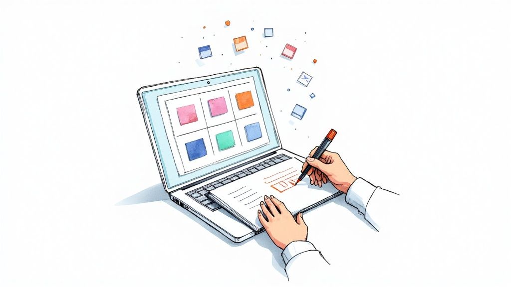
We've all been there: endlessly scrolling through icon libraries, trying to find that one perfect visual. It’s slow, frustrating, and you almost never find exactly what you had in your head. The better way? Generate an icon online using AI. It's the most direct path from a simple idea to a finished, totally unique design.
Why AI Is a Game-Changer for Creating Icons
Not long ago, finding the right icon meant one of two things: sifting through stock libraries or hiring a designer. Both routes eat up time and money. The old way forces you to settle for "good enough" instead of getting precisely what you envisioned.
This is where AI flips the script. Instead of searching, you create. Tools like VibeIcons give you a powerful design assistant that can spin up dozens of high-quality options in seconds. This isn't just about convenience; it fundamentally changes how we approach the creative process.
The Headaches of Old-School Icon Sourcing
Traditional methods are full of roadblocks, especially for teams that need to move fast. Relying on pre-made icon packs almost always leads to the same old problems:
- Style Clashes: Finding an icon that perfectly matches your brand guidelines or UI kit is a needle-in-a-haystack situation.
- Budget Drain: Premium icons and custom design work get expensive, fast.
- Creative Settling: You’re stuck with what someone else already made, which often means tweaking your vision to fit their design.
The real magic of AI icon generation is the combination of speed and specificity. You can go from a vague idea like "a friendly robot holding a leaf" to a polished, usable SVG in under a minute—without compromising your creative direction.
This new approach is a lifesaver for developers, marketers, and startup founders who need great visuals on demand. You can explore countless visual directions just by describing an idea. To see just how powerful this can be, check out these insights from a leading AI icon generator. The workflow is refreshingly simple: write a prompt, let the AI work its magic, fine-tune your favorite, and export it for immediate use.
Writing Text Prompts That Generate Great Icons
The secret to getting the perfect icon from an AI generator isn't some complex technical trick; it all comes down to the quality of your text prompt. The best way to think about it is like you're briefing a top-tier designer who's ready to bring your exact vision to life. The more specific your instructions are, the better the final icon will be.
Simply typing in "a rocket" is going to give you just that—a generic rocket. To get an icon that feels truly custom-made for your project, you need to layer in context and stylistic direction.
From Vague Ideas to Specific Instructions
Specificity is your best friend here. You can steer the AI by adding details about the style, perspective, color palette, and even the overall mood you're aiming for. This small shift in how you write your prompt turns the AI from a simple generator into a genuinely powerful creative partner.
Let's look at the difference in action.
- Vague Prompt:
a sleeping cat - Specific Prompt:
a simple line art icon of a sleeping cat, minimalist, single color, peaceful expression
See the difference? The second prompt gives the AI clear guardrails, ensuring the final image aligns with a specific design aesthetic instead of just spitting out a random illustration. This is absolutely critical for maintaining brand consistency across your assets. For a deeper dive, our guide on using an icon image creator has even more advanced techniques.
A great trick is to layer your descriptions. Start with the main subject, then add the style, and finish with any colors or emotions. This helps the AI understand the most important parts of your request.
Adding Style and Color for Better Results
This is where the real magic happens. Injecting stylistic keywords is how you can truly refine the output and get exactly what you need. Don't be afraid to experiment with different terms to find the visual language that fits your brand.
Imagine you're creating an icon for a new finance app. You could try prompts like:
flat design icon of a piggy bank3D claymation style icon of a stack of coinsblue and green gradient icon of a wallet
Each one of those prompts points the AI toward a completely different visual result, giving you an incredible amount of creative control right from the start.
This kind of accessibility is a big reason why the generative AI market is exploding. It's projected to jump from USD 71.36 billion in 2025 all the way to USD 890.59 billion by 2032 as these tools become a standard part of our everyday software. It’s a massive shift, and learning how to prompt effectively is a key skill.
Taking Your AI-Generated Icons to the Next Level
Getting a solid starting point from your text prompt is one thing, but turning that AI concept into a polished, on-brand icon is where the magic really happens. This is where you, the designer, take back full creative control. Tools like VibeIcons don't just hand you a finished product; they give you a built-in vector editor to refine every last detail.
This isn't just about small touch-ups. It’s about taking complete ownership of the design. You can zoom right in and adjust every curve, point, and line. Let’s say the AI gives you an icon with a slightly thicker stroke than your brand guidelines specify. No problem. You can manually tweak the stroke weight until it’s a perfect match. That kind of granular control is crucial when you need to generate an icon online that fits flawlessly into a professional project.
It’s this combination of AI speed and human precision that makes the process so powerful. This infographic breaks down the workflow quite nicely.
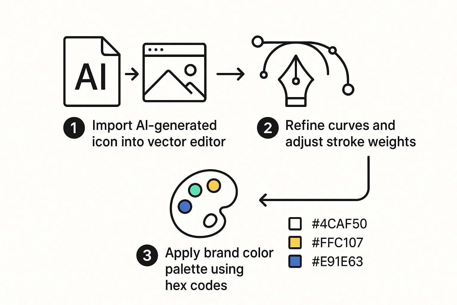
As you can see, it's a straightforward path from a raw AI output to a completely custom, brand-ready asset.
Fine-Tuning Colors and Layers
One of the first things most designers do is dial in the colors. To maintain brand consistency, you absolutely need to use your specific color palette. In the VibeIcons editor, you can just select any element of the icon and punch in your brand’s exact hex codes. This takes all the guesswork out of the equation and ensures a perfect match, every single time.
Beyond color, smart layer management is a game-changer. By grouping related parts of an icon—like all the petals of a flower—you can adjust them all at once. This makes moving, scaling, or editing complex icons so much faster and more accurate.
This demand for deep customization is fueling explosive growth in the AI image generator market, which was already valued at USD 349.6 million in 2023. It's projected to more than triple, hitting USD 1.08 billion by 2030, showing just how much creators value this level of control. You can dig into more data on the AI image market's rapid expansion to see what's behind the trend. At the end of the day, it's this hands-on refinement that turns a decent AI icon into a truly great one.
Choosing the Right Icon File Format
https://www.youtube.com/embed/bE98tqXUJaU
Once you've generated an icon and tweaked it to perfection, there's one last step that can make or break how it looks in the real world: choosing the right file format. It might seem like a small detail, but exporting your icon incorrectly can lead to blurry images, slow websites, and a whole lot of frustration later on.
The choice really comes down to two types of image files: vector and raster. Getting this right is key to making sure your icons look sharp everywhere they're used.
Vector vs. Raster Formats
Vector formats, like the ever-popular SVG (Scalable Vector Graphics), are built on a foundation of mathematical formulas. This is their superpower—it means you can scale them to any size, from a tiny favicon to a massive billboard, and they will never, ever lose quality. No pixelation, no blurriness.
On the other hand, you have raster files like PNG (Portable Network Graphics) and JPG (Joint Photographic Experts Group). These are made up of a fixed grid of tiny squares, or pixels. They're fantastic for photos but start to fall apart when you resize them. If you try to blow up a small raster icon, you’ll quickly end up with a fuzzy, unprofessional mess.
For just about any digital use case—websites, mobile apps, or software interfaces—SVG is the undisputed champion. Its scalability and tiny file size make it the best choice for UI elements that need to look crisp on a dozen different screen sizes.
Still not sure which one to pick? Here are a few common scenarios:
- Website Logo or UI Button: Go with SVG every time. This ensures it looks just as sharp on a small phone screen as it does on a huge 4K monitor. For a deeper dive into vectors, take a look at our guide on how to make a vector image in Illustrator.
- Social Media Profile Picture: A high-resolution PNG is your best bet here. It supports transparent backgrounds and works perfectly on all major social platforms.
- Complex Illustration for a Blog Post: JPG can work if file size is your main worry, but a PNG will usually give you a cleaner look for graphics, especially with solid colors and text.
Choosing the right format is the final polish that ensures all your hard work on the design really shines. To make it even clearer, here’s a quick breakdown of the most common icon file formats and where they work best.
Icon File Format Use Cases
| Format | Best For | Key Feature |
|---|---|---|
| SVG | Websites, apps, logos, and UI/UX design | Infinitely scalable without quality loss |
| PNG | Social media, web graphics, email | Supports transparency and lossless compression |
| JPG | Detailed photos, complex illustrations | Small file sizes with lossy compression |
| ICO | Website favicons and Windows application icons | A container for multiple sizes in one file |
Ultimately, picking the right format ensures your icons are versatile, high-quality, and optimized for their specific job.
Going Beyond Basic Prompts to Create Truly Unique Icons
If you've played around with AI icon tools, you know that simple prompts often lead to simple, sometimes generic, icons. The real magic happens when you move beyond just asking for an image and start actively directing the AI’s creative process. That's how you generate an icon online that truly feels custom-made.
One of the most effective tricks of the trade is using negative prompting. Think of it as telling the AI what to avoid. It’s a surprisingly powerful way to refine your results and steer clear of common pitfalls.
For example, if the icons coming back feel a bit too chaotic, try adding a negative prompt like cluttered, excessive detail, shadows. This simple command tells the AI to dial back the complexity, often resulting in a cleaner, more professional design.
Merging Aesthetics and Building Cohesive Sets
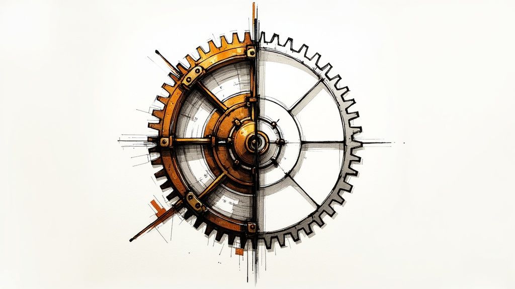
Another fantastic way to push the creative boundaries is to blend different styles in a single prompt. This is where you can cook up something genuinely original. Instead of just "gear icon," why not try something like, a steampunk-inspired gear icon with a modern, minimalist outline? This forces the AI to get creative by merging two completely different worlds.
My go-to workflow for building a full, professional-looking icon set is to nail down a core style prompt first. Once I have that, I just swap out the subject for each icon. This little trick ensures every icon feels like it belongs to the same family.
Let's say you decide on a core style: minimalist line art icon, single color, rounded corners. From there, building out the set is easy:
minimalist line art icon, **user profile**, single color, rounded cornersminimalist line art icon, **settings gear**, single color, rounded cornersminimalist line art icon, **notification bell**, single color, rounded corners
Using a system like this guarantees a consistent visual language across your entire app or website. This level of efficiency is why these tools are becoming so essential for designers and businesses.
The market reflects this shift. In 2023, the AI logo generator market in North America was already valued at USD 722 million. And it's not slowing down; the global market is on track to hit USD 2.06 billion by 2033. If you're interested in the numbers, you can explore the full AI logo generator market analysis for a deeper dive.
Got Questions About Generating Icons Online?
Jumping into a new tool always brings up a few questions. When it comes to using AI to generate icons, it’s no different. It's a fantastic way to create visuals, but you’re probably wondering about the important stuff—like who actually owns the icons, if you can use them for commercial work, and how to make sure they're truly unique.
Let’s tackle some of the most common things people ask.
Who Actually Owns the Icons I Make?
This is a big one, and thankfully, the answer is usually simple. When you create icons on a platform like VibeIcons, you own the rights to the specific designs you generate. You can use them in your projects without having to think about licensing fees or giving credit.
Of course, it's always smart to glance over the terms of service for any tool you use. But most solid platforms are built to give you full ownership, so you can use what you create however you need to.
Can I Use These Icons for Commercial Projects?
You bet. In fact, that’s one of the main reasons people generate an icon online with AI in the first place. These aren't just for fun; they're professional-grade assets ready for real-world business use.
Here are just a few ways people use them commercially:
- Logos and Branding: Spinning up a unique logo for a new startup or product line.
- Website and App UI: Crafting a complete, consistent set of icons for a user interface.
- Marketing Materials: Dropping custom icons into social media graphics, slide decks, and online ads.
The bottom line is that these tools are designed for professional work. You’re not just doodling; you’re creating functional, legally sound design assets you can put to work in a commercial setting immediately.
How Do I Make Sure My Icons Are Actually Unique?
The magic is all in your prompt. While the AI has seen a lot of images, your specific instructions are what guide it to create something new. To get a truly original icon, you have to get specific.
Don't just ask for a generic icon. Layer in details about your brand’s personality, your specific color palette, and even the feeling you want to convey.
For example, instead of just chat bubble icon, you could try something like, a friendly, rounded chat bubble icon in a claymation style, using a soft gradient of blue and green. The more creative direction you give, the more the final icon will be a reflection of your unique idea—and nothing like what anyone else has.
Ready to create stunning, unique icons in seconds? With VibeIcons, you can go from a simple idea to a polished, professional SVG ready for any project. Start designing for free today at https://www.vibe-icons.com.