Crafting the Perfect Drag Drop Icon
Learn to design and implement an intuitive drag drop icon. Our guide offers real-world code examples and UI/UX insights for developers and designers.
A well-designed drag drop icon is more than just a visual flourish; it's the handshake between the user and your interface. It provides instant, clear feedback, turning a potentially clunky action into something that feels natural and intuitive. This tiny visual cue is what tells someone, "Hey, you can grab this and move it around." Our job is to make that entire process feel effortless.
What Makes a Drag Drop Icon Intuitive

Before we even think about code, we need to nail the design principles that put users in the driver's seat. The difference between a frustrating interaction and a smooth one often boils down to subtle visual signals that clearly communicate what’s happening at every moment.
These conventions have been around for a while. If you look back, the roots of modern GUIs go all the way to the Xerox Star system in 1981, which first brought icons and drag-and-drop to the market. This was a huge leap from command-line interfaces, establishing a visual language we still build on today.
Core Principles of Effective Design
The best drag-and-drop interactions are built on a foundation of crystal-clear communication. A user should never be left wondering what's going on or what to do next.
Here are the key ingredients for an intuitive experience:
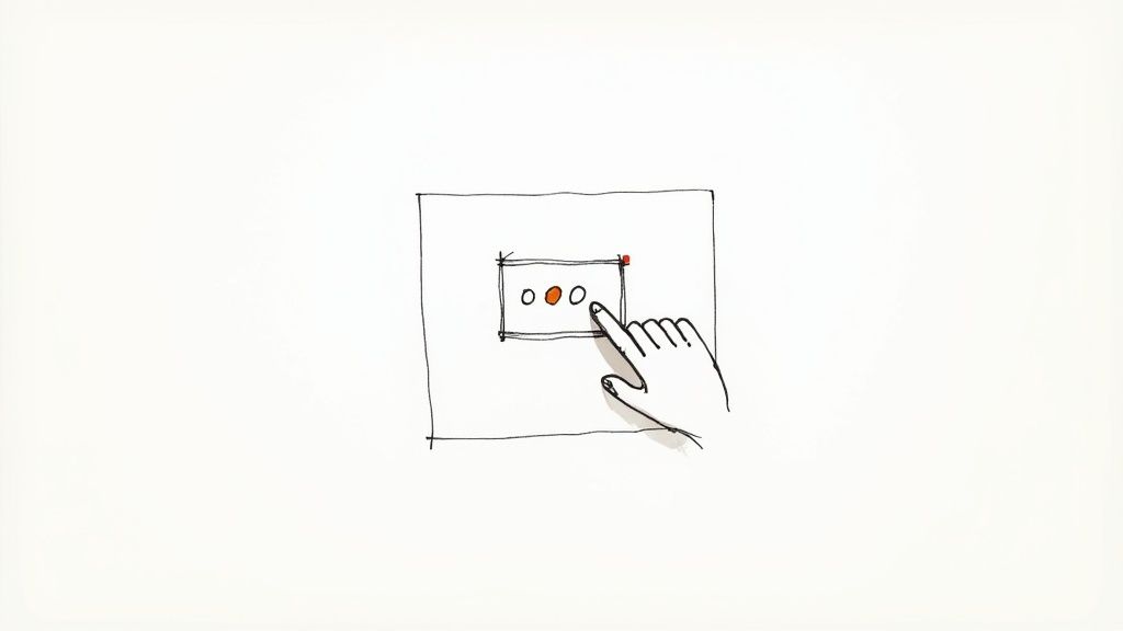
- Affordance: The icon’s design has to scream "I'm interactive!" Common patterns that work well are textured "gripper" dots (you've probably seen the six-dot grid) or a slightly raised look created with subtle shadows.
- Feedback: The interface needs to react the instant a user does something. This means changing the cursor to a "grabbing" hand on click, making the element appear to "lift" off the page with a drop shadow, and clearly highlighting potential drop targets.
- Consistency: Keep your visual language the same across the entire application. If one draggable element uses a certain icon style, all of them should. This builds a predictable, reliable pattern for your users.
A great drag-and-drop experience is like a silent conversation. The icon signals its purpose, the cursor change confirms the action, and the visual feedback guides the user to a successful conclusion without any confusion.
Accessibility Is Non-Negotiable
An intuitive design has to be an accessible one, period. Those slick visual cues we just talked about are completely invisible to someone using a screen reader.
To create a truly inclusive experience, your drag drop icon needs to be supported by solid, semantic HTML and ARIA attributes that describe its function and state to assistive technologies. For a closer look at this, our guide on enhancing user experience with icons offers some great insights.
Designing Your Icon for Different States
A truly effective drag-and-drop icon is more than just a static image; it's a dynamic guide that communicates with the user at every step of the interaction. You need to think about its entire lifecycle, designing for movement and feedback across three critical states. Each one requires a distinct visual cue to make the process feel intuitive.
First up is the default or idle state. This is what the user sees before they even think about interacting. The icon needs to clearly say, "Hey, you can move me," without screaming for attention. The classic six-dot "gripper" icon is a perfect example because it's a widely understood symbol for movability. It just sits there, patiently waiting.
When a user's cursor glides over the element, you hit the hover state. This is your first chance to provide instant feedback. A subtle change here goes a long way. Maybe the icon gets a little bigger, its color shifts slightly, or the cursor itself morphs into a "grab" hand. This small acknowledgment tells the user, "Yep, this is exactly what you think it is," building their confidence to complete the action.
This infographic breaks down a simple workflow for thinking through and designing these interactive states.
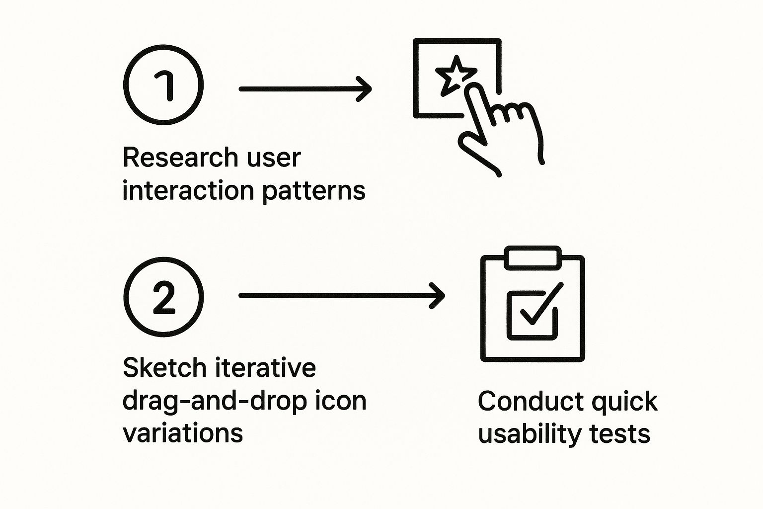
As you can see, the process puts the user first, moving from initial research and ideation right through to testing and refinement. It's all about making sure the final icon just works.
The Active Dragging State
Now for the main event: the active or dragging state. This kicks in the moment a user clicks and starts moving the element. The visual change here needs to be the most dramatic of the three.
A common and highly effective technique is to make the element semi-transparent or lift it off the page with a subtle drop shadow. This creates a clear sense of detachment, showing the user they've successfully "picked up" the item. The cursor should also switch to a "grabbing" or closed-hand icon, reinforcing the action.
This idea of directly manipulating digital objects isn't some new fad. It actually has roots going back to the late 1970s at Xerox PARC, where it was a key feature of their revolutionary Xerox Star system. They figured out that making digital interactions feel more physical and direct was the key to making computers more approachable. You can learn more about the evolution of this UI model from the earliest graphical interfaces.
Picking the right file format is crucial for making these states work flawlessly. Here’s a quick comparison to help you decide.
Choosing the Best Icon Format for the Web
| Feature | SVG (Scalable Vector Graphics) | PNG (Portable Network Graphics) | Icon Font |
|---|---|---|---|
| Scalability | Perfectly scalable; looks sharp at any size. | Raster-based; quality degrades when scaled up. | Scales perfectly like text. |
| File Size | Typically very small. | Can be large, especially for complex icons. | Small, but the entire font set must load. |
| Styling | Easily styled with CSS (color, stroke, fill, filters). | Limited styling (only with CSS filters). | Can be styled with text properties (color, size, shadow). |
| Performance | Excellent; can be embedded directly in HTML. | Can increase HTTP requests if not sprited. | Requires an HTTP request; may cause a flash of unstyled text. |
| Accessibility | Great; can include title and description tags. | Requires proper alt text. | Can be tricky; often read as characters by screen readers. |
For drag-and-drop icons, SVG is almost always the best choice. Its scalability and CSS-styling capabilities make it incredibly flexible for creating those dynamic state changes we just talked about.
For all states, using a vector format like SVG is non-negotiable. SVGs are scalable without quality loss, ensuring your drag drop icon looks crisp on any screen size or resolution. They are also lightweight and can be styled directly with CSS, making them incredibly flexible.
Bringing Your Icon to Life with HTML and CSS
Alright, your design is polished and ready to go. Now for the fun part: translating that design into a real, functional element on the page. This is where we bridge the gap from design to development, and the foundation is actually pretty straightforward, thanks to a native browser feature.
The magic starts with a single HTML attribute: draggable.
That's it. By setting draggable="true" on an element—whether it’s a <div>, an <img>, or your brand-new SVG icon—you’re telling the browser, "Hey, this thing can be picked up and moved." This one little attribute is our ticket into the entire Drag and Drop API.
Styling the Interaction States
Once an element is draggable, we need to provide that crucial visual feedback we planned out earlier. This is where CSS comes in, making the interaction feel responsive and intuitive. We'll eventually use JavaScript to toggle classes on the fly, but for now, let's just get the styles right.
You'll want to define a few key states:
- The Default State: This is just your standard
.drag-drop-iconclass. Nothing fancy yet. - The Hover State: A simple
:hoverpseudo-class can change the cursor tograb, which is a great visual cue that invites interaction. - The Dragging State: When the user is actively dragging the icon, a class like
.draggingcan lower its opacity, add a subtle box-shadow to "lift" it off the page, and switch the cursor tograbbing.
The screenshot above, pulled from the excellent MDN Web Docs, shows how the draggable attribute and various drag events work hand-in-hand. We're leaning on this native browser support so we don't have to pull in a heavy external library for a simple interaction.
One thing to keep in mind is the "ghost image"—that semi-transparent copy of the element that follows your cursor. Styling it directly is tricky, and browser support can be inconsistent. If you need total control over its appearance, you’ll have to dive into more advanced JavaScript to create a custom one.
Getting these styles right gives the user immediate confirmation that their actions are working. For more ideas on styling, check out these tips on how to change the color of an icon with CSS, which is perfect for creating those dynamic hover and active effects.
Bringing Drag Events to Life with JavaScript
Giving an icon the draggable attribute is a good first step, but it doesn't do anything on its own. It’s just a static element waiting for instructions. That’s where JavaScript comes in—it’s the engine that breathes life into the interaction, letting us respond to what the user is doing in real time.
We'll be tapping into the browser's native Drag and Drop API, which is essentially a series of built-in events. Think of it like a conversation happening behind the scenes: the item being dragged talks to the potential drop zones, and the browser listens in. By attaching our own code to these events, we can jump into that conversation and control what happens next.
This idea of direct manipulation isn't new. It goes all the way back to the original Macintosh in 1984 and has become a cornerstone of intuitive design. In fact, over 60% of modern mobile devices rely on a touch-based version of this same core concept. If you're curious about the history, there are some great reads like this one on goodspeed.studio.
The Core Drag and Drop Events You'll Need
Let's cut through the noise. While there are several events available, you really only need to master three to build a solid drag-and-drop feature. These three events handle the entire lifecycle of the interaction, from the moment a user picks an item up to when they set it down.
Here’s the essential trio you’ll be working with:
dragstart: This fires the second the user starts dragging your icon. It’s the perfect spot to do two things: attach the data of the item being moved and add a CSS class (like.dragging) to give the user some visual feedback. I usually make it slightly transparent or add a subtle box-shadow.dragover: This event triggers continuously as the user drags the icon over another element. This is the big one. You absolutely must callevent.preventDefault()inside this listener on any element you want to be a drop zone. If you don't, the browser’s default behavior will block the drop from ever happening.drop: This is the payoff. It fires when the user lets go of the mouse button over a valid drop target (one with thatdragoverhandler we just talked about). Here’s where you’ll grab the data you stored earlier and officially move the element into its new home.
One of the most common rookie mistakes I see is forgetting to prevent the default behavior on the
dragoverevent. If your drop isn't working, I can almost guarantee that's the first place to look. It’s a small line of code, but it makes all the difference.
Getting comfortable with this event-driven flow is a huge step in building more dynamic interfaces. For anyone looking to level up their skills, we have more articles covering front end development that dive into more advanced techniques. By understanding how to manage this sequence, you can turn a simple drag drop icon into a genuinely useful and interactive feature.
Polishing Your Drag-and-Drop: From Functional to Flawless
Getting a drag-and-drop feature to work is one thing. Making it feel good is another thing entirely. When I’m working on an interface, this is the part where I focus on the little details that separate a basic feature from a genuinely polished user experience.
One of the first things you'll run into is making it work on mobile. It's a classic "works on my machine" problem if you only test with a mouse. The dragstart event you rely on for desktops just doesn't exist on touch screens. To get that same intuitive feel on a phone or tablet, you have to switch gears and use touch events like touchstart, touchmove, and touchend.
Keep it Snappy and Make it Accessible
Performance can really take a nosedive once your draggable elements get more complex. If you're trying to drag an element that has dozens of nested children, you’ll notice the browser starts to stutter. It's just too much to render in real-time. The trick is to create a simplified "ghost image" to follow the cursor—a lightweight copy instead of a full, heavy clone.
And then there's accessibility, which is absolutely non-negotiable for a professional-grade UI. Visual cues are great, but they mean nothing to someone using a screen reader. You have to provide that same feedback programmatically.
- Lean on ARIA: When an item is picked up, set its
aria-grabbedattribute totrue. For the drop zones, usearia-dropeffectto tell the user what will happen—whether it's a "move" or a "copy" action. - Announce What's Happening: An ARIA live region is perfect for this. You can use it to give real-time updates like, "Item grabbed," or "Task moved to 'Done' column."
A truly polished interface feels effortless for everyone. Think of accessibility as a core part of the build, not an afterthought. It's what makes sure every single user can get the job done.
Finally, know when not to build it yourself. If you're building something really complex, like multi-list sorting or nested draggable groups, don't try to reinvent the wheel. Seasoned libraries like SortableJS or Dnd Kit for React have already been through the wringer. They've solved all the tricky edge cases and browser quirks so you don't have to.
Answering Common Drag-and-Drop Questions
Even with the best planning, a few tricky questions always seem to pop up when you're implementing drag-and-drop. I've seen these trip up developers countless times, so let's get them sorted out.
What's the Best Format for a Drag-and-Drop Icon?
Hands down, SVG (Scalable Vector Graphics) is your best bet for drag-and-drop icons. They're incredibly lightweight, which means faster load times, and they scale to any size without a hint of pixelation. Your icons will look crisp and clean on every single screen.
But the real magic of SVG is how easily you can manipulate it with CSS. Need to change the icon's color when a user hovers over it or make it semi-transparent while it's being dragged? You can do all of that with a few lines of code, no need to swap out image files.
How Do I Make My Drag-and-Drop Interface Accessible?
This is a big one. Accessibility isn't optional. For screen readers, you'll want to use ARIA (Accessible Rich Internet Applications) attributes. Specifically:
aria-grabbed: This tells the user's assistive technology whether an item is currently selected for dragging.aria-dropeffect: This is used on the drop zone to announce what will happen when the item is dropped (e.g., move, copy, or link).
You absolutely must provide a keyboard-only alternative as well. A great, user-friendly pattern is to let someone select an item with the Enter key, move it between drop zones using the arrow keys, and place it with Enter again.
This trips up nearly every developer the first time they build this. You’re trying to drop an element, and it just snaps back to where it started. The culprit is almost always a forgotten
event.preventDefault()inside thedragoverevent listener on your drop target.
Browsers, by default, won't let you drop elements just anywhere. You have to explicitly signal that a specific area is a valid drop zone, and that's precisely what preventDefault() does. It's a simple one-liner that allows the drop event to fire as you'd expect.
Struggling to create a drag-and-drop icon that actually fits with your existing design system? VibeIcons uses AI to generate style-consistent, high-quality icons in seconds. Give it a try and create your first five for free.