How to Make Custom App Icons That Get Noticed
Learn how to make custom app icons that drive downloads. Our guide covers design principles, tools from AI to pro software, and platform-specific tips.
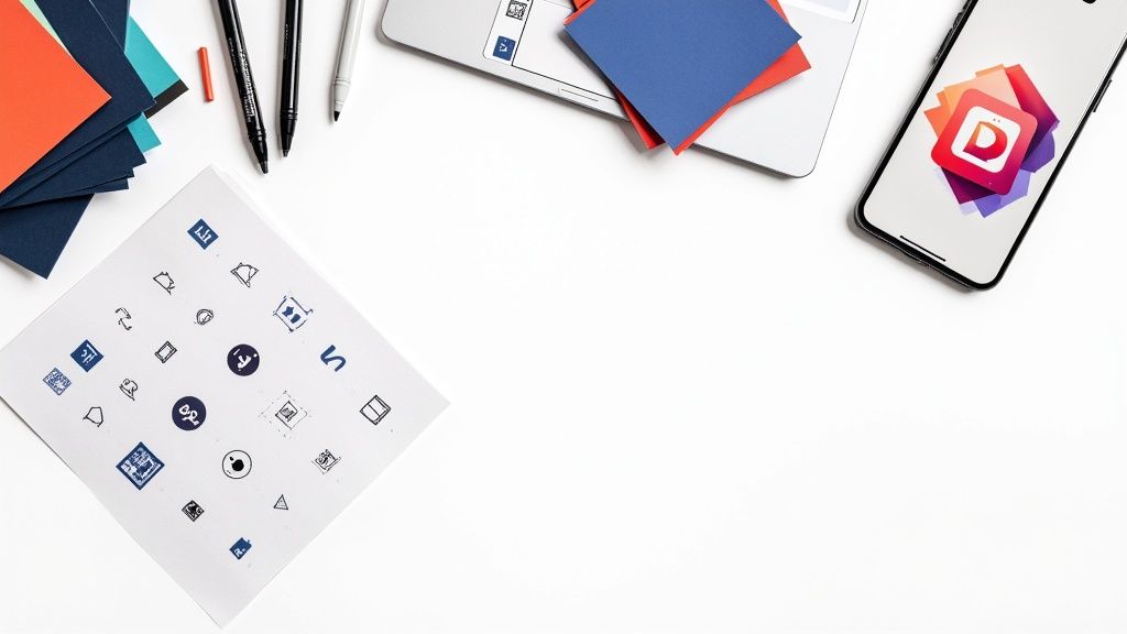
Creating a custom app icon boils down to a few key stages: nailing down a concept, firing up a design tool like Figma or an AI generator like VibeIcons, and then exporting the final design in the right format for iOS or Android. The real trick is to land on a simple, memorable design that instantly tells people what your app is all about.
Why Your App Icon Is Your Most Powerful Asset
Long before a user reads a single review, watches your promo video, or even glances at your app’s name, they see its icon. Think of that tiny square as your silent salesperson, hustling 24/7 in the crowded digital aisles of the App Store and Google Play. It's the first handshake, the elevator pitch, and more often than not, the one thing that decides between a tap and a scroll.
A great icon does more than just look pretty—it communicates your app's core purpose in a split second. This isn’t just about aesthetics; it's a critical business tool. Just think about the most successful apps on your phone. Their icons are instantly recognizable, becoming visual shorthand for the service they provide. That's the power of a strong first impression, and your icon is what builds it.
The Undeniable Impact on Downloads
A standout icon directly fuels discoverability and download rates. When people are scrolling through search results or top charts, their eyes are scanning dozens of icons at once. Yours needs to pop. It has to grab their attention and make them curious enough to learn more. A generic or confusing icon simply gets lost in the noise, rendering your app invisible, no matter how amazing it is.
The data on this is crystal clear. Swapping a weak icon for a well-designed one can dramatically lift conversion rates. In fact, studies show a strategic redesign can boost conversions from an average of 4.2% to 6.8%—a staggering 62% increase. For an app with any kind of scale, that translates into thousands of new downloads from a single visual tweak. You can dig deeper into the data behind icon design and user acquisition in this detailed guide on mobile icons.
Your app icon isn't just a part of your product; it is the product to someone who hasn't downloaded it yet. It carries the entire weight of your brand's promise in a tiny, tappable package.
The app icon landscape is always evolving, with certain styles proving more effective than others at capturing user attention. Understanding these trends can give you a significant edge.
Key Icon Design Trends and Their Impact
Here’s a look at some current trends and how they’re performing in the wild.
| Design Trend | Key Characteristics | Performance Uplift |
|---|---|---|
| Minimalist Glyphs | Simple, single-color symbols on a solid or gradient background. Focus on a single, recognizable shape. | Can increase tap-through rates by up to 18% due to high legibility and brand recall. |
| Vibrant Gradients | Smooth transitions between two or more bold colors. Creates depth and visual interest. | A/B tests often show a 10-15% lift in conversions compared to flat color designs. |
| Neumorphism | Soft, extruded plastic look with subtle shadows and highlights. A modern take on skeuomorphism. | Can improve perceived value, but performance is mixed. Best for utility and finance apps. |
| Abstract Characters | Using a friendly, stylized character or mascot. Builds an emotional connection. | Highly effective for gamified or lifestyle apps, boosting engagement by 20% or more. |
Staying on top of these trends doesn't mean you have to follow them blindly, but it gives you a powerful toolkit for creating an icon that truly performs.
Communicating Purpose and Personality
Ultimately, your goal is to design a custom app icon that masters two key jobs:
- Clarity: It needs to give users a clear hint about what your app does. A music app might feature a musical note, while a fitness app could use a stylized dumbbell or a running figure. The connection should be immediate.
- Personality: It has to reflect your brand’s character. Is your app fun and playful, or is it serious and professional? The colors, shapes, and overall style you choose all work together to create that feeling.
Learning how to make custom app icons is all about finding that sweet spot between clarity and personality. It’s about creating a visual that isn't just beautiful, but is also one of your hardest-working business assets.
Defining Your Icon's Core Concept
Before you ever touch a design tool or write a single prompt, the real work begins. A truly great icon isn't born in sophisticated software; it starts with a strong, clear idea. The first hurdle is boiling down your app's entire purpose into a single, powerful visual metaphor.
Ask yourself this: if you had to represent your app with just one object or action, what would it be? For a note-taking app, maybe it’s a simple pencil or a folded piece of paper. For a travel app, a compass, a plane, or a globe might come to mind. This core idea is the bedrock you'll build everything on.
It's all about finding a symbol that’s universally understood but still feels unique to your brand. You want to avoid overused clichés, but don't get so abstract that people have no idea what your app does. The goal is instant recognition.
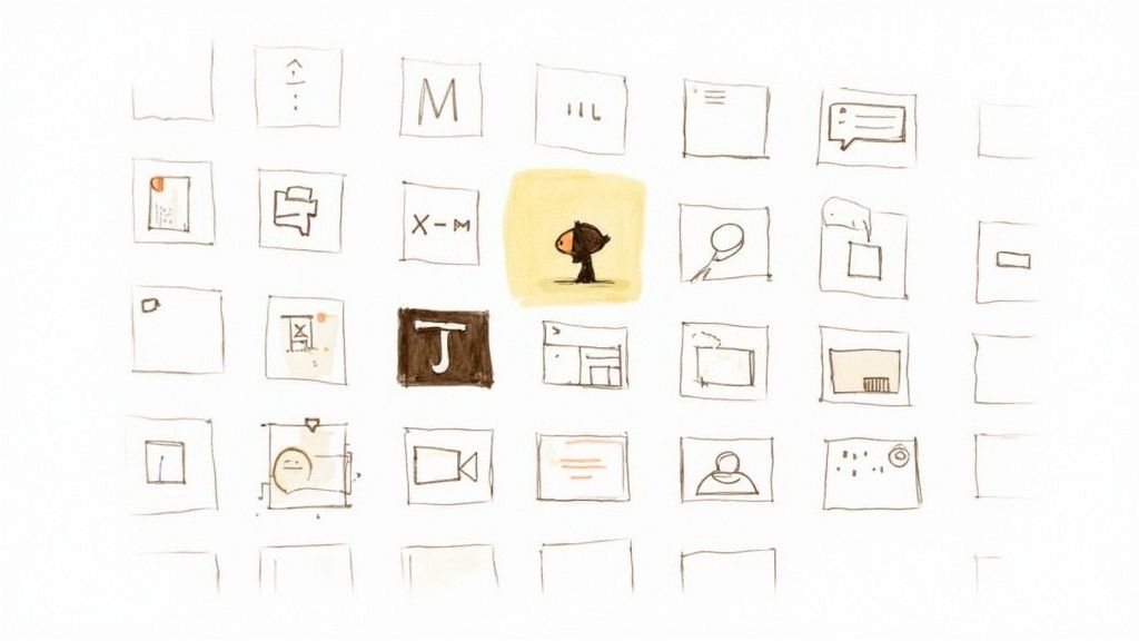
Brainstorming and Visual Exploration
With a few core ideas in mind, it's time to start playing. This isn't about polish; it's about getting concepts out of your head and onto a page to see what sticks. A couple of old-school techniques work wonders here.
First up, create a mood board. This is your creative North Star. Pull together screenshots, color palettes, logos, and illustrations that nail the feeling you want your brand to have. Are you aiming for modern and sleek, or something more fun and quirky? This visual library keeps your design choices anchored to your brand’s personality.
Next, start sketching. Forget about artistic talent—this is about speed and volume. If your idea is a compass, draw it ten different ways: simple, detailed, abstract, geometric. This rapid-fire, low-fidelity process helps you spot the strongest shapes and compositions without sinking hours into a single idea that goes nowhere.
A great icon is rarely the first idea you have. It's the one that survives a dozen rounds of sketching, simplifying, and refining. The concept phase is where you separate a good idea from a truly effective one.
Analyzing the Competition
Once your concepts are taking shape, it’s time for a reality check. Head over to the App Store and Google Play, search for apps in your category, and take a long, hard look at what’s already out there. This isn’t about copying anyone; it’s about strategically finding your own lane.
Pay close attention to common themes and colors. For instance, if every other finance app uses green and gold with a dollar sign, choosing a bold purple with a unique symbol could make you pop off the screen.
Look for opportunities to set yourself apart by asking a few key questions:
- What colors are overused? Spot the dominant palettes and think about an alternative that still feels right for what your app does.
- What metaphors are common? If everyone is using a shopping cart, could you use a stylized bag or a price tag instead?
- What is the overall style? Are most icons flat and minimalist, or are they 3D and illustrative? You can stand out by adopting a contrasting—yet still modern—style.
This foundational work is what elevates a simple graphic into a potent marketing tool. It ensures your final design isn't just pretty, but is strategically positioned to grab attention in a very crowded space.
Choosing the Right Tools for Your Project
Once you've nailed down your concept, it's time to pick up the digital tools to bring it to life. The modern design toolkit is packed with options, but you don't need to be an expert in all of them. The best choice really just comes down to your skill level, your timeline, and what the project demands.
For a lot of people, especially non-designers or teams that need to move fast, user-friendly platforms are a fantastic starting point. A tool like Canva has a super gentle learning curve. Its drag-and-drop interface and huge library of elements mean you can pull together a professional-looking icon in minutes. It's perfect for early prototypes or internal projects where you don't have a dedicated design budget.
But when you need absolute creative control and a pixel-perfect result, you'll want to reach for professional-grade software. These tools are the industry standard for good reason.
Professional Vector Editors
For any designer who lives and breathes precision and scalability, nothing beats a true vector editor. These programs let you create artwork that can be scaled up or down to any size without losing a shred of quality—a non-negotiable for app icons that have to look sharp everywhere.
- Figma: This collaborative, browser-based tool has taken the UI/UX world by storm. Its vector tools are powerful yet intuitive, making it a brilliant choice for creating icons that live inside a larger design system.
- Adobe Illustrator: The long-reigning champ of vector graphics. Illustrator offers an incredible depth of features for crafting complex illustrations and highly detailed icons, giving you granular control over every single point and curve.
Getting the hang of making custom app icons in these programs takes a bit more time, but the payoff is total creative freedom. If you're trying to figure out which one is right for you, our guide on the best vector design software can help you weigh the pros and cons for your workflow.
AI-Powered Icon Generators
A fascinating new category of tools has emerged that uses artificial intelligence to spin up unique icons from simple text descriptions. These are amazing for brainstorming sessions, getting initial mockups done, or even generating final assets when you need a specific style in a hurry.
For instance, VibeIcons lets you generate icons that match the look and feel of popular libraries like Heroicons or Phosphor. This is a huge help when you're using an existing icon set but discover you're missing a few specific symbols. You just type in what you need, and the AI does the heavy lifting.
The real magic here is how simple it is to turn an idea like "a friendly robot waving" into a polished, vector-ready icon that maintains a consistent style with the rest of your set.
This kind of rapid, style-consistent creation is becoming more important as design trends shift. Keeping your app icon fresh has a real impact on user acquisition. Looking ahead to 2025, icons that reflect the latest design trends can seriously boost conversions. For example, apps that adopted the 'Glassmorphism 2.0' style—which uses subtle depth, translucency, and vibrant colors—saw their conversion rates jump by 22% compared to those still using older flat designs.
The right tool isn't always the most powerful one; it's the one that gets you from a great idea to a high-quality icon with the least amount of friction. Don't be afraid to mix and match—use an AI generator for ideas and a vector editor for refinement.
Mastering the Principles of Effective Icon Design
Creating an icon that looks good is one thing. Designing one that actually works? That’s a completely different ballgame. The real gap between an amateur icon and a professional one isn't just talent—it's an understanding of a few core design principles. Think of these not as fuzzy artistic guidelines, but as the DNA of a high-performing visual that can make or break a user's first impression.
The first and most important test for any icon is scalability. Your design has to be instantly recognizable everywhere it shows up. It needs to hold its own as a tiny notification dot, stay sharp in a crowded settings menu, and look crisp when blown up for a feature banner in the App Store. If the essential details turn to mush when it shrinks, the design has failed.
This is exactly why simplicity is your best friend in this process.
The Power of Simplicity and Recognition
A great icon communicates its purpose in a fraction of a second. That kind of speed demands a ruthless commitment to simplicity. You get there by focusing on bold, clean shapes and a tight, high-contrast color palette. A classic rookie mistake is trying to cram in too much detail—tiny textures, multiple objects, or complex shading. The result is almost always a muddled, forgettable blob.
Think about the app icons you remember most. The Twitter bird, the Snapchat ghost, the Instagram camera. Each one is built on a single, powerful silhouette. They don't need text or fancy gradients to be understood. They've become true symbols.
To get that level of clarity, keep these ideas in mind:
- Stick to a single metaphor. Don't try to represent every single feature of your app. Pick the one core action or idea and build your design around that.
- Use a limited palette. Two or three complementary colors with strong contrast are usually more than enough. This makes your icon pop against any background.
- Do the grayscale test. Strip all the color from your design. Is the primary shape still clear and instantly identifiable? If so, you're on the right track.
This approach ensures your design is not just a pretty picture but a functional tool, a concept we explore further in our guide on how to create an icon from scratch.
Leveraging Color and Contrast
Color isn't just for decoration; it's a shortcut to a user's emotions and attention. A little color psychology goes a long way here. Blues, for example, often suggest trust and reliability, which is why you see them all over finance and productivity apps. Reds can create a sense of urgency or excitement, making them a great fit for entertainment or food delivery.
But whatever colors you choose, they must be balanced with contrast. Your icon is going to live on a million different user wallpapers, in both light and dark modes. A low-contrast design will simply get lost in the noise. High-contrast pairings—like a bright, vivid color on a dark background—guarantee your icon stays visible and legible, no matter the context.
An icon that relies on subtle color gradients to convey its shape will often appear as an undefined blob at smaller sizes. Bold contrast is not optional; it's essential for recognition.
In the end, mastering these principles means you stop treating your icon like a miniature piece of art and start seeing it for what it is: a hard-working piece of communication. Scalability, simplicity, and contrast are the pillars that make sure your custom app icon does its job—getting noticed and earning that tap.
Navigating iOS and Android Platform Guidelines
You've designed a fantastic icon. It's creative, on-brand, and you're proud of it. But hold on—the job isn't finished until it plays by the rules of the app stores. A design that ignores platform guidelines is, frankly, a design that’s dead on arrival.
Both Apple and Google have their own specific rulebooks, covering everything from pixel dimensions to stylistic choices. Following them isn't about stifling creativity; it's about making sure your icon looks polished and professional on millions of different devices. Think of it as the final, crucial quality check before you go live.
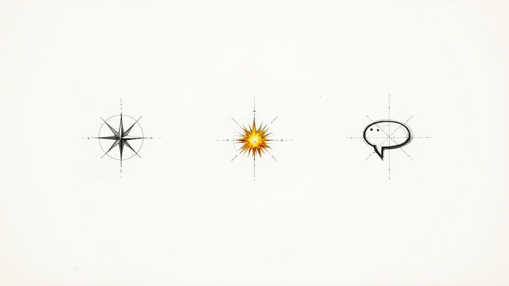
This infographic breaks down some of the universal truths for creating an icon that works hard for your app.

As you can see, concepts like scalability, simplicity, and clear contrast are non-negotiable, no matter which platform you're targeting.
Understanding Apple's iOS Requirements
Apple's design philosophy is all about clean, consistent user experience, and their icon guidelines are a perfect reflection of that. When you design for iOS, you aren't just making a square—you're designing for the squircle. That’s Apple’s signature shape with those continuously rounded corners.
The good news? You don't have to create the rounded corners yourself. Apple’s system automatically applies the mask to your final image. Just focus on delivering a perfect square.
Here's what you absolutely have to get right for the App Store:
- No Transparency: Your icon has to be 100% opaque. Any see-through areas will lead to an automatic rejection.
- Square Dimensions: You’ll need to provide a high-resolution square image, with the primary asset being 1024x1024 pixels. This ensures it looks sharp everywhere, from the oldest iPhone to the latest iPad Pro.
- Simple and Focused: Apple really favors icons that are symbolic and instantly recognizable. Avoid overly complex illustrations or photorealism; they tend to look cluttered and out of place on the iOS home screen.
Think of Apple's guidelines as a way to ensure a seamless fit. An icon that blends into the iOS environment just feels more trustworthy and professionally built, which builds user confidence from the first glance.
If you want to really get into the weeds of Apple's design language, we've put together a complete guide on creating standout app icons for iPhone that covers all the nuances.
Mastering Android's Adaptive Icons
While iOS chases uniformity, Android is all about flexibility. To account for the wild variety of devices from different manufacturers—each with its own UI—Google introduced adaptive icons. This clever system ensures your icon looks great whether the phone’s maker uses circular, square, or teardrop-shaped masks.
An adaptive icon is actually built from two separate layers:
- Foreground Layer: This is your primary logo or symbol. It must be opaque and designed to fit within a "safe zone" so that no critical parts get lopped off by a mask.
- Background Layer: This sits behind the foreground and is usually a solid color or a simple gradient. This layer must also be fully opaque.
This two-layer setup is what allows for those subtle motion effects you see on Android devices and guarantees your branding remains intact across the entire ecosystem.
To make things easier, here’s a quick-reference table that boils down the key differences between designing for Apple and Google.
iOS vs Android Icon Requirements at a Glance
| Requirement | iOS (Apple App Store) | Android (Google Play Store) |
|---|---|---|
| Shape & Masking | Submit a full square; Apple applies a squircle mask. | Two-layer system (foreground/background) adapts to various manufacturer masks (circle, square, etc.). |
| Dimensions | Primary asset must be 1024x1024 pixels. | Foreground and background layers are also 1024x1024 pixels, with a "safe zone" for the foreground. |
| Transparency | Not allowed. The entire icon must be opaque. | Not allowed. Both foreground and background layers must be fully opaque. |
| Design Philosophy | Favors simple, symbolic, and focused designs for a uniform look. | Embraces flexibility and subtle motion effects while preserving core branding. |
Ultimately, whether you're building for one platform or both, success comes down to sweating the details. Both Apple and Android require a 1024×1024 pixel master file and strictly forbid transparency. But knowing the difference between a squircle and a two-layer adaptive icon is what separates an amateur from a pro—and a rejected app from a featured one.
Common Questions About App Icon Design
As you wrap up your icon design, you're bound to have a few questions. It’s completely normal. Getting these details right is what separates a good icon from a great one, so let's walk through some of the things that designers often ask.
A big one is how often you should update your app icon. There's no magic number here. A good time to consider a refresh is during a major app redesign or if design trends have simply left your icon looking a bit dusty. Of course, if A/B testing shows a clear winner, that's your cue. Just be careful not to change it too frequently—that can throw off your loyal users. A quick check-in once a year to see if it still feels fresh is a smart move.
Another question that comes up all the time is about using words.
Can I Use Text in My App Icon?
My advice? Almost always, no. Text on an app icon is a classic rookie mistake. It shrinks down to an unreadable smudge on a phone's home screen, and besides, your app's name is usually sitting right below it anyway. It just adds clutter.
Your goal should be a clean, memorable symbol that speaks for itself. Now, can you use a single letter? Sometimes. If your brand is built around a stylized initial—think the Netflix 'N' or the Medium 'M'—it can work. But even then, it has to be incredibly well-executed to stay legible.
The best icons are visual shorthand, not tiny posters. If you need to add words to explain it, the concept probably isn't strong enough on its own.
This idea of simplicity carries over into the more technical side of things, like how to actually save and hand off the final files.
What Is the Best File Format for My Final Icon?
When you’re ready to submit to the app stores, you'll need PNG files. Apple’s App Store specifically asks for a 1024x1024 pixel PNG with no transparency. For Android and the Google Play Store, you'll provide a set of PNGs at various sizes to accommodate its adaptive icon system.
But here’s the critical part: your master design file should never be a PNG. Always, always create your icon in a vector format like SVG. Use a tool like Figma or Adobe Illustrator for this. It's not optional. Working in vector means you can scale your design to any size—from a tiny notification icon to a giant billboard—without losing a shred of quality. It’s the only way to future-proof your work.
Ready to stop searching and start creating? Generate the perfect, style-consistent icons for your project in seconds with VibeIcons. Try it for free and get your first five icons by visiting https://www.vibe-icons.com.