Find the Perfect Icon for Gallery: Tips & Ideas
Learn how to choose the ideal icon for gallery websites. Discover powerful tips for selecting the perfect icon for gallery that enhances your design.
An icon for a gallery is much more than a simple button you click. Think of it as the front door to your digital collection—it's the very first clue that tells a user what’s waiting for them on the other side. It’s a tiny piece of visual language that shapes a visitor's first impression in an instant.
The Hidden Power of a Great Gallery Icon
A well-chosen gallery icon is like the clear, helpful signage in a museum. It silently points people in the right direction, cuts down on confusion, and makes the whole experience feel natural and intuitive. Without it, your most compelling visual content might get completely overlooked. A great icon isn't just for looks; it's a hard-working tool that makes your site easier to use.
This little graphic carries a lot of responsibility. It has to convey its purpose in a split second, connecting what a user sees with what they expect to happen. An effective icon for a gallery can significantly reduce cognitive load—that's the mental energy someone has to spend just to figure out your website—by making navigation feel effortless.
Why Every Pixel Counts
The benefits of a strong icon go beyond just getting people from point A to point B. It quietly reinforces your brand’s identity and adds to a clean, professional feel. When all your icons are consistent and designed with care, they build trust and signal to your audience that you value quality. That attention to detail is what invites people to stick around and explore.
This infographic breaks down how a well-designed icon can directly improve key user experience metrics.
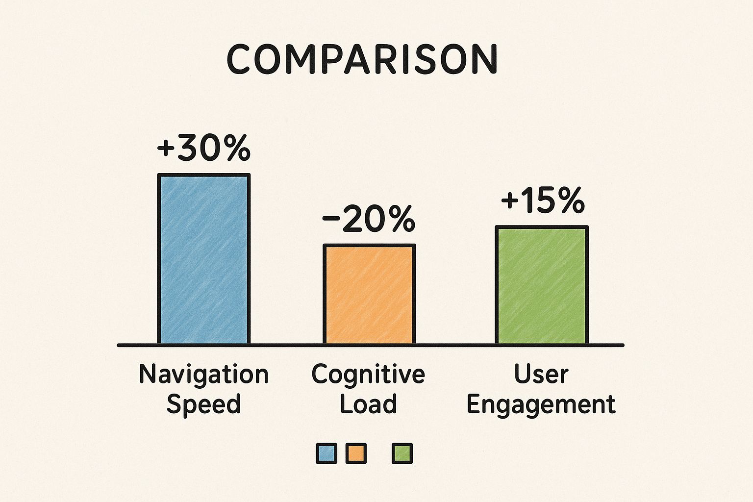
As you can see, these small visual cues can lead to real improvements in how fast people find what they're looking for and how engaged they are, all while making your site feel simpler to navigate.
The Growing Importance of Visual Cues
The need for clear, intuitive icons has never been greater. The digital world is increasingly visual, so the way we present our collections of images, projects, or products matters immensely. The rising demand for visual content highlights just how important icons are. In fact, more than half of galleries are planning to create more online content, from digital exhibitions to social media stories.
This trend really puts the spotlight on icons and other visual elements as essential tools for grabbing user attention and building a recognizable brand. You can learn more about these gallery marketing statistics and see how they're shaping design decisions.
A gallery icon is the silent ambassador for your content. Its job is to issue a clear, compelling invitation to explore, turning passive visitors into active participants.
Ultimately, taking the time to choose the right icon for a gallery is an investment in your user's experience. It's how you ensure that all those carefully curated photos, projects, or products aren't just there to be seen, but are actually discovered and enjoyed.
Understanding the Visual Language of Icons
Think of icons as a universal language for your website. When you’re choosing an icon for a gallery, you’re doing more than just picking a pretty picture. You're selecting a specific dialect that has to match your content’s tone and, more importantly, your audience's expectations. This visual shorthand is built on powerful metaphors and shared understanding.
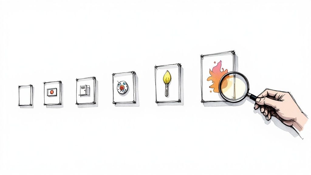
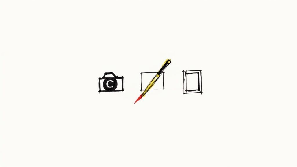
It works because it taps into concepts we all recognize instantly. A camera shape immediately screams "photographs," while a painter's brush suggests "art" or "illustrations." These symbols create mental shortcuts for your visitors. They don’t have to stop and read—they can see, understand, and click in one seamless motion.
This immediate recognition is what makes a user's journey feel effortless. When someone can instantly predict what an icon does, they feel more confident and in control, which is exactly what you want if you're hoping they'll stick around and explore.
The Power of Visual Metaphors
At its core, a visual metaphor is just an image that stands in for an idea, an action, or an object. The best ones are dead simple and widely understood. A magnifying glass for "search" or a house for "home" are classics for a reason—they work everywhere, no translation needed.
When it comes to a gallery, some common metaphors are a no-brainer:
- A Stack of Photos: This one’s a great generic icon for a gallery. It clearly signals a collection of multiple images.
- A Landscape Frame: This often points to a photo gallery, especially one focused on scenic or outdoor photography.
- A Grid of Squares: This represents a structured layout or a collection, making it perfect for portfolios or product catalogs.
But here’s the thing: you have to choose a metaphor that actually fits your specific content. A gallery for a historical archive, for instance, might be better served by an icon that looks like an old-fashioned photo album. It adds a layer of character that a generic grid never could. That single decision starts to shape how visitors feel about your collection before they’ve even seen the first image.
Matching Icon Style to Your Gallery's Vibe
Beyond the metaphor, the actual artistic style of the icon is a huge deal. It sets the entire mood. A sleek, minimalist line icon gives off a completely different vibe than a colorful, detailed illustrative one. One says "modern and professional," while the other might feel more "creative and playful."
Getting the style right is a strategic branding decision. It makes sure your visual language is consistent and speaks directly to the people you’re trying to reach. A mismatch can feel jarring or unprofessional, completely undermining the quality of the work in your gallery.
A great icon doesn't just show users where to go; it tells them how they should feel about what they're about to see. It sets the stage for the entire experience.
So, how do you pick? It all comes down to the personality of your brand and the content you're showcasing. The table below breaks down some of the most common icon styles and where they really shine, helping you find that perfect match.
Matching Icon Style to Your Gallery's Vibe
| Icon Style | Key Characteristics | Best For | Real-World Example |
|---|---|---|---|
| Line Icons | Simple, elegant outlines with a consistent stroke weight. Modern and clean. | Corporate websites, minimalist portfolios, tech platforms, and professional photography galleries. | A design agency's project showcase using thin, crisp icons to maintain a sophisticated look. |
| Filled Icons | Solid shapes without outlines. Bold, clear, and highly visible. | Mobile apps, dashboards, and websites where immediate recognition is critical for navigation. | A social media app using solid icons for "home," "messages," and "profile" for quick tapping. |
| Illustrative Icons | Detailed, colorful, and often unique. Can have shadows, gradients, and multiple colors. | Creative portfolios, children’s websites, brand storytelling, and themed digital archives. | A food blog using rich, illustrated icons of ingredients to represent different recipe categories. |
| Two-Tone Icons | Uses two colors, typically one for the outline and another for a partial fill or accent. | SaaS platforms and design-forward websites that need more visual interest than line icons but less complexity than full illustrations. | A productivity tool using a two-tone calendar icon to highlight the current date. |
Ultimately, the goal is to find an icon style that feels like a natural extension of your brand. When the icon, the content, and the overall design are all in sync, you create an experience that’s not just usable, but memorable.
Core Principles of Effective Icon Design
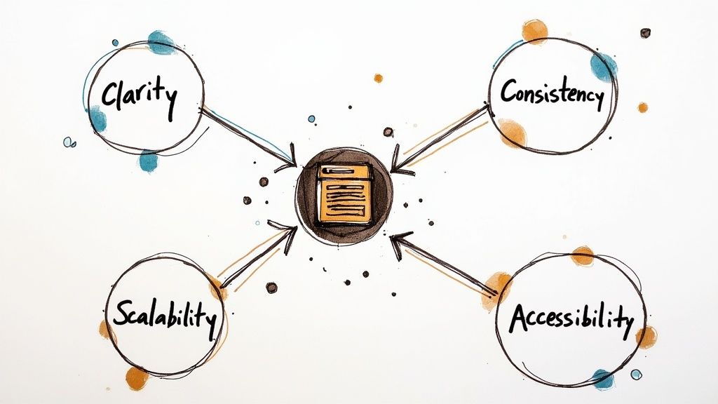
So, what’s the secret sauce that turns a decent icon for a gallery into a truly fantastic one? It's not magic, but it does come down to a few fundamental design principles. Think of them as a practical checklist that ensures your icons are clear, professional, and actually help your users, not hinder them.
When you nail these four pillars—clarity, consistency, scalability, and accessibility—you create a visual language that feels intuitive. It’s about more than just looking good; it's about building an experience that feels seamless and trustworthy from the moment someone lands on your page.
Clarity: The Five-Second Rule
An icon’s primary job is to communicate, and it needs to do it fast. If a user has to pause and squint to figure out what a symbol means, that icon has already failed. The goal is instant recognition. You want the meaning to click in just a few seconds.
This is exactly why simple, universally understood shapes almost always win out over complex, abstract illustrations. A detailed drawing might look impressive, but if it sacrifices clarity for art, it just creates friction for the user. Think of it like a road sign—the message needs to be delivered quickly and without ambiguity.
To get there, focus on a single, core idea for each icon. Resist the urge to cram multiple concepts into one tiny graphic. A clean, bold silhouette will always cut through the noise on a busy screen far more effectively.
Consistency: Building a Cohesive Experience
Consistency is what makes your interface feel polished and thoughtfully designed. When every icon for a gallery and button on your site plays by the same visual rules, it creates a powerful sense of harmony. This isn't just for looks; it establishes predictability, and predictability builds user trust.
A cohesive icon set should feel like it belongs to the same family. Here’s what to keep an eye on:
- Uniform Stroke Weight: Make sure the lines and outlines in all your icons have the same thickness.
- Consistent Corner Style: Decide on sharp or rounded corners and stick with it across the board. Don't mix and match.
- Shared Color Palette: Use a defined set of brand colors to keep everything looking unified.
- Similar Level of Detail: Avoid placing a simple, minimalist line icon right next to a complex, multi-layered one.
When your icons look like they were made for each other, users learn your visual language more quickly. They know what to expect, which makes navigating your site feel smooth and second nature. If you want to go deeper, our guide on how to create icon images has some great tips for achieving this kind of visual harmony.
Scalability: Perfect Pixels on Every Screen
We live in a multi-device world. From tiny smartwatches to massive desktop monitors, your icons have to look crisp and clear on every single screen. That's the principle of scalability in a nutshell. A well-designed icon must hold its own whether it’s shrunk down to 16x16 pixels or blown up to 128x128 pixels.
This is precisely why vector formats like SVG (Scalable Vector Graphics) are non-negotiable for modern web design. Unlike pixel-based formats (like PNG or JPG), which can get blurry and jagged when resized, SVGs are drawn with math. This means they can be scaled to any size imaginable without losing a single drop of quality.
A truly scalable icon is resolution-independent. It looks just as sharp on a high-end retina display as it does on an older monitor, guaranteeing a high-quality experience for every single user.
When you’re designing or choosing icons, always prioritize the SVG format. It’s a foundational choice that ensures your visuals will look professional and stand up to the ever-changing landscape of device resolutions.
Accessibility: Designing for Everyone
At the end of the day, a great icon is an inclusive one. Accessibility isn't just a box to check; it’s a core tenet of responsible design that ensures everyone can use your product, regardless of their abilities. For icons, this means being mindful of users with visual impairments or those who rely on tools like screen readers.
Here are a few key practices to bake into your process:
- Sufficient Color Contrast: Your icon’s color needs to stand out clearly from its background. Aim for a contrast ratio of at least 4.5:1 to ensure it's easily visible for people with low vision.
- Clear Visual States: Use obvious visual cues to show when an icon is being hovered over, focused on, or clicked. This could be a simple color change, a background highlight, or a subtle outline.
- Support for Screen Readers: Since a screen reader can't "see" your icon's image, you need to provide a text alternative. You can do this by adding an
aria-labelattribute in the code or by placing a visible text label right next to the icon.
Making your icon for a gallery accessible means you’re creating a better, more user-friendly website for all.
Where to Find High-Quality Gallery Icons
Knowing what makes a great icon is one thing, but finding the perfect assets for your project is where the real hunt begins. Whether you're working with a zero-dollar budget or you're ready to invest in a completely custom solution, the right icon for a gallery is out there. Let's walk through the best places to look, from massive free libraries to bespoke design services.
The journey really starts with one key decision: will you license existing icons or commission a designer to create a unique set? Both paths have their merits, and the right choice boils down to your project's budget, timeline, and branding needs.
Navigating Pre-Made Icon Libraries
Icon libraries are basically massive, searchable databases packed with thousands of ready-to-go icons. They've become the go-to for most web projects because they're fast, affordable, and give you high-quality visuals almost instantly. Most of these platforms offer icons in web-friendly formats like SVG right out of the box.
A few of the heavy hitters you should know are:
- Font Awesome: This one is a true giant in the industry. Its collection has become a web standard, and for good reason. The free tier is incredibly generous, while the pro version unlocks thousands more styles and variations.
- The Noun Project: Celebrated for its sheer diversity and artistic range, this library gathers icons from designers all over the world. It’s a fantastic place to find unique, creative symbols that go way beyond the usual corporate fare.
- Heroicons: Built by the team behind Tailwind CSS, Heroicons is a beautifully hand-crafted set of SVG icons. They come in both outline and solid styles and are designed for absolute clarity, making them a favorite among developers and minimalist designers.
Here’s a peek at Font Awesome’s clean interface, which gives you an idea of how extensive their library is.
You can see how the searchable layout and different style options make it easy to find a fitting icon for gallery collections or any other UI need. A well-organized library like this is a massive time-saver.
One word of caution when using these libraries: always check the license. Many offer free icons, but they often require you to give credit. Paid plans usually remove that requirement and give you access to the full collection and extra features.
A great icon library doesn't just give you assets; it gives you a consistent visual system. Sticking to one library is the easiest way to ensure all your icons share the same design DNA.
The Power of Free Resources
For projects on a shoestring budget, free resources are an absolute lifesaver. Beyond the free tiers of the big libraries, countless designers offer high-quality icon packs completely free of charge. These are perfect for startups, personal projects, or anyone who needs professional-grade icons without the price tag.
For a curated list, check out our guide on where to find free vector icons to download for your next project.
The digital artwork market is growing like crazy, with projections showing it will reach a substantial size by 2033, thanks in part to NFTs and virtual platforms. In these highly visual digital galleries, icons are essential for translating complex ideas into simple, appealing symbols that help artists and galleries showcase their work. You can learn more about the trends in the digital artwork market and see just how vital these visual elements have become.
When to Invest in Custom Icon Design
Libraries are fantastic, but sometimes "off-the-shelf" just doesn't cut it. If your brand has a truly distinct identity, or if you need icons for niche concepts that you just can't find in a standard library, it’s time to think about custom design.
Investing in a custom icon for a gallery set gives you some powerful advantages:
- Perfect Brand Alignment: Custom icons are built from the ground up to perfectly match your brand’s personality, color palette, and style guide. They become a true extension of your visual identity.
- Unique and Memorable: With a custom set, you can be sure your website won't look like anyone else's. That uniqueness makes your brand more memorable and gives it a more professional, polished feel.
- Complete Ownership: When you commission custom icons, you own them outright. That means you have total freedom to use them however you want, without ever worrying about licensing rules.
Hiring a designer is an investment, no doubt, but the return is a set of assets that are uniquely yours. To get the best results, it’s crucial to write a clear and detailed design brief. Make sure you include your brand guidelines, examples of icon styles you admire, a list of the specific icons you need, and any core metaphors you want them to represent. That clarity is the key to getting a final product you'll love.
Putting Your Icons to Work on Your Website
Finding the perfect icon for gallery collections is a huge step, but the real magic happens when you bring it to life on your website. Implementing an icon correctly means it will look sharp, load fast, and work perfectly for every visitor. This might sound a little technical, but trust me, it's more straightforward than you think.
We'll walk through the essential steps, from picking the right file type to placing your icon exactly where you want it. The goal here is to give you the confidence to do this yourself, no coding degree required.
Choosing the Right File Format: SVG vs. PNG
Before you can add an icon to your site, you have to decide on its format. For web use, this choice almost always comes down to two options: SVG or PNG. While both can technically work, one is a much better choice for modern web design.
- PNG (Portable Network Graphics): This is a pixel-based format. Think of it like a digital photograph—it’s made of a fixed grid of tiny squares. While great for detailed images, PNGs lose quality when you try to resize them. They get blurry, pixelated, and just don't look professional.
- SVG (Scalable Vector Graphics): This is a vector-based format. Instead of pixels, SVGs are built with mathematical equations. This means they can be scaled to any size—from a tiny button to a giant billboard—without ever losing a drop of clarity.
For web icons, SVG is the clear winner. Its scalability guarantees your icons will look crisp on every screen, from a small smartphone to a massive high-resolution monitor. SVGs also tend to have smaller file sizes, which helps your website load faster, and you can easily change their color or size with CSS.
Always opt for SVG for your web icons. This single choice guarantees sharpness, flexibility, and better performance, future-proofing your design against any screen size.
Simple Ways to Add Icons to Your Site
Once you have your SVG icon ready, it's time to get it on the page. There are a few different ways to do this, but let's focus on two of the simplest and most effective techniques: using an <img> tag and embedding the SVG code directly.
1. Using the <img> Tag
This is the method you're probably most familiar with. It works just like adding any other image to your website—you simply point the src attribute to your icon file. It’s a quick and easy way to get an icon on the page.
The downside? Styling the icon with CSS can be a bit limited. Changing its color on hover, for instance, isn't as straightforward with this method.
2. Embedding SVG Code Directly
For maximum control, you can paste the SVG code directly into your HTML. If you open an SVG file in a text editor, you'll see a block of XML-based code. You can copy this and paste it right where you want the icon to appear on your page.
This approach gives you complete control over the icon with CSS. You can easily target different parts of the SVG to change colors, add animations, or adjust stroke widths. To learn more about this, check out our guide on how to change the color of icons.
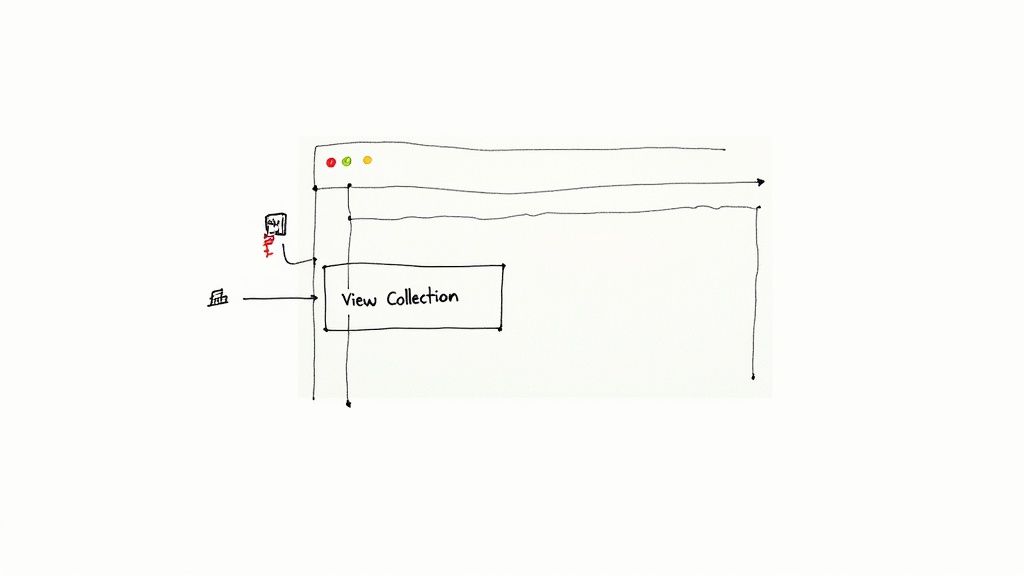
A Practical Example: Placing a Gallery Icon
Let's see this in action. Imagine you have a button that says "View Our Work," and you want to place a small gallery icon right next to the text. It's a classic use case that adds a helpful visual cue for your users.
Here’s a look at how you could structure the HTML and CSS to make it happen:
.gallery-button {
display: inline-flex;
align-items: center;
gap: 8px; /* Adds space between the icon and text */
padding: 12px 24px;
border: none;
background-color: #007bff;
color: white;
font-size: 16px;
cursor: pointer;
}
.icon-gallery {
width: 20px;
height: 20px;
fill: currentColor; /* Inherits the button's text color */
}
This simple code snippet creates a clean, professional-looking button. The display: inline-flex and align-items: center properties are the key—they perfectly align the icon and the text vertically. The gap property then adds some breathing room, making the whole thing easy on the eyes.
The Future of Icons in Virtual Galleries
Today’s icons are pretty straightforward. For the most part, they’re static signposts that help us get around. But the role of an icon for gallery collections is about to change in a big way, becoming far more than just a simple button to click. We’re heading toward a future that’s interactive, responsive, and genuinely immersive.
Picture an icon that subtly animates when you mouse over it. This isn’t just for looks; it’s a tiny bit of feedback, a micro-interaction that tells you the interface is listening. That little bit of movement makes the whole experience feel more alive and satisfying.
From Static to Dynamic Interaction
The first real jump forward is from static images to icons that move and react. Imagine an icon for a photography gallery that cycles through a few tiny thumbnails from the collection. Or picture an icon for an art exhibit that looks like a brushstroke when you click it.
These dynamic touches aren't just for show. They serve a real purpose:
- Provide Instant Feedback: A quick pulse or a color shift instantly confirms your click was registered.
- Guide User Attention: A gentle, subtle animation can pull your eye toward a key feature or new content.
- Enhance Brand Personality: The way an icon moves can give a gallery a unique character and feel, making it much more memorable.
This transition transforms a passive browsing session into an active conversation between you and the gallery, making everything feel smoother and more natural.
Icons in Augmented and Virtual Reality
The biggest shake-up, though, is coming from technologies like Augmented Reality (AR) and Virtual Reality (VR). In these immersive spaces, an icon isn't stuck on a flat screen anymore. It becomes a three-dimensional object you can interact with in entirely new ways.
In a virtual gallery, an icon is not just a link to content—it can become the content itself, a gateway that unfolds into an interactive experience.
Technologies like AR and VR are completely changing the game for icon design in digital galleries. Here, icons stop being flat images and become interactive objects you can manipulate in a 3D world. This opens the door for incredible experiences that merge the digital and physical. You can explore more about these trends in modern iconography to see just how deep this evolution goes.
Imagine you're walking through a virtual museum and see a glowing, floating crystal. When you reach out and "touch" it with your controller, it doesn't just take you to another webpage. It expands into a full 3D model of a sculpture that you can walk around and inspect from every possible angle. This is where the icon for gallery content becomes a true portal, pushing designers to think far beyond the limits of today's flat screens.
Got Questions About Gallery Icons? We've Got Answers
As you start weaving icons into your designs, you're bound to run into a few questions. It happens to everyone. Getting them sorted out early helps you sidestep common pitfalls and make sure your final product is as effective as it is good-looking.
Let’s clear up some of the most common questions people have when picking an icon for a gallery.
SVG or PNG: Which Format is Best for a Gallery Icon?
Nine times out of ten, SVG (Scalable Vector Graphics) is the format you want. Think of it this way: SVGs are built with math, not pixels. That means you can stretch or shrink them to any size—from a tiny phone screen to a massive monitor—and they’ll stay perfectly sharp.
PNGs, on the other hand, are pixel-based and will get blurry when you resize them. Plus, SVGs usually have smaller file sizes and you can change their color and even animate them right in your code. The only time you'd really reach for a PNG is for a super-detailed, almost photographic icon that would be a nightmare to create as a vector.
Do I Really Need Text Labels on My Gallery Icons?
Absolutely, yes. It's a golden rule for both usability and accessibility. What looks like an obvious "gallery" icon to you might be a "photos" or "portfolio" icon to someone else. A simple text label clears up any confusion instantly.
More importantly, text labels are non-negotiable for accessibility. Screen readers use them (or hidden ARIA attributes) to tell visually impaired users what the icon does. For something as important as a main gallery link, a visible label is the way to go.
How Can I Make Sure All My Icons Look Like They Belong Together?
Consistency is key to a polished design, and the easiest win here is to stick to one icon family. Don't grab one icon from one designer and another from a different library. It’s a recipe for a messy, unprofessional look.
To keep everything looking cohesive, just follow a few simple rules:
- Pick a style and stick with it. Are you using line icons? Filled icons? Stick to one.
- Keep visual details the same. Make sure the line thickness (stroke weight) and corner styles match across the board.
- Use your brand's color palette. Apply your colors consistently to every icon.
When you follow these guidelines, every icon for gallery links and other interactive elements will feel like they're part of one harmonious system.
Tired of endlessly searching for that one missing icon to complete your set? Stop hunting and start creating. VibeIcons uses AI to generate icons that are a perfect match for your favorite libraries like Heroicons or Lucide. Get your first five icons free and try VibeIcons today.