A Guide to Using Icons for Email to Boost Engagement
Discover how to effectively use icons for email to improve readability and engagement. Our guide covers types, best practices, and easy implementation.
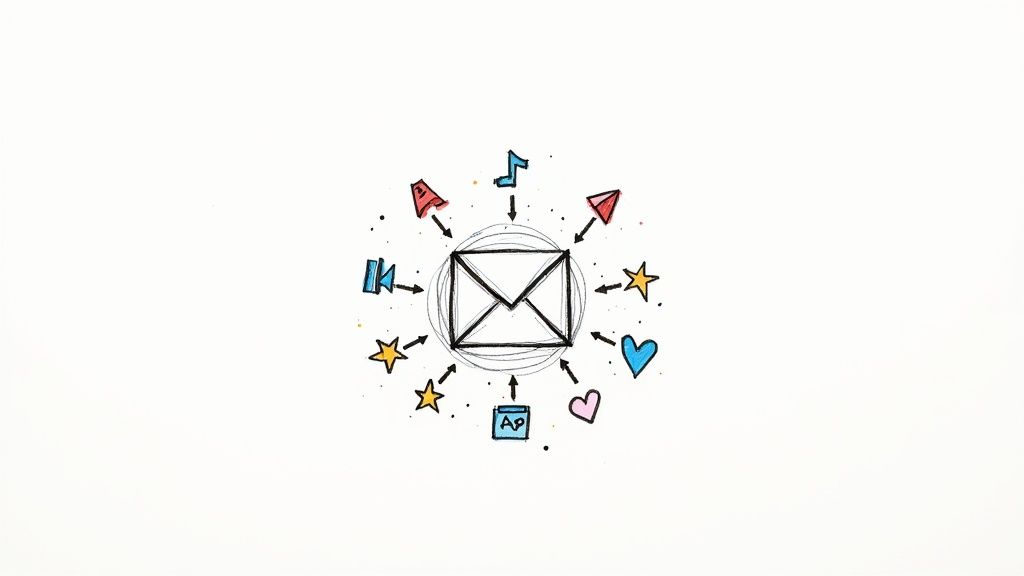
When you think about it, email icons are just little pictures. But in a crowded inbox, these simple graphics do some heavy lifting. They’re a visual language that helps people scan and understand your message at a glance, guiding them through your content without a single word.
Why Icons Are Essential for Modern Email Communication

Let's be honest, most people don't read emails—they scan them. Icons aren't just there to look pretty; they're powerful tools for getting your point across fast. Think of them as signposts in your email, breaking up walls of text and directing your reader’s eyes exactly where you want them to go.
A simple shopping cart icon next to a "Buy Now" button, for example, is instantly understood by just about everyone. It’s a shortcut that saves the reader mental energy and makes it easier for them to take action. This kind of visual shorthand is absolutely critical, especially when your subscribers are quickly scrolling on their phones.
Boosting Readability and Engagement
We're wired to process images way faster than text. By sprinkling in a few well-chosen icons, you instantly make your emails easier to scan and a lot more visually engaging. The result? A better experience for your reader, which often translates to higher engagement and better click-through rates.
A few key benefits really stand out:
- Improved Scannability: Icons help users spot what they’re looking for in a split second, whether it’s your contact info, social media links, or the main call-to-action.
- Enhanced Brand Consistency: Sticking to a consistent icon set reinforces your brand identity and gives all your communications a polished, professional feel.
- Universal Understanding: Good icons break through language barriers, which is a huge advantage if you have an international audience.
Icons serve as a bridge between your message and your reader. They simplify complex ideas and create an intuitive path for the user to follow, turning a passive reader into an active participant.
The Evolution of Email Icons
Using visual cues in digital messages is nothing new. Take the classic envelope icon. It became the universal symbol for email way back in the 1990s when email was just taking off. It was a smart metaphor borrowed from the real world (physical mail) that made a new, unfamiliar technology feel intuitive.
That simple graphic set the stage for how we use icons today—to make digital interactions feel familiar and effortless. If you're curious about the bigger picture, you can find more context in this report on email statistics.
Exploring Different Types of Email Icons
Think of email icons like tools in a toolbox. You wouldn't use a hammer to turn a screw, right? Similarly, not all icons serve the same purpose. Each one has a specific job, whether it's getting someone to click, reinforcing your brand's vibe, or just making your email look clean and professional. Knowing the difference helps you pick the right tool for the job.
Let's break down the main categories of icons you'll see in emails. Getting a handle on these groups will make your design choices much more intentional and, ultimately, more effective.
To give you a quick overview, here's a look at the common types of icons you'll find in emails and what they're typically used for.
Common Types of Icons for Email and Their Functions
| Icon Type | Primary Function | Common Examples |
|---|---|---|
| Social Media Icons | Connect subscribers to social profiles and encourage cross-platform engagement. | Facebook "f", X bird, Instagram camera, LinkedIn "in" logo. |
| Functional Icons | Represent a specific, interactive action to guide user behavior. | Magnifying glass (search), paperclip (attachment), trash can (delete), arrow (navigation). |
| Service & Product Icons | Visually represent specific features, benefits, or offerings of a business. | Shield (security), cloud (storage), chart (analytics), gear (settings). |
| Decorative & Branding Icons | Enhance visual appeal, reinforce brand identity, and create a cohesive look. | Company logo, seasonal graphics (snowflake, pumpkin), abstract design elements. |
Now that you have the big picture, let's dive into what makes each of these categories unique and how to use them effectively.
Social Media Icons
These are the ones you see in almost every email footer—and for good reason. A simple bird logo or a stylized "f" is an instant, universally understood invitation for subscribers to connect with you elsewhere online. Their job is pretty straightforward: to build a bridge from your email list to your social media communities.
These little icons are visual shortcuts. They save you from having to spell out "Find us on Facebook" or "Follow our updates on X." By sticking them in the footer, you give people an easy, consistent way to engage further without cluttering up your main message.
Functional Icons
Functional icons are the true workhorses of email design. They’re the ones people are meant to click or tap, and they signal a direct action. Think of them as visual verbs.
You see them everywhere:
- Action-Oriented: A magnifying glass for search, a paperclip for an attachment, or a trash can to delete something.
- Navigation: Simple arrows pointing you to the next item or a "hamburger" menu icon that opens up more options.
- Confirmation: A checkmark that says "Success!" or a little "x" to close a pop-up.
These icons are absolutely critical for a good user experience. They make your email feel intuitive. Instead of having to read text on a button, our brains instantly recognize a familiar symbol and know what it does. This cuts down on mental effort and makes navigating your email a breeze.
Service and Product Icons
When you want to show off your company's features without a wall of text, this is where service and product icons shine. A simple cloud icon can instantly communicate "cloud storage," while a shield can represent a new security feature. These are custom graphics that get your value across in a flash.
For example, a software company might use a small chart icon to draw attention to its analytics tools or a gear icon to point people toward their account settings. They help break down complex ideas into bite-sized visuals, making your product’s benefits crystal clear at a glance. If you're curious about the best format for these, you can learn more about using scalable vector graphics in our guide to the SVG email icon.
Decorative and Branding Icons
Last but not least, we have decorative icons. These aren't necessarily for clicking, but they play a huge role in adding personality and tying the whole design together. This could be your brand’s logo in the header or subtle graphic elements that match the theme of your campaign, like snowflakes for a winter sale.
The visual style of these icons matters a lot, as you can see below.
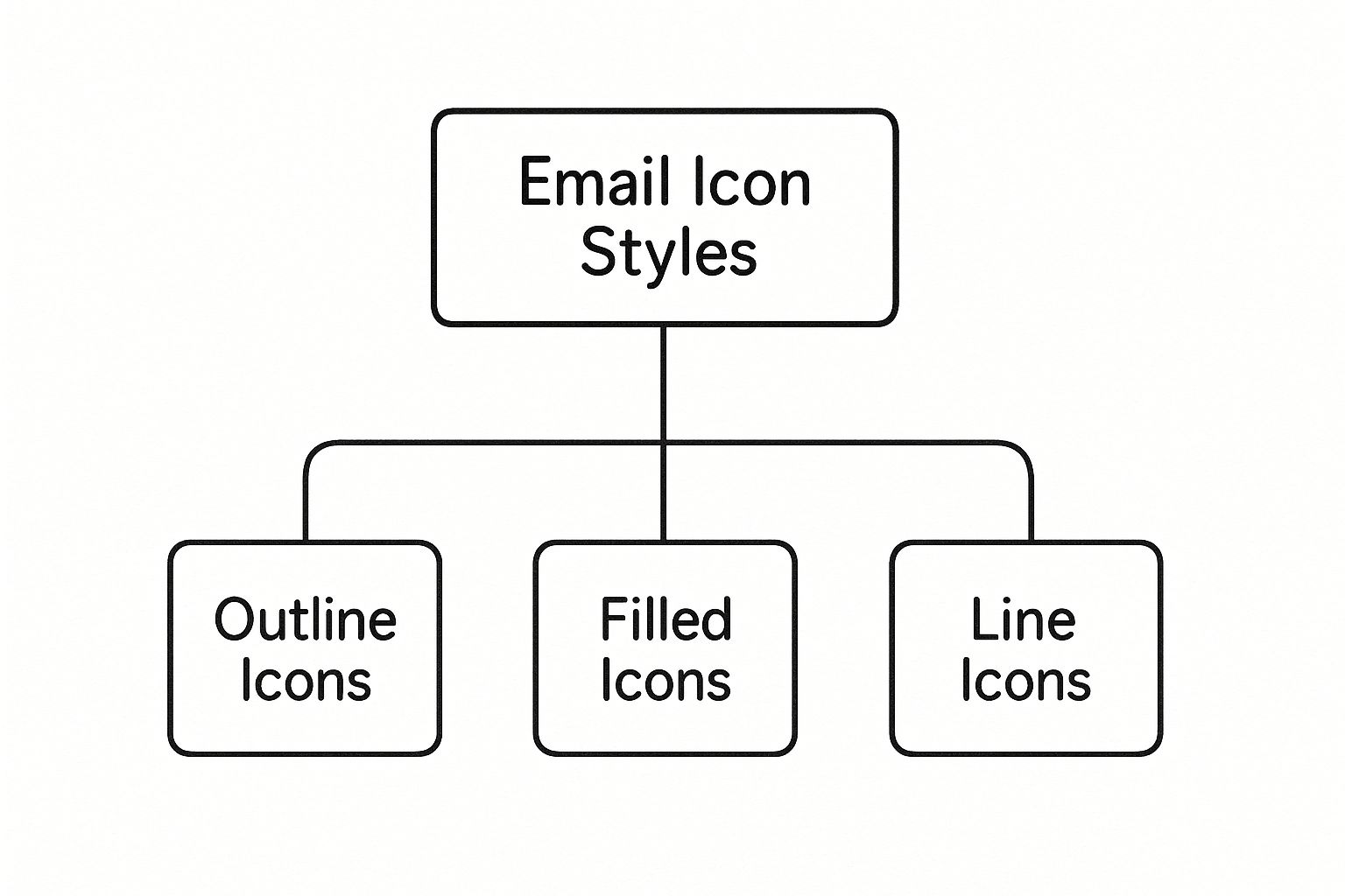
This chart gives you a great sense of how different styles—like outline, filled, or colorful icons—can create totally different feelings. It’s all about picking a style that fits your brand’s personality and the message you want to send.
Best Practices for Choosing and Using Icons in Emails
Just dropping icons into your email design won’t cut it. To really make them work, you have to use them with purpose. Think of icons as visual shorthand—they’re there to support your message and guide your reader, not to create confusion. Sticking to a few core principles will ensure your icons add real value and make your emails look professional and easy to navigate.
The first rule is to establish a consistent visual style. Imagine an email where you've mixed detailed line art with chunky, solid-fill icons. It immediately feels messy and thrown together. Using a cohesive set of icons for email is one of the easiest ways to reinforce your brand identity and give your design a polished, intentional feel.
Maintain Brand Consistency and Clarity
Your icons should look like they belong to your brand. If your company has a clean, minimalist vibe, your icons should match. If your brand is more fun and playful, you can get a bit more creative. The idea is to create a seamless experience where every element, right down to the smallest icon, feels like a natural part of your brand world.
Beyond looks, the meaning of an icon has to be crystal clear. What good is an icon if no one knows what it means? Using an abstract or overly clever symbol for a key action like "Download" is a recipe for user frustration. Stick to symbols that are universally understood and won't make your audience stop and think.
When in doubt, always choose clarity over creativity. The best icon is one that requires zero thought from your audience. Its purpose should be obvious in a split second, guiding them smoothly to the next step.
Optimize for Accessibility and Mobile Viewing
Let's face it: a huge chunk of your audience will read your email on their phone, where screen real estate is precious. This means getting the technical details right is non-negotiable.
Here’s what you need to focus on:
- Sizing and Spacing: Icons have to be big enough to easily tap with a thumb but not so massive they dominate the design. Just as important is the empty space around them. Generous "tap targets" prevent those frustrating accidental clicks on neighboring links.
- Accessibility: Every single icon that isn't purely decorative needs descriptive alt text. This is how screen readers tell visually impaired users what the icon is for, ensuring your message gets through to everyone.
- Color Contrast: An icon that blends into the background might as well not be there. Make sure there’s enough contrast between your icon and its background color so it’s easy for everyone to see. A low-contrast icon is just bad design.
For a much deeper dive into how all these pieces fit together, check out our guide on the effective use of icons.
Avoid Visual Clutter
It's easy to get excited and start sprinkling icons everywhere. But more isn't always better. Too many icons create visual noise that distracts from your main message and makes the whole email feel cluttered.
Every icon needs a job. Is it drawing attention to a link? Is it breaking up a list of features? Is it guiding the reader’s eye down the page? If you can't give an icon a specific purpose, you probably don't need it.
The real goal is to find that sweet spot where your icons support the content without stealing the show. Be selective, be strategic, and you'll create emails that not only look great but work even better.
How to Format Icons for Optimal Email Performance
Picking the perfect icon is only half the battle. How you format it is what separates a crisp, professional email from a slow, blurry mess. Think of it like a chef preparing a dish—the best ingredients in the world won't matter if your cooking technique is off. The same principle applies here; even a beautifully designed icon will flop if it isn't technically optimized for the email inbox.
This is a huge deal for mobile users, who make up a massive chunk of email opens. Nothing makes someone hit the delete button faster than an email that takes forever to load. Getting the formatting right ensures your icons pop up instantly and look sharp on every screen, from a wide desktop monitor to a tiny smartphone.
Choosing the Right Image Format
The file format of your icon is a critical decision that affects quality, file size, and whether it even shows up correctly in different email clients. Each one has its own strengths, so let's break them down.
PNG (Portable Network Graphics): This is your workhorse for most static email icons. The magic of a PNG is its support for transparency, which lets you place it on any background without that ugly white box around it. It also uses lossless compression, so you don't sacrifice quality.
GIF (Graphics Interchange Format): Need a little motion? A GIF is your answer. It's perfect for simple, looping animations like a blinking notification bell or a shimmering star. Just remember, they’re limited to 256 colors, so they aren't great for anything too detailed or photorealistic.
SVG (Scalable Vector Graphics): In a perfect world, we'd use SVGs for everything. They're vector-based, which means you can scale them to any size imaginable and they'll never get blurry. While support in email clients is getting better, it’s not quite universal. If you use an SVG, make sure you have a PNG as a fallback just in case.
For most situations, a well-optimized PNG gives you the best mix of quality, transparency, and compatibility. It’s the safest and most reliable bet.
Mastering Compression and Resolution
Okay, you've picked your format. Now it's time to get that file size down. Huge image files are the number one enemy of a fast-loading email. The whole point of compression is to shrink the file as much as possible without anyone noticing a drop in quality.
Think of an icon as a sprinter, not a marathon runner. It needs to load in a flash to do its job. A good rule of thumb is to keep icon file sizes under 15KB.
Resolution is the other side of the coin. You need to save your icons at twice the size they'll actually be displayed in the email. This is often called designing for Retina displays. So, if your icon will be shown at 32x32 pixels, you should save the file as 64x64 pixels.
This little trick ensures your icons look incredibly sharp and clear on high-resolution screens. By finding that sweet spot between smart compression and double resolution, you get icons that look crisp, clean, and professional on every single device.
A Step-by-Step Guide to Adding Icons Using VibeIcons

This screenshot gives you a glimpse into the VibeIcons platform, and you can immediately see how clean and straightforward it is. The whole point is to make generating new icons fast and intuitive. It's designed to strip away the technical headaches, making it a breeze for marketers and designers to add professional, consistent icons for email.
Finding and Generating Your Perfect Icon
First things first: you need to find the right icon for your message. VibeIcons has a library designed to work beautifully alongside popular sets like Heroicons and Phosphor, so any new icons you create will feel right at home with your existing design system.
You can kick things off with a simple search for a concept—think "arrow," "user," or "settings."
But what if the exact icon you need isn't there? This is where the platform really comes alive. You can use its AI to generate a brand-new icon that matches the style you’re already using. This feature is a massive time-saver, ending the frustrating hunt for that one missing icon or the need to fire up design software yourself.
Using a single tool like VibeIcons is the secret to achieving visual consistency. When you source icons from all over the web, you end up with a mismatched mess. Here, every icon you generate shares the same line weight, corner radius, and aesthetic, giving your emails a polished, cohesive feel.
Customizing Color and Size for Your Brand
Once you’ve picked or generated your icon, it’s time to make it truly yours. A generic black icon rarely fits a carefully crafted brand identity. VibeIcons gives you simple controls to tweak the color and size right there in the platform, before you even think about exporting.
This is a make-or-break step for brand alignment. You can plug in your brand's exact hex codes to ensure the icon's color is a perfect match for your logo, CTA buttons, and other brand elements in the email. Sizing is just as simple, letting you get the icon just right so it looks sharp on both big desktop screens and tiny mobile displays.
Generating and Embedding the Code
With your icon looking perfect, the final step is getting it into your email. VibeIcons makes this part surprisingly easy, even if you’re not a developer. You have two great options.
Download as SVG: You can download the icon as a high-quality SVG file. This is usually the best choice for emails because SVG is a vector format—it's incredibly lightweight and can be scaled to any size without getting blurry. You just upload this file to your email platform’s media library like any other image.
Copy React Code: For developers building emails with more advanced frameworks, there’s an option to copy clean React code straight from the platform. This is perfect for integrating the icons seamlessly into a modern development workflow.
And if you’re ready to take your branding to the next level, you can even create a completely unique icon set from scratch. We walk you through the entire process in our guide on how to make custom icons.
Following this simple process means you can add high-quality, on-brand icons for email in just a few minutes, without needing to be a design pro or a coder. The tool does all the heavy lifting, freeing you up to focus on what really matters: crafting an email that connects with your audience.
FAQ About Using Icons in Email
Diving into email design, especially with visual elements, can stir up a lot of questions. When it comes to using icons for email, there's more to it than just dropping in a nice-looking graphic. A little strategy goes a long way. This section tackles some of the most common questions to help you use icons with confidence.
Getting these details right is about making sure your emails don't just look good, but also work flawlessly across every inbox and device. Let's clear up some of the usual hang-ups.
Will Using Too Many Icons Affect Deliverability?
This is a great question. While icons themselves won’t directly torpedo your deliverability, an email that's all sizzle and no steak—meaning, mostly images with very little text—can absolutely raise a red flag for spam filters. Email clients get suspicious when they see a high image-to-text ratio.
Think of icons as punctuation for your message, not the message itself. To play it safe, use them to support your copy and always, always fill out the descriptive alt text. This not only helps with accessibility but also gives email clients context if a user has images turned off.
What Is the Best File Format for Email Icons?
For nearly every situation you'll encounter, PNG is your workhorse. It's the most reliable and widely supported format for icons in email, hands down. Its killer feature is its support for transparency, which means you can place your icon on any colored background without that ugly white box framing it.
While SVG is a fantastic, scalable format on the web, its support across email clients is still a bit of a gamble. And GIFs? They're great, but only for simple animations. For a crisp, static icon that just works everywhere, a well-optimized PNG is the way to go.
The name of the game is universal compatibility. A PNG file ensures your icon looks exactly as you intended for the vast majority of your audience, helping you dodge those dreaded broken-image symbols that can kill a user's experience.
How Do I Make My Icons Visible in Dark Mode?
Ah, the dark mode problem—a classic design challenge that trips up so many people. That sleek, dark icon you designed looks perfect on a light background, but as soon as a user's device flips to dark mode, poof, it vanishes into the black background.
Thankfully, you've got a few options to fix this:
- Design with an Outline: One of the simplest tricks is to add a thin, light-colored stroke or outline to your dark icons. It's subtle in light mode and a lifesaver in dark mode.
- Use a Subtle Glow: Another cool technique is to save your PNG with a faint, semi-transparent white glow effect. It's invisible on light backgrounds but makes the icon pop perfectly on dark ones.
- Choose Versatile Colors: The easiest route? Just pick icon colors that have enough contrast to be seen on both light and dark backgrounds right from the start.
Can I Use Emojis Instead of Icon Images?
You absolutely can, but be prepared for a major trade-off: you give up all control. Emojis are like chameleons; they look wildly different depending on the operating system, device, or email client they're viewed on. That professional-looking emoji on an iPhone might look goofy and off-brand on an Android or in a Windows email client.
Using your own icon images gives you complete control over how they look, making sure every single subscriber sees the exact same visual. That consistency is crucial for building and maintaining a professional brand image. While emojis can be fun for a casual, conversational tone, custom icons for email are the clear winner for any important functional or branding elements.
Ready to create stunning, consistent icons for your emails without all the usual headaches? VibeIcons lets you generate AI-powered, brand-aligned icons in seconds. Find the perfect match for your existing icon sets or create something entirely new. Start designing for free with VibeIcons.