A Guide to Icons for Web Development
A complete guide to icons for web development. Learn about SVG vs PNG, performance, accessibility best practices, and using AI tools to create custom icons.
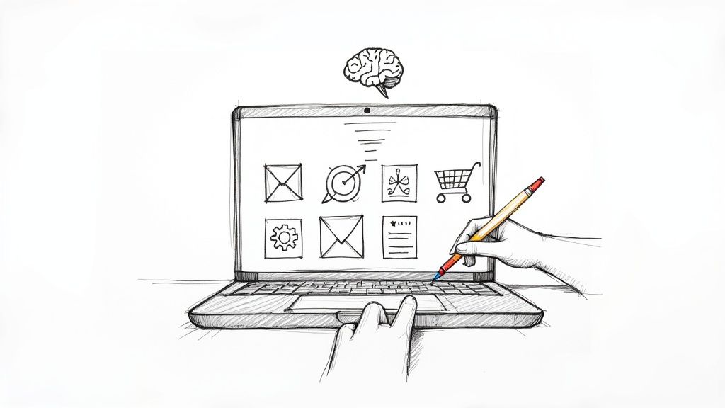
Icons are the silent workhorses of your website. They're the universal shortcuts that guide users through complex digital spaces, translating actions like "save" or "delete" into symbols we all instantly understand. They aren't just decoration; they're fundamental tools for building an intuitive digital experience.
The Hidden Language of Icons in Web Development
Think of icons as the road signs of the internet. A simple arrow points the way forward, a magnifying glass invites a search, and a shopping cart is the universal symbol for "check out my stuff." Without these visual cues, websites would be a frustrating wall of text, forcing users to read everything just to find what they need. Good icons for web development are functional components that build trust and make navigation feel effortless.
In a sea of nearly 2 billion websites, making the user's journey smooth is everything. Well-placed UI elements, especially icons, can seriously boost conversion rates simply by reducing the mental effort required to get things done. If you're curious, you can discover more web development insights on how UI impacts business success and see just how powerful small visual changes can be.
Building an Intuitive User Experience
The real magic of an icon is in its immediacy. When you see a gear, you know it means "settings." There's no learning curve. This instant recognition is the bedrock of a great user experience, allowing people to move through your site with confidence, knowing exactly what to expect when they click.
This unspoken communication relies on a shared visual language we've all learned over the years. In practice, icons pull a lot of weight:
- Universal Understanding: They cut right through language barriers, which is a huge plus for reaching a global audience.
- Space Efficiency: Icons can say in a few pixels what would otherwise take up precious screen real estate with text—a lifesaver on mobile.
- Enhanced Scannability: They act as visual signposts, helping users scan a page and quickly pinpoint the feature they’re looking for.
- Brand Reinforcement: A unique set of icons can inject your brand's personality into every corner of your site, creating a cohesive look and feel.
More Than Just Pictures
For a developer, an icon is so much more than just a tiny picture. It's an interactive element that demands careful implementation. You have to think about performance, accessibility, and how it will look on a dozen different screen sizes. For instance, choosing a scalable SVG over a static PNG can make a world of difference for page load times and visual clarity.
A great icon is a perfect balance of form and function. It must be aesthetically pleasing enough to fit the design, yet clear enough that its purpose is never in doubt.
This guide is about moving past the idea of icons as simple decorations. We're going to treat them as critical pieces of the development puzzle. We’ll get into the technical weeds—from picking the right format and making sure they're accessible to everyone, to using modern tools like AI to generate icons that are perfectly aligned with your brand. Think of this as the start of a deep dive into the strategy behind truly effective iconography.
Choosing Your Icon Format: SVG vs. Raster
One of the first, and most important, decisions you'll make when building a website is what format to use for your icons. This isn't just a trivial detail—it has a direct impact on your site's speed, how sharp your design looks, and how well it adapts to different screens. The choice really boils down to two main players: SVG (Scalable Vector Graphics) and raster images, like PNGs.
To put it simply, an SVG is a set of drawing instructions. It's just code that tells the browser, "draw a circle here, a line there." A PNG, on the other hand, is like a photo made of tiny colored squares called pixels. This fundamental difference is what makes them behave so differently on the web.
The Power of Scalable Vector Graphics
These days, SVG is the go-to standard for web icons, and for very good reason. Because they are essentially just text files, SVGs are incredibly lightweight and flexible. Their biggest win is scalability. You can stretch an SVG from the size of a tiny favicon to a giant full-screen graphic, and it will stay perfectly crisp and clear every single time. No blurriness, no pixelation.
This quality is a lifesaver for responsive design, where your site needs to look great on everything from a watch to a 4K monitor. Better yet, since SVGs are code, you can style them directly with CSS and make them interactive with JavaScript. Want to change an icon’s color when a user hovers over it? Easy. Want to create a cool loading animation? You can do it all without juggling multiple image files.
For modern, responsive web design, SVGs aren't just a nice-to-have; they're the foundation of a sharp, high-performance icon system. Their tiny file sizes and unmatched flexibility make them the best choice for almost any UI element.
When Do Raster Icons Make Sense?
So, are PNGs obsolete? Not quite. Despite SVG's dominance, raster formats still have their moments to shine. PNGs are the better choice when you're dealing with highly complex details, subtle color gradients, or photo-realistic textures. If your icon needs to look like a tiny, detailed illustration or a small photograph, a PNG will handle that complexity far better.
But that detail comes with a trade-off. Raster images have a fixed resolution, meaning they are built from a set number of pixels. If you try to make a PNG bigger than its original size, the browser is forced to guess what to fill the new pixels with, which leads to that ugly, blurry look we all hate. This makes them a poor fit for the fluid, adaptable layouts of modern websites.
This decision tree gives you a great way to think about whether an icon is just for looks or serves a real purpose, which helps you decide how to implement it.
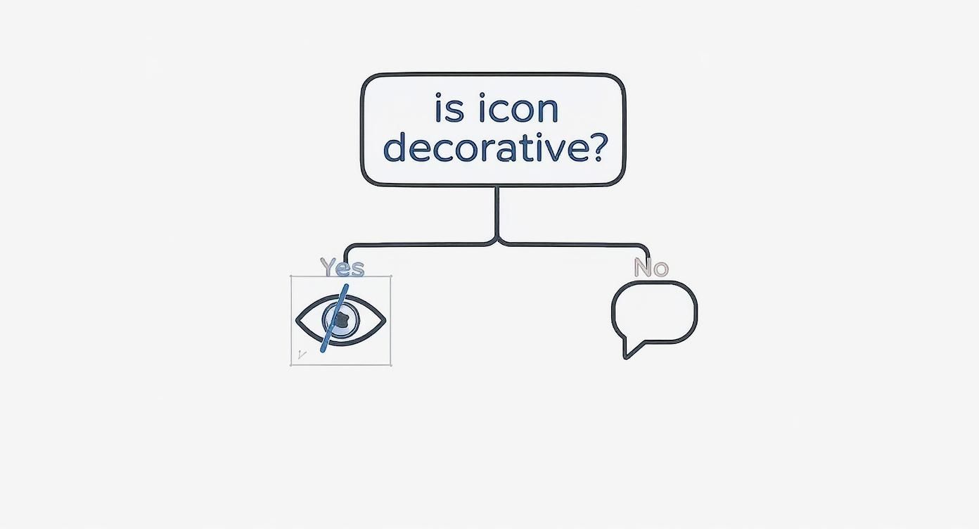
As the graphic shows, if an icon is functional—like a search button—it needs to be properly described for screen readers. But if it's purely decorative, you can hide it from accessibility tools to avoid creating unnecessary noise for users.
SVG vs Raster Icons: A Quick Comparison
To make the choice even clearer, let's put them head-to-head. This table breaks down the key differences to help you decide which format is right for your project.
| Feature | SVG (Vector) | PNG (Raster) |
|---|---|---|
| Scalability | Infinitely scalable without quality loss. | Becomes pixelated when enlarged. |
| File Size | Typically very small, especially for simple icons. | Larger, especially for high resolutions. |
| Styling | Easily manipulated with CSS (color, stroke, fill). | Requires an image editor for changes. |
| Interactivity | Can be animated and scripted with JavaScript. | Limited to CSS effects like hover opacity. |
| Accessibility | Text-based; can include titles and descriptions. | Requires alt text for accessibility. |
| Best Use Case | UI icons, logos, interactive elements. | Complex graphics, photos, detailed illustrations. |
So, what's the final verdict? Your project's specific needs should always be your guide. For the vast majority of user interface elements—things like menu icons, buttons, and status indicators—SVGs are the hands-down winner. They're faster, more flexible, and future-proof.
If you're looking for a great place to start, we've put together a guide on downloading free SVG icons that are perfect for any project. For those rare instances where you need photorealistic detail, a well-optimized PNG is still a perfectly valid choice. By understanding the strengths of each, you can make sure your icons are not just good-looking but also fast, efficient, and accessible to everyone.
Don't let their small size fool you. Icons can have a massive impact on your website's performance and, by extension, its SEO ranking.
Think of each icon as a small piece of luggage. One is no big deal. But a hundred of them? That's going to slow you down. Every icon, whether it's a tiny SVG or part of a larger font file, adds to your site's total weight and complexity.
This digital baggage directly hits your site's loading speed, which is a make-or-break factor for both user experience and search engine rankings. Search engines like Google want to send users to sites that are fast and smooth. Slow-loading pages get pushed down the list. In fact, even a 100-millisecond delay in load time can be enough to hurt your conversion rates. This isn't just a minor tweak; it's a crucial part of building a successful site.
The Connection to Core Web Vitals
Google's Core Web Vitals are the real-world metrics that measure how a user actually experiences your page. They focus on loading, interactivity, and visual stability. The way you handle your icons for web development directly impacts these scores, especially the Largest Contentful Paint (LCP) and Cumulative Layout Shift (CLS).
For instance, if your icons are tucked inside a big, render-blocking font file, it can hold up your main content from appearing, tanking your LCP score. Or, if icons pop in late and cause other elements on the page to jump around, your CLS score takes a hit—creating a jarring and frustrating experience for visitors.
Optimizing your icons isn't just about shaving off a few kilobytes. It's a direct investment in your site's usability and search visibility. A faster, more stable website is rewarded by both people and search engines.
Smart Strategies for Icon Optimization
So, how do you make sure your icons are helping, not hurting? The goal is to keep file sizes tiny and reduce the number of trips the browser has to make to your server. Here are a few battle-tested techniques:
Minify Your SVGs: The raw SVG file from a design tool is often full of junk—editor metadata, comments, hidden layers. Running it through an SVG minification tool cleans all that out, often shrinking the file size by 30-60% with zero loss in quality.
Use SVG Sprites: Instead of making the browser fetch dozens of individual icon files, an SVG sprite bundles them all into a single file. The browser downloads it once and then just plucks out the icon it needs using an ID. This dramatically cuts down on HTTP requests.
Lazy Load Non-Essential Icons: For icons that are "below the fold" or just not visible right away, lazy loading is your best friend. It tells the browser, "Hey, don't worry about loading this icon until the user actually scrolls near it." This lets the browser focus on loading the critical, above-the-fold content first.
How Different Loading Methods Affect Speed
How you load your icons is just as important as the icons themselves. Each approach has its own performance trade-offs, and choosing the right one can make a huge difference in how fast your page feels to a user.
Let's break down the most common methods:
| Method | Pros | Cons | Performance Impact |
|---|---|---|---|
| Inline SVG | No extra HTTP request. Perfect for critical, must-see icons. | Can bloat your HTML if you use too many. Not cached by the browser. | Fastest initial render, but can increase overall page size. |
<img> Tag |
Super simple to implement. The browser can cache it easily. | Requires a separate HTTP request for every icon. Less CSS styling control. | Great for repeat visits, but adds requests on the first load. |
| Icon Fonts | Loads a whole set of icons in one go. | Can cause accessibility headaches and those annoying layout shifts. | Historically popular, but now often beaten by modern SVG sprite techniques. |
In the real world, a hybrid approach usually wins. You can inline the critical icons at the top of your page for the fastest possible rendering and use an efficient SVG sprite system for everything else. This kind of balanced strategy is how you build a site that's both beautifully designed and blazingly fast—delivering the kind of performance that keeps users coming back and search engines happy.
Making Your Icons Accessible to Everyone
When you're building for the web, creating an experience that works for everyone isn't just a nice-to-have—it's fundamental. And icons, as small as they are, play a surprisingly big part in that.
Think of it this way: a public building needs ramps in addition to stairs. In the same way, your website needs to make sure its visual cues are clear to people using assistive technologies, like screen readers. This means accessibility can't be an afterthought; it has to be baked into your icon strategy from day one.
The first question you have to ask is: what is this icon for? Is it just adding some visual flair, or does it do something when a user clicks it? This single distinction is the foundation for making icons accessible.
Differentiating Decorative and Functional Icons
A decorative icon is like the subtle texture on a wall—it adds to the overall look, but it doesn't convey any critical information. If you took it away, no one would be confused about how to use the site. These icons should be hidden from screen readers to prevent unnecessary "noise" that can distract users from the content that actually matters.
It's actually pretty simple to do this. Just add the aria-hidden="true" attribute to the icon's HTML element. This is a clear signal to screen readers to just skip right over it, which makes for a much cleaner experience.
On the flip side, functional icons are the ones that are meant to be clicked or tapped. The magnifying glass for search, the trash can for deleting an item, the hamburger menu—these are all interactive. If a screen reader can't "see" them, a whole segment of your audience is completely blocked from using your site.
A functional icon without a proper text alternative is like a door without a doorknob for someone who can't see it. It’s a barrier that prevents them from moving forward.
For these interactive icons, giving them a clear text alternative isn't optional; it's essential.
Implementing ARIA for Clear Communication
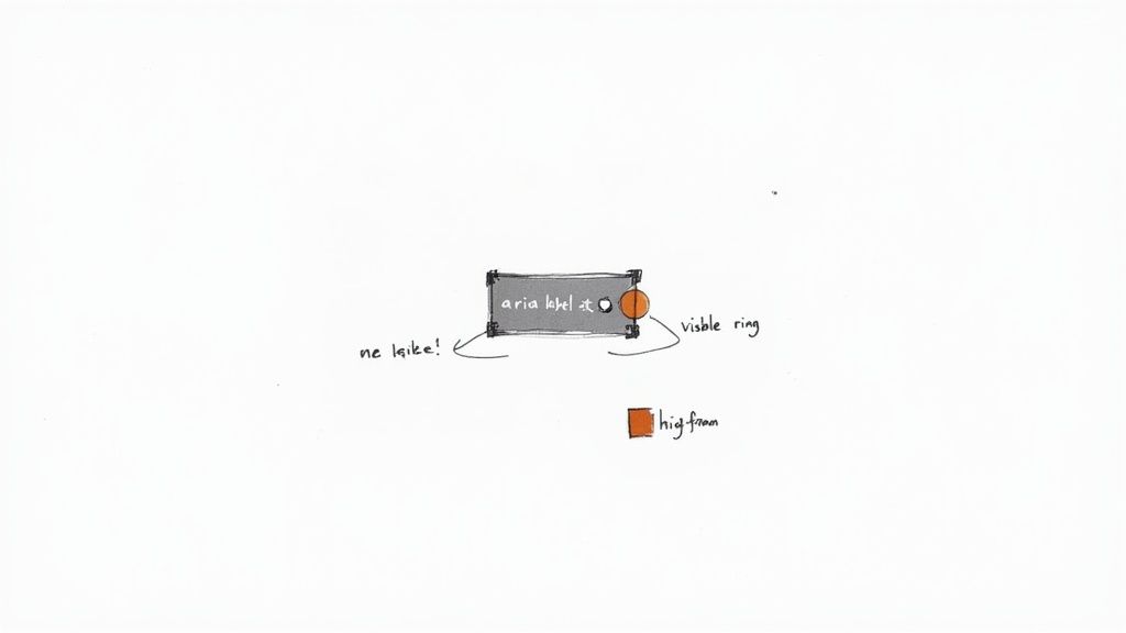
This is where ARIA (Accessible Rich Internet Applications) attributes become your best friend. The aria-label attribute, in particular, lets you attach a short, descriptive text label that a screen reader will announce, giving crucial context to the user.
Let's look at a quick example. Here's a button with a search icon:
Before (Inaccessible):
A screen reader might just announce "button," leaving the user to guess what it does. That's not helpful.
After (Accessible):
Now, the screen reader announces "Search, button." Perfect. The user knows exactly what will happen if they activate it. You'll notice we also added aria-hidden="true" to the SVG itself. This is a best practice to prevent the screen reader from getting confused and trying to read the icon's code after it already read the button's clear label.
Beyond Code: Visual Design Considerations
Accessibility doesn't end with the code. The way your icons look is just as important.
- Sufficient Color Contrast: Icons have to stand out from their background. The Web Content Accessibility Guidelines (WCAG) recommend a contrast ratio of at least 3:1 for UI components and graphical objects. This helps users with low vision see them clearly.
- Don't Rely on Color Alone: Never, ever use color as the only signal for information. If a "success" icon is just a green check and an "error" icon is just a red "X" of the same shape, users with colorblindness might not be able to tell them apart. Always pair color with a distinct shape or a text label to be safe.
These ideas are at the heart of building a better, more inclusive web. You can dive deeper into how small details like these make a big impact by exploring these user experience design best practices. By blending thoughtful visual design with clean, semantic code, you can ensure your icons are clear, useful, and welcoming to every single person who visits your site.
From Floppy Disks to AI: The Evolution of Icon Design
The story of web icons is really the story of the web itself. In the early days, designers had to teach people how to use this new digital world, so they turned to skeuomorphism—making digital things look like their real-world twins. The classic example? The floppy disk icon for "save." It was a genius move when we all had stacks of them on our desks.
This approach was a fantastic bridge for users. It connected the strange, new digital actions to familiar physical objects. A little trash can for "delete," a manila folder for "file"—these symbols needed no explanation. They worked because they were direct translations of things we already understood.
But as technology raced ahead, these real-world metaphors started to feel a bit... dated. Let's be honest, many users today have never even seen a floppy disk. For them, the "save" icon is just an abstract shape they've learned through repetition, not real-world experience.
The Shift to Minimalism and Universal Symbols
Eventually, the design world took a sharp turn toward minimalism and flat design. This wasn't just a trend; it was a necessity. Websites had to work on everything from giant monitors to tiny phone screens, and those detailed, skeuomorphic icons just couldn't keep up. Simple, clean symbols were far more practical.
Flat, abstract icons scaled beautifully, loaded faster, and didn't clutter up a small mobile interface. This new direction also challenged designers to think more globally. The mission was to create symbols that clicked with anyone, anywhere, no matter their language or culture. Think about it—a simple magnifying glass for "search" or a heart for "like" works everywhere.
An effective modern icon communicates its purpose instantly, without relying on outdated real-world metaphors. It succeeds by being simple, clear, and universally understood.
And this isn't just about looking good. The visual design of a website, icons included, is a huge part of building trust. In fact, research shows that 46.1% of visitors decide if a site is credible almost entirely based on its visual appeal. An interface bogged down with clunky, old-school icons can feel unprofessional and untrustworthy to today's users. If you're curious about the data, you can explore the full research on web design statistics to see how much visuals really matter.
The Next Frontier: AI-Powered Icon Creation
Now, we're stepping into another major shift, and this one is powered by artificial intelligence. While minimalist icon libraries gave us consistency, they also brought a sea of sameness. How many times have you scrolled through hundreds of icons, trying to find one that almost fits your brand? It’s a frustrating time-sink for developers and designers.
AI platforms are flipping the script. Instead of settling for a "close-enough" icon from a library, you can now generate the exact icon you need, right when you need it. Tools like VibeIcons are at the forefront of this new creative wave.
Using a simple text prompt, you can conjure up icons that are not only functional but also perfectly in sync with your brand’s visual DNA. Need an icon for "secure document upload" in a sleek, futuristic style using your brand's specific hex codes? AI can whip that up in seconds.
This is a game-changer for a few key reasons:
- Unmatched Customization: You’re no longer stuck with what a library offers. Your icons can be genuinely unique to your project.
- Brand Consistency: Generate a whole family of icons that speak the same visual language, making your brand feel more cohesive across your entire app.
- Wicked-Fast Efficiency: Slash the time you spend hunting for or manually tweaking icons. That’s more time developers can spend on coding features that actually matter.
This new era of icon design gives us the best of both worlds. It takes the hard-won principles of clarity and universal symbols and injects them with the boundless creative power of AI. The result is a faster, more personalized workflow that helps us all build more compelling and visually unified digital experiences.
Using AI to Create and Customize Icons
Artificial intelligence has officially moved out of the "buzzword" category and into the developer's everyday toolkit. When it comes to web development, this is a huge win. You can now generate completely custom icons on the fly, finally breaking free from the old routine of scrolling through endless, generic icon libraries. This alone saves countless hours that used to be lost just searching for the right asset.
Platforms like VibeIcons are at the forefront of this shift, using simple text prompts to create exactly what you need. It’s like having a tiny, super-fast artist on call. You just describe the icon you're imagining—its style, its feel, even its purpose—and the AI gets to work building it for you. This puts real, bespoke design power right into the hands of developers, no design degree required.
From Text Prompt to Perfect Icon
The secret to getting great results from an AI icon generator is learning how to "talk" to it. A vague request will almost always give you a generic, uninspired icon. Specificity is everything.
Instead of just typing "settings icon," try something much more descriptive like, "a sleek, minimalist gear icon with three spokes, thin line style, for a tech dashboard." The more detail you provide, the better you guide the AI toward the final product you have in your head.
Here’s a simple way to think about structuring your prompts to get the best icons for web development:
- The Object: What's the main subject? Think "a cloud," "a document," or "a user profile."
- The Style: What's the aesthetic? Try "flat design," "outline style," or "3D isometric."
- The Context: Where will this icon live? For example, "for a financial app" or "for a playful kids' website."
You can see how the VibeIcons interface is built to make this process incredibly straightforward.
The layout is clean and focused entirely on your prompt, letting you generate, iterate, and refine your icons without getting bogged down in a complex tool. The whole point is to make AI-powered design something anyone on the team can jump into.
Integrating and Customizing AI-Generated SVGs
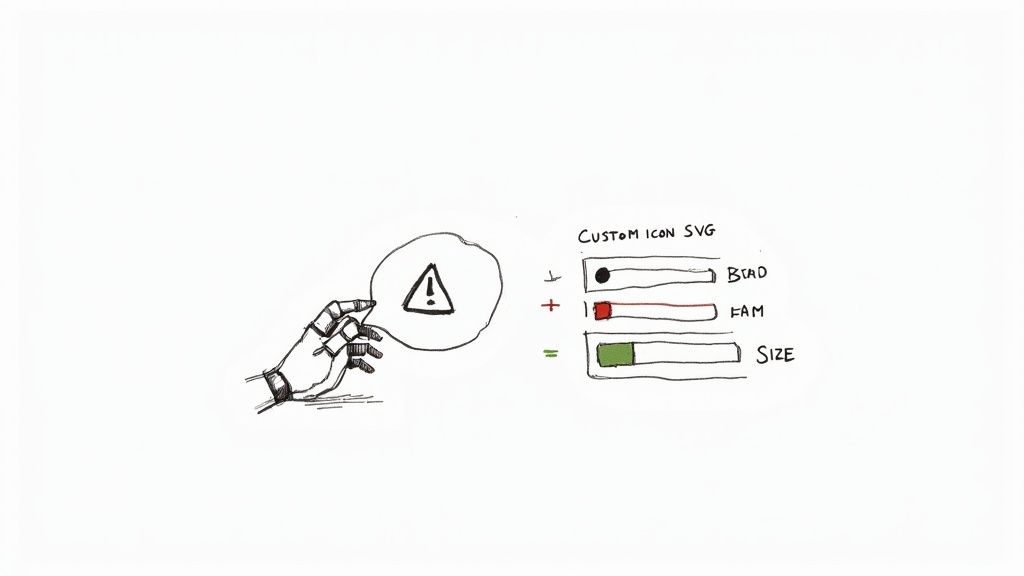
Once the AI hands you an icon you love, the next step is getting it into your project. The best generators export directly to SVG format, which is exactly what you want. SVGs aren't clunky images; they're just code, which makes them incredibly flexible and lightweight. You can download the file and pop it into your project just like any other SVG.
But here’s where things get really interesting: CSS customization. Because that AI-generated icon is vector-based, you have total control over how it looks right from your stylesheet.
An AI-generated SVG isn't a static image; it's a dynamic starting point. You can instantly change its color to match your brand, adjust its size for different breakpoints, or add interactive hover effects with a few lines of CSS.
This workflow is the perfect blend of AI's creative speed and the precise control we love as front-end developers. This is more than just a trend; by 2025, AI-generated web content has surged by 70%, fundamentally changing how we create visual elements. Of course, designers are quick to point out that human oversight is still crucial for ensuring new icons are genuinely intuitive.
The ability to generate an icon and then fine-tune it with code is a massive efficiency boost. No more going back to a design tool for a simple color change. You can manage everything right inside your existing development workflow. For a deeper dive, check out our guide on how to generate an icon online and tailor it for your projects. It’s a modern approach that ensures your icons are not only unique but perfectly integrated into your design system.
Common Questions About Web Icons, Answered
Even when you've got a handle on the basics, real-world development always throws a few curveballs. Here are some quick answers to the questions that pop up most often when working with icons.
What’s the Best Format for Web Icons?
For almost any situation you'll face today, SVG (Scalable Vector Graphics) is the way to go. Think of them as images drawn with code instead of pixels. This means they look razor-sharp on any device, from a smartwatch to a massive 4K display, without losing quality.
On top of that, SVGs are usually tiny in file size and you can style them directly with CSS or even bring them to life with JavaScript animations.
The only time you might reach for a PNG is for something incredibly detailed, like a photorealistic icon with complex gradients. But for standard user interface icons, the flexibility and performance of SVG wins hands down.
Should I Use an Icon Font or Individual SVGs?
A few years ago, icon fonts were all the rage. Today, the clear best practice is to use individual SVG files, often bundled together into an SVG sprite. This method is a game-changer for accessibility, as it lets you give each icon a unique title and description that screen readers can announce.
Using individual SVGs also dodges annoying rendering glitches like the "flash of unstyled text" (FOUT) and gives you pinpoint control over styling. Icon fonts, while clever, can create accessibility and performance problems that modern SVG workflows completely sidestep.
How Do I Make My Icons Accessible?
This is a big one, and thankfully, the rules are pretty simple. How you handle accessibility depends entirely on what the icon is doing.
- If the icon does something (like a search magnifying glass or a hamburger menu), it needs a label. You can add an
aria-labelto the button or link wrapping the icon to describe its action, likearia-label="Search site". - If the icon is just for decoration and doesn't add new information, you should hide it from screen readers with
aria-hidden="true". This prevents them from announcing something generic and unhelpful like "image."
And don't forget color contrast! As a rule of thumb, make sure your icons have at least a 3:1 contrast ratio against their background so people with low vision can see them clearly.
Ready to stop searching and start creating? With VibeIcons, you can generate the perfect, brand-aligned icons you need in seconds. Try it now and get your first five icons for free at https://www.vibe-icons.com.