How to make icon from photo in minutes: easy guide
Learn how to make icon from photo and turn any image into a unique icon for your app, website, or social profile in minutes.
Not long ago, turning a personal photo into a sharp, professional-looking icon meant firing up complex design software and having a good bit of artistic skill. Thankfully, those days are over. With tools like VibeIcons, you can now make an icon from a photo with just a few clicks, letting smart AI handle all the heavy lifting.
Why Custom Icons Are a Game Changer

In a digital space flooded with generic stock imagery, a custom icon is your best bet for standing out. Think about it—whether it's for a new app you're launching, a personal portfolio, or just your social media profile, a unique visual symbol creates an instant, memorable connection. It's your digital signature, making you recognizable at a glance.
This is about more than just looking good; it's about building an identity. A well-crafted custom icon can do wonders:
- Boost Brand Recognition: A consistent and unique icon helps people spot your brand or profile instantly, no matter the platform.
- Convey Personality: The style, colors, and subject of your icon say a lot about you. It can set a tone that’s playful, professional, or artistic.
- Improve User Experience: In app and web design, a clear, intuitive icon is crucial for smooth navigation and keeping users engaged.
The Power of AI in Icon Creation
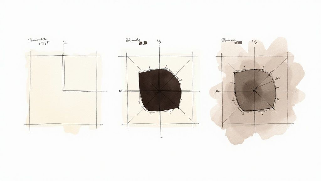
So, how does a tool like VibeIcons pull this off so fast? The process is actually pretty fascinating. When you upload a photo, the AI gets to work analyzing the image to identify the main subject, neatly separating it from the background. From there, it intelligently simplifies the shapes, lines, and colors to generate a clean, scalable vector graphic.
This kind of technology is at the heart of a massive market shift. The AI image generator market, valued at around USD 299 million in 2023, is expected to explode to over USD 917 million by 2030. You can see the full trend analysis over on Fortune Business Insights™.
The real magic is in the AI's ability to grasp the core essence of your photo and translate it into a simple, universally understood symbol. It's not just tracing an outline; it's a creative reinterpretation.
This AI-driven approach puts professional-grade results within everyone's reach, no design experience required. It’s an incredibly accessible way to produce high-quality visual assets for any project. If you're looking for more inspiration, take a look at our guide on how to generate icons online. Understanding why this matters is the perfect setup for diving into how you can do it yourself.
How to Choose the Perfect Photo for Your Icon
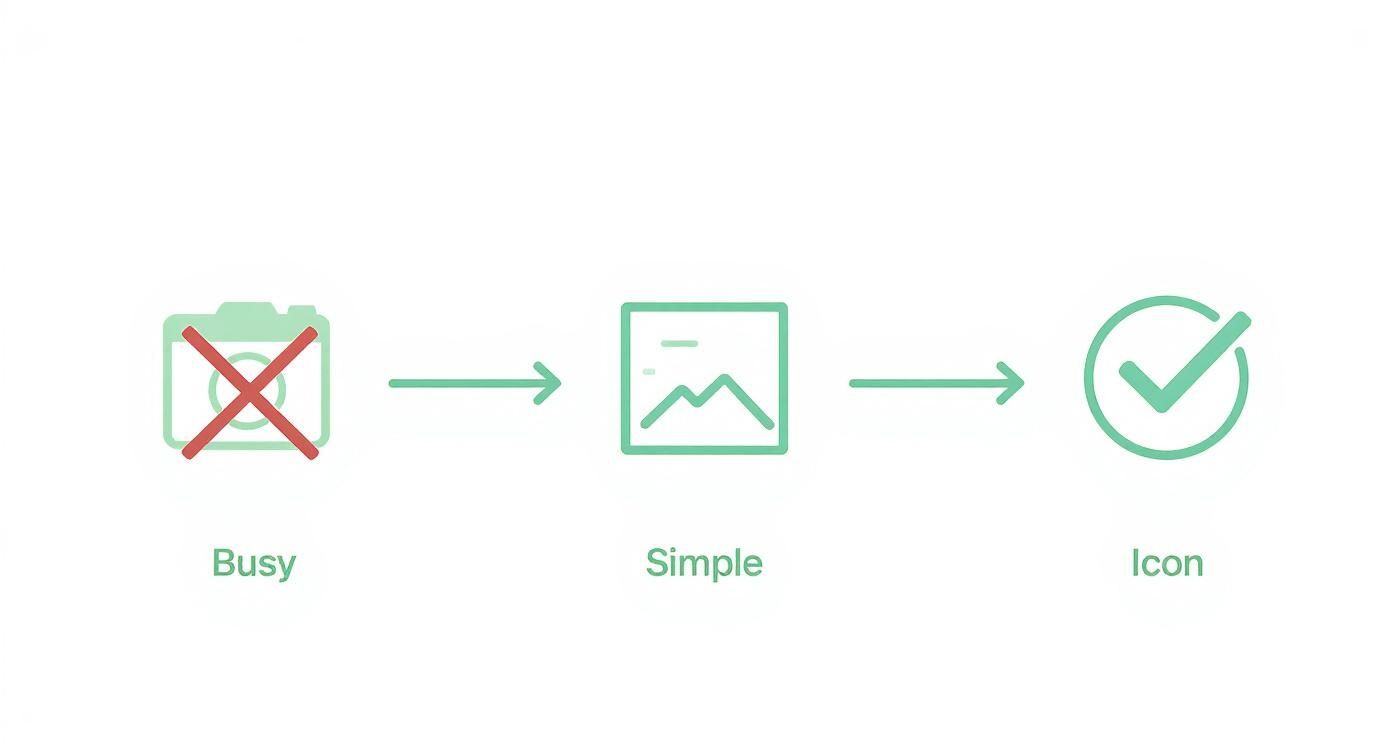
The secret to a fantastic icon? It's all about the source material. Before you even think about uploading an image to create an icon, taking a minute to pick the right one can make all the difference. Think of it like cooking—the better your ingredients, the better the final dish.
You don’t need a professionally shot photo, but there are a few things to look for. The whole idea is to give our AI a clear, easy-to-understand subject to work with. If you start with a confusing or cluttered image, you’ll almost always end up with a muddled, less-than-stellar icon.
Prioritize a Clear Subject
First things first: your photo needs one, single, undeniable focal point. Is it a person's face? A specific object? Your dog? The AI has to know what the star of the show is right away. If your main subject gets lost in a sea of background noise or other competing elements, the conversion process is going to have a tough time.
For instance, a close-up portrait where the person's face fills most of the frame is perfect for a profile icon. On the other hand, a photo of that same person standing in the middle of a dense forest with tricky lighting and shadows? Not such a great choice.
Here are a few quick checks to run on your photo:
- Is the subject instantly recognizable? If you have to search for it, so will the AI.
- Are the edges well-defined? The outline of your subject should be sharp and distinct from whatever is behind it.
- Is it the biggest thing in the frame? Your main subject should dominate the picture, not be a tiny detail in a larger scene.
Mind the Background and Lighting
Once you’ve nailed down a clear subject, the next two things to check are the background and the lighting. A simple, clean background is your best friend here. A plain wall, a clear blue sky, or any solid-colored surface works beautifully because it creates a natural contrast that makes your subject pop.
Lighting is just as important. Good, even lighting helps define the shapes and contours of your subject, which is exactly what the AI needs to trace clean lines for your icon. Try to steer clear of photos with harsh shadows, intense backlighting, or that grainy look you get in low light. These kinds of issues can hide important details and muddy the final result.
Here’s a little trick I use: squint at your photo. If you can still easily make out the main subject's basic shape, it's probably a great candidate for an icon. This helps you see the image in terms of simple forms, which is pretty much how the AI sees it.
Think about these two scenarios when you go to make an icon from a photo:
| Good Photo Example | Bad Photo Example |
|---|---|
| A well-lit portrait against a solid, neutral background. | A group photo with multiple people and a busy backdrop. |
| An object shot on a clean table with soft, natural light. | The same object in a cluttered room with harsh shadows. |
Ultimately, choosing the right photo is about setting yourself up for success from the start. By picking an image with a clear subject, a simple background, and good lighting, you’re giving yourself the perfect canvas to create a sharp, professional-looking icon that really stands out.
Bringing Your Icon to Life with VibeIcons
Alright, let's get to the fun part—actually turning that photo you picked into a polished, professional-looking icon. VibeIcons is built to handle the heavy lifting, using AI to transform a complex design job into a straightforward, creative experience. I'll walk you through the entire process, from the moment you upload your image to the final tweaks that make it perfect.
The idea here is to show you just how simple it is to make an icon from a photo without needing a degree in graphic design. Consider this your roadmap to the VibeIcons dashboard.
Your First Upload and the Magic of AI
First things first, you need to get your picture into the system. Head over to the VibeIcons platform and find the upload area. It’s designed to be dead simple: just drag your image file and drop it onto the page, or click to browse for it on your computer.
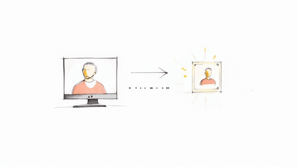
The moment you upload your photo, the AI kicks in. In just a few seconds, it scans the image, figures out what the main subject is, and gives you an initial draft of your icon. This first pass is your base camp—a clean, simplified version of your photo. Don't stress if it's not exactly what you imagined right away; the real magic starts with the customization tools.
This quick visual shows you the ideal path: start with a simple photo, and you'll end up with a crisp, clean icon.
As the graphic shows, a photo with a clean background and clear subject is always the best starting point for a recognizable icon.
Getting Familiar with the Customization Tools
Once that first version is generated, you’ll land on the VibeIcons dashboard. This is your design sandbox. You'll see a live preview of your icon on one side, which updates instantly with every change you make. On the other side, you'll find all the editing tools you need.
Here’s a quick look at the controls you'll be using most:
- Style Selector: This is where you can make the biggest changes. It lets you apply completely different looks to your icon. You could go for a minimalist 'line art' style, a bold 'solid' look, or something more unique like 'Memoji' for a bit of fun.
- Color Palette: If you're designing for a brand, this is essential. You can plug in your exact brand hex codes to keep everything consistent or just play with the pre-set palettes until you find something you like.
- Line Weight Slider: This little slider controls how thick or thin the lines of your icon are. Thinner lines can give it a more delicate, refined feel, while thicker lines make it feel more solid and easier to see at small sizes.
- Background Options: Need your icon to pop? Add a background shape like a circle or square, or simply change the background color. This is incredibly helpful for making sure your icon looks great everywhere it’s used.
I’ve found it’s best to start with the style selector. It has the most dramatic effect on the final look. Once you nail down a style you like, you can then fine-tune everything else.
Let's say you're making an icon for a new coffee shop app. You upload a photo of a single, well-lit espresso cup. You could apply a 'line art' style, bump up the line weight so it’s easily visible on a phone screen, and then set the color to your brand's signature dark brown. Each of these small, deliberate choices adds up to a custom icon that looks like it was made from scratch. The best way to learn is to just jump in and experiment.
Advanced Styling Tips for a Professional Look
Alright, you’ve got the basic icon generated. Now comes the fun part—adding the polish that makes it truly stand out. This is where we move beyond the default settings and start making deliberate design choices that transform a simple graphic into something memorable.
Mastering a few of these finer points will ensure your icon doesn't just look good, but actually works. When you make an icon from a photo, the real goal is to create a visual that grabs attention and communicates its purpose instantly.
Blending Styles for a Unique Aesthetic
One of the best things about VibeIcons is the ability to play with different AI styles. Don't feel like you have to stick with the very first one you pick. I always recommend generating your icon with a few different presets to see how each one interprets your original photo. A 'line art' style might give you a clean, minimalist vibe, while a 'solid' style could deliver a bolder, more graphic punch.
The real magic happens when you start blending these elements. You might find that the 'line art' style nails the perfect outline, but you much prefer the fill colors from the 'flat' style. By generating a few versions, you can either combine the best parts in an external editor like Figma or just use them as inspiration for the final tweaks you make right inside VibeIcons. This back-and-forth process is exactly how designers often arrive at a completely unique look.
The Psychology of Color and Palette Selection
Color is never just for looks; it’s a powerful communication tool. The colors you pick for your icon will trigger specific feelings and associations in your audience. A bright, energetic yellow could be perfect for a creative app, while a calm, trustworthy blue is a classic choice for financial services.
Before you lock in a color, take a moment to think about your brand’s personality and the message you want to convey.
- Vibrant Palettes: Think reds, oranges, and yellows to communicate energy, speed, or excitement.
- Cool Palettes: Blues, greens, and purples tend to feel more professional, calm, and trustworthy.
- Monochromatic Schemes: Using different shades and tints of a single color is a surefire way to create a sophisticated and cohesive look.
This stuff really matters. A thoughtfully designed icon can directly influence user behavior. In fact, some studies show that a well-optimized icon can boost app conversion rates by up to 30% or more. That's the difference between a casual browser and a dedicated user. If you want to dive deeper, this analysis of icon conversion rates is a great read.
Mastering Negative Space and Backgrounds
Sometimes, what you don't put in your icon is just as important as what you do. I'm talking about negative space—the empty area around your main subject. This is absolutely critical for clarity and focus. An icon that feels cramped or cluttered is hard to recognize, especially when it's shrunk down for a phone screen or browser tab.
Use the cropping and background tools to give your subject room to breathe. A simple circular or square background can frame your icon nicely, creating a clean boundary and ensuring it stands out against any interface.
Changing the background is one of the easiest ways to dramatically improve how readable your icon is. A solid color background creates fantastic contrast, making your icon pop. For a more modern feel, a transparent background helps your icon blend seamlessly into different designs. It’s all about finding the right balance, and our guide on choosing the best backgrounds for icons has a ton of practical tips on this very topic. By focusing on these details, you elevate a simple graphic into a professional-grade asset that truly works for your brand.
How to Export and Use Your New Custom Icon
Alright, you’ve designed a fantastic icon. But an icon sitting on your hard drive isn't doing you any good. The final, crucial step is getting it out into the world in the right format so it looks sharp and professional wherever you use it.
https://www.youtube.com/embed/RliNhczKk74
The choices you make during export will make the difference between a crisp, pixel-perfect icon and a blurry, unprofessional one. A one-size-fits-all approach just doesn't work, since different platforms have very specific needs.
Choosing the Right File Format
Once you're ready to download your masterpiece from VibeIcons, you'll see a few options. Understanding what each one does is the key to getting this right.
- SVG (Scalable Vector Graphic): For anything on the web, this is your best friend. Because it's a vector file, you can scale it from a tiny favicon to a massive billboard without it ever getting blurry. It’s perfect for websites and apps where quality is non-negotiable.
- PNG (Portable Network Graphics): Need a high-quality image with a transparent background? PNG is the format for you. It's ideal for things like social media profile pictures, email signatures, or presentations where your icon will sit on top of other colors or images.
- ICO: This one is a specialist. It’s primarily for website favicons—that tiny little icon you see in a browser tab. An ICO file is smart because it can hold multiple sizes in a single file, ensuring it looks great across different devices and screen resolutions.
My personal rule of thumb is simple: SVG for anything digital and interactive, PNG for static visuals. This has saved me countless headaches and ensures I’m always using the most efficient, high-quality format for the job.
A Quick Checklist for Flawless Implementation
With the right file downloaded, you’re ready to deploy your icon. The ability to make an icon from a photo has become a huge deal, which is why tools like VibeIcons are so popular. In fact, the global market for image converters is already worth around USD 2.41 billion and is expected to more than double by 2035. You can dig into the data on this trend over at Industry Today.
Before you call it a day, run through this final pre-flight check:
- Test on Different Backgrounds: Drop your icon onto both light and dark backgrounds. Does it still pop? Is it easy to see? This simple test can save you a lot of trouble later.
- Check Real-World Sizing: Look at the icon at the actual size it will be used. A design that looks amazing blown up on your screen might become an unreadable blob when shrunk down to 16x16 pixels.
- Confirm Platform Requirements: If you’re submitting to an app store, read their guidelines carefully. Apple and Google have their own specific rules for icon sizes and formats, and you don’t want a rejection over something so easy to fix.
Taking a few extra minutes for this final review ensures all your creative effort pays off with a versatile and effective icon.
Still Have Questions About Turning a Photo into an Icon?
Even with a tool as intuitive as VibeIcons, it's natural to have a few questions when you first make an icon from a photo. I've seen a few common queries pop up time and again, so let's walk through them to make sure you're ready to go.
First, let's talk about image rights. This is a big one. People often ask if they can just grab any cool photo they find online. The simple answer is a hard no. You absolutely need to use photos that you own or have clear permission to use. Your own headshot, your company's logo, or a product shot you took are all fair game. Pulling a copyrighted image from a Google search, however, is a quick way to land in legal hot water.
What’s the Ideal Photo Resolution?
Another question I hear all the time is about photo quality. Do you need a professional DSLR shot to get a good icon? Not at all, but the quality of your source image does matter. A fuzzy, low-res photo—especially one that's been compressed a bunch of times by messaging apps—just doesn't give the AI enough detail to work with.
As a rule of thumb, try to start with a picture that’s at least 1000 pixels on its shortest side. That's usually enough information for the AI to produce something crisp and clean. The key is clarity, not just a massive file size.
Here's a pro tip: A sharp, well-lit photo from a modern smartphone will almost always give you a better result than a blurry, high-resolution image from an older, less capable camera. It's all about the quality of the pixels, not just the quantity.
Can I Go Back and Edit My Icon Later?
Of course! Think of the first icon you generate as a starting point, not the final product. VibeIcons is built for iteration. Maybe your brand colors get a refresh, or you want to try out a new style for a social media campaign. All your saved icons are ready and waiting for you to tweak them whenever you need to.
Your icons should be living assets that evolve with your brand. Here are a few real-world scenarios where you might go back and edit:
- A/B Testing: Create two versions of a website icon—one with a blue background and one with green—to see which one gets more clicks.
- Seasonal Updates: Add a little Santa hat or some autumn leaves to your logo icon to keep things fresh during the holidays.
- Platform Adjustments: You might find you need a bolder, simpler version of your icon for a small app display, while a more detailed one works better on your desktop site.
This ability to refine and adapt is what separates a good icon from a great one. It’s how you create visuals that truly work for you across every platform.
Ready to see it in action? With VibeIcons, you can bring your photos to life as unique, professional icons in just a few seconds. Get started for free and design your first five icons today!