Make Icons from Images Instantly with AI
Discover how to make icons from images using AI. Our guide shows you how to turn any picture into a professional, custom icon set with VibeIcons in minutes.
Tired of the old, painstaking process of creating icons? You know the one—spending hours in design software, meticulously tracing shapes and tweaking vector points just to turn a simple photo into a usable icon. It was a massive time sink for everyone, from designers to developers.
Fortunately, there’s a much smarter way to work now.
A Better Way to Make Icons from Images
AI is flipping the script on icon creation. Instead of starting from a blank canvas, you can now use tools built specifically to make icons from images.
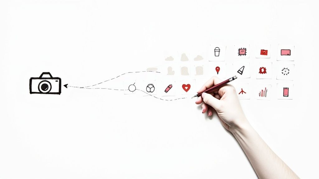
Imagine you're launching a new feature for your app and need a set of custom icons that match your product's photography. The old way meant a lengthy design brief and days of back-and-forth. The new way? You just upload a product photo, and an AI tool like VibeIcons instantly generates dozens of styled, vector-based options. It’s not just faster—it’s a completely different and more intuitive workflow.
From Manual Labor to Intelligent Automation
The real magic of using AI here is the blend of speed and consistency. A human designer might spend a full day crafting a handful of icons. An AI can deliver a complete, stylistically unified set in mere seconds. This is a game-changer for anyone who needs to prototype or iterate quickly.
This shift is part of a much bigger picture. The technology that allows AI to understand and interpret photos is booming. The global image recognition market was valued at USD 53.11 billion in 2024 and is on track to hit USD 184.55 billion by 2034. This explosive growth shows just how much we're relying on AI to process visual information for practical, everyday tasks.
Why an AI Approach Is a No-Brainer
Take a look at how simple the interface is over at https://www.vibe-icons.com/.
As you can see, it’s not some complex dashboard. You upload an image, pick a style you like, and the AI does the heavy lifting. This move from manual design to an intelligent, automated system brings some serious advantages:
- Incredible Speed: Get a full icon set ready in the time it used to take to just outline one by hand.
- Guaranteed Consistency: Every icon comes out looking like it belongs. The visual language, colors, and line weights are all perfectly matched.
- Endless Creativity: Want to see what your icon looks like in a minimalist style? Or maybe as a colorful 3D render? You can test out different aesthetics without any extra design effort.
- Open to Everyone: You don't need a graphic design degree anymore. If you have an idea, you can create high-quality, custom icons for your project.
To put it in perspective, let's quickly compare the two methods.
Icon Creation Methods Compared
| Feature | Traditional Icon Design | AI Icon Generation (VibeIcons) |
|---|---|---|
| Time Investment | Hours or days per set | Minutes per set |
| Skill Requirement | High (Requires design software proficiency) | Low (Intuitive, no design skills needed) |
| Consistency | Requires meticulous manual effort | Automatically consistent by design |
| Cost | Can be expensive (designer fees, software) | Highly affordable and scalable |
| Iteration Speed | Slow; revisions take significant time | Instant; generate new styles in seconds |
Ultimately, the choice is clear. While traditional design will always have its place for highly bespoke projects, AI-powered generation offers a practical, efficient solution for the vast majority of needs.
Thanks to AI, the ability to make icons from images is no longer a niche skill. It's now a tool available to anyone with an idea, empowering teams to create beautiful, on-brand visuals without slowing down.
Choosing the Right Image for Perfect Icons
The secret to getting stunning AI-generated icons? It all boils down to your starting image. Think of it as giving the AI a clean blueprint—the better your input, the more incredible the output will be. When you make icons from images, starting with a strong foundation is the single best way to avoid headaches later on.
A photo with a clear, high-contrast subject almost always gives you better results. Say you're creating an icon of a coffee mug. You’ll get much further with a photo where the mug stands out against a simple background. If you feed the AI a cluttered, poorly lit photo, you’re essentially forcing it to guess which parts matter, and the results can be unpredictable.
Isolate Your Subject for Better Results
One of the most powerful things you can do is prep your image beforehand. You don't need fancy editing software like Photoshop; often, a simple crop is all it takes. By cropping tightly around your subject, you're telling the AI, "Hey, focus on this." It removes all the distracting background noise that can muddy the waters.
Imagine you want an icon of a laptop, but your photo is of a person holding it in a messy office. If you upload the whole picture, the AI might try to include bits of the person or the background junk. A quick crop to focus only on the laptop gives the AI a direct, unmistakable instruction.
Your goal is to eliminate all visual noise. The image you upload should scream one thing: the object you want to iconify. Taking a moment to do this drastically improves the quality and accuracy of what VibeIcons produces.
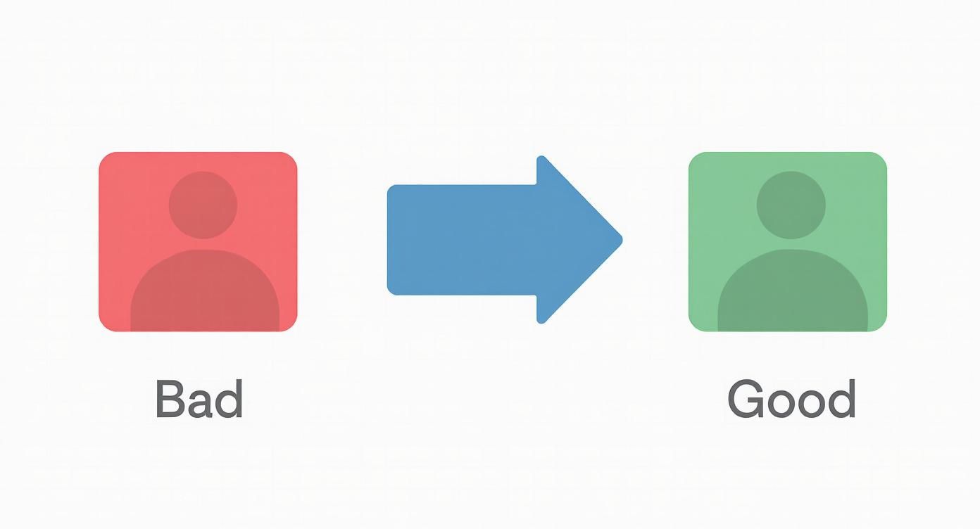
Good vs. Bad Source Images
Let’s make this practical. A "bad" source image would be a low-resolution photo of a red sneaker, taken from far away, surrounded by a dozen other shoes on a rack. The AI has to struggle to figure out what you want, often leading to a generic, blurry icon.
Now, what’s a "good" source image? A sharp, high-resolution photo of that same red sneaker, but this time it's shot up close against a plain white background. The subject is obvious, the details are crisp, and the contrast is perfect. This clarity empowers the AI to capture the unique silhouette and features of the sneaker, resulting in a fantastic, recognizable icon.
- Avoid This: Blurry, low-contrast photos with busy, confusing backgrounds.
- Do This: Use clear, sharp images where your subject is the undeniable star of the show.
Taking just a minute to choose and crop your image properly is the most important step in the whole process. It’s what separates a mediocre icon set from a fantastic one that looks polished and professional.
Bringing Your Icon Set to Life with VibeIcons
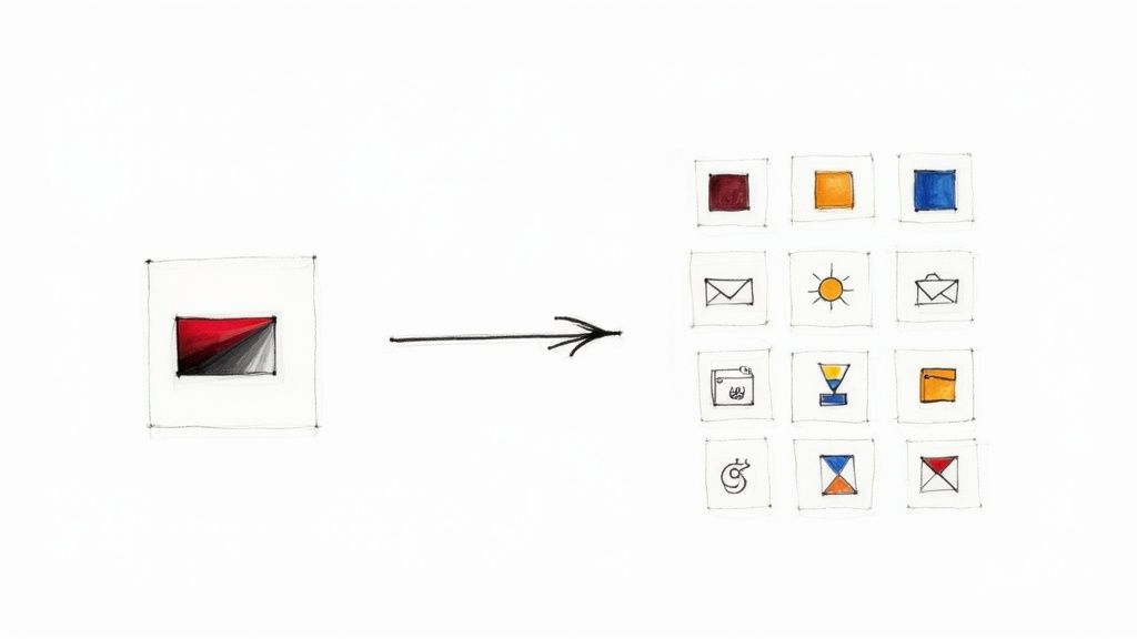
Alright, this is where the magic happens. We're going to take that prepped image and turn it into a complete, ready-to-use icon set. The AI does the heavy lifting, but don't think for a second that you're just a passenger. You're the creative director here, guiding the process to make icons from images that truly match your project's vibe.
Let's walk through a real-world scenario. Say we're building out a new feature for a coffee subscription app. We've got a great photo of our signature coffee bag, and we need a whole family of icons based on it. We'll need one for the main product page, a different one for the shopping cart, and maybe a super-simple version for the navigation menu.
From One Photo to a Full, Cohesive Set
The quality of what you put in directly impacts the quality of what you get out. This flowchart breaks it down perfectly.
It’s a simple concept, but so important. A sharp, focused image gives the AI clear instructions. A blurry or cluttered one forces the AI to guess, and the results can be unpredictable.
Once you upload that coffee bag photo into VibeIcons, you’re not just hitting a "convert" button. Instead, the dashboard opens up a world of creative possibilities. This is about interpreting the core idea of your image and applying a new design language to it. You can immediately start playing with styles like:
- Minimalist: This is my go-to for clean, modern UIs where you want clarity above all else.
- 3D Clay: Want something more playful and tactile? This style adds a fun, touchable feel that really pops.
- Outline: A true classic. Outline icons are fantastic for readability, especially when they need to be scaled down to tiny sizes.
The entire interface is built for experimentation. You can cycle through these styles and see previews in real-time, letting you get a feel for the direction without committing to anything.
Fine-Tuning the Creative Details
Beyond the big-picture style, you get to drill down into the specifics. For our coffee app, we’d probably want to stick to our brand's earthy color palette—think rich browns, warm creams, and maybe a single bold accent color. You can feed this palette to the AI, and it will apply those colors consistently across every icon it generates. Everything will feel like it belongs together.
If you want to dive deeper into this part of the process, we have a whole guide on how to generate an icon online that covers these finer points.
You also have the power of negative prompts. Let's say the first batch of icons includes some distracting text from the coffee bag's label. No problem. You can simply add "text" or "complex patterns" as a negative prompt, telling the AI to actively avoid those elements in the next round.
This back-and-forth is what makes a tool like this so valuable. It’s less of a machine and more of a collaborator. You steer the vision with your style choices and prompts, and the AI handles the tedious work of rendering a dozen variations in seconds.
With your preferences locked in, you hit the generate button. VibeIcons will produce a grid of options based on your coffee bag photo. You’ll see it rendered in your chosen style from different perspectives and with varying levels of detail. Some will be more literal, others more abstract. From that grid, you can just cherry-pick the perfect icons for your app feature—all born from that single photograph.
Polishing Your AI Icons to Perfection
The AI does the heavy lifting, giving you a fantastic starting point, but this is where your expertise really comes into play. Once you make icons from images, the next step is to add that human touch. It’s about taking an icon from 90% there to 100% perfect for your project.
The ability to quickly generate visual assets is becoming a must-have in all sorts of fields, from scientific research to entertainment. As digital standards evolve, so does the demand for powerful, easy-to-use tools that can handle high-resolution imaging and format conversions. For a deeper dive, you can explore the image converter market at infinitymarketresearch.com.
Fine-Tuning Colors and Details
One of the quickest and most effective edits you can make is to the color palette. VibeIcons is great at picking up on your original colors, but you'll often need to plug in the precise hex codes to match your brand guide perfectly. This is absolutely critical in user interface (UI) design, where even a tiny color deviation can make things feel off.
For instance, say you're building a "dark mode" for your app. The icon the AI generated might be just a little too vibrant. No problem. You can hop into the editor and tweak the fill or stroke colors to a softer hue that integrates beautifully with the new theme. This kind of detailed control makes your icons feel like they truly belong.
Don’t be afraid to regenerate an icon if a small detail isn't quite right. Sometimes, running the prompt again with a tiny adjustment is much faster than trying to manually edit a tricky vector shape.
Creating Icon States and Variations
Icons rarely exist on their own. In a real-world application, most UI elements need different states to show users what’s happening. This is where AI becomes a massive time-saver.
Let's imagine you've just nailed the design for your "Home" icon. You're going to need a few variations for different user interactions:
- Active State: Maybe you give it a solid fill or a bolder stroke to show that the user is on the home screen.
- Inactive State: This is often a lighter, outlined version in a neutral color, like a subtle gray.
- Hover State: For web or desktop, you might want the icon to change color slightly when a mouse pointer hovers over it.
Instead of drawing each version from scratch, you can use your main icon as the foundation. Just copy it and adjust the colors and styles in VibeIcons to create a full set of states in minutes. This method guarantees that the shape and size are identical across every variation. If you want to take it a step further, have a look at our guide to professional icon clean-up.
Perfecting the Final Output
The last step before you hit "export" is a final quality check. Get in there and zoom in on the vector paths. AI can occasionally leave behind tiny artifacts or curves that aren't perfectly smooth. The editor gives you the tools to clean up these minor imperfections easily.
Also, check the line weight. Does it match the other icons in your set? Making small tweaks to the stroke width can have a huge impact on how unified your entire icon library looks. This final, detailed review is what really separates a decent icon set from a truly professional one.
Putting Your Custom Icons to Work
Alright, you’ve used VibeIcons to spin up a fantastic set of custom icons from your own images. They look sharp, they're on-brand, and they're all yours. Now what? The most obvious places are your website or app interface, but that’s just scratching the surface. Think bigger.
Your new icons are potent branding tools, ready to bring a cohesive feel to everything you do.
Let's start with social media. Instead of grabbing generic highlight covers for your Instagram profile, why not use your custom icons? Suddenly, each highlight becomes a clean, professional, and instantly recognizable part of your brand identity. It's like having tiny, perfectly crafted billboards right on your profile.
The same idea works wonders for documents. Picture a sales pitch or a client report. Swapping out standard bullet points for custom icons that illustrate key concepts makes your data far more engaging. Complex information becomes easier to scan and remember, which helps your message hit home.
Building a Consistent Visual Language
This is where custom icons really pull away from the stock icon pack. You’re not just decorating; you're building a unique visual language for your brand.
Think about how you can use them in places like:
- Software User Guides: A custom icon for "Export Report" is so much clearer than a generic arrow.
- Employee Onboarding: Associate key company concepts or process steps with specific icons to help new hires get up to speed faster.
- Email Signatures: Add a touch of personality and reinforce your brand with every message you send.
A generic icon is, by definition, a one-size-fits-all solution. But your AI-generated icons were created from your images, in your style. They carry your brand's unique DNA, making them a perfect fit every time.
The real power of custom icons is their versatility. They're not just UI elements; they're brand assets that create consistency everywhere, from your app's navigation bar to your business cards.
This push for unique, high-quality digital assets is a huge trend. The global image converter market, which covers technologies just like this, was valued at USD 2.41 billion back in 2025. It’s expected to more than double, hitting USD 5.3 billion by 2035. That's a massive jump, and it shows just how much businesses rely on custom visuals. You can dig into the trends driving the image converter market to see the full picture.
Getting creative with where you place these icons will give you the best return on your design efforts. They're more than just pretty pictures—they're a fundamental part of how people experience your brand.
Got Questions About Turning Images Into Icons?
Diving into AI to make icons from images is exciting, but let's be honest, it brings up a few questions right away. It’s a totally new way of working, so figuring out the practical side of things—like image rights and what kind of files you get—is super important. Let's tackle some of the things people usually ask.
Can I Use Any Image I Find Online?
This is probably the biggest one. You find a cool photo online, run it through the AI, and get a perfect icon. But can you actually use it commercially? The answer comes down to one thing: the license of the original image. If that photo is copyrighted and you don't have permission, using it is a huge risk.
To keep things simple and legal, stick to two main sources:
- Images you own: Your own product photos, logos, or graphics you've created are perfect.
- Royalty-free stock photos: Use sites like Unsplash or Pexels, but always double-check that the license allows for commercial use and modification.
This way, you know you have the rights to use your new icons anywhere you want without looking over your shoulder.
What Kind of Icon Files Will I Get?
People also wonder about the final product. Are these just low-res JPEGs, or are they files you can actually use in a professional project? With a tool like VibeIcons, you’ll get your icons in SVG (Scalable Vector Graphics) format.
If you’ve worked in design, you know SVG is the industry standard. For everyone else, here’s why it’s so great:
- Scales perfectly: You can make an SVG icon tiny for a mobile app or huge for a billboard, and it will never get blurry or pixelated.
- Super small file size: SVGs are just code, which means they’re incredibly lightweight. This is a big deal for keeping your website or app fast.
- Fully editable: You can pop an SVG open in a vector editor like Adobe Illustrator or Figma and change anything—the colors, the shapes, the lines. You have total control.
You’re not just getting a picture of an icon; you’re getting a professional-grade asset ready for any project.
How Far Can I Push the Customization?
It’s natural to wonder just how smart the AI is. Can it really turn any photo into a great icon? While the tech is seriously impressive, it works best when you give it something clear to work with.
An image with a single, obvious subject—like a person, a dog, or a coffee mug—will almost always give you a better result than a chaotic photo of a crowded street. The AI can get confused if there’s too much going on.
Think of the AI as a creative assistant. It's brilliant, but it can't read your mind. Give it a clear visual brief, and you'll get a much better result.
It’s a partnership between your idea and the AI's ability to bring it to life. By keeping these points in mind, you can skip the trial-and-error and start creating polished, unique icons right away.
Ready to stop wondering and start creating? With VibeIcons, you can take your own images and get back stunning, ready-to-use icons in just a few clicks. It's fast, simple, and you can try it for free.