Make Picture an Icon Easily with AI - Quick & Simple Guide
Learn how to make picture an icon using AI tools. Discover step-by-step methods to convert images into scalable icons effortlessly and professionally.
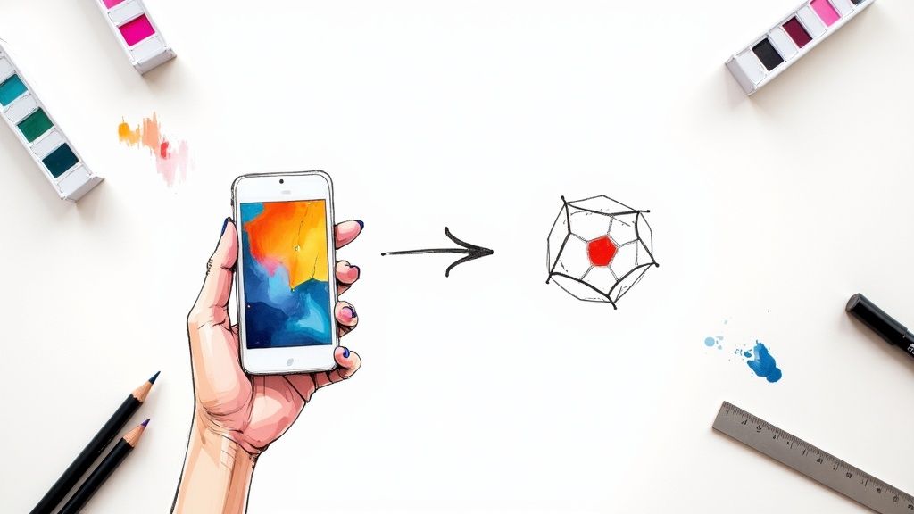
If you need to quickly make an icon from a picture, an AI tool like VibeIcons is your best bet. It analyzes the image and converts it into a clean, scalable vector in seconds. This completely sidesteps the old-school, tedious process of manual tracing and gives you a professional-quality icon ready for your website, app, or branding work.
Why Bother Turning a Picture Into a Custom Icon?
Stepping away from the same old generic icon packs is one of the smartest moves you can make to build a distinct visual identity. When you turn a picture into an icon, you're doing more than just making a graphic. You're capturing a unique idea or product and distilling it into a simple, recognizable symbol that belongs only to you. This is how you achieve a level of brand consistency that off-the-shelf icons just can't match.
Custom icons make your entire digital presence feel more deliberate and polished. Instead of shoehorning a generic symbol into your design, you can create one that perfectly communicates what a feature or service is all about. For instance, a real estate app could use a photo of a distinctive house key to create an icon for its property listings. Right away, users form a connection that’s specific to that brand. It's this kind of custom touch that strengthens brand recall and makes you stand out.
The Impact of Custom Visuals
Going the custom route also means you have total control over the end result. You can tweak every last detail—from line thickness to the exact hex codes in your color palette—to make sure it aligns perfectly with your brand’s look and feel. This is especially critical for keeping the user experience consistent across your website, mobile app, and other platforms.
Let's be honest, icons have become a fundamental part of UI design; they're a visual language everyone understands. As digital products have gone global, this has become even more true. As of 2025, icon design trends have leaned heavily into minimalism and subtle gradients, mixing simplicity with a pop of visual interest. The "less is more" mindset helps reduce a user's mental workload, making icons easy to spot and understand on any screen size. You can explore more about these icon design trends to see how they're shaping modern interfaces.
A Quick Insight: Custom icons are far more than just little graphics. They're a direct reflection of your brand's personality and attention to detail. Taking the time to create them sends a clear message to users that you care about their experience, which goes a long way in building trust.
Here’s a quick overview of the process, breaking down what happens at each step.
Key Stages of Picture to Icon Conversion
Here is a summary of the main steps involved in turning a standard image into a professional, usable icon for digital projects.
| Stage | Key Objective | Primary Benefit |
|---|---|---|
| 1. Image Preparation | Clean up and simplify the source image. | Ensures the AI can accurately identify the main subject. |
| 2. AI Conversion | Upload the image for vectorization. | Instantly generates a scalable SVG from a raster image. |
| 3. Style Customization | Adjust stroke, color, and icon style. | Aligns the icon perfectly with your brand’s visual guidelines. |
| 4. Export & Integration | Download the final SVG or code snippet. | Provides a production-ready asset for immediate use. |
Ultimately, the aim is to create a visual system that’s both effective and unique. When you transform a picture into an icon, you're crafting an asset that pulls its weight for your brand. It communicates ideas more quickly, improves usability, and adds to a polished, professional product that truly connects with your audience.
Choosing the Right Image for Conversion
The quality of your final icon is pretty much decided before you even upload a single file. Seriously. Picking the right source image is the most critical part of the whole process. Not every photo is going to work well when you make a picture an icon. Think of it like giving the AI a clean blueprint—the better your starting material, the sharper and more accurate your final icon will be.
Just a few minutes of prep can make a world of difference. I'm not talking about firing up Photoshop and spending an hour editing. It's more about making a few smart, simple tweaks to give the conversion tool the best possible chance to succeed.
What Makes an Image Icon-Ready
So, what does a good candidate look like? The best images for icon conversion share a few common traits that make the AI's job a whole lot easier. You want to look for photos with a single, clear subject. If the main object is fuzzy or just melts into the background, the generator is going to have a tough time figuring out where the edges are.
High contrast is your secret weapon. A dark subject against a light background (or the other way around) gives the AI clean, obvious lines to trace. A picture of a black coffee mug on a white table? Perfect. A shot of a beige seashell on a sandy beach? You're probably going to get a blob.
Here's a quick checklist for what to look for:
- Single, Clear Subject: Zero in on one main object. Ditch any photos with a bunch of competing things in the frame.
- High Contrast: The subject needs to pop right off the background.
- Simple Background: The less clutter, the better. Busy, patterned backgrounds are the enemy of a clean icon.
- Good Lighting: Try to avoid harsh shadows or super bright spots that hide the true shape of your subject.
Don't sweat it if your image isn't perfect right off the bat. A couple of quick adjustments can get it there.
Simple Prep Work for a Better Icon
Before you hit that upload button, take a moment to do a few quick edits. I promise this takes less than five minutes, and it's the key to getting a professional-looking result.
First thing's first: crop your image tightly around the subject. This instantly gets rid of distracting background noise and tells the AI exactly what to focus on. If you're turning a photo of a cool-looking succulent into an icon, crop out the rest of your messy desk so only the plant and its pot remain.
Next, think about removing the background altogether. There are a ton of free online tools that can do this for you in a single click. A transparent background forces the AI to analyze only the subject, which almost always gives you a cleaner vector shape. This is a game-changer for photos with busy or textured backdrops.
Pro Tip: Don't underestimate a quick brightness and contrast bump. Kicking up the contrast just a little can really sharpen the edges of your subject, making them much easier for the AI to "see" and trace accurately.
Finally, give the resolution a quick check. You don't need a gigantic file, but a tiny, pixelated image will only produce a blocky, mushy-looking icon. A clear source image is the foundation for a crisp final product. This little bit of prep work is truly the secret to making a picture an icon that looks polished and ready to use.
Bringing Your Icon to Life with an AI Generator
Alright, your image is prepped and ready to go. Now for the fun part—letting an AI generator do the heavy lifting. This is where your simple picture gets converted into a clean, versatile digital icon in just a few moments. Forget complex vector software; these tools are built to make this process incredibly straightforward.
The whole thing usually kicks off with you uploading your cleaned-up image. Once it's in the system, the AI gets to work analyzing the core shapes, lines, and contrasting colors in your picture. Its job is to boil the image down to its most essential visual elements, which then become the foundation for your new icon.
If you're curious about the different tools out there, we've put together a guide on the best icon image creator options that digs a bit deeper into the technology.
Seeing the First Draft
Almost instantly, you’ll see the first batch of icons the AI has generated. Don't be surprised if you get a few different takes on it. Many generators will give you a choice of initial styles—like "outline," "filled," or "duotone"—that shape how that first version looks.
What the AI is doing is essentially a very smart trace. But it’s not just blindly following the lines. It’s actually interpreting the image to create a balanced and easily recognizable symbol. For instance, if you upload a detailed photo of a bicycle, the AI knows to focus on the frame, wheels, and handlebars, not every single gear tooth and spoke. It captures the essence.
The real magic of an AI generator is that it sees the idea behind your image, not just the pixels. It cuts through the noise to produce a clear, functional icon that gets its message across instantly. That’s what great icons are all about.
This quick chart shows the prep work that makes the AI's job easier and gives you a better result.
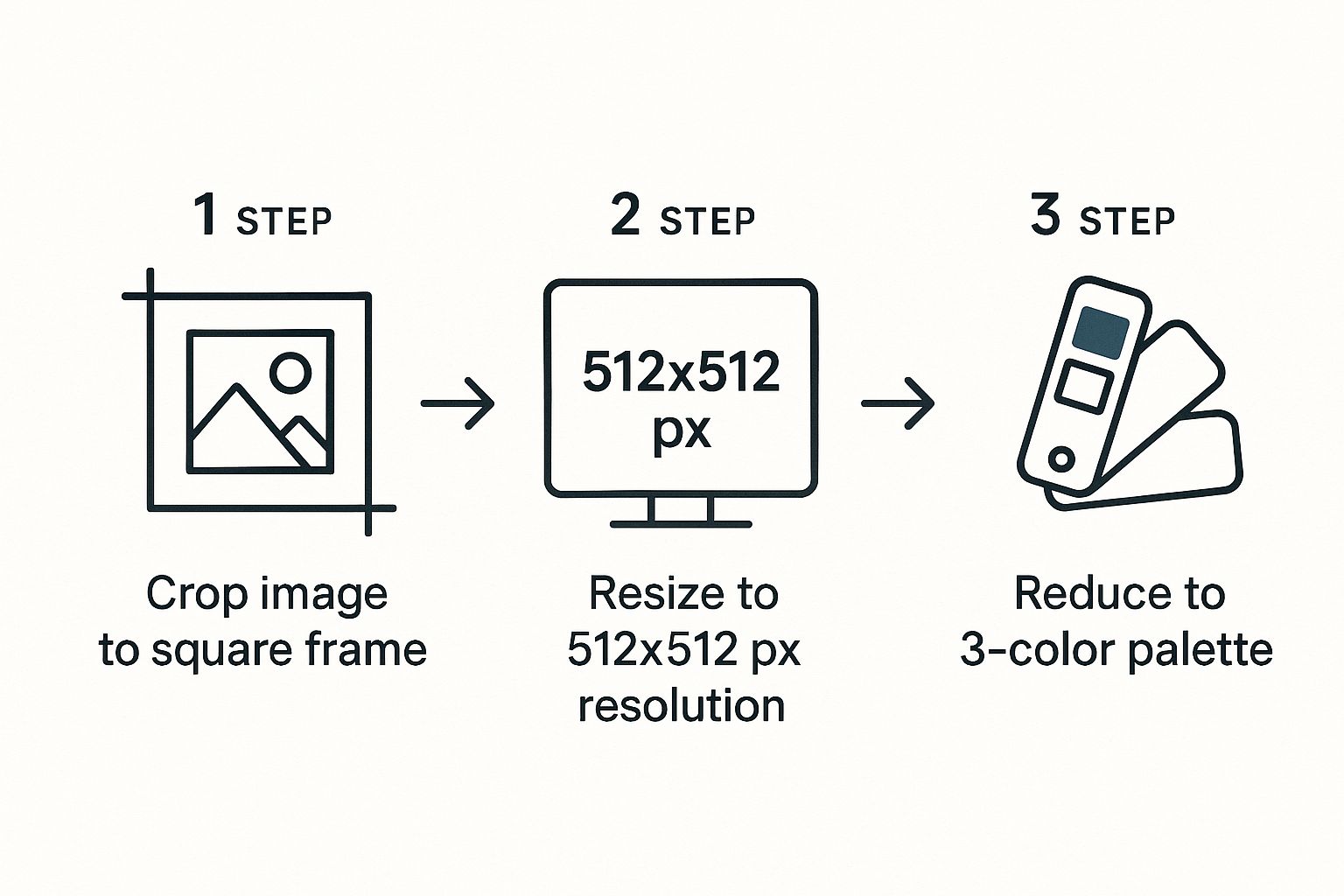
As you can see, simple steps like cropping, resizing, and simplifying colors give the AI the best possible raw material to work with.
Dialing in the Perfect Look
The best part is that you’re not just stuck with the first thing the generator spits out. Most tools give you a surprising amount of control to tweak and refine the final icon. Think of yourself as the art director, guiding the AI.
You’ll typically find a few key settings to play with:
- Detail Level: This is usually a slider that tells the AI how much complexity to keep. Lower settings create a more abstract, minimalist icon. Higher settings will preserve more of the smaller details from your original image.
- Smoothing: This is your best friend for cleaning up any jagged edges or clunky-looking curves. A little bit of smoothing can turn a rough draft into a polished, professional-looking final icon.
- Style Presets: Many generators come loaded with presets to get you started. You might find options like "thin," "bold," or even styles designed to mimic popular icon libraries like Lucide or Heroicons.
The trick is to treat the AI as a creative collaborator. By getting familiar with these settings, you can guide the tool to create an icon that’s not just technically sound but also a perfect match for your project’s aesthetic. The upload is just step one; the real creative work happens when you start refining.
Refining Your Icon's Style and Design
The initial AI-generated icon is a great starting point, but now comes the fun part: making it truly yours. This is where you get to dial in the details and transform a generic graphic into something that perfectly captures your brand's unique vibe. Think of the AI's output as a quality sketch—you're the artist who brings it to life.
A few thoughtful adjustments can completely change an icon's personality. You can take the same base image and make it feel bold and impactful, or light and elegant, just by tweaking a few settings.
Mastering Stroke and Weight
One of the first things I always look at is the stroke weight. This single slider controls the thickness of the lines, which has a massive impact on the icon's overall feel and visual presence.
Imagine you're designing for a new fitness app. A thicker, heavier stroke might scream strength and durability, making it perfect for a workout-tracking feature. On the other hand, a thinner, more delicate stroke could feel more appropriate for a meditation or wellness section, suggesting a sense of calm and precision. It’s a subtle yet incredibly powerful way to set the tone.
A piece of advice I always give to new designers: keep your stroke weight consistent across an entire icon set. It's one of the most important things you can do to make a collection of different icons feel like a unified, cohesive family.
This kind of control is what creates a polished and consistent user experience.
Applying a Cohesive Color Palette
Color is where you can really inject your brand’s personality. A simple monochrome icon is timeless, but a well-chosen color palette can make your design truly stand out. This is especially critical when your icon needs to grab someone's attention.
For instance, mobile app icons are a huge deal. In an app economy that generated nearly $350 billion globally in the early 2020s, first impressions matter. Some studies even show that a well-designed app icon can boost install rates by a staggering 560%. If you're curious about the data, this in-depth analysis of mobile app icon trends is a great read.
Here are a few color strategies I often use:
- Monochrome: A single color—usually black, white, or a primary brand color. This gives you a clean, minimalist look that’s super easy to work with.
- Duotone: Two complementary or branded colors. This adds a nice bit of depth and visual interest without getting too busy. Think of a tech startup using its signature blue with a secondary accent.
- Gradients: A smooth blend of two or more colors. It's a modern approach that can make an icon feel dynamic and contemporary, which is great for a forward-thinking brand.
If you want to get into the nitty-gritty of applying color correctly, we have a guide on how to change the color of icons that covers some best practices.
Ultimately, refining your icon’s style comes down to making intentional choices. By thoughtfully adjusting the stroke weight and applying a strategic color palette, you're ensuring the final design doesn't just look professional—it perfectly represents your brand and speaks directly to your audience.
Putting Your New Icon to Work
Alright, you’ve designed a fantastic icon. Now comes the fun part: getting it out of the generator and into a real-world project. This is where your design meets development, and the right export strategy makes all the difference.
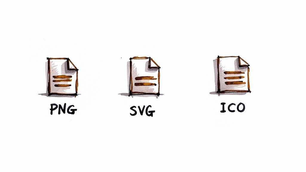
When you make picture an icon, your choice of format is the first critical decision. For pretty much any modern web or app project, Scalable Vector Graphics (SVG) is the way to go. Forget raster formats like PNG or JPG. SVGs are just code, which means they are incredibly lightweight and can be scaled to any size—from a tiny UI element to a full-screen graphic—without losing a shred of quality. That crispness at any dimension is a game-changer.

Embedding Icons in HTML and CSS
So, how do you get your new SVG into a website? It's actually quite straightforward. Most icon tools will let you either download the .svg file or copy the SVG code itself. For maximum flexibility, I almost always recommend copying the code and placing it directly into your HTML. This is often called "inlining" an SVG.
The real magic of inlining is that it exposes the icon to CSS. You can change its color on hover, adjust its size with media queries for responsive designs, or even add slick animations.
For instance, say you have a simple "settings" icon. The HTML would look something like this:
And with a bit of CSS, you can bring it to life:
/* CSS to style the icon /
.settings-icon {
width: 32px;
height: 32px;
stroke: #333; / A nice dark gray */
transition: transform 0.2s ease-in-out;
}
.settings-icon:hover {
stroke: #007bff; /* Bright blue on hover */
transform: rotate(90deg);
}
Working with Icons in React
If you're building with a framework like React, the workflow is even cleaner. Tools like VibeIcons typically offer a "Copy React" or "Copy JSX" button, which hands you a ready-made component.
You can drop this code into a new file (e.g., SettingsIcon.js) and import it wherever you need it in your app.
// src/components/SettingsIcon.js
const SettingsIcon = (props) => (
<svg
xmlns="http://www.w3.org/2000/svg"
width="24"
height="24"
viewBox="0 0 24 24"
fill="none"
stroke="currentColor"
strokeWidth="2"
strokeLinecap="round"
strokeLinejoin="round"
{...props}
{/* All the SVG path data goes here */}
export default SettingsIcon;
This component-based approach is incredibly efficient. It lets you pass in props to dynamically change things like the className or even the color of the icon on the fly.
A Quick Note on Accessibility: Always remember to add an
aria-labelor a<title>element to your SVG if the icon is meaningful (like a "close" button). For purely decorative icons, usearia-hidden="true". This is a small step that makes a huge difference for users who rely on screen readers.
Looking at the bigger picture, icons are becoming more essential than ever. With 5.45 billion people on social media worldwide, these tiny visual cues are crucial for navigating complex digital environments. By 2025, we'll see iconography become even more dynamic, shaped by AI and augmented reality.
If you're interested in really getting your hands dirty with vector editing, check out our guide on the best vector design software.
Common Questions About Making Icons
Even with fantastic AI tools at our fingertips, a few questions always pop up when you decide to make a picture an icon. I get it—the process can feel a little technical at first, but most of the common hurdles are surprisingly easy to clear once you know what to look for.
Let's walk through some of the most frequent queries I hear, from picking the right source image to making those final, crucial edits. Getting these sorted out early will save you a lot of headaches down the road.
What Is the Best Type of Picture to Use?
You’ll get the best results from images with a single, clear subject against a high-contrast background. I’m talking about simple product shots on a plain white surface, a clean logo, or a portrait where the person is clearly defined.
On the other hand, try to avoid photos with busy, chaotic backgrounds, bad lighting, or complicated shadows. Those elements tend to confuse the AI, and you’ll end up with a messy, inaccurate icon. A clean input is the secret to a clean output.
Can I Edit the Icon After It Is Generated?
Absolutely. In fact, you should! This is one of the biggest strengths of this workflow. Most AI icon generators export in SVG format, which is a vector file. This means you can pop it open in your favorite design software—whether that's Figma, Adobe Illustrator, or even a great free tool like Inkscape.
Once it’s loaded, you have total control. You can smooth out curves, delete stray points, or tweak the colors to match your brand’s exact hex codes.
Key Takeaway: Don't think of the AI-generated icon as the final product. It's more like an excellent first draft that saves you a ton of time. You get the speed of automation plus the detailed control of a human designer—the best of both worlds.
Why Is SVG Better for Icons Than PNG?
There’s a reason SVG (Scalable Vector Graphics) is the industry standard for icons. It really comes down to a few key advantages:
- Scalability: SVGs are resolution-independent. You can scale an SVG icon to the size of a billboard, and it will never, ever look blurry or pixelated. This is a must-have for responsive design.
- File Size: Believe it or not, SVGs often have smaller file sizes than their PNG or JPG counterparts, which helps keep your website fast.
- Flexibility: You can style SVGs directly with CSS. This means you can change colors, add hover effects, or even animate them with just a few lines of code, making them incredibly dynamic.
How Do I Ensure My Icon Is Accessible?
This is a big one. Accessibility isn't an afterthought; it's a core part of good design.
If your icon conveys information—like a hamburger menu or a search loupe—you need to provide a text alternative for screen readers. The easiest way is by adding an aria-label attribute to your HTML tag. For example: <button aria-label="Open menu">...</button>.
Now, what if the icon is purely for decoration and adds no real meaning? In that case, you can use the aria-hidden="true" attribute. This tells assistive technologies to skip right over it, creating a cleaner experience for users who rely on them.
Ready to create stunning, brand-aligned icons from your images in seconds? VibeIcons gives you the power to generate professional-quality icons that perfectly match your project's aesthetic. Try VibeIcons for free and design your first five icons today!