What Is Design System A Guide for Growing Teams
What is design system? Discover the components, benefits, and real-world examples that explain how a design system can scale your products and align your teams.
A design system is the single source of truth for your entire product team. It’s a complete set of standards, reusable components, and clear guidelines that come together to help everyone build consistent, high-quality digital products far more efficiently.
Think of it less as a document and more as a living product that serves all your other products.
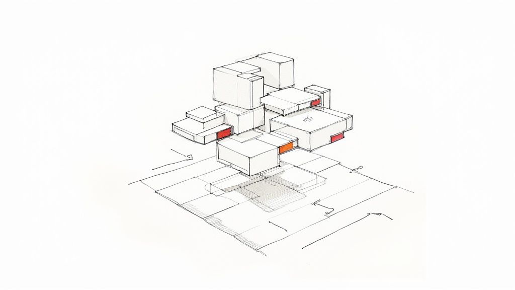
Unpacking the LEGO Box of Digital Products

Let's use a simple analogy to understand what a design system is. Imagine your product team has a massive, shared box of LEGO bricks. Instead of every person making their own bricks from scratch for every new project, everyone agrees to use the same set of high-quality, pre-made pieces.
This simple act ensures that everything they build—no matter who builds it—looks and feels like it belongs to the same cohesive universe.
This shared "box" contains everything your team needs to build with confidence and speed:
- Reusable Components: These are your actual LEGO bricks. Think of buttons, form fields, navigation bars, and modals that are already designed, coded, tested, and ready to snap into place.
- Visual Standards: This is the instruction manual and color guide for the bricks. It defines the exact typography, spacing rules, iconography, and brand colors to use.
- Clear Guidelines: This part explains why and how to use each piece. It provides the do's and don'ts, ensuring every component is used correctly and consistently.
Ultimately, a design system is the bridge that finally connects your design and development teams, creating a shared language they can both speak. Designers and developers are no longer siloed, tossing static mockups back and forth. They’re pulling from the exact same library of functional, ready-to-go components. This alignment dramatically cuts down on the friction and endless revisions that can slow projects to a crawl.
How a Design System Differs From a Style Guide
It's easy to mistake a design system for a simple style guide, but they are worlds apart. A style guide is a static document outlining brand rules like logos and colors. A design system, on the other hand, is a dynamic and interactive toolkit for building products.
Here's a quick comparison showing the evolution from a static document to a dynamic, integrated system.
| Characteristic | Style Guide | Design System |
|---|---|---|
| Nature | Static, descriptive document | Dynamic, interactive toolkit |
| Content | Visual guidelines (colors, fonts, logos) | Reusable UI components, code snippets, patterns |
| Purpose | To ensure brand consistency | To enable efficient, scalable product development |
| Audience | Primarily for designers and marketers | For the entire product team (designers, devs, PMs) |
| Output | A reference PDF or webpage | A living library of code and design assets |
A style guide tells you what something should look like. A design system gives you the actual, coded building blocks to make it.
"A design system is a collection of solved problems — the boring stuff. Snowflakes by their very nature are not boring; they’re unique! In a design system ecosystem, product teams are welcome and encouraged to create their own snowflakes in order to solve their problems."
This distinction is what makes design systems so powerful. It’s the difference between looking at a blueprint and having a complete set of prefabricated walls ready for assembly. With the latter, you can build faster, more consistently, and at a massive scale. By centralizing both design decisions and code, the system becomes the engine that drives product development, not just a dusty reference manual.
The Building Blocks of an Effective Design System
A powerful design system isn't just one thing; it's a collection of core ingredients all working together. Think of it like a chef's pantry. A chef relies on foundational elements like salt, fat, acid, and heat, and a design system depends on its own set of essential building blocks. Once you see how these pieces fit together, you can start building a cohesive and scalable product.
It all starts with a visual foundation. This layer contains all the sensory elements that give your brand its unique look and feel. These aren't just fuzzy ideas; they're concrete assets that steer every single design decision.
- Color Palette: The specific primary, secondary, and accent colors that define your brand's personality.
- Typography: The set of fonts, sizes, and weights for headings, body text, and other elements. This is what creates a clear visual hierarchy.
- Spacing and Layout: The rules for margins, padding, and grids that ensure your compositions feel balanced and consistent on every screen.
These foundational elements are typically captured in what's known as a style guide. If you want to dive deeper, you can check out our guide on how to create a style guide.
The Component Library
With the visual foundation in place, the next layer is the component library. This is where your team keeps its collection of reusable, interactive UI elements. Remember those LEGO bricks we talked about? This is them—each one designed, coded, and tested for consistency and accessibility right out of the box.
This library holds everything from the smallest atoms to more complex structures:
- Atoms: These are the basic HTML elements like buttons, input fields, and labels.
- Molecules: Simple groups of atoms working together, like a search form that combines a label, input field, and button.
- Organisms: More complex components built from molecules and atoms, such as a website's main navigation bar or a detailed product card.
A design system is a collection of solved problems — the boring stuff... a design system team’s job is to keep the finger on the pulse of what’s happening at the product level. If 5 teams are all creating snowflakes that are all doing similar things, that’s a super strong signal that there’s an opportunity for the design system to address a common need.
Guidelines and Design Tokens
Of course, just having a library of components isn't enough. Your team needs to know how and when to use them. That’s where usage guidelines and documentation are crucial. This living documentation offers clear instructions, best practices, and the do's and don'ts for using each component, making sure everyone is building in a unified way.
Finally, the secret sauce that makes a modern design system truly scalable is design tokens. These are the single source of truth that connects your visual foundation directly to the code. So, instead of a developer hard-coding a hex value like #007BFF, they use a token like color-brand-primary.
This simple change is incredibly powerful. Let's say you need to update your primary brand color. You just change the token's value in one place, and that update ripples out automatically across every single component in your entire product suite. It's no wonder that projections show over 84% of teams will have adopted design tokens by 2025 to boost consistency and efficiency. This shift makes maintaining and evolving your brand's visual identity practically effortless.
Why Investing in a Design System Pays Off
Thinking about a design system as just a "design thing" is a common mistake. In reality, it’s a powerful business strategy that delivers a tangible return on your investment. Yes, it takes some effort to get one up and running, but the payoff in efficiency, brand consistency, and sheer product quality is massive.
At its core, a design system empowers your teams to build better products, faster. It stops them from reinventing the wheel on every single project.
Instead of getting bogged down in endless debates about button padding or the exact hex code for a specific shade of grey, your designers and developers can pour their energy into solving real user problems. This is the crucial shift: moving from repetitive, low-impact tasks to creative, high-value work. Suddenly, your teams can ship new features faster, react to market shifts with more agility, and maintain an incredible level of quality across your entire product suite.
The structure below shows how these pieces fit together.
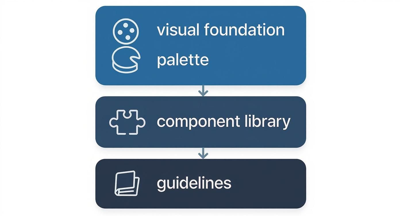
As you can see, everything is built on a solid visual foundation. This creates a single, reliable resource that everyone in the organization can turn to, from designers to the C-suite.
Unlocking Efficiency and Speed
One of the first things you'll notice is a huge boost in speed across the entire product development process. When your teams can pull pre-built, tested, and approved components from a shared library, redundant work simply vanishes.
- Lightning-Fast Prototyping: Designers can assemble new screens and user flows with incredible speed. It’s a lot like building with LEGOs—just grab the right piece and snap it into place.
- Shorter Development Sprints: Developers can pull ready-to-go code snippets for everything from modals to form fields, which drastically cuts down on build time and reduces the risk of new bugs.
- Less Rework and Frustration: Because designers and developers are working from the exact same set of components, the final build looks and feels just like the initial design. This means fewer back-and-forth revision cycles.
A design system isn't a side project; it's critical infrastructure. By investing in this shared foundation, you give your teams a stable, consistent base to build upon, rather than forcing them to start from a blank slate every time.
Fostering Collaboration and Consistency
Beyond just moving faster, a design system breaks down the walls that so often separate design and engineering teams. It establishes a shared language and a unified toolkit that everyone uses, paving the way for true collaboration.
This alignment ensures every digital touchpoint—whether it’s your marketing site, your web app, or your mobile experience—feels like it came from the same company. It’s cohesive. It’s intentional.
This kind of brand consistency isn't just about looking good; it builds trust. When users find a predictable and familiar interface every time they interact with you, they feel more confident and comfortable. The end result is a higher-quality product, built by a more efficient, collaborative, and aligned team.
Learning From the Best Design Systems in the Wild
Theory is great, but to really understand what a design system can do, you have to see it in action. Let’s look at how some of the biggest names in tech handle design at an immense scale. These aren't just pretty pattern libraries; they're full-blown products with dedicated teams, deep documentation, and clear philosophies that serve thousands of employees.
Seeing how these systems solve real-world problems offers a masterclass in building for consistency, scale, and collaboration.
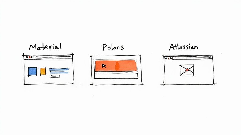
Google Material Design
If you’ve heard of one design system, it’s probably Google’s Material Design. It's the unifying force behind nearly every Google product you use, from Android to Gmail. First released in 2014, it has gone through major updates, with the latest version (Material 3) bringing in more personalization and dynamic color.
But Material Design is much more than just a collection of UI elements; it’s a whole design philosophy. The core idea is based on the physical world, using familiar concepts like light, shadow, and motion to make digital interfaces feel intuitive. Its documentation is second to none, offering not just code but detailed guidance on how and why to use each component.
The screenshot below from the Material 3 site gives you a feel for how organized and educational their approach is.
You can see how they treat their system as a product meant to teach, guiding users to make the best possible design choices.
Shopify Polaris
Shopify’s ecosystem is massive, serving merchants, partners, and app developers. Their design system, Polaris, is the glue that holds it all together, ensuring every part of the experience feels like Shopify. The main goal? To help external developers build apps that look and feel completely native to the platform.
What makes Polaris so brilliant is its laser focus on its audience. Every single decision is filtered through a few core principles:
- Trustworthy: Each element is designed to feel secure and dependable.
- Approachable: The language is clean and simple, making it easy for anyone to use.
- Performant: Speed is a feature, helping merchants run their businesses smoothly.
Polaris perfectly illustrates how a design system can be a powerful business tool. It’s not just about looks; it's about reinforcing the Shopify brand and enabling an entire community of partners to succeed.
Atlassian Design System
When your company makes complex, interconnected tools like Jira and Confluence, you can't afford to have a disjointed user experience. The Atlassian Design System is what gives their whole product suite a unified feel, providing a shared vocabulary for designers and engineers across many different teams.
Atlassian’s system is a standout example of amazing documentation. It covers everything from high-level design principles and brand voice to specific component usage and content guidelines. By putting all these resources in one place, they enable their teams to ship new features quickly without ever compromising on quality. It’s a powerful answer to the question "what is a design system?"—it's the foundation for building better products, faster.
How to Build Your First Design System
So, where do you even begin building a design system? It can feel like a massive, overwhelming project, but the secret is to not treat it that way. Don't try to boil the ocean. Instead, start small by focusing on the immediate, tangible problems slowing your team down right now.
Think of it like tidying up a messy workshop. You wouldn't tear the whole thing down and rebuild it from scratch. You'd start by organizing one drawer of tools—probably the ones you reach for every single day. This step-by-step approach makes the whole process manageable and, more importantly, lets you show real value almost immediately.
The most practical first step is a design audit. Go through your existing products and grab screenshots of every button, form field, and navigation bar you can find. Once you lay all these elements out side-by-side, the inconsistencies will jump right out at you. This visual inventory immediately highlights the most common components, giving you a perfect place to start.
Establish Your Foundation
With the chaos laid bare, you can start bringing in some order. The goal here is to define your core visual elements, which will serve as the foundation for everything else you build. Don't get stuck chasing perfection; just aim for a solid version one that your team can put to use right away.
- Define Your Primitives: First, lock in your core color palette, typography scale, and spacing rules. These are the non-negotiable building blocks of your visual language.
- Build Your First Components: Next, turn your attention to the most frequently used elements you found during your audit. For most teams, this means starting with buttons, input fields, and a handful of essential icons.
- Document as You Go: As you create each new element, write down simple, clear instructions. Explain what it is, when to use it, and maybe include a basic "do and don't" example. Keep it brief and to the point.
This initial effort creates instant value by giving your team a small but reliable toolkit. If you want to see how this kind of iterative process plugs into a larger workflow, our guide on agile development best practices has some great insights on building momentum.
Choose Your Command Center
For a design system to actually work, it needs a central home—a single source of truth that everyone can access. These days, tools like Figma have become the de facto command center for creating and sharing design systems, offering a collaborative space where design and code can finally meet.
The rapid adoption of these platforms shows a major shift in how product teams operate. By 2025, Figma had grown to over 10 million individual users, a huge leap from just 4 million back in 2022. This growth is fueled by its ability to bring teams together; for instance, about 84% of designers now work with developers every week right inside the platform. You can dig into more stats on Figma's impact on team collaboration at SQ Mag.
A design system isn't a side project; it's critical infrastructure. By investing in this shared foundation, you give your teams a stable, consistent base to build upon, rather than forcing them to start from a blank slate every time.
Finally, you'll need to set up a basic governance model. Decide who gets the final say on changes and create a clear process for how team members can request new components. This ensures your system grows in a structured, intentional way, keeping it from becoming a mess all over again. Start small, document clearly, and iterate based on what your product actually needs—that's how you build a system that grows with your team.
Keeping Your Design System Alive and Thriving
So, you've launched your design system. That's a huge win, but it’s really just the beginning. The real work starts now: making sure it grows with your company instead of gathering dust and becoming a digital artifact.
A design system that isn't actively maintained quickly turns into a liability. It falls out of date, creating more confusion and cleanup work than it ever saved. To prevent this, you have to think of your design system not as a one-off project, but as a living, breathing product with its own lifecycle, team, and roadmap.
Establishing a Clear Governance Model
One of the first things you need is a solid governance model. Don't let the word scare you off—this isn't about adding red tape. It’s about creating a clear, predictable way for the system to change and grow. Who gets to approve changes? How do new components get proposed and added? What’s the plan for versioning?
A good governance model prevents the system from descending into chaos, where anyone can toss in a half-baked component. It makes sure every addition is thoughtful, well-documented, and meets the quality bar you’ve set. This is absolutely critical for maintaining the system's integrity over the long haul. If you're looking for more ways to keep your creative assets in order, our guide on brand asset management solutions is a great place to start.
A design system team’s job is to keep a finger on the pulse of what’s happening at the product level. If multiple teams are creating unique solutions for similar problems, that’s a strong signal that the system needs to address a common need.
Driving Adoption and Measuring Impact
Of course, a governance model is pointless if no one actually uses the system. Getting people on board takes effort. You have to actively champion it by running workshops, offering office hours, and—most importantly—creating documentation so good that using the system becomes the path of least resistance for designers and developers.
It's also smart to track how the system is being used. Analytics can show you which components are popular and which are being ignored, giving you real data to inform what you build next. This isn't just a niche practice anymore; the Design Systems Software Market was valued at USD 75.2 billion in 2023 and is projected to hit USD 115 billion by 2031. As you can see from these market trends on Verified Market Research, companies are seriously investing in tools that help them standardize design and work better together.
Got Questions About Design Systems? We’ve Got Answers.
When teams first start dipping their toes into the world of design systems, the same questions always seem to surface. It's totally normal. Let's clear up some of that initial confusion so you can feel more confident about how this all works in the real world.
Here are a few of the most common things people ask.
"Are Design Systems Just for Huge Companies?"
Not at all. It’s easy to see giants like Google and Shopify and think this is an enterprise-only game, but design systems are incredibly valuable for startups and small teams, too.
Even a simple system brings consistency and saves a mountain of time down the road. It helps a small team punch above its weight, letting you build and ship faster. The trick is to match the system's complexity to your team's actual needs—don't try to copy Google's setup when you're just starting out.
"How Long Does It Take to Actually Build One?"
This is probably the most common question, and the honest answer is: it’s never really "done." Think of it less like a project with a finish line and more like a product that grows and evolves alongside your main product.
That said, a small team can usually get a solid foundation built in about three to six months. This first version would typically include the basics: your color palette, typography, and a few core components like buttons and form inputs. From there, you just keep building on it.
A component library is a crucial part of a design system, but it's not the whole story. The library is the set of reusable UI elements, while the design system is the entire ecosystem. This includes the library plus guiding principles, detailed documentation, and a governance model.
It's this complete package that really makes the difference. You don't just get the building blocks (the "what"); you get the rulebook that explains why and how to use them to create something people love.
Struggling to find the perfect icons that match your design system's aesthetic? VibeIcons lets you generate AI-powered icons that seamlessly blend with popular libraries like Heroicons and Lucide. Get your first five icons free at https://www.vibe-icons.com.