Create an Icon from an Image: Easy Step-by-Step Guide
Learn how to create an icon from an image with our quick guide. Discover tips on choosing photos, using AI tools, and customizing your icons easily.
Let's be honest, stock icons are fine. They get the job done. But "fine" doesn't make your brand stand out. When you take the extra step to create an icon from your own image—whether it’s a photo or a custom graphic—you’re doing more than just filling a space. You're injecting your brand's unique personality right into your user interface.
This process turns a simple picture into a powerful branding tool, making your website or app feel instantly familiar and uniquely yours.
Why Bother Creating a Custom Icon From an Image?
Generic icons are everywhere, and that’s the problem. They're forgettable. They don't tell a story or build a real connection with your audience. When you create an icon from an image that actually belongs to your brand, you’re crafting an asset that speaks volumes in a tiny space.
Imagine a small, local coffee shop. They could use a generic coffee cup icon, and it would work. But what if they used a simplified vector icon of their signature latte art? Suddenly, that little favicon or app button tells a story. It creates an authentic connection that a stock graphic never could. It's these small details that make a digital presence feel cohesive and memorable.
Strengthen Brand Identity and Recognition
Custom icons are like a visual signature for your brand. They weave your identity into every corner of your digital real estate, from the navigation bar on your website to the buttons in your mobile app.
When people repeatedly see icons that are distinctively yours, they start to build a mental association. That unique style becomes synonymous with your brand, which boosts recall and makes everything feel more familiar. This kind of consistency is a hallmark of a professional, polished brand and shows your audience you sweat the details.
Crafting icons directly from your own images ensures every visual element is perfectly aligned with your brand's story and vibe. That attention to detail doesn't go unnoticed; it directly builds a stronger, more memorable brand presence.
Boost User Engagement and Trust
There’s a real psychological effect at play when people interact with personalized visuals. They make an interface feel more human and approachable, which is a key ingredient for building trust.
For instance, one study found that replacing a generic icon with a human photo could skyrocket conversion rates by an incredible 48%. If you're curious about the deeper psychology, VWO's blog has a great write-up on how human-centric design impacts conversions.
You're tapping into that exact same principle when you create an icon from a familiar image. An icon based on a real-world product or a custom illustration just feels more authentic and trustworthy than a generic symbol pulled from a database. This small shift can make a big difference in engagement, as people naturally connect more with a brand that feels real.
How to Choose the Right Image for Your Icon
Before you even touch a piece of software, the fate of your icon is pretty much sealed by the image you start with. Seriously. Choosing the right photo is the difference between a crisp, clean icon and a muddy, confusing blob that no one can decipher.
Your best bet is to find a picture with a single, obvious subject. Picture a lone coffee cup on a simple background. Now, picture a busy park scene with a dozen people. The coffee cup is a fantastic candidate; its shape is simple and instantly recognizable. That park scene? It's going to turn into an absolute mess when you try to shrink it down.
What Makes an Image a Great Candidate
When you're sifting through photos, keep an eye out for three key things. First up is high contrast. This is a big one. The subject needs to stand out sharply from whatever is behind it. This contrast is what helps the conversion tool easily trace the object’s edges and separate it from the background.
Next, look for a distinct and simple shape. Objects with really intricate details or wispy edges tend to get lost in translation. Simplicity truly is your friend when it comes to icon design.
And finally, you need an uncluttered background. A clean, solid-colored backdrop is ideal, but even a nicely blurred one works wonders. It just prevents the software from getting confused and trying to include bits of the background in your final icon. If you want to dive deeper, we have a whole guide on how different backgrounds for icons affect the final design.
The best icons always come from images where the subject is the undisputed hero. If you have to squint to find the main object, that photo is too busy for a clean conversion.
Image Selection Checklist for Icon Creation
To make things even clearer, I've put together a quick checklist. Run your image through these points before you start the conversion process to save yourself a lot of potential headaches.
| Attribute | Ideal Characteristic | Why It Matters |
|---|---|---|
| Subject Clarity | A single, focused object | Guarantees the icon’s message is clear and not watered down by competing elements. |
| Contrast Level | High contrast between subject and background | This is crucial for clean edge detection, making the AI’s job much easier. |
| Background | Simple, uncluttered, or blurred | Prevents distracting background patterns from being pulled into your final icon design. |
Using this checklist as a quick quality check will set you up for success and help you create an icon from an image that looks professional and communicates clearly.
Using an AI Tool to Convert Your Image to an Icon
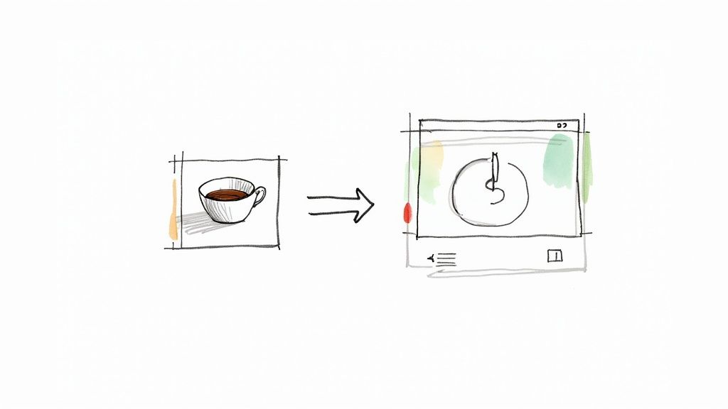
Alright, you've picked the perfect image. Now for the fun part. Forget spending hours tracing paths in complex software; a smart tool like VibeIcons can handle the heavy lifting of converting your photo into a clean vector icon. Think of it less like a machine and more like a creative partner you guide.
Your first move is a simple one: upload your photo. This is where you hand over the raw material and let the AI get to work. It immediately starts analyzing the core components of your image—the lines, shapes, and contrast—to map out how it can be transformed.
Exploring Different AI Style Presets
Once the initial processing is done, you'll be presented with a range of style presets. This is where the magic really starts to unfold and you get to see how you can create an icon from an image. Your photo is instantly re-imagined in several distinct aesthetics.
- Minimalist Line Art: This strips your image down to its essential outlines. It's a fantastic choice for a clean, modern, and understated look.
- Vibrant 3D Renders: Need something that pops off the screen? This style adds depth with realistic shadows and highlights, giving your icon a tangible, almost physical feel.
- Flat & Geometric: A timeless classic. This option simplifies your image into solid shapes and is perfect for user interfaces, branding, and app icons where clarity is king.
Every style carries a different vibe and serves a different purpose. I always tell people to play around here. What might seem "wrong" for one project could be the absolute perfect fit for another.
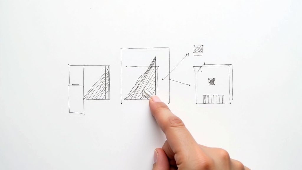
The infographic below really nails how the AI breaks down a complex photo. It identifies the fundamental shapes and lines to build a simple, effective icon from the ground up.
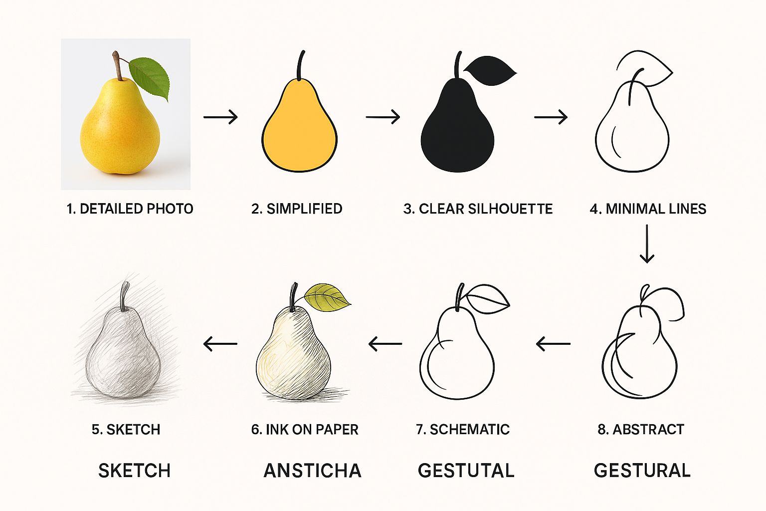
It’s all about stripping away the noise while keeping the soul of the original subject intact.
Refining Your AI-Generated Icon
After you've landed on a style you like, it's time to add your personal touch. The initial AI generation usually gets you 90% of the way there, but that last 10% is what makes the icon truly yours.
This is where you can dial in the colors to match your brand palette perfectly. For instance, if your company uses a specific shade of blue (#0047AB), you can plug that exact hex code right in. Consistency is key.
A great icon isn't just generated; it's guided. Use the AI's output as a brilliant starting point, then apply your unique brand knowledge to refine the colors and details until it's perfect.
You can also tweak things like line thickness or smooth out curves to get the exact finish you're looking for. If you want a deeper dive into these techniques, our guide on how to make a picture an icon breaks it all down. This control ensures the final result isn't just an AI's best guess—it's a polished, professional asset that you directed from start to finish.
Fine-Tuning and Exporting Your New Icon
Once VibeIcons generates the initial version of your icon, it's time to put on your designer hat. The small, deliberate tweaks you make now are what will elevate a good icon into a polished, professional asset that’s ready for anything. This is where you take full control to get the final product just right.
The first big decision you'll make is choosing the right file format. This isn't just a technical step; it directly impacts how and where you can use your icon effectively. Think of it as picking the right tool for the job.
Picking the Perfect File Format
Where your icon will ultimately live determines the format you need. Here’s a quick breakdown to help you decide:
- SVG (Scalable Vector Graphics): This is the gold standard for web use. SVGs are vectors, meaning you can scale them to any size—from a tiny favicon to a massive billboard—and they’ll stay perfectly crisp and sharp. No pixelation, ever.
- PNG (Portable Network Graphics): Go with PNG when you need a high-quality raster image with a transparent background. It’s perfect for things like PowerPoint presentations, social media posts, or documents.
A workflow I often use is exporting the SVG from VibeIcons and then pulling it into a dedicated design tool like Adobe Illustrator or Figma for any final, granular adjustments. This gives me the best of both worlds—the speed of AI generation combined with the hands-on precision of manual refinement. If you're looking for more techniques, check out our guide on how to https://www.vibe-icons.com/blog/create-icon-images from the ground up.
An icon's journey isn't over when it's generated; it's over when it's being used successfully. Picking the right file format is that final, critical step to ensure it looks and performs exactly as you planned.
The need for this kind of format flexibility is only growing. In fact, the global market for image converters is projected to hit $198.4 million by 2032. This trend shows just how vital it is for digital assets to be adaptable across a huge range of platforms and devices. You can read more about this expanding market in Semiconductor Insight's full report.
Common Mistakes to Avoid When Making Icons
https://www.youtube.com/embed/svd4WQE_92Y
Turning a photo into a vector is a fantastic starting point, but I've seen a few common pitfalls trip people up and lead to a less-than-ideal result. You run your image through the converter, excited to see the output, only to find it looks muddy, cluttered, or just… off.
The most common culprit? Overcomplication. It's easy to get attached to every little detail in the original photo, but when you're making an icon, less is almost always more.
Think about where this icon will live. If it’s a 16x16 pixel favicon in a browser tab, all those intricate lines and tiny shapes will just blur together into an unrecognizable blob. The magic of a good icon is its immediate clarity, even at a glance.
Losing the Soul of the Image
On the flip side, you can simplify things too much. I've seen this happen when a very aggressive AI style is applied to a photo with subtle but crucial features. For instance, you might have a picture of your product, and a minimalist line art style completely erases the one small detail that makes it unique.
The real art is in striking that perfect balance—simplifying the form without stripping away its core identity.
Here are a couple of practical tips I've picked up:
- Prep your source image: Before you even upload it, try bumping up the contrast a little. This can help the AI get a better read on the most important edges and shapes.
- Play with different styles: Don't just settle on the first result. A "Flat" or "3D" style in VibeIcons might preserve more of the original character than a pure line art conversion would.
It's not just about getting a vector file at the end. The goal is to create a symbol that instantly communicates what the original object was. If you lose that clarity, the icon has failed its primary job.
Finally, don't overlook your color palette. Choosing colors that are too similar or that clash badly with their intended background can make your icon completely invisible. Always do a quick test—drop your finished icon onto light, dark, and even busy backgrounds to make sure it stands out and stays legible everywhere.
Common Questions When Creating Icons
When you're turning an image into an icon, a few questions always seem to pop up. Let's walk through some of the common ones to make sure you get the best possible result every time you create an icon from an image.
How Important is My Source Image’s Resolution?
Think of it this way: the AI can't create detail that doesn't exist in the first place. For a clean, professional conversion, you’ll want to start with a high-resolution image. I always recommend using something that’s at least 1024x1024 pixels.
A larger, clearer source photo gives the AI much more information to work with, which directly translates into sharper lines and a more faithful vector icon.
How Do I Get an Icon with a Transparent Background?
Good news—most modern icon tools, including VibeIcons, take care of this for you. When you export your new icon as an SVG or PNG, it’s generated without a background by default. This is exactly what you want.
That means you can drop it onto your website, app, or presentation, and it will sit perfectly over any color or texture without that amateurish white box around it.
This is one of the biggest time-savers of using a dedicated tool. It intelligently isolates your subject, so the final PNG or SVG is ready to use immediately—no extra trips to a photo editor needed.
Which Format Should I Use for Retina Displays?
For anything on the web, the answer is always SVG (Scalable Vector Graphics). It's the gold standard for a reason.
SVGs are built on mathematical formulas, not a grid of pixels. This means they can be scaled up or down to any size without ever getting blurry. Your icon will look incredibly crisp on every device, from a standard monitor to a high-resolution retina display.
Can I Actually Use These Icons in My Commercial Work?
Absolutely. Icons created with a platform like VibeIcons are generally yours to use for commercial projects. This gives you the freedom to use them for your business website, a mobile app, or even in your marketing campaigns without getting tangled up in licensing headaches.
Ready to see it in action? You can turn your own images into polished, professional icons in just a few seconds. VibeIcons lets you create your first five icons completely free. Give it a try and start creating now.