Create Icon From Picture: Easy Steps & AI Tools
Learn how to create icon from picture quickly using AI tools and expert tips. Turn your images into professional icons for branding or projects.
Turning a simple photo into a sharp, scalable icon is a game-changer. It's about taking a standard picture and boiling it down to its essential graphic elements, often using smart AI tools to handle the heavy lifting like background removal and styling. The end goal is a clean vector file, like an SVG, that looks great at any size.
Why Bother Turning Photos Into Icons?
Before we jump into the "how," let's talk about the "why." This isn't just a neat design trick; it's a smart move for branding and communication. We've all seen the same generic stock icons a million times. They work, sure, but they don’t exactly make you or your brand memorable.
A custom icon made from a real photo, on the other hand, immediately stands out. Imagine a small business swapping its generic chatbot avatar for a stylized icon of the founder. Instantly, that automated chat feels more personal and trustworthy. Or think about an app developer who uses a simplified graphic of their flagship product for the app icon—it becomes instantly recognizable on a crowded phone screen.
It’s All About Trust and Recognition
At its core, this is about building a connection. People relate to other people and real-world objects, not abstract shapes. The numbers back this up, too. High-quality, authentic visuals have a massive impact on how users engage. Some studies have shown that using real photos of people can boost conversions by up to 95% compared to stock imagery.
I’ve seen this in practice. One A/B test I remember replaced a generic "contact us" icon on a blog with a simple, stylized photo of the author. The result? A 48% jump in contact form submissions. You can discover more about how authentic images boost conversion rates and build that crucial audience trust.
An icon made from a real picture carries a story and a personality that stock assets simply can't replicate. It’s an instant signifier of authenticity in a digital space filled with generic visuals.
Making the User Experience Better
Custom icons also just plain work better. They give users clear, unique visual cues as they navigate your site or app. When your icons are distinct to your brand, they become part of a cohesive and memorable journey.
This is especially true for things like:
- Profile Avatars: "About Us" pages come to life when you use custom icons of your team members.
- Product Categories: A simplified icon of your main product can represent an entire category much better than a generic symbol.
- Favicons: That tiny icon of your logo or product in a browser tab is a constant brand reinforcement.
Ultimately, knowing how to create an icon from a picture is an incredibly practical skill. It gives marketers, designers, and business owners a powerful tool to build a stronger, more recognizable brand.
Choosing the Right Picture for Icon Conversion
The success of your final icon really hinges on the quality of the photo you start with. If you want to create an icon from a picture that looks polished and professional, you need to give the AI good material to work with.
Think of it this way: the AI is smart, but it's not a mind reader. An image with a clear, focused subject and a simple, uncluttered background is ideal. This makes it incredibly easy for the software to identify the main event and separate it from the noise.
For example, imagine a picture of a coffee mug on a plain white table versus one sitting on a cluttered desk. The first one is a perfect candidate; the second will likely confuse the AI and give you a messy result. Always opt for a high-resolution photo to ensure your final vector icon is sharp and avoids any frustrating pixelation.
Prepping Your Photo for the AI
Before you even think about uploading, a couple of quick edits can make a world of difference. You don't need to be a Photoshop wizard; your phone's built-in editor has everything you need.
First things first, crop the image into a square. This forces the composition to focus squarely on your subject and aligns with the typical shape of an icon. It’s like giving the AI a perfectly framed canvas to start from.
Next, bump up the contrast just a little. This simple tweak makes the edges of your subject "pop" from the background, creating a much clearer outline for the AI to trace. It’s a tiny step that dramatically improves the accuracy of the vectorization process, especially for automatic background removal.
This infographic breaks down the simple prep workflow.
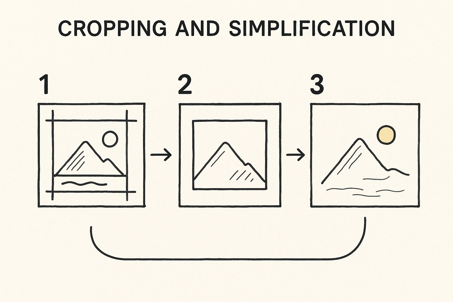
As you can see, a few thoughtful adjustments—cropping to a square and boosting the contrast—provide a much cleaner input for the AI. This leads directly to a better final icon with less manual cleanup required from you.
Key Takeaway: A well-chosen and prepped image is 90% of the battle. Spending two minutes on these small edits will save you a ton of time trying to fix a messy AI-generated result later on.
Ultimately, your goal is to make the AI's job as straightforward as possible. When in doubt, choose clarity over complexity. A clean starting image is the most reliable path to a clean, professional-looking icon.
Using AI to Generate Your Icon Instantly
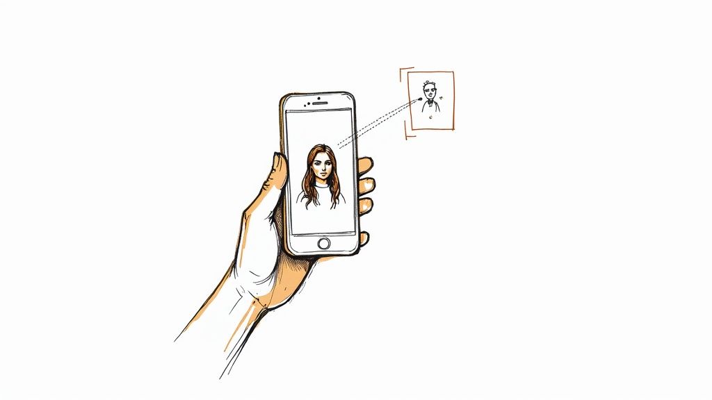
With your picture prepped and ready, it's time for the fun part. This is where AI tools like VibeIcons really shine, turning a complex design task into a simple, creative process. Forget wrestling with software—your role here is to provide the creative direction and let the technology handle the technical details.
The first step is always the simplest: just upload your image. The AI immediately gets to work, and one of its most impressive first moves is automatically removing the background. It intelligently isolates your subject, cleanly erasing everything else. This alone can save you a ton of manual editing time right out of the gate.
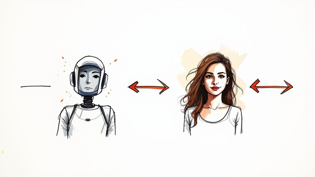
Choosing Your Design Style
Once your subject is isolated against a clean slate, you can start playing with different design styles. This is where you really begin to inject your brand's personality into the icon. A good AI tool will offer a range of options that align with popular and effective design systems.
A few common styles you'll likely come across include:
- Minimalist: Think clean lines and a simple, flat look. It's perfect for modern apps and websites.
- 3D or Clay: This style adds depth and a more playful, tactile feel to your icon.
- Outline: A true classic. It's versatile, professional, and works well on almost any background.
Let's put this in context. A new tech startup might go for a minimalist icon to communicate sleek efficiency. On the other hand, an educational blog for kids could use a soft, 3D style to seem more fun and approachable. You can explore a whole world of possibilities with a dedicated icon image creator to find the perfect match.
The interface is usually very intuitive, letting you click through different styles and see the results instantly, like in the example below.
This real-time feedback is fantastic. It lets you experiment quickly until you land on a look that just feels right for your brand.
Fine-Tuning Colors and Details
After you've locked in a style, the final touch is dialing in the color palette. Most AI generators will offer a smart suggestion based on your original photo, but you always have the final say. This is your chance to align the icon perfectly with your brand's official color scheme or even test out a few new combinations.
The magic of AI is how it handles these complex conversions in a flash. It's no wonder the market for these tools is growing so fast, with a projected value of nearly US$198.4 million by 2032 as more people look for smarter ways to create. This detailed report digs into the market's growth if you're curious.
What used to be a long, tedious design job is now an enjoyable, creative session. You can pump out dozens of high-quality variations in just a few minutes—a task that would have taken a designer hours to do by hand. The final output is a professional, vector-ready icon that's good to go for any use case you can think of.
Refining Your AI-Generated Icon
The AI gets you about 90% of the way there, which is an incredible head start. But that last 10%? That’s where your human eye and a little fine-tuning can turn a good icon into a truly great one. This is the stage where you polish the raw output, making sure the final asset fits your brand like a glove.
The number one goal here is consistency. Take a hard look at your new icon alongside your existing design library. Does the line weight match? Do the colors feel right? A cohesive visual identity is built on these small details, and it's what makes a brand feel professional and instantly recognizable.
Polishing The Details For Maximum Impact
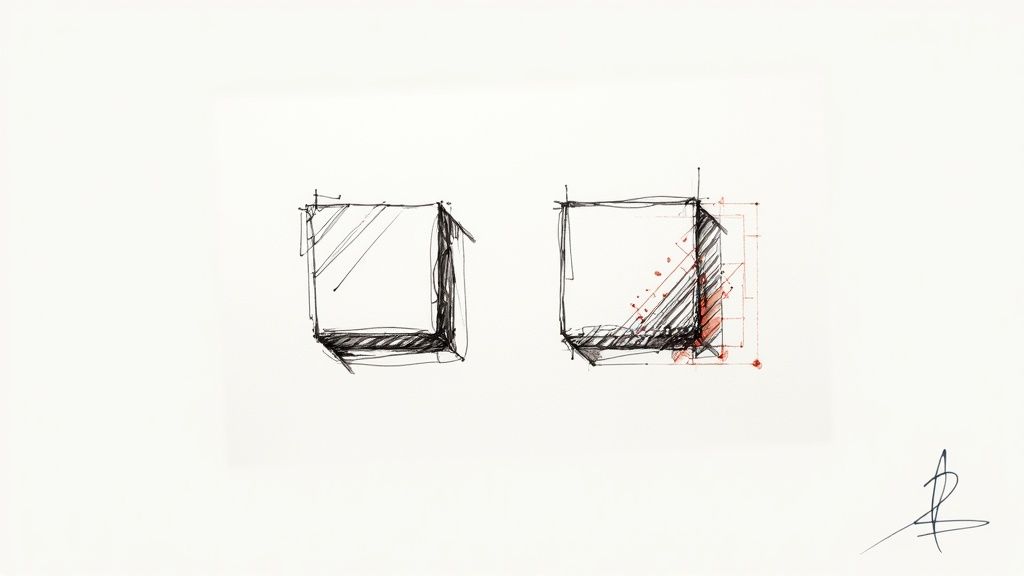
AI is brilliant, but it can sometimes leave behind tiny imperfections—a slightly wobbly line here, a strange curve there. Firing up a vector editor like Adobe Illustrator or Figma allows you to quickly smooth out those rough edges for a crisp, clean finish.
Next up is the all-important scalability test. A truly functional icon has to look just as sharp as a tiny 16x16 pixel favicon as it does on a large landing page banner. I always shrink my new designs down to their smallest intended size to see what happens. If the essential details blur into a fuzzy mess, it's time to simplify the design.
Choosing the right size from the get-go can save you a lot of headaches. Here’s a quick reference I use to match icon dimensions to their most common applications.
Icon Size and Common Use Cases
| Pixel Size | Common Use Case | Key Consideration |
|---|---|---|
| 16x16 | Favicons, small UI elements (e.g., list bullets) | Must be extremely simple and instantly recognizable. |
| 24x24 | Standard for Google Material Design toolbars. | Detail is still minimal; focus on a single, clear concept. |
| 32x32 | Taskbar icons, smaller navigation elements. | A good balance of detail and clarity for most desktop interfaces. |
| 64x64 | Desktop icons, list views with larger icons. | Allows for more detail without sacrificing legibility. |
| 128x128+ | App Store listings, feature sections, marketing. | High-detail work; can include subtle gradients and shadows. |
This table is just a starting point, of course, but it's a solid guide for making sure your icon is fit for purpose right from the beginning.
Pro Tip: When you create an icon from a picture, always test it on both light and dark backgrounds. An icon that looks fantastic on white can completely vanish on a black or colored backdrop. We cover this in more depth in our guide to choosing effective backgrounds for icons.
Once you've perfected your icon's style, don't just stop at one. You've just created a visual formula you can apply to other photos, letting you build out an entire custom icon set. This turns a single task into a repeatable process, ensuring every part of your brand feels unified and unique.
Finalizing and Exporting Your Icon
You've put in the work, and your new icon looks fantastic. Now for the most important part: getting it out of the editor and into the real world. A great design can fall flat if it's not exported correctly, so let's talk about how to choose the right format for the job.
Think of it this way: you wouldn't use a screwdriver to hammer a nail. The same principle applies here. Picking the right file type ensures your icon looks crisp and professional everywhere, from a tiny browser tab to a massive high-resolution display.
Choosing the Right File Type
For nearly every digital use case, your choice will come down to two powerhouse formats: SVG and PNG.
- SVG (Scalable Vector Graphic): This should be your go-to for almost all web applications. SVGs are pure vector magic, meaning they can scale infinitely up or down without ever getting blurry. They're perfect for logos, UI elements, and anywhere you need a graphic to look sharp on any device. For a more technical breakdown, we have a complete guide on how to make a vector image in Illustrator.
- PNG (Portable Network Graphics): A PNG is your best bet when you absolutely need a pixel-based (raster) image that supports a transparent background. It’s ideal for things like email signatures or social media profile pictures where vector formats might not be an option. Just remember that unlike SVGs, a PNG can look pixelated if you try to scale it up too much.
One special format that often gets forgotten is ICO. This one is specifically for your website's favicon—that little icon that appears in the browser tab. Thankfully, turning your creation into an ICO file is easy. Plenty of online tools can convert your image to the required 16x16 or 32x32 pixel dimensions. You can see a breakdown of the best options in this handy icon converter comparison for 2025.
Frequently Asked Questions About Turning Photos Into Icons
When you first dive into making icons from your photos, a few questions tend to surface right away. Nailing these details from the start can save you a ton of headaches later on.
Let's walk through some of the most common sticking points I see people run into.
What’s the Best Type of Photo to Use?
For the sharpest possible icon, always start with a high-resolution PNG or JPG file. I usually lean towards PNGs, especially if the photo already has a transparent background—it just makes the AI's job a little easier.
Think of it like this: a high-quality source image gives the AI a clean canvas to work with. If you feed it a blurry or pixelated photo, you're going to get a blurry, pixelated icon, no matter how sophisticated the tool is.
Can I Make an Animated Icon Straight From a Photo?
Not directly with these tools, no. The process we're covering here is all about creating static icons, like SVGs or PNGs. Animation is a whole different beast. It typically involves taking your finished static icon and then bringing it into specialized software to create a GIF or Lottie file.
So, while you can't just click a button to get an animated icon from a picture, the static icon you create is the perfect first step for any animation project you have in mind.
How Can I Make Sure My Icon Looks Good on Any Background?
This is a big one. An icon that looks fantastic on a light background can completely vanish on a dark one, and vice-versa. The key is to test, test, test. Before you call it done, drop your new icon onto both a solid black and a solid white background. This simple check will instantly reveal any visibility problems.
Pro Tip: One of my favorite tricks for ensuring an icon works everywhere is to add a thin, neutral-colored stroke (like a light grey) around it. This subtle outline helps it pop just enough to stay defined, whether it's sitting on a light, dark, or busy background.
Ready to see it in action? Take your own photos and turn them into polished, professional icons in just a few clicks. Give VibeIcons a try and get your first five icons completely free. Start creating now!