The Ultimate Font Awesome Cheatsheet
The complete Font Awesome cheatsheet for developers. Quickly find, copy, and paste any icon with class names, Unicode, and examples for all styles.

For any developer or designer, a solid Font Awesome cheatsheet is less of a nice-to-have and more of a necessity. It’s the fastest way to find the exact icon you need from a library that's grown to an absolutely massive scale. This guide is built to be that go-to reference, packed with class names and copy-paste examples for every icon.
Why a Font Awesome Cheatsheet is a Game-Changer
Font Awesome has become the internet's standard icon toolkit for good reason. It’s scalable, built with accessibility in mind, and the selection is huge. But with over 20,000 icons across both the free and pro plans, hunting down the right one can really slow you down.
That's where a well-organized cheatsheet comes in. Instead of breaking your focus to dig through the official docs, you can find what you need, copy the class, and drop it straight into your project. It's about keeping your workflow smooth and efficient.
Think of this guide as your single source for everything Font Awesome. Whether you've been using it for years or are just getting started, this reference will help you get your work done faster.
Getting the Icon Styles and Prefixes Right
Before we jump in, let's quickly cover the different icon styles. Each style has its own prefix, and using the wrong one is the number one reason an icon doesn't show up. It’s a simple thing, but it trips people up all the time.
Here’s the breakdown:
- Solid (
fas): This is the classic, filled-in style that started it all. Many of the most common solid icons are free. - Regular (
far): A lighter, outlined version of the icons. Most of these require a Pro subscription. - Light (
fal): An even thinner and more delicate outlined style, available exclusively for Pro users. - Duotone (
fad): This is a really cool two-tone style that adds a nice touch of depth. It's also a Pro feature. - Brands (
fab): This collection is dedicated to company and brand logos like Google, Facebook, and Twitter. The entire Brands set is completely free to use.
Getting this right is easy. For instance, if you want a solid user icon, you'd use the class fas fa-user. For the official Facebook logo, you'd use fab fa-facebook. Don't worry about memorizing them—this cheatsheet will give you the exact class you need for every single icon.
Top 20 Most Used Font Awesome Icons
To get you started, here's a quick look at some of the most popular icons you'll see across the web. This table gives you a preview, tells you if it's in the Free or Pro set, and provides the exact HTML you can copy and paste.
| Icon Preview | Icon Name | Style | HTML Class (<i> tag) |
|---|---|---|---|
| User | Free | <i class="fas fa-user"></i> |
|
| Search | Free | <i class="fas fa-search"></i> |
|
| Home | Free | <i class="fas fa-home"></i> |
|
| Envelope | Free | <i class="fas fa-envelope"></i> |
|
| Check | Free | <i class="fas fa-check"></i> |
|
| Times | Free | <i class="fas fa-times"></i> |
|
| Cog | Free | <i class="fas fa-cog"></i> |
|
| Spinner | Free | <i class="fas fa-spinner"></i> |
|
| Arrow Right | Free | <i class="fas fa-arrow-right"></i> |
|
| Arrow Left | Free | <i class="fas fa-arrow-left"></i> |
|
| Shopping Cart | Free | <i class="fas fa-shopping-cart"></i> |
|
| Heart | Free | <i class="fas fa-heart"></i> |
|
| Star | Free | <i class="fas fa-star"></i> |
|
| Free | <i class="fab fa-twitter"></i> |
||
| Free | <i class="fab fa-facebook-f"></i> |
||
| Free | <i class="fab fa-instagram"></i> |
||
| Free | <i class="fab fa-linkedin-in"></i> |
||
| GitHub | Free | <i class="fab fa-github"></i> |
|
| Bars (Menu) | Free | <i class="fas fa-bars"></i> |
|
| Plus | Free | <i class="fas fa-plus"></i> |
These icons are workhorses that you'll likely find a use for in almost any project. Now, let's dive into the complete library.
How Font Awesome Became an Industry Standard
To really get why a good Font Awesome cheatsheet is so essential, it helps to know how the tool got to where it is today. When Font Awesome launched back in 2012, it was a game-changer. It offered scalable vector icons you could style with simple CSS, which was a huge leap forward from the clumsy image sprites everyone was using at the time.
The initial icon set was pretty modest, but it was incredibly practical. It gave developers all the essential interface icons they needed, and you could get them working with just a single line of code. This simplicity, paired with its open-source model, meant developers jumped on board almost immediately.
The Evolution into a Powerhouse
The real magic happened with the major releases that followed. These updates didn't just add a few icons; they massively expanded the library and rolled out powerful new features. Each new version brought hundreds, then thousands, of new icons, covering everything from brand logos to very specific industry symbols.
This is what turned Font Awesome from a handy little tool into an indispensable resource. It scaled up to handle projects of any size.
The timeline below really shows its journey from a small, focused set to the massive library we have today.
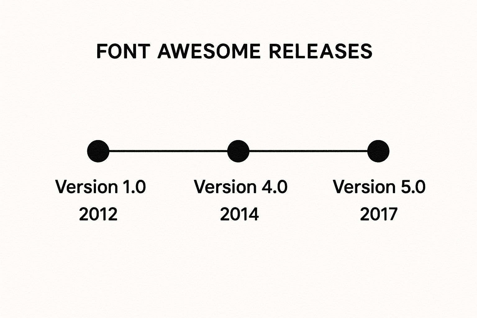
As you can see, the collection grew so fast that finding what you needed without a cheatsheet started to get tricky.
Cementing Its Place in Web Development
This incredible growth has locked in Font Awesome's place as a core part of the modern web developer's toolkit. By 2025, the ecosystem provides over 15,000 icons across its free and pro versions. To put that in perspective, the free library alone has grown by more than 250% since version 4.
Take the Font Awesome 5.1 release, for example. It dropped with 1,264 free icons and 2,068 paid ones, adding a ton of variety that proved just how versatile it had become. It's no surprise that it’s now used on millions of websites, including huge platforms like medium.com. For a closer look at its reach, you can check out the latest findings on Font Awesome adoption from Wappalyzer.
At this point, Font Awesome is more than just an icon library; it’s a standard. Its consistency, accessibility options, and sheer selection are why it's trusted on everything from personal blogs to massive enterprise applications. And that’s exactly why a good cheatsheet isn't just a nice-to-have—it's a must-have in any developer's workflow.
How to Use This Cheatsheet Effectively
Diving into a massive icon library can feel like searching for a needle in a haystack. I've designed this Font Awesome cheatsheet to cut through the noise and help you find exactly what you need, fast. Think of it less like a dense manual and more like your personal quick-reference dictionary for icons.
To really get the hang of it, you just need to understand how each entry is laid out. I’ve broken down every icon listing into a few key parts, so you can grab the code you need and get right back to building, without skipping a beat.
Here’s a quick look at what you’ll find for each icon:
- Icon Preview: You'll see the icon right there, so there's no guesswork.
- Official Name: The icon's designated name, which is perfect for quick searches.
- Style Prefixes: These are the CSS classes for each style, like
fasfor Solid,farfor Regular, andfabfor Brands. - Unicode Value: The unique code for the icon, which is super handy if you're using CSS pseudo-elements.
This simple, comprehensive structure is why a good cheatsheet is an indispensable tool for any developer. It helps speed up your workflow and makes integration a breeze, whether you're working with CSS or implementing the font directly. The official Font Awesome documentation is built this way for a reason—it gives you immediate access to the codes you need to keep your UI consistent.
Finding and Implementing Icons
The real power of this guide is its copy-and-paste simplicity. I've organized everything to support the two main ways you'll likely be adding icons to your projects.
This screenshot from a typical Font Awesome cheatsheet shows how icons are grouped with their names and Unicode values, making them incredibly easy to spot.
It’s this kind of clear, organized view that saves you from having to guess names or scroll through endless categories to find the right icon.
1. Using HTML <i> Tags
This is by far the most common and direct way to get an icon on your page. Just find the one you want and copy the HTML snippet. It’s that easy.
For instance, if you need a solid user icon, you’d use this:<i class="fas fa-user"></i>
Or, for a brand icon like Twitter, it would look like this:<i class="fab fa-twitter"></i>
2. Using CSS Pseudo-elements
For those times when you need more control, you can use CSS to insert icons. I find this method really useful for adding icons before or after elements like list items or button text.
.my-element::before {
font-family: "Font Awesome 5 Free";
font-weight: 900; /* For Solid icons /
content: "\f007"; / Unicode for the 'user' icon */
}
This technique gives you a ton of flexibility and keeps your icons managed cleanly within your stylesheet. If you're curious about different implementation strategies, you can learn more about the effective use of icons in design.
Complete Icon Reference Organized by Category
This is where the rubber meets the road in our Font Awesome cheatsheet. It's built for developers and designers who need to find the right icon now, but it’s also great for just exploring what’s possible. Instead of one giant, intimidating list, we’ve broken everything down into logical categories. This way, you can quickly find the exact icon you need and maybe even discover a few better alternatives along the way.
For every icon, you'll find a visual preview, its official name, the Unicode value, and the ready-to-copy HTML class for each style. It’s all here, whether you’re just dropping in a simple <i> tag or getting fancy with CSS pseudo-elements.
User Interface and Navigation Icons
Think of UI icons as the essential building blocks of any app or website. They're the silent guides that show users what to do, confirm actions, and provide feedback without a single word of text. A good UI icon feels instantly familiar, making navigation feel effortless. Font Awesome has a massive library of these workhorses, from simple arrows to detailed settings cogs.
You'll see these icons everywhere—in menus, on buttons, inside forms, and on alerts. Using them consistently creates a clear visual language that your users will quickly learn and depend on. Here’s a look at some of the most common UI icons you'll probably use every day.
Common UI Icons:
- user: The classic symbol for a user profile or account.
- Solid:
<i class="fas fa-user"></i>(Unicode:f007) - Regular:
<i class="far fa-user"></i>(Unicode:f007)
- Solid:
- home: A universally understood icon for the main or starting page.
- Solid:
<i class="fas fa-home"></i>(Unicode:f015)
- Solid:
- search: The go-to icon for any search bar or find functionality.
- Solid:
<i class="fas fa-search"></i>(Unicode:f002)
- Solid:
- bars: The "hamburger" menu, perfect for tucking away navigation links.
- Solid:
<i class="fas fa-bars"></i>(Unicode:f0c9)
- Solid:
- cog: Instantly recognizable for settings, configurations, or options panels.
- Solid:
<i class="fas fa-cog"></i>(Unicode:f013)
- Solid:
- envelope: Signifies email, messages, or a "contact us" action.
- Solid:
<i class="fas fa-envelope"></i>(Unicode:f0e0) - Regular:
<i class="far fa-envelope"></i>(Unicode:f0e0)
- Solid:
- times: The 'X' used for closing modals, dismissing alerts, or removing tags.
- Solid:
<i class="fas fa-times"></i>(Unicode:f00d)
- Solid:
Web Application and Action Icons
Once you move past basic navigation, web apps need a richer visual language for specific actions. This category is full of icons for things like file management, text editing, status updates, and media controls. Getting these right is key to making a complex application feel simple to use.
A well-placed checkmark, for instance, gives immediate positive feedback. A trash can icon leaves no doubt about what will happen when you click it. These little visual cues do a lot of heavy lifting, helping users get things done faster.
| Icon Name | Description | HTML Class (Solid) | Unicode |
|---|---|---|---|
| check | Confirms a selection or successful action. | <i class="fas fa-check"></i> |
f00c |
| plus | Indicates adding a new item or expansion. | <i class="fas fa-plus"></i> |
f067 |
| trash-alt | Represents deleting or removing an item. | <i class="fas fa-trash-alt"></i> |
f2ed |
| edit | Signifies an option to edit or modify content. | <i class="fas fa-edit"></i> |
f044 |
| upload | Used for file upload functionality. | <i class="fas fa-upload"></i> |
f093 |
| download | Represents downloading a file. | <i class="fas fa-download"></i> |
f019 |
| spinner | A loading indicator for ongoing processes. | <i class="fas fa-spinner"></i> |
f110 |
Brand and Social Media Icons
The fab (Font Awesome Brands) set is easily one of the most popular parts of the library. It’s packed with high-quality vector logos for hundreds of companies and products. This is your go-to for social media links, payment provider logos, or showing off your tech stack. Since these are official brand logos, they provide instant recognition.
Using them couldn't be easier. The entire brand library is free, and every icon uses the fab prefix. This makes it a breeze to add social share buttons or login options without hunting down a bunch of separate image files.
Pro Tip: When linking to your social profiles, always use the
fabbrand icons. It keeps your design looking clean and professional and ensures you're using logos correctly.
Popular Brand Icons:
- twitter:
<i class="fab fa-twitter"></i>(Unicode:f099) - facebook-f:
<i class="fab fa-facebook-f"></i>(Unicode:f39e) - linkedin-in:
<i class="fab fa-linkedin-in"></i>(Unicode:f0e1) - github:
<i class="fab fa-github"></i>(Unicode:f09b) - instagram:
<i class="fab fa-instagram"></i>(Unicode:f16d) - google:
<i class="fab fa-google"></i>(Unicode:f1a0) - apple:
<i class="fab fa-apple"></i>(Unicode:f179) - paypal:
<i class="fab fa-paypal"></i>(Unicode:f1ed)
Accessibility Icons
Designing for accessibility isn't just a nice-to-have; it's a fundamental part of building for the modern web. Font Awesome has a dedicated set of icons to help you represent accessibility concepts and features. These icons are visual cues that show you’ve built your site to be usable by everyone.
You can use them to point out features like video captions, audio descriptions, or tools for changing font sizes and contrast. They’re a simple but powerful way to show that your site is inclusive by design.
- universal-access: A general icon representing overall accessibility.
- Solid:
<i class="fas fa-universal-access"></i>(Unicode:f29a)
- Solid:
- wheelchair: Indicates access for users with mobility impairments.
- Solid:
<i class="fas fa-wheelchair"></i>(Unicode:f193)
- Solid:
- audio-description: Represents audio descriptions for visual content.
- Solid:
<i class="fas fa-audio-description"></i>(Unicode:f29e)
- Solid:
- volume-up: Often used to indicate text-to-speech functionality.
- Solid:
<i class="fas fa-volume-up"></i>(Unicode:f028)
- Solid:
- low-vision: Signifies features designed for users with low vision.
- Solid:
<i class="fas fa-low-vision"></i>(Unicode:f2a8)
- Solid:
Directional Arrow Icons
Arrows are one of the most basic and powerful visual cues we have. They show direction, guide navigation, and illustrate flow. In this section of our Font Awesome cheatsheet, we cover a huge range of arrow styles, from simple chevrons to complex circular arrows for things like retrying an action. You'll find them in carousels, "back to top" links, and table sorting headers.
The great thing about Font Awesome's arrow collection is its variety. You can find the perfect style to match your site's aesthetic, whether it’s clean and minimal or bold and chunky.
Key Arrow Icons:
- arrow-left: A standard arrow for "back" or "previous."
<i class="fas fa-arrow-left"></i>(Unicode:f060)
- arrow-right: The opposite, for "forward" or "next."
<i class="fas fa-arrow-right"></i>(Unicode:f061)
- arrow-up: Points upward, often used for "scroll to top."
<i class="fas fa-arrow-up"></i>(Unicode:f062)
- arrow-down: Points downward, used for expansion or "read more."
<i class="fas fa-arrow-down"></i>(Unicode:f063)
- chevron-left: A sleek arrow perfect for carousels and sliders.
<i class="fas fa-chevron-left"></i>(Unicode:f053)
- chevron-right: The right-facing version of the chevron.
<i class="fas fa-chevron-right"></i>(Unicode:f054)
- external-link-alt: Shows that a link will open in a new tab.
<i class="fas fa-external-link-alt"></i>(Unicode:f35d)
E-commerce and Shopping Icons
For any online store, clear iconography is a must-have for a good user experience. These icons guide shoppers from the product page all the way through checkout, representing actions like adding to a cart, viewing a wishlist, or making a payment.
Because these symbols are universally recognized, they reduce friction and make customers feel more confident. A familiar shopping cart or credit card icon can make a real difference in helping a user complete their purchase.
| Icon Name | Use Case | HTML Class (Solid) | Unicode |
|---|---|---|---|
| shopping-cart | Represents the user's shopping cart. | <i class="fas fa-shopping-cart"></i> |
f07a |
| credit-card | Signifies payment or credit card input. | <i class="fas fa-credit-card"></i> |
f09d |
| tag | Used for pricing, sales, or product tags. | <i class="fas fa-tag"></i> |
f02b |
| store | Represents a storefront or marketplace. | <i class="fas fa-store"></i> |
f54e |
| barcode | Can be used for product lookup or scanning. | <i class="fas fa-barcode"></i> |
f02a |
| gift | Indicates a gift option or special offer. | <i class="fas fa-gift"></i> |
f06b |
Medical and Health Icons
Font Awesome also has a specialized collection of icons for the medical and healthcare fields. They're ideal for hospital websites, health-focused apps, patient portals, and medical blogs. The set includes symbols for everything from doctors and equipment to specific procedures.
Using these standardized icons helps build a professional, trustworthy interface—something that’s incredibly important in the healthcare world. They provide clear, unmistakable visual markers for different types of information and services.
Example Medical Icons:
- user-md: Represents a doctor or medical professional.
- Solid:
<i class="fas fa-user-md"></i>(Unicode:f0f0)
- Solid:
- heartbeat: Signifies heart health or vitality.
- Solid:
<i class="fas fa-heartbeat"></i>(Unicode:f21e)
- Solid:
- pills: Represents medication or pharmacy services.
- Solid:
<i class="fas fa-pills"></i>(Unicode:f484)
- Solid:
- stethoscope: A classic symbol for a medical examination.
- Solid:
<i class="fas fa-stethoscope"></i>(Unicode:f0f1)
- Solid:
Customizing and Styling Font Awesome Icons
Just dropping an icon onto your page is only the first step. The real magic happens when you start styling it. Any good Font Awesome cheatsheet needs to show you how to make these icons truly your own, and thankfully, you can do a lot with just a few simple utility classes.
These built-in helpers let you tweak icons right in your HTML without having to write a bunch of extra CSS. This approach not only keeps your code cleaner but also makes on-the-fly adjustments incredibly fast—a huge plus for any efficient workflow.
Sizing Icons for Any Context
One of the first things you'll want to do is change an icon's size. Font Awesome has a set of intuitive classes that scale icons relative to the font size of their parent container. This is a smart way to ensure your icons always look proportional and visually balanced.
The classes are incredibly easy to remember. For instance, fa-2x makes an icon twice as big as the text around it, while fa-xs shrinks it down.
Here are the key sizing classes you'll use:
fa-xs- Extra smallfa-sm- Smallfa-lg- Large (33% larger)fa-2x- Two times the sizefa-5x- Five times the sizefa-10x- Ten times the size
Example Usage:<i class="fas fa-camera fa-2x"></i>
This simple line of code gives you a camera icon that’s double the default size.
Adding Movement with Animation and Rotation
Static icons are fine, but sometimes you need something that catches the eye. Font Awesome's animation classes are perfect for drawing attention to loading indicators, notifications, or other important elements.
On top of that, you can easily rotate and flip icons to get the exact orientation you need. This comes in handy for things like directional arrows or just for creating some unique visual flair.
Animation Classes:
fa-spin: Gives you a smooth, continuous spinning motion.fa-pulse: Rotates the icon in eight distinct steps, ideal for elements that need to grab attention.
Rotation and Flipping Classes:
fa-rotate-90: Rotates the icon 90 degrees clockwise.fa-flip-horizontal: Flips the icon on its horizontal axis.fa-flip-vertical: Flips the icon on its vertical axis.
You can get really creative by combining these. For example, slapping
fa-spinon a cog icon is a classic, universally understood sign that something is processing in the background.
Applying Color and Custom CSS
By default, Font Awesome icons just inherit the color of their parent text. But you can easily change that with basic CSS. All you have to do is target the icon's class or add an inline style to apply any color from your site's palette. For a much deeper look into this, check out our guide on how to change the color of icons effectively.
With your own custom styles, the possibilities are pretty much endless. You can create cool hover effects that change an icon's color or size, giving users a nice bit of interactive feedback.
CSS Example for a Hover Effect:
.social-link i {
color: #333;
transition: color 0.3s ease;
}
.social-link i:hover {
color: #007bff; /* Changes color on hover */
}
A simple snippet like this can make your social media links feel much more dynamic. This is where you move beyond a basic cheatsheet and start integrating Font Awesome into a polished, custom design.
Having a good Font Awesome cheatsheet on hand is one thing, but really putting it to work means getting it hooked into your development process smoothly. Most modern frameworks and content management systems have their own best practices for adding icons, and you'll often find dedicated packages that make things easier and boost performance.
Getting these integrations right is key. It ensures your icons not only show up but are also efficient, scalable, and easy to maintain down the road.
JavaScript Frameworks
When you're working in the JavaScript world, especially with frameworks like React or Vue.js, the official wrappers are the way to go. These give you proper components that take care of all the tricky parts of rendering SVG icons, which is great for both accessibility and performance. It's a much cleaner and more modern approach than just sprinkling <i> tags everywhere.
These official libraries also support tree-shaking. This is a huge deal because it means only the icons you actually use get packed into your final application, which can seriously shrink your production bundle size.
- React: The
react-fontawesomelibrary lets you import icons directly as components. This makes your code far more readable and declarative. We've got a whole guide on this, which you can find right here: using Font Awesome in React projects. - Vue.js: In the same spirit, the
vue-fontawesomepackage gives Vue developers a component-based system. It makes it super easy to pass props to control things like size, color, and animation.
This component-first method just fits so much better with how these frameworks operate. Icons can react and change based on your application's state without you having to mess with the DOM directly.
WordPress and Drupal
Font Awesome is just as common in big-name CMS platforms like WordPress and Drupal. Here, you'll typically add it using plugins or modules that handle the entire setup for you.
These extensions take care of linking the necessary stylesheets and scripts automatically. Once it's set up, you can start using icon classes from this cheatsheet directly in your theme files or right inside the content editor, no manual configuration needed. In WordPress, for instance, a bunch of different plugins let you turn on Font Awesome with a single click.
The reliability of these integrations is solid. Looking at the Drupal community, for example, you can see consistent weekly adoption of their Font Awesome module. This shows it’s a trusted tool for even enterprise-level sites that need robust, accessible icons. It's a great example of how a simple cheatsheet supports global web standards. You can check out the Drupal module usage statistics on Drupal.org if you want to see the data for yourself.
Frequently Asked Font Awesome Questions
Even with a great Font Awesome cheatsheet by your side, things can still go wrong. It happens. This section is all about tackling those common head-scratchers so you can get back to building without the frustration.
Let's start with the most infamous problem: the mysterious "empty square" icon. You've dropped the HTML in, double-checked the class name, but all you're getting is a blank box where your icon should be. Nine times out of ten, this is down to one of two simple issues.
First, your project might not be linked to the Font Awesome stylesheet correctly in your HTML's <head>. Second, and just as common, is a mismatch between the icon's style prefix (like fas or fab) and the font files you've actually loaded. For instance, trying to use a Pro icon with a Free plan kit just won't work—the icon data simply isn't there.
Why Are My Icons Showing Up as Empty Squares?
This is easily the #1 troubleshooting issue for anyone using Font Awesome. Seeing that empty box is the browser's way of telling you it can't find the specific icon glyph it needs to draw on the screen.
When this happens, run through this quick diagnostic checklist:
- Check Your Stylesheet Link: Make sure the
<link>tag pointing to your Font Awesome CSS is actually in the<head>of your HTML document. A simple typo in the path is a very common culprit. - Verify the Style Prefix: Are you using the right prefix? Free users typically have access to
fas(Solid) andfab(Brands). If you try to usefar(Regular) orfal(Light), which are Pro styles, you'll get blank squares. - Confirm
font-familyin CSS: If you’re styling with pseudo-elements, you have to tell the browser which font to use. For version 6, your CSS should explicitly state something likefont-family: 'Font Awesome 6 Free';orfont-family: 'Font Awesome 6 Brands';. - Clear Your Cache: It sounds simple, but browsers love to hang on to old stylesheets. A hard refresh (Ctrl+Shift+R or Cmd+Shift+R) can often fix the problem instantly by forcing it to grab the latest version of your files.
What Is the Best Way to Add Font Awesome to a Project?
There isn't a single "best" way to add Font Awesome; it really depends on your project. The right method for a quick prototype is different from what you'd do for a large-scale application.
For simple websites or getting a project off the ground quickly, nothing beats using a CDN (Content Delivery Network). You just copy a single <link> tag from the Font Awesome site, paste it into your HTML head, and you're done. It’s fast, straightforward, and doesn't require downloading anything.
For more serious applications, especially those built with tools like Webpack, the standard approach is to install Font Awesome as a package using NPM or Yarn. This method gives you far more control, letting you import only the icons you need, which can seriously shrink your final bundle size.
If you're working in a framework like React or Vue, your best bet is to use the official
react-fontawesomeorvue-fontawesomelibraries. They treat icons as proper components, which not only improves performance but also makes your code a lot cleaner and easier to manage.
Can I Use Pro Icons With a Free Plan?
This question comes up all the time, and it's an important distinction. The short answer is no, you can't use Pro-only icons if you're on the Free plan.
The Free and Pro icon sets are packaged in completely separate font files and stylesheets. The Free kit simply doesn't contain the glyph data for the thousands of icons exclusive to the Pro version.
If you add a class for a Pro icon, like far fa-heart (the regular, outlined heart), your Free kit won't know what to do with it, and you'll see that dreaded empty square again. To get access to all the Regular, Light, and Duotone styles, you'll need an active Font Awesome Pro subscription and the Pro-specific Kit for your project. Don't worry, this cheatsheet clearly marks which styles are Free and which require a Pro plan.
Feeling stuck when the perfect icon just doesn't exist? If you're tired of searching, VibeIcons has you covered. You can instantly generate any missing icon variant or state in a style that perfectly matches your existing library. Create your first five icons for free and see how easy it is to complete your design system.