Create an Impactful Icon for AI | Design Tips & Ideas
Learn how to design an icon for AI that stands out. Discover concepts, tips, and practical steps to craft a memorable AI logo today!
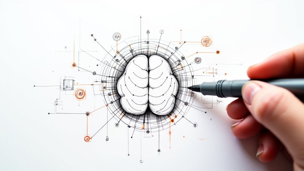
A great icon for AI is more than just a pretty picture; it's a piece of visual communication. It has to take a big, complex idea like machine learning and distill it into a simple, recognizable shape that instantly clicks with the user.
Translating Your AI Vision into a Visual Concept
Before you even think about opening a design tool, you have to get clear on the core idea behind your AI. What does it actually do? Who is it built for? The icon for a highly technical developer tool will need a completely different vibe than one for a simple consumer app—one should feel precise and powerful, the other intuitive and friendly.
Think about the abstract concepts that power your AI. Most AI technologies boil down to a few key themes:
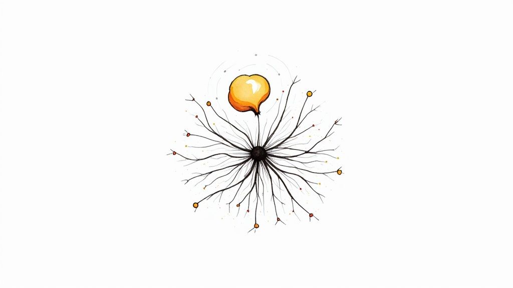
- Learning and Intelligence: This is often shown with brains, neural pathways, or classic lightbulbs.
- Connectivity and Networks: Think interconnected nodes, grids, or flowing streams of data.
- Automation and Speed: Gears, flowing lines, or even rocket shapes can get this idea across.
To help brainstorm, I've put together a quick table that maps common AI concepts to visual ideas. It's a great starting point for finding a direction.
Translating AI Concepts into Visual Themes
This table breaks down common AI concepts and provides corresponding visual themes and symbolic elements to inspire your icon design process.
| AI Concept | Visual Theme | Example Elements |
|---|---|---|
| Machine Learning | Intelligence, Growth | Stylized brain, neural networks, growing plant, lightbulb |
| Data Analysis | Insight, Patterns | Magnifying glass, charts, abstract data points, puzzle pieces |
| Automation | Efficiency, Process | Gears, circuits, robotic arm, flowing arrows, assembly line |
| Natural Language | Communication | Speech bubbles, sound waves, abstract letterforms, quill |
| Generative AI | Creation, Imagination | Magic wand, artist's brush, stars, building blocks |
| Neural Networks | Connectivity, Complexity | Interconnected nodes, web, constellation, circuit board |
Hopefully, seeing these laid out helps spark some ideas for your own project. The goal is to find a visual metaphor that feels authentic to what your AI does.
Define Your Audience and Message
The visual style you land on has to resonate with your users. If you're building an enterprise AI platform for a B2B audience, a sleek, geometric icon will signal professionalism and reliability. On the other hand, an icon for a creative AI assistant can get away with more organic shapes and bright colors to feel friendly and inspiring.
A great icon for AI doesn’t just represent technology; it builds trust. Its design must instantly tell a story about what your tool does and who it’s built for, making the abstract feel tangible and accessible.
Getting this right is more important than ever. The number of people using AI is exploding—it's projected to hit 378 million globally in 2025, a huge leap from 116 million just five years earlier. You can dig into these adoption statistics to see just how crowded the space is becoming. A distinct visual identity is your first step to getting noticed.
Create a Focused Creative Brief
To keep your design process on track, I always recommend starting with a simple creative brief. It doesn’t have to be a massive document, just something that answers a few key questions.
- What's the AI's core function? (e.g., data analysis, content creation, workflow automation)
- Who is the primary user? (e.g., developers, marketers, general consumers)
- What three keywords describe the brand's personality? (e.g., innovative, reliable, creative)
With this simple brief in hand, you’re ready to jump into a tool like VibeIcons with a clear vision, making it much easier to turn your abstract ideas into a powerful icon.
Core Principles for Modern AI Icon Design
When you’re designing an icon for an AI product, you're doing more than just creating a pretty graphic. You're trying to distill trust, intelligence, and function into a single, tiny image. After years in the field, I’ve found that it really boils down to three fundamental principles: scalability, color psychology, and simplicity. Get these right, and you're well on your way.
First up, scalability is non-negotiable. Think about all the places your icon will live—from a tiny 16x16 pixel favicon in a browser tab to a huge graphic splashed across a presentation screen. It has to look sharp everywhere. This is why vector designs are the only way to go; they keep their integrity and clarity at any size, ensuring your brand looks consistent no matter the context.
Next, let's talk about color. Color is a shortcut to emotion. In the AI world, you see a lot of blues and purples, and for good reason—they tend to communicate trustworthiness, intelligence, and a touch of the futuristic. But don't feel locked into that palette. A bold orange or a fresh green could signal creativity and growth, helping you stand out from the crowd.
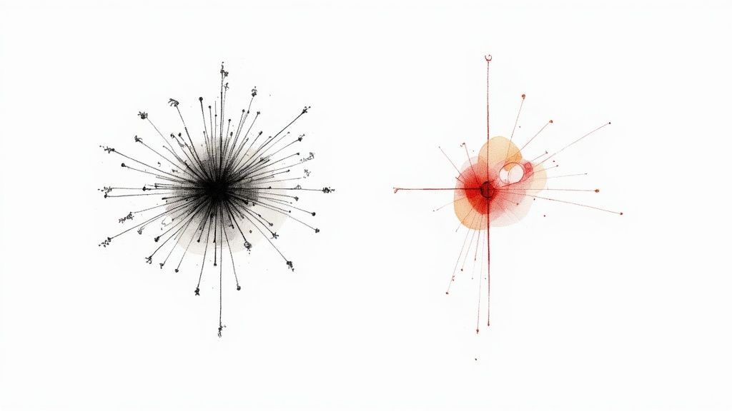
This infographic breaks down how these elements—scalability, color, and simplicity—all work in tandem to create an icon that truly connects.
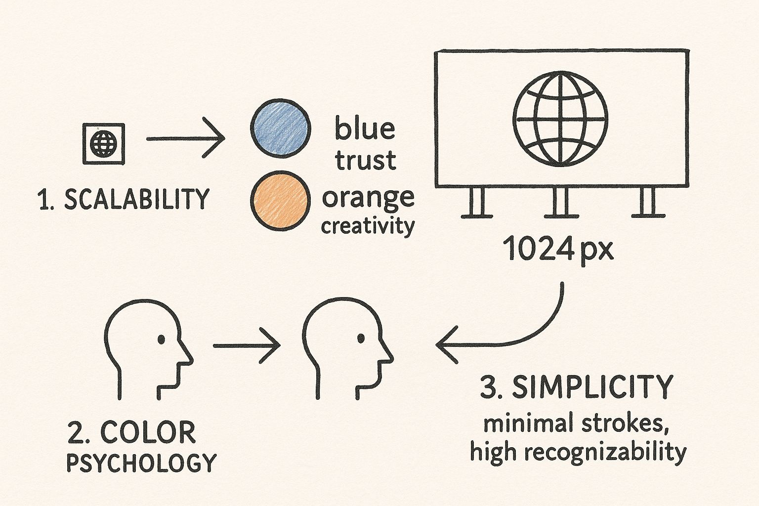
As you can see, a powerful icon holds its own at any size and uses thoughtful color and clean form to make an instant, positive impression.
Simplicity and Brand Trust
Finally, and perhaps most importantly, simplicity and clarity are paramount. The most iconic logos and symbols are almost always the simplest. When you cram too much detail into a design, it just becomes a confusing mess at smaller sizes. A clean, minimalist approach isn't just easier to recognize; it's easier to remember.
This ties directly into building brand trust, which is a massive hurdle as AI becomes more scrutinized.
A simple, professional icon signals that the underlying technology is just as considered and reliable. It builds an immediate sense of trust before a user even engages with the product.
This focus on trust couldn't be more critical. Governments everywhere are taking a closer look at AI. In 2024 alone, legislative mentions of AI shot up by 21.3% across 75 countries, according to a recent report on the global AI landscape from Stanford University.
Using clear, consistent visual language—like we cover in our guide on design principles like repetition—is a subtle yet powerful way to reinforce that feeling of stability and professionalism.
A Hands-On Guide to Creating Your AI Icon
Alright, let's get down to the fun part: taking your idea and turning it into a real, tangible icon. We'll be using VibeIcons for this walkthrough, and I'll show you how the quality of your input directly shapes the final result. It's less about the tool and more about how you talk to it.
The first, most crucial part of the process is writing a solid prompt. Simply typing "AI icon" is a recipe for a generic, forgettable image. Instead, pull from the visual themes we've already covered. A prompt that blends concepts, styles, and even moods will always give you something far more compelling.
This is the VibeIcons interface where the magic happens.
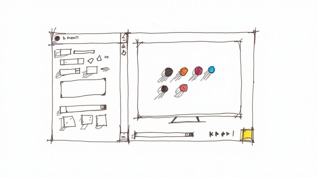
As you can see, the layout is clean and straightforward. The goal here is to let you focus on your creative direction without getting bogged down by a complex dashboard. It’s built for quick, iterative design.
Writing Prompts That Actually Work
When it comes to prompts, specificity is your secret weapon. The more detailed your instructions, the more the AI has to work with, and the closer it will get to what's in your head. Think of yourself as an art director guiding a designer.
Let's look at a few practical examples to get the gears turning:
- For a slick, futuristic feel: Try "Minimalist icon of a neural network brain, glowing neon blue lines, sleek and geometric, on a dark background."
- For something warm and approachable: You could use "Organic, flowing icon of an abstract data stream, soft rounded shapes, friendly and inviting, in pastel colors."
- For a more technical, corporate look: How about "Isometric icon of interconnected data blocks, precise circuit patterns, professional and clean, monochrome."
See how each prompt creates a totally different visual world? Don't hesitate to run multiple variations. The whole point is to explore different creative paths until one feels right. For a deeper dive into crafting these, we have a complete guide on how to generate an icon online that truly reflects your brand.
The best AI-generated icons come from prompts that tell a story. Instead of just describing an object, describe the feeling and style you want it to have. That nuance is what turns a generic symbol into a powerful brand asset.
Once you’ve generated a few versions you like, the refinement process begins right inside the platform. Use the built-in style and color options to fine-tune the output. Maybe that "futuristic" icon feels a bit too cold—try swapping the color palette for something warmer. Or maybe the "friendly" icon is a little too soft and needs more structure; you can easily regenerate it with a more geometric style selected.
This back-and-forth between prompting and tweaking is the key. It’s how you’ll land on an icon that's truly perfect for your project.
Polishing Your AI-Generated Icon
The first AI-generated icon you get is a fantastic starting point, but it's rarely the final product. The real magic comes from the human touch—this is where a good concept becomes a professional, polished asset ready for any project. I find that most initial designs are about 90% of the way there, and just a few thoughtful tweaks can elevate them to perfection.
Your first stop should be the built-in editing tools right inside VibeIcons. These are incredibly handy for quick adjustments. Think fine-tuning a color to match your brand guide perfectly or slightly altering the weight of a line. You'd be surprised how much impact these small changes can have, and you don't even have to leave the platform.
When you need total control, though, nothing beats exporting your icon as an SVG and opening it in a dedicated vector editor. Tools like Figma or Adobe Illustrator give you granular power over every single anchor point and path. This is the workflow most pros use.
Taking Your Icon to the Next Level
Once you've got your SVG open in a vector editor, the real polishing begins. This is the crucial step that separates a decent design from a truly professional one.
From my experience, there are a few key areas to focus on:
- Simplify Your Paths: AI-generated vectors can sometimes be a bit messy, with more anchor points than necessary. Cleaning these up makes the file lighter and helps it render more cleanly, especially on websites.
- Align to the Pixel Grid: This is a non-negotiable for me. Making sure all your lines and shapes snap perfectly to the pixel grid is what prevents blurry edges and keeps your icon looking razor-sharp, no matter the size.
- Check for Consistency: If this icon is part of a set, pull up the others and compare them side-by-side. You're looking for consistent line weights, corner radii, and an overall cohesive style.
This meticulous process is what it takes to create a high-quality icon for ai that looks and performs flawlessly everywhere. For a much deeper dive, we've put together a guide on our professional icon clean-up process.
The final refinement of an AI icon is where artistry meets precision. It’s about honoring the initial creative spark while applying the rigorous standards of professional design to ensure the final product is flawless.
As AI becomes more common—with some reports showing up to 78% of organizations globally using it in 2024—having a sharp visual identity is more critical than ever. Yet, according to the latest generative AI statistics and trends, only about 1% of companies feel they've fully matured their AI implementation. This highlights a huge gap where excellent design can make a real impact. Taking that final step to refine your icon ensures it reflects the quality and sophistication of the technology it represents.
Common Icon Design Mistakes and How to Avoid Them
Even with a great tool at your fingertips, it’s surprisingly easy to fall into a few common traps when creating an icon for AI. I've seen it happen time and time again.
One of the biggest culprits? Overcomplication. Designers get excited and cram tons of cool details into their work. It might look amazing blown up on a monitor, but shrink it down to favicon size, and it just becomes an unreadable smudge. For icons, simplicity isn't just a preference; it’s a necessity for scalability and recognition.
Then there's the cliché problem. Let's be honest, how many more glowing brains or circuit board patterns do we need to see? While they seem like a logical fit for AI, these symbols are totally played out. Leaning on them can make your forward-thinking product feel dated and generic, which is the last thing you want in a competitive space.
Perhaps the most critical mistake, though, is a lack of brand alignment. Your icon isn't just a random piece of art; it's a tiny ambassador for your brand. If it clashes with your company's color palette, tone, or overall vibe, it creates a jarring experience for the user.
Sidestepping Common Design Traps
So, how do you steer clear of these pitfalls? It really comes down to being intentional and keeping a few key things in mind as you work.
- Don't Forget to Shrink It: Always, always test your design at multiple sizes. Your main stress test should be 16x16 pixels. If it’s not legible at that size, it's back to the drawing board to simplify.
- Dodge the Obvious: Instead of going for a literal interpretation (like a robot head), try thinking more abstractly. What's the core benefit your AI provides? Security? Creativity? Connection? Find a unique visual metaphor for that feeling.
- Stick to the Script (Your Brand's Script): Before you even start generating ideas, have your brand guidelines open. The icon's style—whether it's fun and friendly or sleek and professional—needs to be a perfect match for your brand's personality.
A great AI icon strikes a delicate balance. It needs to be simple enough for a glance, unique enough to be remembered, and authentic enough to feel like it truly belongs to your brand.
By actively watching out for these common missteps, you can guide your design process toward something that’s not just visually appealing but genuinely effective. You’ll end up with an icon that strengthens your brand identity and communicates real value from the first look.
Common Questions When Designing AI Icons
When you start diving into creating an icon for an AI project, a few questions always seem to pop up. Let's walk through some of the common sticking points I see, so you can make sure your final design is sharp, flexible, and looks completely professional.
What Colors Work Best?
It’s true, blues and purples are everywhere in tech for a reason—they suggest trust and intelligence. But honestly, the best color is the one that fits your brand's unique vibe.
A bright, energetic green could be perfect for an AI focused on growth and sustainability. On the other hand, a splash of orange might better capture a brand built on creativity and innovation. The goal is to land on a palette that not only looks great but also reinforces the story you're telling your audience.
Should My Icon Be Abstract or Literal?
For almost any modern AI tool, I'd strongly recommend going with an abstract icon. It’s just a much better way to represent complex concepts like "machine learning" or "data synthesis" without being overly simplistic.
A literal icon, like a robot head or a circuit-board brain, can feel cliché and might look dated in just a couple of years. Abstract designs have a much longer shelf life and help you stand out.
Plus, an abstract icon for ai is incredibly practical. It stays clean and recognizable whether it's a tiny favicon in a browser tab or a large graphic on a presentation slide.
What File Formats Do I Actually Need?
To make sure your new icon is ready for anything, you'll want to have a few essential file types on hand. Think of it as your icon toolkit.
- SVG (Scalable Vector Graphic): This one's a must-have. It's the standard for websites and apps because it can be resized to any dimension without getting blurry.
- PNG (Portable Network Graphics): You'll need a set of high-quality PNGs with transparent backgrounds. I usually export them in several sizes for things like social media profiles, email signatures, or marketing graphics.
- Vector Source File (.AI or .EPS): Never, ever lose this. The original vector file is your master copy, essential for any future edits or if you ever need it for high-quality printing.
Feeling ready to create an icon that perfectly captures your AI project? With VibeIcons, you can generate stunning, professional-quality icons in just a few clicks. Start designing for free and see your vision come to life.