A Guide to Flawless Icon Quality Assurance
Implement a robust icon quality assurance process in your design system. Learn how to define standards, automate checks, and maintain a perfect icon library.

Icon quality assurance is just a fancy way of saying we're checking our icons to make sure they're not a mess. It's a systematic review to confirm every single icon meets the technical, aesthetic, and functional rules we've set. Think of it as the final, crucial checkpoint that keeps your design system clean and your user experience sharp.
Why Icon Quality Assurance Is a Game Changer
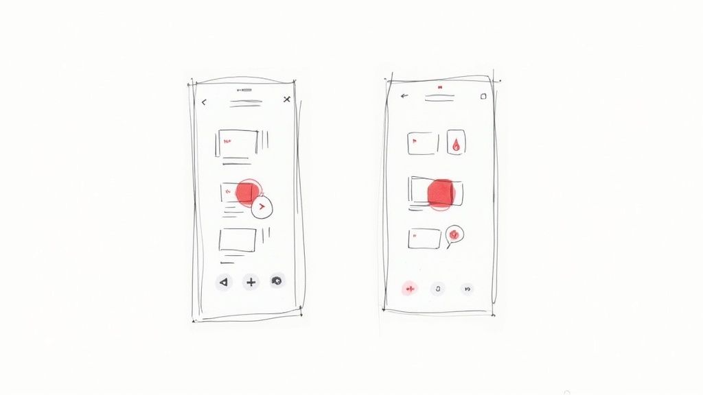
Have you ever looked at a screen and felt something was just... off? Chances are, you were looking at inconsistent icons. It's a subtle problem, but it acts like a form of "icon debt" that slowly chips away at an otherwise great user experience.
When icons have different styles, stroke weights, or sizes, they create tiny visual hiccups. These disruptions might seem small, but they confuse users and make polished layouts feel sloppy. Over time, this erodes the integrity of your entire design system.
Without a formal icon quality assurance (QA) process, these little mistakes start to pile up. Maybe the original "Settings" icon has a 2px stroke, but a new designer adds a "Profile" icon with a 1.5px stroke. Or one icon is perfectly centered on its 24x24 pixel grid, while another is off by a hair. These errors compound, making the product feel less professional and trustworthy.
The True Cost of Inconsistent Icons
The problem runs deeper than just aesthetics. Inconsistent icons make users hesitate. They have to stop and figure out what a symbol means, which increases their cognitive load and makes navigating your product a chore. For developers, a disorganized icon library is a nightmare, forcing them to waste time searching for the right asset or manually fixing alignment bugs. All that friction bogs down the entire product development cycle.

Putting a solid QA workflow in place isn't just busywork; it's a strategic move that pays off. The benefits are real and immediate:
- Boosts Team Efficiency: When designers and developers know every icon is reliable, they can build faster and with more confidence. No more second-guessing.
- Strengthens Brand Identity: Consistent icons are the bedrock of a cohesive brand image. They ensure you look professional across every single digital touchpoint.
- Improves User Experience: Clear, predictable icons make interfaces feel intuitive. This cuts down on user frustration and makes your product easier to use. For a deeper look, our guide on the effective use of icons in UI design breaks down how quality visuals directly impact user engagement.
Ultimately, icon quality assurance isn't about nitpicking pixels. It’s about creating a single source of truth that protects your design system’s integrity and ensures a seamless experience for your users.
Nailing this from the beginning is a massive win for your design process and the business as a whole. It turns your icon set from a potential source of chaos into a truly reliable and scalable asset.
Defining Your Icon Design Principles
You can't enforce quality if you haven't defined what quality looks like. Before you can even think about automating icon QA, you need a crystal-clear, documented set of design principles. These rules are the bedrock of your icon library, moving your team away from subjective "I like this one better" conversations and toward a shared source of truth.
Without this groundwork, consistency is a pipe dream. These principles act as the blueprint for every single icon, ensuring that one created today by Designer A looks like it belongs next to one created six months from now by Designer B. This alignment is what gives your entire user interface that polished, professional feel.

This level of rigor isn't just for software companies; it's a mark of quality across industries. Look at the Contract Research Organization (CRO) sector, valued at around $92 billion. These organizations depend on airtight quality assurance for pharmaceutical innovation. The top players have found that strong quality protocols can slash clinical trial times by about 20%—a perfect example of how standardized processes directly impact efficiency and safety. You can read more about the top clinical trial companies to see how these concepts play out in a high-stakes field.
Establishing Your Core Standards
So, where do you start? The first step is to nail down the non-negotiable technical and stylistic rules for your entire icon set. Document everything and put it somewhere everyone can find it, whether that’s in your design system documentation, a shared Figma file, or a Confluence page.
Your core standards should address a few key areas:
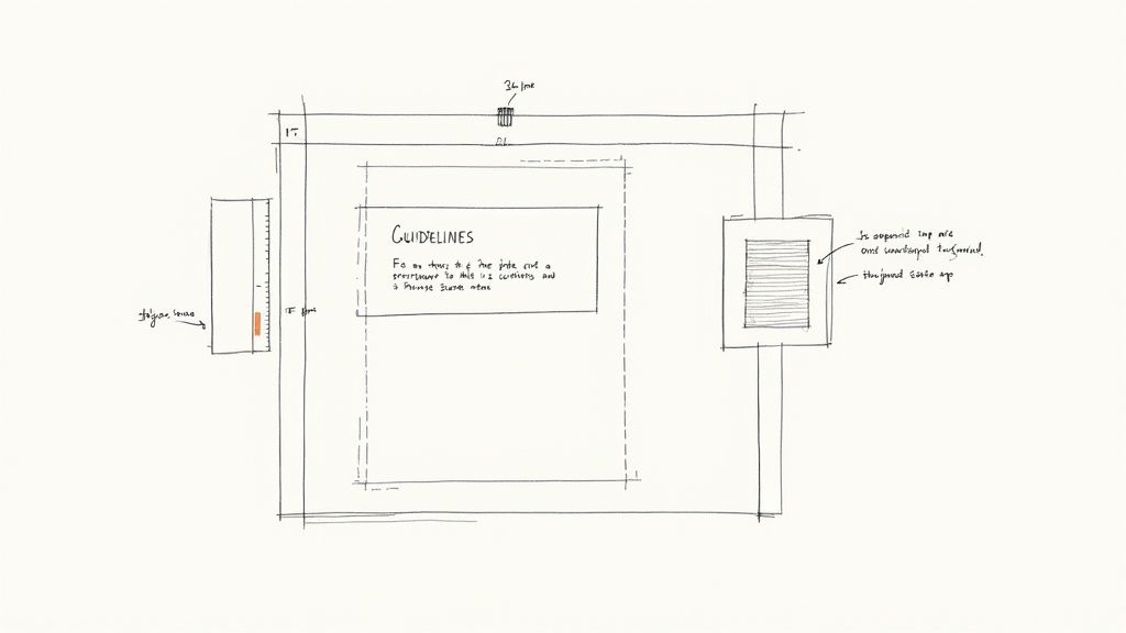
- Grid and Bounding Box: Lock in a consistent canvas size, like 24x24 pixels. It’s also smart to define a "live area" within that grid—for instance, a 2px padding on all sides—to give icons breathing room and prevent them from getting clipped.
- Stroke Weight: Pick a primary stroke weight (1.5px or 2px are common) and make it the default. If your system needs multiple weights for different contexts, define those clearly and document their specific use cases.
- Corner Radii: Standardize the radius for any rounded corners. Using a consistent value, like 2px, across all shapes is a simple trick that makes the entire set feel harmonious.
- Visual Style: This is where you define the overall vibe. Are your icons filled, outlined, or a mix? Do they use specific end cap styles (butt, round, square)? These choices are fundamental to your brand's visual identity.
To get everyone on the same page, I've found a checklist is the best way to start the conversation and document the final decisions.
Core Icon Design Principles Checklist
This checklist covers the essential technical and stylistic standards to define for your icon set. It's your first line of defense in ensuring consistency and quality from the very beginning.
| Attribute | Specification Example | Why It Matters |
|---|---|---|
| Grid Size | 24x24 px | Creates a consistent canvas for all icons, making alignment predictable. |
| Bounding Box | 20x20 px (2px padding) | Prevents icons from feeling cramped or getting clipped at the edges. |
| Stroke Weight | 1.5px | Ensures all icons have a uniform line thickness for a cohesive look. |
| Corner Radius | 2px on all outer corners | Creates a consistent, harmonious feel across the entire icon family. |
| End Caps | Round | Softens the feel of the icons and prevents sharp, jarring line endings. |
| Color Palette | neutral-700 for default, interactive-500 for hover |
Limits color usage to on-brand, accessible options, reinforcing UI consistency. |
| Style | Outlined (no fills) | Defines a clear visual language that distinguishes your icons. |
This checklist isn't just a technical document; it's a social contract for your team.
Getting team buy-in on these principles is just as important as defining them. Hold a workshop or review session to discuss and agree on the rules. When everyone feels a sense of ownership, they are far more likely to adhere to the standards.
Once you codify these principles, you've created a powerful reference point. New designers can get up to speed in a fraction of the time, and veteran team members have a clear guide for keeping things consistent as the library grows. This is the first, and most crucial, step in building a truly robust icon QA process.
Your Manual Icon QA Checklist
Automation is great for catching the technical stuff, but nothing beats a designer's eye. Think of this manual review as your non-negotiable first line of defense—the final quality check that software just can't replicate. A solid checklist turns this from a tedious chore into a quick, effective habit.
This is where your design instincts really shine. You'll spot those subtle visual quirks that a script would miss, like a stroke that’s a fraction of a pixel off or a corner radius that just feels inconsistent with the rest of the set. Creating a repeatable process here ensures every single icon gets the same level of scrutiny.
Visual and Structural Integrity
First things first, let's look at the icon's visual and structural health. This is where you play detective, hunting for the tiny mistakes that can cause big headaches when an icon is scaled or handed off to developers.
The main goal here is simple: confirm the icon is clean, well-built, and fits perfectly within your established design principles.
- Grid and Bounding Box Alignment: Is the icon sitting properly within its frame (e.g., 24x24 pixels)? More importantly, is it optically centered in the live area, respecting the built-in safe space?
- No Open Paths or Stray Points: Time to zoom in. Hunt down any vector paths that aren't fully closed, as they can cause bizarre rendering issues with fill colors. While you're at it, delete any stray anchor points floating around outside the main artwork.
- All Shapes Flattened and Combined: Have all strokes been converted to outlines? Are all the separate little shapes merged into one unified vector object? This is crucial for preventing parts of the icon from scaling weirdly or breaking apart.
I can't tell you how many times I've seen a live text layer sneak into an icon file. Always, always convert text to outlines. This guarantees the icon looks right on any device, whether the user has that specific font installed or not.
If you want to go deeper on this, we've put together a full guide on how to properly clean up your SVG icons before they ever touch your library.
Naming and Export Validation
Once you're happy with how the icon looks, it's time to check its metadata and export settings. Trust me, inconsistent naming is one of the fastest ways to create chaos in a design system. It frustrates designers and gives developers a massive headache.
A logical naming convention makes your entire library searchable and intuitive. Something like category/icon-name/size (e.g., ui/arrow-left/24) is easy for everyone to understand and work with.
Here’s what to look for before you hit "approve":
- Correct Naming Convention: Does the icon’s name actually follow the format you agreed on? This simple check saves so much confusion down the line.
- Vector Precision: Are all anchor points sitting on whole pixels? Sub-pixel placement is a classic cause of blurry, fuzzy icons. Snap everything to the pixel grid.
- No Unnecessary Groups or Layers: The final SVG should be a single, clean layer. Get rid of any hidden layers, empty groups, or random metadata that might be bloating the file size.
- Consistent Fill Rules: For icons with complex shapes or cutouts, make sure the fill rule (usually
nonzeroorevenodd) is set correctly. This prevents weird gaps or overlaps from appearing when the SVG renders.
This two-part checklist—covering visual integrity and then export readiness—gives you a rock-solid manual gate for your icon quality assurance process. It's detailed enough to catch the deal-breakers but quick enough that it won't become a bottleneck in your team's workflow.
Scaling Your System with Automated Quality Checks
Let’s be honest: manual reviews are great for catching subtle visual problems, but they just don't scale. When your icon library balloons from a few dozen to hundreds—or even thousands—of assets, manual checks quickly become a massive bottleneck. This is where automation comes in, transforming your icon quality assurance from a tedious chore into a powerful, efficient safety net.
Think of an automated workflow as a gatekeeping system. These scripts and tools are tireless guardians, instantly checking every new icon contribution against your technical standards. This frees up your designers to do what they do best: focus on creative quality and visual polish, confident that the boring technical stuff is already handled.
This shift isn't just happening in design systems. The entire business world is moving this way. The global market for quality management software was valued at around USD 11.14 billion in 2024 and is expected to climb to USD 20.66 billion by 2030. This growth, detailed in recent quality management software market research, signals a clear industry-wide move toward centralized, automated quality control.
Tapping into Tools for Automated Validation
The great news is you don’t have to build this system from the ground up. You can automate a huge chunk of your QA checklist just by combining tools you might already be using with some simple scripts.
- Figma Plugins: Tools like Icon Linter or Design Lint are your first line of defense. You can set them up to spot common mistakes right inside Figma—things like missing color styles, funky naming conventions, or detached components—before an icon even gets exported.
- SVG Optimization Scripts: Once icons are exported, you can run them through an automated cleaner like SVGO (SVG Optimizer). These scripts are fantastic for stripping out junk metadata, removing editor-specific code, and compressing the file. The result? A lean, clean, and production-ready SVG.
- Custom Linters: For rules that are unique to your system, you can write custom scripts (often called linters) that dig into the SVG code itself. These can enforce things like
fill-ruleconsistency, check for specific attributes, or even verify that every path sits perfectly on the pixel grid to avoid any blurriness.
A smart way to start is by automating the most objective and repetitive checks from your manual list. Things like validating that the bounding box is exactly 24x24 or ensuring the filename follows your
category/name/sizeconvention are perfect first candidates.
This layered approach means you’re catching potential errors at every step of the process.
Finding the Right Balance: Manual vs. Automated QA
So, what should you automate, and what still needs a human touch? Some checks are perfect for machines, while others will always benefit from a designer’s eye. The key is to let automation handle the repetitive, objective tasks so your team can focus on the subjective, creative ones.
Here’s a quick breakdown to help you decide.
Manual vs Automated Icon QA
| Check Type | Best for Manual QA | Best for Automated QA |
|---|---|---|
| Visual Integrity | Assessing if the icon is clear, recognizable, and on-brand. | N/A |
| Naming Conventions | Checking if the name is intuitive and makes sense in context. | Validating that the name follows a specific format (e.g., category/name). |
| Bounding Box | N/A | Verifying the frame dimensions are exact (e.g., 24x24px). |
| Pixel-Perfection | Spotting visual misalignments or subtle optical imbalances. | Checking if all vector paths and points align to the pixel grid. |
| Color Usage | Ensuring the color choice is appropriate for the icon's meaning. | Confirming the icon uses only approved color tokens from the library. |
| SVG Code | N/A | Stripping unnecessary metadata, comments, and editor-specific tags. |
| Consistency | Judging if the icon's style feels consistent with the rest of the set. | Enforcing technical rules, like fill-rule or stroke properties. |
Ultimately, a great QA process isn't about choosing one over the other. It's about creating a powerful partnership where automation handles the grunt work, freeing up human designers to focus on what they do best: creative excellence.
Integrating Automation with Version Control
The real magic happens when you weave these checks directly into your version control system, like Git. By using platforms such as GitHub Actions or GitLab CI/CD, you can build a workflow that runs on autopilot every time a designer wants to add an icon.
Imagine a designer opens a pull request to add a new set of icons. This action automatically triggers a script that runs through all your technical checks.
Here’s an example of what the feedback from a GitHub Actions workflow might look like.
The action gives immediate, clear feedback, showing whether the automated checks passed or failed. This effectively stops flawed icons from ever being merged into your main library.
If a check fails—say, an icon has the wrong fill rule or uses a rogue color—the pull request is automatically blocked. The system tells the contributor exactly what they need to fix. This creates a self-service QA loop that saves everyone time and ensures your icon library stays clean and reliable.
Having a solid process is one thing, but getting people to actually follow it is another. The real secret to successful icon quality assurance is making it a natural part of your team's everyday routine—something that feels like habit, not a chore. This means ditching the last-minute, chaotic reviews for a clear contribution model that everyone understands.
The whole point is to map out a clear journey for an icon, from its first draft to final approval. You want to cut down on friction and make sure everyone knows what’s going on. For teams that live in version control, this usually starts with a designer creating a new branch in Figma to work on an icon. When they’re ready, they can open a pull request in a repository like GitHub, which officially kicks off the QA process.
Fostering a Culture of Shared Quality
This isn't just a series of technical hoops to jump through; it's about building a team culture where everyone feels responsible for quality. When a designer submits a new icon, the feedback needs to be crystal clear and constructive. Vague comments like "this doesn't feel right" don't help anyone. Instead, feedback should point directly to your documented design principles.
For instance, a reviewer could say, "This looks great, but let's tweak the corner radius to our standard 2px to keep it consistent with the rest of the set." That kind of feedback is specific, actionable, and reinforces the standards everyone has agreed on. It transforms the review from a simple critique into a collaborative coaching session.
Streamlining the Review Process
To keep the process from getting bogged down, status labels are your best friend. Whether you're in GitHub, Jira, or another tool, simple tags like ‘Needs Review,’ ‘Revision Requested,’ and ‘Approved’ give everyone an at-a-glance update. This transparency is crucial for preventing bottlenecks and making sure no submission falls through the cracks.
- Needs Review: The icon is ready for a teammate to run through the QA checklist.
- Revision Requested: A reviewer has left specific, actionable feedback for the original designer to address.
- Approved: The icon has passed every check—both manual and automated—and is good to go.
A great workflow empowers everyone on the team to be a guardian of quality. It's not about a single design lead policing the library; it’s about giving every designer and developer the tools and knowledge to contribute with confidence.
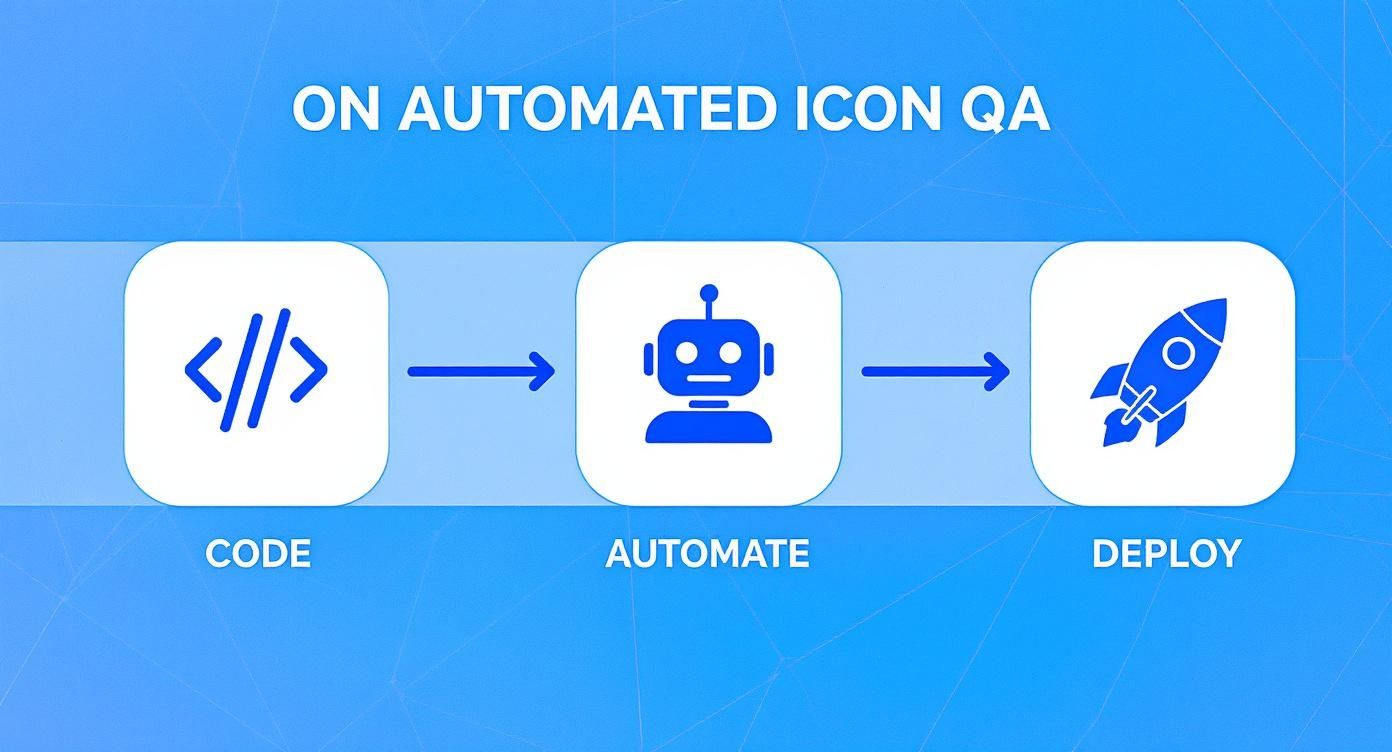
This process diagram shows how a contribution flows from a code branch through automated checks to final deployment.
As you can see, automation plays a huge role here, acting as a gatekeeper that ensures technical standards are met long before an icon makes it into production.
This kind of rigorous, built-in quality assurance isn't just for design. Look at a world-leading clinical research organization like ICON plc, which shows just how critical QA is in high-stakes fields like drug development. In 2025, ICON reported revenues climbing to around $8.35 billion, a figure driven by the constant demand for its quality-focused services in managing incredibly complex clinical trials.
Ultimately, baking QA into your workflow isn't about adding bureaucracy. It's about building a smarter, more efficient system that protects the integrity of your product. If you're just starting to build out these processes, getting the fundamentals right is everything. Our guide on what is a design system can help you understand the foundational structures that make these workflows successful.
Answering Your Icon QA Questions
Setting up an icon QA process is one thing, but making it work in the real world is another. You'll inevitably run into situations that don't fit perfectly into your shiny new checklist. That’s totally normal.
Let's walk through some of the most common questions that pop up when teams start getting serious about icon quality.
What If an Icon Needs to Break a Rule?
This is a classic. You've just established a perfect 20x20 pixel live area, and then someone needs to add a complex, asymmetrical brand logo that just won't cooperate. If you force it into the grid, it looks squished and wrong.
In these moments, remember that the rules are there to serve design, not the other way around. The goal is to make a deliberate, well-documented exception.
When a designer needs to break a rule, the key is to have them explain why in the pull request or design file notes. This paper trail is crucial. It stops another well-meaning designer from coming along later and "fixing" what was actually an intentional decision.
A great rule of thumb is this: allow exceptions for optical balance and brand integrity, but never for technical sloppiness. An icon might need to break the grid for a good reason, but it should never have open paths or messy layers.
Where Should Small Teams Start?
If you're a team of one or just a handful of designers, building a fully automated QA pipeline can feel like a mountain you don't have time to climb. Don't let that stop you.
The single most impactful thing you can do is create a simple manual checklist and stick to it. You don't need fancy tools to get started.
Focus on the fundamentals that give you the biggest bang for your buck:
- Grid and Bounding Box: Make sure every single icon lives in the same size frame (e.g., 24x24 pixels).
- Consistent Stroke Weight: Pick a single stroke weight, like 1.5px, and use it for everything.
- Clean Vector Output: Before exporting, flatten all shapes and hunt down any stray points.
- Simple Naming Convention: A clear format like
category/icon-namegoes a long way.
Honestly, just nailing these four things will solve 80% of your consistency problems. You can always bring in automation down the road as your team and library get bigger.
How Often Should We Update Our QA Process?
Your QA process isn't a "set it and forget it" kind of thing. Think of it as a living document that needs to grow and adapt right alongside your design system. I've found that scheduling a review every six months to a year works really well.
Get the team together and ask some simple questions:
- Are any of our checks just causing headaches or confusion?
- Have our core design principles shifted?
- Could a new tool automate some of the stuff we're still doing by hand?
- With hundreds of new icons, do our naming conventions still make sense?
This regular check-in keeps your icon quality assurance process from becoming a rigid set of rules nobody likes. Instead, it remains a genuinely helpful tool that supports your team and helps you maintain a high-quality, scalable icon system for the long haul.
Tired of inconsistent icons holding you back? VibeIcons lets you generate flawless, AI-powered icons that perfectly match your existing library's style. Create your first five icons for free and see how easy it is to achieve perfect consistency.