Create an Icon Transparent Background Flawlessly
Learn how to make an icon transparent background for any project. Our guide covers AI generation, customization, and best practices for perfect results.

An icon transparent background is the secret ingredient for modern, professional design. It’s what lets your graphics sit perfectly on any color, texture, or photo without that clunky, distracting box around them. This one detail is often the difference between a design that looks polished and one that feels amateurish.
Why Transparent Backgrounds Are a Designer's Best Friend

In design, versatility is the name of the game. An icon with a solid background is stuck; it’s inflexible. You either have to perfectly match its background color or live with a jarring, mismatched look that screams unprofessional.
I remember a website redesign project where the client’s old logo icons all had solid white backgrounds. The new design used a beautiful dark charcoal theme, and those white-boxed icons stuck out like a sore thumb. It instantly cheapened the whole aesthetic we were trying to build. An icon transparent background completely sidesteps this entire issue, letting your visuals just work.
Seamless Integration Is No Longer Optional
Think about the real-world demands on digital assets today. You need graphics that look great everywhere—from a light-themed mobile app to a dark-mode desktop interface and even on a printed brochure. Transparency makes your icons instantly adaptable.
This isn't just a "nice-to-have" anymore; it's a core part of a good user experience (UX). When a user switches to dark mode, they expect a seamless transition, not a screen full of bright white squares breaking the immersion. That kind of consistency builds trust and reinforces your brand’s identity. When your icons feel native to every environment, your brand looks more credible and thoughtfully designed.
The advantages are pretty straightforward:
- Works Everywhere: Your icons will look great on any color, gradient, or image.
- Looks Professional: You can finally say goodbye to amateurish background boxes.
- Keeps Branding Consistent: Ensures your visuals maintain a uniform look across all platforms.
- Ready for the Future: Your designs will stay adaptable as UI trends change over time.
An icon is only as good as its ability to blend in. Transparency is what unlocks its true potential, making sure it enhances—not disrupts—the user's experience.
This flexibility has become the industry standard. In fact, it's projected that by 2025, over 80% of popular icon sets from major sources will default to transparent formats like PNG or SVG. This shift really underscores how vital they are for modern, scalable design. You can learn more by checking out the latest icon design trends to see how transparency is shaping the field.
Choosing the Right File Format for Your Transparent Icon
Not all file formats that support transparency are created equal. Your choice can impact scalability, file size, and overall quality. Here's a quick rundown to help you decide.
| Format | Key Feature | Best Use Case |
|---|---|---|
| PNG | Raster format with lossless compression | Websites, apps, and presentations where you need high-quality static images with detailed colors and gradients. |
| SVG | Vector format based on XML | Web design, logos, and any application where the icon needs to scale perfectly without losing quality (e.g., responsive design). |
| GIF | Supports simple transparency and animation | Best for basic animations or icons with very few colors. Not ideal for complex, high-quality static icons. |
| WEBP | Modern format with superior compression | A great PNG alternative for the web, offering smaller file sizes for similar quality. Browser compatibility is now excellent. |
Ultimately, for most designers, the choice comes down to PNG for high-quality raster needs and SVG for anything that needs to be infinitely scalable.
Bringing Your Icon Concept to Life with AI
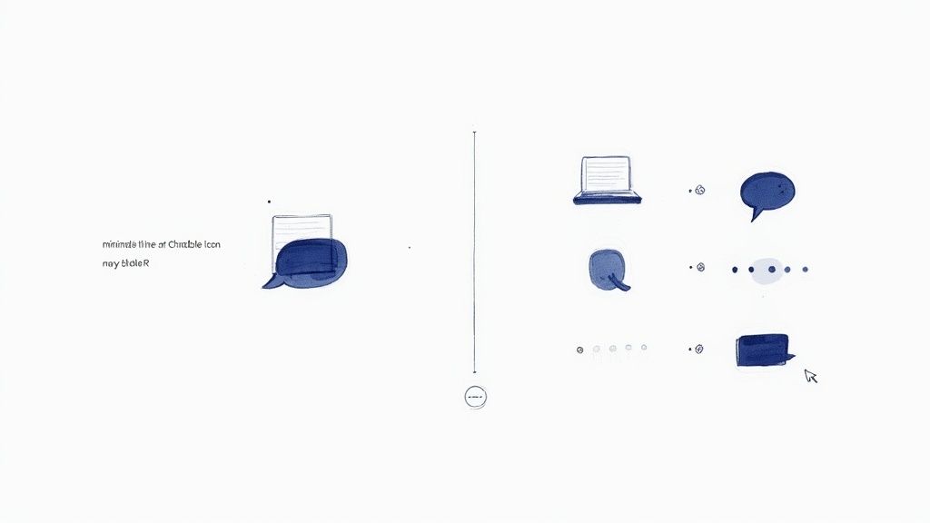
Alright, this is where the fun begins. Using a smart AI tool like VibeIcons lets you turn your idea into a solid base icon in just a few seconds. Honestly, it's a huge step up from the old days of sketching everything from scratch.
The real trick to getting a great result is all in the prompt. Just typing 'chat icon' won't cut it. You need to think like you're briefing a designer, giving the AI specific directions to follow.
Crafting a Prompt That Delivers Results
Details are everything. Instead of a vague prompt, try something more descriptive. A much better approach would be something like: "minimalist line art chat bubble icon, navy blue, subtle rounded corners, flat design style." See the difference? You’re not just telling the AI what to make, but also how to make it.
I have a few go-to stylistic keywords I lean on all the time to get the look I want.
- Flat Design: Gives you that clean, modern aesthetic with no fussy gradients or shadows.
- Line Art: Perfect for icons defined by outlines instead of solid, filled-in shapes.
- Isometric: This one creates a cool 3D look, viewed from a slight angle.
- Duo-tone: A great way to lock in a specific two-color palette for a bold visual.
When you add these kinds of details, the first icon the AI spits out is usually 90% of the way there. This saves an incredible amount of time you'd otherwise spend tweaking and editing. If you want to dive deeper, we have a full guide on how to generate an icon online with AI that’s packed with more tips. The idea is to let the AI do the heavy lifting for you.
Getting specific with your initial prompt is the single most effective way to ensure the AI generates a useful, high-quality icon that aligns with your creative vision from the start.
Why This is a Big Deal
This whole process feels miles ahead of how we used to work. Think about it—back in the 90s, icons were mostly clunky bitmaps with solid, ugly backgrounds. The arrival of the PNG format in 1996 was a true game-changer. It introduced alpha-channel transparency, which finally let icons blend into any background without those nasty white boxes around them.
In the end, a well-written prompt gives you a fantastic head start on creating a professional icon transparent background.
Here’s the rewritten section, designed to sound like an experienced human expert:
Dialing in Your Icon to Fit Your Brand
Getting an icon from the AI is a great first step, but it’s rarely the last one. Think of the initial output as a rough draft—a solid concept that now needs your expertise to truly shine and fit seamlessly into your existing brand identity. This is where we go from a cool-looking graphic to a professional, on-brand asset.
First things first: color. Every brand has its specific color palette, usually defined by precise hex codes. If your brand blue is #1E40AF, you can't just settle for a generic blue that looks "close enough." Using the exact hex code is non-negotiable for maintaining a consistent and polished brand image. It’s a small detail that makes a huge difference.
Making It Look Like It Belongs
Beyond color, you need to look at the icon's construction. One of the most common giveaways of a mismatched icon is the stroke weight—the thickness of the lines. If all your other brand icons have a clean 2px stroke, a new icon with a 1px or 3px stroke will stick out like a sore thumb. It creates a subtle but jarring inconsistency that can make the whole design feel a bit… off.
I always run through a quick mental checklist to make sure everything lines up:
- Color Check: Are these the exact hex codes from our style guide? No guessing allowed.
- Stroke Consistency: Does the line weight match our existing icon set?
- Corner Style: Are the corners sharp, or do they have a specific radius? This needs to be consistent.
- Simplicity: Can I remove any unnecessary details to make the icon clearer, especially when it’s small?
The whole point is to make the new icon look like it was created by the same designer, on the same day, as the rest of your assets. That seamless integration is what separates amateur design from a professional, cohesive brand experience.
Don't Forget to "Squint Test" for Legibility
Finally, it’s time for the real-world test. An icon might look fantastic blown up to 128x128 pixels on your screen, but what happens when you shrink it down to a 16x16 pixel favicon? Intricate details often turn into a blurry mess at smaller sizes.
This is why simplifying is so important. Make sure the core concept of the icon is still recognizable even when it's tiny. This step ensures your icon transparent background is truly versatile and looks sharp everywhere, from a website header to a mobile app navigation bar.
Nailing That Flawless Transparent Background
Alright, now for the part where the magic really happens: getting that perfectly clean icon transparent background. This is more than just hitting a "remove background" button and hoping for the best. One of the biggest mistakes I see designers make is thinking a white canvas is the same as a transparent one. It's not, and that mistake becomes painfully obvious the second you place that icon on a dark-colored website or app.
True transparency comes from something called an alpha channel. Think of it as an extra layer of information in an image file (like a PNG) that tells each pixel how see-through it should be. A standard JPG with a white background doesn't have this; it’s just a block of white that will always look like a white block, no matter where you put it.
How to Check if Your Background Is Actually Transparent
You can't just eyeball an exported icon and assume it's good to go. The only real way to know for sure is to test it. Drop your icon onto a few different colored backgrounds, especially dark ones. Placing it on a black or charcoal gray backdrop will instantly reveal any sloppy leftovers, like a faint white halo around the edges or stray pixels you missed.
These little imperfections are super common, particularly with icons that have soft, feathered edges or semi-transparent parts like gradients. Taking the time to hunt down and eliminate these artifacts is what makes an icon look polished and professional. If you're running into trouble, it might be worth exploring different methods for handling backgrounds from the start. Our guide on backgrounds for icons dives into a few strategies that can help you get a flawless result every time.
This infographic breaks down the workflow I use to prep an icon before even thinking about the background.
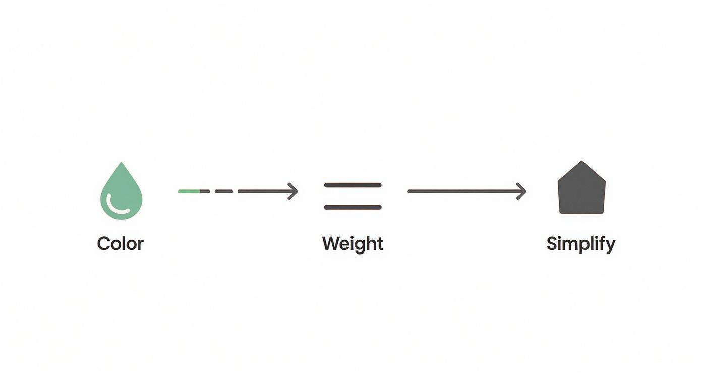
As you can see, getting the color, weight, and overall simplicity right first makes the transparency step a whole lot easier.
Pro Tip: Never assume your background is transparent. Always test it on both a light and a dark surface. A five-second check can save you from a massive design headache later on.
Dealing with more complex icons often requires a delicate touch. For example, if your icon has a subtle drop shadow, you need that shadow to fade out smoothly into nothing, not get chopped off with a hard edge. This is where using a tool with solid alpha channel support is non-negotiable. It helps preserve those fine details, ensuring your icon looks like it truly belongs in any design, without a clunky, visible border.
Bringing Your New Icon to Life
You’ve tweaked your icon to perfection and nailed that transparent background. Now for the fun part: putting it to work. Exporting your new asset isn't just a final click; it's a critical decision that affects how your icon looks and performs out in the wild.
The best format really boils down to where the icon will live. This isn’t a one-size-fits-all deal.
SVG for the Web, PNG for Everything Else
For just about anything web-related—from your company website to a mobile app—SVG (Scalable Vector Graphics) is the undisputed champion. I almost always recommend it for digital products. Because SVGs are built on code, not pixels, they can be stretched to any size without getting blurry. Think tiny favicon to massive hero image, all from one file. Plus, they're typically lighter files, which helps keep your page load times snappy.
But what about when you’re not building a website? For things like presentations, documents, or social media posts, a high-quality PNG (Portable Network Graphics) is your go-to. PNGs are fantastic because they fully support the alpha channel, which is the tech that makes a true icon transparent background possible. This means your icon will look sharp and clean when you drop it on top of a colored background or a photo in your slide deck.
It's a small detail that makes a big difference. After all, content with compelling visuals can generate up to 94% more views than plain text. A crisp icon with a transparent background cuts through the clutter, drawing the user's eye and making your interface more intuitive.
Getting Your Icon into the Mix
Once you have your file, using it should be simple. If you're handing it off to a developer, the SVG file is usually all they need. If you want to dig deeper into the technical side, we have a whole guide on using icons for web development that you might find helpful.
Here are a couple of real-world scenarios I see all the time:
- On a Website (SVG): A developer can pop the SVG right into the HTML. This is great because it means they can easily change its color with CSS, maybe for a cool hover effect.
- In a Presentation (PNG): Just drag and drop the PNG file into your PowerPoint, Keynote, or Google Slides project. It will sit cleanly over any background, blending right in without any ugly white boxes.
The real goal here is seamless integration. When you pick the right format for the context, you're making sure your design shows up exactly as you envisioned, no matter where it's being displayed.
Got Questions About Transparent Icons? Let's Clear Things Up.
Working with icon formats can feel a bit like a minefield, especially when you're aiming for that crisp, clean look on any backdrop. Getting the transparency right is key to making your designs look professional, so let's walk through a couple of the most common questions I hear.
Getting this stuff sorted out from the start will save you a world of frustration. There's nothing worse than placing what you thought was a transparent icon only to see a clunky white or black box appear around it.
SVG vs. PNG: Which One Should I Use for Transparency?
Ah, the classic debate. The truth is, the "best" format really boils down to how you plan to use the icon. It's all about context.
Here's my rule of thumb after years of dealing with this:
- SVG (Scalable Vector Graphics) is the undisputed champion for web and app design. Because it's essentially code, not pixels, you can scale it up or down infinitely without it ever looking blurry. Total game-changer.
- PNG (Portable Network Graphics) is your reliable workhorse for everything else. Think presentations, documents, or social media posts where you need a static image and vector support is off the table.
For any web project, I default to SVG every time for its sharpness and tiny file size. For just about anything else, a high-resolution PNG will get the job done beautifully.
Help! Why Does My Icon Still Have a Background?
So you downloaded a PNG, but when you use it, there’s a solid white or black square behind it. This usually means the file wasn't saved with a proper alpha channel, which is the technical term for the part of the file that stores the transparency information.
Here's a quick pro-tip: To check for true transparency, just drag and drop the icon file onto a dark background in a tool like PowerPoint or Google Slides. If it blends in seamlessly with no box around it, you're good to go.
It's also worth remembering that some file types just can't handle transparency. A JPG, for example, will always flatten any transparent areas into a solid color (usually white). If you absolutely need a transparent background, you have to stick with formats built for it, like PNG, SVG, or GIF.
Ready to create flawless icons with perfect transparency every single time? Give VibeIcons a try and generate your first five icons completely free. Get started with VibeIcons.