Create Better Icons for Bookmarks with VibeIcons
Tired of generic favicons? Learn how to create custom icons for bookmarks using AI. This guide shows you how to design, edit, and organize your browser visuals.
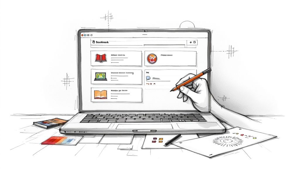
Using custom icons for bookmarks does more than just tidy up your browser. It completely changes how you interact with your saved links, turning a generic list into a personalized and highly efficient dashboard. This small tweak makes finding what you need instant, saving you a little bit of time and mental energy every single day.
Why Personalized Bookmark Icons Matter
Take a quick look at your browser's bookmark bar. It's probably a jumble of default globe icons, fuzzy logos, and generic folder symbols. When you’re in a hurry, your brain has to stop and read each title, which slows you down.
Now, picture replacing that visual noise with clean, distinct icons that you’ve created yourself.
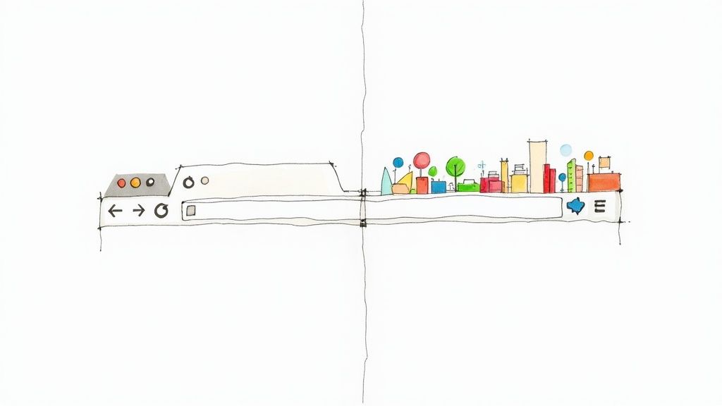
This isn't just about making things look pretty; it's a genuine productivity hack backed by cognitive science. Our brains process images an incredible 60,000 times faster than text. When you assign a unique icon to each bookmark, you're essentially creating a mental shortcut. This allows you to navigate your most-used sites almost instinctively.
For a marketer keeping tabs on a dozen competitor sites or a student trying to organize complex research, this simple change transforms a chaotic list into an intuitive, scannable dashboard.
Turning Chaos into a Curated Dashboard
Here’s a quick comparison showing the practical difference between sticking with default favicons and creating your own personalized icons for bookmarks.
The Impact of Custom Bookmark Icons
| Attribute | Generic Browser Favicon | Custom VibeIcons Icon |
|---|---|---|
| Visual Recognition | Often blurry, inconsistent, or a generic globe. | Clear, consistent, and instantly recognizable. |
| Navigation Speed | Slower; requires reading text labels to find links. | Faster; allows for quick, instinctual clicking. |
| Organization | Limited to folders and text-based sorting. | Enables visual grouping by color, style, or theme. |
| Personalization | None. You get whatever the website provides. | Fully tailored to your workflow and aesthetic preferences. |
As you can see, the benefits go far beyond simple aesthetics, directly impacting how efficiently you can work.
A personally curated set of icons for bookmarks brings some immediate, practical wins:
- Faster Recall: You'll instantly recognize a link without having to read the title.
- Improved Organization: Visually group related links together. For instance, you could use one color for all work projects and another for personal sites.
- Reduced Cognitive Load: You spend less mental energy hunting for what you need and more time actually getting things done.
The real value is in reclaiming your focus. Instead of hunting for a link, your eyes are guided directly to what you need, making your workflow smoother and less distracting.
Beyond the Browser
This idea of visual organization isn't just for your browser's toolbar. Custom icons can bring a sense of unity to your entire digital life, from apps like Notion and Trello to the shortcuts on your desktop. This kind of consistency makes switching between different tools feel much more seamless.
If you want to dig deeper into how icons work as a visual language, our guide on the use of icons offers some great insights: https://www.vibe-icons.com/blog/use-of-icons.
Ultimately, creating custom icons for bookmarks is a small investment of your time that pays off big in day-to-day efficiency and clarity.
Generating Your First Icons with AI
https://www.youtube.com/embed/RvNPsvMMaEA
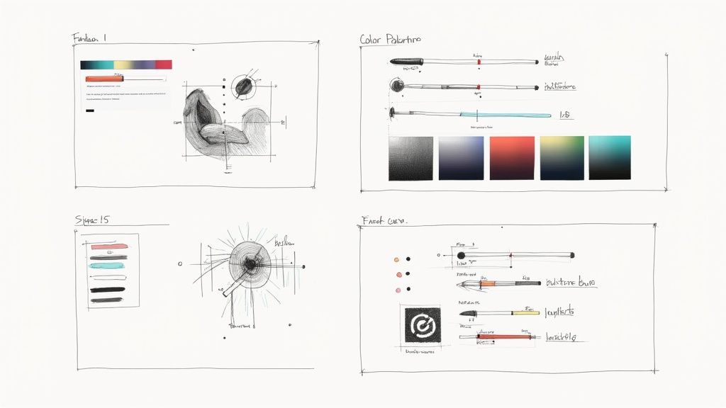
This is where your vision starts to become a reality. Think of the VibeIcons AI generator as your creative assistant, ready to translate your text descriptions into clean, functional icons for bookmarks. The real magic is in how you describe what you want.
A great prompt is clear and full of detail. It steers the AI by painting a picture of the subject, style, and even the colors you have in mind. There's a huge difference between a vague idea and a well-crafted one.
For example, just typing "book" will probably get you a pretty standard icon. But if you get specific with something like "minimalist open book, single line art, dark blue," you're telling the AI exactly what you're picturing. That kind of detail is what gets you results that feel truly custom.
From Simple Words to Stunning Visuals
Let's look at how different prompts can lead to wildly different outcomes. Say you need a bookmark icon for a folder where you keep research for your tech blog.
- Simple Prompt:
circuit board - Detailed Prompt:
glowing neon circuit board for tech blog, futuristic style, electric blue
The first prompt is a decent start, but the second one gives the AI so much more to work with. It defines the style (glowing neon, futuristic), the subject (circuit board), and even the color (electric blue). The result is a far more compelling icon that immediately signals what that bookmark is for.
The real skill here is learning to translate the image in your head into a few key descriptive words. Think like an artist giving directions—mention the subject, the style, and any standout features.
To really get the hang of it, keep these pointers in mind:
- Be Specific: Don't just say
car. Tryvintage sports car, side profile, red. - Define the Style: Add descriptors like
flat design,3D render,pixel art, orhand-drawn sketch. - Mention Colors: Including a color like
emerald greenorwarm orange toneshelps steer the final design in the right direction.
Refining Your AI-Generated Icons
Don't be surprised if your first attempt isn't perfect. That’s totally normal. The creative process is all about a little trial and error. Treat it like a conversation with the AI—if the first icon isn't quite right, just tweak your prompt and try again.
For instance, if your "minimalist book" icon came out looking a bit too busy, you could adjust the prompt to "simple open book icon, one continuous line, no background." This back-and-forth is how you dial in the results until they perfectly match what you envisioned.
If you're ready to get more advanced with your prompting, our full guide on using an icon image creator is packed with more techniques. It's a great resource for mastering the art of generating exactly the icons you need.
By playing around with different combinations of words and styles, you'll quickly get a feel for what works. Soon enough, you'll be creating entire sets of cohesive icons for bookmarks that not only look fantastic but also make your digital life a whole lot easier to navigate.
Taking Your Icons to the Next Level with Advanced Edits
An AI-generated icon is a brilliant starting point, but the real magic happens in the editor. Once the AI has laid the groundwork, VibeIcons hands you the keys to a powerful editing suite. This is where you get to roll up your sleeves and transform a good concept into a pixel-perfect asset that’s uniquely yours.
We're talking about much more than just a simple color swap. The editor lets you get right into the nuts and bolts of your icon's structure. You can tweak individual layers to add or remove specific details, apply custom gradients to nail a brand's color scheme, or even use the text tool to overlay initials for project-specific bookmarks.
Getting a Handle on Layers and Elements
Think of layers like clear sheets of plastic stacked on top of one another, each holding a different piece of the final image. The VibeIcons editor gives you complete control to pull these layers apart and put them back together with surgical precision.
Let’s say you generated a simple ‘document’ icon for a client's project folder, but it looks a little too stock. Here’s how you could make it your own:
- Select the main shape: Isolate the primary layer that makes up the document’s outline.
- Introduce a new element: On a new layer, drop in a small star or maybe the client's initial.
- Fine-tune and combine: Reposition and resize your new element until it looks just right, then merge the layers to create a single, unified graphic.
This level of granular control is a game-changer. It means you can take any AI-generated icon and adapt it for a very specific purpose, turning a generic graphic into a bookmark you can spot instantly. It’s a small tweak that can seriously speed up your workflow.
Nailing the Perfect Colors and Gradients
Color is probably your most powerful tool for visual organization. A quick color change can immediately tell you what an icon is for. The VibeIcons editor makes this dead simple, but it also lets you go way beyond just filling a shape with a solid color.
Being able to apply precise brand colors or thematic palettes to your icons isn't just about making things look pretty. It's about building a functional visual system that your brain decodes in a fraction of a second.
You can apply complex gradients, plug in exact hex codes from a brand style guide, or just play around with different shades to add a bit of depth. For anyone who wants to go deeper, we've put together a full guide on how to change the color of an icon that's packed with tips.
This push for visual organization isn't just a hunch; it's a clear trend. The growing demand for personalized digital tools shows a clear preference for designs that are both functional and visually unique. People want their digital spaces to be efficient and look good while they're at it.
Ultimately, the goal is to create icons for bookmarks that are not just functional but also perfectly aligned with your projects. By getting comfortable with these advanced editing features, you can make sure every icon you generate is a perfect fit.
Putting Your New Icons to Work in Your Browser
You’ve designed a fantastic set of icons with VibeIcons. That's the fun part. Now, let’s get them where they belong, replacing those generic bookmark favicons with your own clear, custom visuals. Don’t worry, this is way easier than you might think and you won't need to touch a single line of code.
For most people using a modern browser, the quickest path is a dedicated extension. These little tools are basically managers for your bookmark icons, giving you a simple interface to upload your own images in just a couple of clicks.
Finding the Right Browser Extension
First things first, you'll need an extension that plays nice with your browser. Luckily, there are great, highly-rated options for all the major players, and they all follow a similar logic.
- Chrome Users: Head over to the Chrome Web Store and search for something like "Favicon Changer" or "Bookmark Favicon Changer." You'll find plenty of solid choices.
- Firefox Users: The Firefox Add-ons store has you covered. Search for terms like "Favicon Customizer" and you’ll find what you need.
- Safari Users: While Safari's extension ecosystem is a bit more curated, you can still find favicon managers in the App Store that get the job done.
After you install one, you'll usually see a new icon pop up in your browser's toolbar. To change a bookmark's icon, just go to that bookmarked site, click the extension's button, and it'll prompt you to upload your new file. It's a really simple way to make your bookmark bar instantly more organized and easier to scan.
This infographic breaks down just how straightforward the process is.
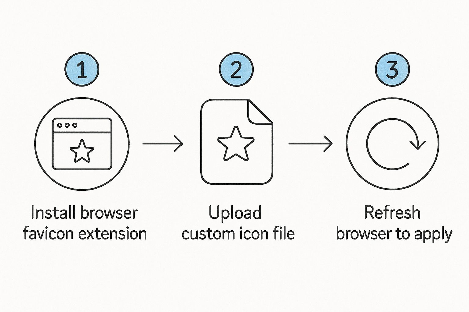
As you can see, it really is just a matter of installing the extension, uploading your icon, and giving the page a quick refresh to see your new visual take its place.
Beyond the Browser: Icons in Your Productivity Tools
Your browser bar is just the beginning. The real power of custom icons for bookmarks and links comes alive when you carry that visual language over into your productivity apps. This is where you can build a truly intuitive dashboard for your work life.
I’ve found that using the same icon for a project in my browser and in my task manager creates an immediate visual connection. It helps my brain switch gears between different contexts much faster.
Here are a couple of places I do this all the time:
- In Notion: Every single page in Notion can have its own icon. Instead of settling for the built-in emojis, I upload my custom VibeIcons. It makes telling the difference between client projects, my content calendar, and personal notes incredibly easy.
- In Trello: While you can’t change a Trello board’s main icon, you can use your custom icons as cover images on individual cards. This is a game-changer for visually coding different types of tasks—like "bug fix," "new feature," or "client feedback"—making my boards much less cluttered.
This idea of visual organization is catching on everywhere. For example, a tool like Kanka lets users assign custom icons to different parts of the platform, helping them keep unrelated items separate and making navigation feel cleaner. The core idea is the same no matter the tool: a good icon provides instant clarity.
When you start applying your icons across your entire digital toolkit, you’re doing more than just making things look pretty. You’re building a smarter, more personal, and much more efficient way to navigate your work.
Building Thematic Icon Sets for Organization
Creating icons one by one is a good start, but the real magic happens when you think bigger. When you move beyond single icons to building entire thematic sets, you can transform a chaotic bookmark bar into a clean, intuitive command center. It's all about creating a consistent visual language for different parts of your digital life.
Think about it: what if you had a dedicated theme for "Client Projects"? Every bookmark related to your work could share a professional color palette and a specific icon style. Maybe each client gets a simple circle icon, but the color instantly tells you which project it is. Finding the right link becomes a split-second, almost subconscious action.
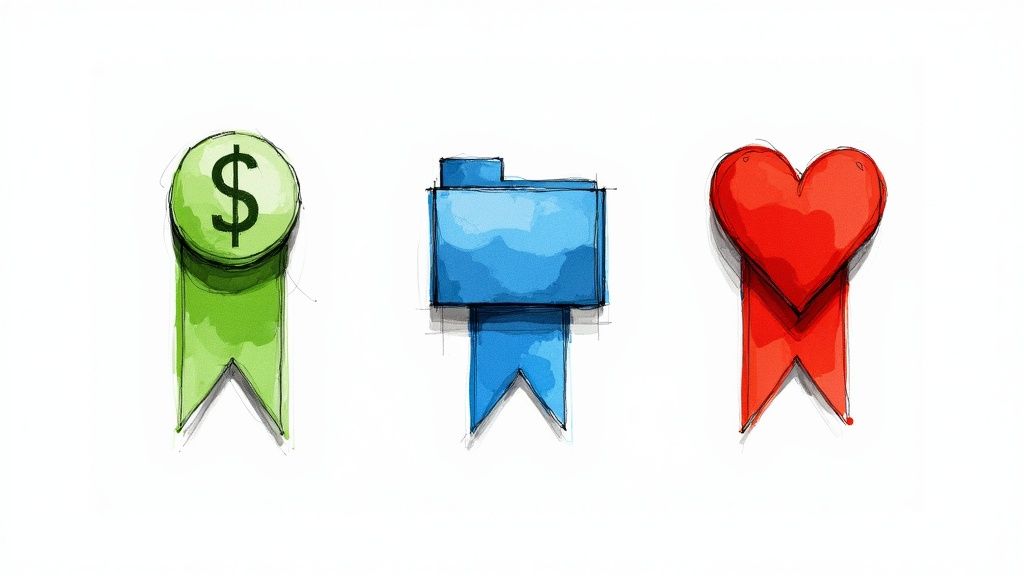
Or, you could design a "Personal Finance" theme. This set might feature bold, easy-to-read symbols for your bank, investment platform, and budgeting app. A green dollar sign for your savings account and a blue graph for your portfolio creates a visual shorthand that’s impossible to miss.
Planning Your First Thematic Set
Before you fire up the VibeIcons generator, it’s worth taking a few minutes to sketch out your themes. A little planning upfront makes a huge difference in creating icons for bookmarks that are not only nice to look at but genuinely useful.
Start by mapping out the main categories of your online life. For most of us, these are a pretty solid starting point:
- Work Projects: A home for client links, internal tools, and project management boards.
- Personal Finance: Quick access to banking, investment, and budgeting apps.
- Learning & Hobbies: Bookmarks for online courses, favorite articles, and creative tools.
- Social & News: Your go-to links for social media feeds and news sites.
With your categories defined, you can start thinking about the visual glue that will hold each set together. Consistency is everything here.
The goal isn't just to make pretty icons; it's to build a reliable system. When all your work-related bookmarks share a blue color scheme, your brain learns to associate 'blue' with 'work,' drastically cutting down the time it takes to find what you need.
This push for deep personalization isn't just happening with bookmarks. The global online bookmark services market is expected to hit USD 3.5 billion by 2032, which really shows how much people want more control and a better user experience for managing their digital world. As we look for more ways to make our tools our own, personalized icons for bookmarks are a powerful and logical next step. You can read more about the growing personalization trend in digital tools to see just how big this shift is.
Maintaining Visual Consistency in VibeIcons
VibeIcons is built for creating these kinds of cohesive sets. The trick is to establish a few simple rules for each theme and then stick to them.
Let's say you're building out that "Work Projects" theme. Your rules might look something like this:
- Primary Color: Use
#005A9C(a classic, professional blue) for the main element of every icon. - Icon Style: Stick to a
flat designorline artstyle for a clean, modern look. - Core Shape: Base each icon on a consistent shape, like a circle or a rounded square, to create visual harmony.
By locking in these core elements, you can generate dozens of different symbols that still feel like they belong to the same family. This simple strategy turns a messy collection of random favicons into a structured, easy-to-navigate system. It’s proof that well-designed icons for bookmarks are a serious upgrade for anyone looking to get their digital life in order.
Got Questions About Bookmark Icons? Let's Unpack Them.
Even with a great tool in your hands, a few practical questions always come up. Getting your custom icons for bookmarks set up is pretty simple, but it's smart to think about the details, especially when you're jumping between devices or dealing with different file types.
Let's clear up some of the things people ask most often.
Can I Use These Custom Icons on My Phone?
This is a big one. You've spent time creating a beautifully organized setup on your desktop, and you want that same experience on your phone. It's a great thought, but mobile browsers play by slightly different rules.
You can't directly replace the bookmark icons inside mobile Chrome or Safari—it's just not a built-in feature. But there's an even better workaround: use them for your home screen shortcuts.
When you hit 'Add to Home Screen' for a website on your phone, you can often pick a custom image for that shortcut. This is the perfect spot to use your VibeIcons creations. It lets you build a clean, branded set of shortcuts for your go-to sites right on your home screen.
What's the Best File Format and Size?
Nailing the technical specs is key to making sure your icons look sharp and load properly. My advice? Stick with PNG files with a transparent background. This format keeps everything looking crisp and avoids those clunky white boxes around your design.
Now, for size. The old-school favicon was a tiny 16x16 pixels, but thankfully, things have moved on.
For most situations, I recommend exporting at 64x64 or 128x128 pixels. These larger sizes scale down beautifully without losing detail, ensuring your icons for bookmarks look great on any display, even the high-res ones.
Do My Custom Icons Sync Across Devices?
Ah, the million-dollar question for anyone who uses more than one computer. Whether your icons sync up really comes down to how you apply them.
If you're using a browser extension that syncs with your Google or Firefox account, then yes—your custom icons should pop up on your other devices automatically. This is hands-down the easiest way to do it.
On the other hand, if you're using a more technical method that involves changing local files on your computer (which is pretty rare), those changes will not sync. They'll be stuck on that one machine.
For a hassle-free experience, a syncing extension is the only way to fly.
Ready to stop searching and start creating? With VibeIcons, you can generate the exact icons you need in seconds. Get started for free and see how easy it is to build a more organized digital workspace.