A Guide to the Image Not Available Icon
Understand the image not available icon. Learn how to design, customize, and implement accessible placeholders to improve user experience on your site.
We’ve all seen it: a broken image link on a website. Instead of the picture you were expecting, you see a small placeholder. That’s an "image not available" icon, and it’s a tiny but critical piece of the user experience.
This icon acts as a visual stand-in, showing up whenever a graphic fails to load. Whether it's due to a broken file path, a server hiccup, or a slow connection, this little symbol prevents an ugly blank space from disrupting the page layout. It keeps things looking clean and lets the user know that content is supposed to be there.
The Unsung Hero of Web Design

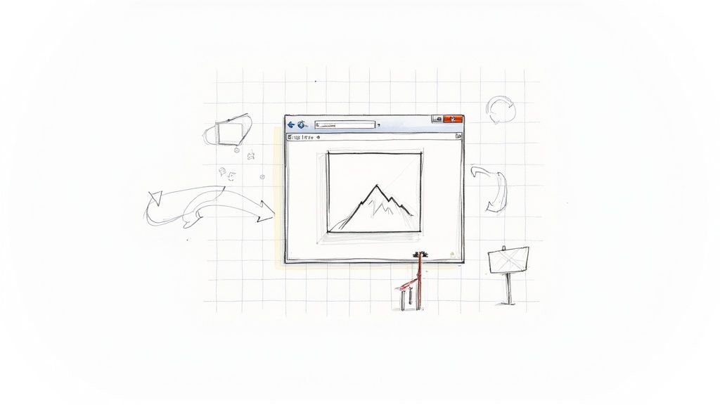
Think of it as a polite note left behind when an image can't make it to the party. We're all familiar with the classic symbol—maybe a little mountain landscape or a picture frame with a crack through it. This is the image not available icon, and honestly, it’s one of the most overlooked yet important elements in web design.
Without it, you'd just have a gaping hole on the page. The layout would collapse, text would shift, and the whole experience would feel jarring and unprofessional. This icon gracefully holds the fort, sending a clear, simple message: "An image should be here." It’s a small touch that prevents a lot of user confusion.
Why This Tiny Icon is a Big Deal
The value of this placeholder goes way beyond just filling an empty box. It’s a sign of a well-thought-out design, one that anticipates and plans for the inevitable technical glitches that happen online.
Here’s what this small icon really accomplishes:
- Sets Clear Expectations: It tells visitors, "Don't worry, the site isn't broken—just this image." This manages frustration and shows that the missing content is a technical issue, not a sign of a poorly built page.
- Preserves the Layout: By holding the image's designated space, the icon stops the surrounding content from collapsing and shifting. This maintains visual consistency and prevents a chaotic user experience.
- Acts as a Quick Diagnostic Tool: For developers, a visible placeholder is an instant alert. It’s a red flag that points directly to a broken asset that needs fixing.
A Quick Look Back
Placeholders for missing content have been around for as long as the web has been visual. As websites in the late 1990s and early 2000s became more image-heavy, the need for a fallback became obvious.
Early browsers like Netscape Navigator and Internet Explorer created their own default icons for broken images, establishing their role as a standard UI element. Fast forward to today, and you can see how vital these icons still are. Their continued presence in modern icon libraries proves they are a fundamental part of good design.
This simple graphic is a core part of any robust design strategy. By understanding the role of different icons, you start to see how these small details work together to create a smooth and intuitive user journey. To dig deeper, you can explore the strategic use of icons in web design.
Why Missing Images Impact Your Website
A broken image is so much more than a small visual hiccup. It's a silent credibility killer. When someone lands on your page expecting a certain visual and finds an ugly, empty box, it immediately eats away at their trust. That small error sends a big message: the site might be old, poorly maintained, or just plain broken.
Think of your website as your digital storefront. A missing product image is the equivalent of an empty shelf in a physical store. It just makes the whole operation feel unprofessional and unreliable. This kind of negative first impression is a major reason for high bounce rates, as users quickly click away to find a source they can actually count on.
The Real Cost of a Broken Visual
The fallout from missing images goes way beyond just a bad look; it directly hits your business where it hurts. A visually incomplete page can completely derail a user's journey, especially on e-commerce sites where seeing the product is non-negotiable. Without that visual confirmation, a potential customer is highly unlikely to make a purchase.
And this isn't some rare, hypothetical problem. It happens all the time. Studies have shown that around 30% of web users worldwide run into image loading failures. In areas with slower internet connections, that number can jump to over 40%. For sites that rely heavily on visuals, missing images can slash user engagement by about 15% simply because the site feels less trustworthy. You can learn more about creating better visual experiences from the W3C Web Accessibility Initiative.
This breakdown in visual communication creates friction. It makes it harder for people to understand your content, follow instructions, or feel good about your brand. Over time, those little frustrations add up and can do real damage to your reputation.
Common Causes Behind Image Failures
Figuring out why images fail to load is the first step toward building a more robust website. It’s not always a dramatic server crash. More often than not, it's a simple, everyday technical hiccup.
Some of the usual suspects include:
- Broken File Paths: This is the big one. It happens when an image gets moved, renamed, or deleted, but the
<img>tag pointing to it is never updated. - Server Timeouts: If the server holding the image is slow or gets overloaded with requests, the browser might just give up trying to load it.
- Hotlinking Issues: Some websites block their images from being displayed on other domains. If you're linking to an external image, this can cause it to break.
- File Corruption: Sometimes, the image file itself is just damaged and can’t be read by the browser.
Key Takeaway: Image loading failures are not a matter of if, but when. Since you can't prevent every single issue, having a smart way to handle them is crucial for keeping your site looking professional and trustworthy.
This is exactly where a well-designed image not available icon becomes your first line of defense. Instead of showing users a jarring error, it provides a clean, branded placeholder that keeps your layout intact and sets the right expectations.
Designing Placeholders That Actually Work
A great image not available icon is more than just a stand-in. It’s a vital piece of the user experience puzzle, capable of turning a moment of potential frustration into a smooth, professional interaction. Think about it: a poorly designed placeholder can make your site look broken. A thoughtful one, however, tells the user, "everything's fine, the image just isn't here right now."
The real goal is to create a placeholder that’s both helpful and a natural extension of your brand. Ditching the generic, browser-default icon for a custom one that uses your brand’s colors, style, or even a subtle logo makes a huge difference. It maintains a cohesive look and signals to your users that you care about the small details.
Core Principles of Placeholder Design
When you're designing your own placeholder icon, you're walking a fine line between universal recognition and unique brand identity. The sweet spot is an icon that users immediately understand without a second thought. This requires a smart approach to both the visual metaphor and the technical details.
To make a placeholder that truly adds value, keep these three things in mind:
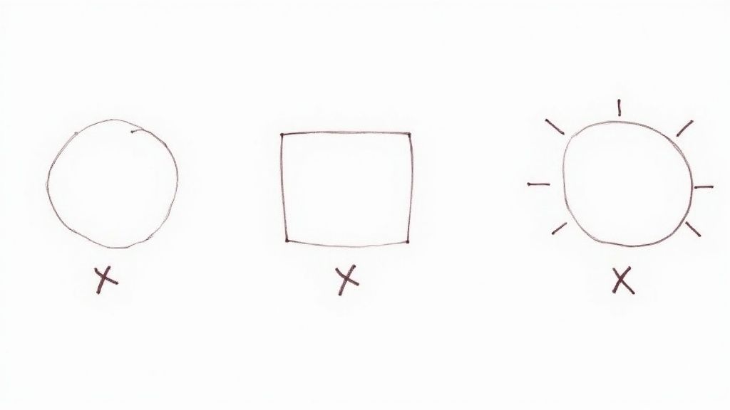
- Universal Symbolism: Stick with symbols people already know. A simple mountain landscape, a camera with a slash through it, or an empty picture frame are all classic choices. They instantly get the message across: "an image is supposed to be here."
- Brand Consistency: Weave in your brand's color scheme and typography. A placeholder that fits in with the rest of your design feels deliberate and polished. A generic one can look like a glaring error.
- Scalability and Clarity: Your icon absolutely must be a vector, like an SVG. This is non-negotiable. Vectors ensure your icon stays crisp and sharp on any screen, from a tiny phone to a huge 4K monitor, with zero pixelation.
Key Insight: The best placeholder icons are quiet but clear. They shouldn't scream for attention or compete with your content, but they should effectively communicate their purpose while subtly reinforcing your brand’s visual style.
Putting It All Together
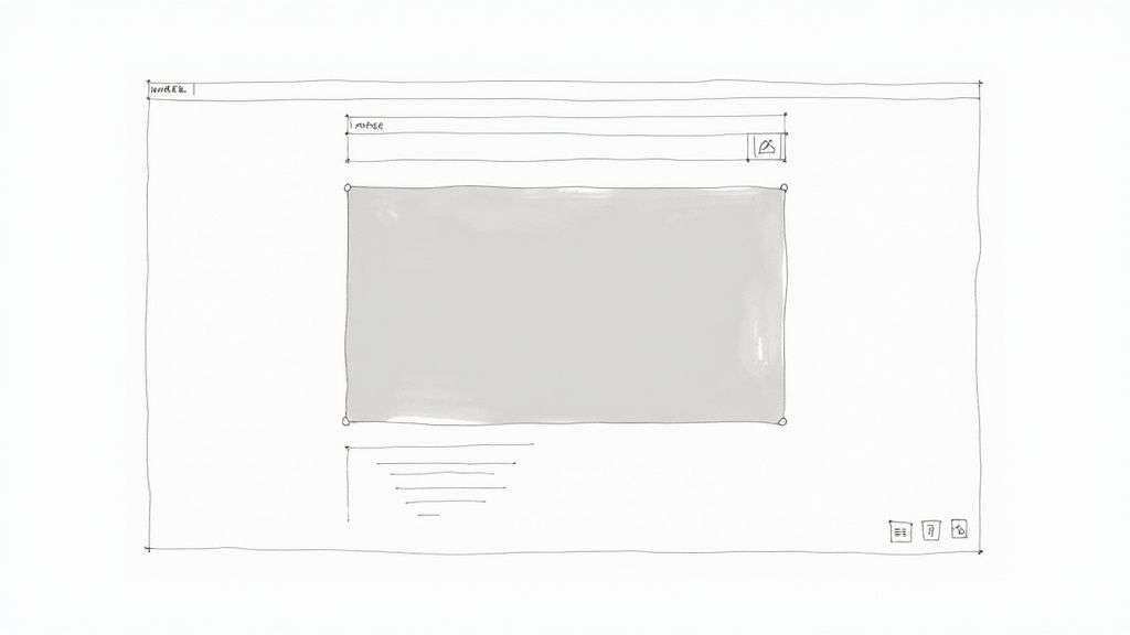
Picture an e-commerce site with a sleek, minimalist vibe. If a product photo fails to load, a standard broken image icon would completely shatter that aesthetic. But what if a custom, light-gray placeholder showing the simple outline of a t-shirt appeared instead? It holds the space, informs the customer, and keeps the visual harmony intact. That's how a humble image not available icon can directly improve the user's journey.
For anyone building websites or apps, crafting a positive user experience means planning for every scenario—especially the errors. A well-designed placeholder demonstrates foresight and contributes to a more robust, professional-looking final product. To dig deeper into how icons influence what users think and feel, check out our guide on how icons impact user experience.
Creating Accessible Placeholder Icons
When an image fails to load, sighted users get a clear visual cue—that familiar broken image icon. But what happens for someone using a screen reader? For them, a broken image isn't just a missing picture; it's a gap in the conversation, an invisible barrier that can leave them completely lost.
This is where we have to stop thinking of accessibility as a "feature." It's a cornerstone of solid design. A well-designed placeholder must communicate its purpose to everyone, no matter how they’re browsing your site. Getting this right turns a potential point of failure into a genuinely inclusive and helpful experience.
The Role of Alt Text and ARIA
Our main tools for the job are alternative text (alt text) and ARIA (Accessible Rich Internet Applications) attributes. Think of alt text as a simple, descriptive label that a screen reader reads aloud when it encounters an image. It’s your opportunity to tell the user what they're supposed to be seeing.
A classic mistake is leaving the alt text blank or just writing "image." A much better approach is to provide meaningful context.
Key Insight: Good alt text for a broken image doesn't just say "image not available." It should describe the intended content of the missing visual, giving users the full context of what they're missing.
So, instead of a generic alt="product image", something like alt="A red wool sweater with a crew neck" is infinitely more useful. It tells the user exactly what was meant to be there, so the flow of information never breaks.
This is a bigger issue than you might think. Many sites still rely on whatever default the browser shows, which often isn't very helpful.
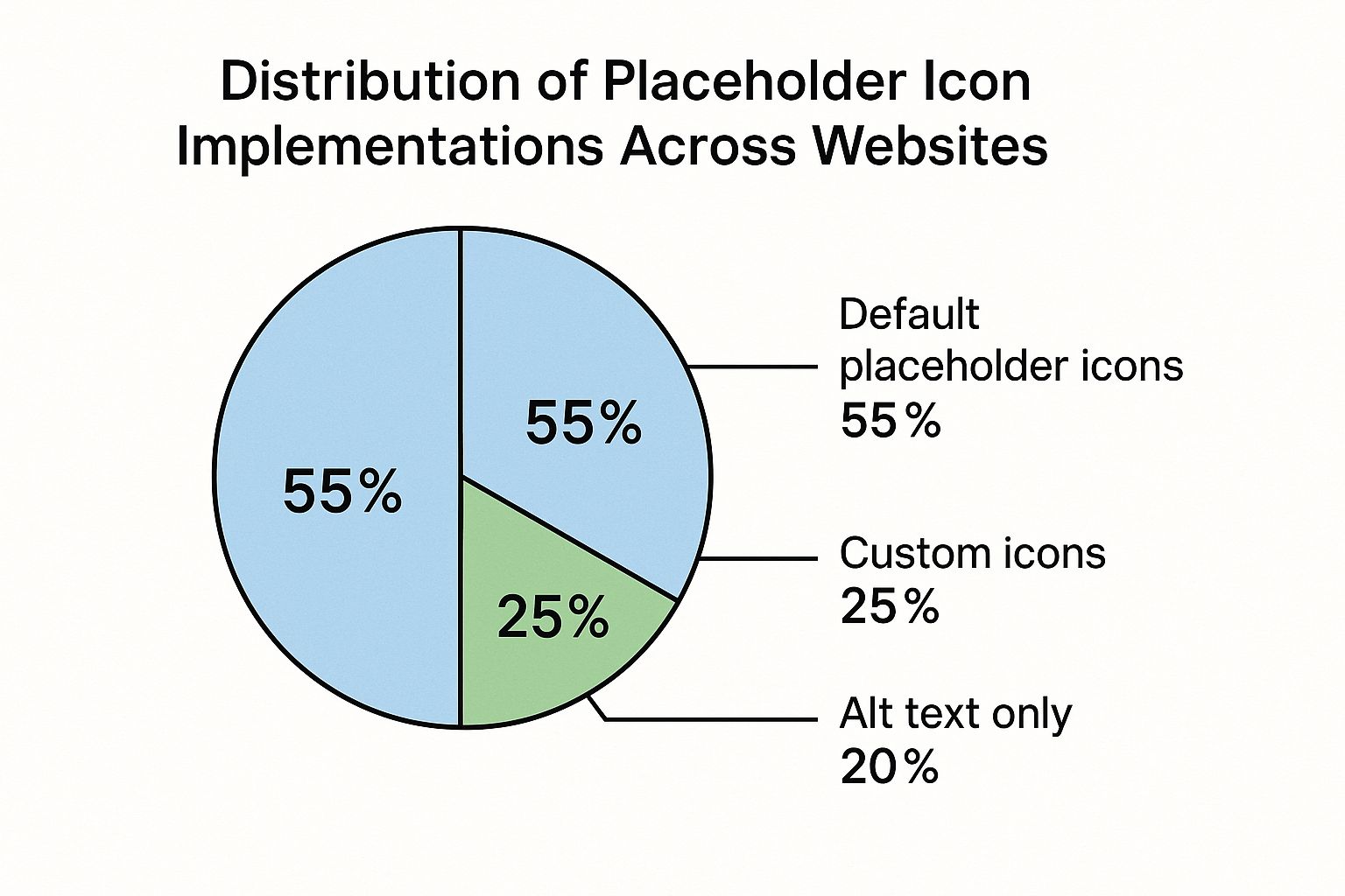
The data here is pretty clear: over half of websites are still using default placeholders. That's a huge opportunity for designers and developers to step up and create a much better user experience with custom, accessible design.
Best Practices for Accessible Placeholders
Making a truly accessible image not available icon really comes down to a few key practices. The goal is to provide total clarity for screen reader users without adding any clutter for anyone else.
The following table breaks down some common accessibility concerns and shows how to move from a poor implementation to an ideal one.
Accessibility Best Practices for Placeholder Icons
| Accessibility Concern | Poor Practice (Avoid) | Good Practice (Recommended) | Best Practice (Ideal) |
|---|---|---|---|
| Alt Text Content | alt="" or alt="image" |
alt="Image not available" |
alt="[Detailed description of what the image was supposed to show]" |
| Redundant Info | alt="Image of a cat" |
alt="A cat" |
Alt text is descriptive; icon has aria-hidden="true" to prevent double-reading. |
| Decorative Placeholders | No alt text, causing screen reader to read the file name. | Using alt="" on the decorative icon. |
Using aria-hidden="true" on the icon itself so it's ignored by screen readers. |
| Icon Clarity | Using a generic, unstyled browser default icon. | A custom icon that is visually clear. | A custom icon paired with clear alt text and ARIA attributes for a seamless experience. |
Putting this into practice is straightforward. Here are a few actionable tips to get you started:
- Be Descriptive, Not Redundant: Screen readers already announce that an element is an image, so starting your alt text with "Image of..." or "Picture of..." is just noise. Get straight to the point.
- Use
aria-hidden="true"for Decorative Icons: If your placeholder icon is purely for visual effect and the alt text already does all the heavy lifting, you can addaria-hidden="true"to the icon element. This tells screen readers to just skip over it, avoiding any confusion. - Keep It Concise: Context is king, but nobody wants to listen to a novel. Aim for a clear, succinct description that captures the essence of what’s missing.
- Test with a Screen Reader: This is the most important step. There's no substitute for actually testing your work. Use the built-in screen reader on your computer or a browser extension to experience your site the way a visually impaired user would.
By weaving these strategies into your workflow, you can ensure that a broken image doesn't break the entire experience. Instead, you provide a fallback that is functional, informative, and shows a commitment to every single person who visits your site.
How to Implement Custom Placeholder Icons
So, you're ready to ditch that ugly, browser-default broken image symbol? Good call. Swapping it out for a custom image not available icon is a simple move that keeps your site looking polished and on-brand, even when a picture fails to load. The idea is to replace that jarring error with something that feels like it belongs.
We’ll look at two great ways to do this. First, a quick and lightweight method using only CSS. Then, we’ll dive into how an icon library like VibeIcons can give you more design power and consistency across your entire site. Both options will make your user experience much smoother.
A Pure CSS Solution
One of the cleverest ways to handle broken images is with CSS pseudo-elements—specifically ::before and ::after. This technique lets you target those broken image tags and slide your own content and styling right into the empty space. No extra HTML or JavaScript needed.
Think of it this way: pseudo-elements are like invisible layers you can paint on top of an element. When an <img> tag breaks, you can use ::before to show a message like "Image not found" and ::after to display a styled icon or a simple background.
It's an incredibly efficient approach. Your site stays fast because there are no extra image files to download, and you get total control over how the placeholder looks using the CSS you already know and love.
Integrating a Professional Icon Library
While the CSS-only method is great for simple fixes, a dedicated icon library offers a more powerful and scalable solution. Using a library like VibeIcons ensures your image not available icon looks like it's part of the family, matching every other icon on your site, from menu toggles to social links. This creates a cohesive, professional look.
Getting VibeIcons set up is straightforward:
- Find Your Icon: Search the library for an icon that fits your brand’s personality. A picture with a slash through it or a simple mountain landscape are often clear, universal choices.
- Grab the Code: VibeIcons gives you clean SVG code or React components to copy and paste. This takes all the guesswork out of optimization and ensures the icon looks crisp at any size.
- Style It Up: With the icon in your HTML, you can use CSS to make it your own. Adjust the size, and most importantly, change the color to perfectly match your brand palette.
The real magic of using SVG icons from a library is how easy they are to customize. Unlike a PNG or JPG, you can change an SVG's color, stroke, and size with a few lines of CSS, making them incredibly flexible.
For instance, changing the color is as simple as targeting the icon's class and setting the fill property. This level of control means you can fine-tune every little detail. If you want to learn more, our guide on how to change the color of an icon walks you through the process.
By using a professional library, you're turning a simple error fallback into a thoughtful design element that reinforces your brand.
The Global Language of Placeholder Icons
Think about it for a moment: the image-not-available icon is one of the few truly universal symbols on the web. It's a piece of our shared digital language, understood instantly by anyone, anywhere. Whether you speak English, Japanese, or Swahili, that simple icon of a broken picture frame or a generic mountain landscape sends the same clear message: "Something visual is supposed to be here, but it's missing."
This quiet consistency is a lifesaver for massive global platforms. Take a site like Wikipedia, a sprawling digital library with millions of articles in hundreds of languages. Keeping that experience uniform is a monumental challenge. When a photo is missing from a page—be it an article on ancient Roman history or a biography of a modern artist—a standardized placeholder icon prevents a jarring, confusing blank space. It holds the layout together and keeps the experience predictable for every single user.
A Tiny Symbol for Worldwide Consistency
This reliance on a single, recognizable symbol elegantly solves a huge content management headache. Central repositories like Wikimedia Commons offer standardized assets, like a universally understood "No image available" SVG, that projects all over the world can use.
It’s amazing to see the impact of just one file. That single icon has been used on over 5,000 unique pages across the Wikimedia ecosystem, supporting content on everything from local community events to major historical figures. It's a testament to how one small element can create stability on a global scale. You can see how this one icon supports global content consistency on Wikimedia Commons.
Ultimately, this little icon acts as a fundamental building block for a more reliable internet. It gracefully bridges the gaps left by missing images, ensuring the digital world feels coherent and trustworthy, no matter where you're browsing from.
The Big Picture: The "image not available" icon is a perfect example of universal design in action. Its simple, language-free message creates a stable and consistent web experience for a global audience, proving that sometimes the smallest symbols make the biggest difference.
Got Questions? We've Got Answers
Still curious about the image-not-available icon? Let's clear up some of the most common questions people have about this tiny but crucial part of web design.
Why Does That Broken Image Icon Even Show Up?
You'll usually see this icon pop up for a handful of reasons. Most of the time, it's just a simple broken file path. This just means the website is trying to load an image from a location where it no longer exists—maybe the file was moved, renamed, or deleted without updating the code.
A few other things can cause it, too:
- Server Problems: The server where the image is stored might be down for maintenance or just too slow to send the file.
- Corrupted Files: Sometimes, the image file itself is damaged and the browser just can't make sense of it.
- Hotlinking Blocks: Some sites prevent their images from being displayed elsewhere to save bandwidth. If you're trying to display their image, you'll get the broken icon instead.
How Do I Swap Out the Ugly Default Icon for Something Better?
Getting rid of the generic, browser-default icon is easier than you think. You could get your hands dirty with some CSS, using pseudo-elements like ::before and ::after to style the empty <img> tag. It works, but it can be a bit finicky.
The smarter, more scalable way is to use an icon library. This keeps your placeholder consistent with all the other icons on your site and makes it dead simple to manage everything from one place.
Does a Broken Image Icon Actually Matter for SEO?
Here's the deal: the icon itself doesn't directly tell Google how to rank your site. But what it represents absolutely matters.
Broken images create a clunky, unprofessional user experience, and a bad experience can make people leave your site—fast. This high bounce rate is a red flag for search engines. By using a clean placeholder icon and, more importantly, helpful alt text, you smooth over that bad experience. This keeps users happy and your site looking healthy in the eyes of Google.
Stop hunting for the right icon and just create it. With VibeIcons, you can generate top-notch, AI-powered icons that perfectly fit your design in a matter of seconds. Create your first five icons for free at https://www.vibe-icons.com.